Fine Art Insurance Brochure for Armor Insurance
Nathalie Gribinski
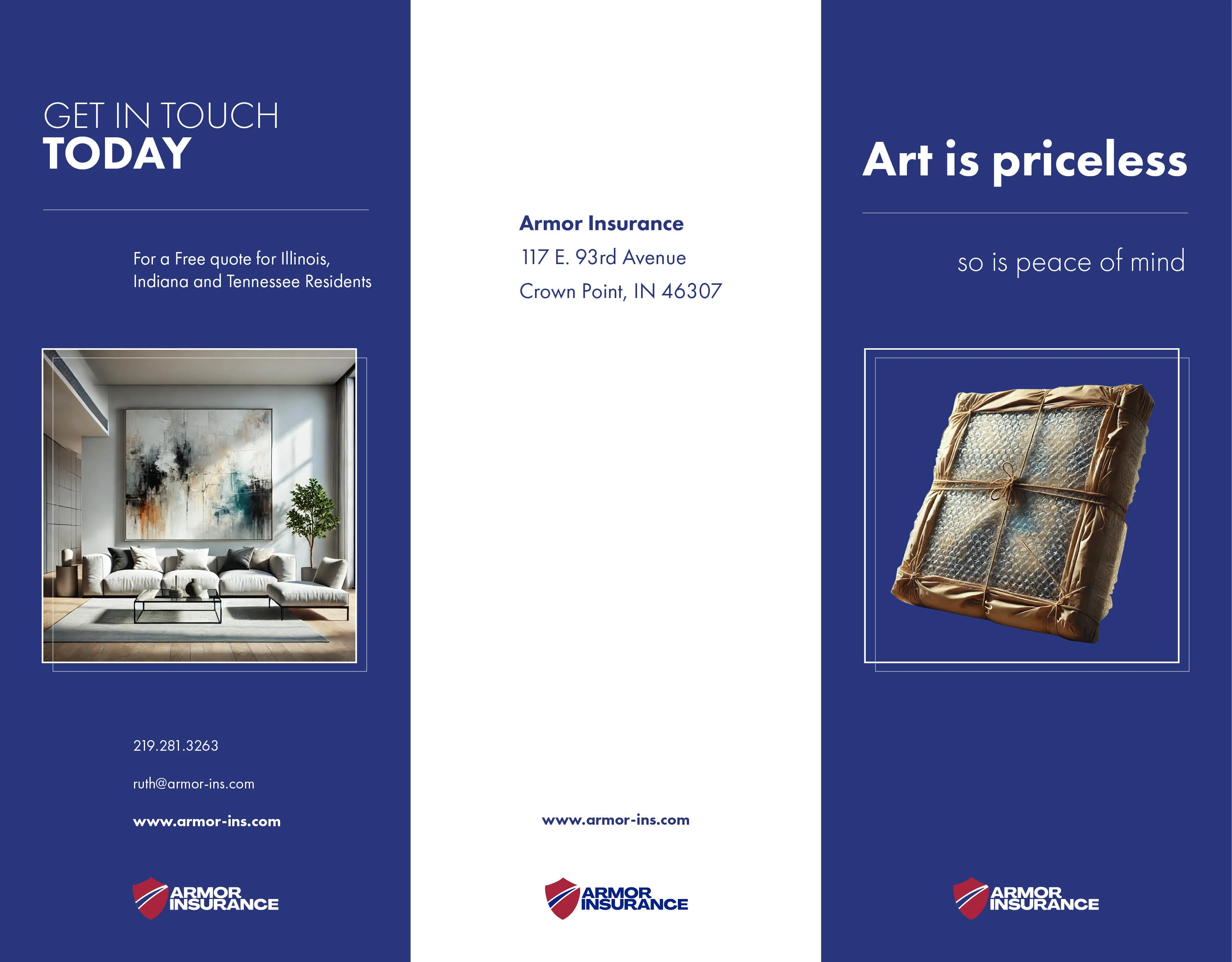
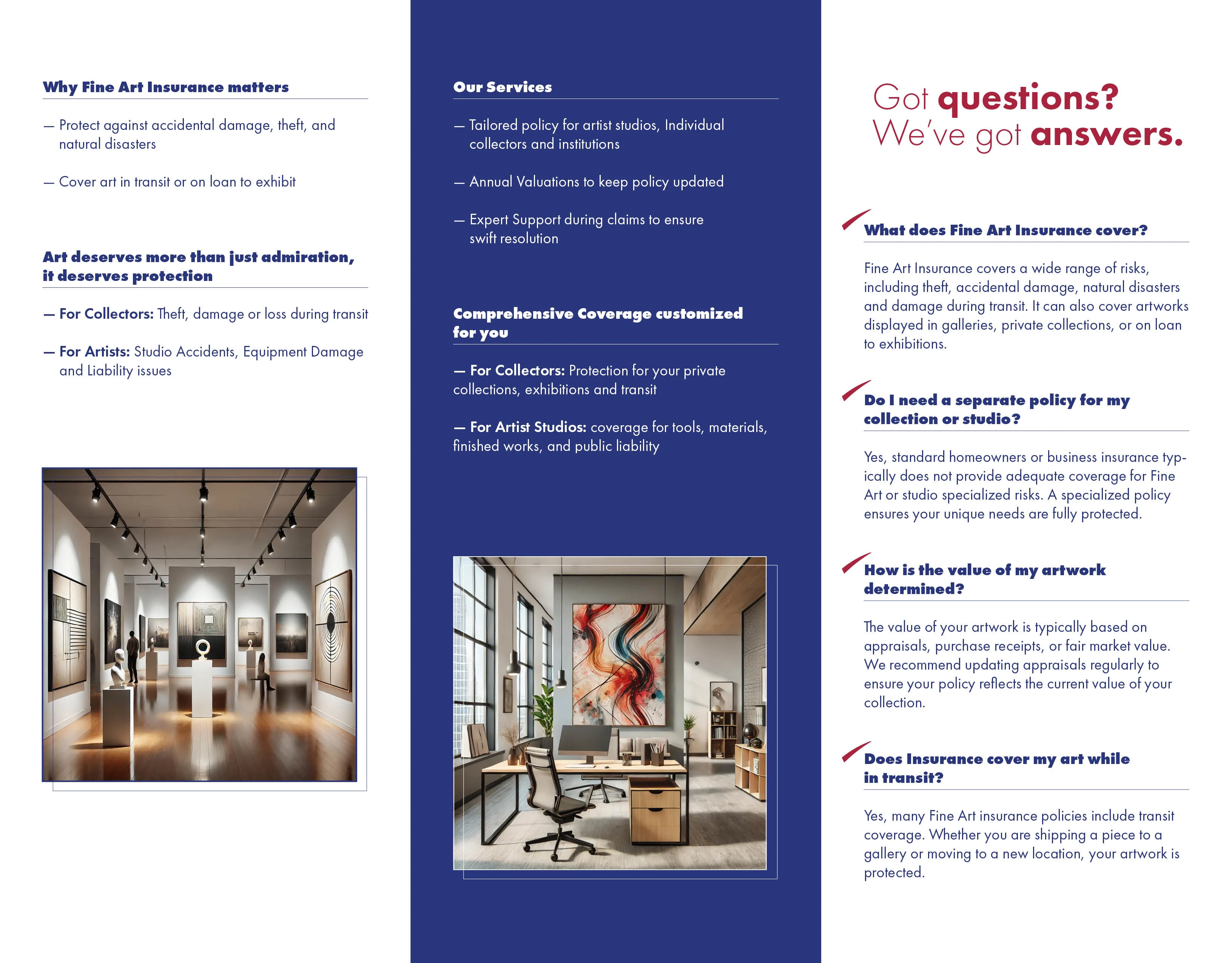
This tri-fold brochure was designed to promote Armor Insurance’s specialized Fine Art Insurance services. The goal was to create a clean, elegant layout that resonates with both art collectors and artists, balancing sophistication with clarity.
The design uses a strong visual hierarchy, contemporary typography, and a consistent blue-toned color palette to convey trust and professionalism. Strategic imagery of art galleries, artworks in transit, and curated interiors helps reinforce the theme of art protection and value. The brochure is organized to make complex insurance information easy to navigate, emphasizing key services, FAQs, and customized coverage options, while maintaining visual appeal across all panels.
Like this project
Posted May 13, 2025
Designed an elegant, informative brochure to promote fine art insurance, blending clarity and visual appeal to build trust with collectors and artists.
Likes
0
Views
5
Timeline
Feb 12, 2025 - Mar 18, 2025