FigureFlow Brand Identity, Strategy & Guideline Project
Approve request to show earnings
View
Daniel Adeeri
Verified
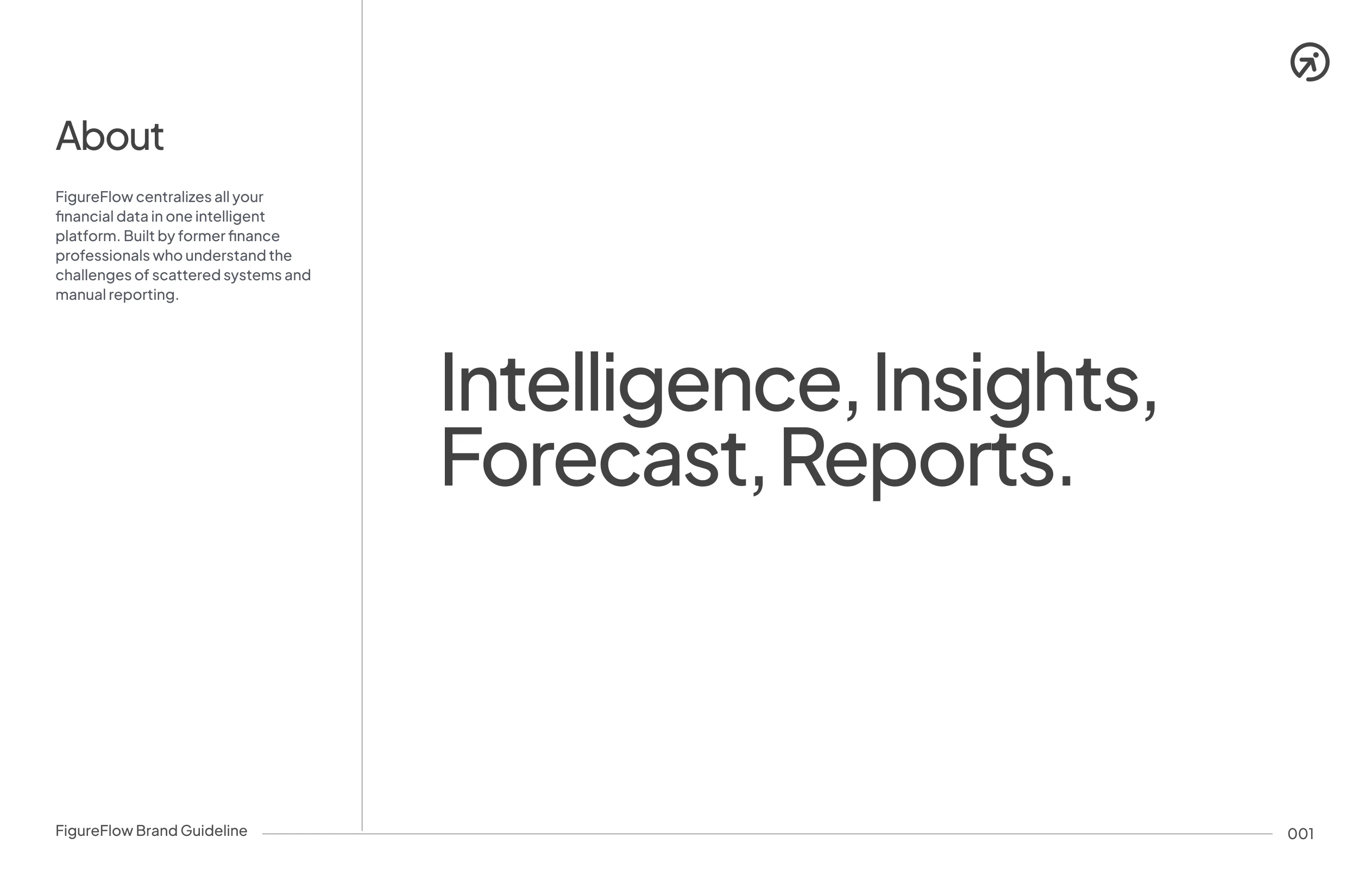
Project Overview
FigureFlow is an AI-powered financial platform that works like a CFO for businesses. It combines conversational AI (ask any question about your finances and data-driven answers), forecasting tools to predict business performance, Insights, and smart reporting that simplifies financial operations. It also includes localized compliance features like Sweden Annual Report Generation.
Visit the website here: FigureFlow
The goal of this brand identity project was to create a system that communicates clarity, trust, intelligence, and control without feeling cold, intimidating, or overly technical.
The Challenge
Financial data lives in too many places
Leaders don’t have a clear, up-to-date picture
Pulling it together takes time and causes mistakes
Teams waste time on repetitive admin work
Financial tools feel visually dense and are designed only for experts
The Solution - Figureflow
All key numbers in one place
Live insights and forecasts, always up to date
Reports created automatically
Clear explanations of what the numbers mean
Instant answers to finance questions, in plain English
The Goal
Figureflow needed a brand that feels credible and enterprise-ready while remaining accessible to non-finance founders, and that can scale seamlessly across product UI, dashboards, marketing, and investor-facing materials balancing approachability with authority.
Brand Strategy
Brand Positioning
“Financial clarity, without the confusion.”
Figureflow positions itself as:
A decision-making partner rather than just a dashboard, an intelligent guide that explains why numbers matter while delivering a modern CFO experience for startups and growing businesses.
Brand Personality
Clear – No noise, no unnecessary decoration
Intelligent – Insight-driven by AI
Calm – Reduces anxiety around finances
Trustworthy – Feels secure and reliable
Forward-looking – Built for planning and not just reporting
Visual Identity Direction
Design Principles
Clarity over decoration
Every visual element must improve understanding.
Structure and flow
Layouts reflect financial logic: inputs → analysis → outcomes.
Confidence through restraint
Minimal, controlled typography, intentional spacing.
Explainable intelligence
Visuals support the idea that AI insights are understandable.
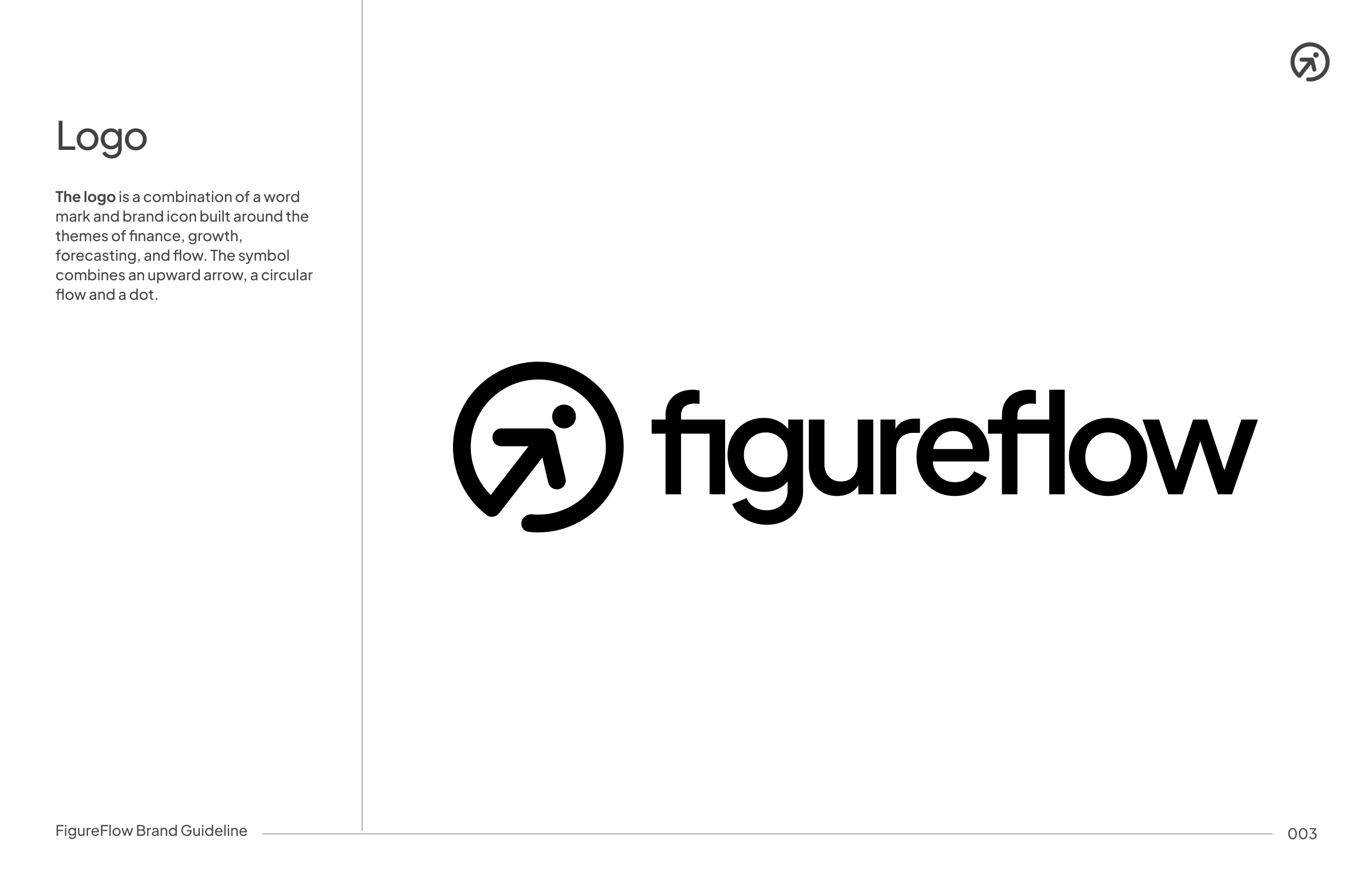
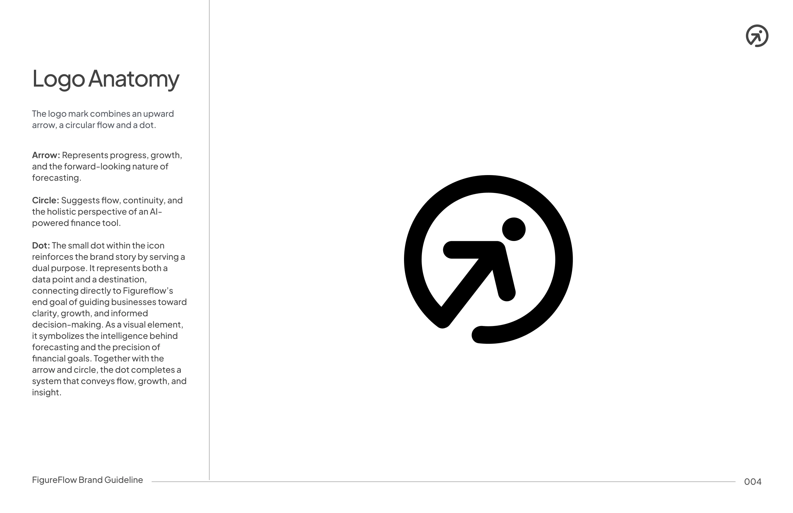
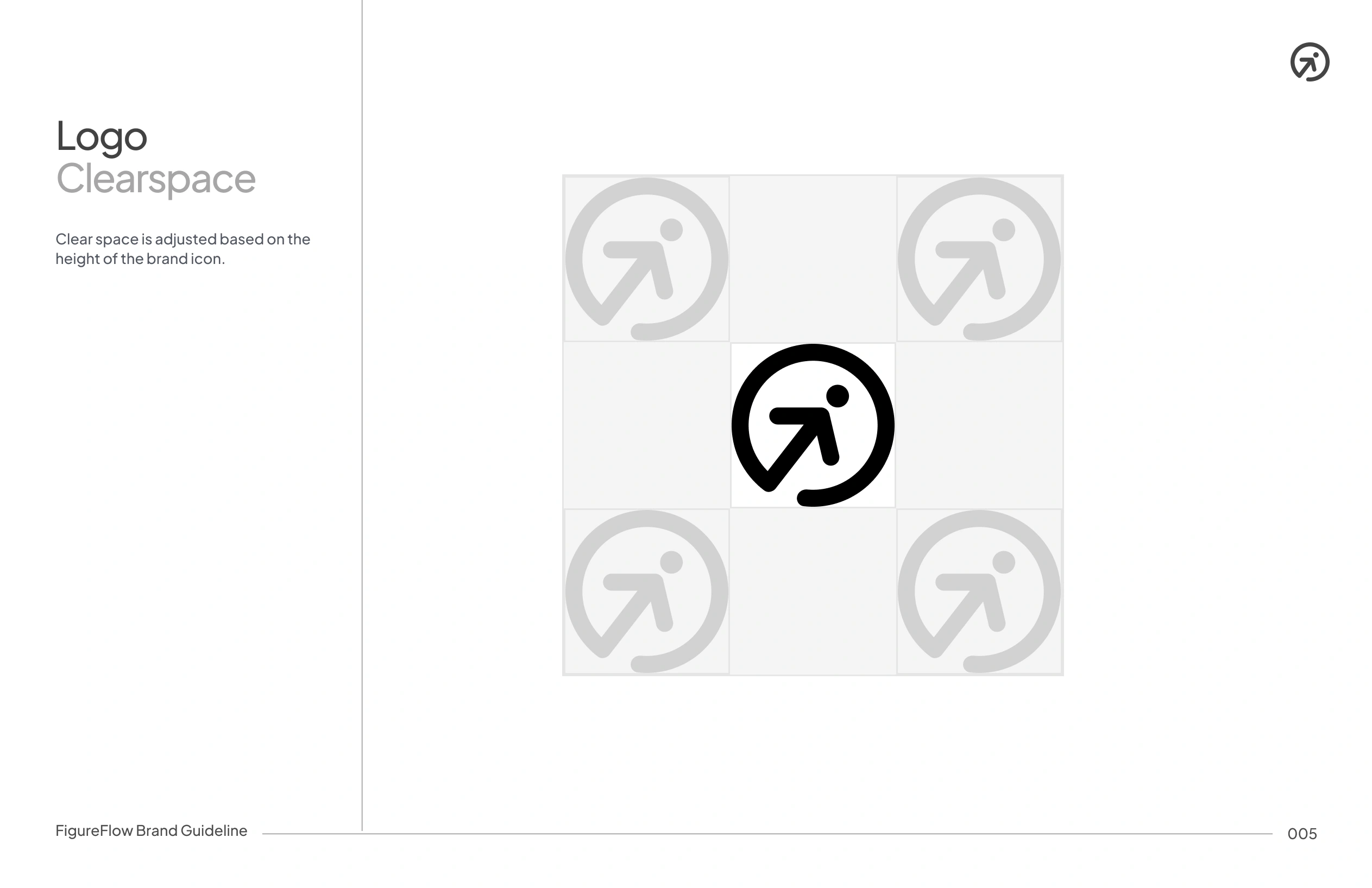
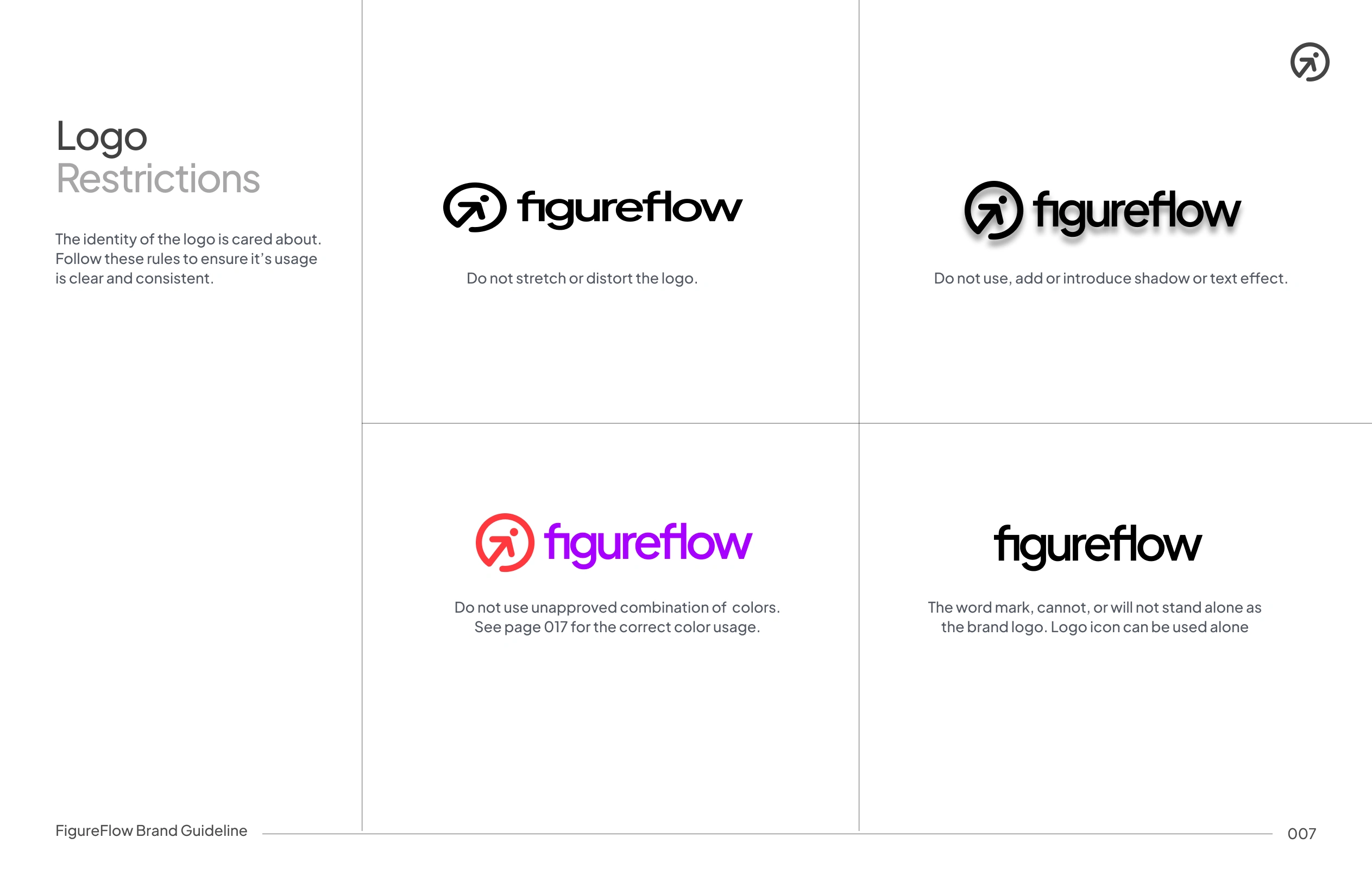
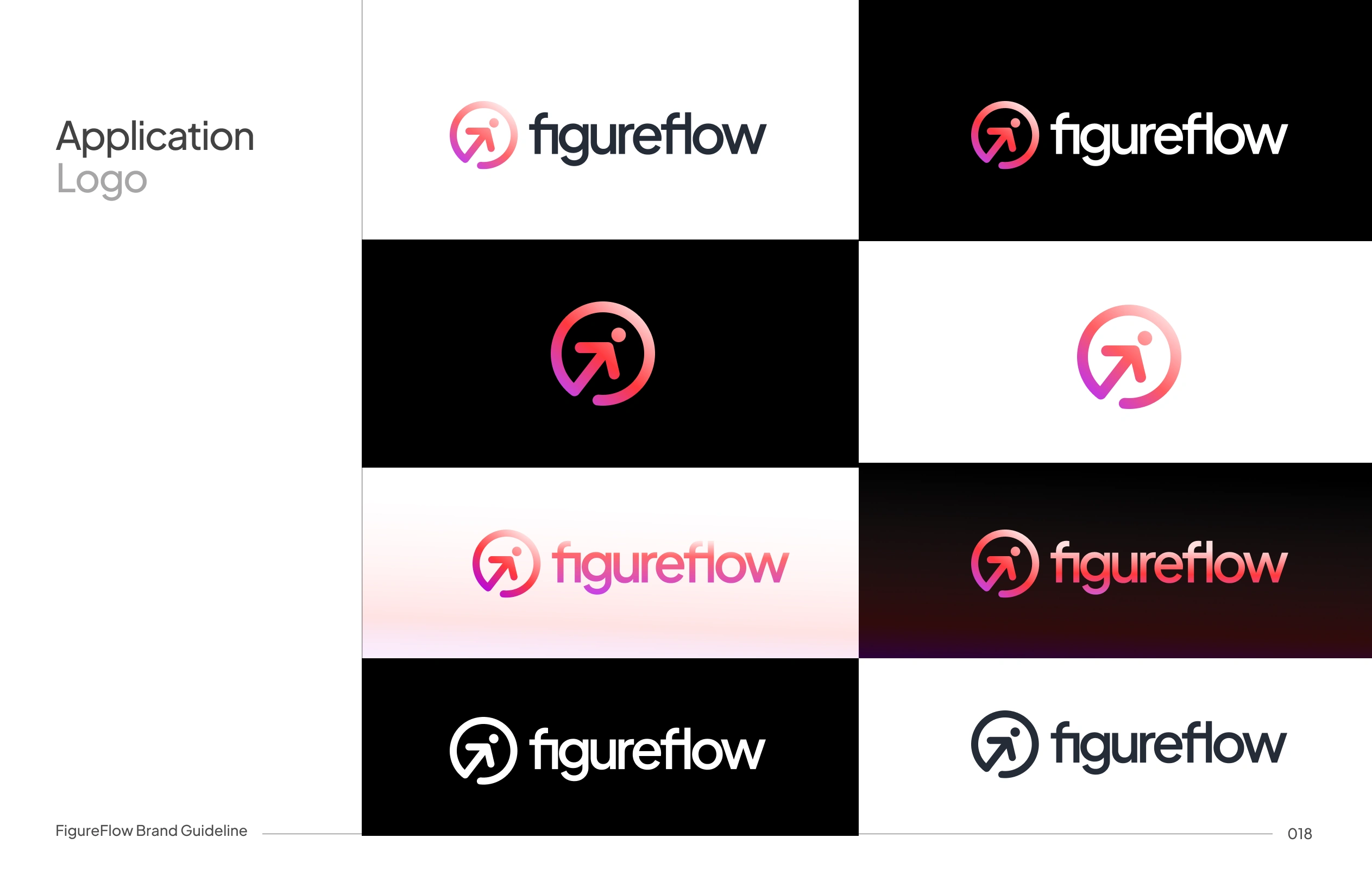
Logo Concept
The Figureflow logo is built around the idea of movement and progression numbers flowing into insights.
Modular construction
Balanced geometry
Works well as both a wordmark and an icon
Optimised for dashboards, app icons, and marketing use
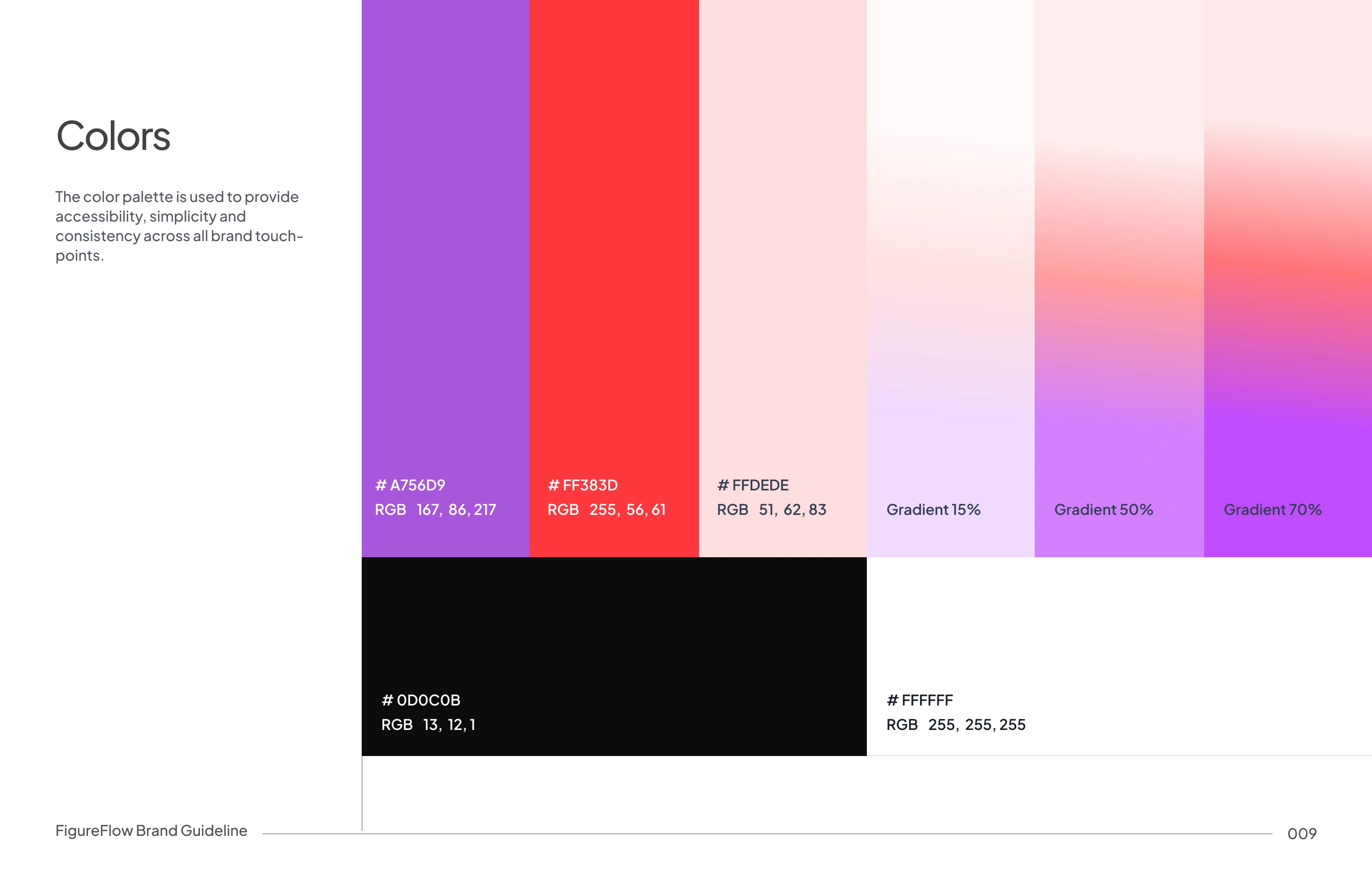
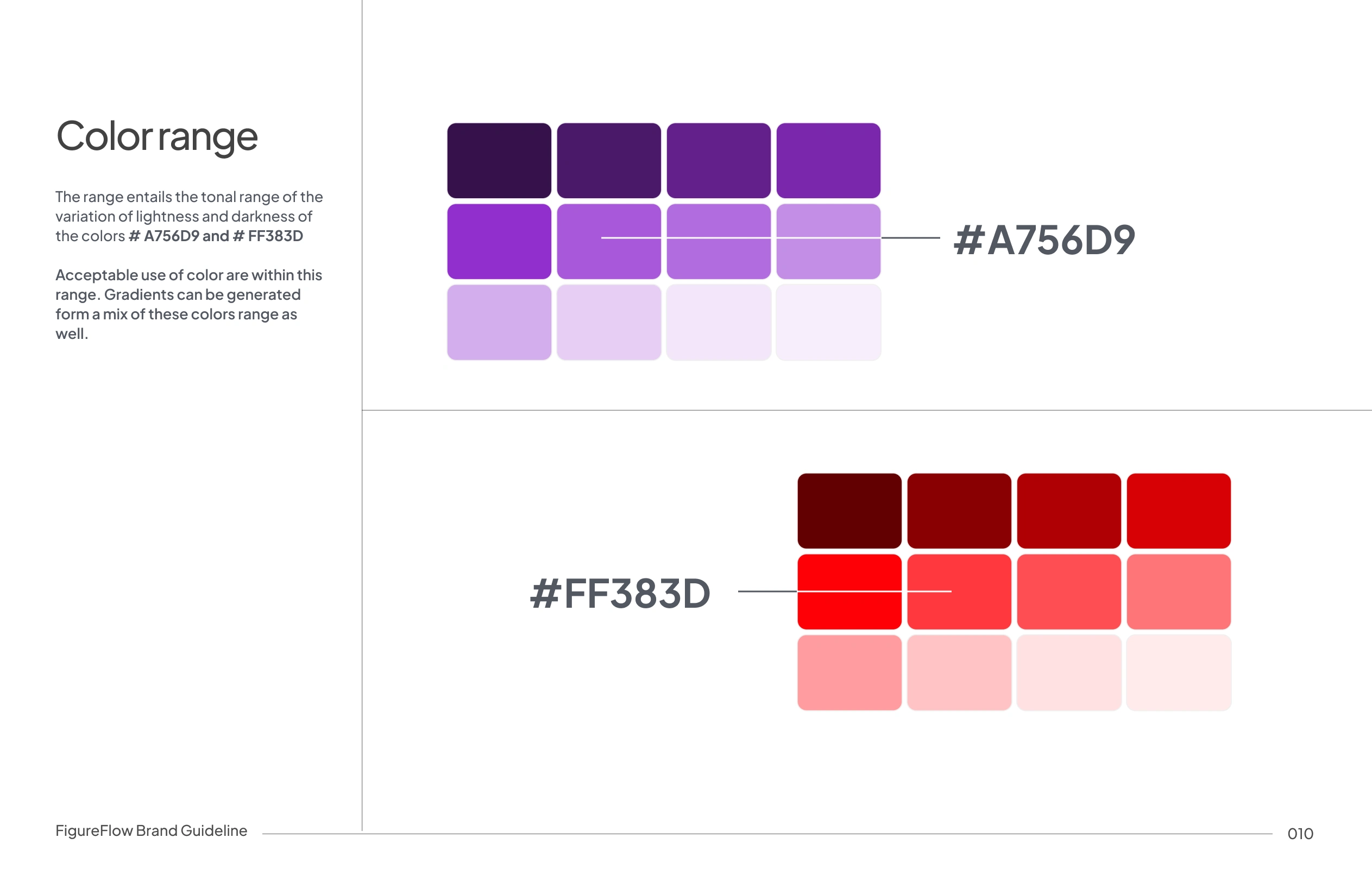
Color System
Figureflow’s color system is built around a focused primary palette of purple and shades of red, supported by neutral black and white for balance and clarity.
Purple represents intelligence, analysis, and long-term thinking, while red is used deliberately to surface key actions, changes, and critical financial signals. Controlled tonal ranges and gradient variations allow the colors to scale across UI states, data visualization, and brand applications.
The system is designed to be expressive and ensure consistency across product, marketing, and brand touchpoints.
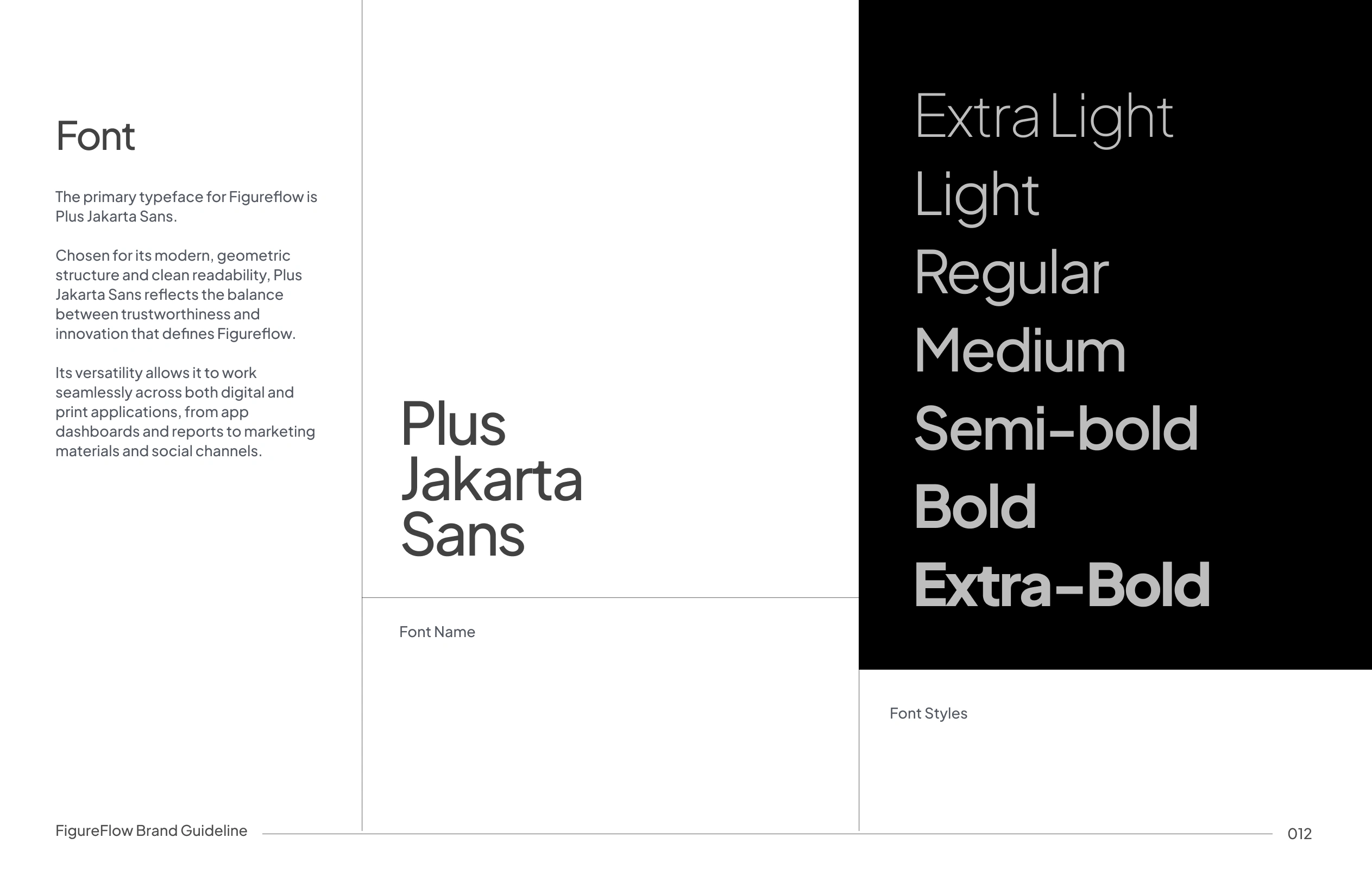
Typography
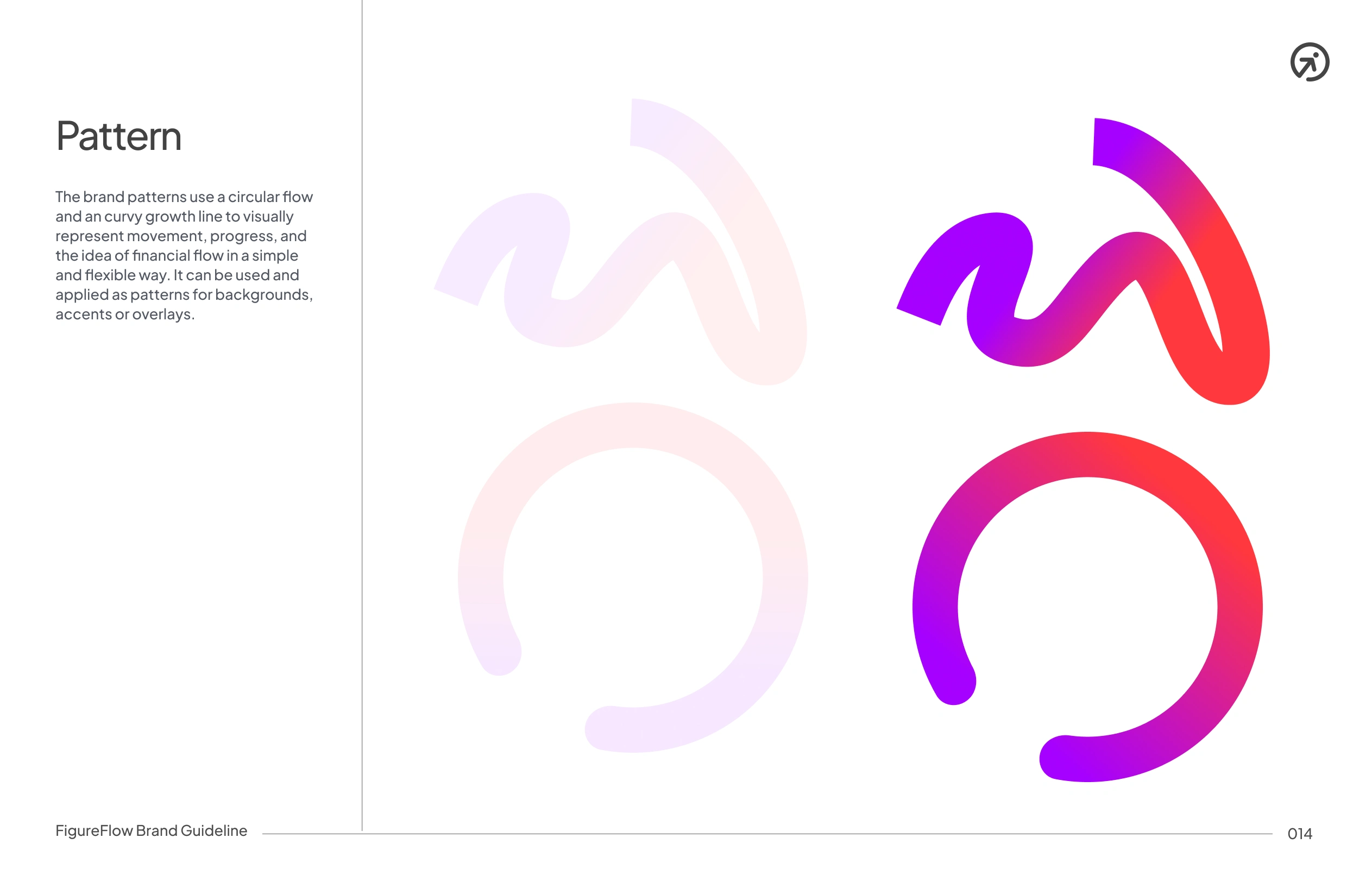
Brand Pattern
Imagery

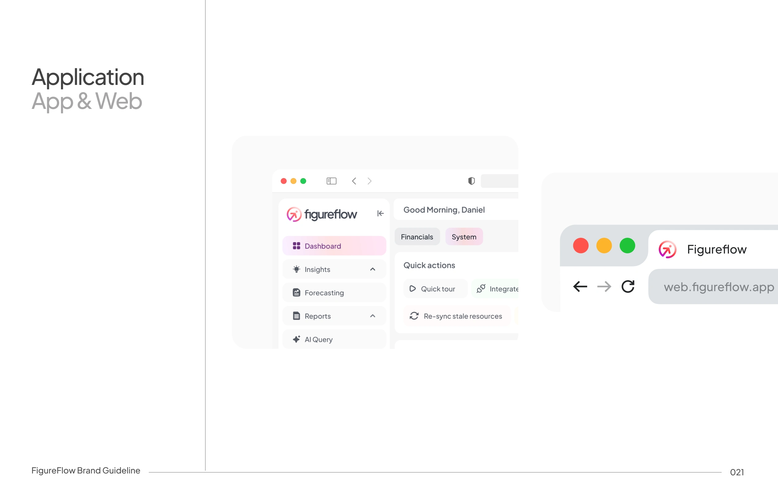
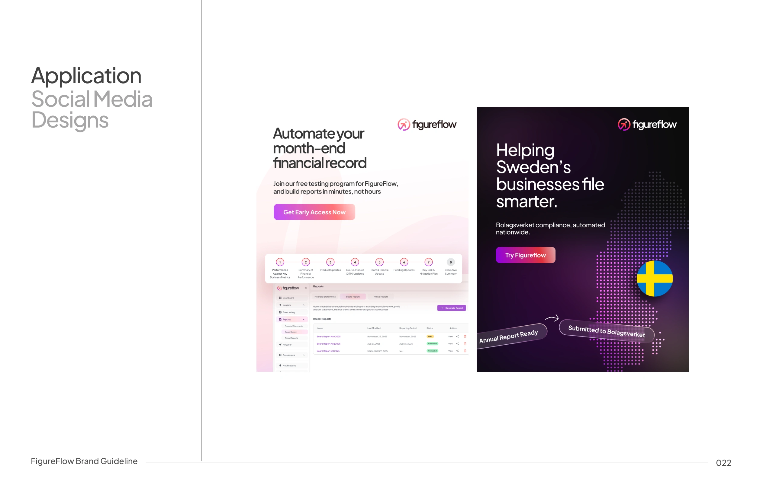
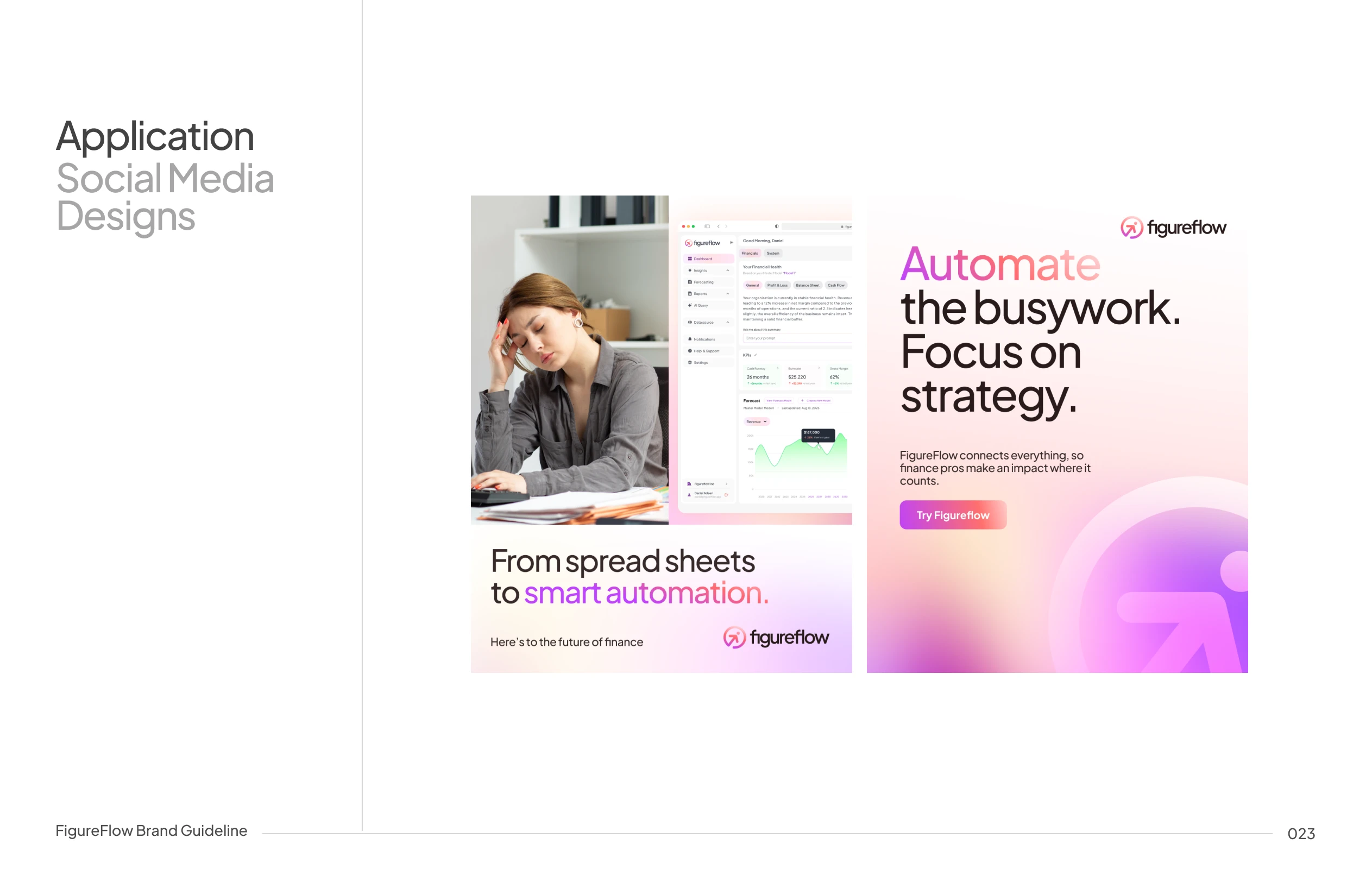
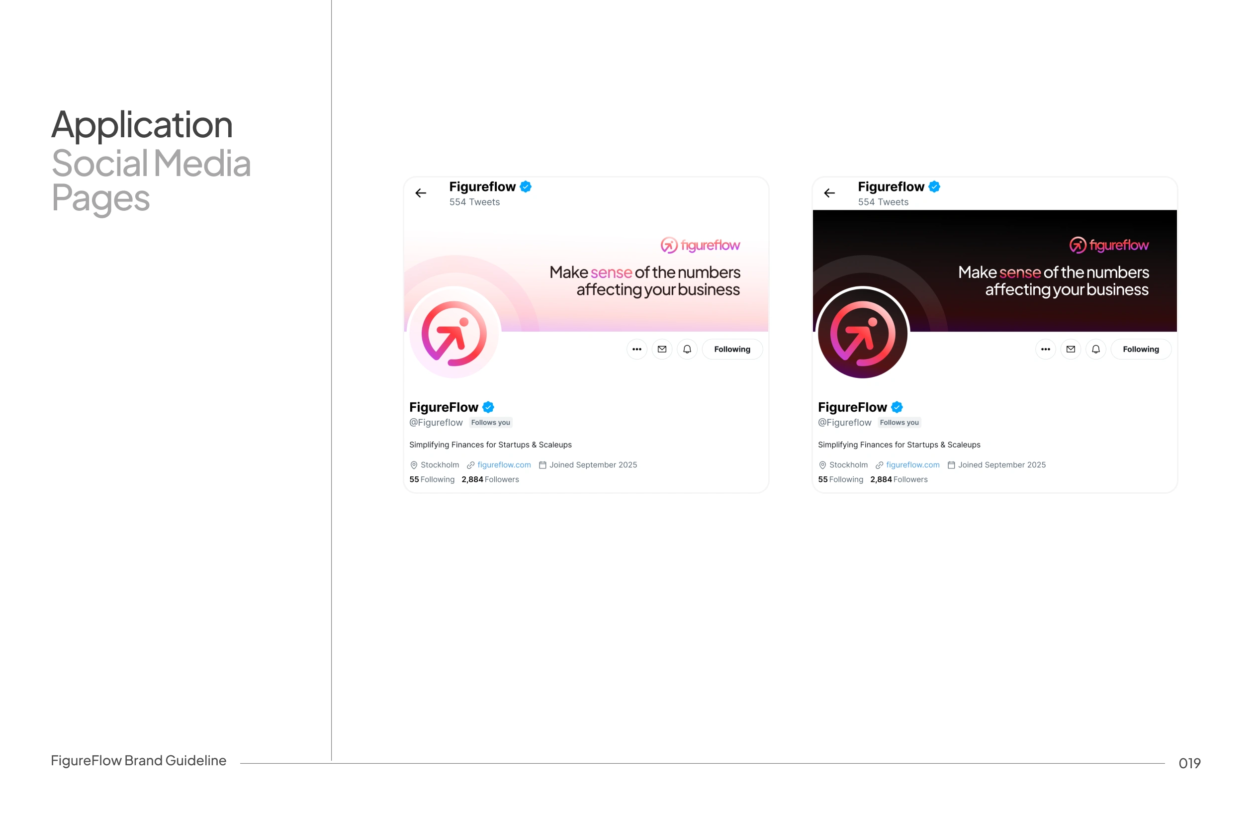
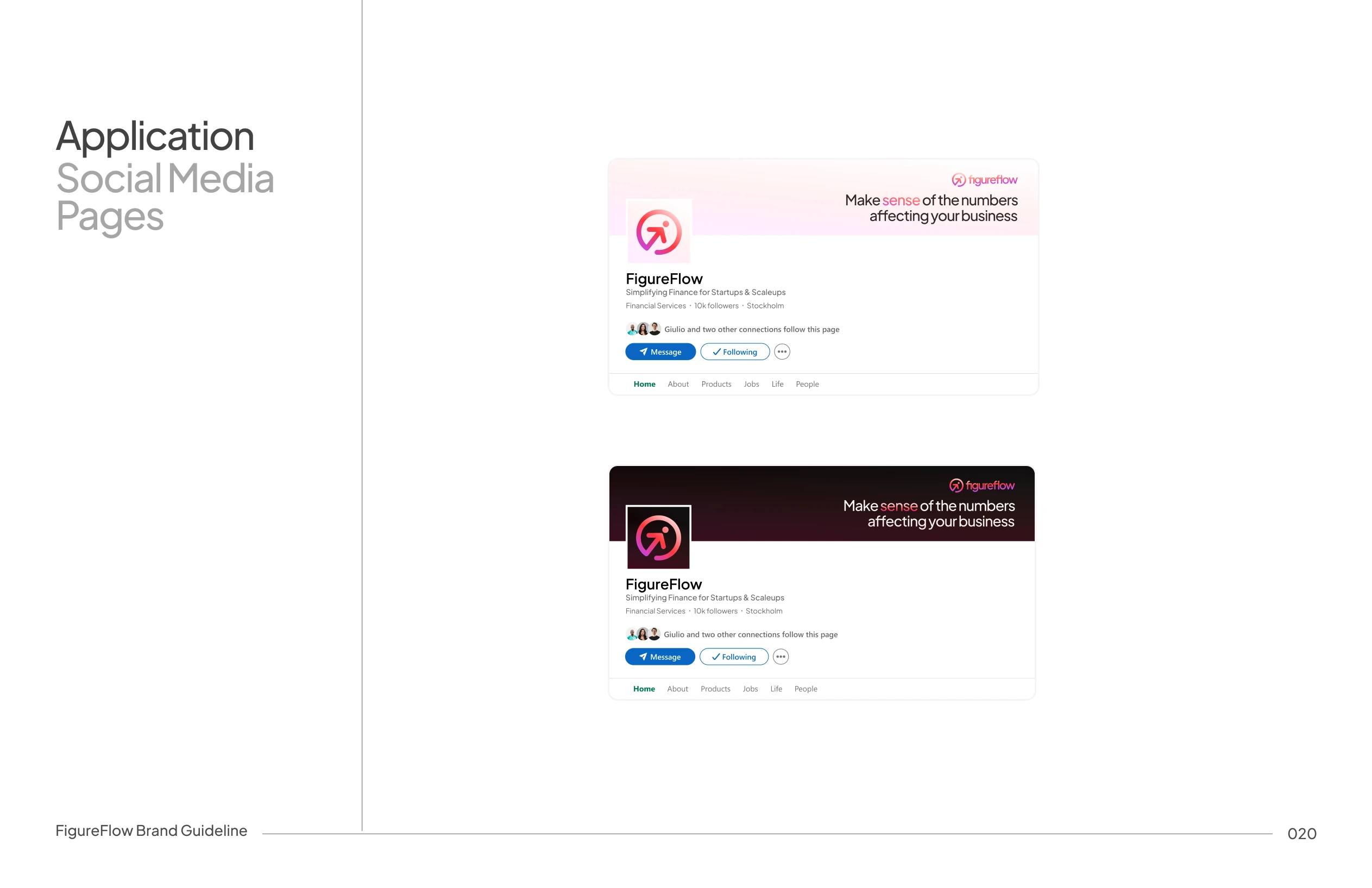
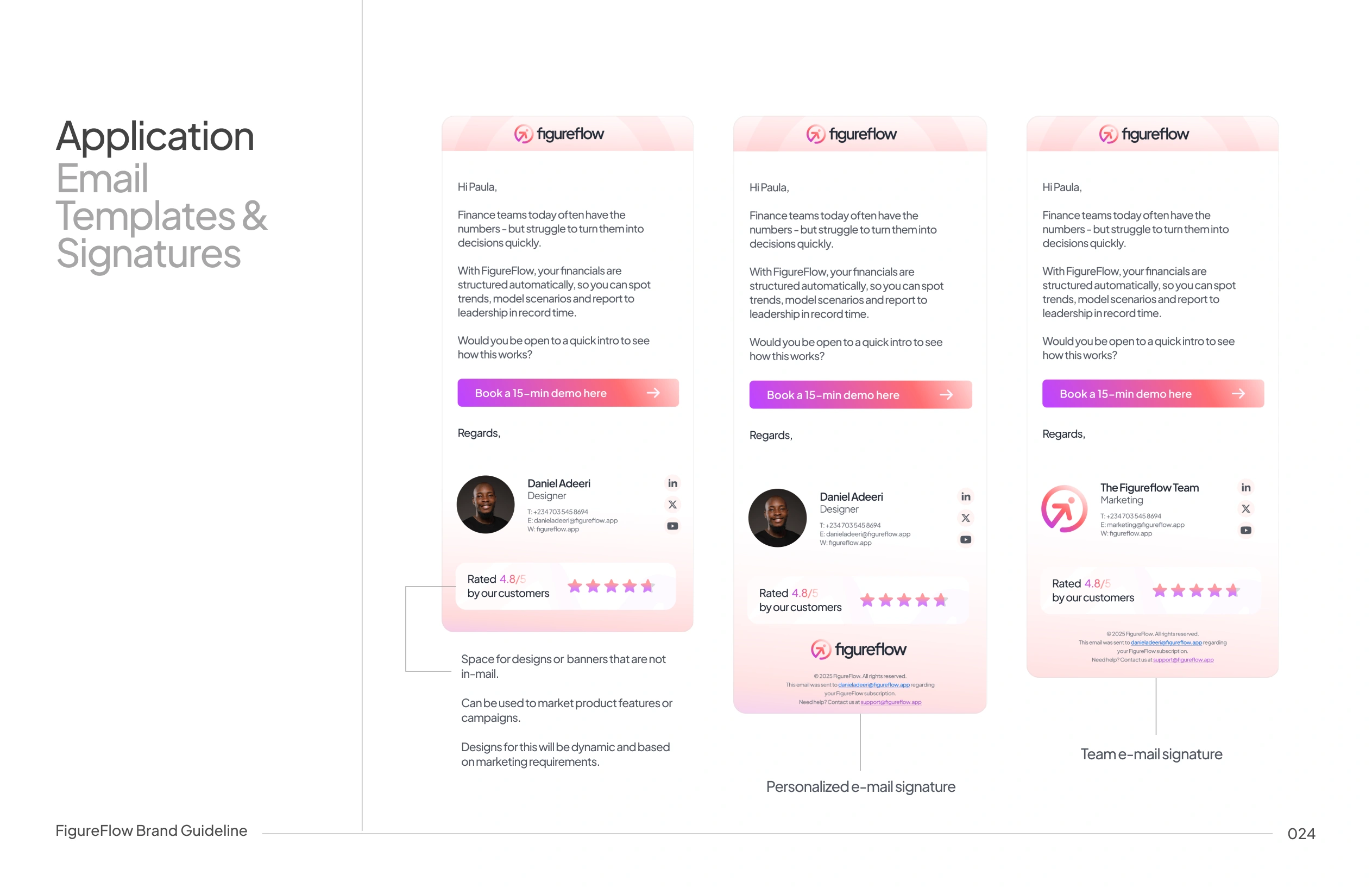
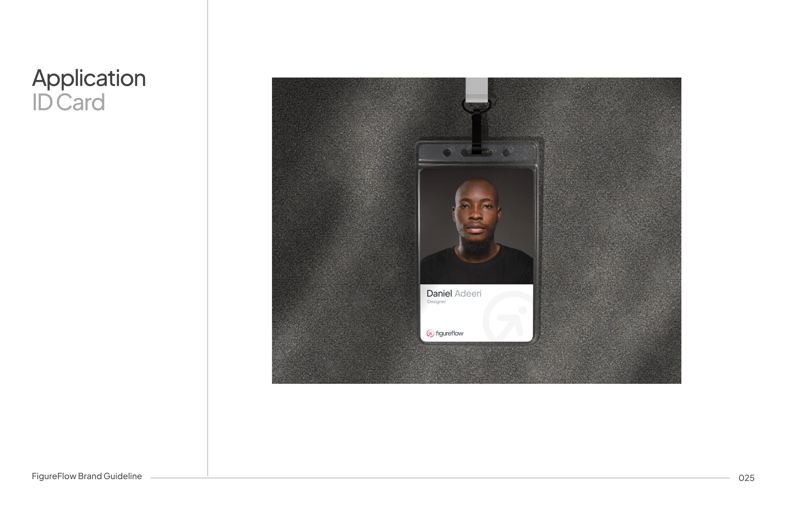
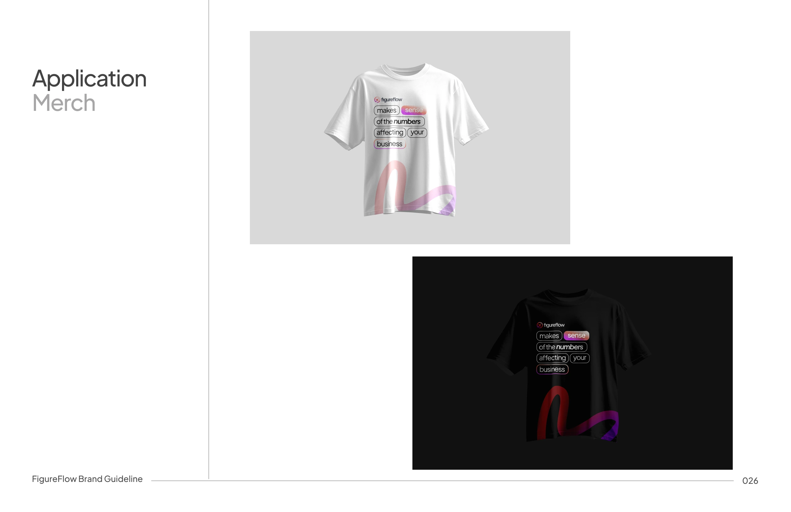
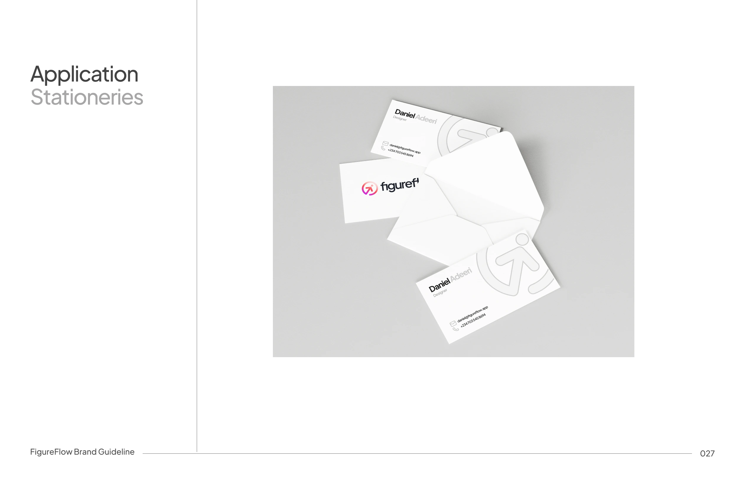
Application and Use Cases
The identity system scales across:
Web app dashboards
Social media, motion and launch assets
Pitch decks
Financial reports
This ensures consistency regardless of where users encounter Figureflow.

This project focused heavily on designing for trust.
In finance, branding is mostly about being clear, calm, and dependable, rather than being loud.
Figureflow’s identity proves that complex financial products can still feel human, modern, and intuitive when design is driven by understanding, not aesthetics alone.
Like this project
Posted Jan 1, 2026
Developed a brand identity for FigureFlow Financial Intelligene system that communicates financial clarity and trust.
Likes
3
Views
68
Timeline
Sep 29, 2025 - Oct 4, 2025
Clients
FigureFlow