Oak & Willow Realty Group | Brand Identity Design
Arlina Roman
Package
VIP Design Intensive (Brand Identity Design)
The Brief
Oak & Willow Realty Group came to me in the early stages of launching their new real estate team. Mary Ann and Kara bring years of industry experience and a strong reputation in the Georgetown, Texas, market, and they needed a cohesive brand identity to unify their partnership and position them as a refined, relationship-driven team.
The scope included strategic brand development, visual identity design, print collateral, and future-forward foundations for web and social expansion.
Pre-Booking Challenges
Before coming to me, the team tried AI for their branding, but the logo concepts felt generic, lacking uniqueness and emotional connection. They wanted something more of a customized brand identity that reflected their partnership, Texas roots, and the balance of strength and grace behind Oak & Willow. The challenge was to transform a surface-level idea into a strategic, story-driven identity that felt personal and elevated.
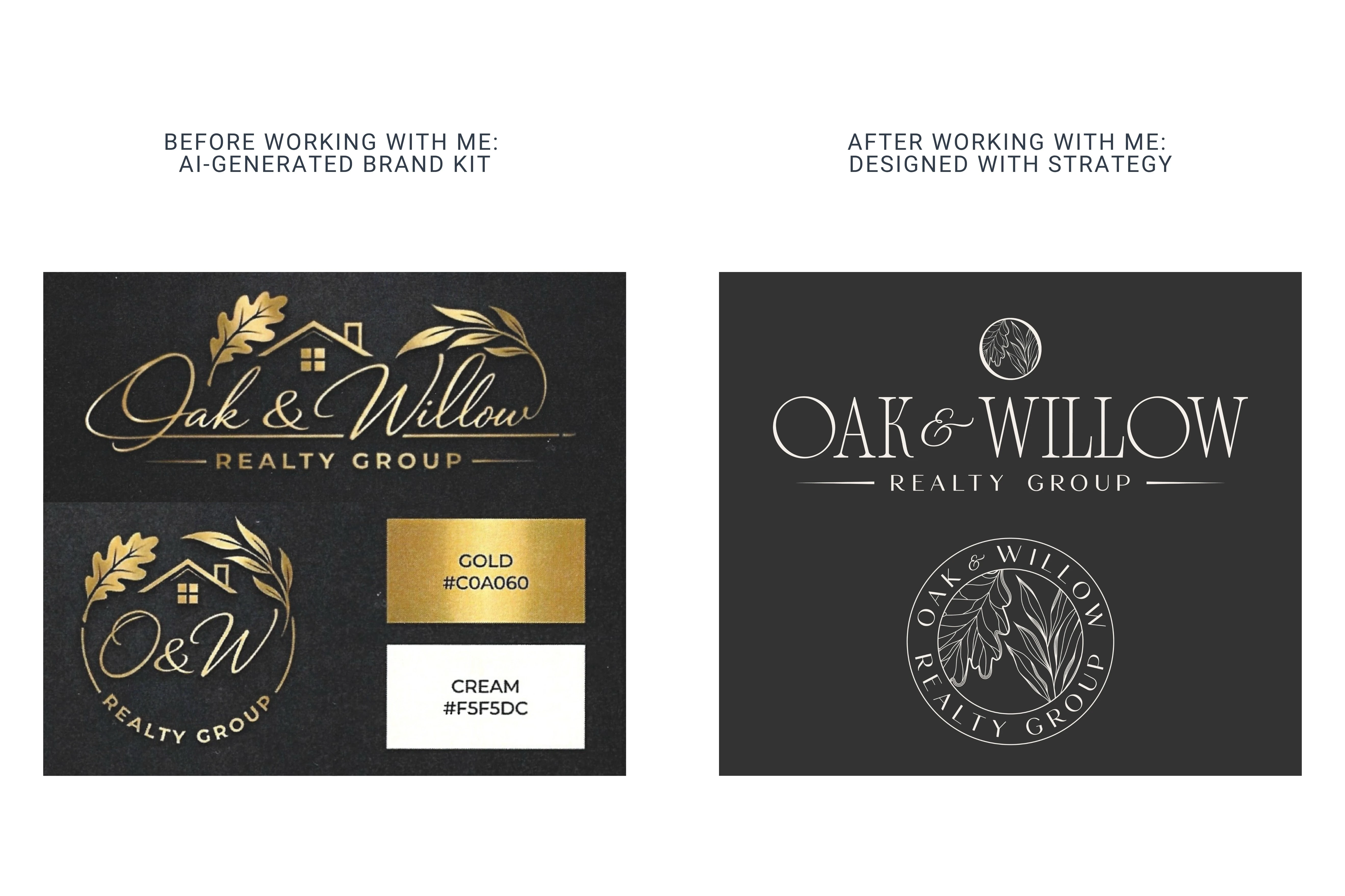
AI vs. Designer
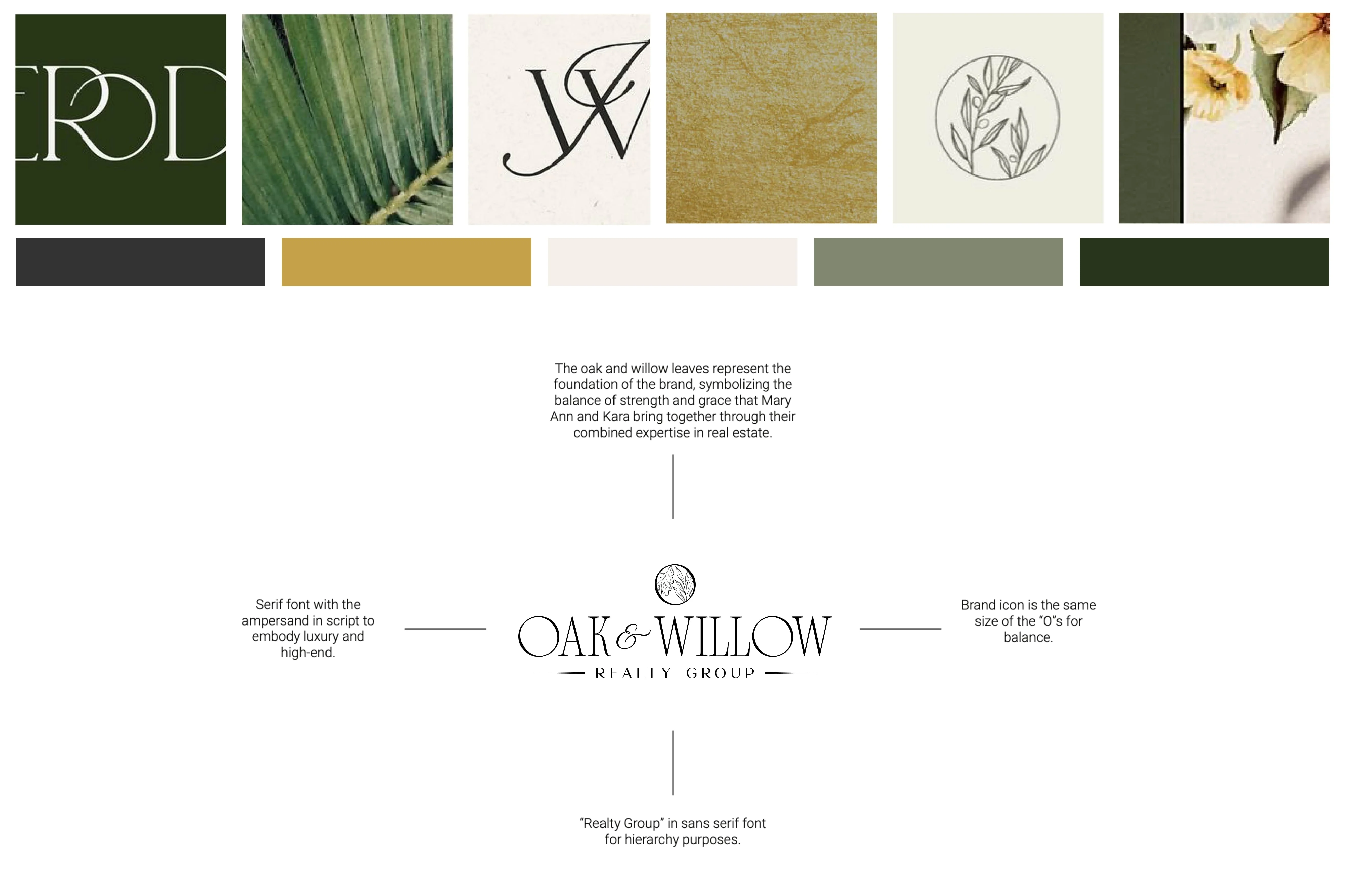
Mood Board & Logo Reasoning
Insight
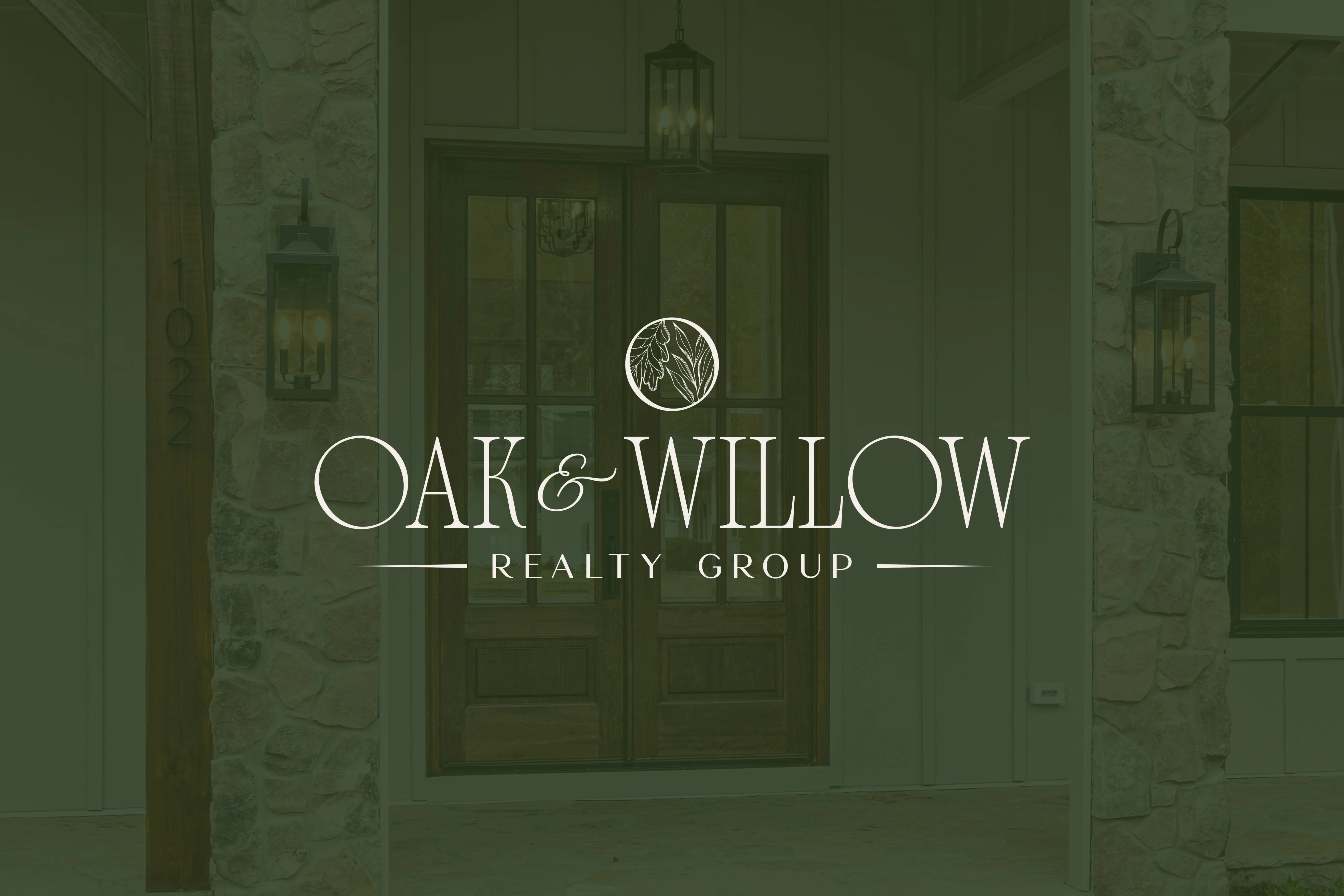
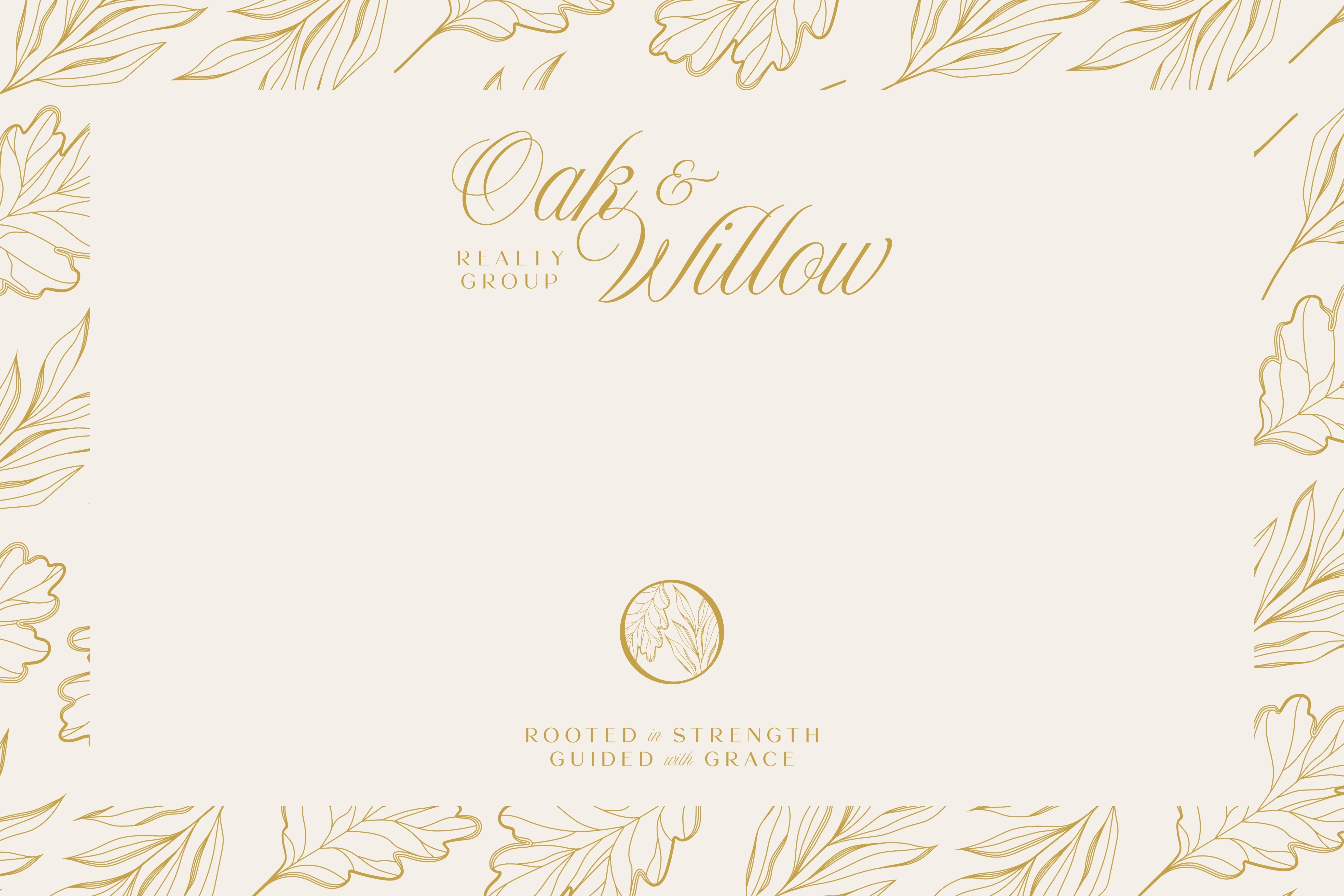
The strongest truth behind the brand was found in their partnership itself: two women bringing complementary strengths together to guide clients through meaningful life transitions. The symbolism of the oak and willow naturally reflected this balance: oak representing strength, stability, and roots, while willow introduced grace, flexibility, and thoughtful guidance. This duality became the emotional foundation of the brand, allowing the identity to feel both grounded and elegant.
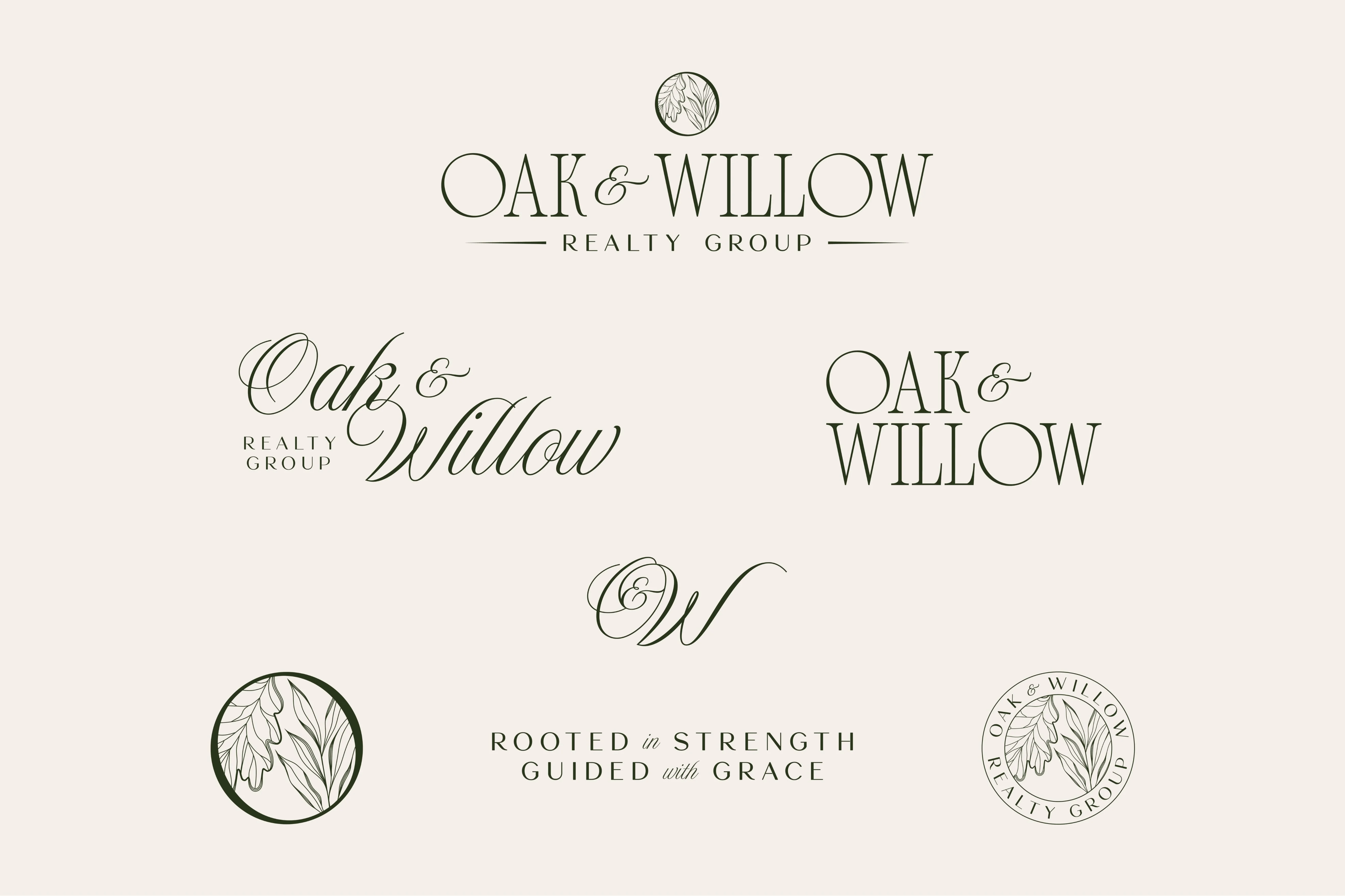
Logo Variations
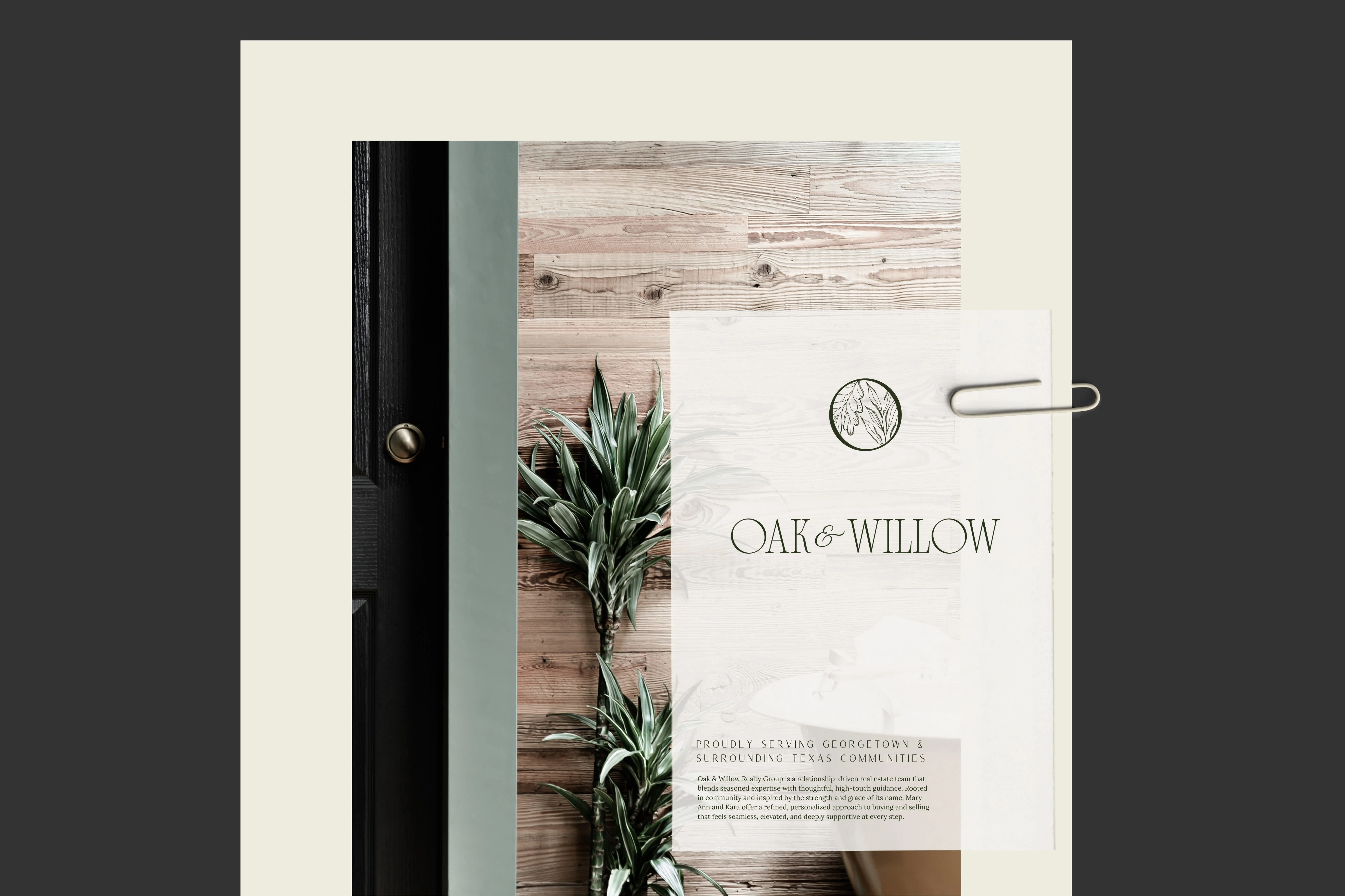
Mockup
Brand Identity Design
Design Intent
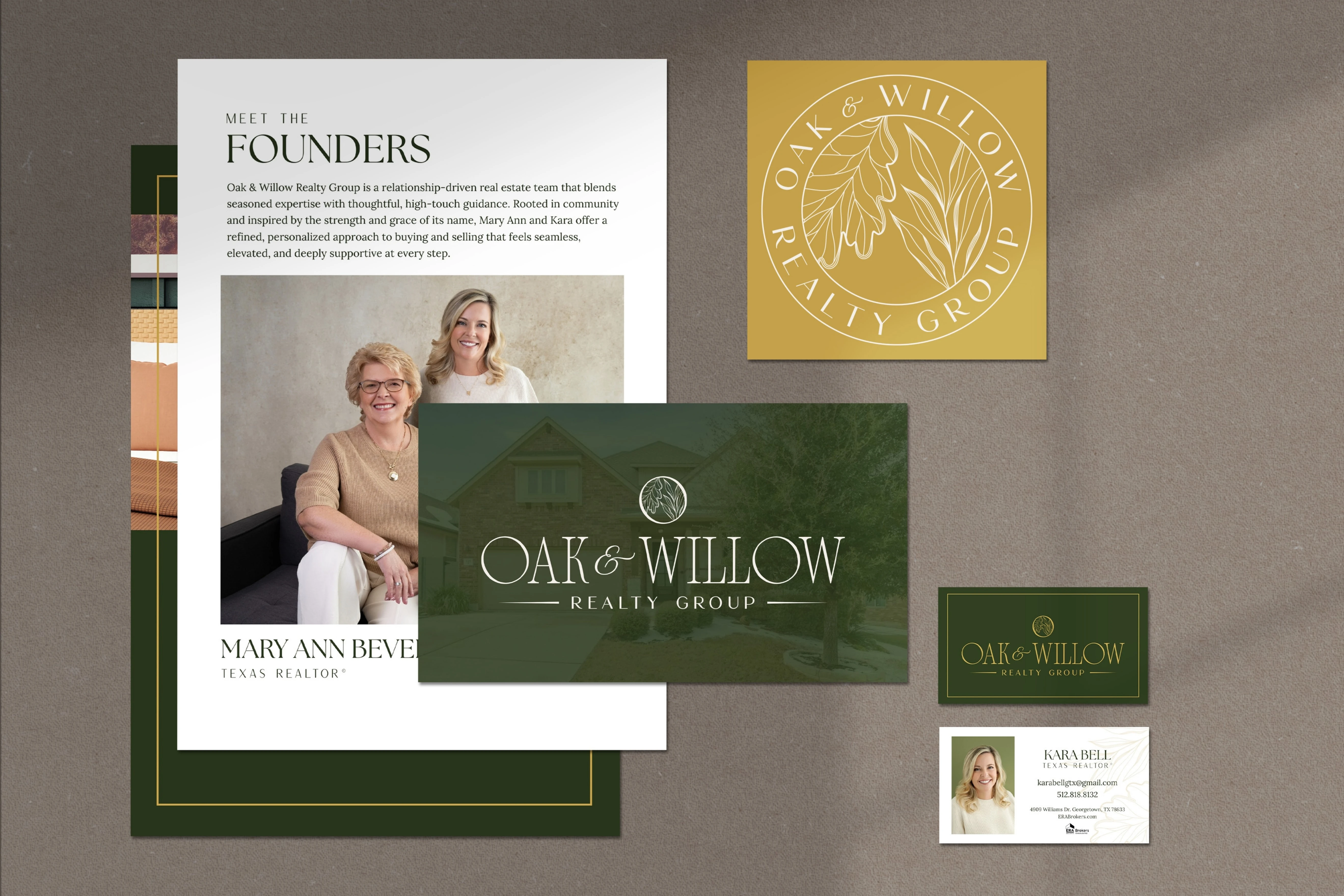
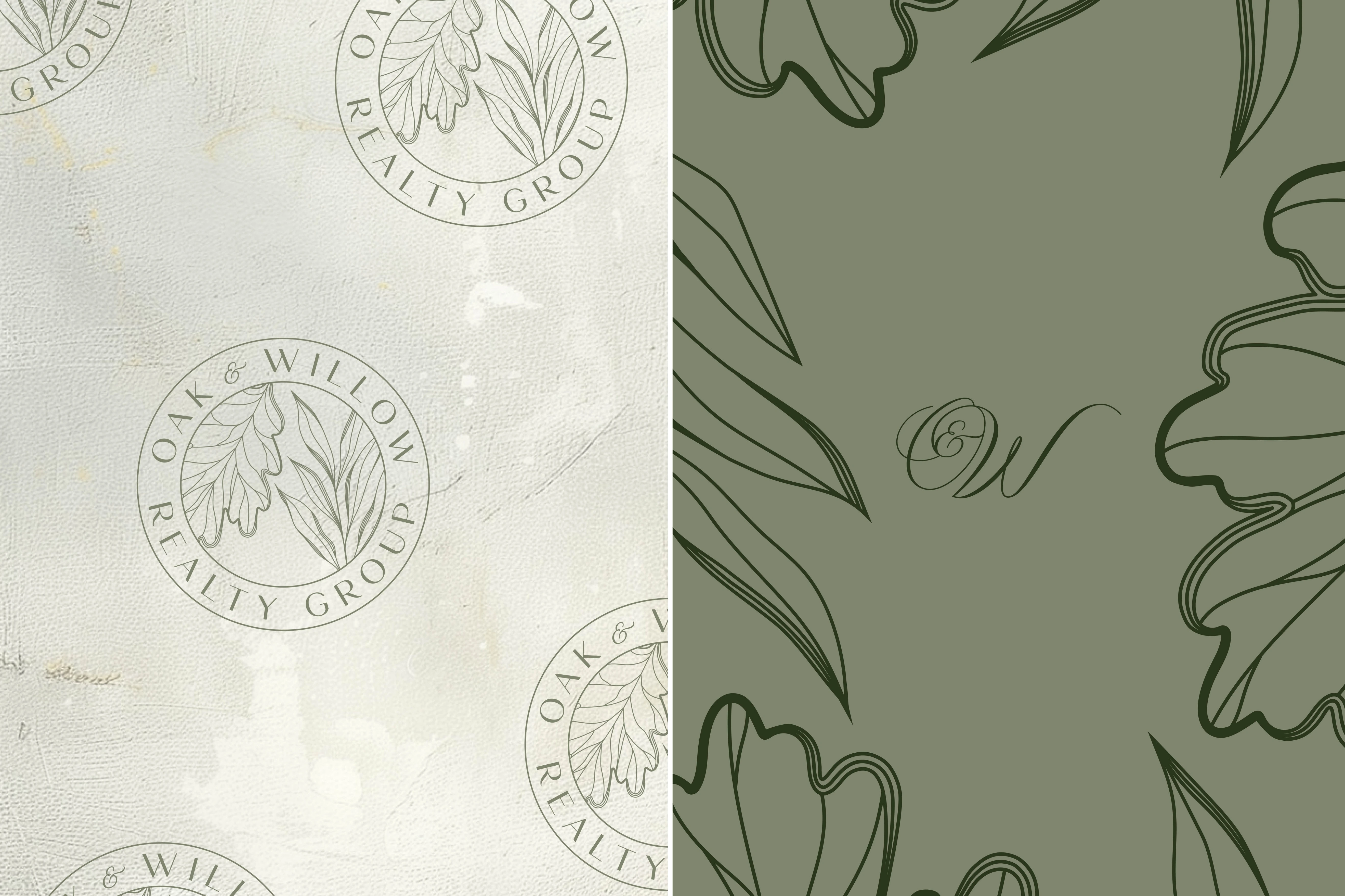
I translated this insight into a luxury-inspired visual system rooted in nature and refined professionalism. Deep forest greens, soft neutrals, and warm gold accents were chosen to reflect trust, sophistication, and the Texas landscape. Elegant serif typography, custom botanical illustrations of oak and willow leaves, and timeless print pieces such as postcards and business cards helped bring the symbolism to life. Every design decision was made to create a brand that feels rooted in community, elevated in presentation, and deeply personal in its client experience.
Marketing Materials Mockup
Branded Backgrounds
Outcome
The final result positioned Oak & Willow Realty Group as a polished, high-touch real estate brand that feels instantly established and trustworthy. The visual identity gave Mary Ann and Kara a cohesive presence across print materials, vendor fair collateral, and future digital touch points, creating strong recognition within their local market. Most importantly, the brand now reflects the strength of their partnership and the graceful guidance they offer clients stepping into their next chapter.
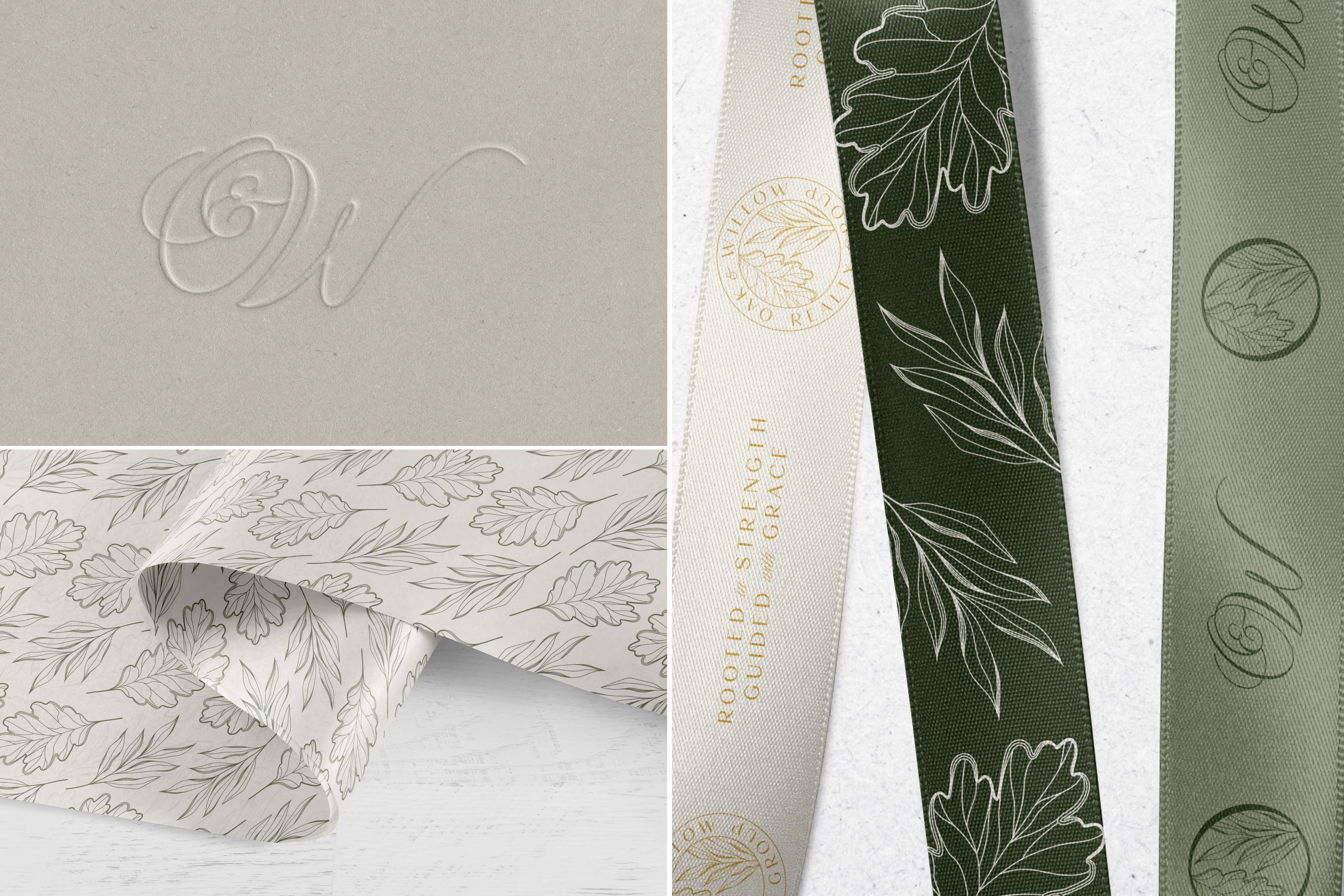
Packaging Mockups
Arlina is amazing! She understood our vision perfectly & nailed it the first time! I feel very blessed to have found this very talented lady!
- Mary Ann Bevell of Oak & Willow Realty Group
Like this project
Posted Apr 2, 2026
Created a cohesive, story-driven brand identity for Oak & Willow Realty Group.
Likes
1
Views
4
Timeline
Feb 27, 2026 - Mar 6, 2026