JOCAYO Brand Identity & Logotype Design

kashif qamar


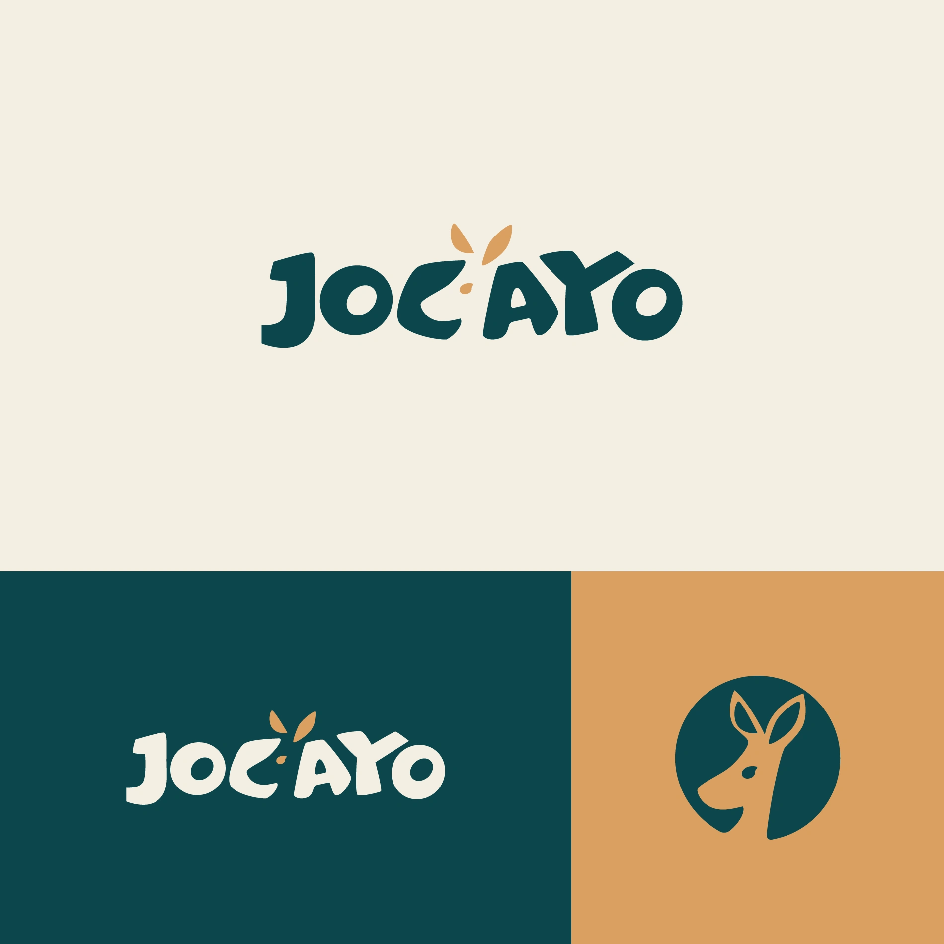
JOCAYO — Playful Brand Identity & Logotype for Kids' Analog Activities
Brand Identity Design • Custom Logotype • Submark Design • Visual System
Adobe Illustrator
Games & Recreational / Kids & Family
SCOPE
Custom Lettering & Logotype
Mascot Submark Design
Color Palette System
Brand Application Concept
BRAND SUMMARY
JOCAYO develops high-quality analog activity sets for children aged three to eight, thoughtfully designed to transform idle waiting times into moments of play, creativity, and discovery in family-friendly business environments.
The goal was to craft a visual identity that feels inherently joyful, imaginative, and approachable for young kids while maintaining the clean, premium craftsmanship required to build trust with businesses and parents alike.
THE CONCEPT & VISUAL SYSTEM
The identity pairs an organic, hand-carved wordmark with a subtle kangaroo/joey motif that reflects curiosity, movement, and playful exploration.
Custom Logotype: Bold, tactile letterforms with friendly, rounded geometry. The central accent subtly mimics ears/sprouts, giving the typography its own vibrant personality.
Mascot Submark: A stylized circular mark capturing an alert, curious animal profile—ideal as a secondary mark for stickers, activity book stamps, and small digital touchpoints.
Color Palette: Warm ochre, deep forest teal, and clean off-white. This palette steps away from loud, generic primary colors, opting instead for a grounded, Scandinavian-inspired warmth suited to timeless analog toys.
shareyourwork Brand Design Logo Design Kids Branding Custom Lettering Games & RecreationalLike this project
Posted Sep 9, 2026
Created a playful and premium brand identity for JOCAYO's kids' activities.