WORIX Construction Visual Identity System

kashif qamar


WORIX — Construction & Industrial Visual Identity System
Brand Identity Design • Logo System • Stationery Design • Industrial Merchandising
Adobe Illustrator • Adobe Photoshop
Architecture & Construction / Engineering
SCOPE
Primary Brandmark & Logotype Development
Construction Hard Hat & Lettermark Symbolism System
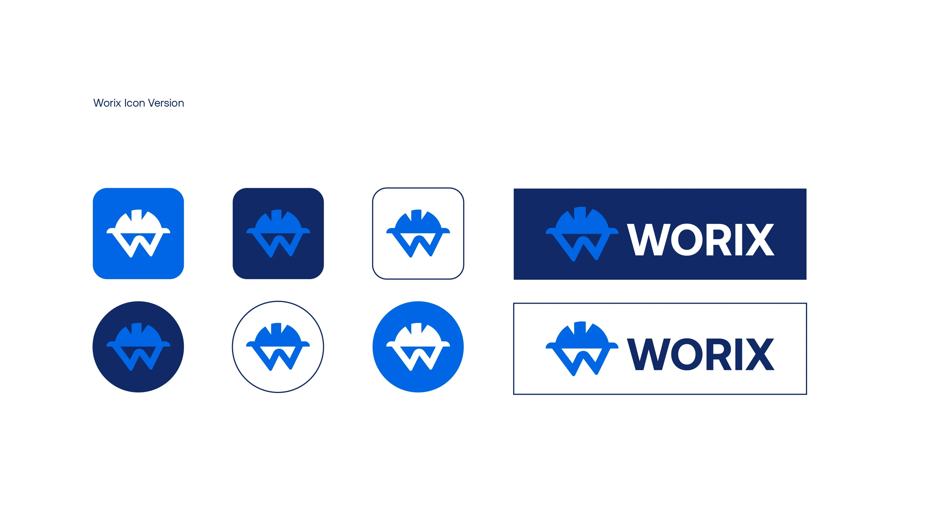
Digital App Icon & Favicon Suite
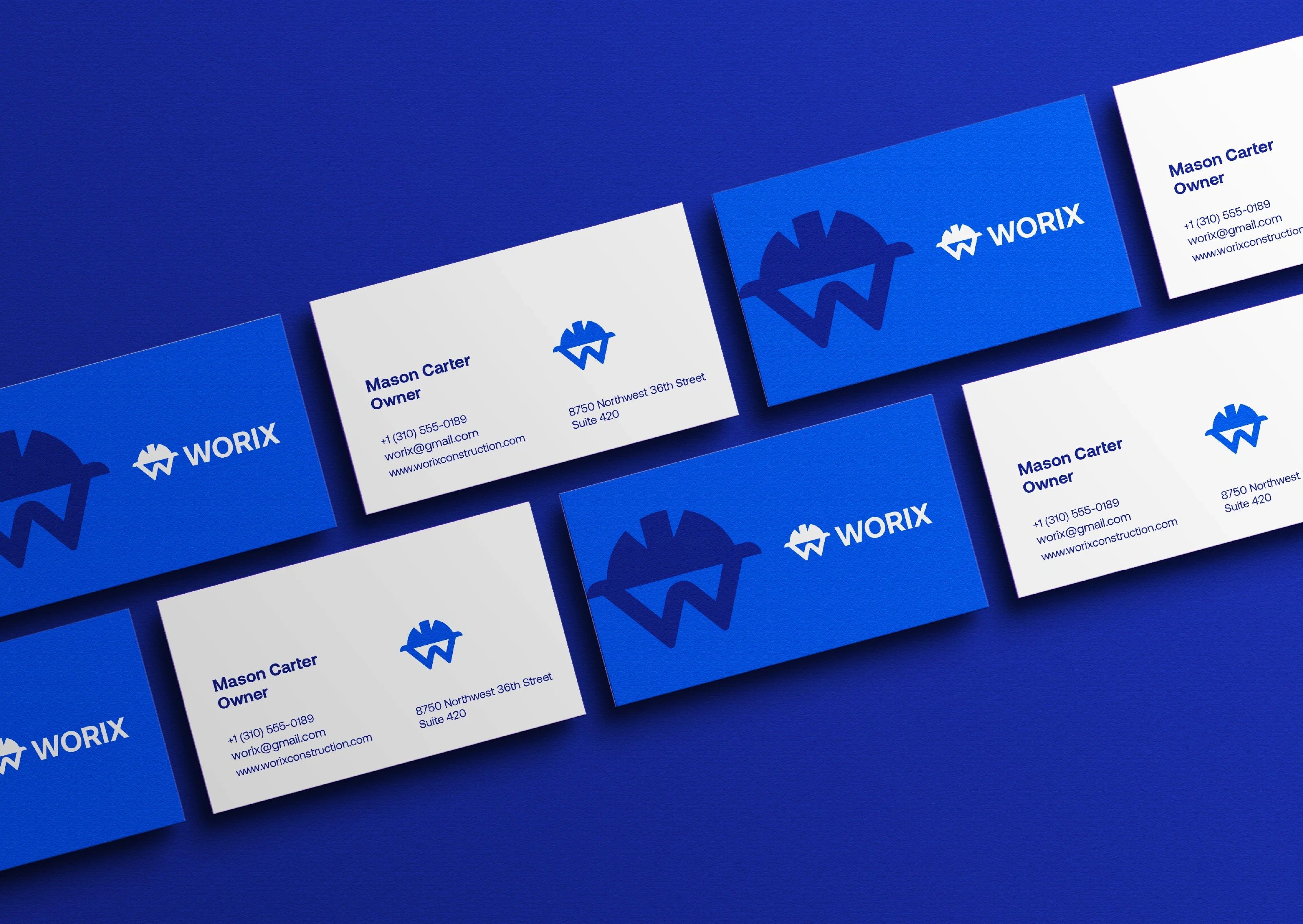
Corporate Stationery, Uniforms & Branded Field Materials
BRAND SUMMARY
Worix is a modern construction and contracting company delivering structural engineering, commercial building, and project execution. Built on reliability, precision, and workplace safety, the brand needed an identity that projects both field strength and corporate professionalism.
The goal was to move away from overly complex, old-school industrial logos and craft a sharp, memorable geometric mark that scales effortlessly across blueprints, high-visibility workwear, heavy machinery, and digital interfaces.
THE CONCEPT & VISUAL SYSTEM
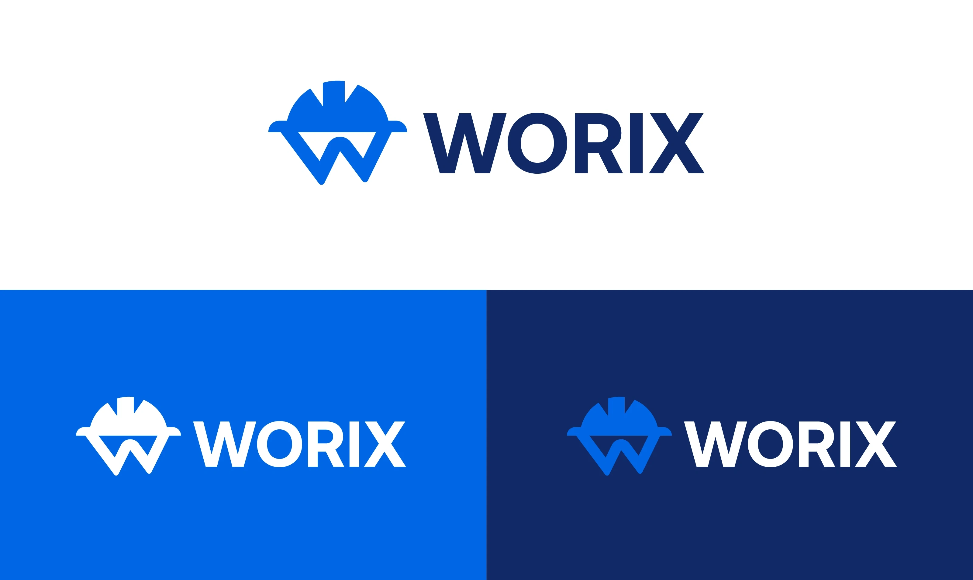
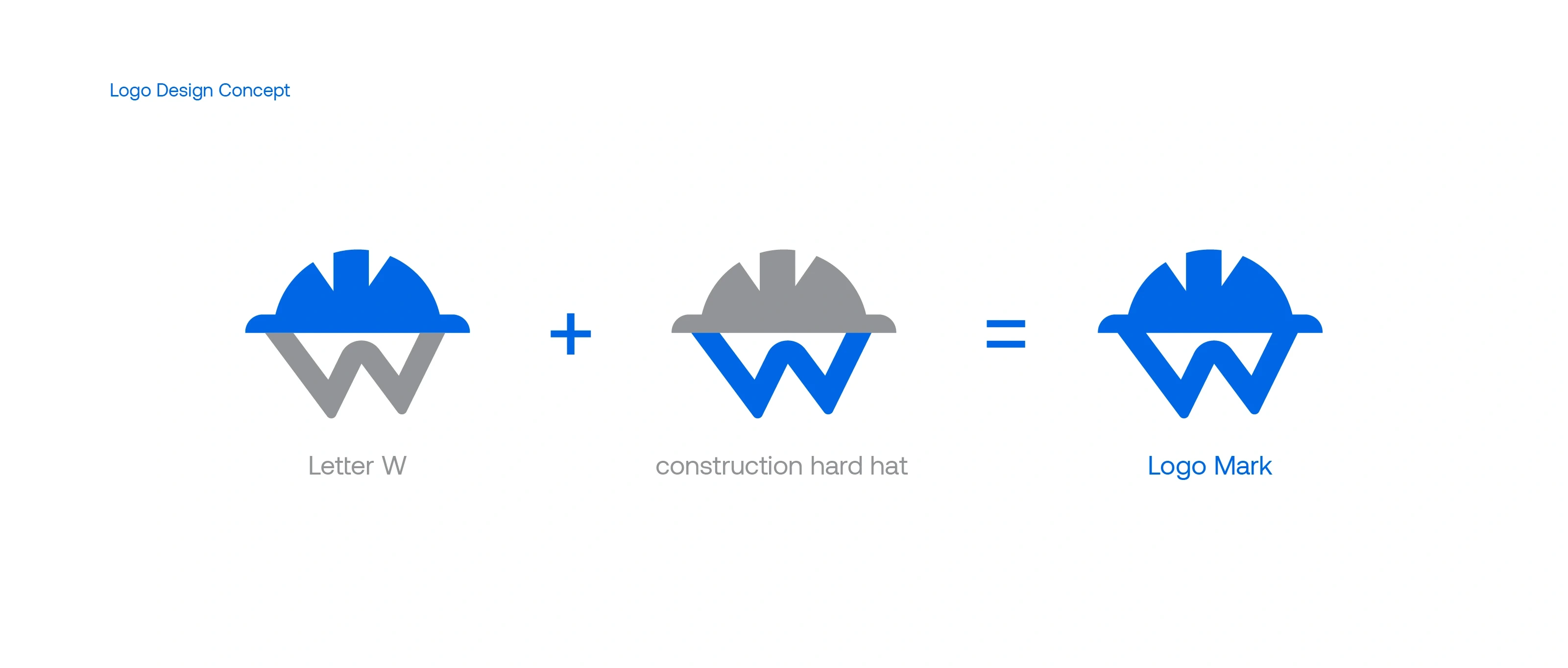
The identity merges the universal symbol of construction—the protective hard hat—with the structural geometry of the initial letter "W".
The Logo Mark: The upper segment forms the crown and brim of a protective site helmet, seamlessly interlocking with the lower chevron strokes of the letter "W". The balanced symmetry communicates structural integrity and engineering precision.
Color Palette:
Electric Cobalt Blue (
#0065E7): Adds a modern, dynamic energy representing progress and forward-thinking engineering.Deep Navy (
#112967): Provides a solid corporate anchor, signaling security, longevity, and trust.Typography: A bold, industrial geometric sans-serif for "WORIX," engineered with wide spacing for instant legibility on highway site boards, crane signage, and uniforms.
PURPOSE BEHIND THE DESIGN & FIELD APPLICATION
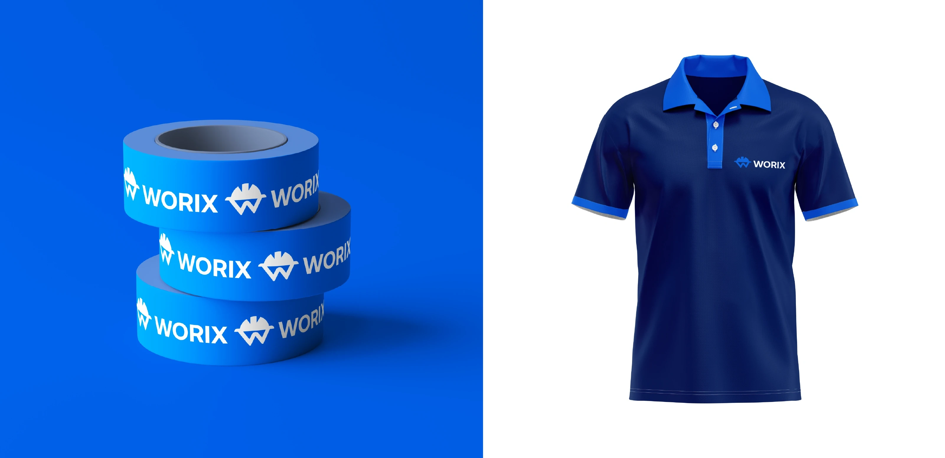
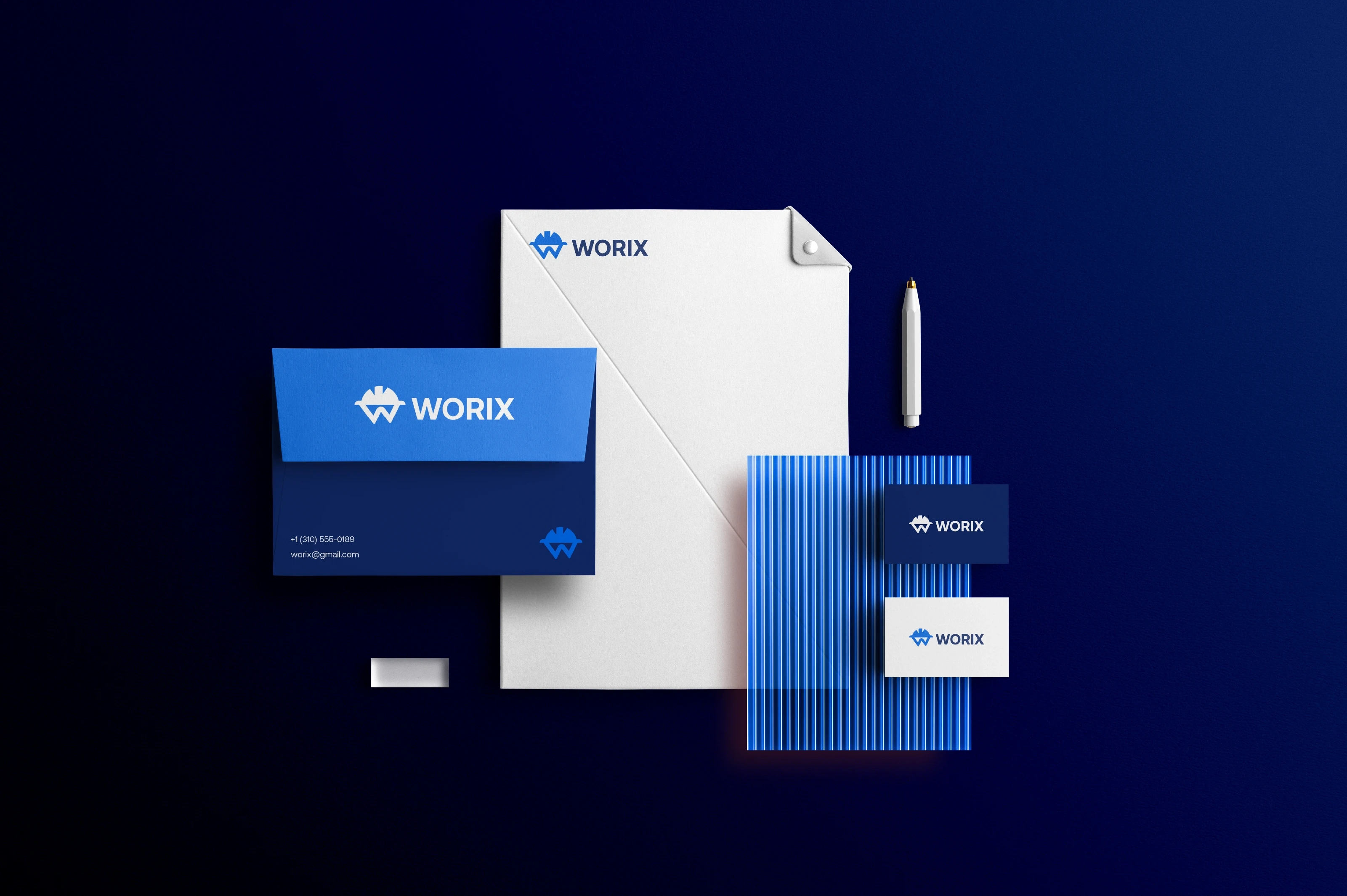
Construction identities must perform under intense real-world conditions. The Worix visual language was stress-tested across print collateral, high-tack barricade tape, embroidered site polo shirts, and luxury corporate stationery for stakeholder proposals—ensuring consistency from the job site to the boardroom.
#ConstructionBranding #BrandIdentity #LogoDesign #IndustrialDesign #VisualSystem #CorporateIdentity #StationeryDesign #GraphicDesigner #MinimalLogo #BrandArchitecture
Like this project
Posted Sep 11, 2026
Designed visual identity for WORIX, including logo and stationery.