Moonbase Logo Design
Fabian Arbor
Moonbase – Logo Design (2024)
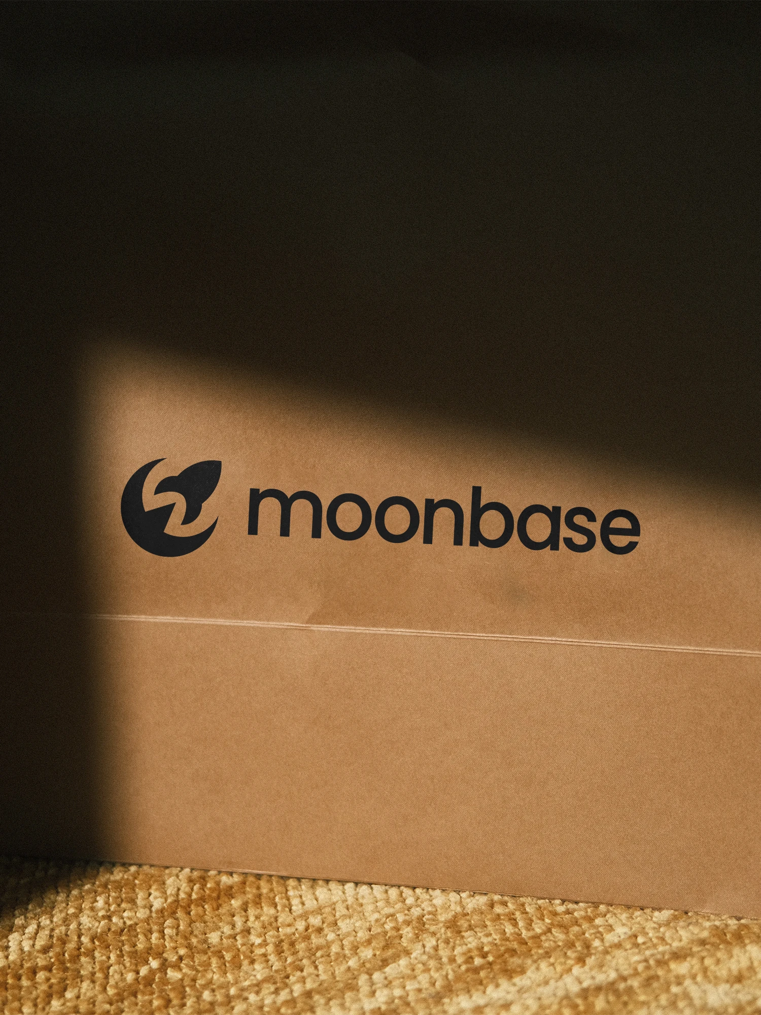
The Moonbase logo captures the balance between exploration and structure — two ideas central to the brand’s vision as a modern SaaS company. Built around a clean geometric form, the logo combines a stylized moon and a simplified rocket, symbolizing progress, precision, and ambition without relying on clichés or unnecessary complexity.
The process behind the mark was deeply iterative. Over 100 variations were explored — each testing different compositions, line weights, and visual metaphors — before arriving at the final version. This rigorous refinement ensured the logo not only looked distinctive but also worked flawlessly at every scale, from a small app icon to large-scale brand applications.
The final design is anchored in simplicity and longevity. Every curve and negative space was intentionally shaped to achieve visual balance and instant recognizability. The result feels timeless — a logo that embodies movement and innovation while maintaining a calm, confident aesthetic.
Like this project
Posted Mar 21, 2025
A clean, timeless logo for Moonbase — designed to reflect clarity, structure, and the forward-thinking nature of a modern SaaS company. From 2024.
Likes
3
Views
15
Timeline
Jan 1, 2024 - Feb 1, 2024