Skin Route - Skincare Market App Design
Today’s skincare landscape is vast and confusing users are bombarded with hundreds of products, conflicting advice, and fragmented information. Without a clear path to discovery, consumers often feel overwhelmed instead of empowered. This leads to indecision, friction, and ultimately, drop-off.
The goal of Skin Route was to reimagine that journey so users can:
discover products confidently
understand their own needs better
make informed purchase decisions without frustration
Skin Route makes skincare discovery feel smart, not stressful.

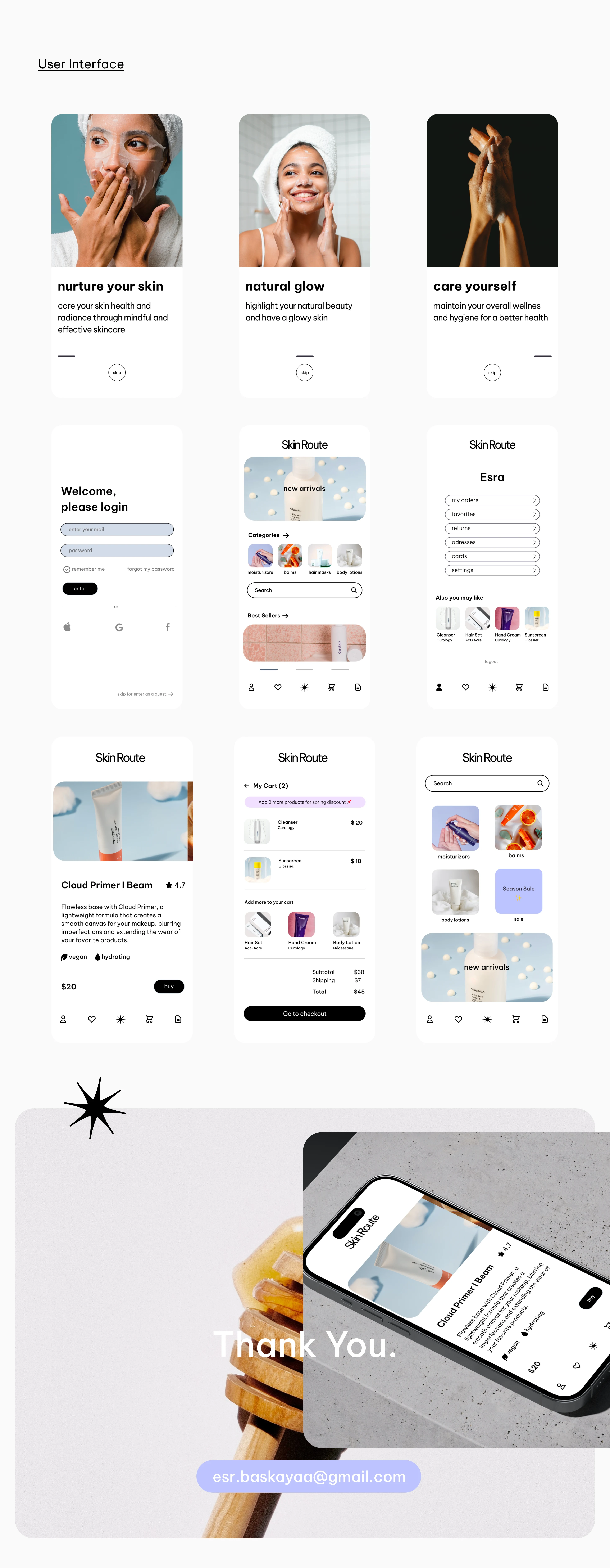
User-first Navigation
Skin Route’s navigation prioritizes:
easy onboarding
accessible discovery
personalized paths
This reduces friction and invites exploration instead of confusion.
🌿 Calm, Intentional UI Language
Instead of aggressive color or cluttered elements, the interface uses visual space and hierarchy to communicate trust — important in skincare decisions.
🧴 Touchpoints that Educate, Not Distract
Every screen serves a purpose:
Product detail clarity
Guided routines
Clean filtering and smart search
The visual clarity supports cognitive ease, which translates into better decisions


Like this project
Posted Sep 19, 2023
User-first branding and mobile app crafted for clarity in a chaotic skincare world for Skin Route. This project blends strategic UX, visual design, and branding
Likes
0
Views
38


