Wellness Brand Website Design

Naima Jordan


Template and concept project | Platforms: Framer and Shopify
The starting point
Most wellness founders know exactly how they want their brand to feel and have no idea how to get a website there. They want calm and credibility, and they want visitors to trust them within seconds. What they usually get is a template that looks right on day one and falls apart the moment they change a headline.
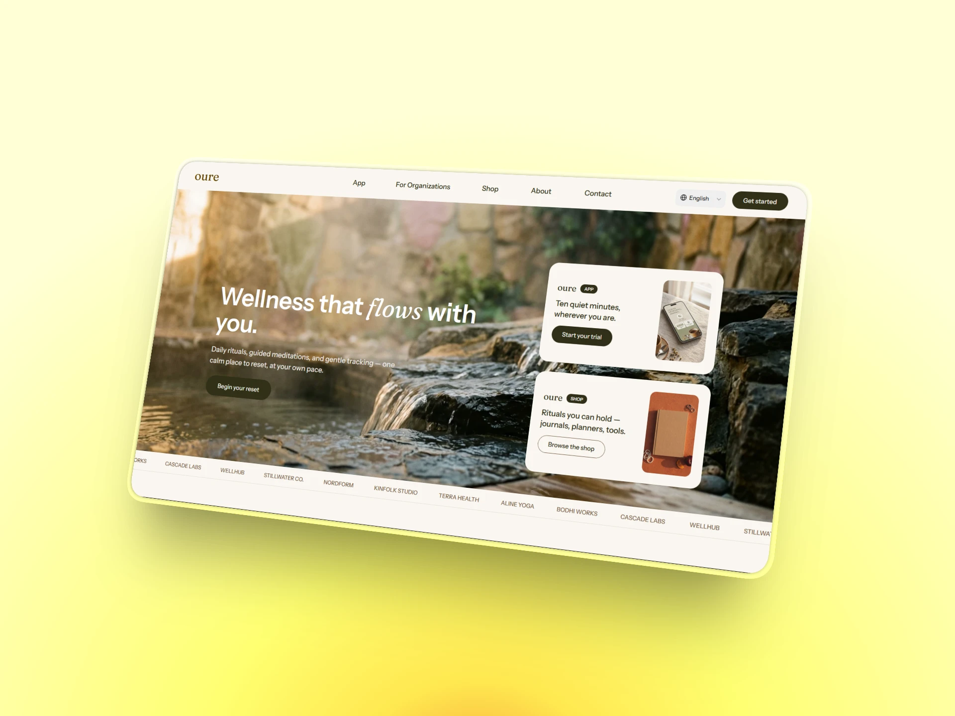
Oure began as an answer to that gap. The brief was a six-page site for studios, apps and organizations: Home, App, For Organizations, Shop, About and Contact. It had to feel premium and unhurried, and it had to work in more than one language.
Oure Framer Template
Designing the feeling first
I started with feeling instead of layout. Every decision came back to one question: does this make a stressed person exhale?
Designing Oure Framer Build
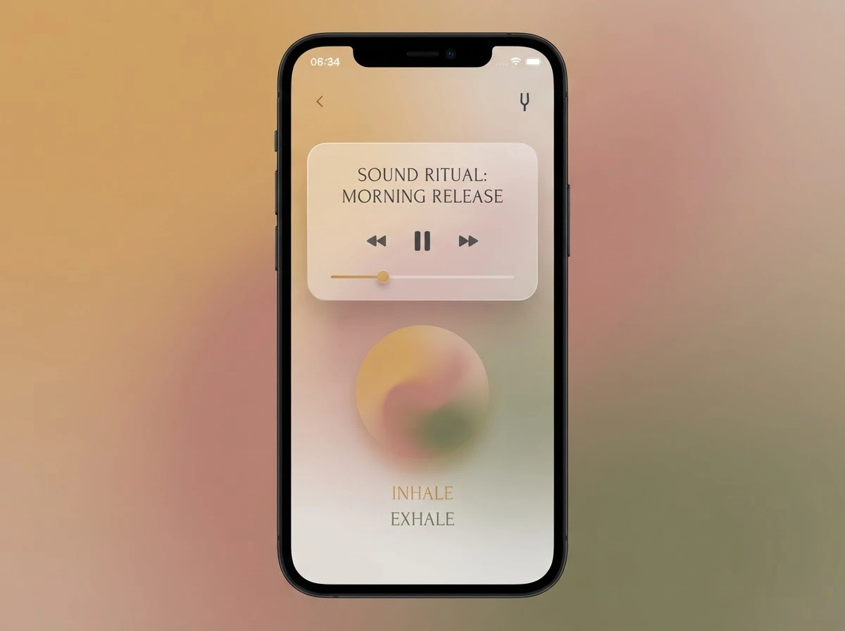
Palette: clay, umber, sage, blush and a warm canvas, so the page feels like linen and stone rather than a screen.
Type: Fraunces for warmth and personality, Instrument Sans for clarity.
Water: soft wave dividers and slow motion that make scrolling feel like drifting rather than jumping.
Every choice had to pass one test: does this lower someone’s heart rate or raise it?
Six pages, one story
Home, App, For Organizations, Shop, About and Contact each have a single job. Home earns trust. App explains the product. Organizations speaks to the buyer with a budget. Shop turns interest into a purchase. About builds the human connection. Contact removes the last bit of friction. A visitor always knows where they are and what to do next.
Oure Page
Where it got hard
My first build looked right but behaved wrong. It was one giant block of code. The design was intact, but nobody could edit a headline or swap an image without touching code, which defeats the point of Framer.
So I took it apart. I broke the design into separate sections (hero, features, steps, FAQ, call to action, product cards) and gave each one simple controls for text, images and links. The shop became a database of products with its own page for each, so adding an item takes a minute instead of an afternoon. Same look, but now anyone can run it.
What I’d tell another founder using the template
Start with the feeling you want people to have, then design backward. Pretty is easy to build. Usable by the person who will run it every day is the part that matters.
Like this project
Posted Oct 27, 2026
Designed a premium, six-page website for wellness brand using Figma, Framer and Shopify.