
Naima Jordan

Helping DTC brands build identities & convert with Shopify.


Wellness Brand Website Design
1
0
SEVEN TEN: a four-location bowling business and what a website can do for a business people walk into
THE INSPIRATION: SEVEN TEN is a concept I designed, inspired by a real bowling alley but not a copy of it. Four houses, 36 lanes, streamlined booking. It's so interesting to see what design can do for in-person businesses.
THE BEFORE: Bowling night usually starts with a question nobody can answer online: is there a lane free? So people call, wait on hold, or show up only just to get wait-listed.
THE AFTER: I designed SEVEN TEN in Claude Design, tweak it in Figma and built it on @Base44: a booking site that feels like the night out, not another template. Light editorial UI, Anybody with a width axis that stretches as you scroll, Host Grotesk + Martian Mono, one color per house, and a logo built on the way that the pins rack in the loader in 7-10 split. The hero logo strikes on load, bowling balls roll in as you scroll, and the footer is designed to be interactive and gamified.
THE AUTOMATION:
- Live Lane Grid: See available lanes before you get to the bowling alley.
- Book lane before you get there, place your food order and reserve your table; all at your finger tips.
- With a monthly calendar that screams community.
Nights out used to start with a phone call and now you can book easier.
#base44giveitaglowchallenge @Base44
3
6
575
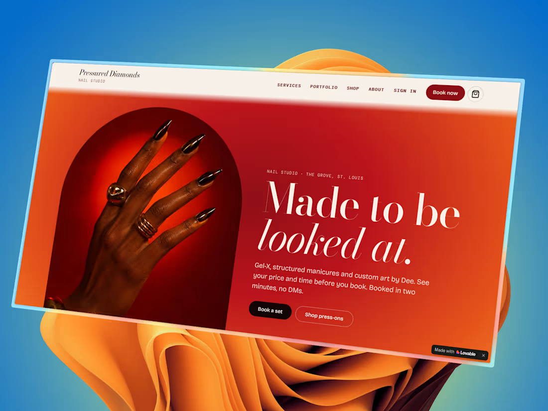
Clients in the beauty space often reach out to me to help build websites; they all have the same issue in common. A great business with a very unreliable booking process, which can cost them time and clients.
My process: comp analysis first, then Pinterest for visual direction, claude to help prompts, then used Lovable to build the real thing.
I've been designing e-commerce and service based brands for a while now and Loveable is super versatile and an added tool for my process.
#Lovable #buildinpublic #beautytech
2
7
701
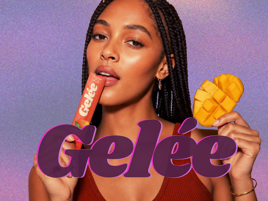
Gelée didn't start as a landing page. It started as a question: what does "your daily collagen jelly stick" actually look like in someone's wellness routine?
From there, everything followed; a color and typography system that felt warm and appetizing, not clinical. A visual identity that could live on packaging, on screen, and in a real hand holding it. Lifestyle photography that made the product feel like a habit, not a supplement.
Brand work isn't just the logo. It's every decision that makes a product feel like something you'd actually want daily. Built with Replo.
#branddesign #d2c #cpg #packagingdesign #visualidentity
2
6
393