HERtitude 2022
Brand identity for HERtitude (2022)
Zikoko is a media publication that’s focused on amplifying the African youth culture by curating and creating smart and joyful content for young Africans and the world. With many prominent categories, one of the newest under Zikoko is HER.
HERtitude 2022 was Zikoko HER’s first women-focused festival. For Zikoko, the festival was designed to increase public presence and audience growth for HER; a category that tailors its content to women and their experiences.
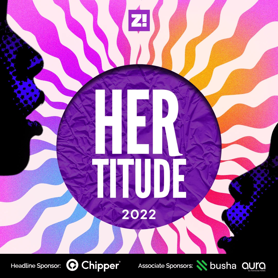
The official identity for HERtitude 2022
For the women, HERtitude was to be a safe space. Here, they could hug, meet new people and dance without watching their backs.
HERtitude targeted 500–750 Nigerian women who were down to experience many of the fun activities the festival offered. I was tasked to handle the following:
Brand identity (cutting across social media, digital platforms, print and web).
Ticketing landing page.
Merchandise.
Illustration.
As per the brief handed to me, Zikoko needed an end-to-end, visually distinct brand identity for HERtitude 2022. This identity would be applied across various touchpoints: a landing page for tickets, social media, print, merch, and newsletters.
Creating HERtitude’s Voice and Visuals
The first challenge was creating a visual language that speaks directly to the target audience. During my conversations with the team at Zikoko, it became clear that they were eager to highlight the qualities of Nigerian women.
To start off, I came up with keywords that aimed to describe the Nigerian woman and shortlisted these words: Beautiful, Strong, Radiant, energetic, bold, and complex.
Many of the most powerful qualities of women have been attributed to nature, and I leaned towards this. With the natural world as a visual symbol, the selected phrases were: The boldness of a rainbow, the energy of the sun, the fluidity of water, and the complex layers of nature, and picture references of these phrases were added to the mood board.
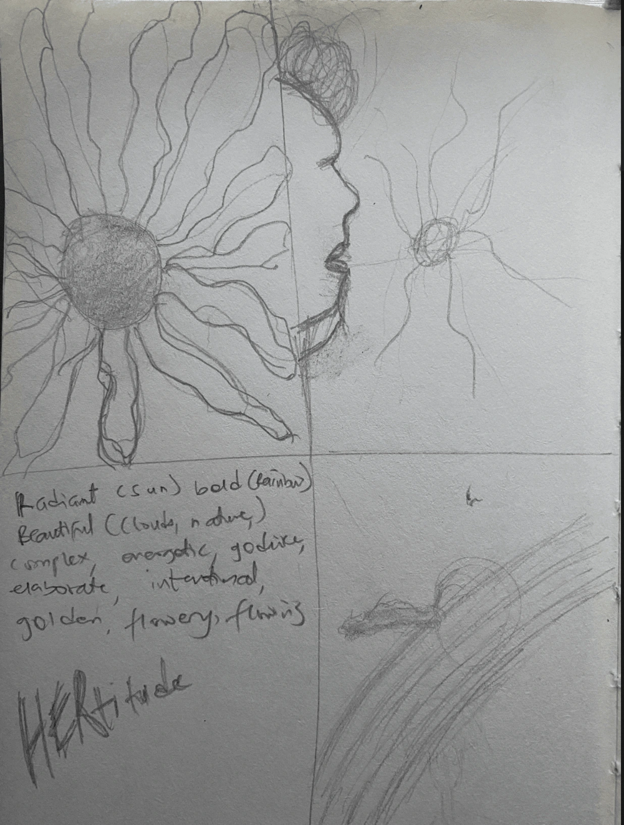
Notes and sketches on defining the qualities of a woman
It was also important to take a look at previous women-focused events, to inspire the brand identity of HERtitude. These were what made up the mood board.
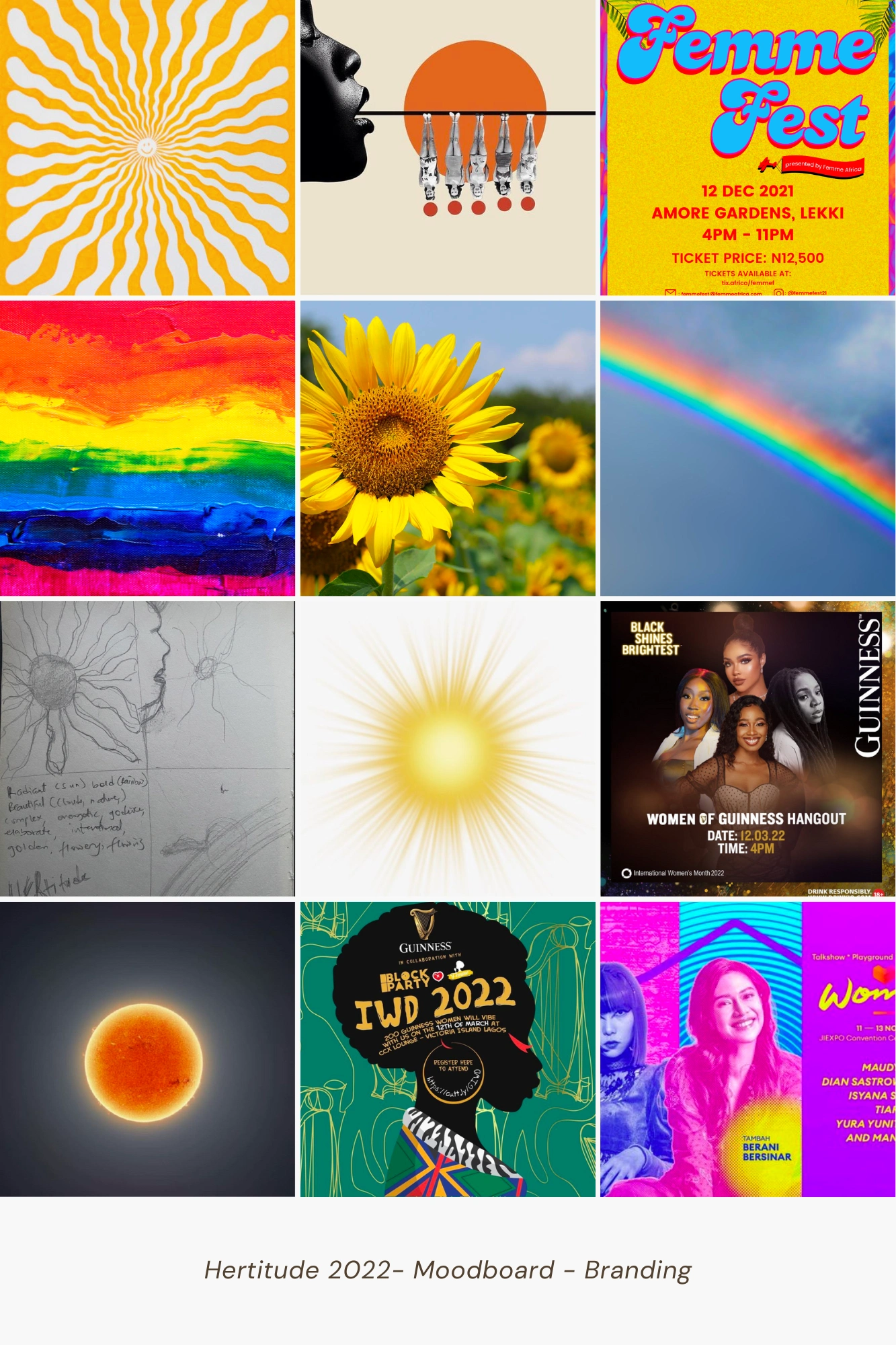
The visual identity for HERtitude needed the right imagery, symbolism and colours that would set a tone for everything else that followed with it.
With my references, I started off by creating symbols. I settled on depicting the sun, its radiance and the wavy flow of water, representing the ever-changing qualities of womanhood and giving the illusion of a powerful godlike being — a woman.


This symbol became the key visual across HERtitude’s final identity and was constant in all of the image + copy design assets created for the event.
For text-only assets, I alternated the final sun circle with a deeper purple textured circle seen in the official brand identity. This is so that there is better contrast, more visibility for text, and avoid an overtly busy-looking design.
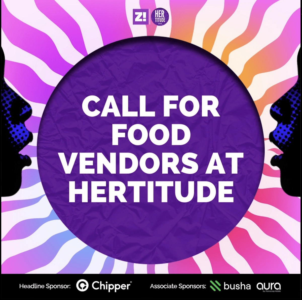
The original circle is alternated with a textured purple circle to allow for better visibility for text-only assets

Application of HERtitude elements on image+copy assets.
Typography for Official Logo
When selecting the typography, we needed something independent from Zikoko’s primary typeface. It needed to be bold, retro, and dynamic. Because of these, I selected a Sans Serif font.
Sans Serif fonts are typically modern, youthful and accessible. After a couple of variations, we settled for League Gothic because of its edgy and bold structure.

I tweaked this font in Adobe Illustrator to create the official logo for HERtitude 2022. It was also used in promotional videos for the event.
Colours
It was necessary for HERtitude 2022 to have a connection to the Zikoko brand (Zikoko typically uses bright colours which are inspired by Pop Culture).
I chose an electrifying colour palette, drawing inspiration from the colours of a rainbow🌈: This became a recognisable blend of bright colours that would remain striking regardless of how many times you see it.
Another inspiration was the 80s youth culture. It was a colourful era with lots of positive impacts made in areas like technology, fashion, youth lifestyle and urban culture. The 80s were vivid — neon with bright bursts of colours was evident.
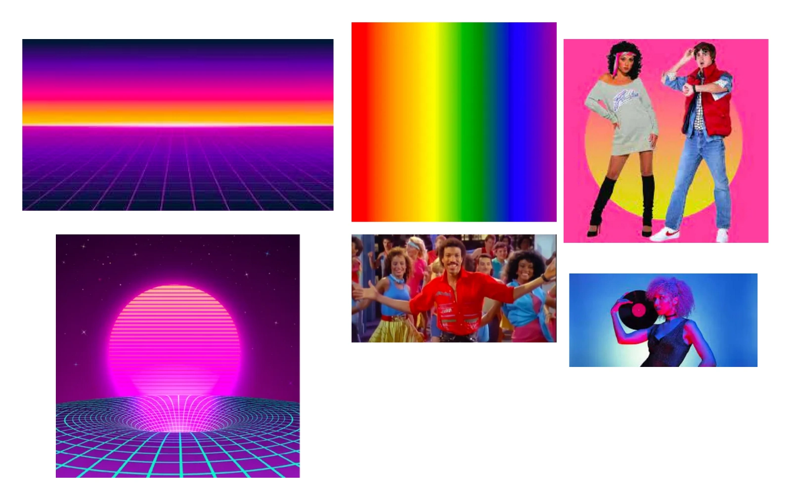
The Rainbow, and the 80’s colours and symbols mood board for colours and illustration style
These references made up the inspiration for the illustration style, and the final colour palette, as seen below:


Colour Palette for Hertitude 2022
The primary colours were mostly used for the landing page, text-only assets, and newsletters. While a mesh of the secondary colours was blended together to bring the final neon result below:
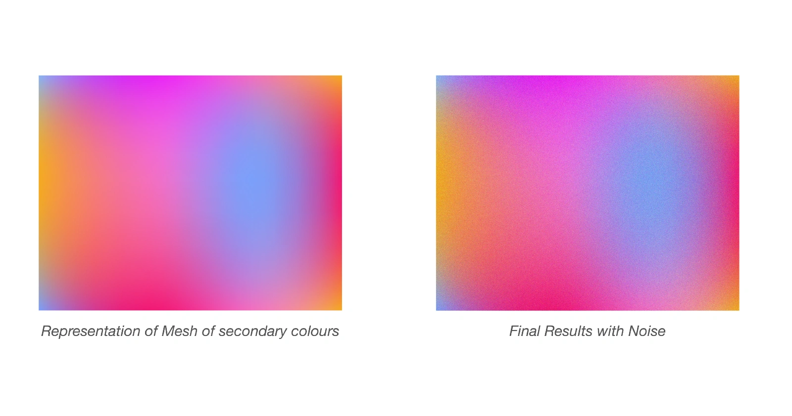
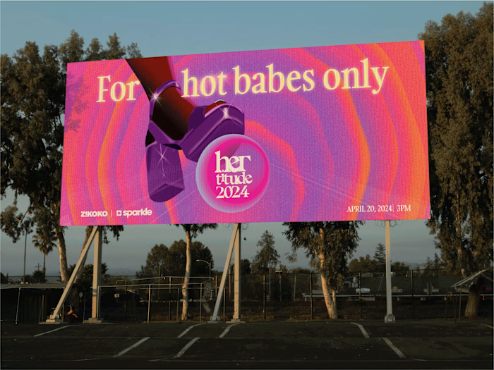
So, with the colours all sorted, I blended them together with the key visual symbol and implemented it as HERtitude’s brand identity for social media, online and offline promotion, newsletters and print.
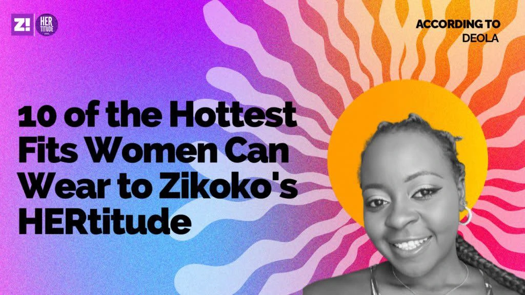
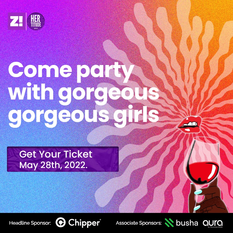
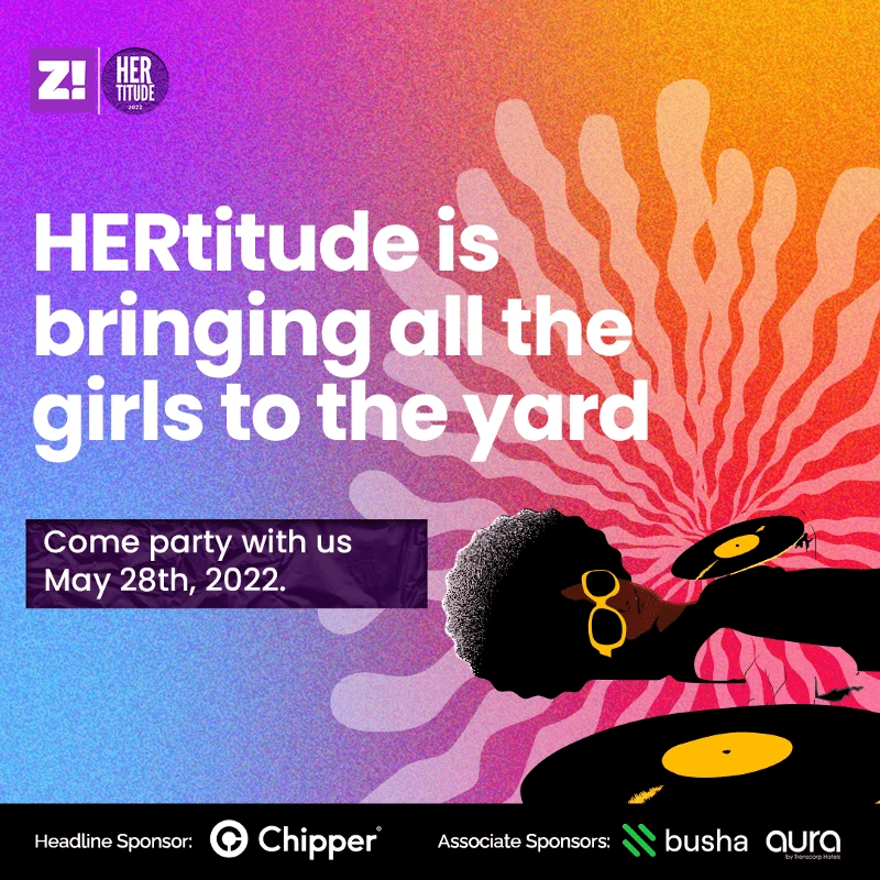
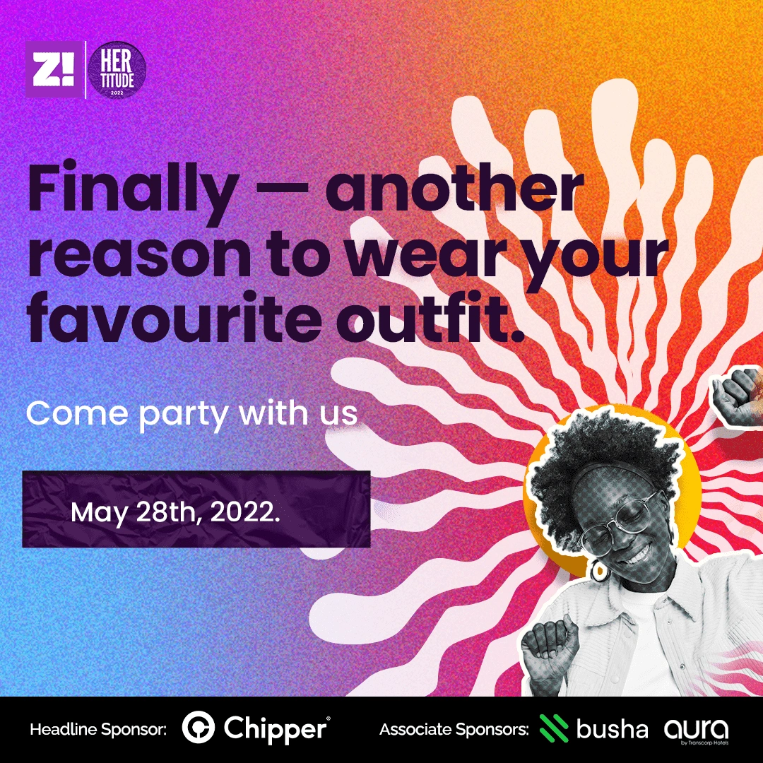
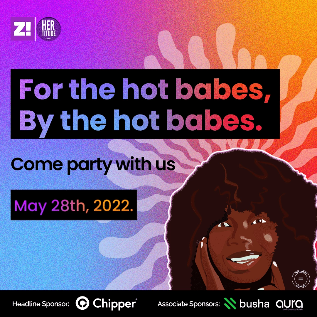
HERtitude’s final identity and the variation implemented for featured images, newsletters, and social media.
Application in Newsletters
Zikoko’s newsletters weren’t left out, as they were one of the major platforms for promoting the event. Many of the designs were resized into different dimensions to fit the newsletters and social media.
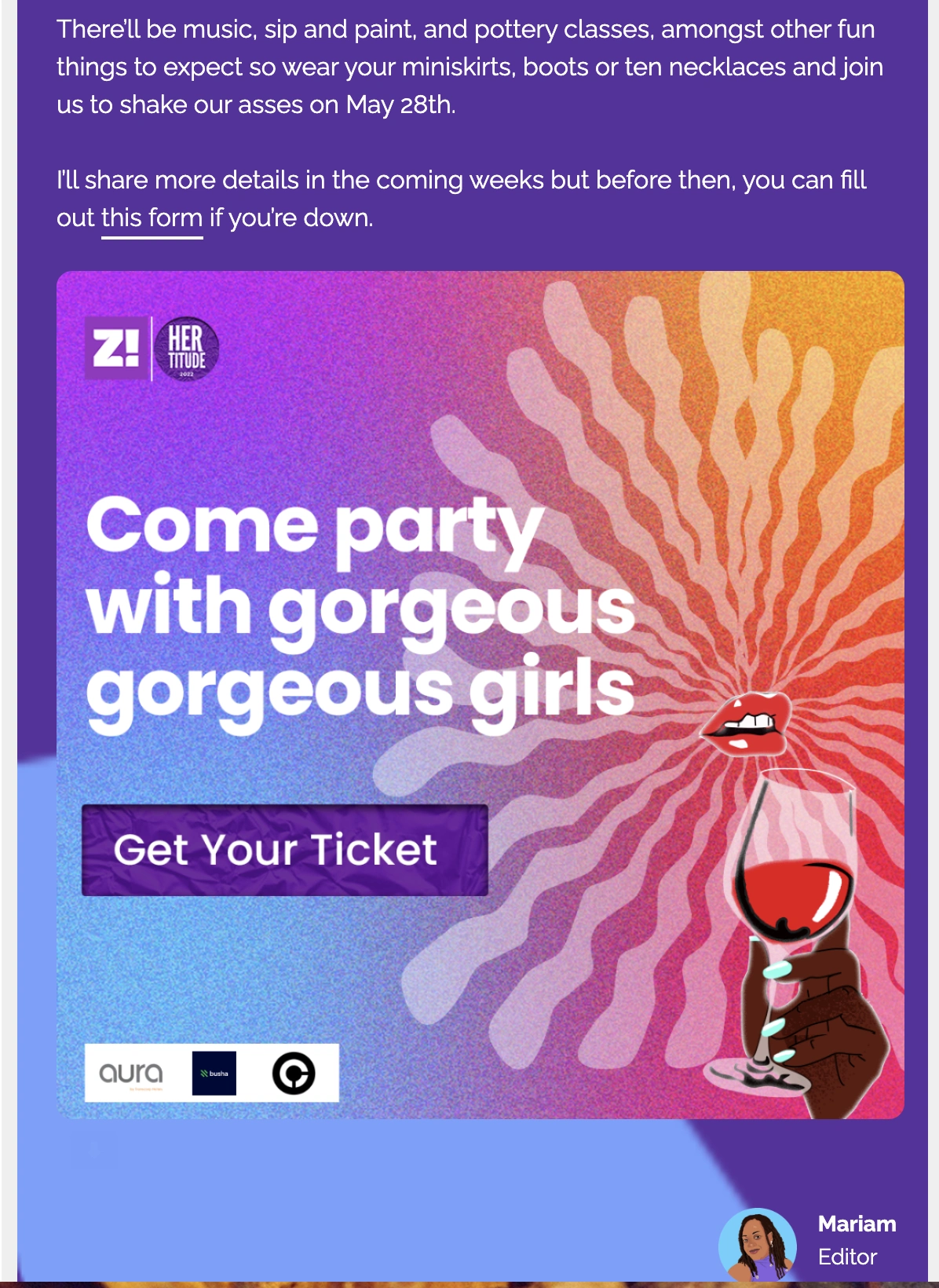
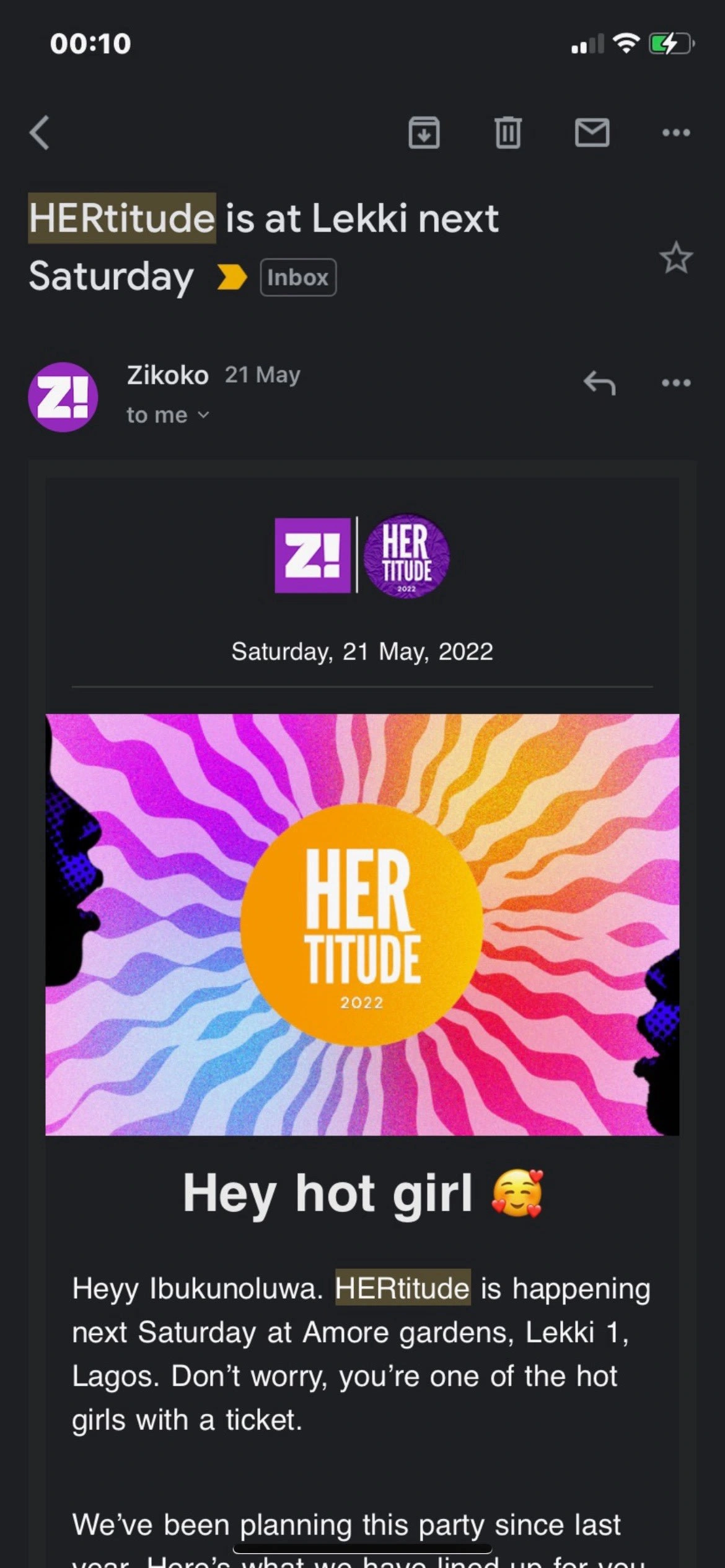
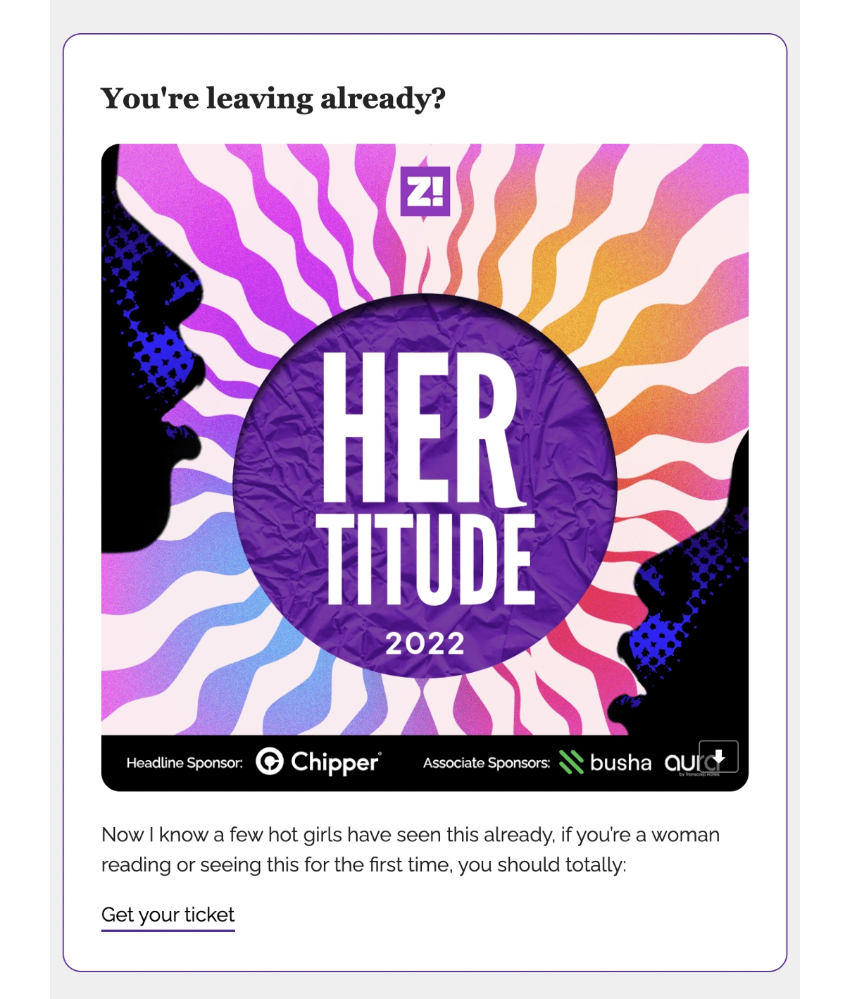
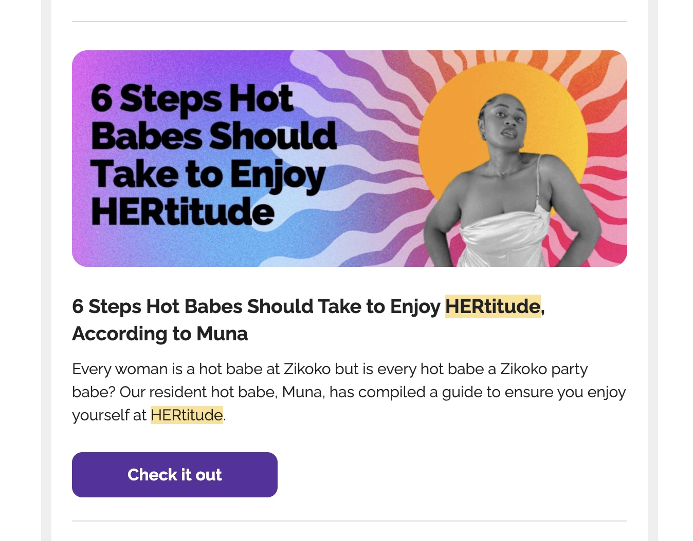
Published newsletters showing HERtitude’s designs
Illustration Style
When ideating an illustration style, I wanted to create true-to-life imagery with colour hues that were relatable to our niche audience — African women. The nude and brown hues were a good representation.
Following the initial 80’s inspiration references, many of the illustrations had traces of the women’s look and symbols attributed to this period.
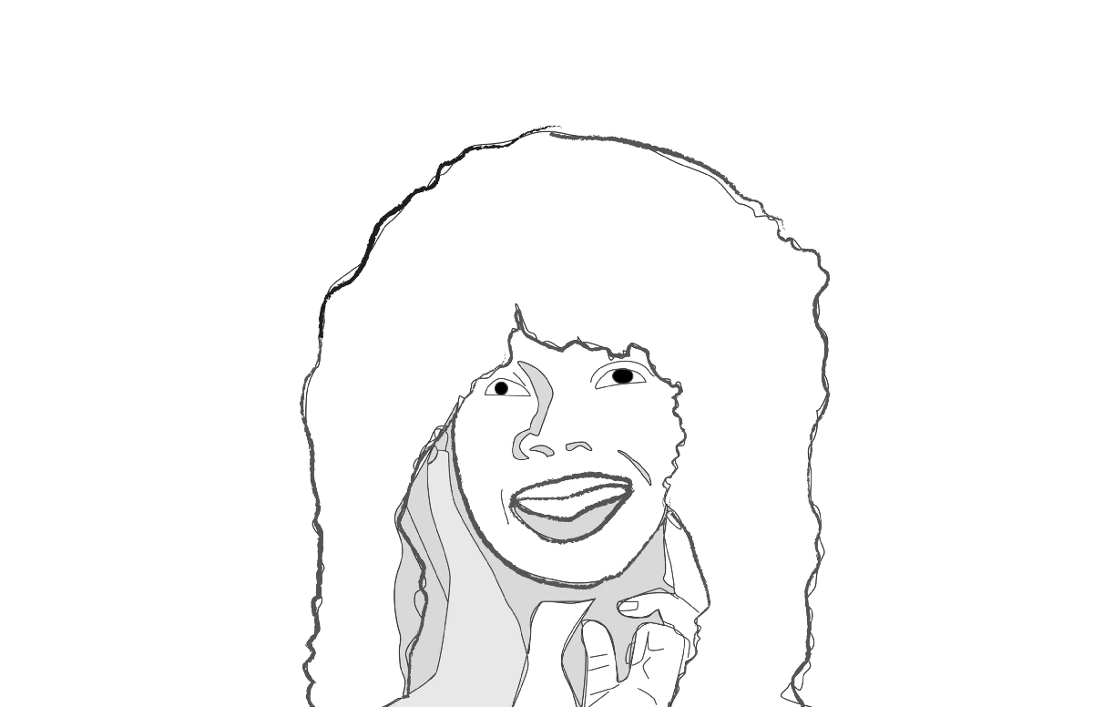
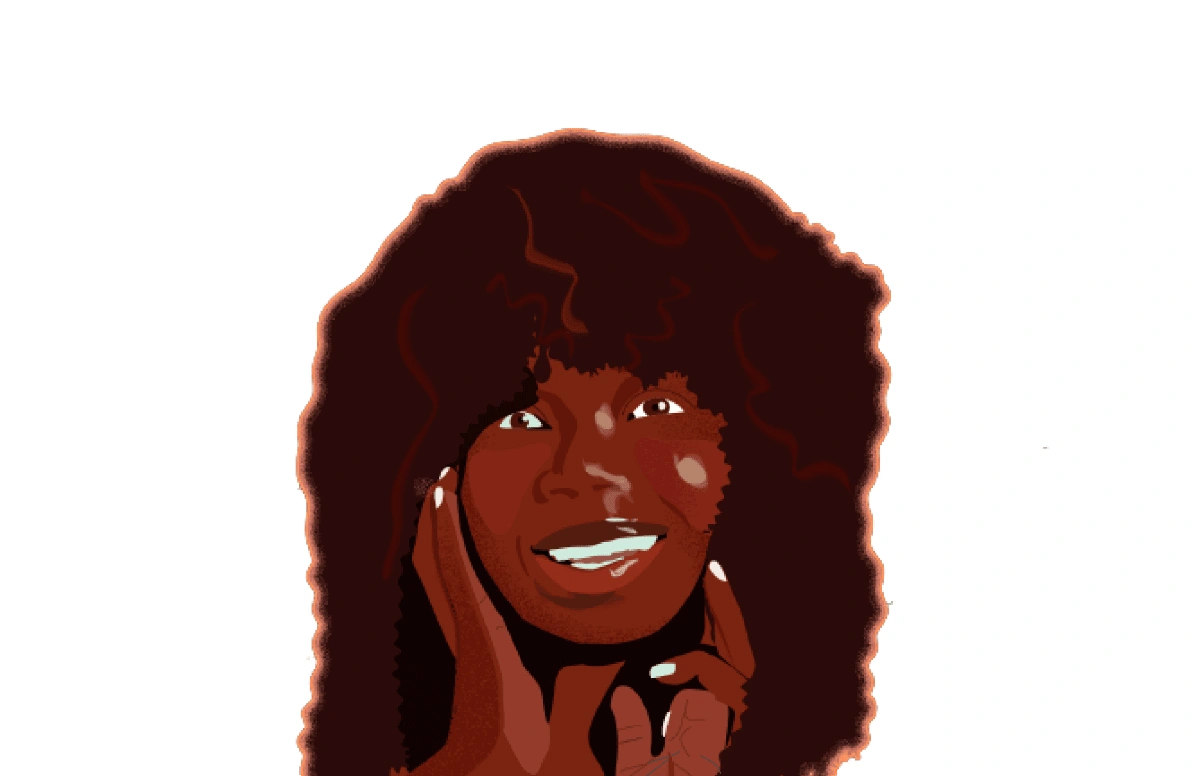
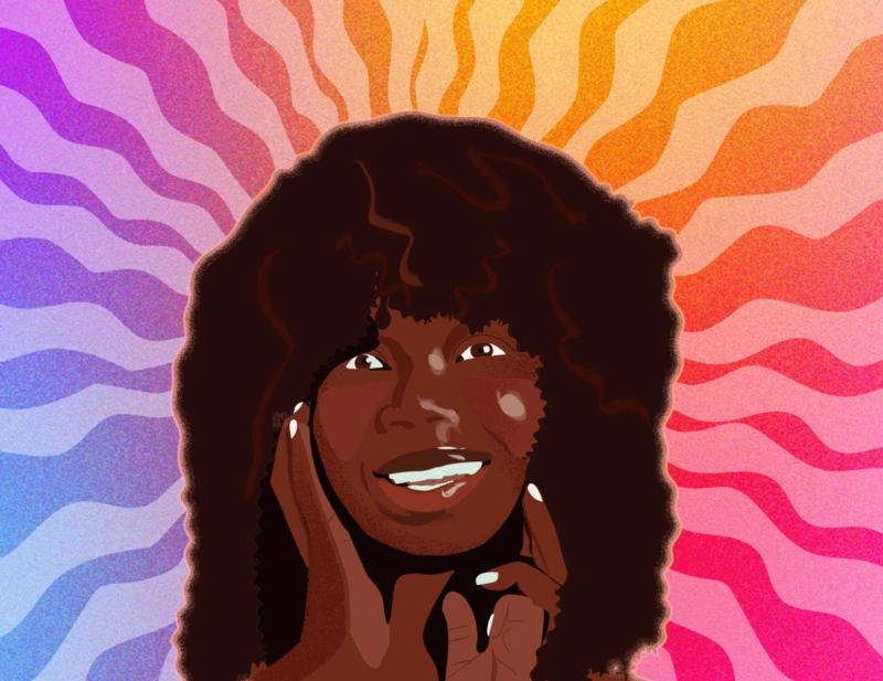
Sketch and final results for one of the Hertitude illustrations
HER Cards (Merch)
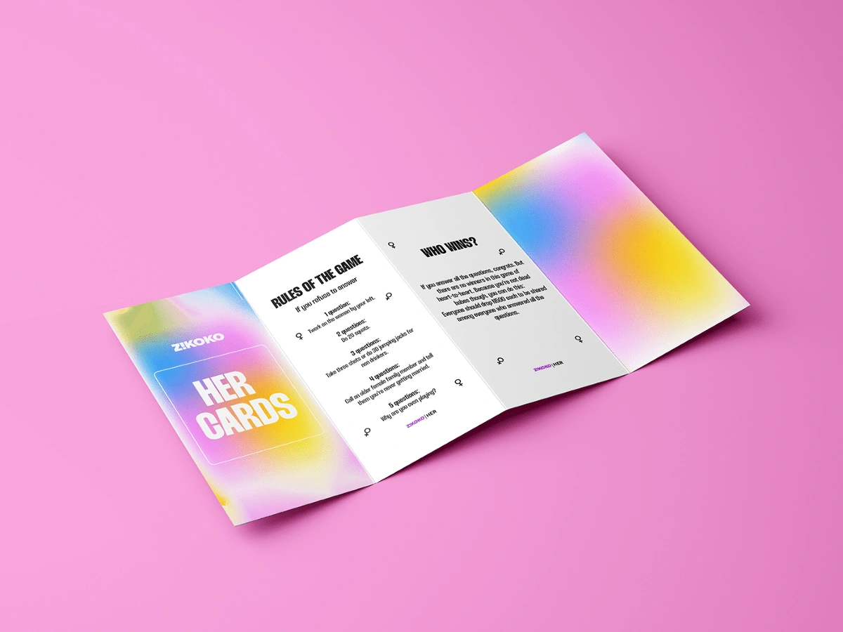
At the festival, Zikoko wanted to sell functional merch that the women could play with, and remember the event by. They settled for a customised game card.
The content in the cards was designed to promote intimacy and confidence amongst the female players. I didn’t want to deviate from HERtitude’s original art direction, especially since the game is a reminder of the event.
Still maintaining HERtitude’s visual identity, I created a pastel blend for the front covers and incorporated Zikoko’s brand wordmark logo colour into the content — the questions.
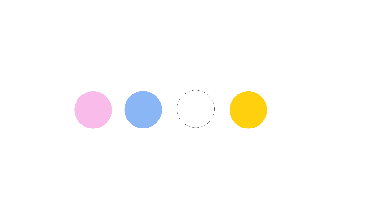
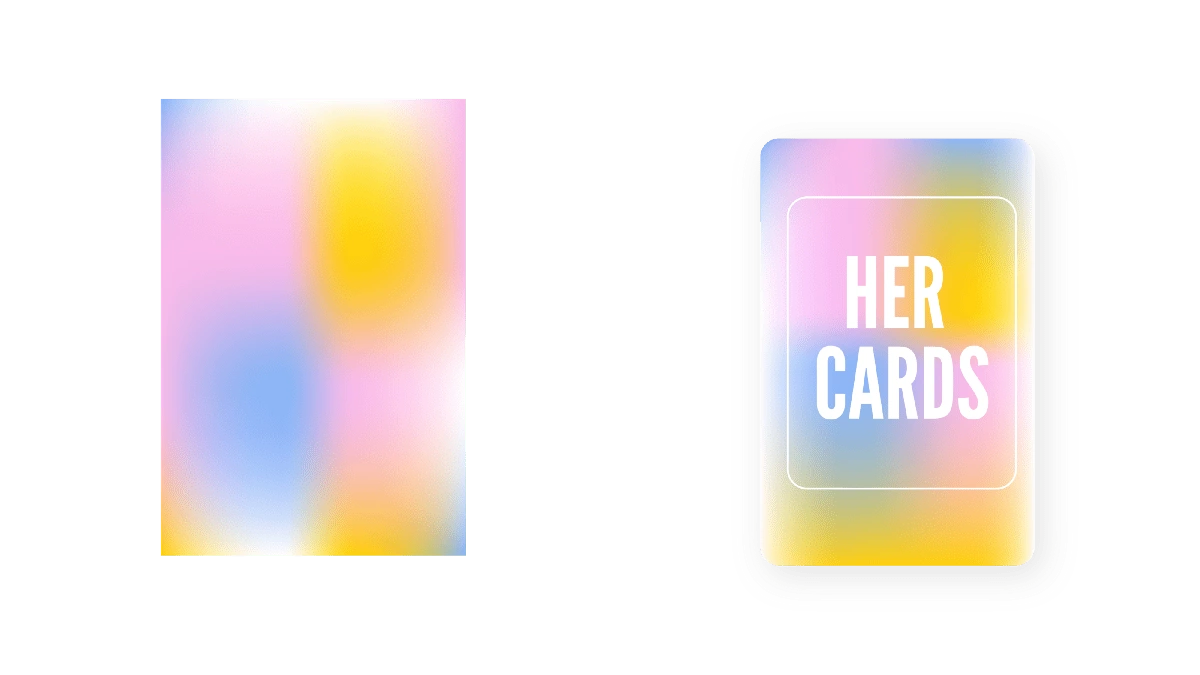
HER Cards — Colour Palette and Final look for Cards
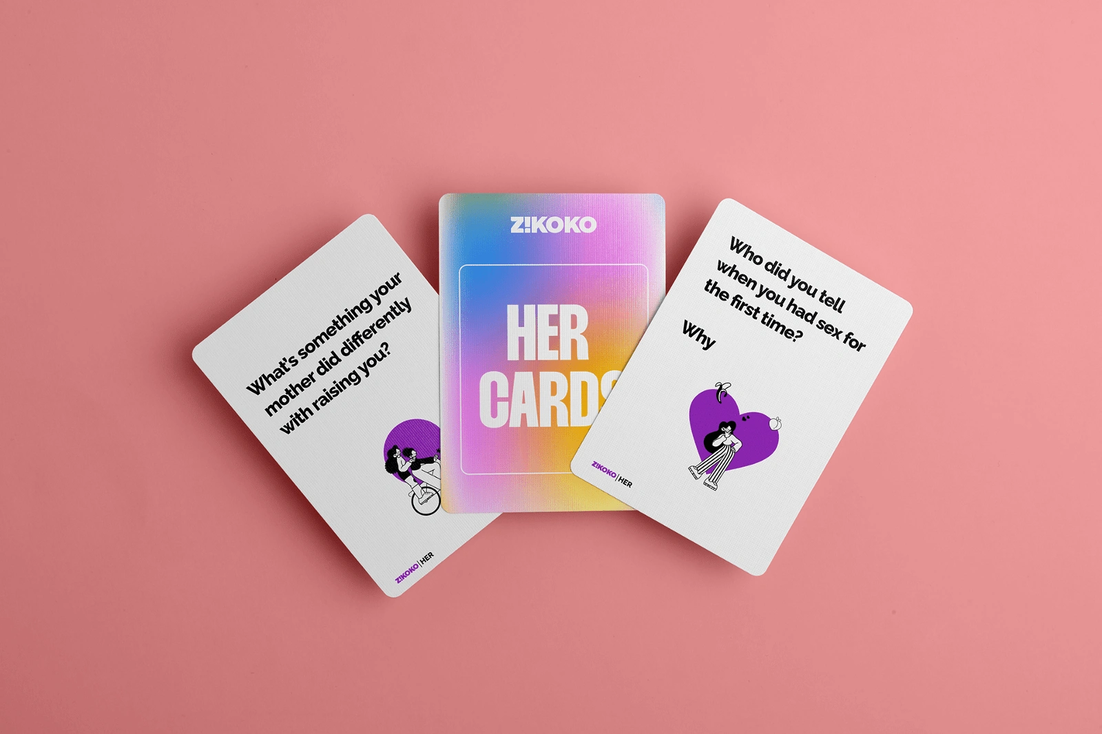
HER Cards — Illustration Style.
Because the HER cards were designed to promote intimacy and healthy relationships between women, I settled for an illustration style that depicts freedom and simplicity.
I drew inspiration from line art, especially because of its implementation in children’s playbooks, textbooks, etc. Tying it back to nostalgia, the illustration style was intended to be childlike and fluid — allowing women to fully express themselves and freely answer the card questions:
Landing Page for Ticketing
The team at Zikoko also needed a landing page to which they could direct their target audience.
Our major focus was on the CTA, and we needed these to be more prominent. I worked with the product team on a landing page that follows the art direction initially created. Because of time constrictions, Mailerlite was the platform used in creating the page.
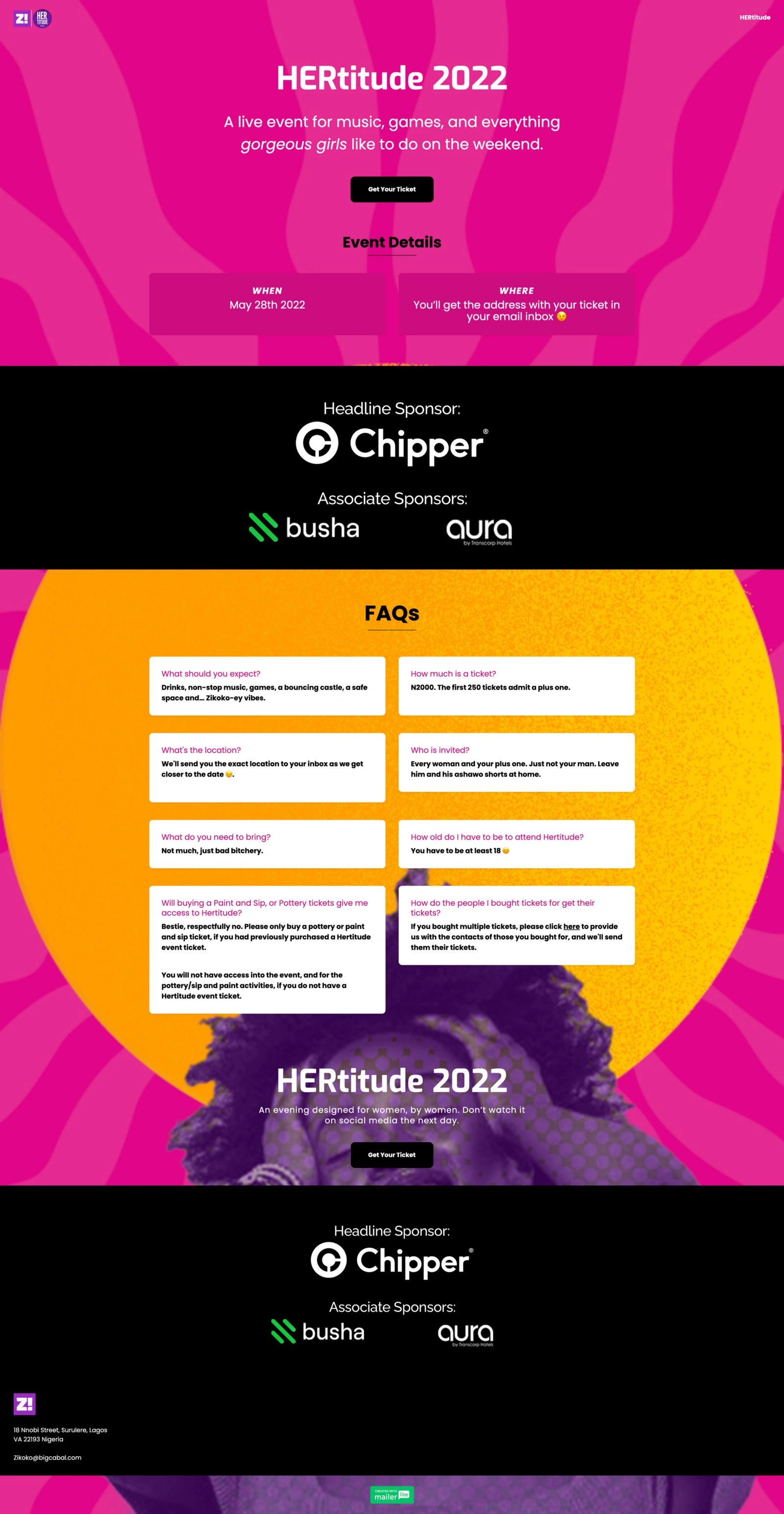
Screenshot of the landing page for tickets.
Constraints
Because of the burst of colours for the visual identity, implementing them across all platforms was challenging. However, using the primary solid colours as a base allowed for easy implementation on the landing page, while the art direction was maintained on all platforms, including social media.
Results
Zikoko recorded a turnaround of 1000 women: a 100% increase from the intended 500 maximum, and secured more sponsors. The event also led to a 15% increase in newsletter subscriptions and social media following.
The identity was modular, so designers, writers and creatives could easily apply the elements to create something new and uniquely HERtitude 2022.
Links to event pictures and videos
Team
Celeste Ojatula: Art direction & Identity DesignOsemudiamen Ehiabhi: Web Design (Contributor) Dayo Adesanya: Design direction (Contributor)Dumebi Iwuchukwu: Design Direction (Supervisor)Oghenekevwe Ogini: Artist Flyer DesignerRuth Zakari: Project SupervisorMariam Sule: Project Lead Ifoghale Eguwe: CopywritingTools used: Adobe Photoshop, Adobe Illustrator, Adobe After-effects, Canva, Mailerlite.
Like this project
Posted Feb 5, 2023
A end-to-end brand and visual identity case study detailing the first ever identity for Zikoko Her's debut women-only festival HERtitude.
Likes
0
Views
33
Clients
Big Cabal Media
