
Empea Brand Identity
Brand identity and launch system for a Nigerian payment gateway entering a saturated, low-trust market.
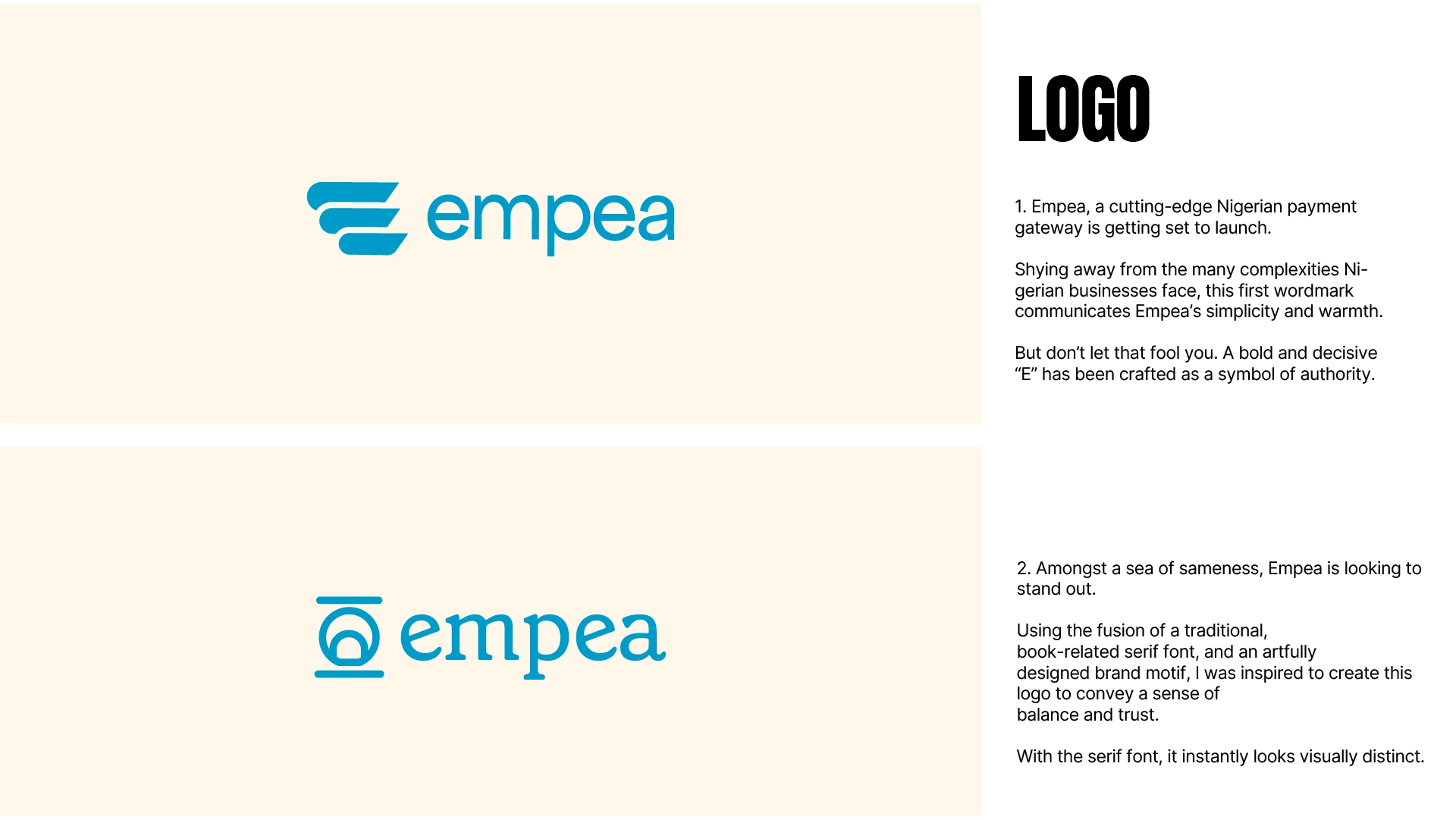
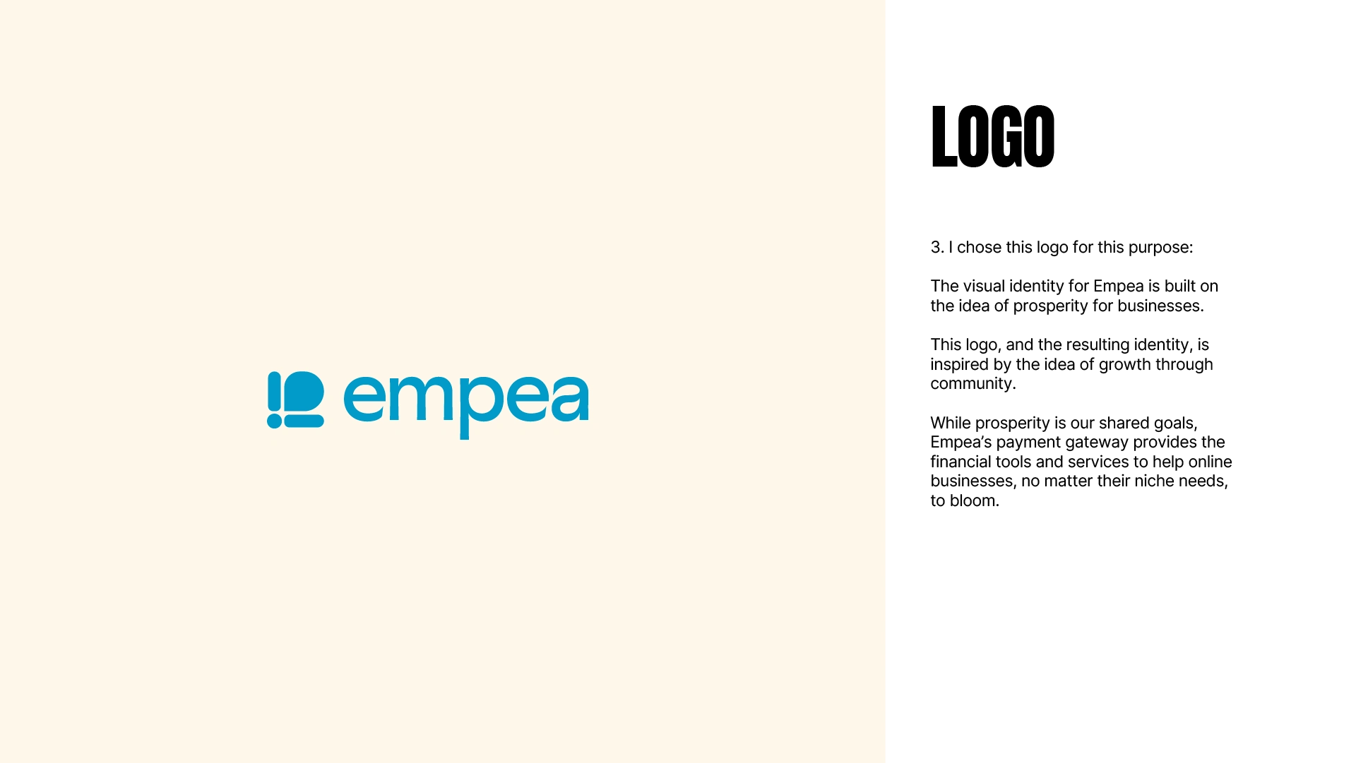
Empea Logo Icon
The Brief
Online payments had become the lifeblood of Nigerian businesses, and the gateway market saturated fast. Too many providers offering inconsistent, sometimes business-breaking service. Empea entered with a genuinely better product (seamless processing, easy integration, multiple payment channels), but it was launching into a crowded field aimed at business owners who were skeptical of anything "new," having built their success the old way.
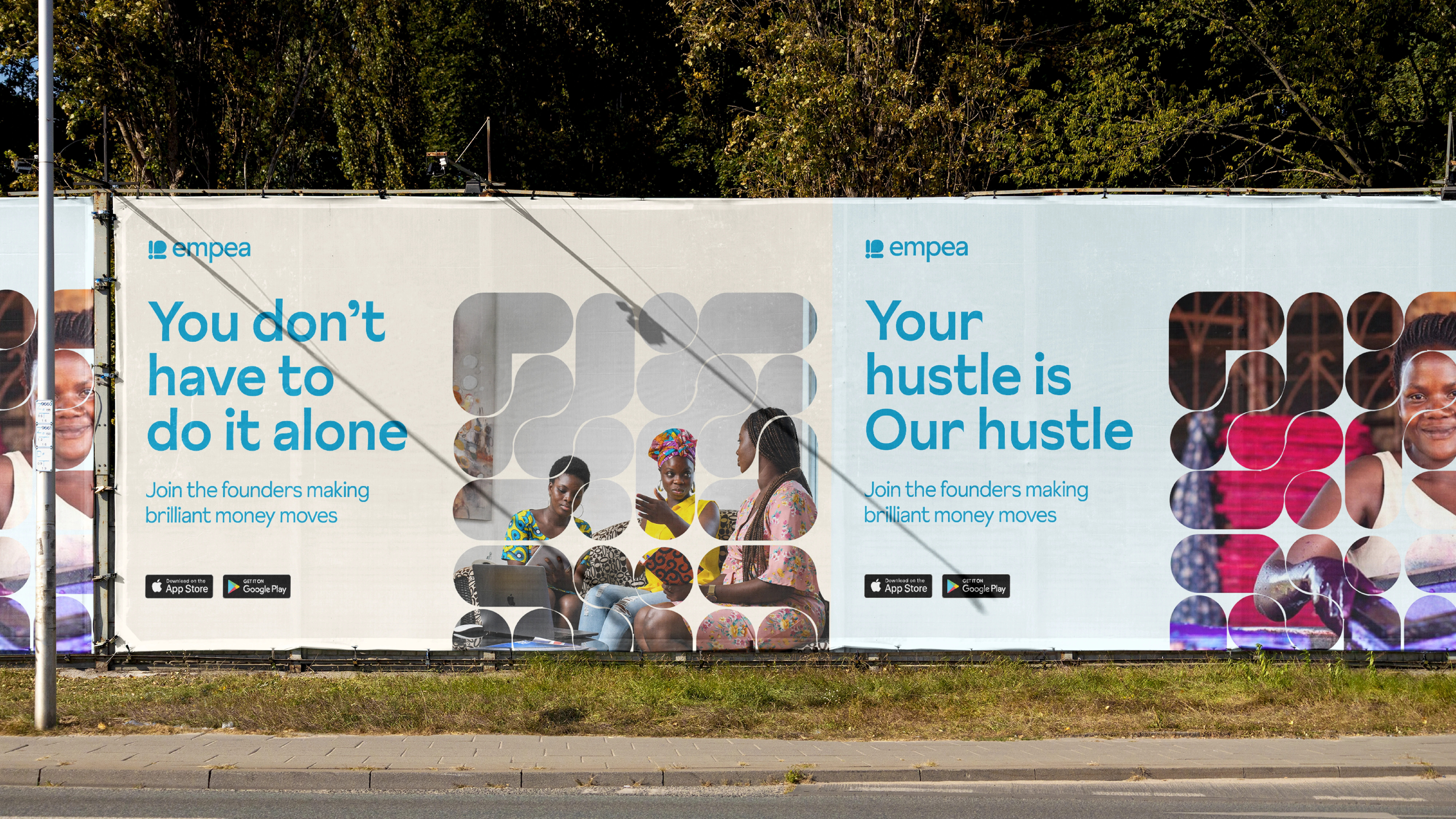
The job: an identity and launch campaign that could make a brand-new name feel trustworthy enough to switch to, and distinct enough to notice.
The Idea
Growth through community. These owners treat their business as their life and want to grow — but they trust what's proven, not what's novel. So instead of leading with disruption, the identity leans on prosperity and partnership: Empea as the dependable engine behind a business's growth, not another flashy newcomer. The real design problem was tone — authoritative enough to earn a skeptic's trust, but warm and human (the brief explicitly asked for humour) so it didn't read as one more cold fintech.
Empea Logo Wordmark

social media assets
The System
Growth through community. These owners treat their business as their life and want to grow — but they trust what's proven, not what's novel. So instead of leading with disruption, the identity leans on prosperity and partnership: Empea as the dependable engine behind a business's growth, not another flashy newcomer. The real design problem was tone — authoritative enough to earn a skeptic's trust, but warm and human (the brief explicitly asked for humour) so it didn't read as one more cold fintech.
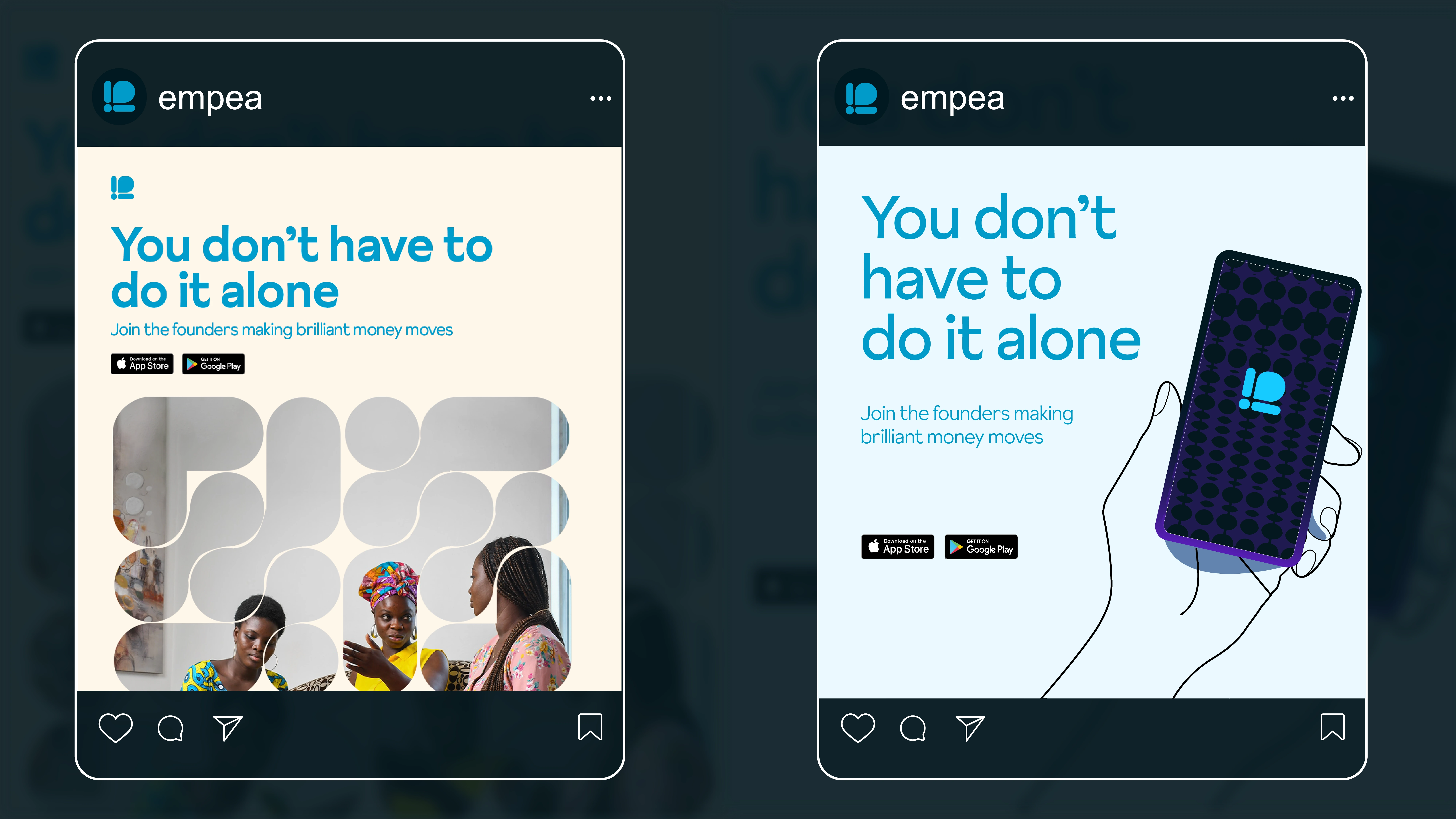
social media assets
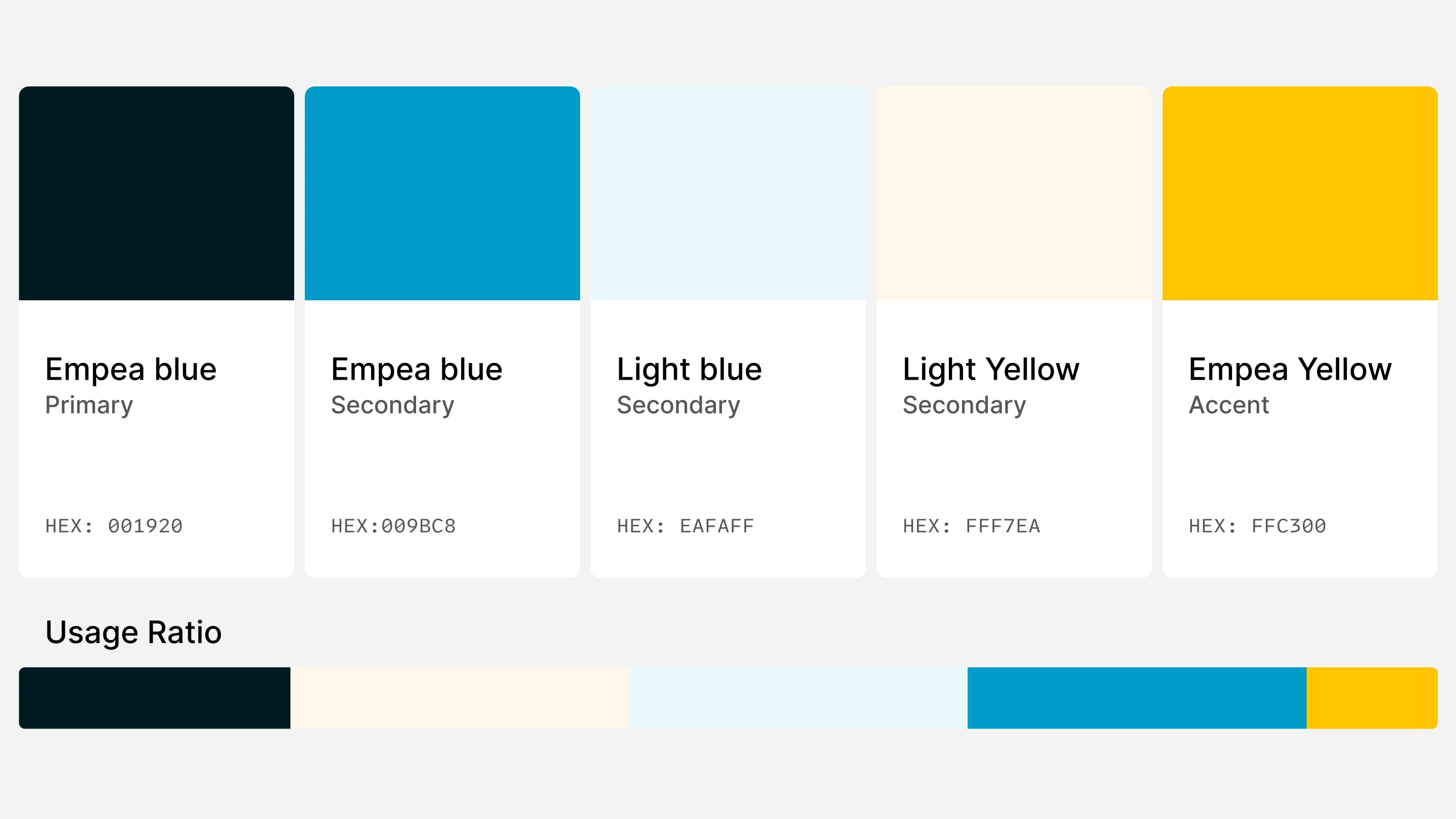
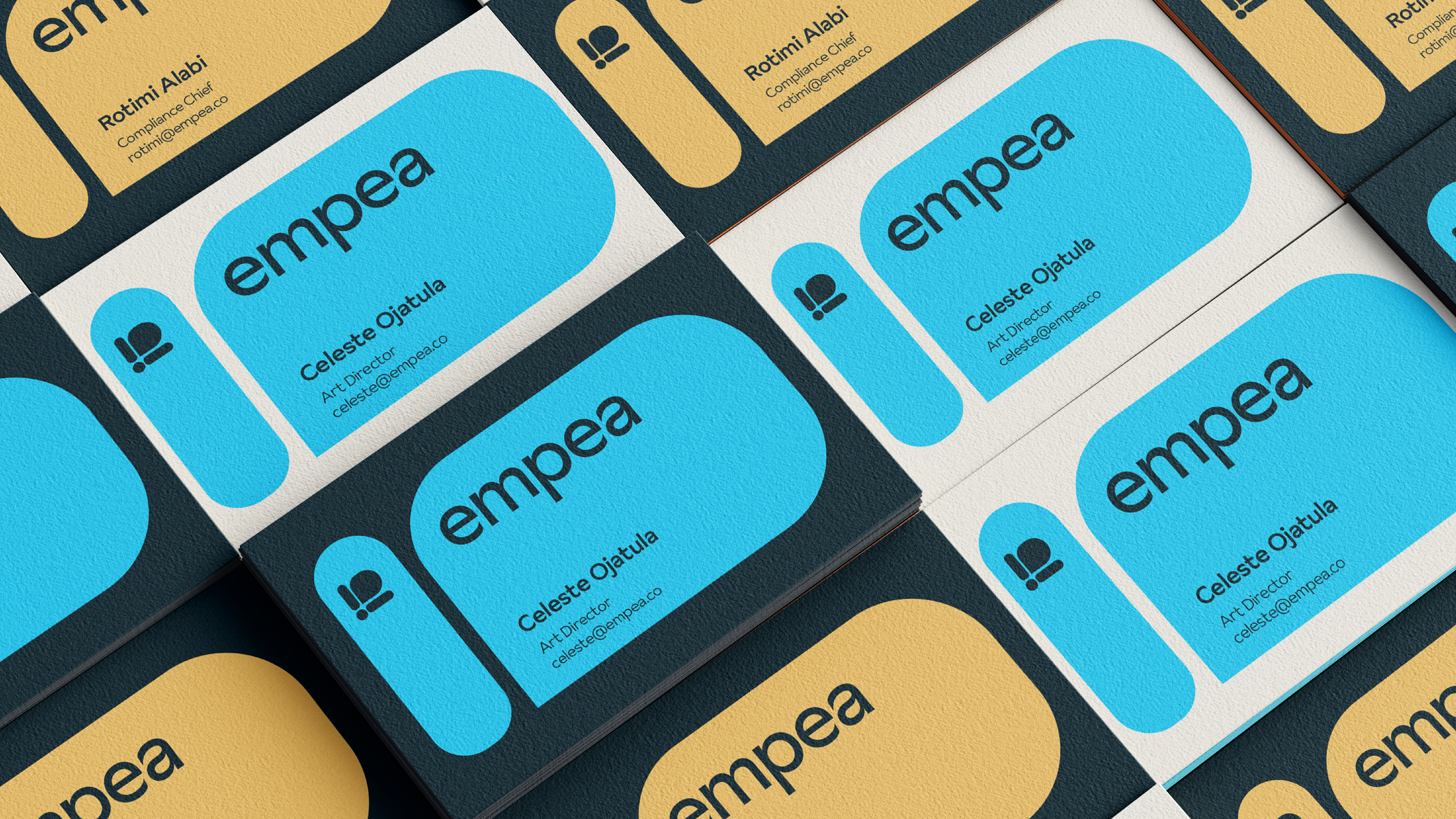
Colour carries that tension directly. Blue gives the credibility and stability a financial product needs to win over cautious owners; yellow brings the optimism, warmth, and humour that keeps it human and growth-minded; the lighter blue keeps the system approachable rather than corporate.
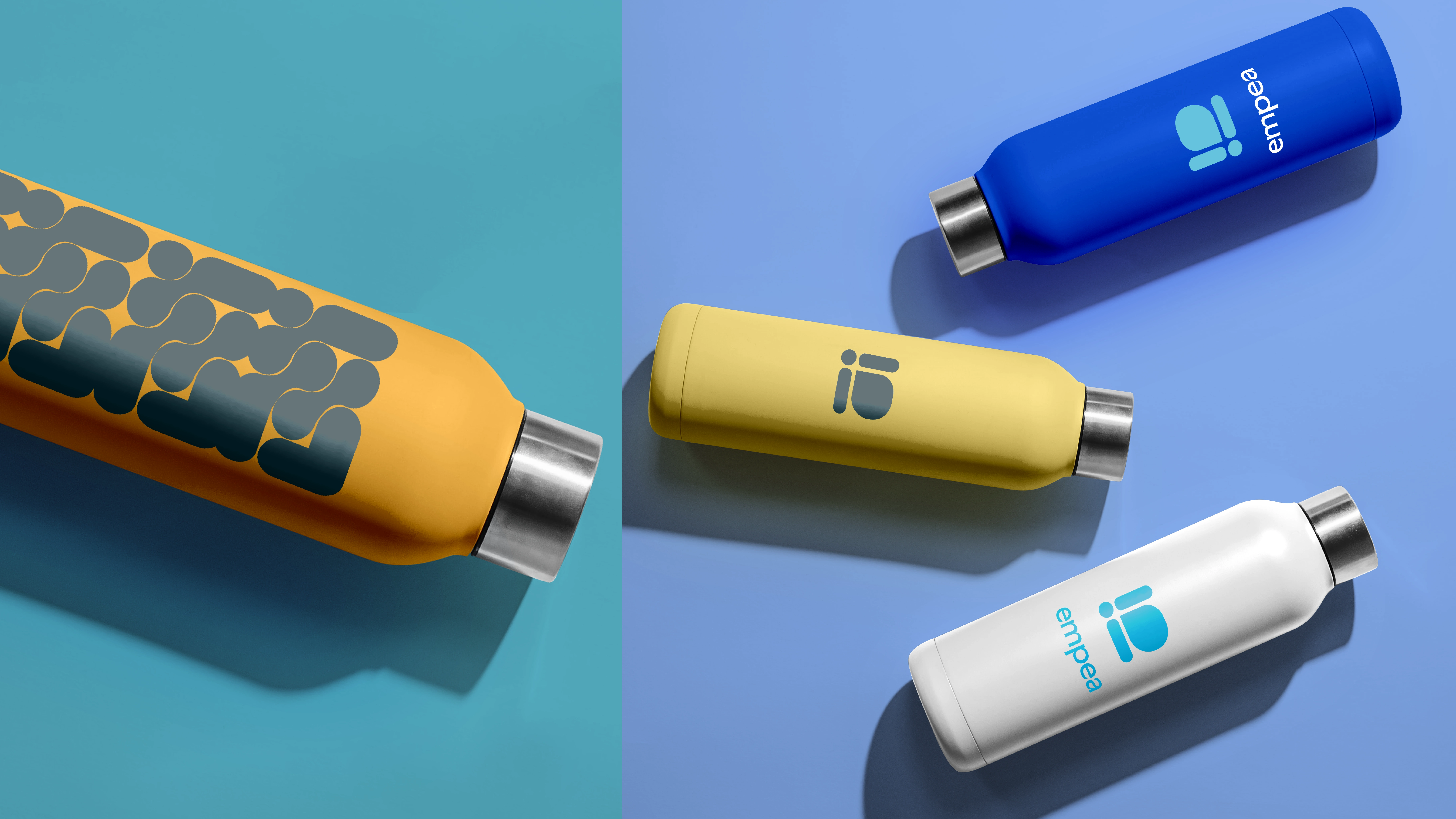
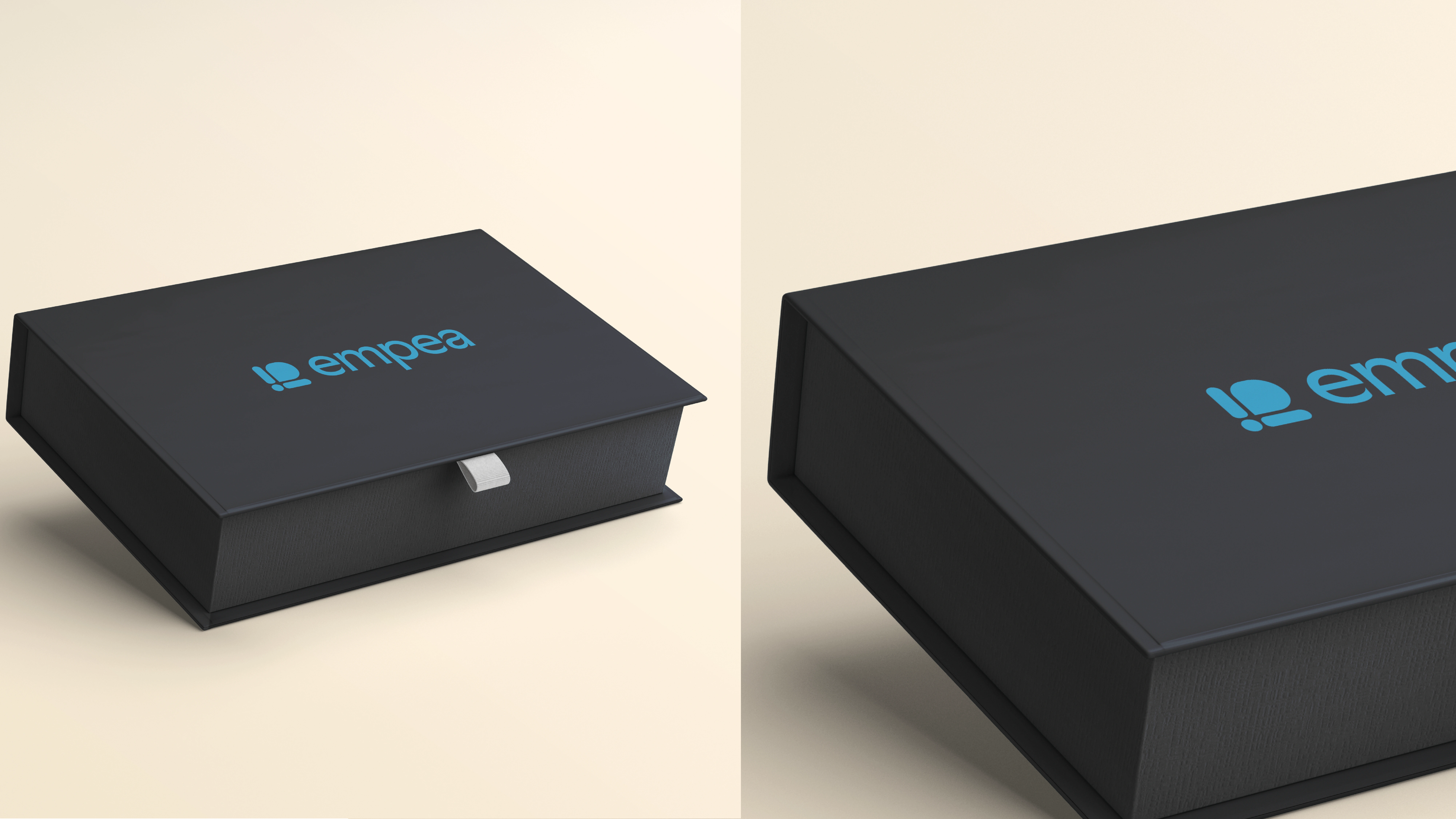
Merch



0 likes · 58 views · Oct 11, 2023
The Brand identity for Empea - a payment gateway solution focused on providing financial freedom for its customers.


