Frank Foolery Audit: Heuristic Analysis of E-Commerce Store
Introduction
Frank Foolery sell apparel such as tees, sweats, etc, targeting Millennials. Their merch is intended to be humorous as it feels like it speaks to those "aha" moments growing up as a millennial.
The company was going to be revamping their overall branding. They had already set forth a creative direction for their products, content, and overall brand experience.
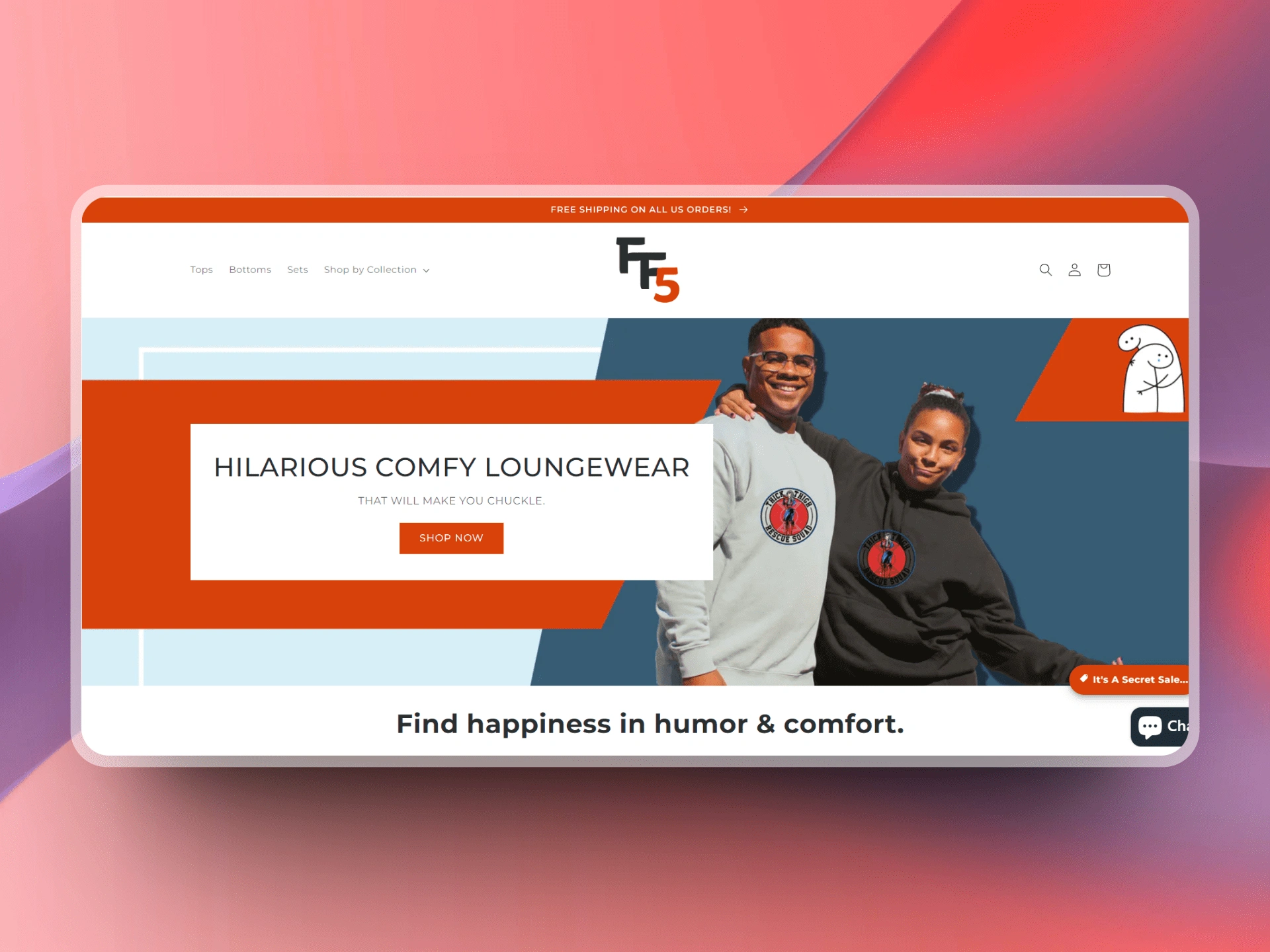
The Current Home Page
I was asked to have a look at the current website and provide some insight regarding the overall experience and dive a little into the optimization of the user experience.
UX Best Practices for E-Commerce Sites
Uncluttered homepages with irresistible value propositions
Well-organized category pages that are easy to navigate
Polished product pages that are easy to navigate
Uncomplicated checkout pages that show progress and make shoppers feel secure
Others
CTA’s should be clear and prominent
Don’t force people to register
Use High Quality Product Images
Product Descriptions
Prominent Sales & Specials Section
Live Chat & Easy Customer Support
Who are the main shoppers?
Casual Browser
General browsing
Casually looking around
Good navigation is Key
Good filters are Important
More likely to browse pagers longer and more thoroughly
Intentional Browser
More likely ready to make a purchase
More likely knows what they're after
Comparing their options
Good search is important
More likely to require saving and coming back to product page
More time sensitive
Heuristic Analysis
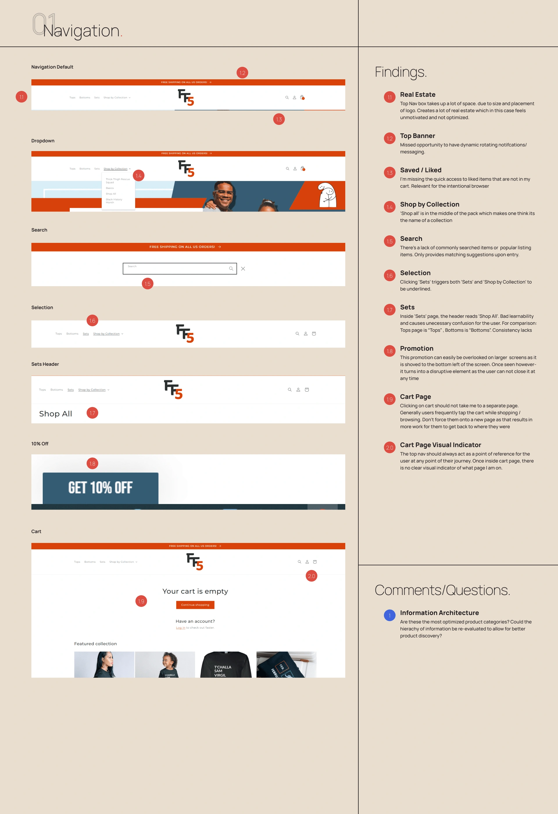
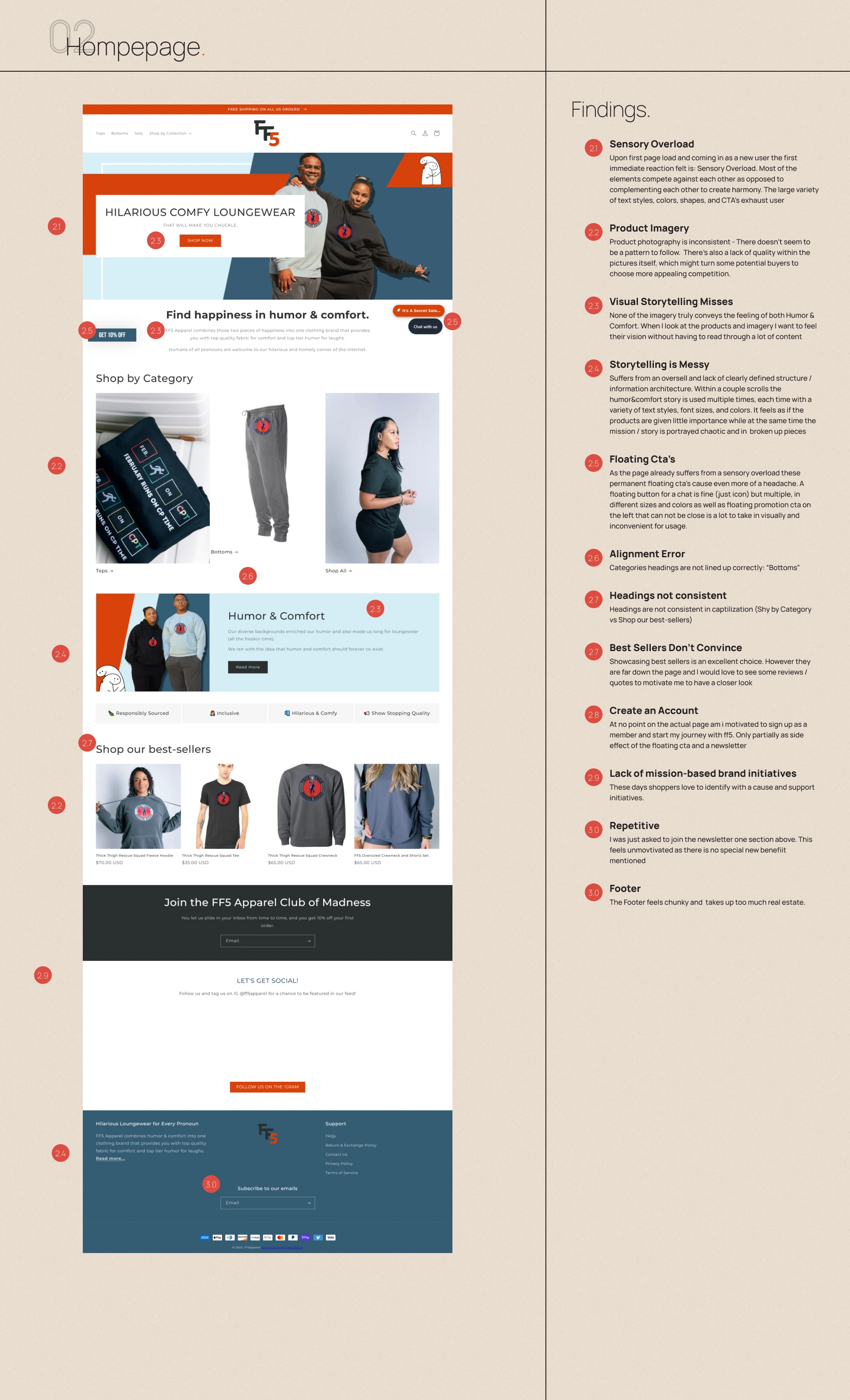
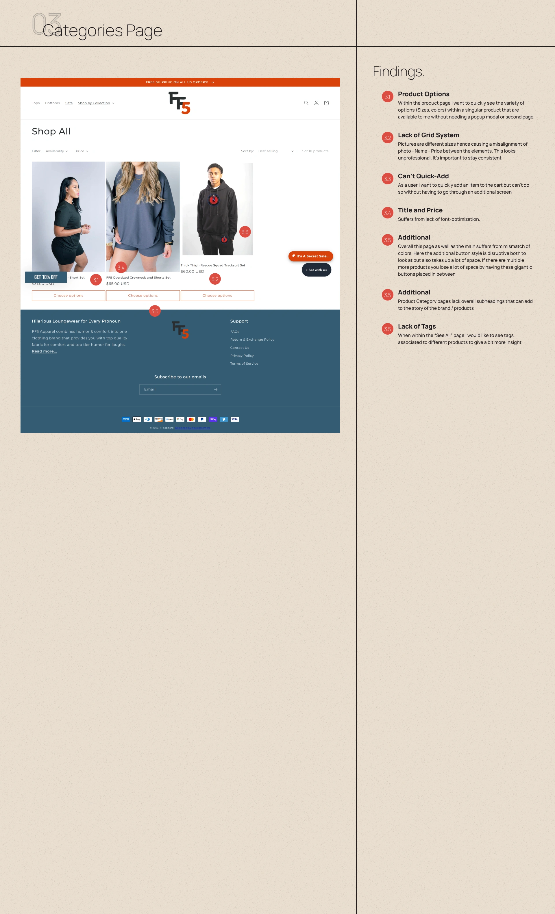
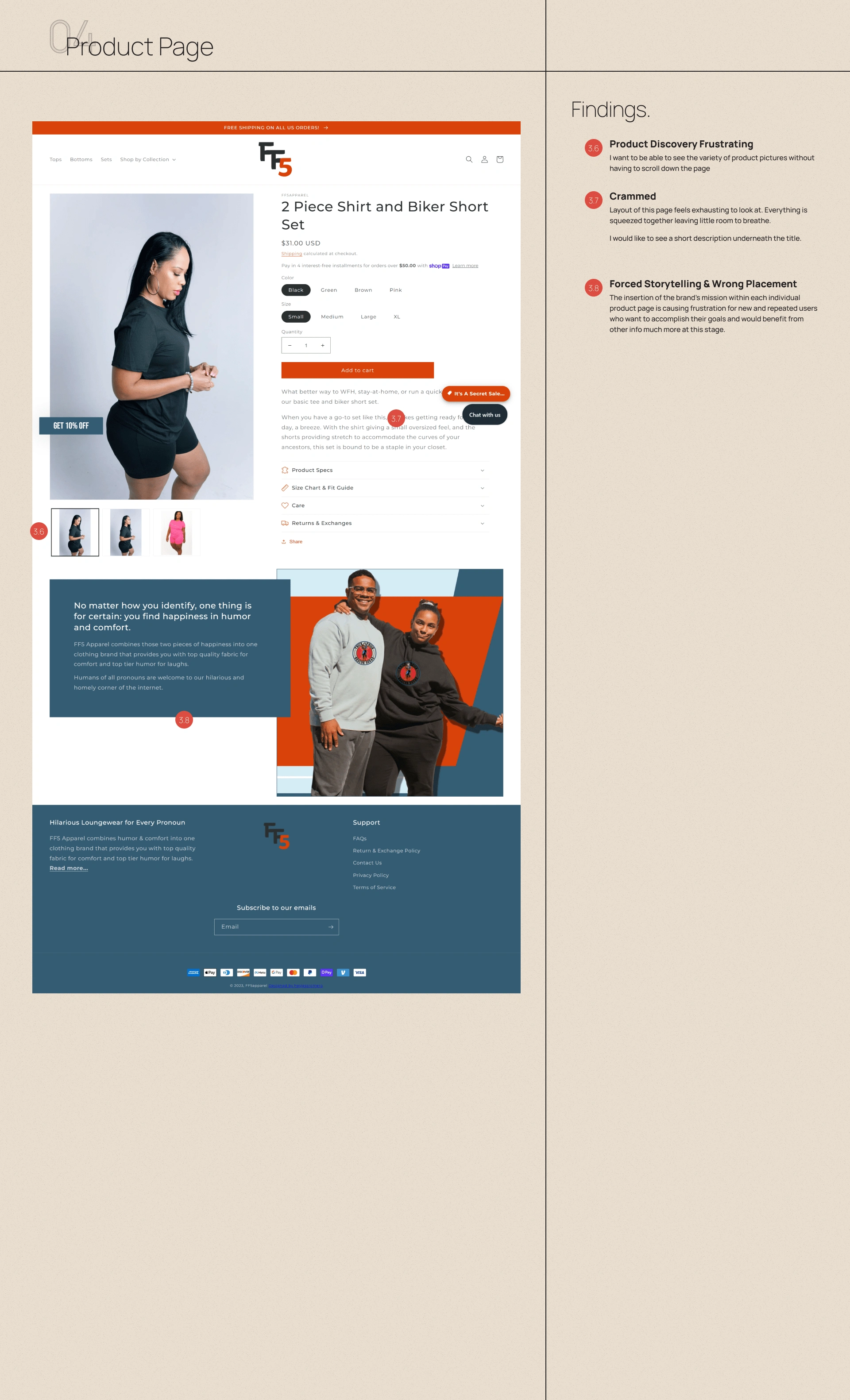
To provide optimal feedback to the team, given the timeframe of one day, I decided on a heuristic analysis of the following (Desktop):
Navigation
Home Page
Categories Page
Product Page
Recommendations

You can view the newly improved website here:
Like this project
Posted Jun 26, 2023
Brief UX Audit of E-Commerce Store targeted towards millennials.
Likes
0
Views
27

