Netflix Social Feature Design - Passion Project
Conceptual Design for Mobile Devices
My Role
Co Lead UX Researcher
UI Lead
Date
March 2021
Duration
2 Week Design Sprint
Purpose
Passion Project
Reconfiguring the Platform for Socialization
Since the COVID-19 pandemic began, average weekly Netflix usage in the US has risen 72%. Our hypothetical client Netflix believes that as a result of the global pandemic, user's needs and expectations of their experience with the platform have changed. As a group of four, we were tasked with designing a new social feature for Netflix's mobile app, targeted towards 18-29 year old binge watchers. Upon discovery and definition of users pain points we designed a fun and intimate social viewing experience for friends and family!
All phases of this project were completed unsupervised and remotely using best practices.
THE CHALLENGE
125 million+
Hours of content
190+
Countries worldwide
203 million+
Subscribers
$16 billion
Spent on original content
It's not cheap to produce great content
Netflix has an ongoing problem due to their own underperforming original content - (no I am not talking about Stranger Things or The Crown..). The company is forced to cancel shows early due to their high budgets. Netflix hopes that by developing a social feature, it will increase viewership for any underperforming content.
Setting ourselves up for success
Due to time and resource constraints, designing for the MVP - minimum viable product, was agreed upon in the group. First we must, then we could.
We defined two goals that had to be achieved with our solution
Create an experience that is on brand with Netflix - Thus avoid alienating the existing audience
Highlight and design the experience around Netflix’s original content.
RESEARCH
Similar to Godzilla and Kong's epic clash on the big screen, Netflix is currently engaged in a fierce battle for dominance...
Implementing a social feature and thus designing a new intuitive user experience for the Netflix audience is a complex task. After initial research on Netflix and the target audience, we completed a competitive analysis to understand whether other streaming platforms have already created and introduced their own social feature(s).
Through this method we learned that Hulu, AmazonPrime Video, and Disney+ have already made first steps at integrating a social feature within their platform. And surprisingly they were all based on the same concept...
A Virtual Watch Party
Amazon Prime
Groups of up to 100 people can watch and chat together (Browser only)
Hulu
Up to 8 people can join a Watch Party session and chat together (Browser only)
Disney+
Groups of up to 7 people can join a Group Watch session and interact via live emoji reactions (Web and Mobile)
That was a lot of fun...meh
After having finished our online research - we decided to test these features as a group to get a deeper understanding of the experience. While functional, there seemed to be a core aspect missing: FUN
The lack of real interaction and engagement between users left us asking why not just watch alone?
Is a Social Feature Even Needed?
But remotely....
Finding relevant people to talk to
To discover whether our target audience had similar thoughts we continued our research by recruiting users for interviews and future usability tests.
First we sent out a user survey through a variety of social channels to make sure we were going to talk to people relevant to our case study. To qualify as relevant, our participants needed to match the following criteria agreed upon by the team, which was based on the data gathered from the project brief.
The Ideal Candidate should
Be between the age of 18-29
Use Netflix as one of their most used streaming platforms
Have a mobile device to watch content on
Spend upwards of six hours a week consuming video content
Lastly they needed to watch two or more episodes per sitting to qualify as Binge Watcher and thus making them the perfect candidate for us to gain more insight from!
Objectives for the Interviews
1) Understand how/why and if a social feature can benefit a user’s viewing experience
2) Understand how our users socialize during or after watching online content
3) Understand how people currently coordinate their shared virtual events
4) Understand users frustrations with current viewing experience
We scheduled interviews with three users that had qualified through the survey.
Ask and Observe
Based on a Discussion Guide we interviewed users through a 30 minute recorded Zoom call and asked them questions related to our objectives
Collect Data
We reviewed all the interview sessions and collected user insights such as observations, quotes, and statements
Synthetize
Based on similarities we organized groups and titled them to find trends and themes - and make initial conclusions
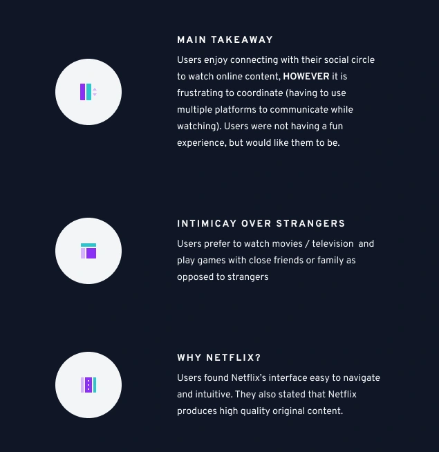
Insights gathered after using a method called Affinity Mapping
“Right now, it’s just easier to watch something alone without the complications of coordinating with third party plugins.”
- Mason, 27
Introducing
Billie the Binge Watcher
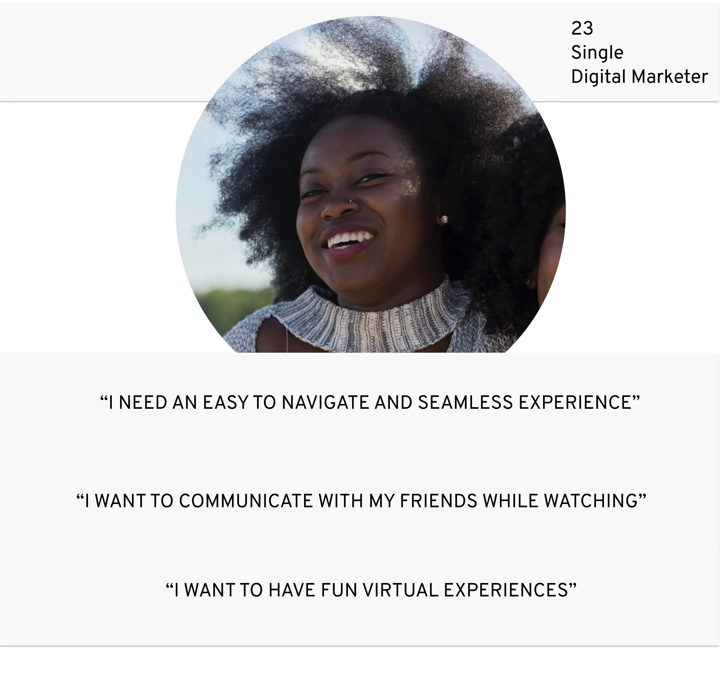
To design for a specific user group and to focus on solving relevant problems we needed to set up a visual reminder: Billie the Binge Watcher
Through the use of this persona, an archetype of our target user and based on the data collected from the user interviews, we were able to define the core problem that our design solution needed to solve:
Billie needs a fun and intuitive way to intimately connect with her friends and family
IDEATE, SKETCH, DESIGN
Remembering the goals
With limited time (2 weeks in total) and resources (a group of four) being the biggest constraints to our project, we needed to prioritize satisfying business and user needs with the least amount of effort, and thus creating the minimum viable product.
And by that I mean, my group had to remind me to think simple and focus on the bigger picture. Blessed/cursed with an overly creative mindset I tend to want to come up with new ideas, greater ways to solve the users problem. However that can be time consuming and it was important for me to adapt to the groups needs and move forward with the timeline we had set for ourselves. A challenge at first but a great opportunity for growth. I learned to stop ideating, and start doing!
Watch, Engage, Play...Repeat
Thankful for my team and freshly reminded of the research up to this point, we had landed on a Watch Party feature as the best course of action. Although not a complete new feature, as it exists in competitors already, we added a unique aspect to heighten the user engagement and enjoyment.
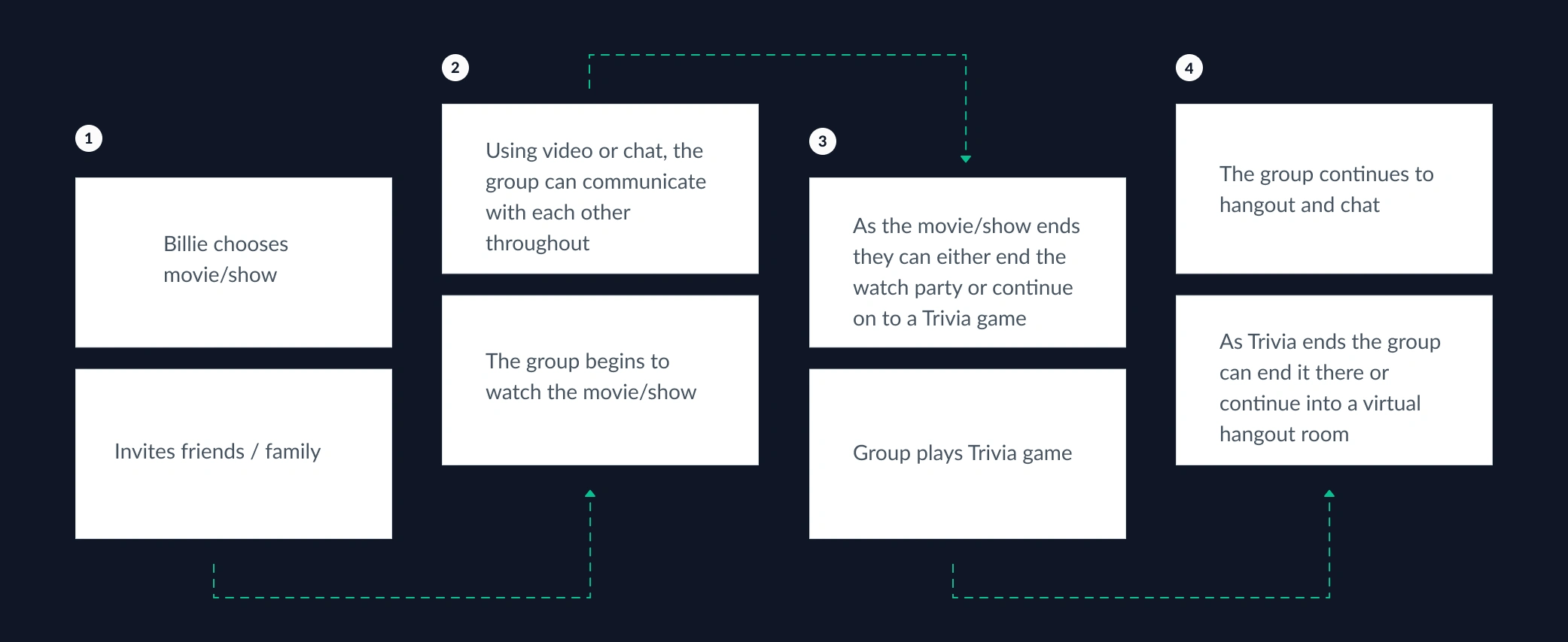
A simplified user flow showcasing the essential steps Billie would take to experience Netflix Watch Party (Click to enlarge)
What even is Netflix Watch Party?
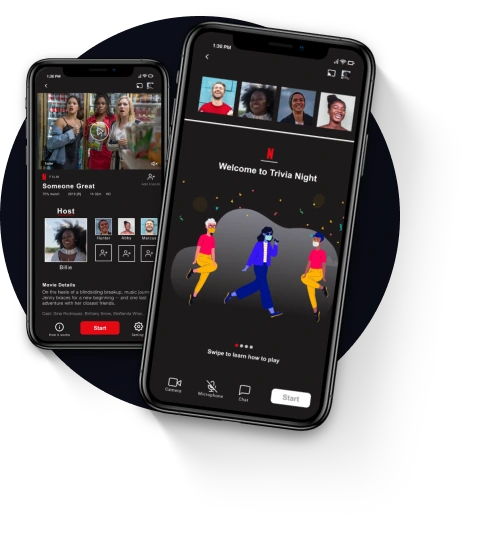
A feature that connects family and friends by giving them the opportunity to watch original content together online, interact with each other, and play trivia games afterwards.
A future state user flow was created to illustrate how Billie would navigate through the design solution that we had come up with.
Our users highlighted that Netflix’s mobile app and flow was straightforward and easy to use. We wanted to keep that in mind as we created the flow, so that there wouldn’t be a steep learning curve when using this new feature
Reflecting on the Needs
Does it Create an Intimate Experience?
Through ability to engage with friends and family during as well as after watching the content together via chat, voice, and camera
Is the Experience Fun?
The Watch Party is made more enjoyable through the implementation of a Trivia game directly related to what was just watched as group.
Will it Satisfy the Business Needs?
Netflix Watch Party will initially only be available for original content and thus drawing in additional users who are curious about the feature. The goal is to get eyes on underperforming original content
Sketching out Ideas
At this point in time we had come to a clear understanding of what features were to be implemented into the design. But we had not yet decided on the visual design and user interface. Individually we sketched out ideas, then as group gave feedback to each other. Through an iterative approach our designs continued to improve
How will the screen look when the group is watching the movie?
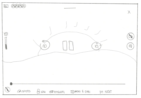
I learned how useful and efficient it can be to sketch on an iPad instead of paper, which I had personally struggled with in the past
The Final Sketch
Through this process we were able to agree upon the best pieces of each sketch, which then resulted into a final design. We were able to define the icon placement (right side for video and chat), bottom left for microphone, as well as having the avatars of participants in the top left corner. From there we continued to complete all necessary screens.
TEST AND ITERATE
Marc - a user - was left with confusion navigating through the lobby screen
The Design Solution Comes to Life
Via Design Tool Figma the Paper Sketches were turned into clickable prototypes and put through a usability test with three unique users that had been found through the initial user survey. That process was repeated for two additional stages
Grayscale and High Fidelity
To test out the prototypes, our nine remote participants were in different video sessions using Zoom. They used their own devices, and shared their screen. Participants were given a scenario for which they had to complete given tasks for.
Our Objectives for the Usability Tests
We were specifically curious about two aspects within the design, that we deemed crucial to the overall success of the project due to their role in solving the users problem.
The Watch Party Lobby
Is it straightforward and intuitive to add friends to the group?Easy to understand the overall concept?
The Trivia Game
Is it fun and easy to understand?
"The concept is great but the experience was not"
Problem
We learned early on in our usability testing that our users felt frustrated navigating through the experience as they did not easily understand what exactly they were able to do. We had to remind ourselves that first time users would be unaware of the feature and needed some type of instructions.
Solution
To address that issue we recognized that by implementing an onboarding experience the first time user would be able to familiarize themselves not only with the different stages of the feature, but also with the icons that will be shown throughout to communicate.
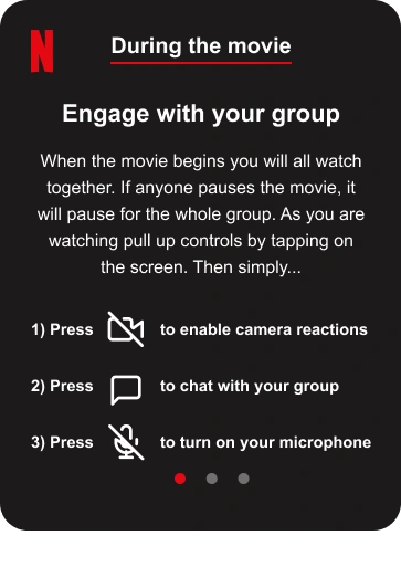
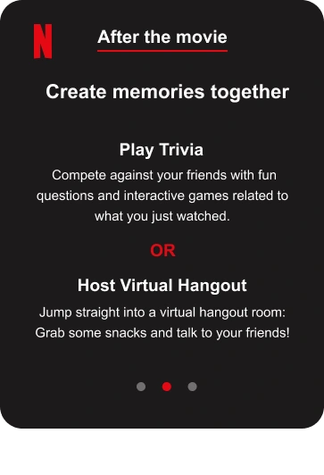
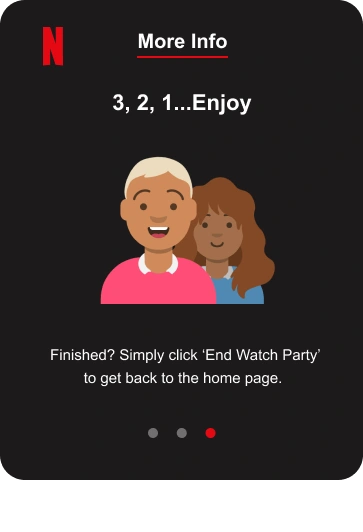
The Watch Party Lobby
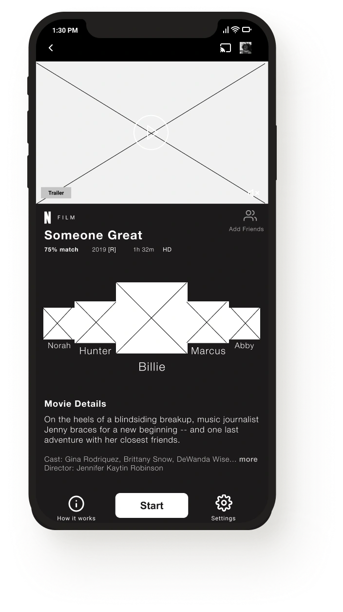
Grayscale
Users were confused about who the host is and did not see how to invite friends
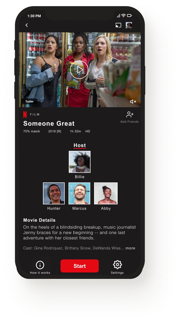
1st. High Fidelity
Solution
We changed the layout by putting the Host on top of the participants. We also gave the host a title. Furthermore we added a + next to ADD FRIENDS
New Problem
Users thought the layout looked awkward and were still having issues locating the add friends option
.
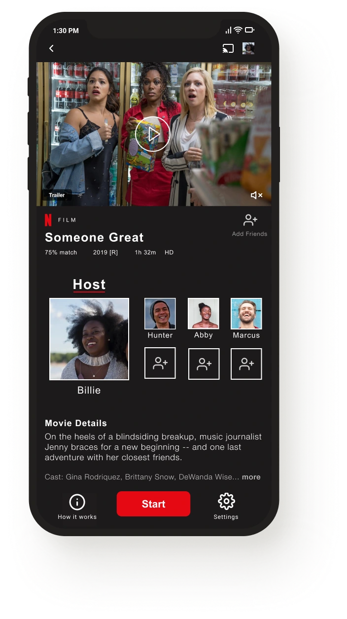
Final Design
Solution
To address the concerns we made better use of the negative space and readjusted the layout. We also increased the host icon for more clarity. Lastly we implemented a new way to add friends
The Trivia Game
Grayscale
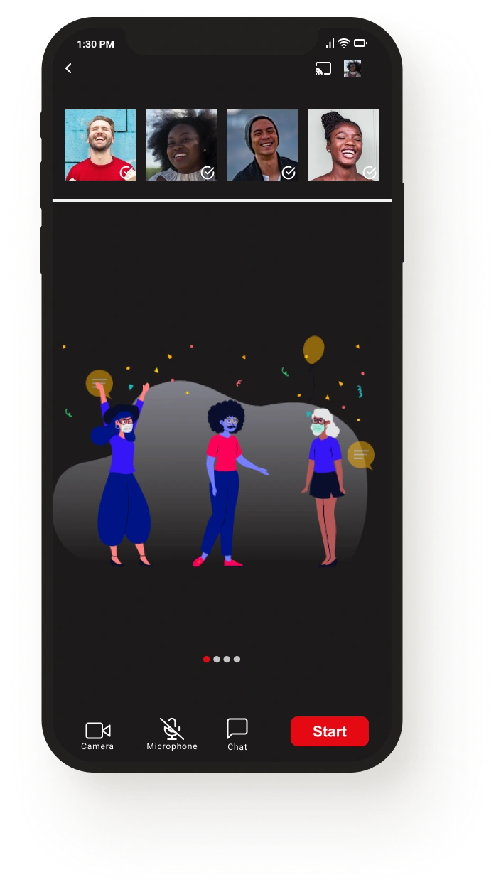
Users found the introduction screen boring...
1st. High Fidelity
Solution
We removed the text, and instead added an illustration to bring in a bit more character and an aspect of playfulness
New Problem
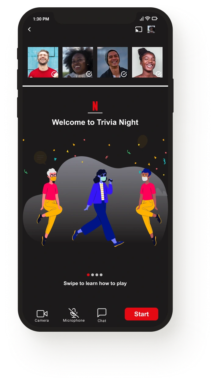
Users were now confused at what they were looking at. Although a fun illustration, there was not enough instructions for them
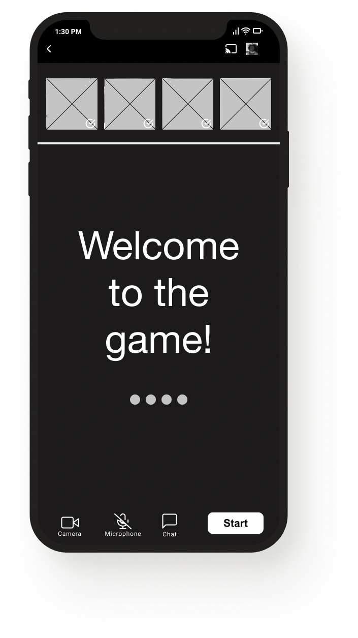
Final Design
Solution
We added a welcome text as well as instructions to learn more about how to play the game
Other Iterations
A Confusing Video Chat
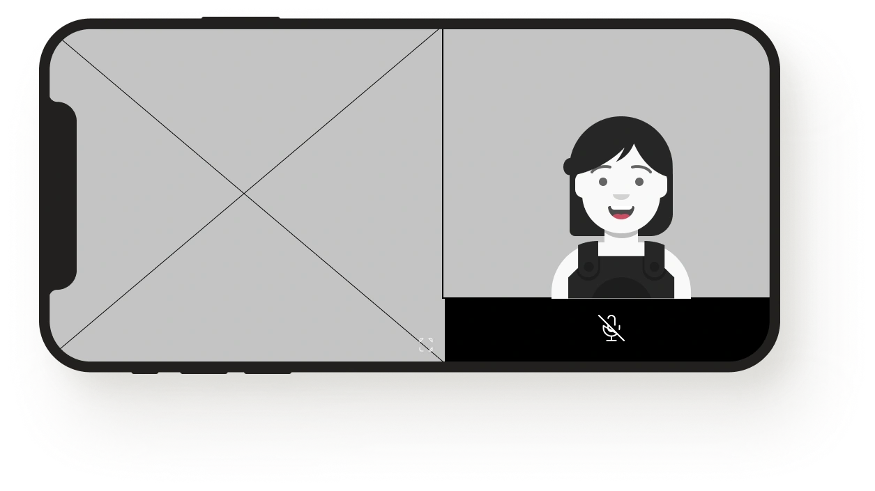
Users felt that the video chat screen was confusing. They wondered who will be shown on screen, the person talking? You? Someone random? They also mentioned that the movie screen should be bigger as the person is taking up too much space.
More People, Less Space
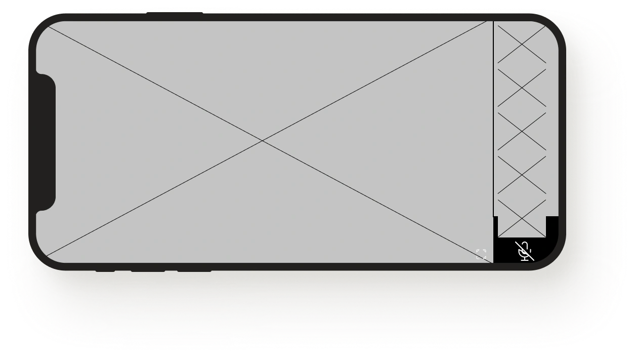
We included an option to view all participants who are vertically aligned near the right side of the screen. We also decreased the size of the participants to leave more room for the content that is being watched.
Wait!
As the movie is coming to an end the host has the power to start the trivia game. However we learned that people would maybe like to take a quick break. To avoid a game being started prematurely we added a READY button for all participants. Except for the host who has a start button. Once every participant has pressed ready, the start button will become clickable.
More Options
As the movie ends we had given the viewers two choices: Either end the watch party or continue to play trivia. In our last usability test we were thankfully made aware that perhaps the group would simply like to hangout afterwards. As a result we added a third option post-movie.
View the full prototype here
View the full Prototype here!
What would Billie do?
1) Search for the movie 'Someone Great'
2) Invite her friends
3) Learn about the feature
4) Watch and engage with her friends
5) Play Trivia
6) Continue to hangout
7) End
Reflecting on the Project
Was the problem solved?
Our users mentioned that if this feature was available they would use it. They specifically highlighted the group game aspect as a welcome addition and felt that Netflix Watch Party gave them a fun social viewing experience. This was great to hear, especially after we had ran into issues with the initial usability test in which our users seemed to be confused at most stages.
A New Experience
This was my first time working with fellow designers in a group setting. While there were challenges in terms of team coordination and responsibilities, I am grateful to have been given the opportunity to work on this project alongside my wonderful colleagues. Also special gratitude to my coffee machine for not giving up on me...
Area of Opportunity
My biggest personal takeaway from this conceptual design study was the importance of time management - 14 days from start to finish - tensions were high. Thanks to my colleague Kaitlyn I learned how to spend my time more efficiently, which was crucial to the success of this project. I will apply the techniques I learned in all of my future work.
Thanks for stopping by! Let's talk
Like this project
Posted Jun 6, 2023
A 2 Week Passion Course Project
Likes
0
Views
41


