Chivalric

Chivalric Agency

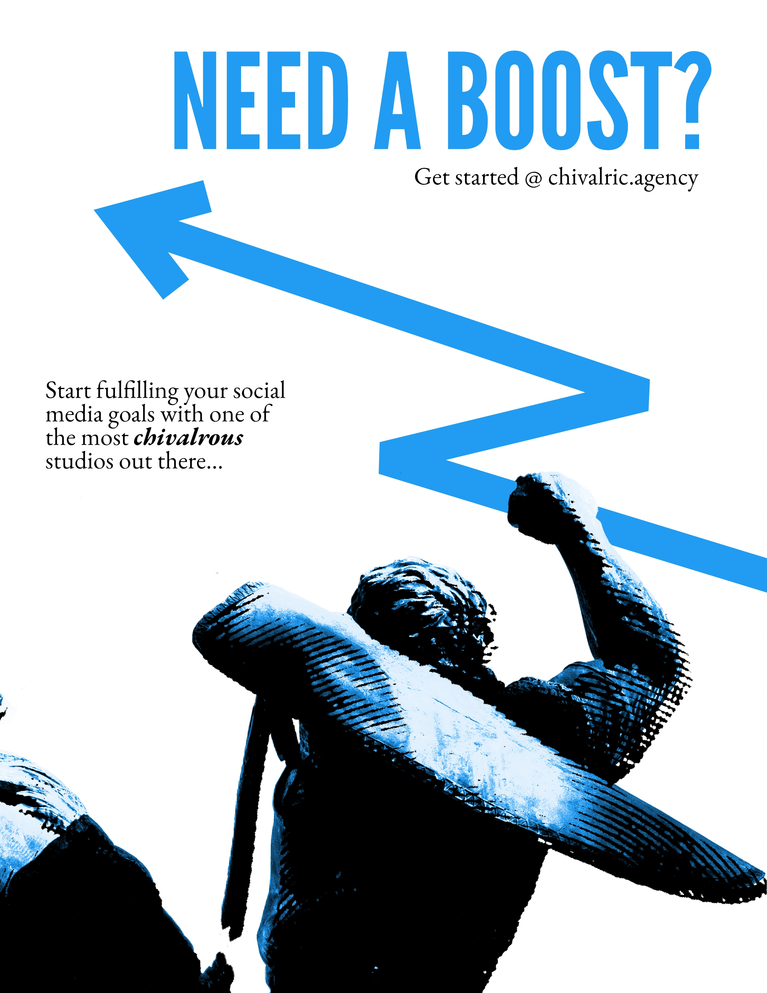
WHAT IS CHIVALRIC? Chivalric is a full-service social media management agency specializing in creating and maintaining online spaces here on the internet. We transform your online presence into thriving and engaging community.
THE BRAND Chivalrous, valiant, and steadfast—qualities of both a knight and the creative talent at Chivalric. Our brand is built on unwavering support and ensuring clients feel secure and empowered in their social media presence. The knightly theme reflects our commitment to loyalty, strength, and dedication, transforming every server into a thriving, fortified kingdom.
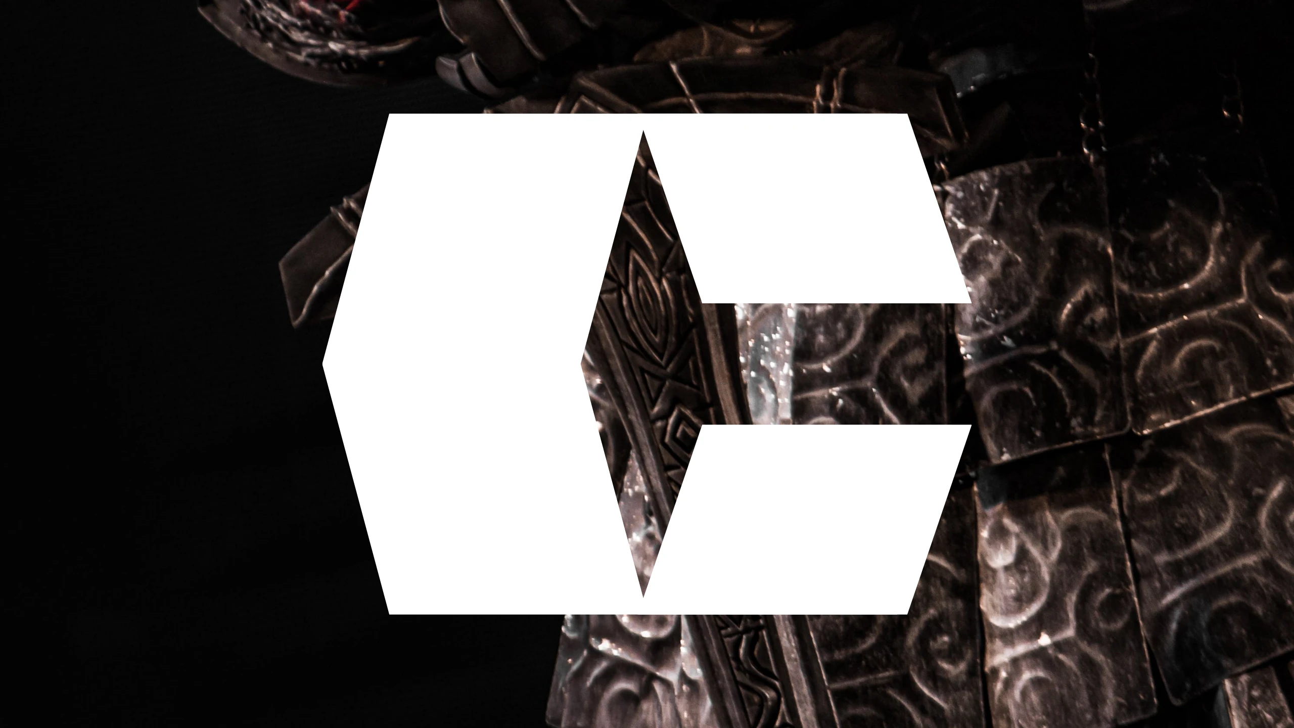
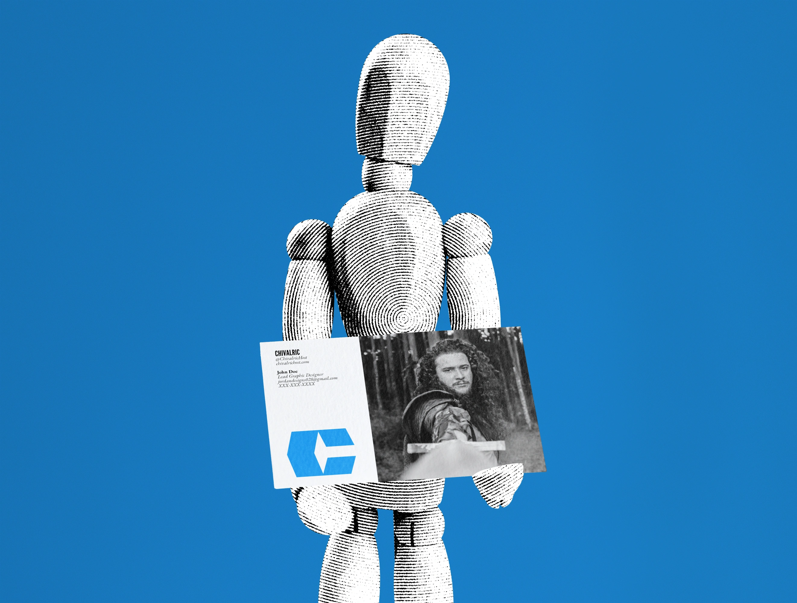
THE CREATION This mark was thoughtfully crafted to represent the process of building a strong, thriving community. The leaning rectangles symbolize walls under construction, reflecting both growth and structure. Their positioning conveys how clients can lean on our experience, trusting us to provide a stable foundation for their communities as they develop and flourish.
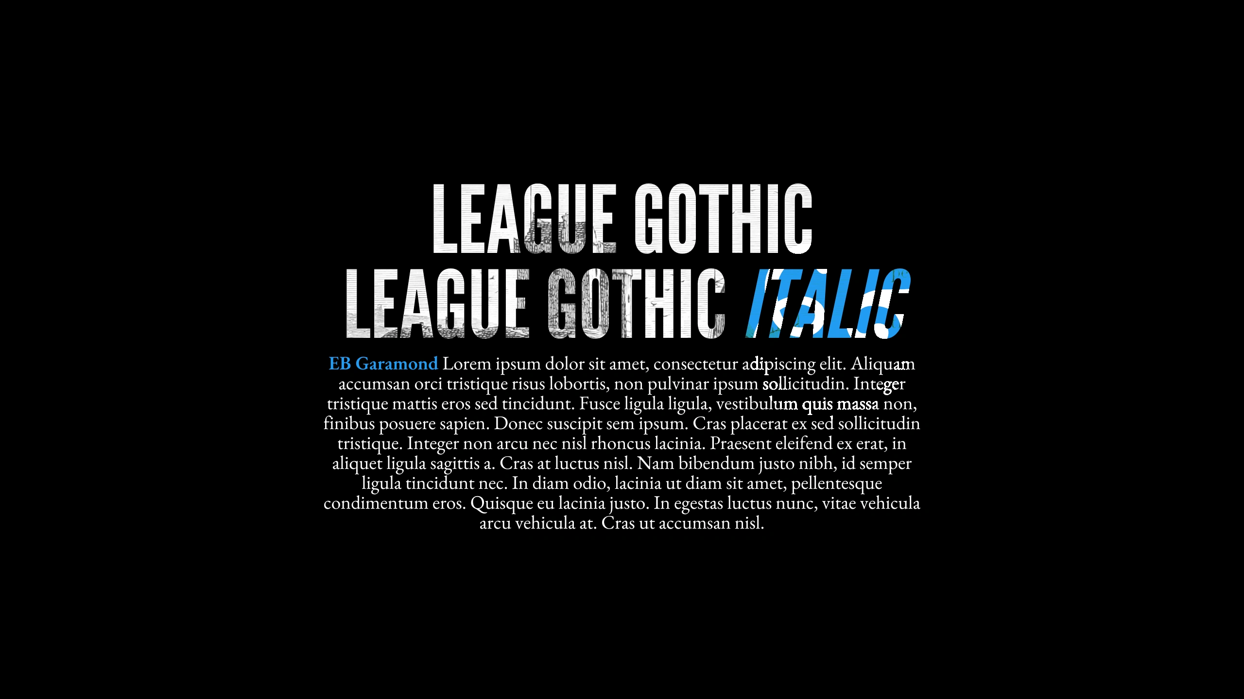
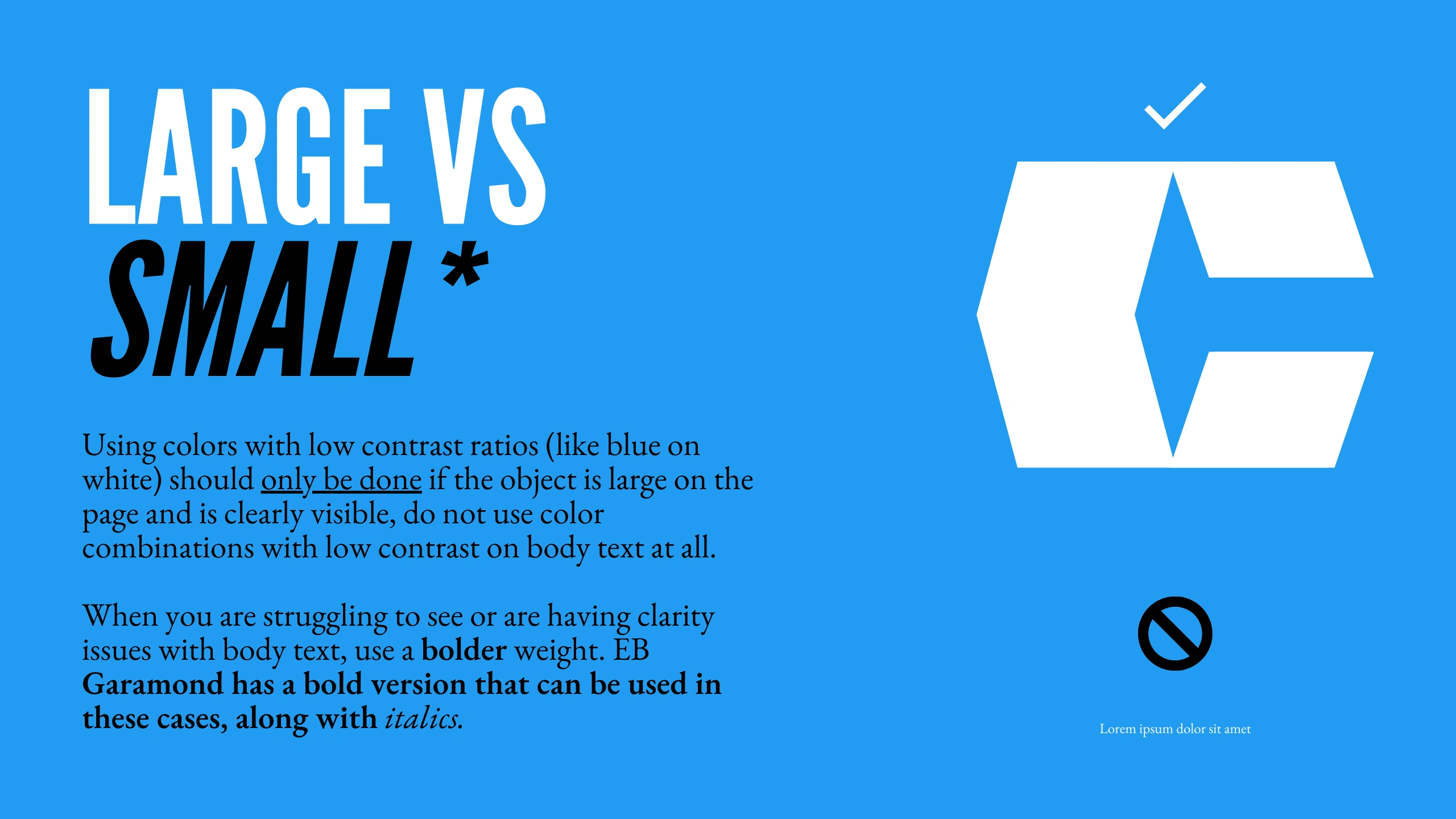
FONTS A beautiful pairing of the tall, structured letters of League Gothic with the intricate beauty of a nice clean serif like EB Garamond just felt right when looking at the brand. I wanted to keep everything current day while still using detailed accents to amplify the brand and help it honor the time it's based on.
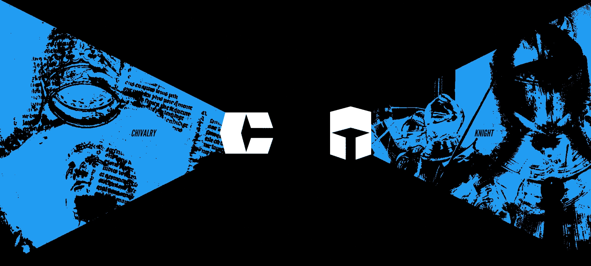
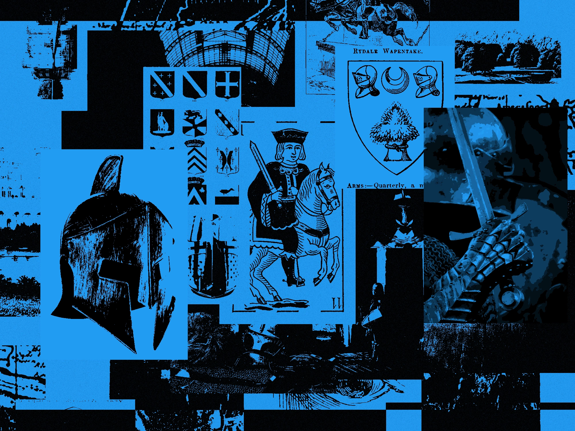
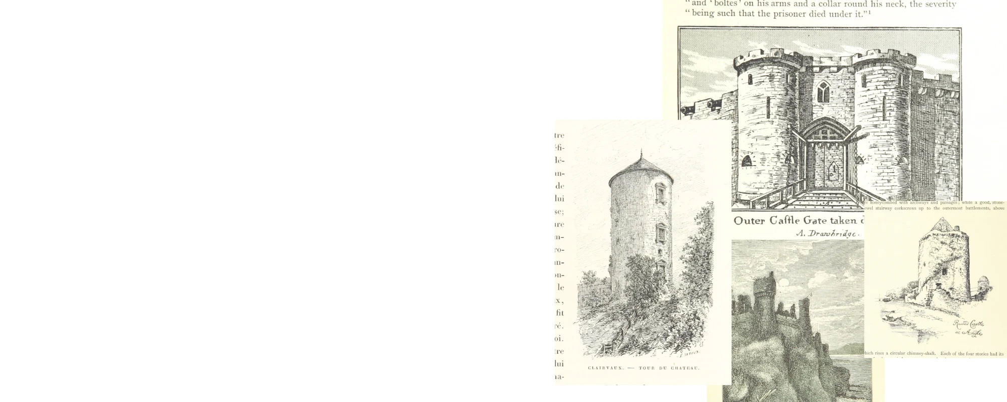
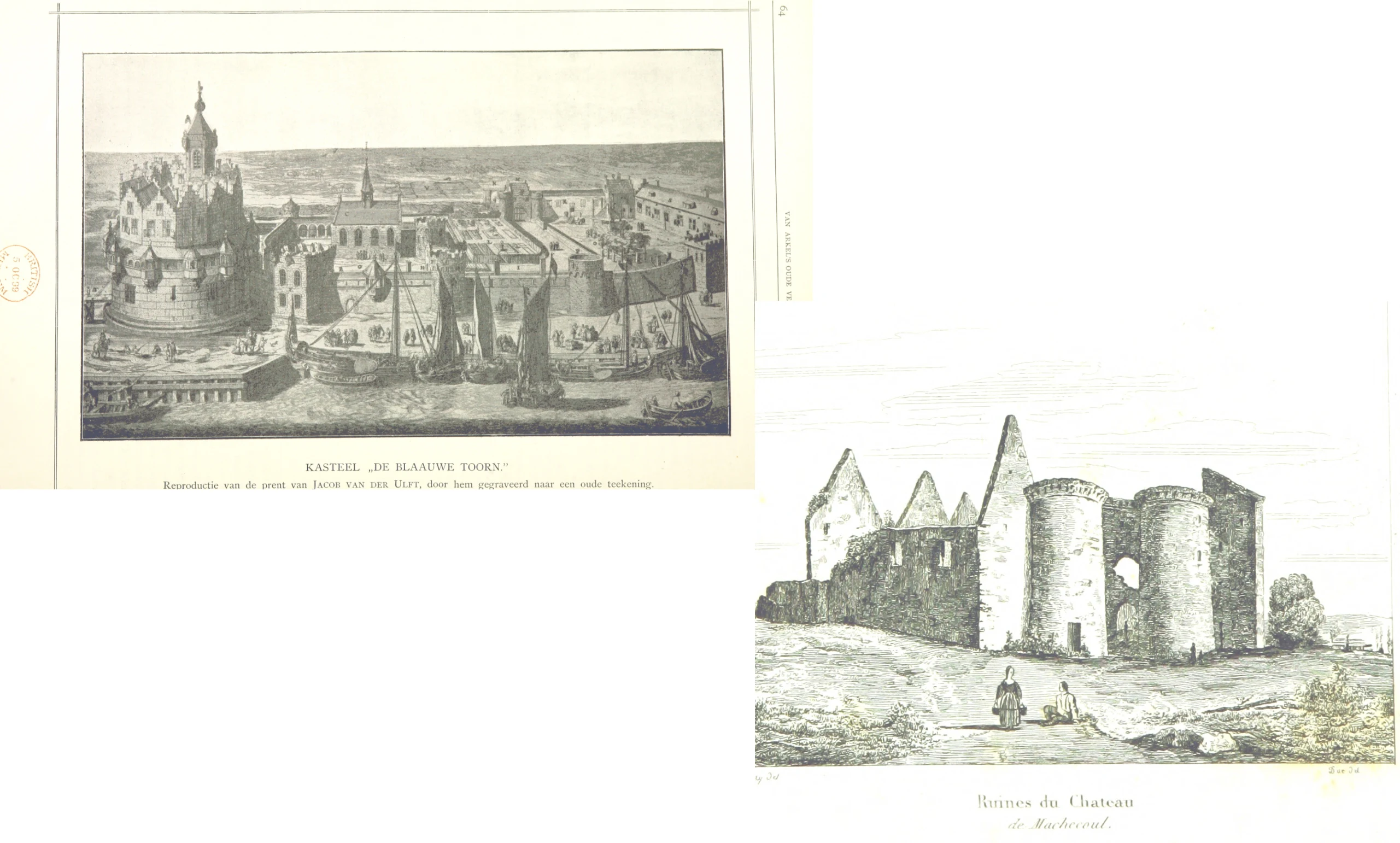
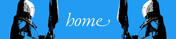
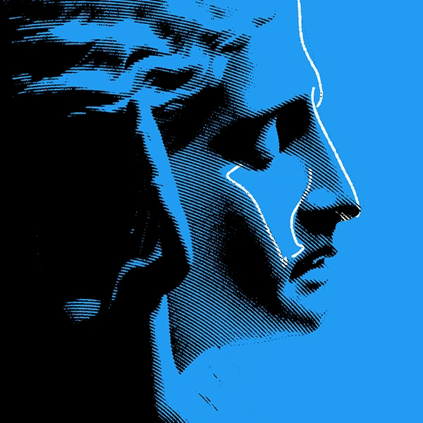
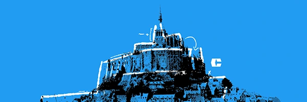
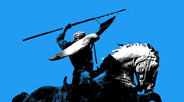
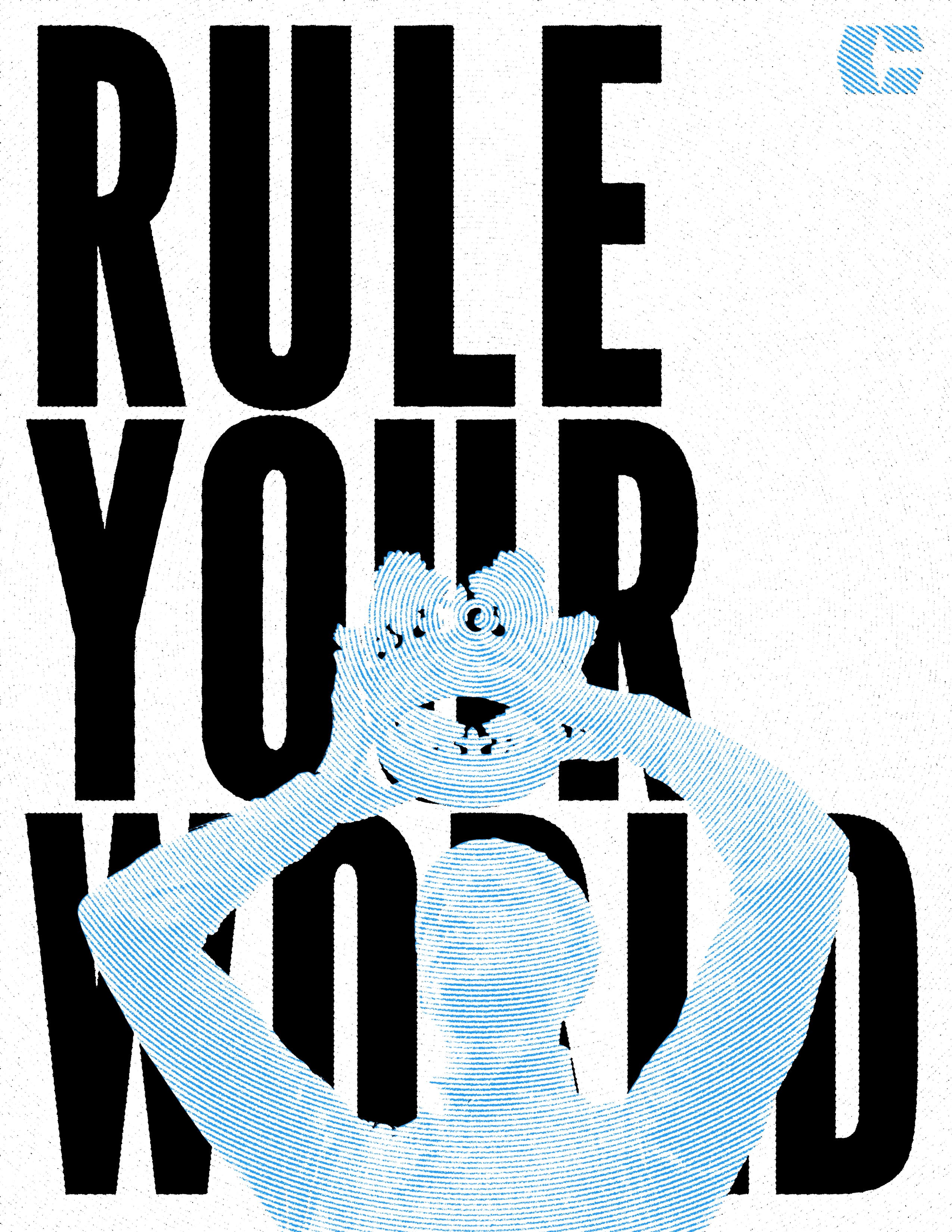
ILLUSTRATIONS A lot of the elements of the brand like posters and advertisements have illustrations that are from the British Library Flickr Page which provides thousands of free, public domain images from their library that can be re-used! You'll see these pop up commonly throughout the project, we really wanted to incorporate these historical illustrations and breathe new life into them!
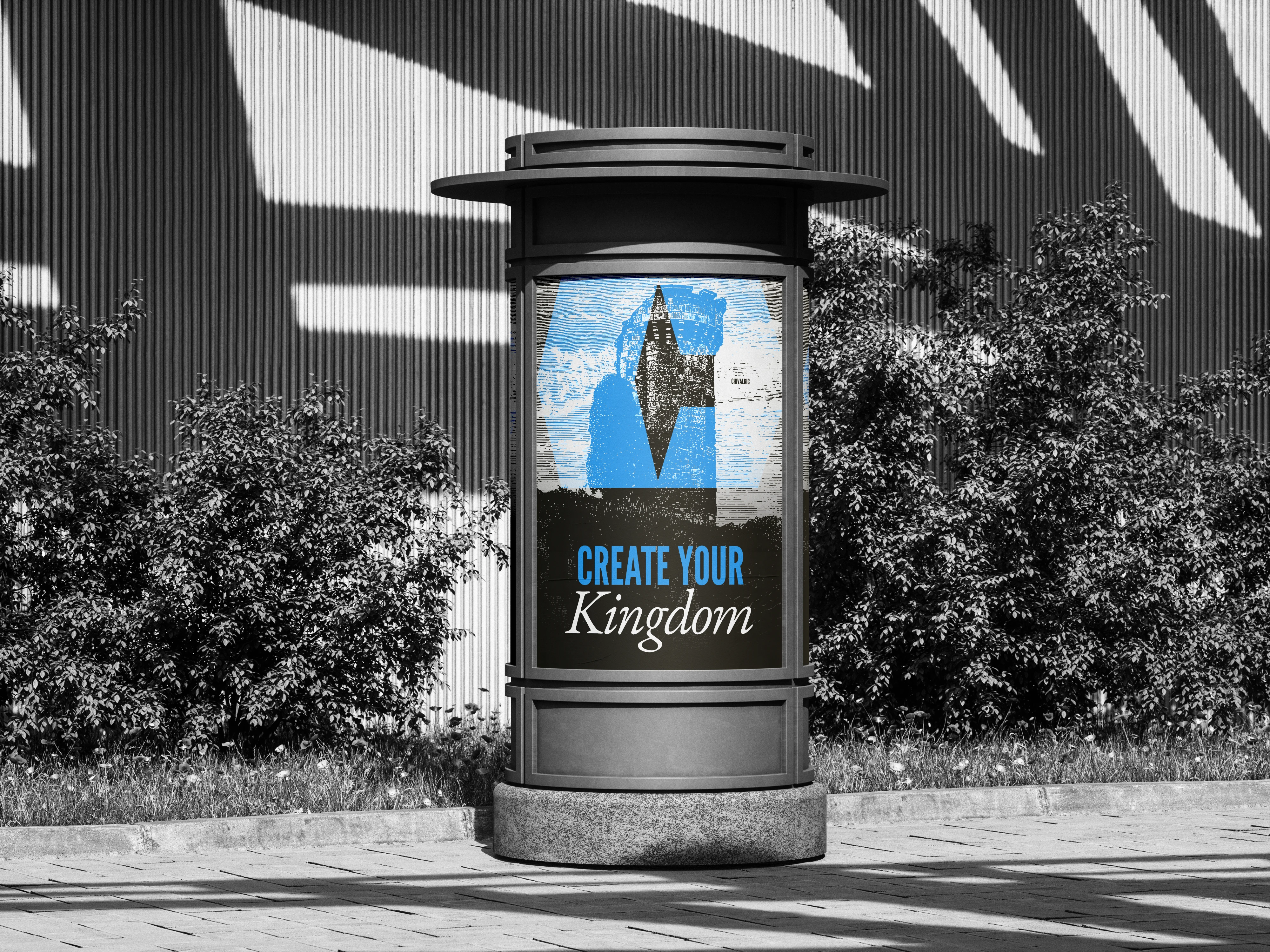
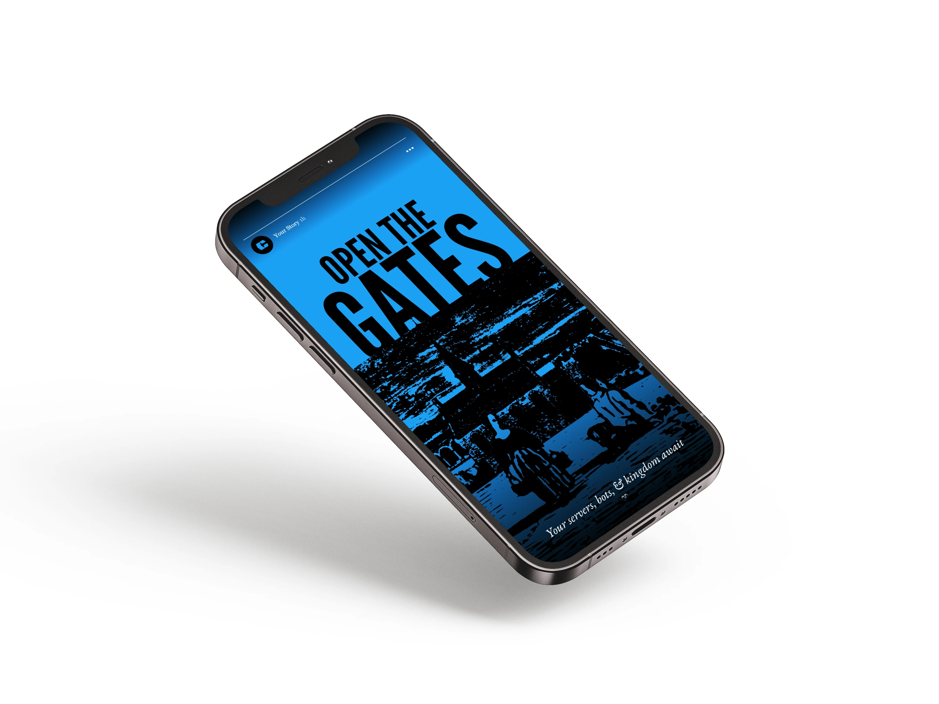
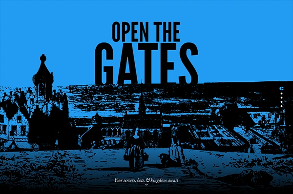
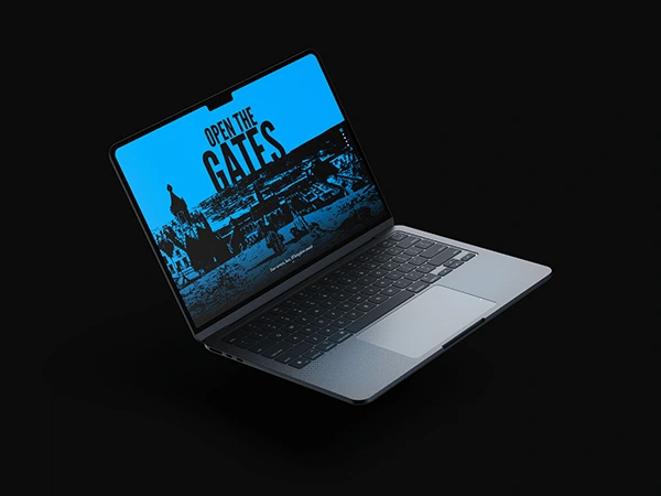
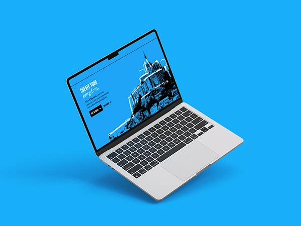
The illustration above is composed of two images from the British library! These pieces are so cool and they worked perfectly in this mockup for the potential design of the website. The concept was to show two people entering a city and showing how you too can open the gates to your community's vision with Chivalric.
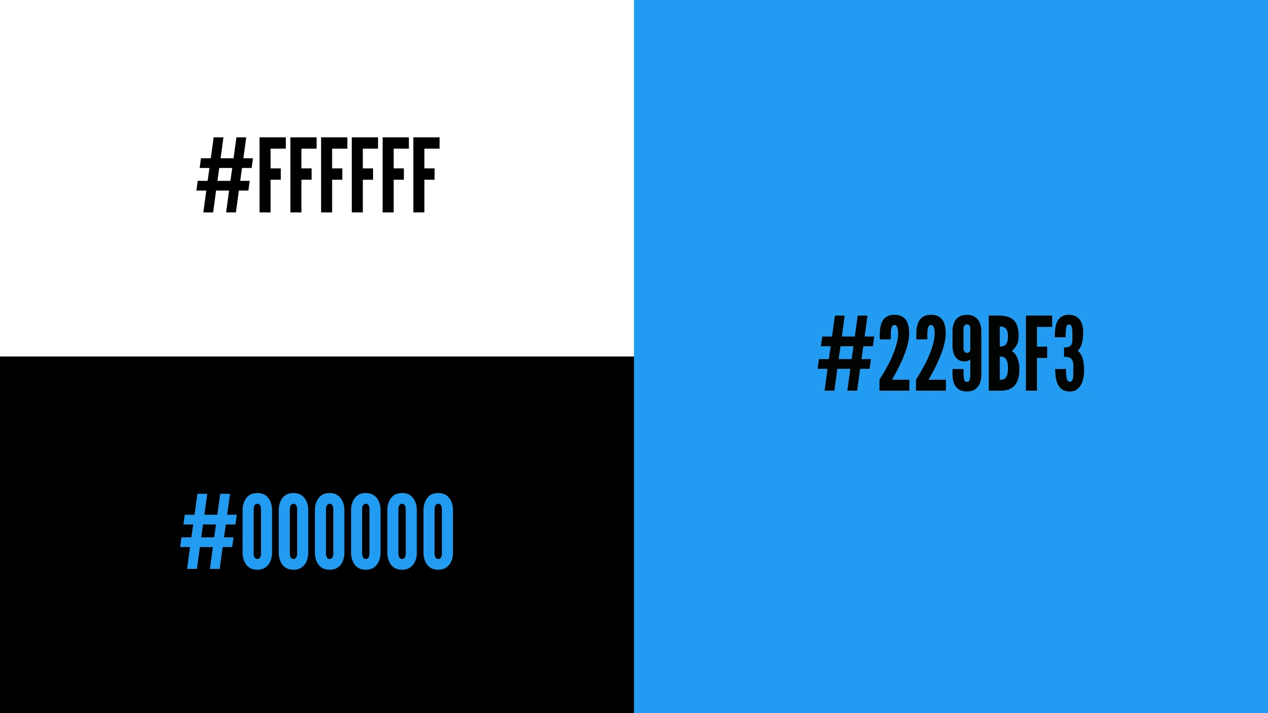
COLOR In our brainstorming and discussions, we had gone through TONS of colors, red was our first pick to align with a playing card theme but it really didn't look right with what we were trying to make, we had then gone with a nice yellow to emulate the color scheme of swiss-suited playing cards. These two colors didn't really match with the theme of the brand though and didn't feel related to technology or the mission of Chivalric, so we scrapped that and the concept entirely. Finally, we picked this nice blue which became an instant hit for its trustworthiness, stability, and how it blended with the elements in the brand.

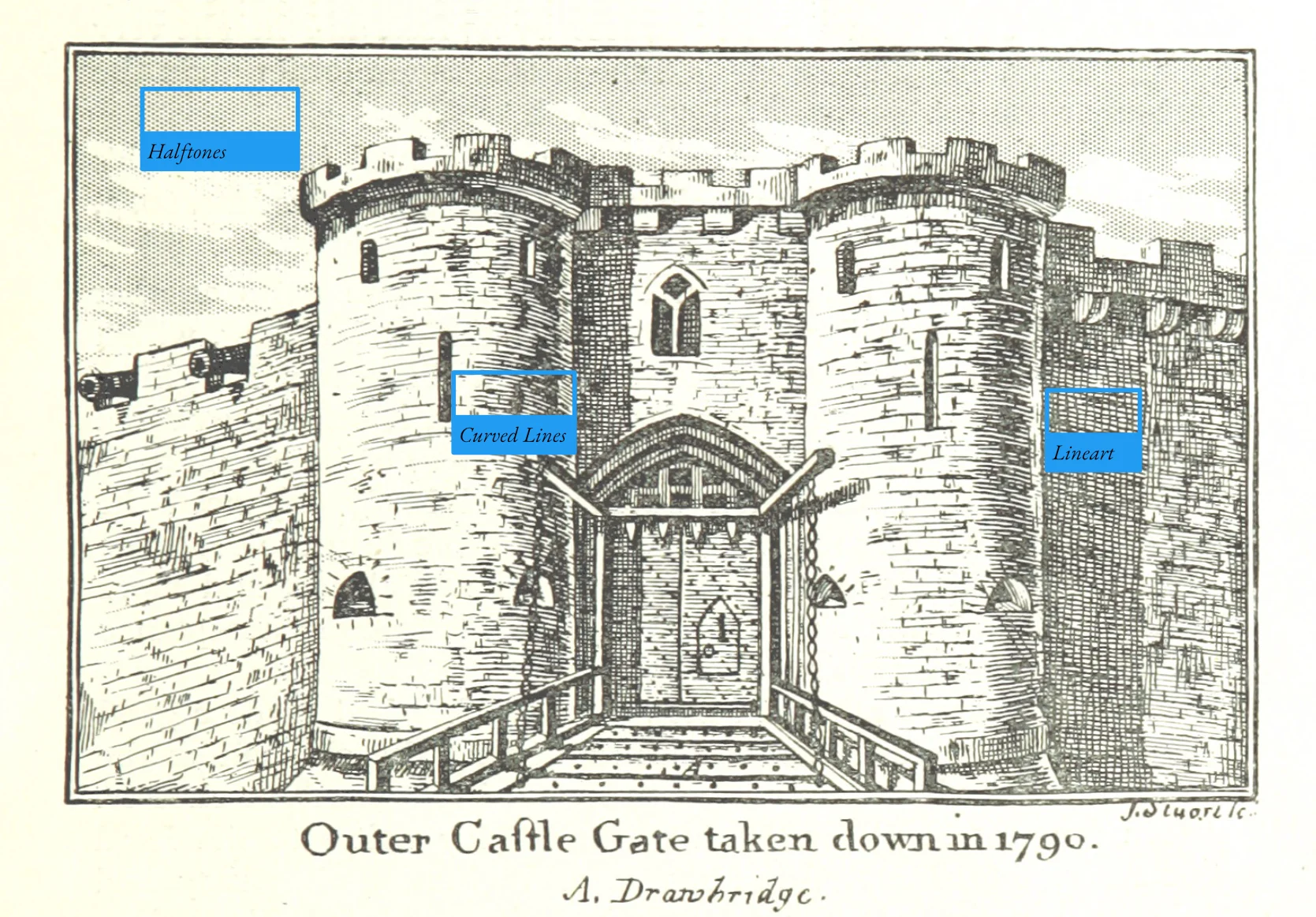
BRAND STYLE We went with this textured halftone style in order to try to replicate the line art that was commonly used in medieval heraldry, drawings, and art. We also wanted it to add a paper texture as written documents and art were one of the only ways of documenting history, world events, and more in the 11th and 12th centuries.


2025, Chivalric Branding & Guidelines
Graphic Designer - Jordan Shay

Like this project
Posted Apr 19, 2025
Chivalric is a full-service social media management agency specializing in creating and maintaining online spaces here on the internet.
Likes
0
Views
0
Timeline
Dec 11, 2023 - Dec 23, 2023


modMAIL
Desert Hawks Branding | Dune Awakening Group

modMAIL
Avalon