Responsive Website and Logo Design for an Insurance Company
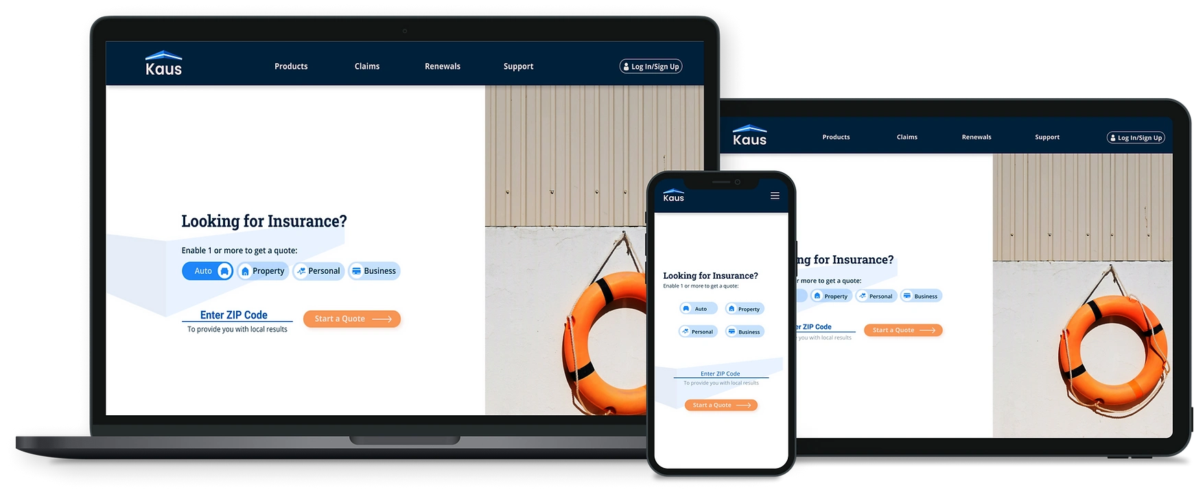
Kaus has been in the business for over 30 years. They have worked only on a B2B environment where they sold insurance through regional agents. In order to continue growing, Kaus would like to refresh their brand keeping the new digital age in mind. They want to target young people who are heavy digital users and provide them a platform to easily purchase insurance from. Kaus' main priority is to offer an easy to use website to their users to access a complex product: insurance.
The solution to attracting the target audience is by creating a easy to use responsive website that shows products from all existing types: property, motor, liability, marine, aviation, life, health, and protection. The users should also be able to easily filter products to find relevant information and options. While creating the responsive site, it is also important to keep Kaus' brand message in mind: trustworthy, modern, fresh, clean and clear.
High-level Design Goals and Objectives:
Design a new modern and fresh logofor the insurance company.
Design a responsive e-commerce website that is pleasing to use and allows customers to browse through all products and easily filter by relevant data.
I wrote a research plan to guide me as I focused on learning about the insurance market, potential competitors, common e-insurance practices, and the potential target audience. My goals and the methodologies used for the research were:
Understand the product and the product needs.
Understand the successes and failures of competitors
Understand users' preferences
How do competitors use the digital space to target their audience?
How do people look for insurance now?
What does a young customer look for in buying an insurance policy?
How do users interact with the e-market?
The full scope of an insurance process is: delivering a quote till claims process.
To succeed in this digital age, an insurance company has to create a digital ecosystem, which allows customers to complete tasks in one experience.
Even in the digital age, there is a high demand and importance of agents.
The digital experience and the personal, human to human, experience need to complement each other in order to create one strong product.
Insurance companies need to leverage artificial intelligence in the claims process. This would allow a reduction in processing times, enhance fraud detection, and improve customer satisfaction.
According to several reports, Millennials make up about 75 percent of global workforce. This is a bid target base for the insurance companies.
Millennials value their freedom, choice, and flexibility.
They prefer self-services such as being able to compare products, make purchases and manage their accounts without having to talk to someone or go somewhere.


During competitive research, I read a lot of user reviews and testimonials from which I created provisional personas to summarize the common goals and pain points. This was like a first round of user feedback to better understand the connection between the users and the market.
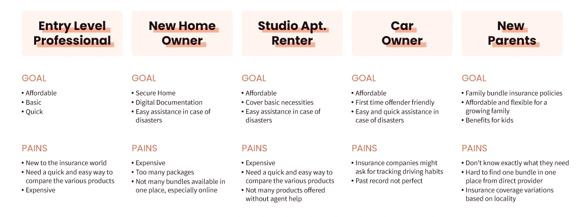
Because insurance was a completely new topic for me, I conducted user interviews to understand users' specific wants, needs, and behaviors. I recruited participants for the interviews from varying age group to learn overall user behaviors. Although some of the participants were part of the target audience, I also recruited outside of Kaus' ideal age group because during market and competitive research, I learned that most of Kaus' target audience - young people - would be first time or new insurnace buyers. Thus, to gain a holistic user understanding of the product itself, I felt it necessary to interview more experienced insurance buyers and gain their insights as well.
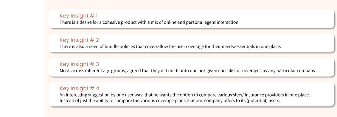
Conducting the research gave me a much better understanding of the product, the process required and the overall market behaviors that users found successful. Since Kaus did not already have an online presence, I started to define product requirements, goals, and mapped out user needs to get a clear idea of what needs to be designed.
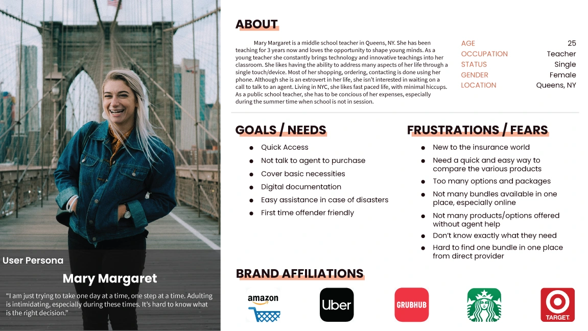
The first step in defining the product was to define a user persona to design for. While creating the persona, I combined client's target audience with my market research and insights gained from user interviews. This way all of my base user's data points are visualized in one place for reference as I further define and design the online insurance website for Kaus.
With a clearer understanding of Kaus and the insurance e-market, I compiled my research findings to define a sitemap. While researching, I explored many existing insurance websites to observe common and easy to use navigational patterns. Keeping those organizational patterns in mind, I created a sitemap for Kaus that also aimed to achieve the laid out objective of being an easy to use website that also allows users to easily filter through the products.
Creating the sitemap helped me think about the potential user flows. The user flow is made for the persona above: Mary Margaret, who as a new user would like to get a quote for an auto insurance and then complete the process by purchasing an option. Thus, I focused on creating a user flow that included all loops a new user would potentially go through. This required diligent thinking as insurance is a complex product. I defined the user's flow to be easy to use and give them the desired results without needing an agent.
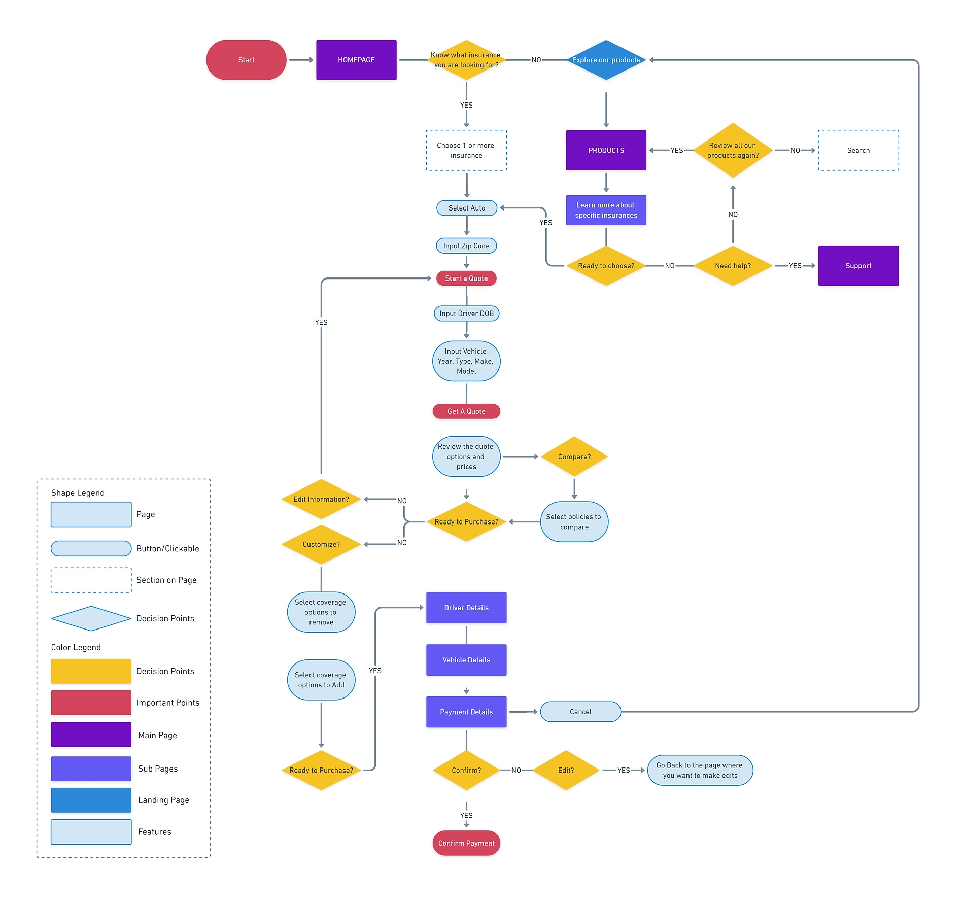
As I worked on defining a user's flow I was able to envision the layout and hierarchy of the process. This helped me prioritize the list of screens to start designing.
Having defined key product and screen requirements, I started sketching some wireframe ideas. Especially when it comes to designing from scratch, it always helps me to do hand sketches first - to fill a blank page with not only by ideas but also by ink. As a product itself needs to be designed from a blank canvas, it helps me to draw the ideas on a blank paper.
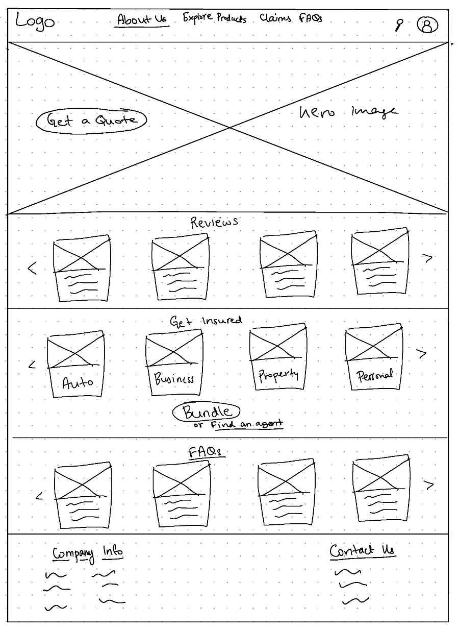
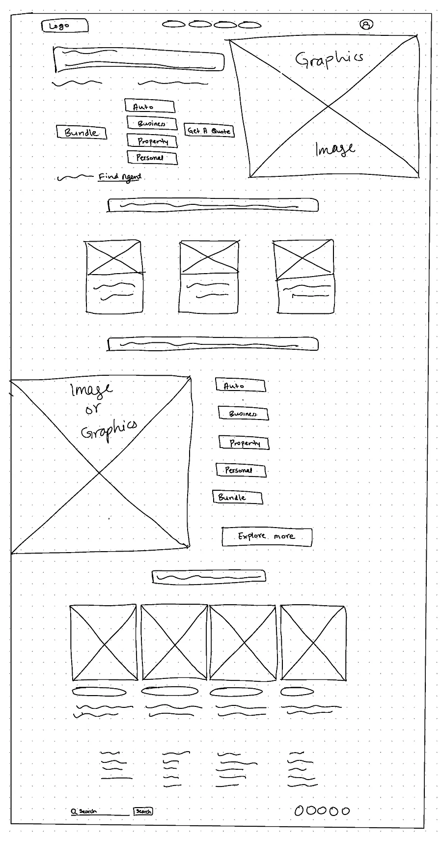
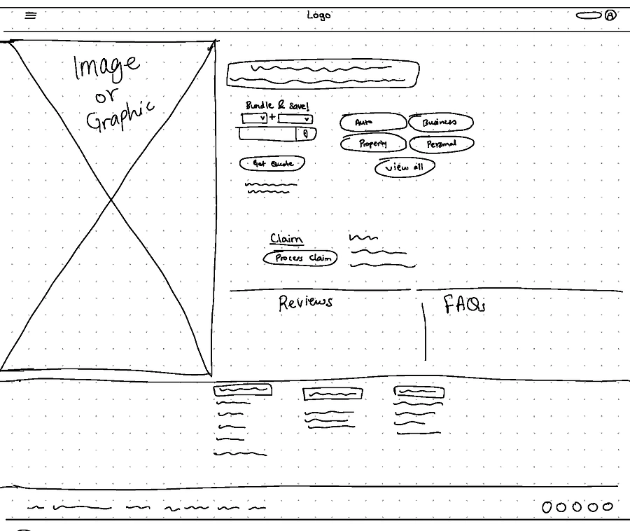
Once sketching got my creative juices flowing, I took my sketches into Figma and started creating mid-fi wireframes.
I created several design options during sketching and mid-fidelity. I was combing different successful navigational patterns that I had seen during research. I showed my design options during group sessions to receive feedback on my work. The feedback helped me select the plus points of the different design options and create one main design mid-fi wireframes.
I had initially created the buttons to select insurance as check boxes. But during the group discussion, someone mentioned how they look more like a toggle function. That idea stuck and hence I revised the design to function as toggle buttons rather than just check boxes.
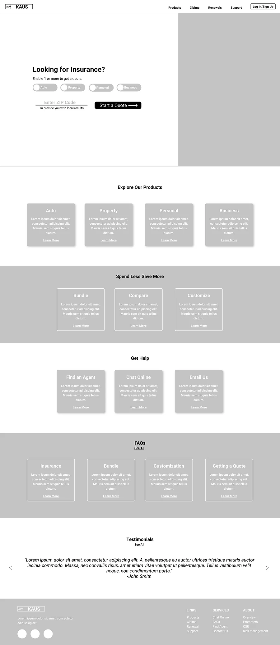
Since Design Option 2 had the more simple and organized layout as well as focused on reducing clicks required by users to obtain the information that they were looking for, I proceeded with this option to implement and explore with the style tile.
As we all know, designing is not a linear process.
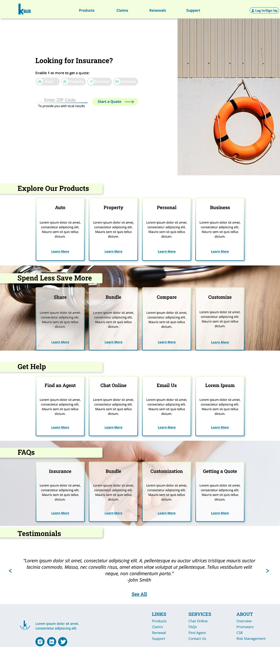
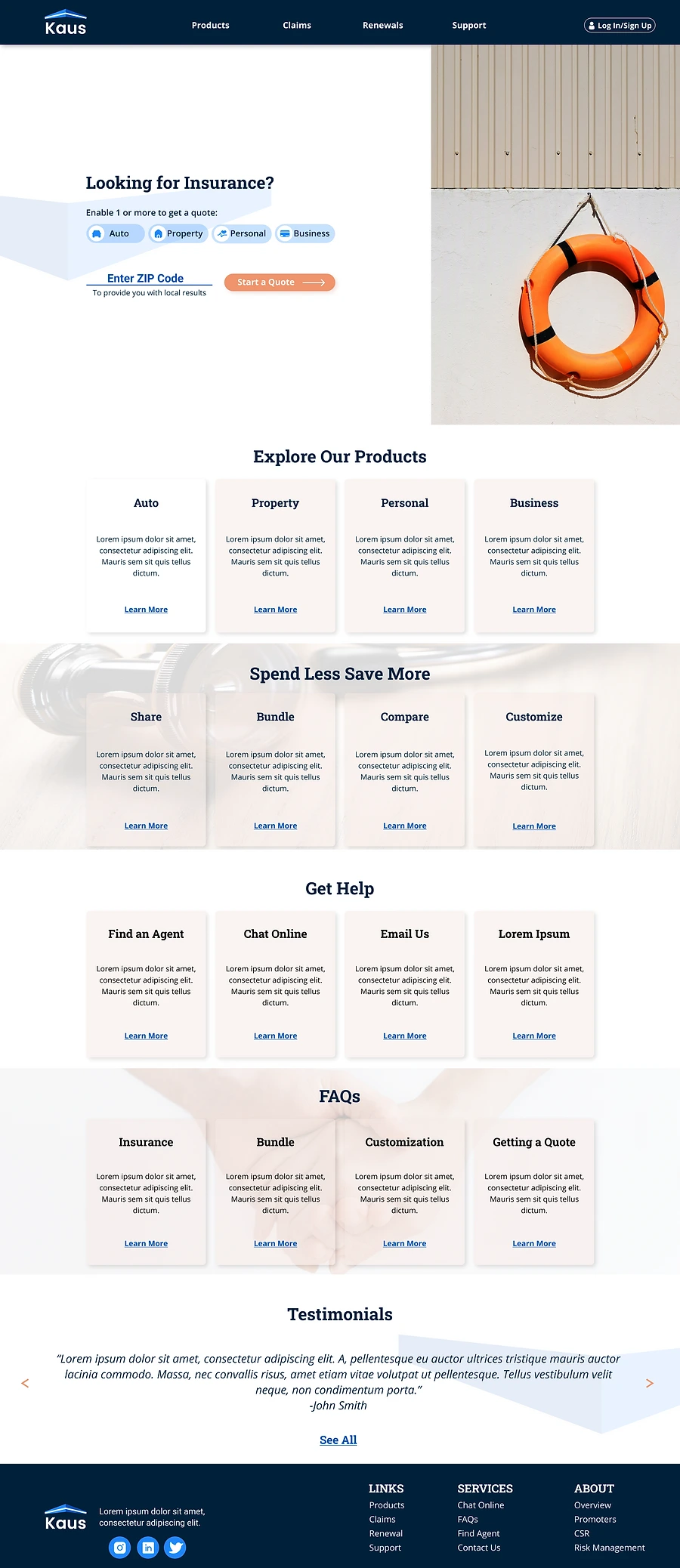
I went through several iterations of a style tile where I chose different typographies along with different color palettes and implemented them to the wireframes. Here are two of the design options that were developed off of the mid-fi wireframe idea # 2 seen above. Different styles of typography and color were applied to the screen. As I worked on designing this product, I started to understand the importance of color pallets + typography while designing a product.
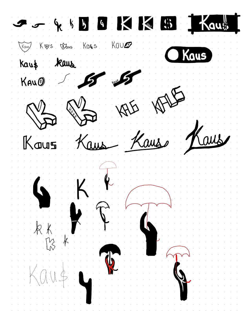
As Kaus did not already have an online presence and was aiming to refresh their brand, I went back to blank canvas when it came for logo design + branding. I again started by sketching by hand and explored many different design options for the logo. I first started by thinking about keywords of the product such as money, coverage, help, insurance. Therefore, I tried to design the logo using symbols such as hand, umbrella, dollar sign, or a shield.
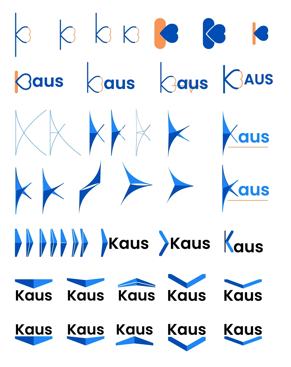
However, upon discussion with other designers and exploring common practices for logo designs for insurance companies in the current market, I realized that a minimal abstract design is more the right direction for Kaus instead of a detailed design. Thus, as I switched from hand sketches to vector designing, I focused on creating simple yet abstract logo designs that worked separate but along with the company name.
Another high-level goal of Kaus was to re-brand in order to to attract a younger crowd, I focused on creating a style tile to match Kaus' brand message: Trustworthy, modern, clean and clear. I choose blue as the main brand color as blue speaks the most of these keywords.
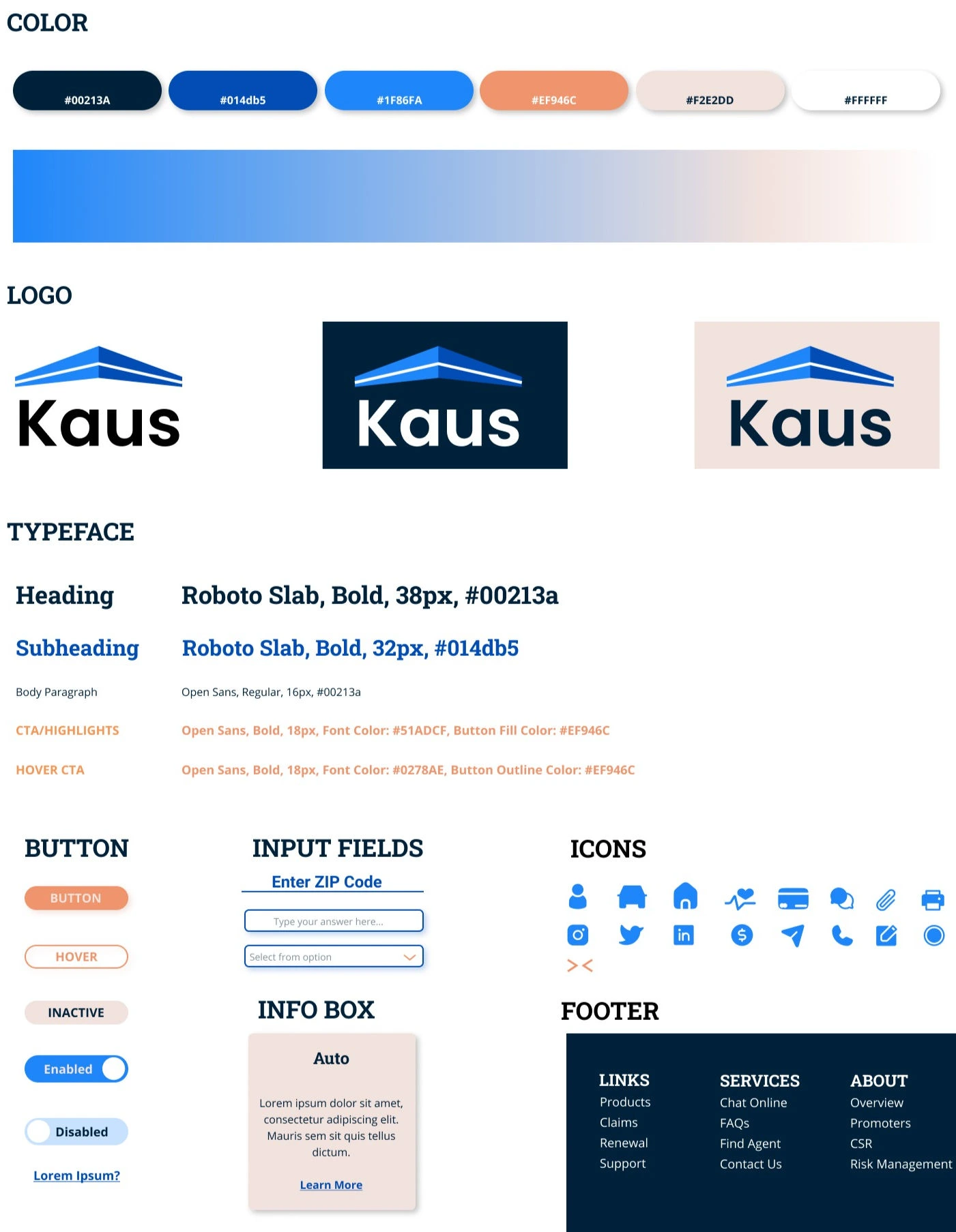

Once the style tile was set, I implemented it to the rest of the wireframes. As I worked on creating the high-fi wireframes, they kept evolving to successfully incorporate the visual hierarchy and key product information. I applied the final design consistently to the responsive screens to allow users ease of use no matter what device or screen size they used.
Once I completed designing the hi-fi wireframes. I put together a usability test plan. I planned out my testing goals and tasks for the participants so that I could prepare a full responsive prototype accordingly.
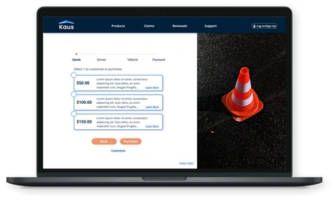
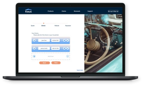
Remote testing via zoom call and upon participant agreement, screen was shared for observation.
Participants and Recruiting:
2-3 participants of ages 21-25, who are new insurance buyers.
2-3 participants of ages 50-55, who have previous experience of purchasing insurance.
I compiled all the feedback I received into an affinity map where different color of the stickies reference the feedback received for each page. I divided the feedback buy different pages. This helped me visually see the feedback for each page and prioritize necessary revisions.
Like this project
Posted Sep 4, 2025
Designed a responsive website and logo for Kaus to resolve complex insurance purchase process for young digital users.

