E-commerce Website Design
Naini Bansal
Silicone Zone has been in the business for about 20 years. They have been selling their products in store as vendors and wholesalers. However, with the rise of the internet and the pandemic, Silicone Zone has seen a reduction in in-store sales.
Solution:
Refresh their brand and redesign the current website to attract young bakers and crafters. The main priority is to have a responsive website that is easily browsable, contains an online shop that has the ability to filter by basic categories of products.
Objectives:
Redesign the responsive E-commerce website of Silicone Zone that is pleasing to use and that allows customers to browse through all products and easily filter by relevant data.
I wrote a Research Plan to guide me as I focused on learning about Silicone Zone's market, their competitors, common e-commerce practices, and the target audience. My goals and the methodologies used for the research were:
Learn common success and pain points of online shopping
Identify successful navigational patterns and filter functions on e-commerce websites
Learn how competitors use the digital space to target their audience
Understand the needs and requirements of online shoppers.
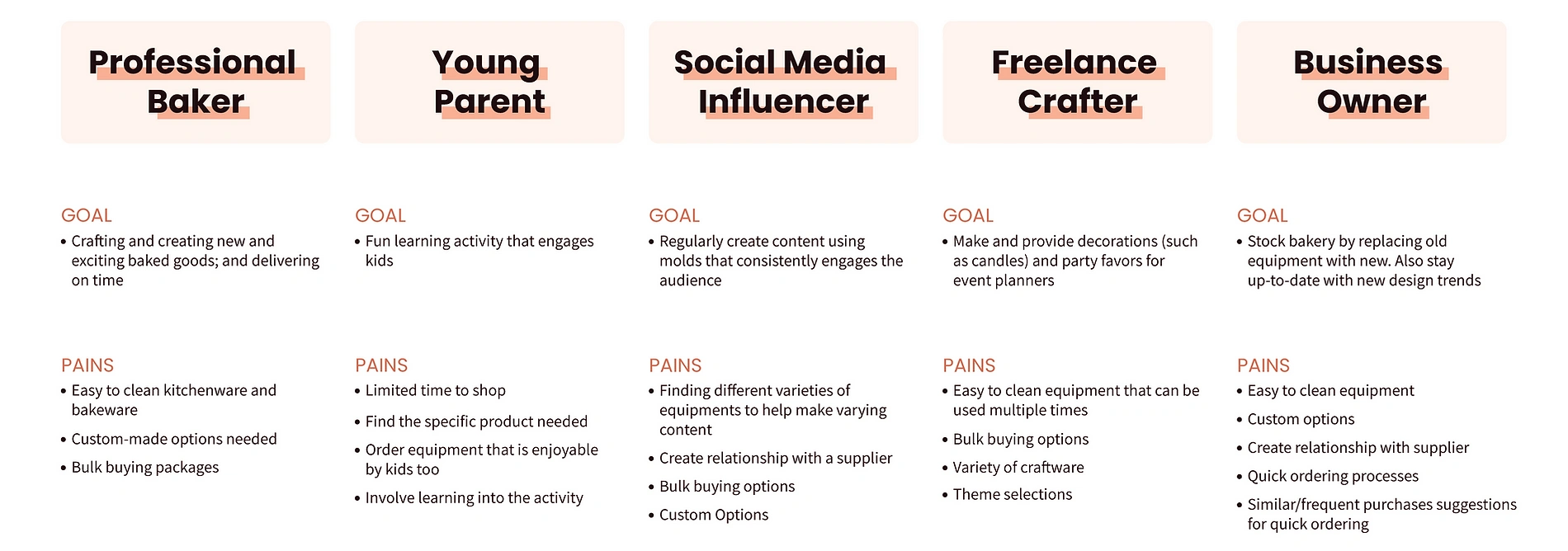
To achieve my research goal of understanding the needs, goals, and challenges of online shoppers, I conducted user interviews. While recruiting participants for the user interviews, I kept in mind Silicone Zone's target audience:
(4) Ages 20-30: Young digital users who shop heavily online.
(2) Ages 30-35: Digital users who only rely on online shopping for necessities.
Before conducting the interviews, I prepared anInterview Guide where I split the questions in two categories: General and Specific. The general questions were to understand the users' overall online shopping behaviors, whereas the specific questions were to understand their preferences regarding certain actions and features of e-commerce shopping.
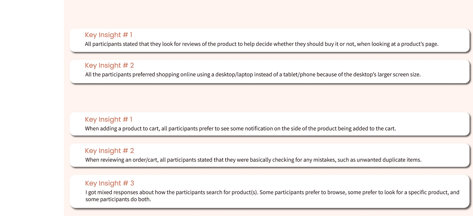
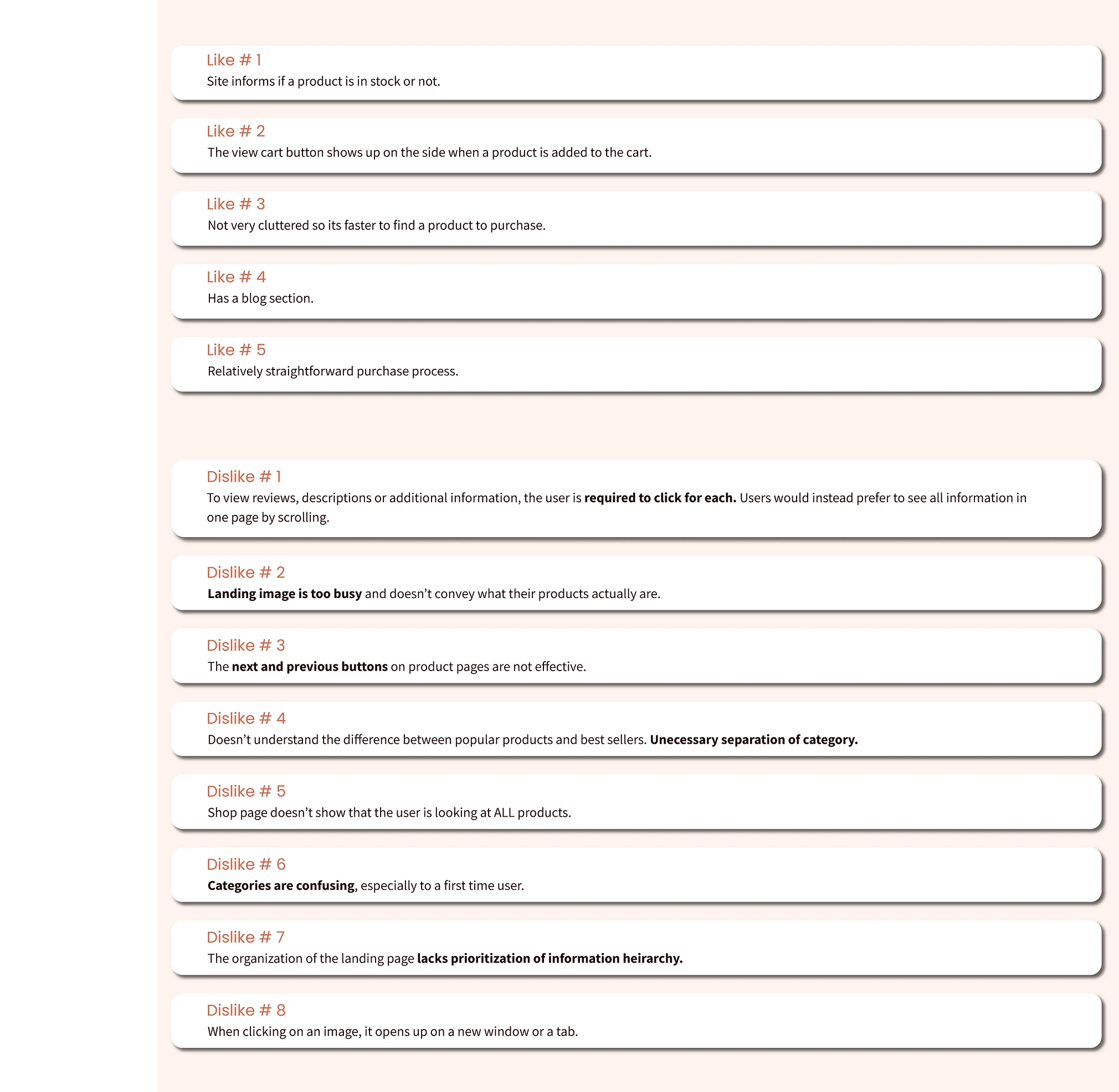
During the user interviews, I also asked participants to visit and explore the existing Silicone Zone website. I asked them to share their screen so I could observe how they navigated through the site and gain some insight into what were the current pain points for the users.
Conducting user interviews before doing market research helped me have a better understanding of online shoppers' overall behaviors. Gaining user feedback of Silicone Zone's existing site also gave me a solid ground to continue my research on. Combining what the Product Owner informed me about their desired target audience with my insights gained from the user interviews, I created five provisional persons. This way I always had my users in mind while researching, defining, and eventually designing.
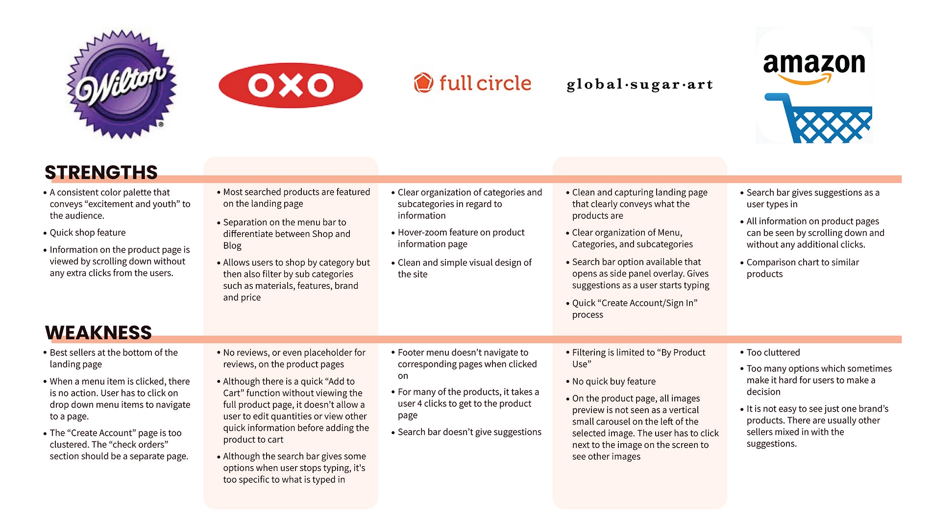
I continued with my research to understand how Silicone Zone's competitors were addressing the same challenge of having an online presence that attracted almost the same target audience. As laid out in my research goal, I focused on learning what were common navigational patterns and filter functions for e-commerce websites. I also analyzed the competitor websites to learn what were some success and pain points for my target users based on the insights I gained from user interviews.
As was concluded by many users during the interviews, the existing site needed a better organization of information. Thus, the natural next step for me was to conduct a card sorting activity. I created and conducted this using optimal sort.
However, the results of the card sorting activity were inconclusive. Upon consulting other designers, I concluded that Silicone Zone had too few products and categories for a successful card sorting activity. This limitation caused the participant results to lack a consistent pattern from which I could implement changes going forward.
Although the card sorting activity was not a success, it helped me understand my client's products in a different light. I realized that I could not treat Silicone Zone as any other e-commerce website. Silicone Zone created and sold specialized bakeware products, thus I focused on that specialization. Thinking this way allowed me to better understand my client's product, and I was able to work to provide users a clearer organization and separation of categories.
With a clearer understanding of Silicone Zone and its products, I compiled my research findings to define a sitemap. As it was noted by users that the existing landing page lacked prioritization of information hierarchy, that is where I started. I also reduced their navigational menu items to allow focus on the big three separations of the site: Shop, Blog, and About Us.
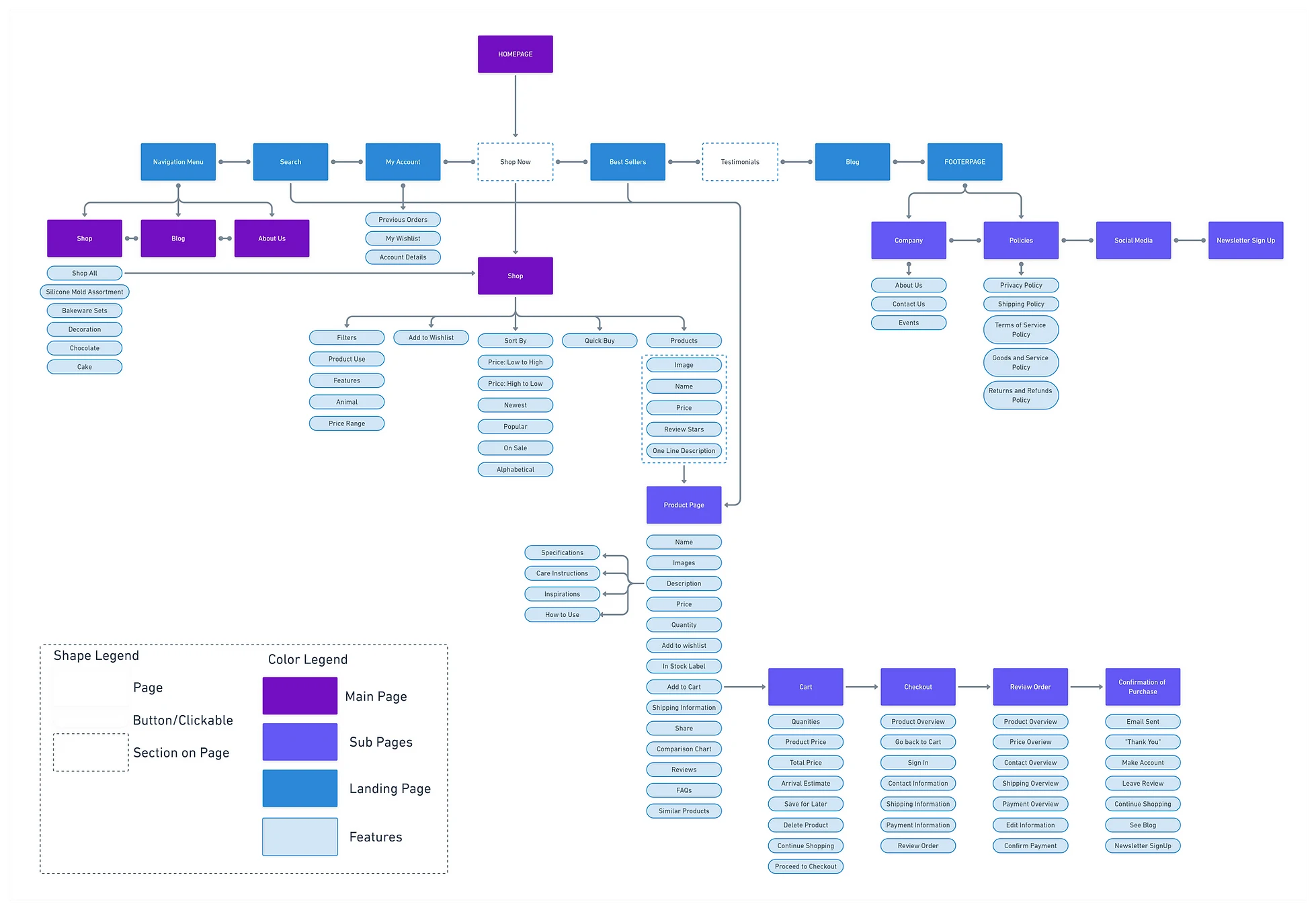
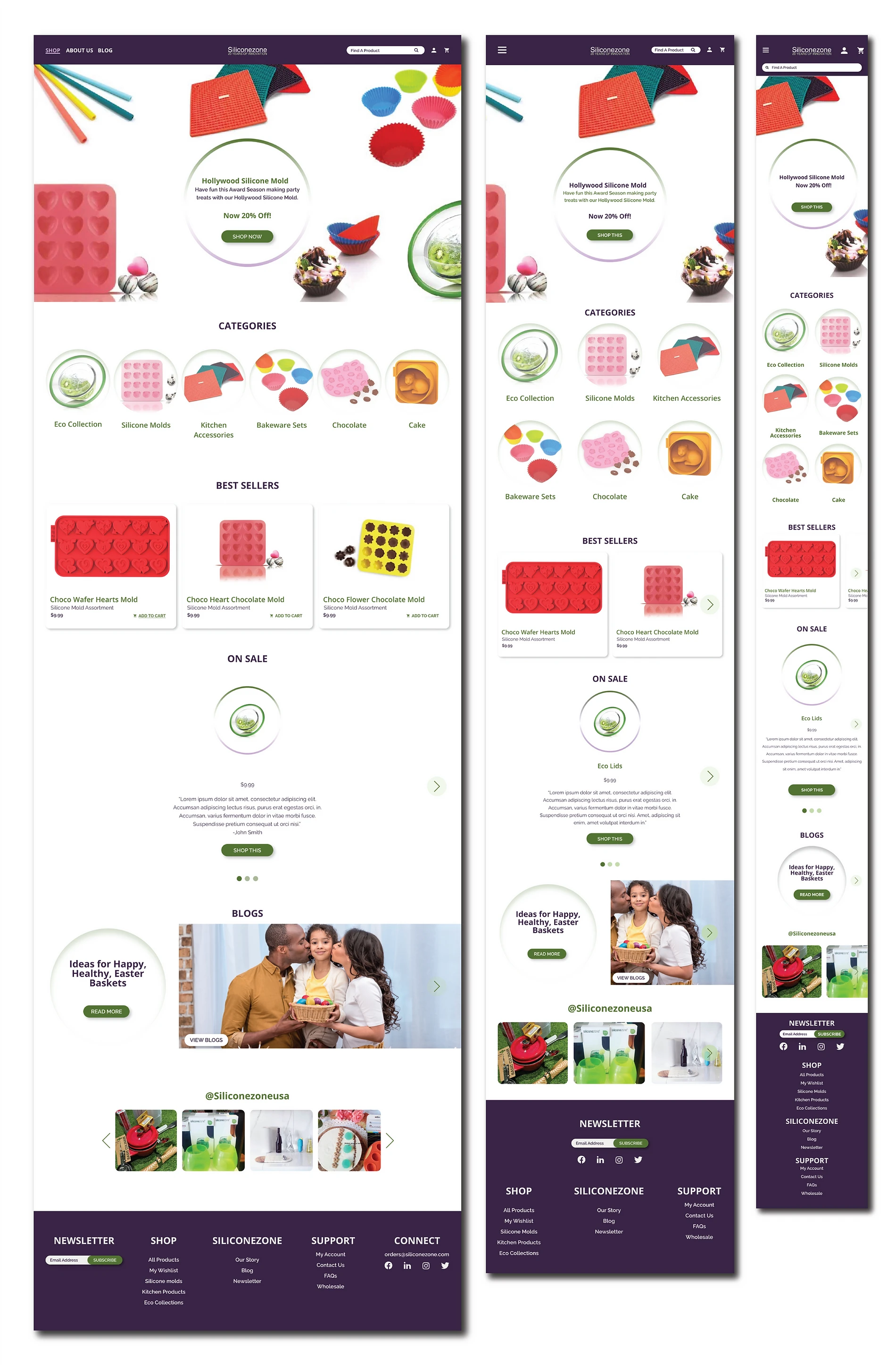
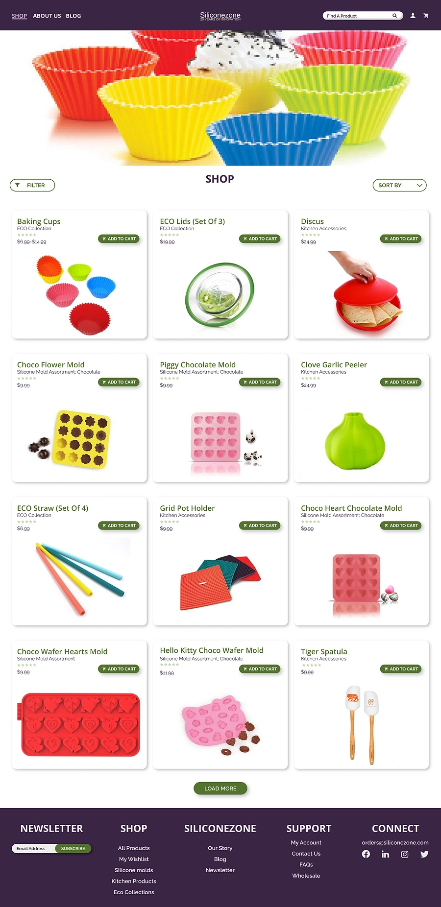
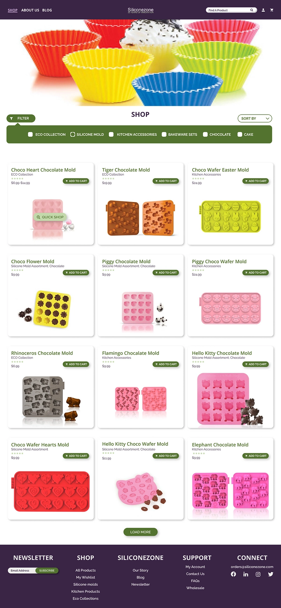
As the goal during this phase one of this project was to make online shopping more attractive and easier for Silicone Zone's target audience, I developed the rest of the sitemap focusing on just the Shop portion of the site. Creating the sitemap helped me think about the potential user flows. It also allowed me to envision the layout and hierarchy of the online shop screens that I needed to design which I implemented in the flow task below.
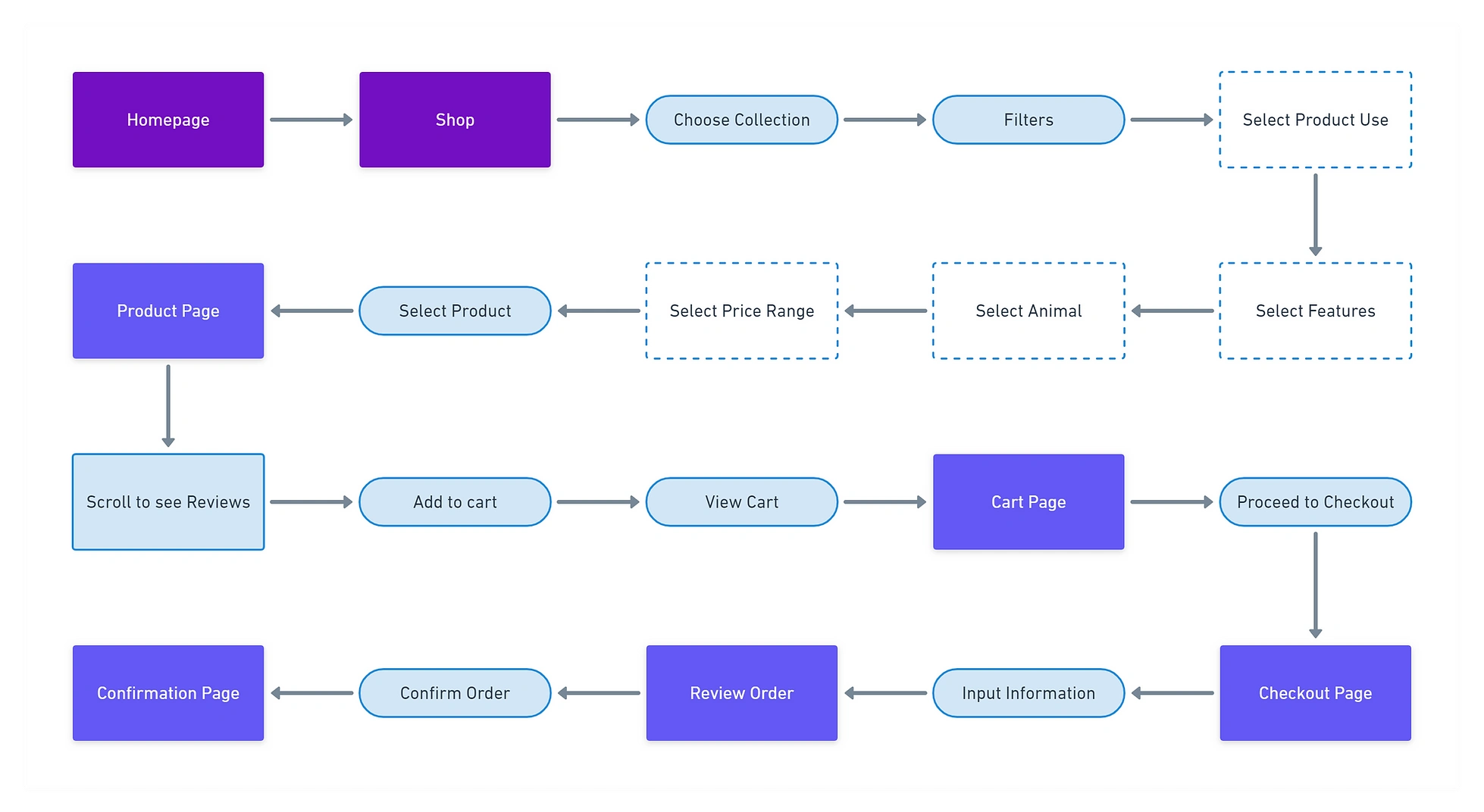
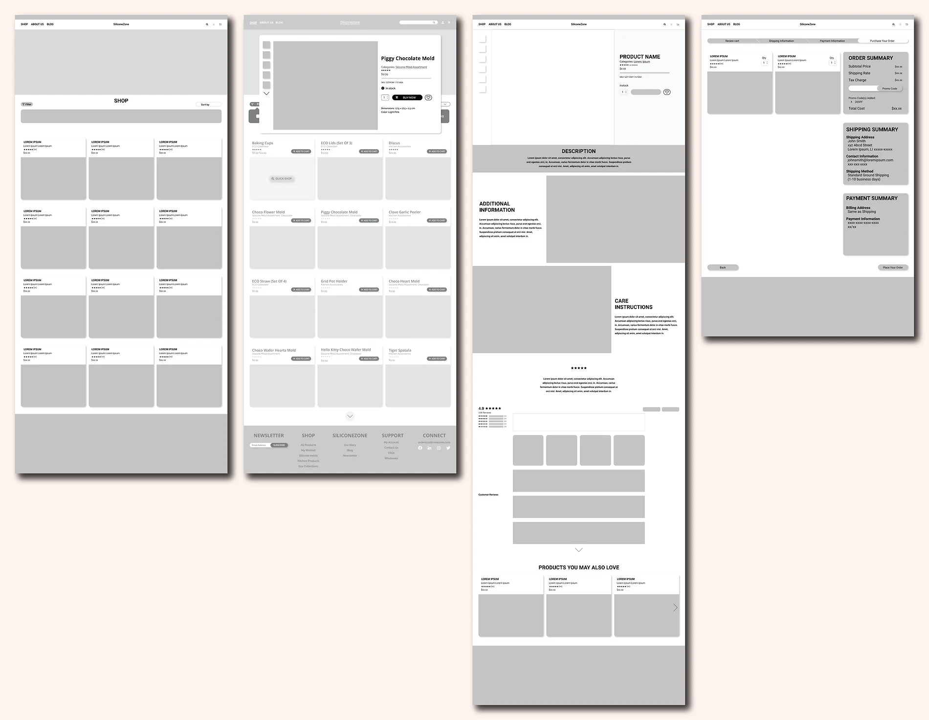
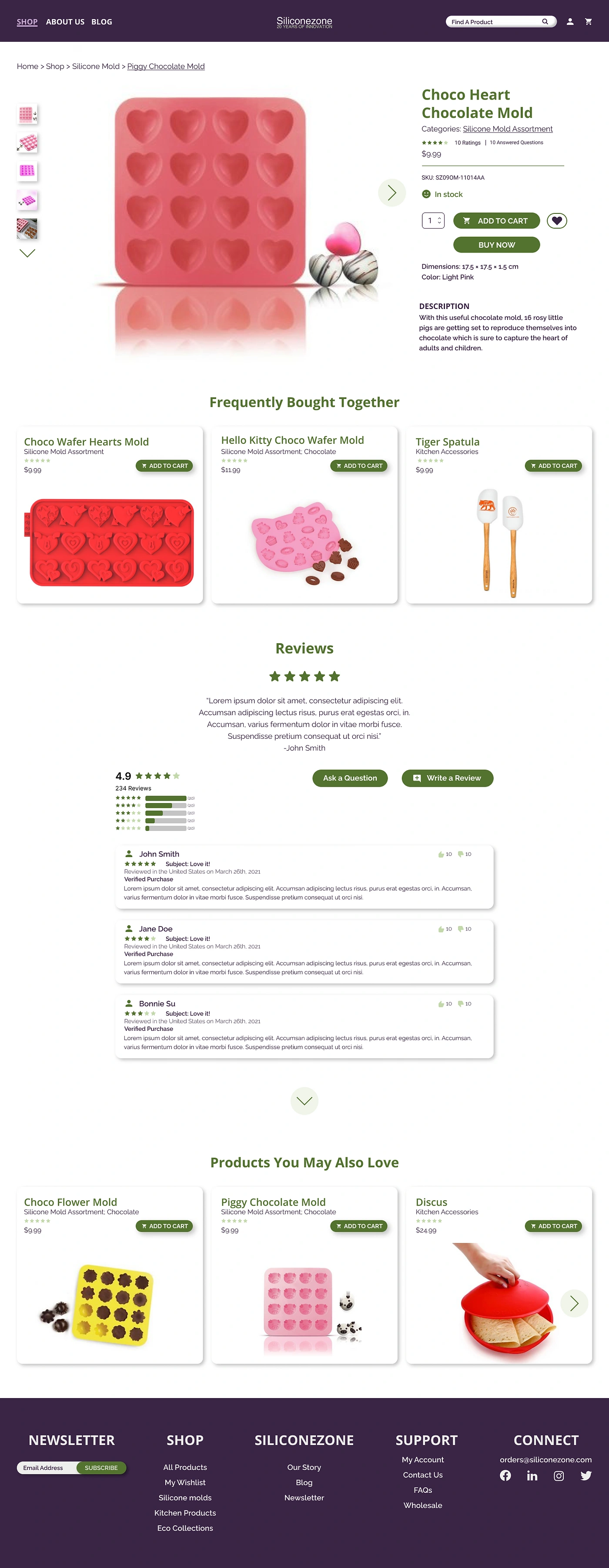
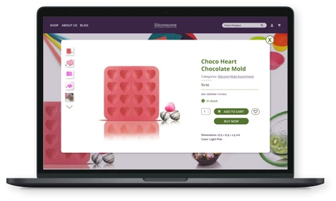
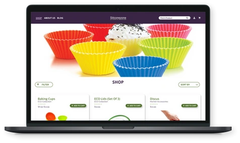
The define phase helped me identify key screens to design. I focused on creating low-fidelity wireframes of the homepage, shop page, quick buy card, product page, and the checkout page. While working on these wireframes I used inspirations from other e-commerce sites and Silicone Zone's competitors to implement successful common design patterns. At the same time I tried to avoid common pain points experienced by online shoppers that I learnt about during user interviews.
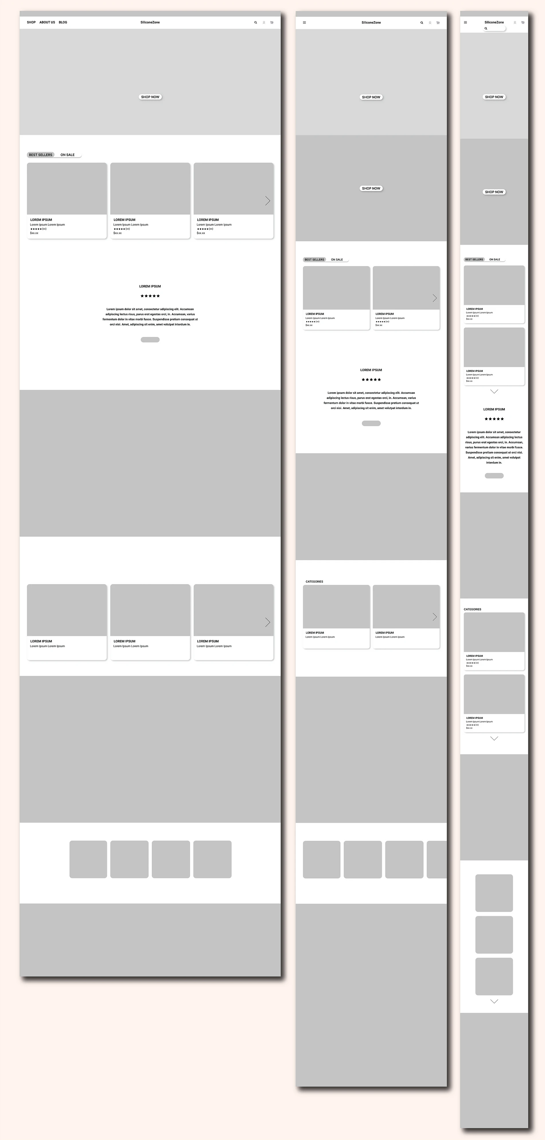
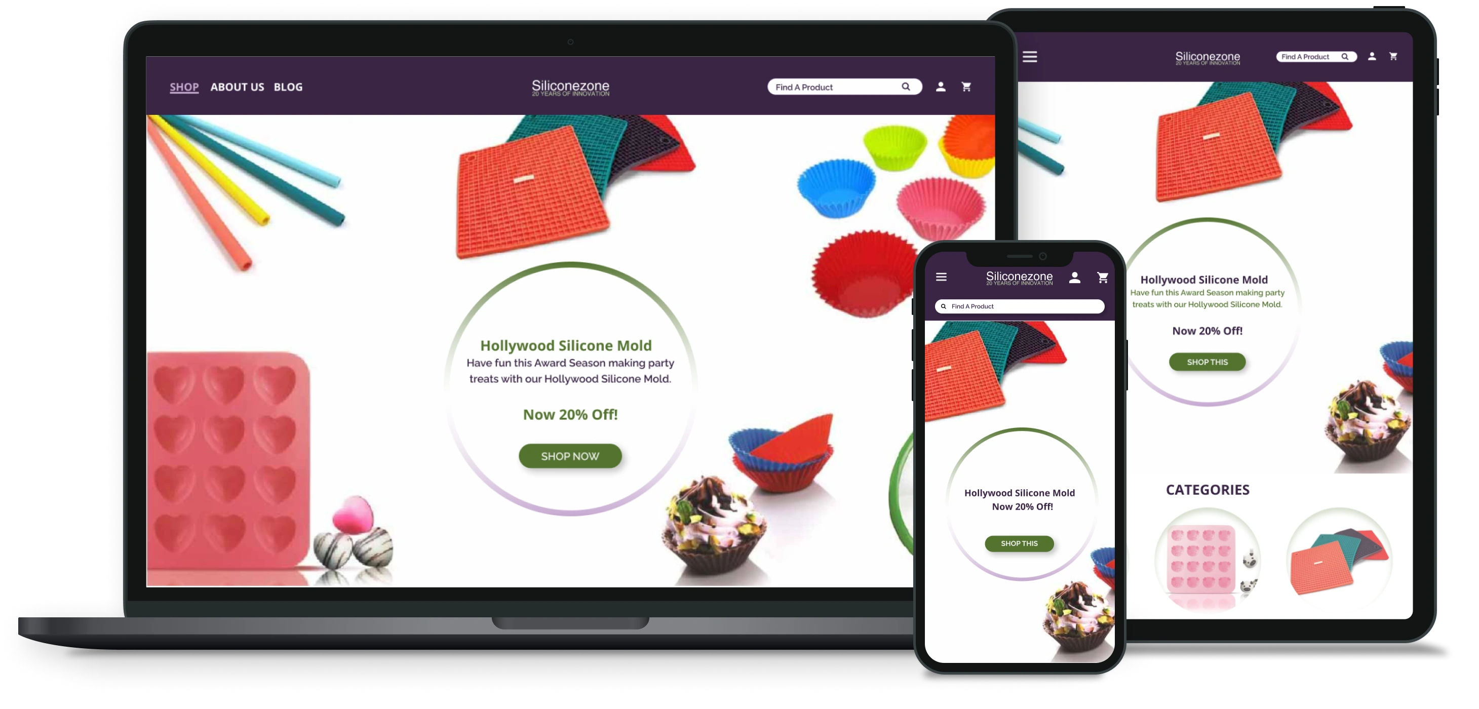
Since logo designing was a low priority risk, I focused on refreshing their color pallete and overall style. The existing site of Silicone Zone had a light green as a color throughout their site. Therefore, to refresh the site, I chose purple to attract artists and crafters, as those were the target audiences. I contrasted the purple with the green for highlight to continue with the client's existing choice, but chose a better contrast of green that works with accessibility guidelines too. This helped me create a style that touched creativity but also spoke to the ecommerce aspect of the site.
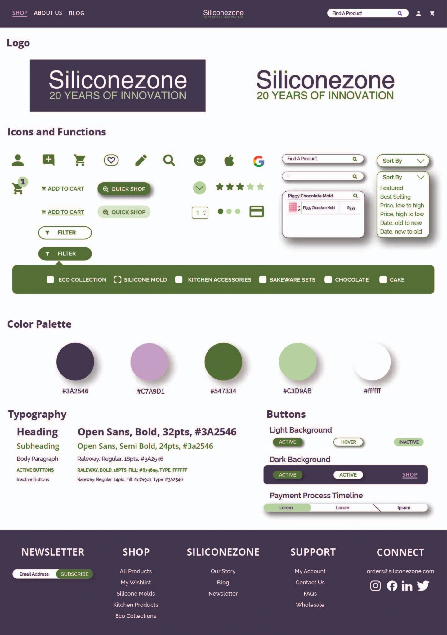
Once I had a style guide set, I applied it to my low-fidelity wireframes to create the responsive UI's. I built on research and group feedbacks to create the responsive UI's using the established style guide. As I designed, I prioritized simplicity while bringing focus to the client's products.
Once I completed designing the hi-fi wireframes. I put together a usability test plan. I planned out my testing goals and tasks for the participants so that I could prepare a full responsive prototype accordingly.
Evaluate if the users are able to successfully navigate through the landing page and purchase a product.
Subject of the test:
Testing high-level prototype for desktop
Remote testing via zoom call and upon participant agreement, screen was shared for observation.
Participants and Recruiting:
4-5 participants of ages 50-35, who have experience shopping online.
3 out of the 5 participants were also part of the user interviews during the research phase.
Conducting the usability testing gave me user insights of my designs. The 3 participants who had seen the existing site of Silicone Zone said that it was much more clear to them what Silicone Zone's products were in the new design as compared to the old.
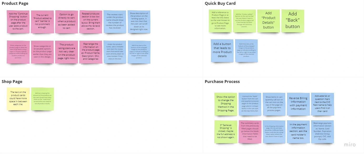
I compiled all the feedback I received into an affinity map where different color of the stickies reference a different participants. I divided the feedback buy different pages. This helped me visually see the feedback for each page and prioritize necessary revisions. As you can see from the affinity map below, the product page, based on user feedback, required the most edits. Thus, that is where I started when making priority changes.
Working to improve an existing website had its perks and challenges. One of the perks was that, as a designer, I realized that I will not always work on a fresh or new product. Therefore, I learned how to analyze an existing product and make effective changes for the target audience.
A key learning during this project was that all UX/UI steps do not apply to every project. As stated earlier, conducting a card sorting was not a helpful activity during the define phase for this product. Since Silicone Zone sells specialized products, it also needed a specialized process for defining the changes needed. Surprisingly, the key here was to focus in on the client's individual product rather than apply a "one size fits all" system.
Next Steps:
1. Present the final design to the product owner.
2. Make revisions based on client feedback. Depending on the depth of feedback, might have to iterate and re-test.
3. Prepare package of final design for the developers, and work with them to achieve a improved e-commerce website for the client.
Like this project
Posted Sep 4, 2025
UX/UI Design and Prototype of an E-commerce site with user interviews, market research, and usability tests.
Likes
0
Views
12
Clients
SiliconeZone