Built with Framer
AccioJob Placement Portal
Priya Bhatt
Designing the AccioJob placement portal from a PRD, one edge case at a time
A 10-month story of shipping V1 from a PRD, watching real students use it, and rebuilding it into something that actually held up.
tl;dr
What is it
The full placement portal for AccioJob, a YC-backed edtech helping students land software engineering jobs. I designed V1 from a PRD and rebuilt it into V2 based on real user data.
Who it's for
Students preparing for tech jobs, using AccioJob for mock interviews, test series, and applying to companies hiring through the platform.
My role
Product Designer
Sole designer for 10 months. Daily syncs with two PMs, occasional direction from the CEO. Owned the placement portal redesign and a full landing page rebuild in parallel.
The 36%
After V2 shipped, visitor-to-active-user conversion went up 36%, with active users being students who actually applied to jobs and got placed.
Overview
AccioJob is a YC-backed edtech that helps students prepare for and land software engineering jobs. Students take prep courses and mock tests, build a profile, and apply to companies hiring through AccioJob. The platform runs both online and offline training across India.
I came in as the design partner and stayed for 10 months, from July 2024 to April 2025. I was the only designer on the project. I worked daily with two product managers, one for the placement portal and one for the landing pages, alongside a backend engineering team. All three founders were hands-on and would sometimes hand me work directly.
Problem
A jobs list that needed to become a real product.
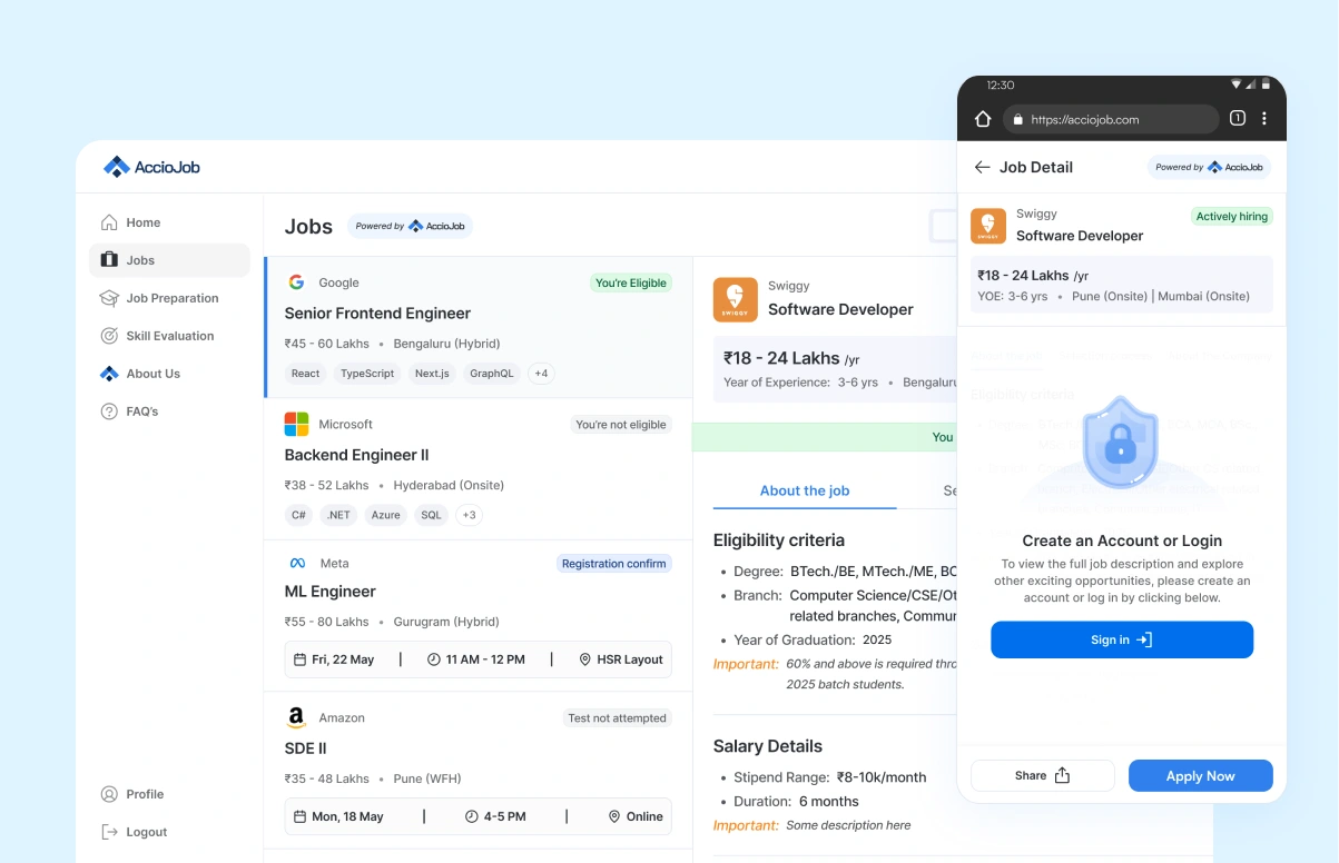
When I joined, AccioJob already had a small jobs search feature sitting inside their existing product. Students could browse a list of openings. That was about it. It worked, but it was a list, not a product.
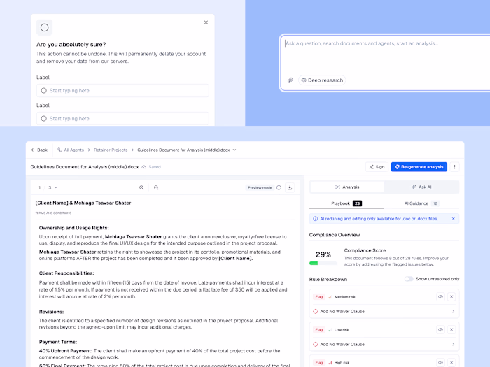
The PM handed me a PRD, and the brief was a lot bigger than the list. They wanted the full placement portal. Job cards, prep services, mock interviews, test series, coding tests, an overview dashboard, applications, status tracking. The whole stretch of what a student needs from "I want a job" to "I got placed."
We had about two to three months to ship the first version. The engineering team was fast, fast enough that they could build almost as quickly as I could design, so the deadline was real and there was no room to overthink it.
Research
I didn't start with research. I started with a version, and let it become the research.
Here is where I want to be honest about how this project actually worked. I didn't run user interviews before designing. The PM owned research, and the timeline was tight. So the plan was different. We would ship a real first version, put it in front of real students, and let their behaviour tell us what to fix.
That meant V1 wasn't the final answer. It was the question. I designed it well, but I designed it knowing the data coming back from it was the actual brief for what came next.
Approach
Version 1
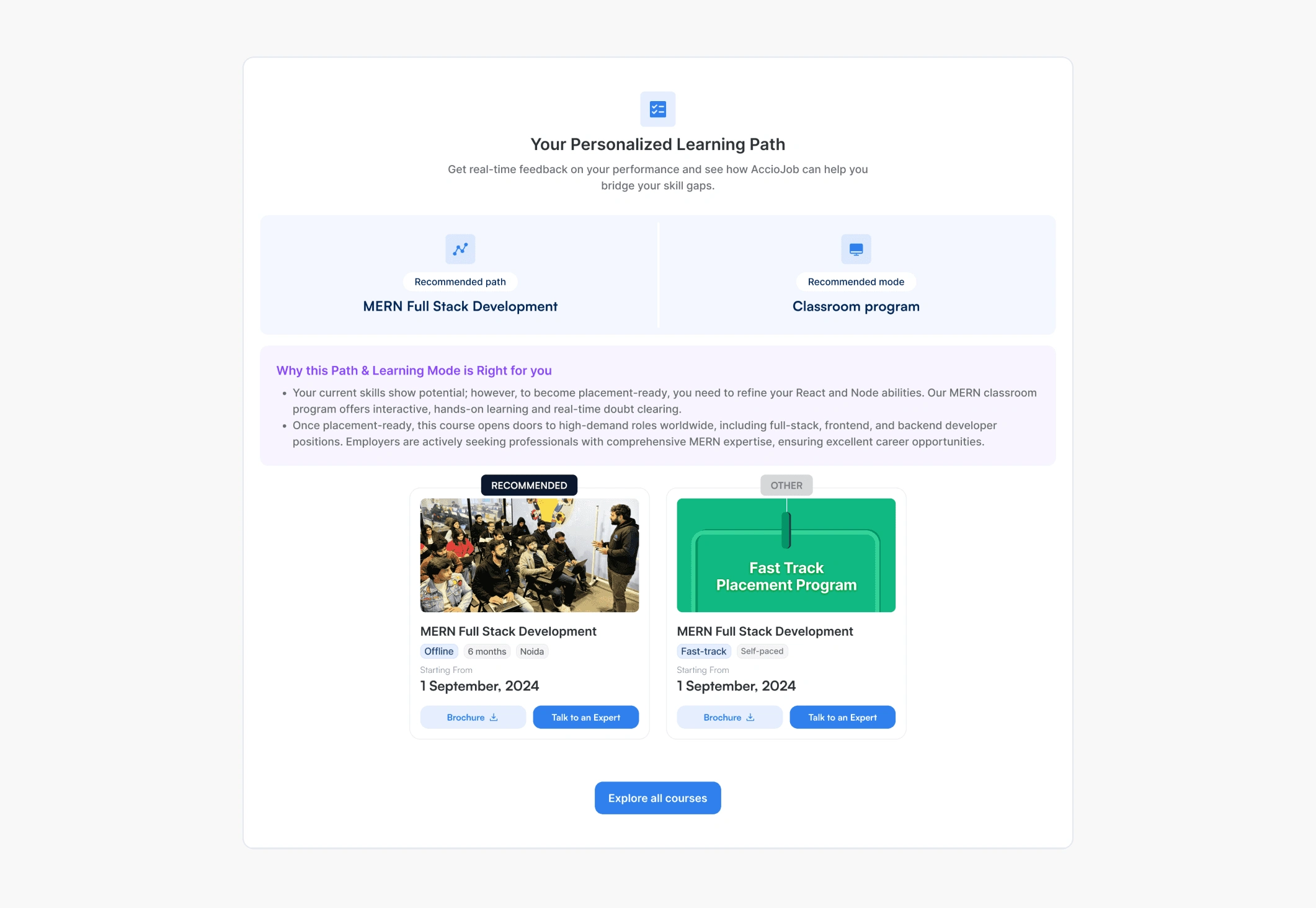
V1 was about getting something usable in front of students fast enough to learn from it. I designed the job cards as clean, readable cards, one per company hiring, with the role, the basic info, and an apply button. I designed the prep services, the mock interviews, the test series, and the coding tests, all bookable from the portal. And I designed a single overview dashboard where a student could see applied jobs, tests attempted, and progress in one place.
Job cards
Prep services
Overview dashboard
V1 shipped in roughly two to three months. Students started using it. The paid prep services were getting bought. People were applying to jobs through the portal. On the surface it was working.
The Data
A few months after V1 shipped, we had real usage data to look at.
What was working
Students were buying prep services, applying to jobs, and the basic flow was holding up.
What wasn't working enough
Students often didn't know where they stood in the application process. A card said "applied" or "test ongoing" but the experience in between those states was flat. There was no sense of momentum, no clear next step, no acknowledgement of progress.
The real gap was that the job cards weren't telling students enough. They were checking back without clarity, or worse, dropping off because they assumed something had gone wrong.
The question for V2 became simple:
How do we make sure every student, at every stage, knows exactly where they are and what to do next?
That meant designing for every state, not just the happy path.
Solution
Version 2
V2 was the big upgrade. Built on real usage data, focused on edge cases, designed to make every state in the journey feel intentional. Three connected pieces of work made up v2, and each one set up the next.
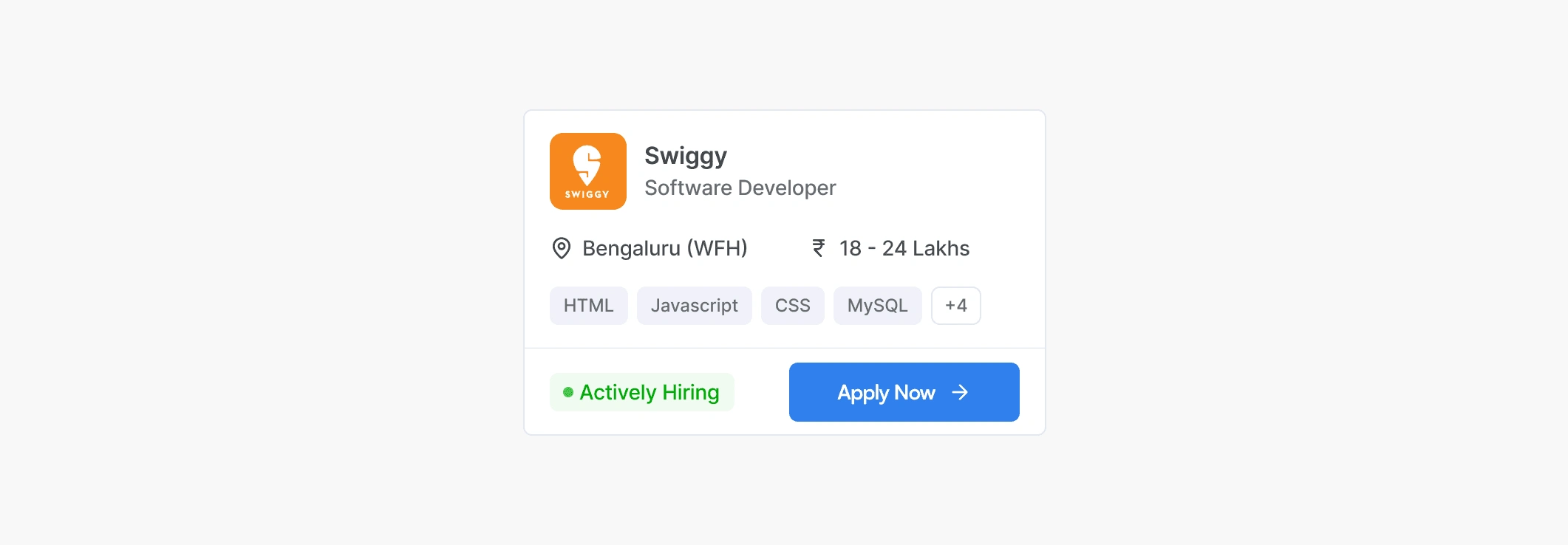
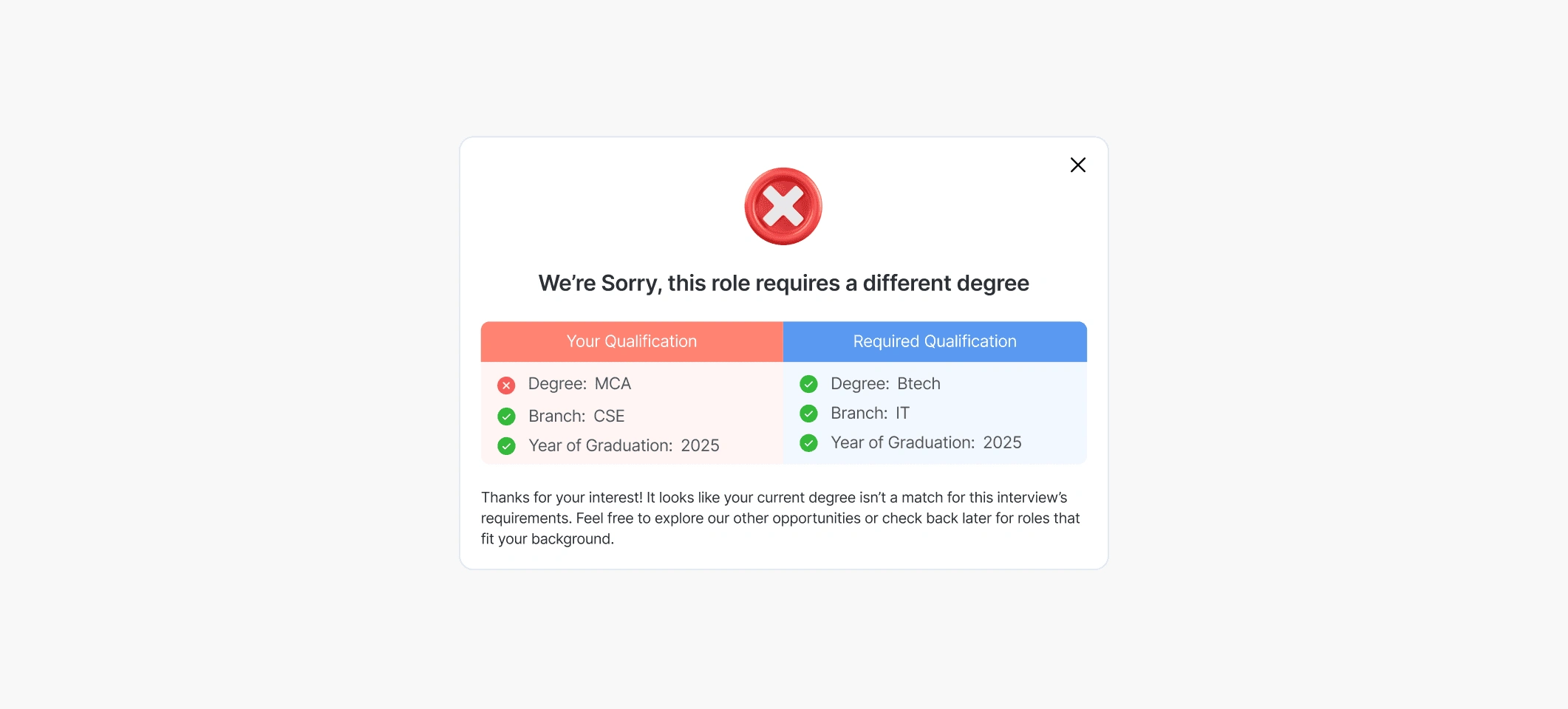
Job card states
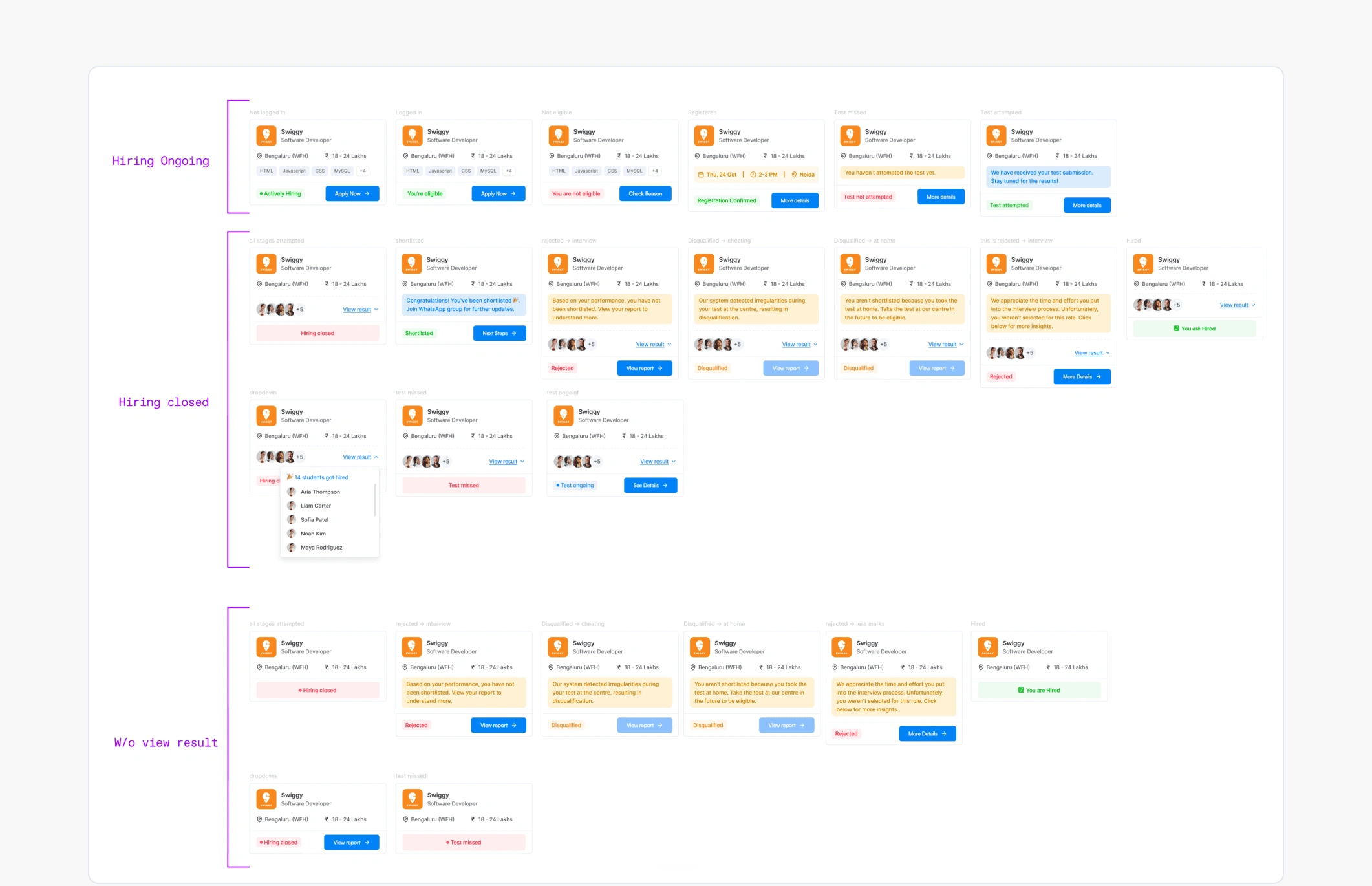
I designed for every possible state a student could be in:
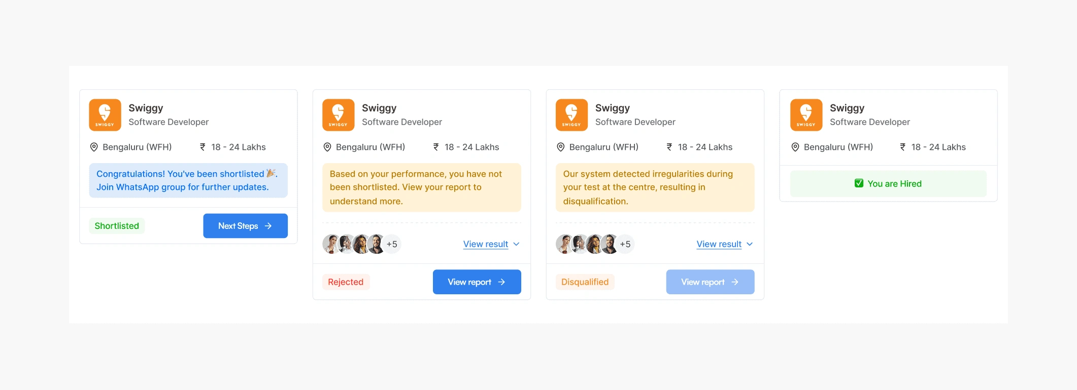
The principle behind this was Visibility of System Status, the first usability heuristic in UX, which says a system should always tell users where they are and what is happening. If a system hides information, users assume the worst. So even when the state wasn't good news, like rejected or disqualified or hiring closed, nothing was hidden. The state itself became the design.
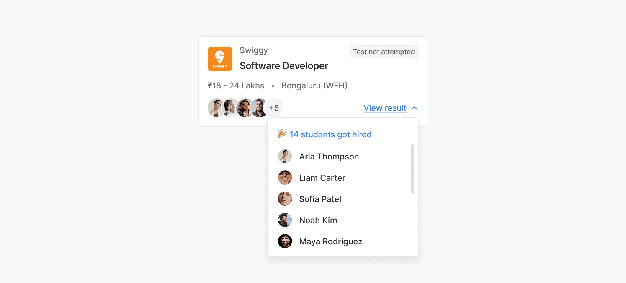
For shortlisted students, a short congrats line and the next step. For hiring closed, a view result link showing how many students actually got placed through that company, which turned a dead end into social proof at the exact moment a student might have felt discouraged. The hardest part was the eligibility logic. A student needed to know not just that they weren't eligible, but exactly why, otherwise the system felt like a black box. So the Job Details page changed its content based on the student's state: about the job, the selection process, about the company, why you are or aren't eligible, and what to do next for your specific stage.
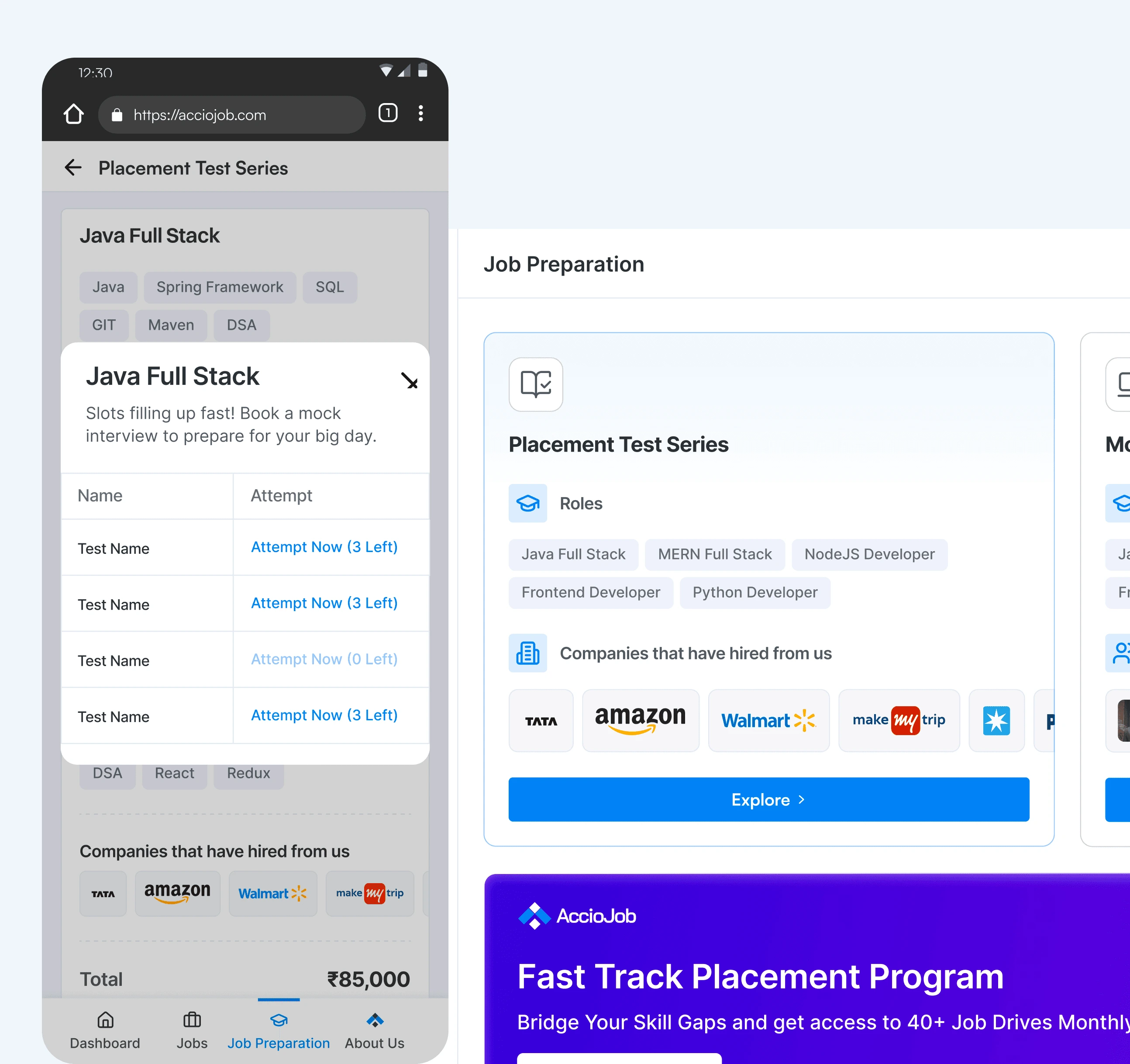
Skill evaluation
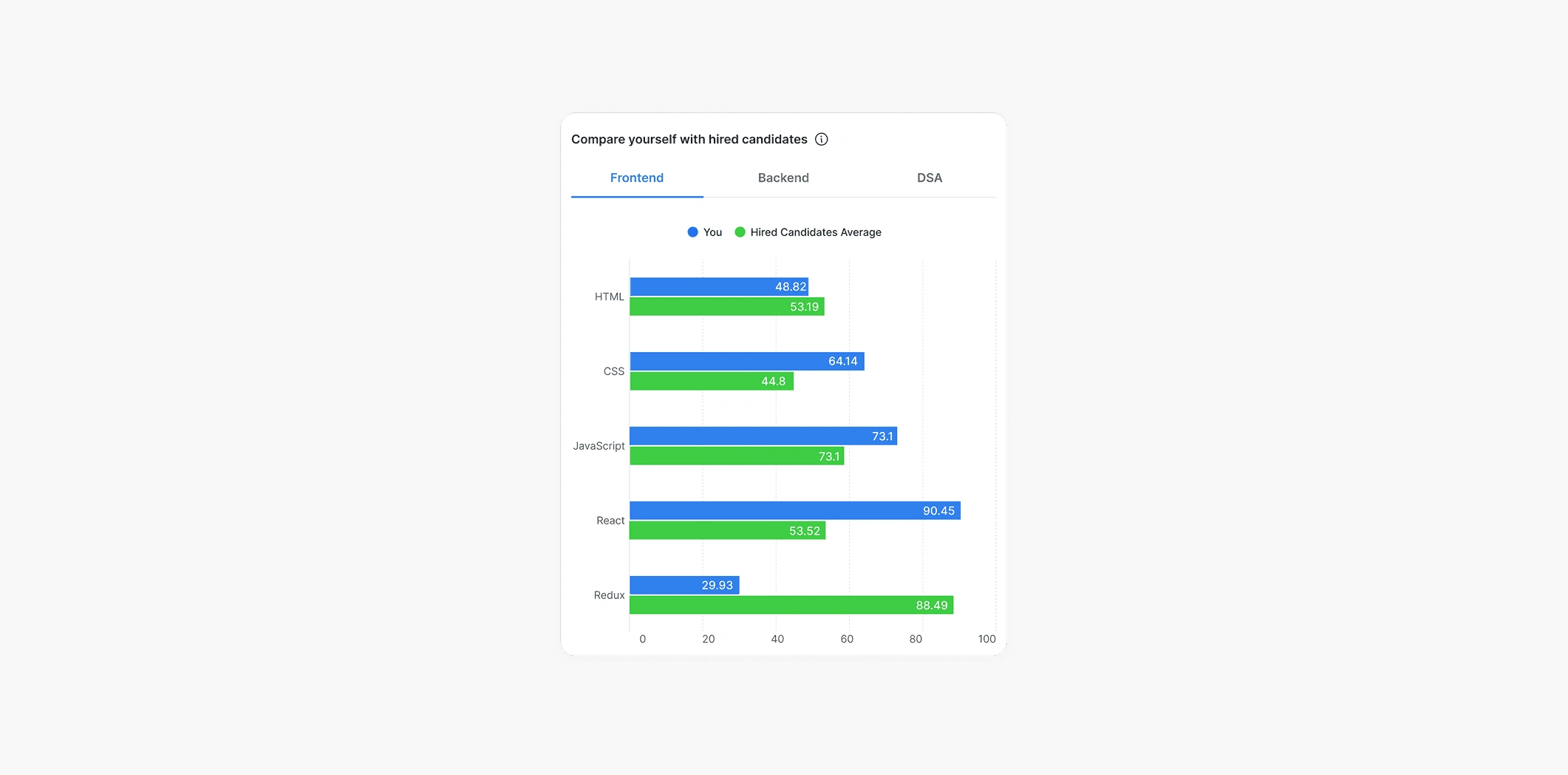
The skill evaluation section was new in V2. After a student took a test for a company, they got a comparison screen. Not just "you scored X," but how their performance stacked up against the candidates who actually got hired by that company. This changed the conversation. Instead of a student thinking "I wasn't good enough," they could see which specific skills the hired candidates were strong in, where they themselves were weak, and what to actually work on. The screen wasn't just data. It was the setup for the next step.
Personalised recommendations
Once a student knew where they were weak, they needed to know how to fix it.
The principle behind this section was Adaptive Personalisation. Unlike generic recommendations that say "take this course," adaptive personalisation adjusts what's recommended based on a user's actual context, not just their past behaviour. Generic recommendations are exactly what students were already ignoring on every other platform. So the logic had to consider the student's actual situation.
Rejected Students
For rejected students, the design needed to do more than deliver bad news. A reject screen that just says "you didn't make it" feels punishing. So instead of a flat rejection, each rejected state showed a performance-based message with a link to the student's full report. They could see exactly where they fell short and what specifically to work on next.
What V2 added up to
After V2 shipped, visitor-to-active-user conversion went up 36%. Active users in this context meant students who actually applied to jobs through AccioJob and went on to get placed.
The 36% wasn't from any single feature. It came from the combination. Students could see where they stood, understand why they were or weren't progressing, and get a clear next step every single time. The whole journey felt designed instead of patched.
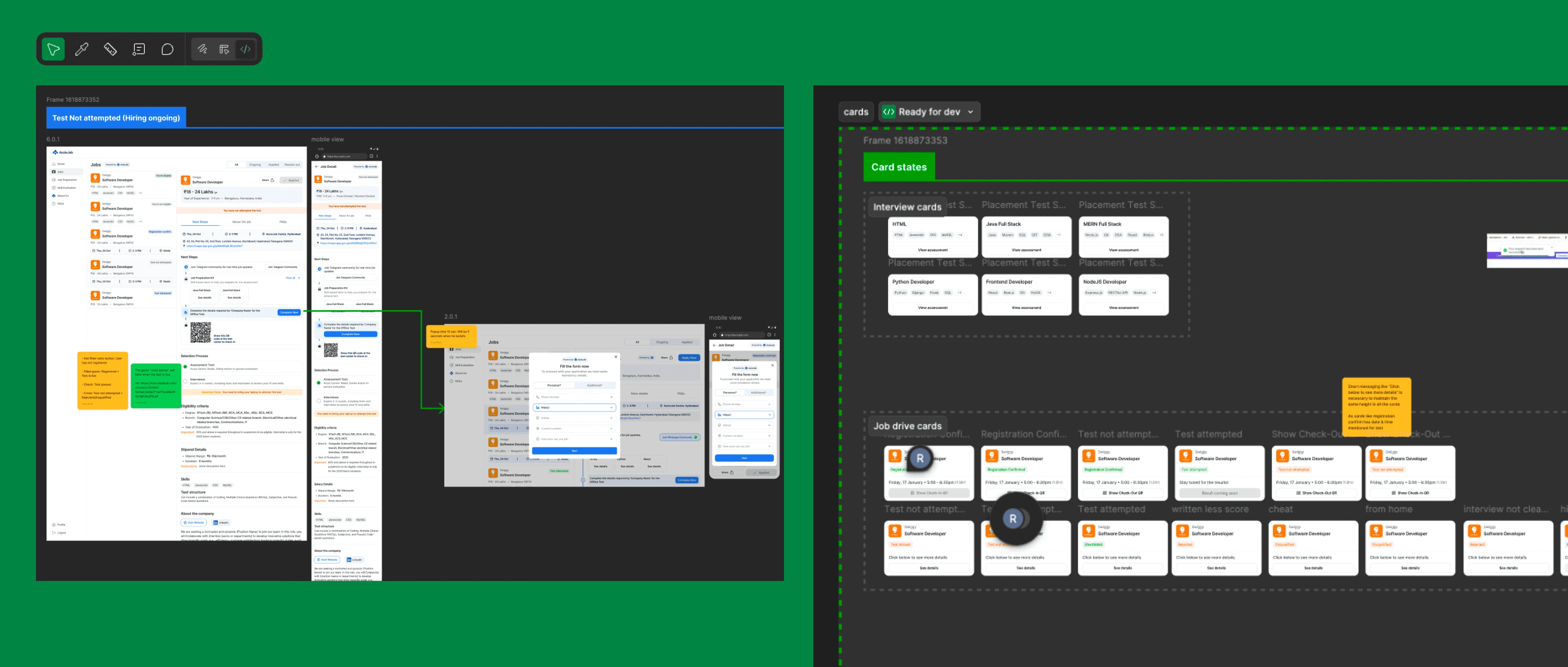
Making it Real: Clean Developer Handoff
Designing a great product is only half the journey, the other half is making sure it comes to life just as intended. For this product, I cared as much about the handoff to developers as I did about the pixels on my screen.
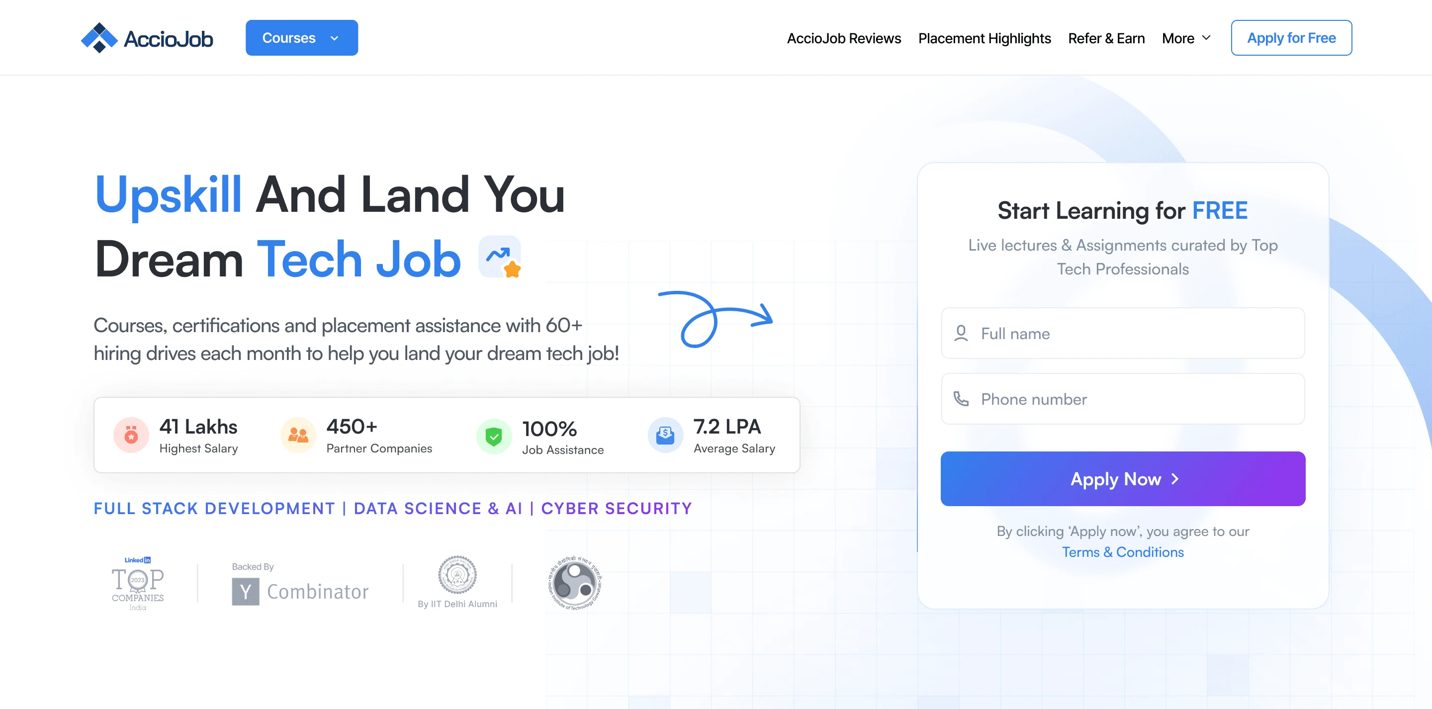
The Landing Page
In parallel with the placement portal work, I also led a full redesign of AccioJob's landing pages. Different PM, different focus, same underlying goal: conversion.
The brief was direct. The existing landing page wasn't converting visitors well enough. We needed something that told the AccioJob story end to end, built trust quickly, and pushed visitors to sign up. The page ended up being 7-8 sections long, structured as a full funnel.
The new landing page included:
A hero that explained AccioJob in one sentence
A "what we do" section walking through the offering
Real student outcomes with names, faces, and the companies they got placed at
Social proof in numbers: students placed, hiring company logos
Multiple CTAs spread across the page instead of one at the bottom
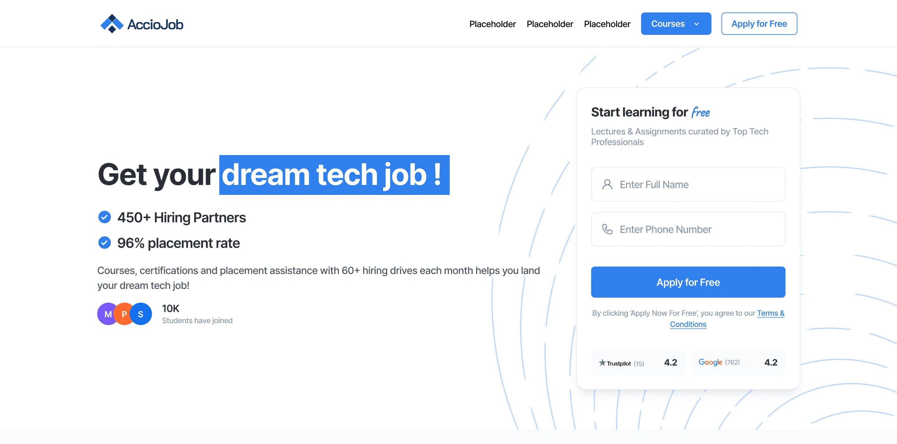
The PM owned the storytelling structure and the funnel logic. The marketing team provided the actual copy. The CEO would jump in occasionally, especially on the hero and the trust sections, where the brand voice mattered most. My job was layout, hierarchy, visual design, and making the whole thing feel coherent across 7-8 sections without losing the funnel momentum.
Impact and learnings
If I did it again, there are things I'd change. I'd document the state logic earlier, because we figured states out as we went and I spent the back half of the project wishing we'd had a clean state diagram from day one. I'd push harder for direct access to students, because for a product this state-heavy, hearing them directly would have caught some edge cases faster. And I'd write a proper design principles doc, because we made a lot of consistent decisions across V2 that were never actually written down.
But the real thing I took from AccioJob is how it taught me to think in states. Not in screens, not in flows, but in every possible state a user could be in and what each one needs. Now when I open a new Figma file, my first instinct is to list every state before I draw a single component. Eligible, not eligible, pending, error, empty, loading, success, partial success, every weird edge case. Designing for the happy path is fast. Designing for everything else is where the real product takes shape.
The other thing I took from it is that shipping something, getting data, and rebuilding it beats trying to design perfectly the first time. V1 wasn't a failure. It was the only way V2 could have happened.
Like this project
Posted Jun 7, 2026
Redesigned the AccioJob placement portal and landing page, improving user conversion by 36%.
Likes
1
Views
3