CogniSync Design System
Priya Bhatt
Building a design system from scratch for a legal AI platform
One system, three surfaces, twelve months of building. Tokens, components, and patterns for a legal AI platform that needed a foundation before it could ship anything else.
My Role
Design Lead (solo designer)
Duration
April 2025 – May 2026
What I did
Design system, product UI, marketing website, pitch decks
tl;dr
What is it
A full Figma design system for CogniSync, a legal AI platform. Foundations and 29 components, all with variants and properties. Built from scratch over a week, then continuously sharpened across 12 months.
Why it mattered
There was no design system when I joined. Every screen was inventing its own buttons, spacing, and colors. For a product that wanted enterprise customers, the inconsistency was a real problem.
My role
Solo designer reporting directly to the CEO. Led the system from foundations through component library, then used it to redesign the product UI, the marketing website, and the pitch decks.
The 36%
Switching the brand color from green to blue. Blue signals trust, which is the entire job of a legal AI product.
What I Walked Into
CogniSync had an MVP when I joined. It worked, mostly. But there was no real system underneath any of it.
Every screen had its own button styles. Buttons in different places did different things. Some primary actions looked like secondary ones, and some destructive actions blended right into the page. The whole product felt rushed because it was.
For a legal AI platform aiming at enterprise customers, this was a real problem. Legal teams notice inconsistency. Lawyers spot sloppiness faster than most users. A product asking to be trusted with contracts can't look like it doesn't trust itself.
The brief from the CEO was simple.
"Build a real system underneath everything, then use that system to fix the product. So that's what I did, in that order."
What I Studied First
Before I built a single token, I spent time studying the design systems I respected most. Each one taught me something different about a different part of the problem.
Material Design
Token hierarchy and the idea of treating color as a system instead of a palette. Material's semantic tokens resolving into different actual values based on context shaped how I structured my own color scales.
Atlassian Design System
How to write documentation that reads like a thoughtful teammate, not a reference manual. Atlassian pairs every component description with usage guidance, which became a pattern I borrowed almost directly.
IBM Carbon
Token naming. Carbon is precise without being verbose. Names like background-primary, text-secondary, and border-strong feel obvious once you see them, which is the entire point.
Wise Design System
Tone and personality at scale. Wise shows that a design system can be utilitarian and still feel warm, which influenced how I wrote my own documentation.
Plus IBM Ivy and a lot of evenings spent reading open-source systems from other teams. I didn't copy any of these. I borrowed the parts that fit CogniSync and left the rest.
Why The Brand Turned Blue
The brand color in the MVP was green. It was fine. It looked clean. It didn't say anything specific. I pushed for blue, and the CEO agreed.

The reasoning was simple. CogniSync is a legal AI product, and legal teams make decisions that have real consequences. When they use an AI tool to review contracts or flag risks, the tool has to feel trustworthy before they'll trust its recommendations.
Blue is the color most associated with trust in interface design. Most fintech is blue. Most enterprise SaaS is blue. Banks are blue. There's a reason for it. Blue signals stability, professionalism, seriousness. Green signals growth, but it doesn't carry the same weight when the conversation is about legal liability.
This wasn't personal preference. It was a positioning decision. The color had to match what the product was asking users to trust it with.

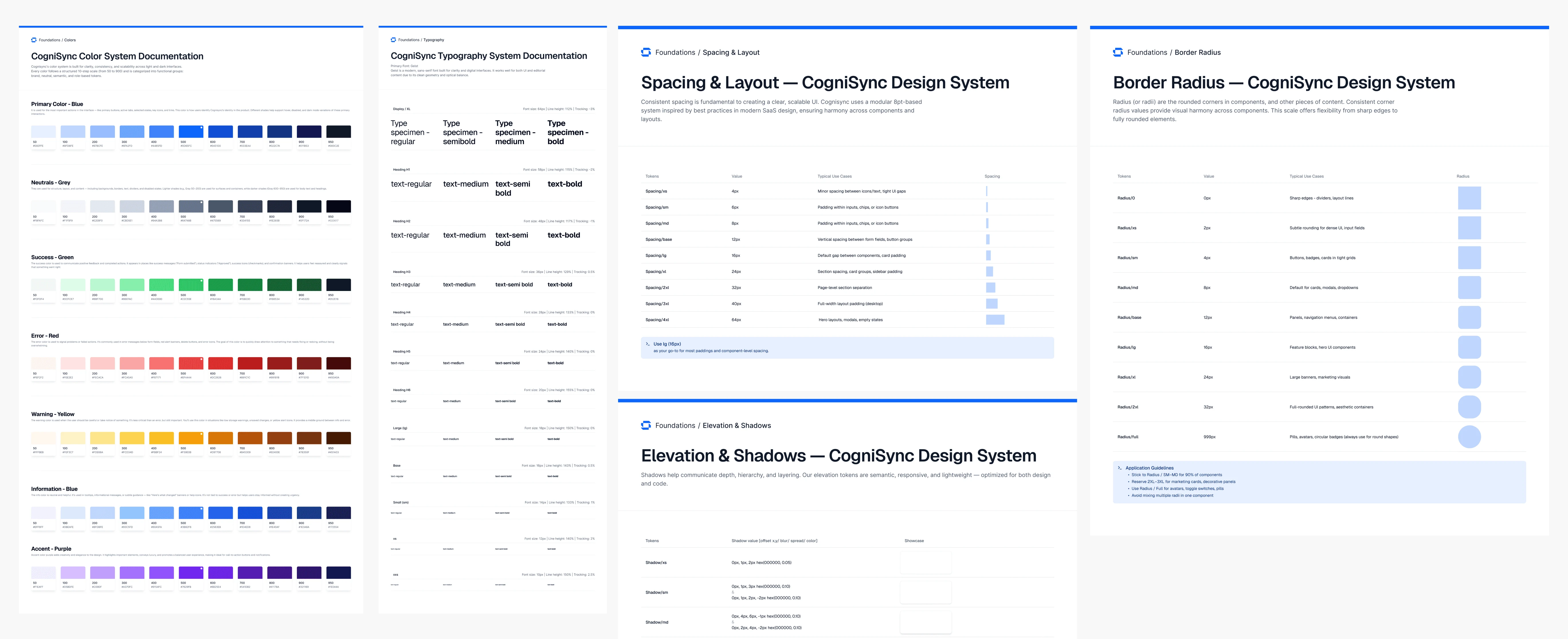
The full blue scale spans 50 to 950 across eleven stops. Lighter shades for hover states and disabled buttons, mid shades for primary actions, darker shades for emphasis and contrast. Every shade has a defined role.
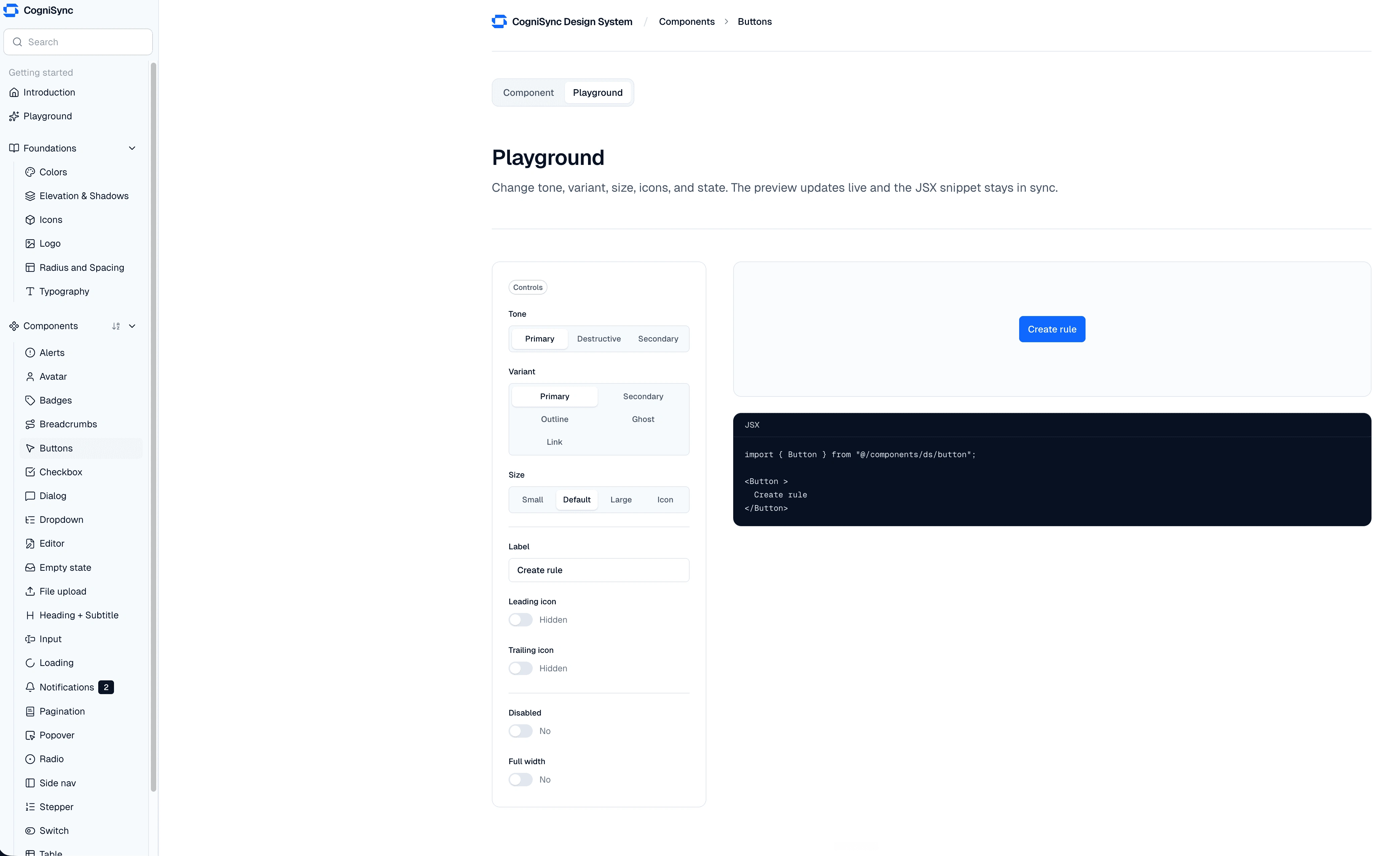
What's In The System
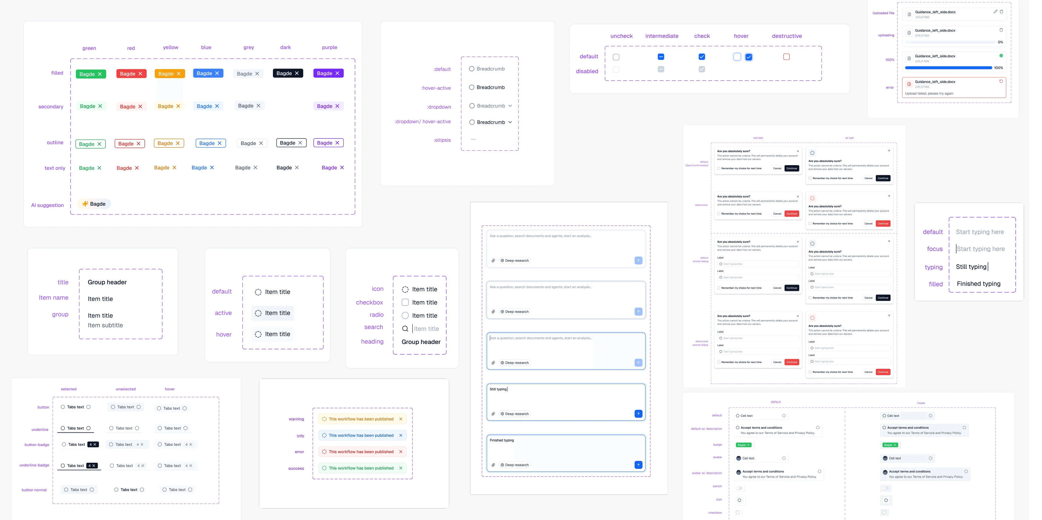
The Figma component library covers six foundations and 29 components, each with its own variants and properties.
### The foundations
Color tokens across seven scales. Primary blue, neutral, success, error, warning, info, and accent. Plus typography, spacing, elevation, border radius, and shadow tokens. The reference layer that everything else sits on.
The components
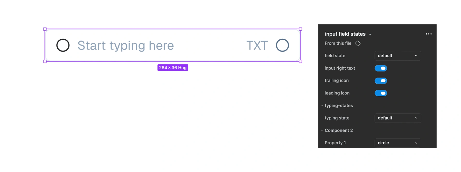
29 components, each built with full variant logic and properties that make them easy to compose into real screens.
Avatar
Badge
Breadcrumbs
Buttons
Checkboxes
Dialogs
Dropdowns
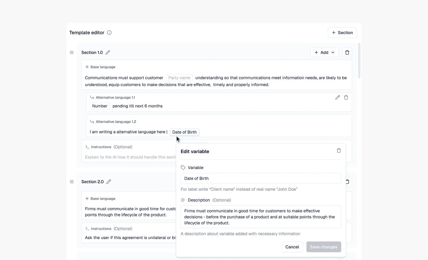
Editor
Empty state
File upload
Heading and subtitle
Feed components
Navigation
Pagination
Popover
Progress
Radio buttons
Stepper
Side nav
Skeleton
Switch
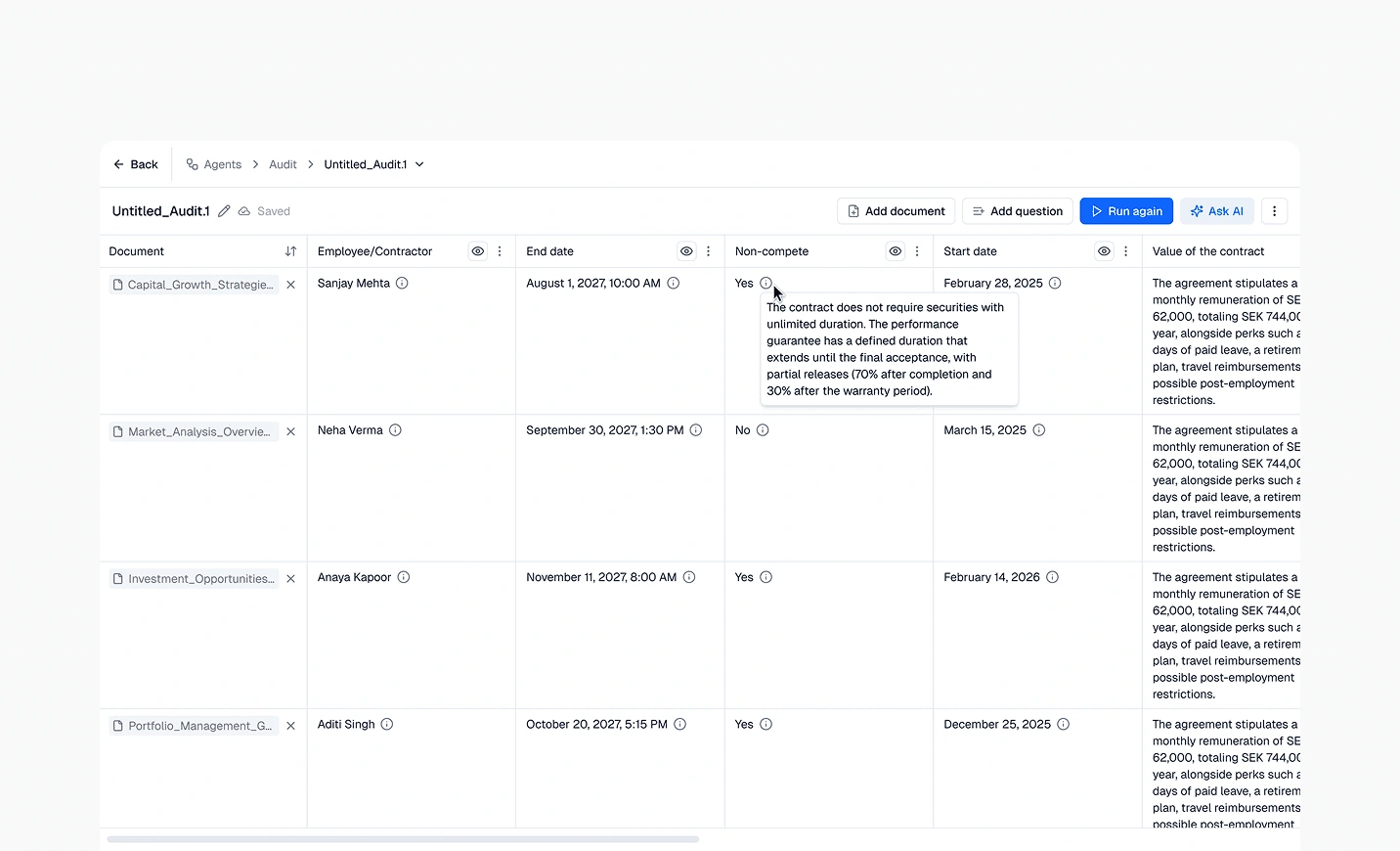
Table
Toast and notification
Tooltip.
How It Stayed Alive
The initial system took about a week to build out. The rest of the 12 months was continuous improvement.
Adding components as new features needed them. Tweaking token values when something didn't read right at scale. Refining variant logic when a developer hit an edge case I hadn't accounted for. Updating documentation when something changed.
A design system isn't a one-time deliverable. It's a living reference that has to keep up with the product underneath it. The system at month 12 was significantly more complete than the one at month 1. Same foundations, more components, sharper documentation, better-named tokens.
The work of maintaining a system is mostly invisible. Nobody gives you credit for the fact that nothing broke this week. But the absence of broken handoffs and inconsistent screens was the entire point.
The One Metric That Mattered
There's really only one outcome metric for a design system. Did developers actually use it?
They did.
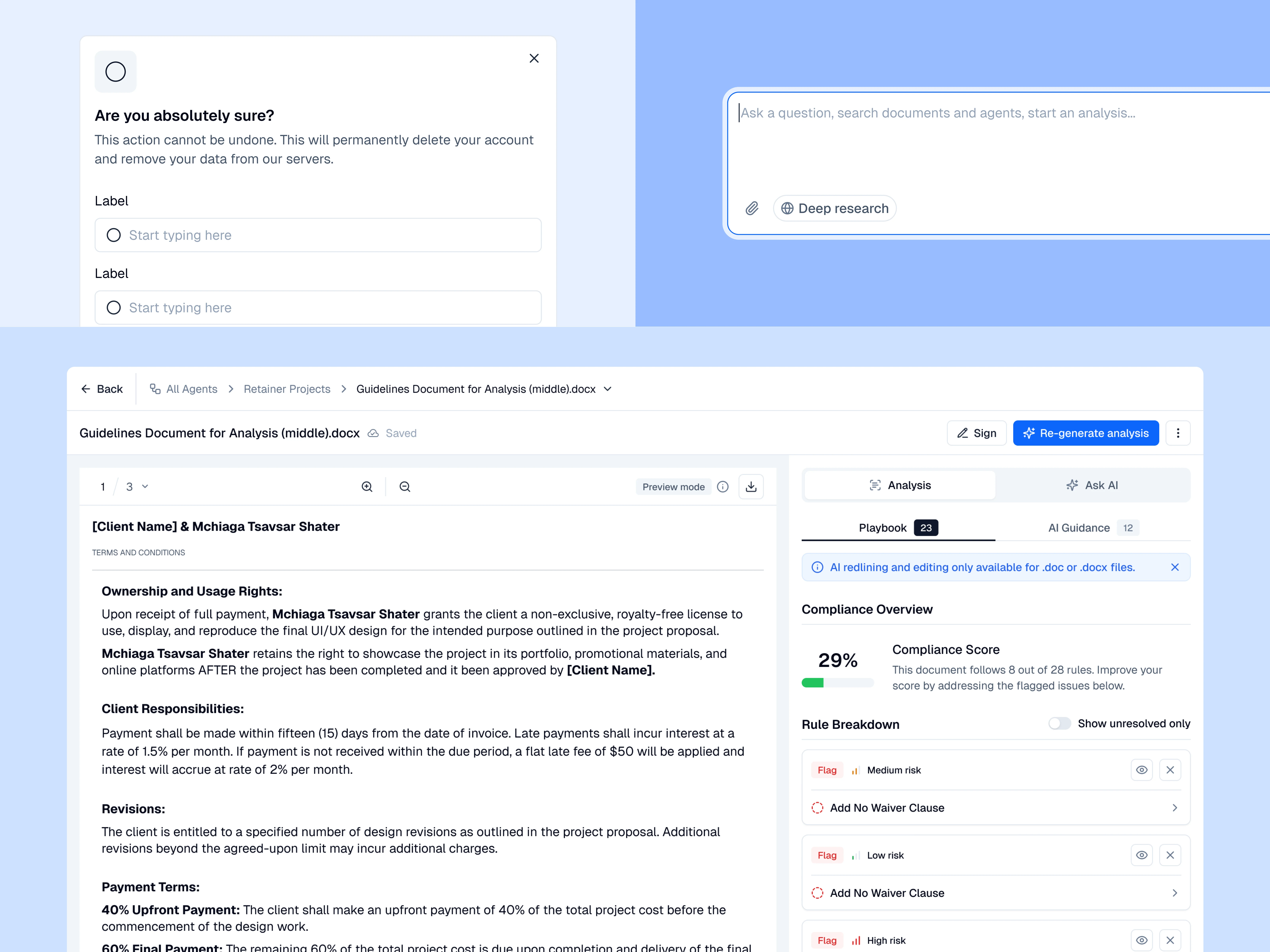
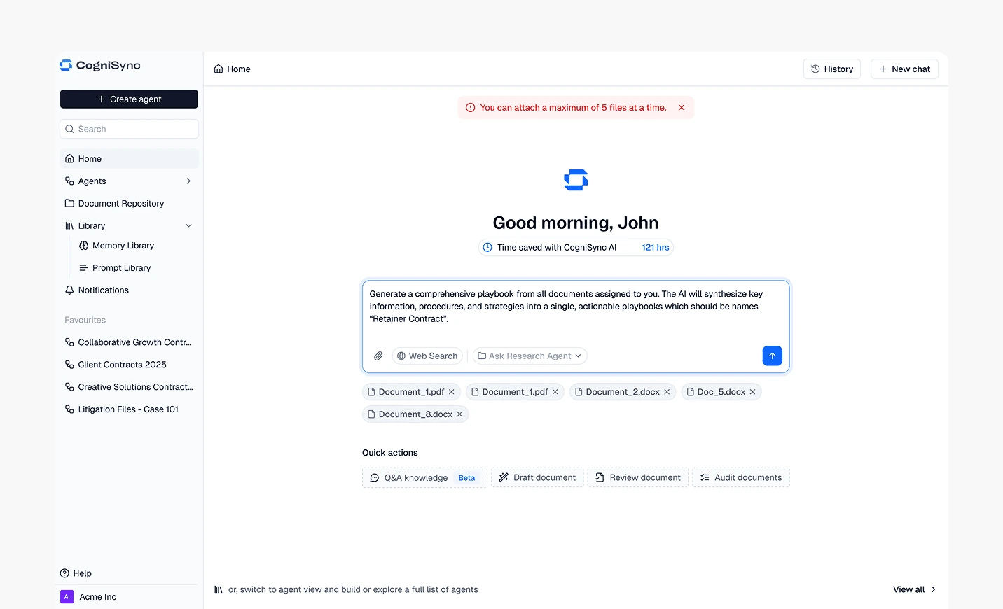
The system shipped into production. Every screen of CogniSync's product runs on these tokens and components. The marketing website uses the same foundations. The pitch decks share the same visual language. One system, three surfaces, fully aligned.
That's the outcome I care about. Not how pretty the Figma file is. Not how many components are in the library. Whether the team can actually ship faster and more consistently because the system exists.
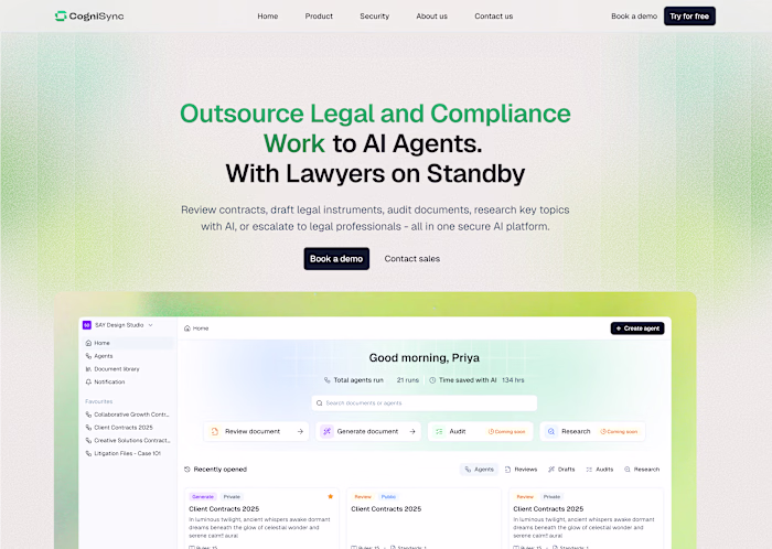
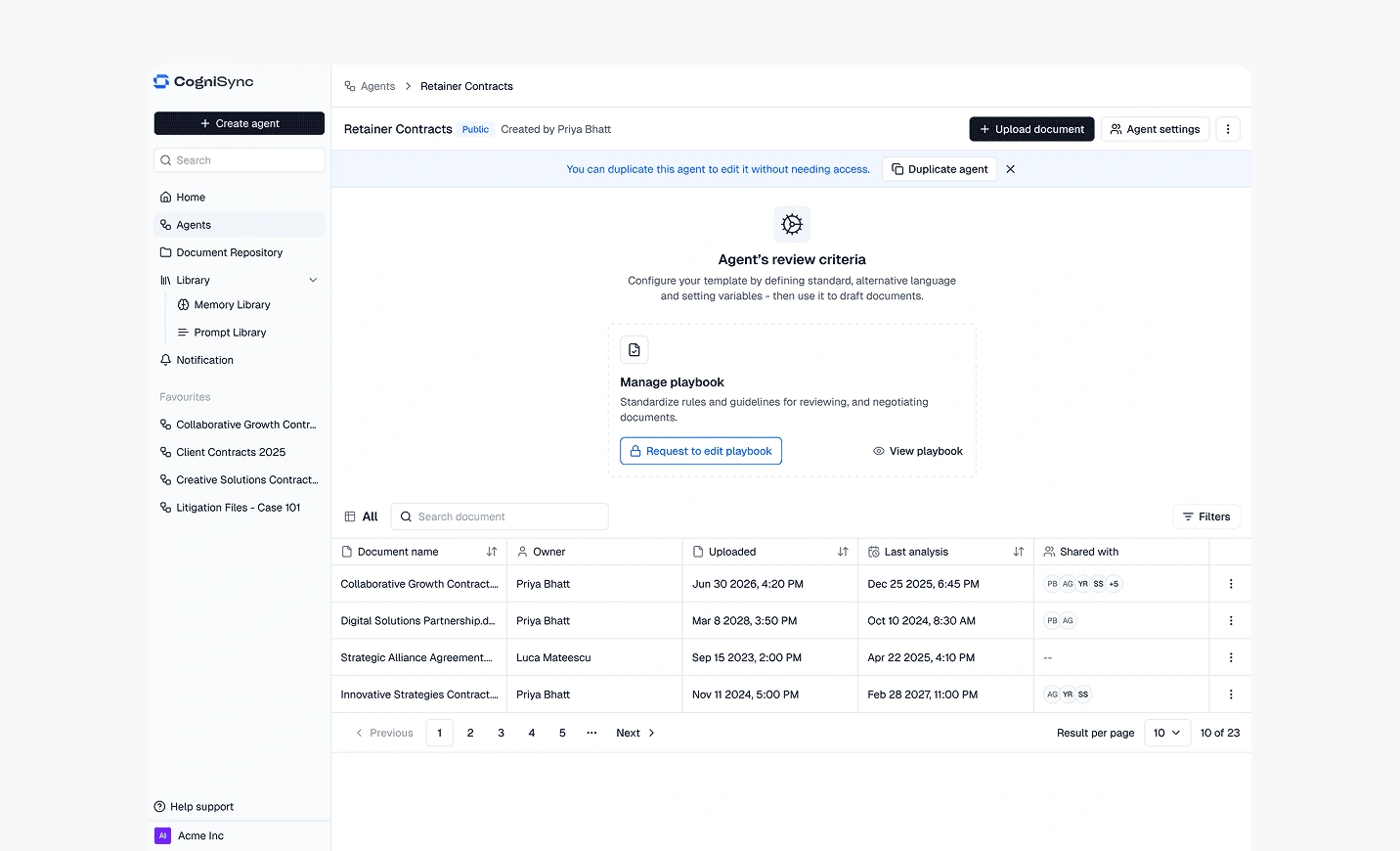
What I Built Using The System
A design system only proves itself when something real gets built on top of it. Here are a few screens from the product that put every part of the system to work.
I Also Vibe Coded It
I vibe coded a documentation site in Next.js for the foundations layer. Tokens with click-to-copy hex codes, typography pages with the type families I'd picked, elevation tokens, the whole reference layer. About six hours of focused work, deployed to Vercel.
It wasn't contracted work. It was a personal exercise that happened to use what I was already building as the subject matter. But it taught me more about how a design system actually behaves in production than the component library version did. You can't fuzz over a token in code. You have to name it, declare it, use it.
What I Took From This
Building a design system is the only design work where the deliverable is invisible if you do it right. Nobody notices a good system. They notice everything that breaks when one isn't there.
Property setup, naming conventions, and nested elements were the unglamorous skills that mattered most. The visual choices were the easy part. Making components actually composable, scalable, and handoff-ready was the work.
If I'm being honest, I enjoyed every part of this. Design systems have a reputation for being tedious. I found them to be the opposite. Once the foundations were in place, every new screen I designed was 10x faster. That compound interest is real.
Like this project
Posted Jun 7, 2026
Created a Figma design system for CogniSync, enhancing UI consistency and trust for a legal AI platform.
Likes
1
Views
2