Built with Jitter
KraKra • Visual Identity
Johan Ferdian JR
Verified
a. Project Overview
KraKra is a social media platform focused on original artwork. As an art-based platform, KraKra serves as a platform for artists from many art disciplines, particularly in East and Southeast Asia.
In this project, I was hired as visual designer (and UXD then, separated case study). Since KraKra is a newcomer in this social media platform industry, they need to totally refresh their brand image to be close to their target audience: artsy people around Asia. So, what I did to KraKra?

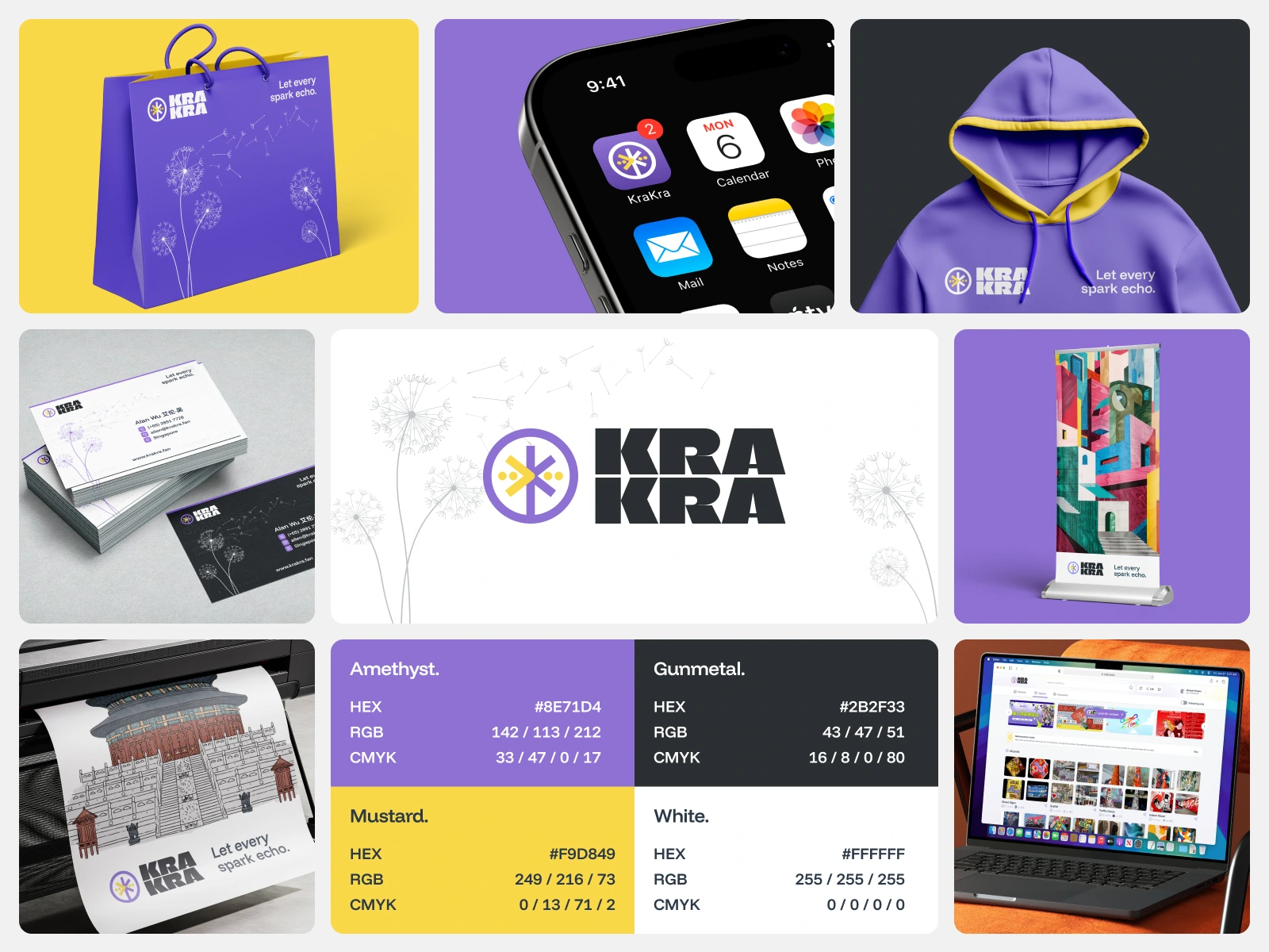
Mockup of finished UI designs
Your brand is not about what you sell; it’s the experience you deliver.
—Tony Hsieh, CEO of Zappos.com
b. Logo Concept
The term 'KraKra' is a creative semantic embodiment that signifies explosion, momentum, spark, and dissemination. The kr- consonant also conveys a sense of explosion, aligning with the concept of inspiration sparks and chain expansion. With the motto 'Let every spark echo.', KraKra aims to be the right platform and space for original creators to express their ideas and works more freely and expressively. Rooted in the spirit of 'echo', this platform hopes to assist creators in thriving in the digital realm with its current echo chain system.
Actually, in the process, we already use concepts of real things. From water ripple, to firework, and any real-world element that could represent the 'spark' moment: happy and spirit.
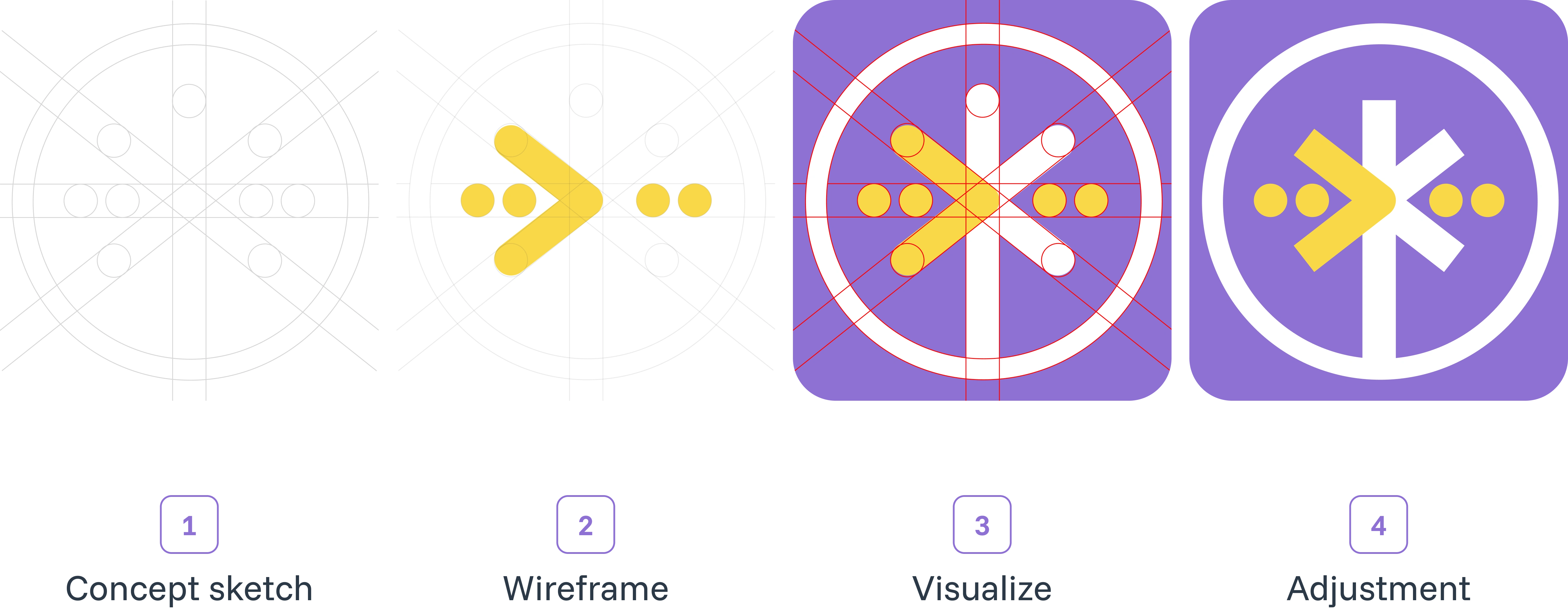
The concept process from dandelion
If the logo combined using wordmark, it could be look like this. Overall logo below is the default logo that should be applied to many marketing platforms. Only if the medium not support this logo to be visually readable, the designer could use another logo variant from its coloring up to layout.
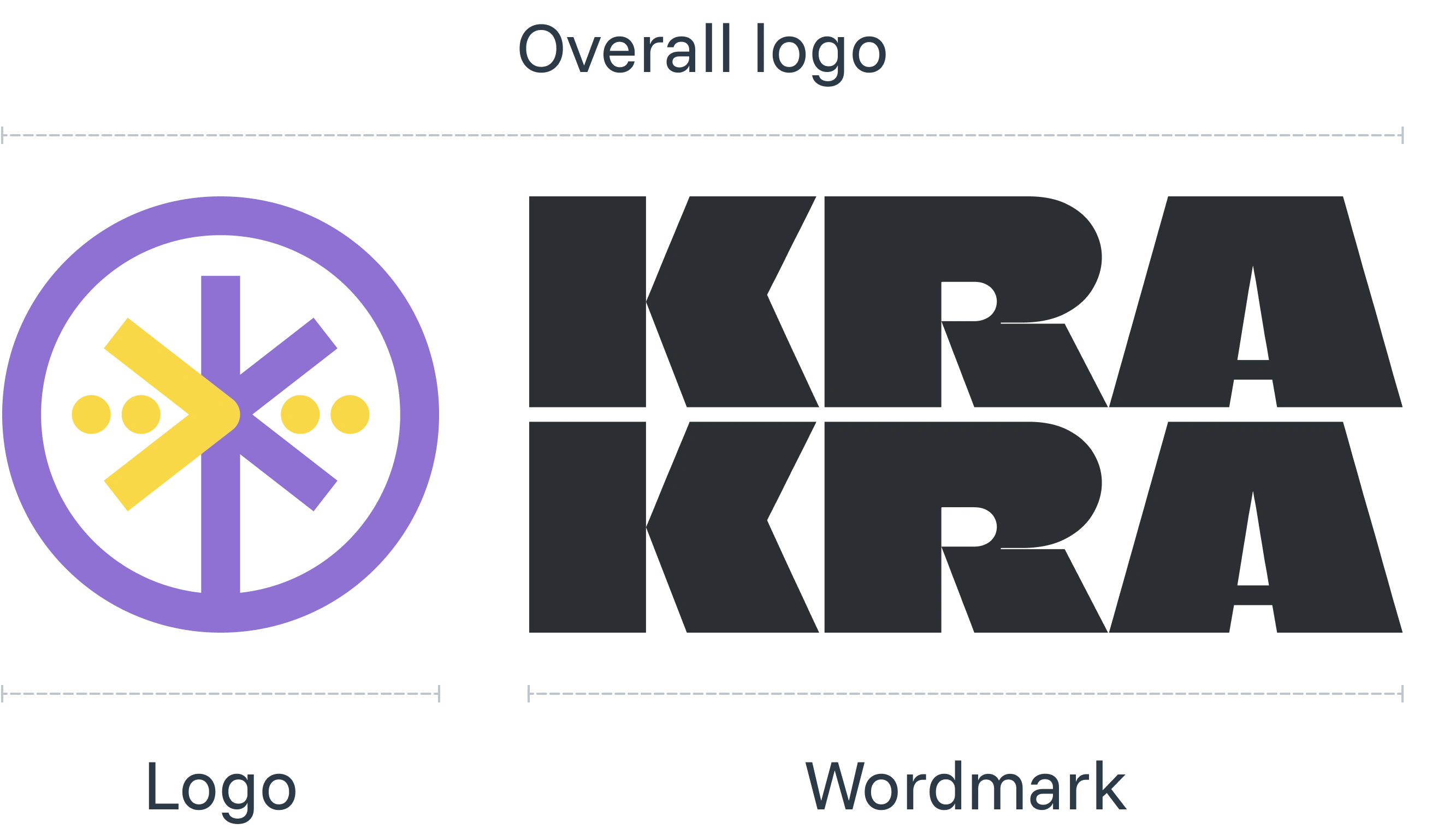
Logo could be applied without wordmark, but not applied otherwise
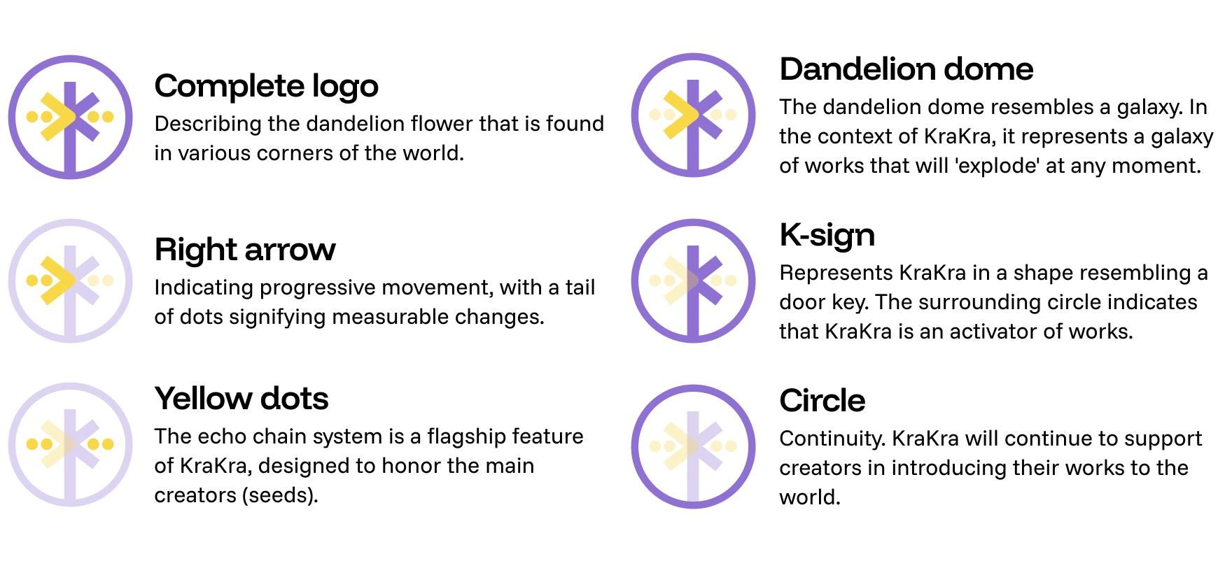
Below the meanings of each element inside the logo. Still, this logo represents the dandelion flower as the base idea of KraKra philosophy.
So, even the logo is very simple, it still has deep meanings inside
c. Logo Variants
First, color. This logo variation combines the brand icon and wordmark. Only 3 variants are available:
purple icon with black wordmark, purple icon with white wordmark, and lastly white icon plus white wordmark. For better approach, I do provide three default background options: white, black, and purple.
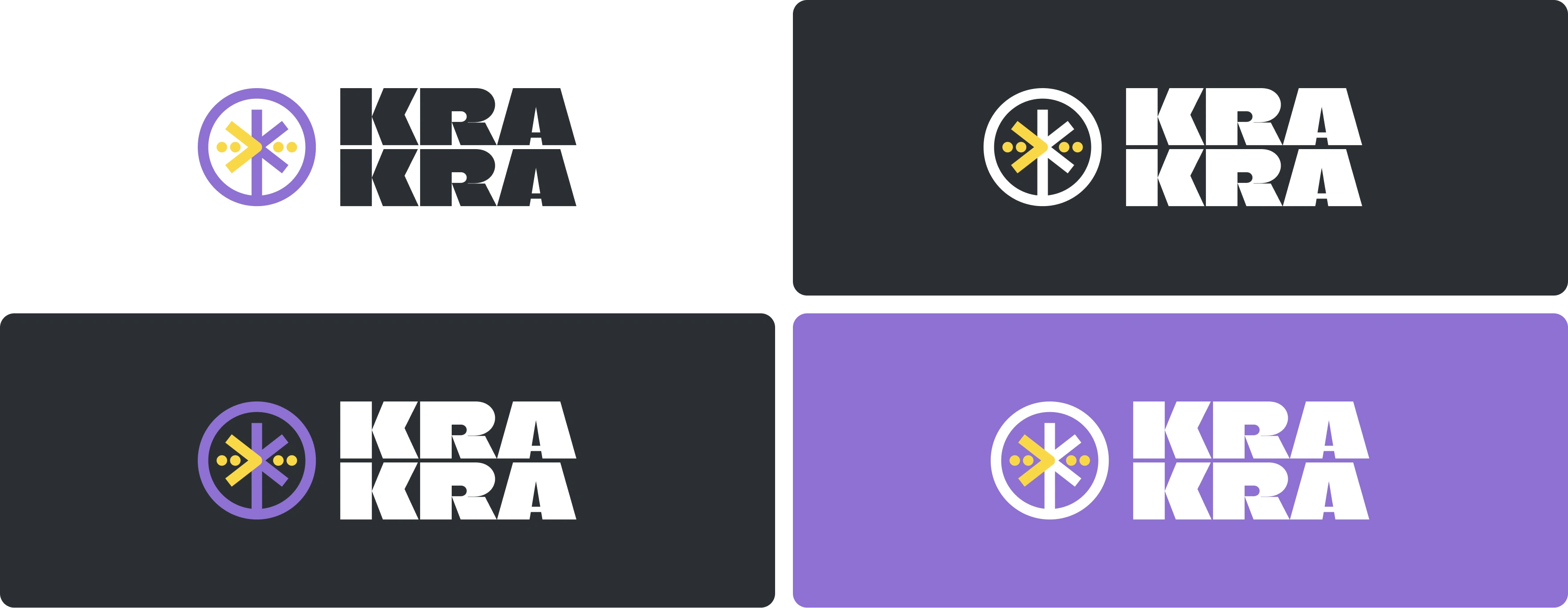
So, logo would only have 2 color variants: purple and yellow
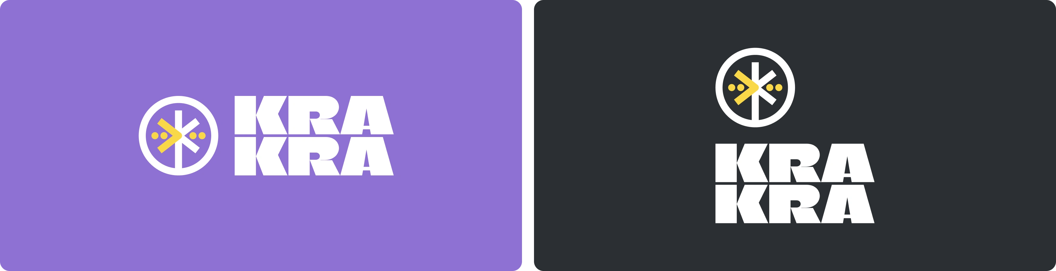
In addition to the horizontal version, this logo is also available in a vertical version. However, it should be noted that the vertical version is not recommended for widespread use, only in certain conditions, as the logo used on the KraKra website also employs the horizontal version. This is to help creators and users remember KraKra as a brand more easily.
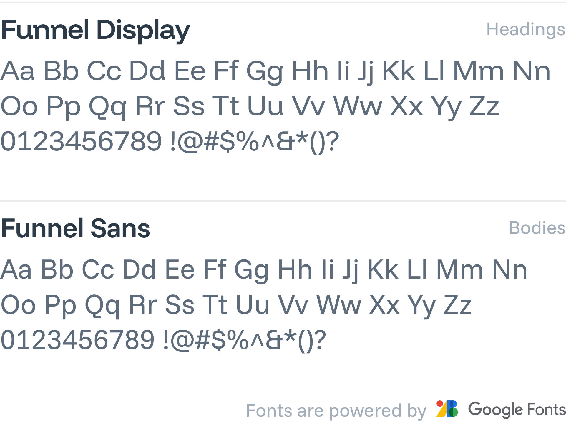
d. Font & Writings
For applications in digital and print media, KraKra uses the Funnel Display and Funnel Sans fonts as its default typefaces. Designed by NORD ID, Kristian Möller, both fonts are available on Google Fonts and can be used for commercial purposes as they are under the Open Font License.
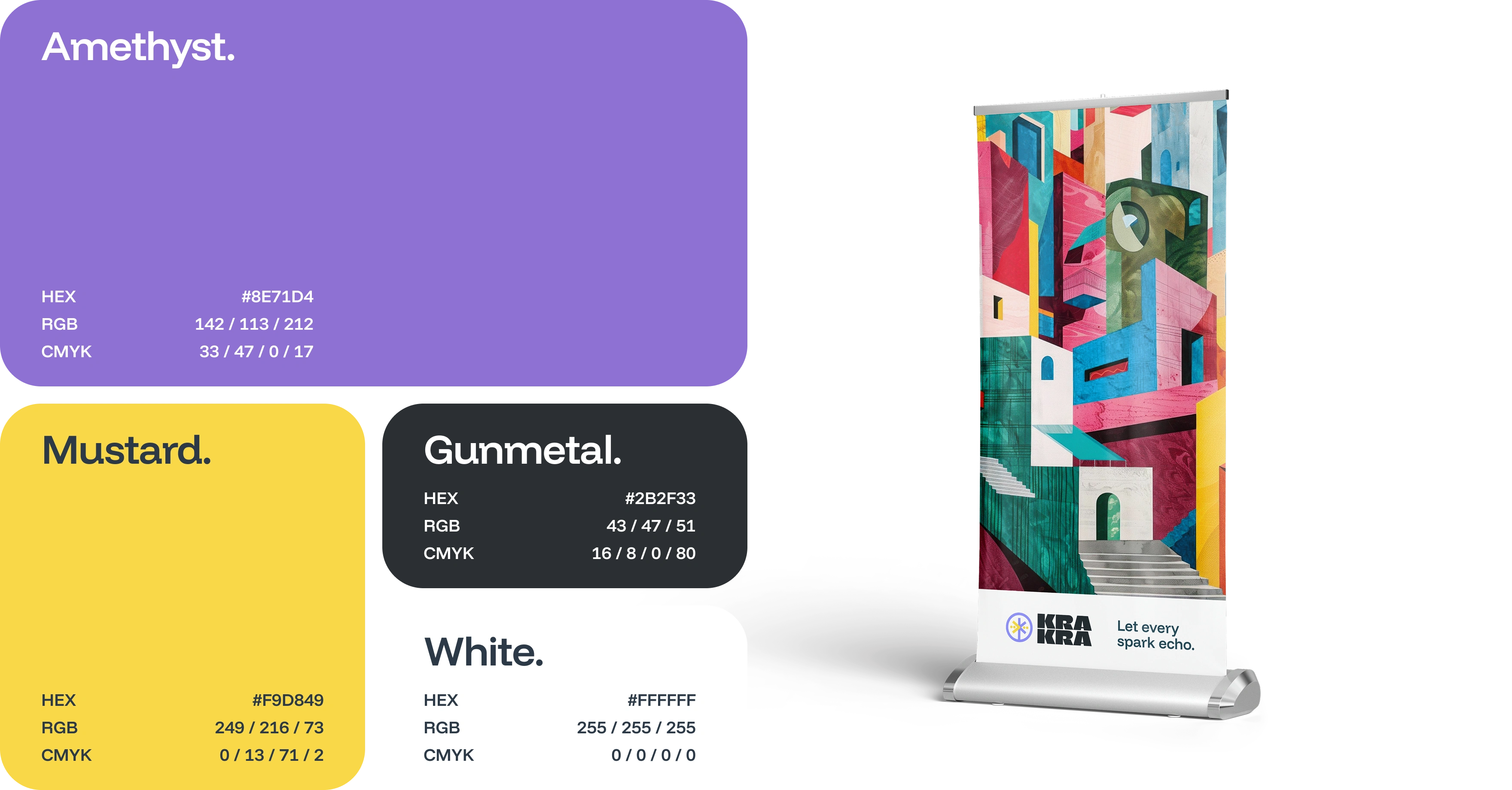
e. Color Sets
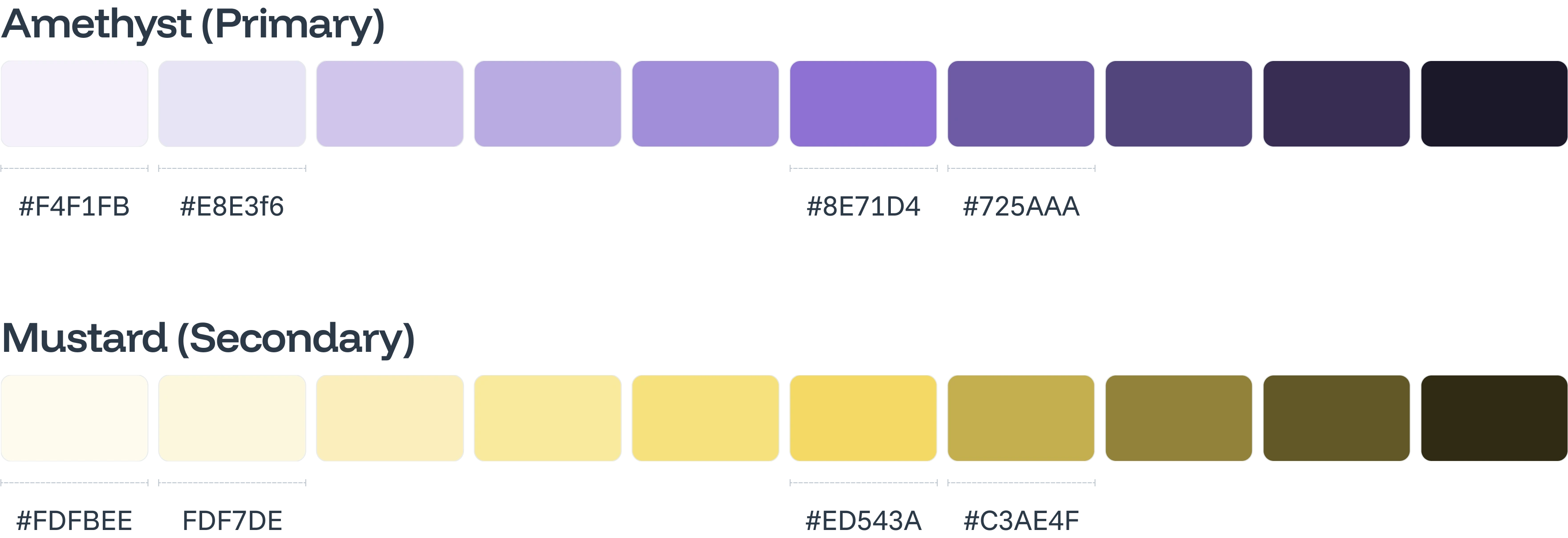
Previosly, KraKra already uses 2 main brand color. So, to make it consistent for current users, I still use brand colors but provide additional colors to make it more delightful and personal to its users. Currently, it's exceedingly rare to find brand using purple as the base or brand color. So, KraKra better to keep this to maintain uniqueness of the brand.
Since I already had customisable Webber Design System that could empower this UI project, I should generate color steps of those brand colors. Usually, I would pick the 50, 100, 500, and 600 color shade level to be widely applied for element effect and UI component states.
Beside brand colors, accent colors are needed usually for UI component states. At least we do need 5 colors to represent statuses: destructive, warning, success, informative, and neutral.
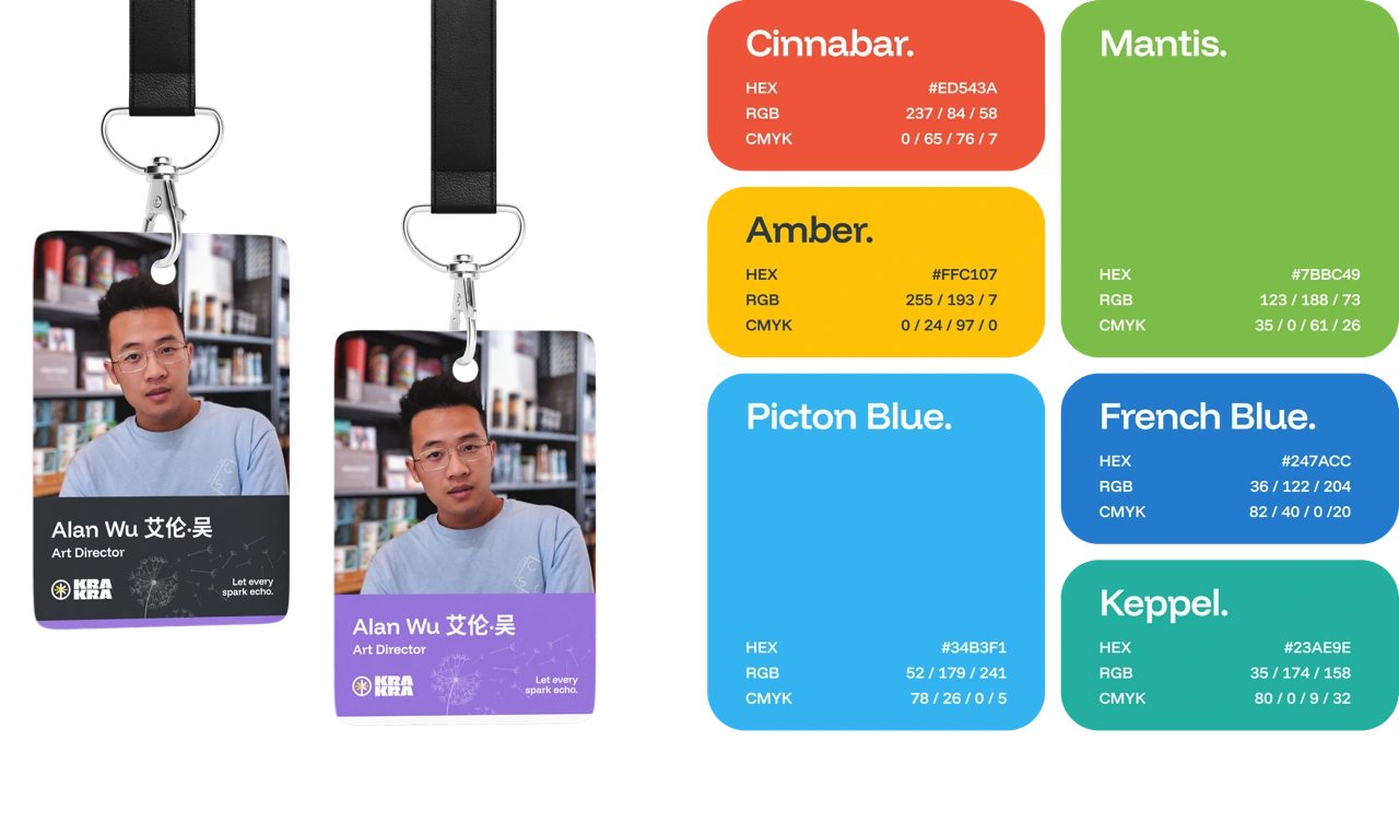
I usually provide four accent colors, two additional colors added by request
And to make it useful, I do generate the shades level of each color.
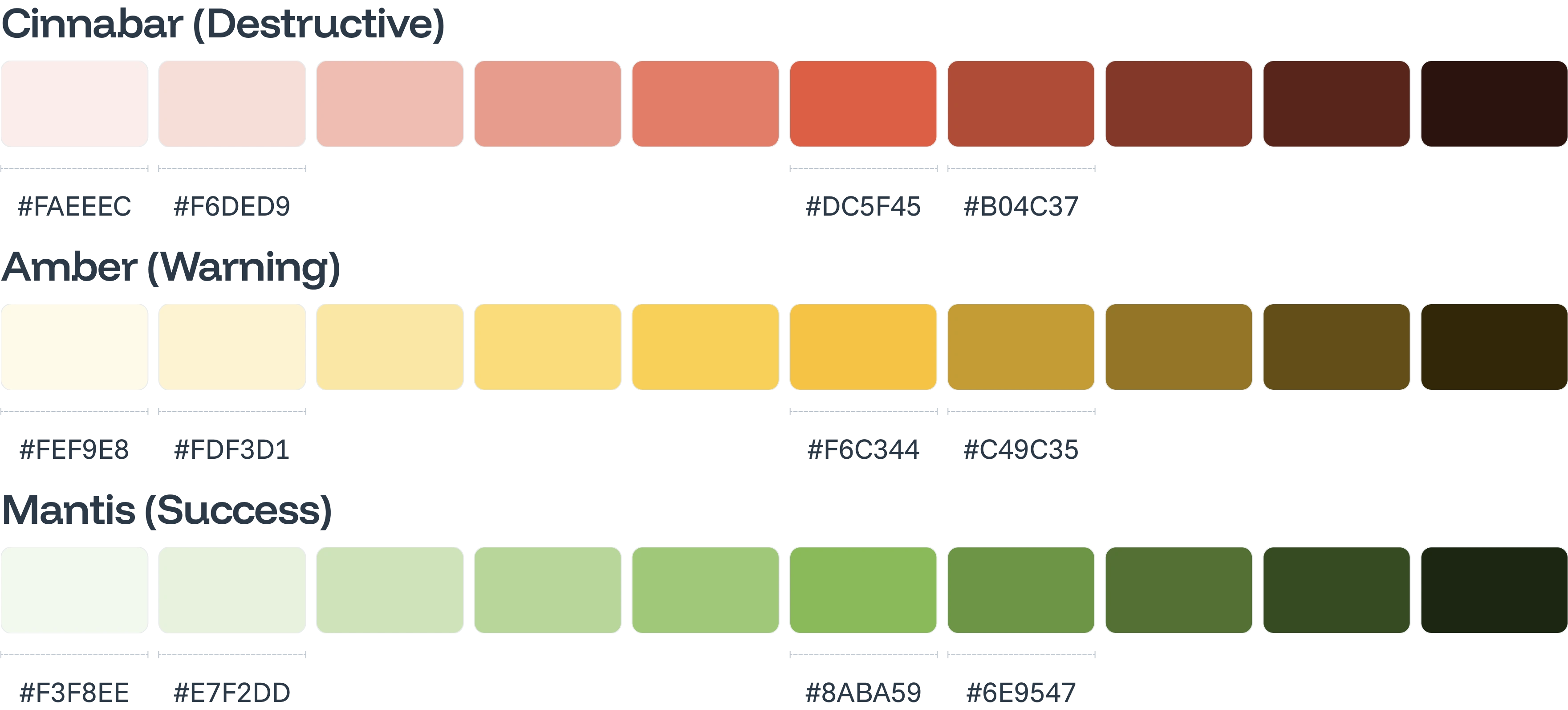
Warm color spectrum
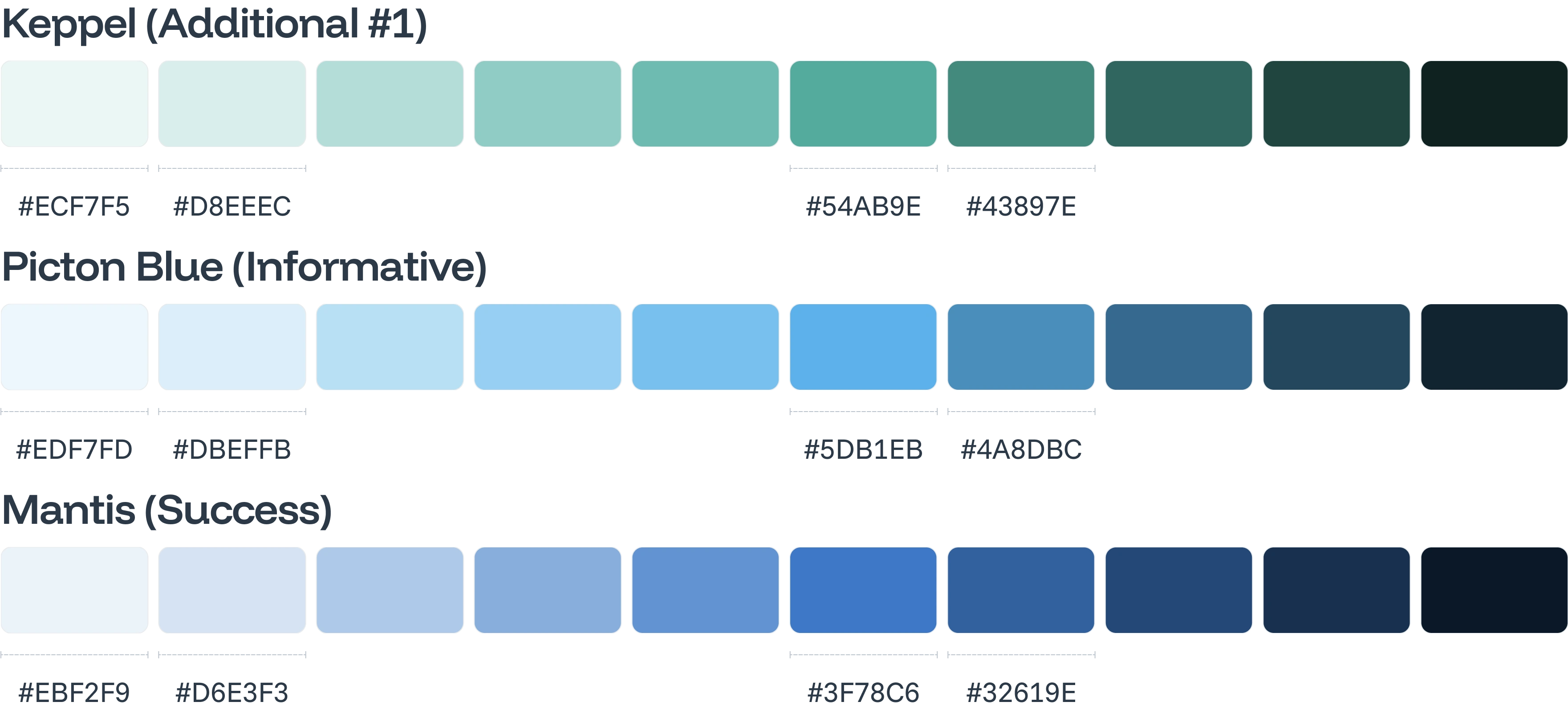
Cool color spectrum
f. Conclusion
This logo, though simple, is rich in meaning. Therefore, the implementation process of the logo needs to be maximized through intensive marketing efforts, so that more users become active contributors to KraKra. Massive marketing across various platforms will make KraKra, even with a simple logo, a strong brand that is memorable, especially to its users.
This branding could be widely applicated in many things, from poster, into app icon, from out-of-home (OOH) advertisement, up to social media content.
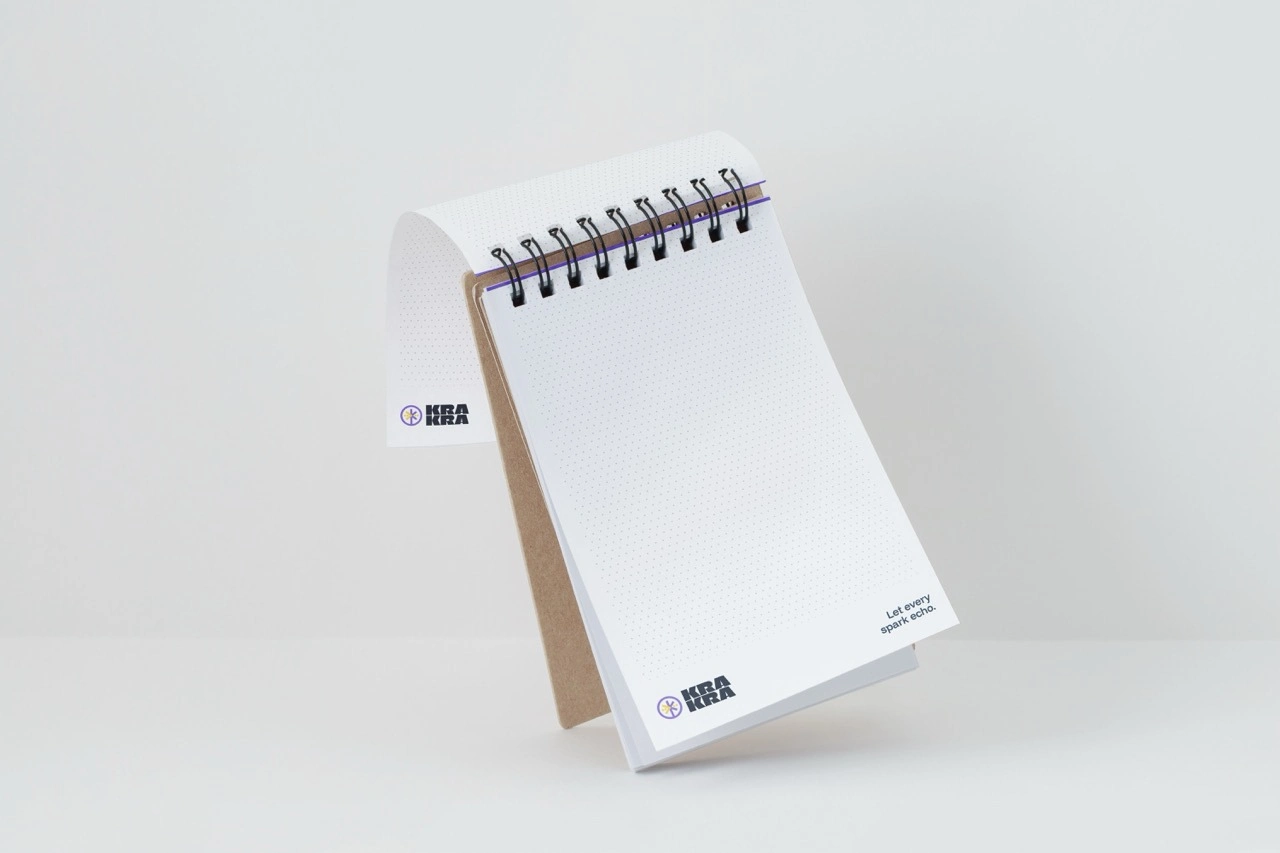
g. Design outputs
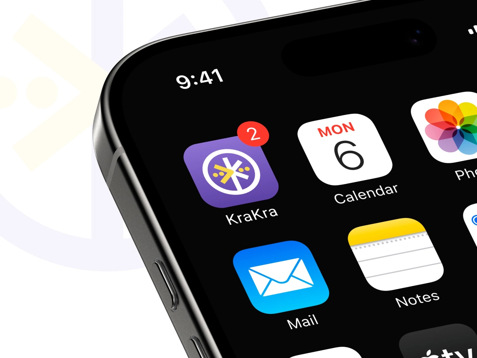
App icon
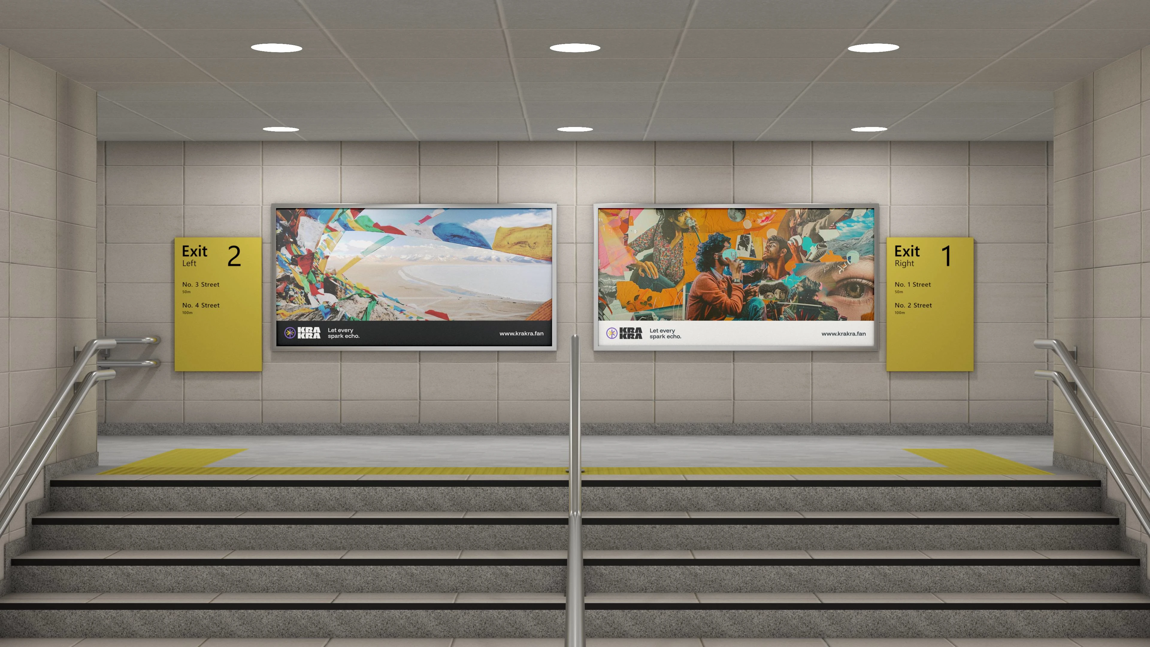
Application of logo in OOH (out-of-home) advertisement displays
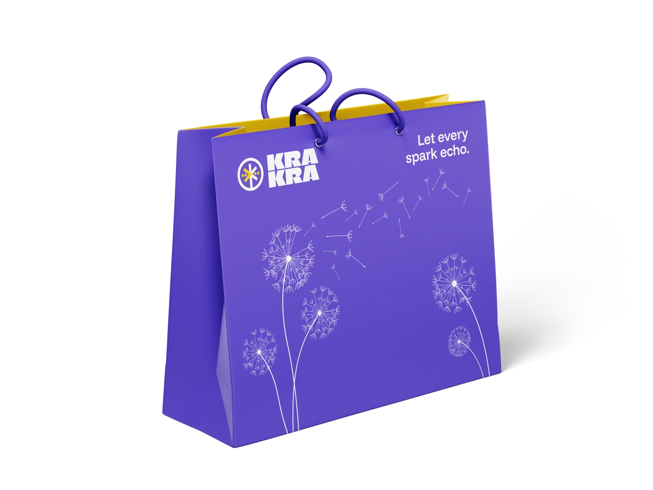
Mockup of paper bag design
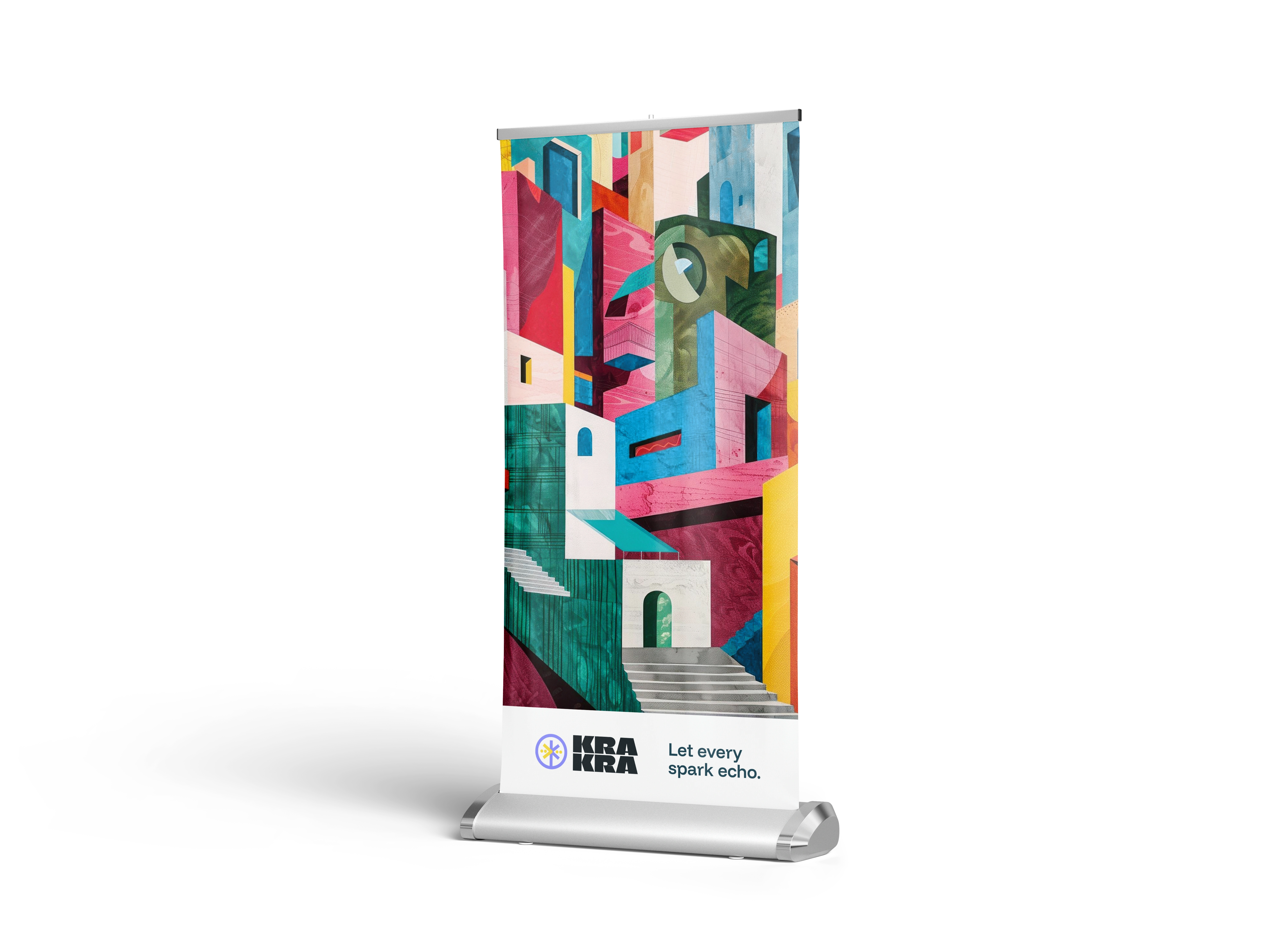
Application of branding in standing banner
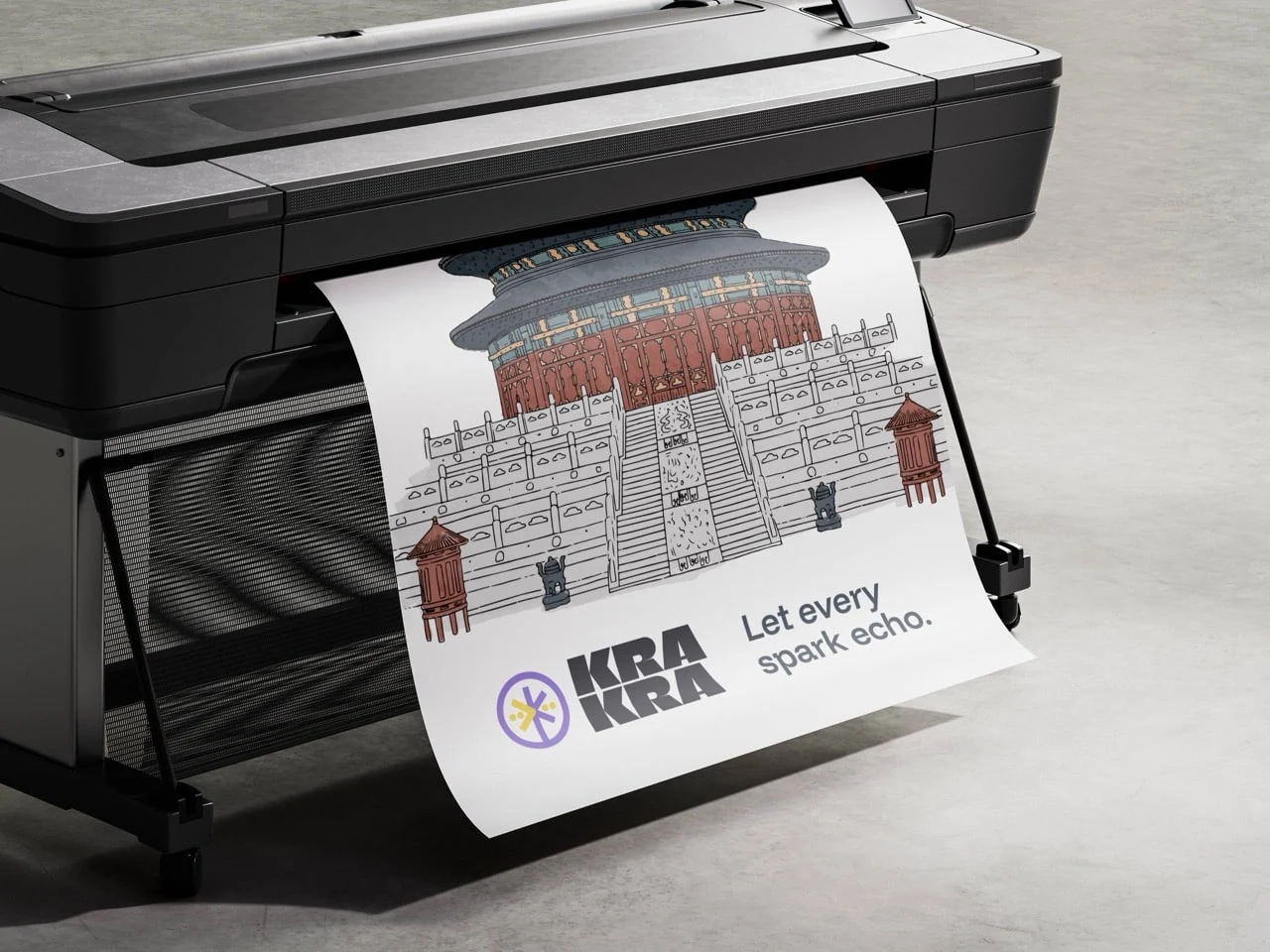
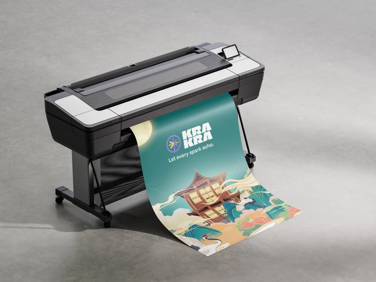
Branding application of matter paper poster
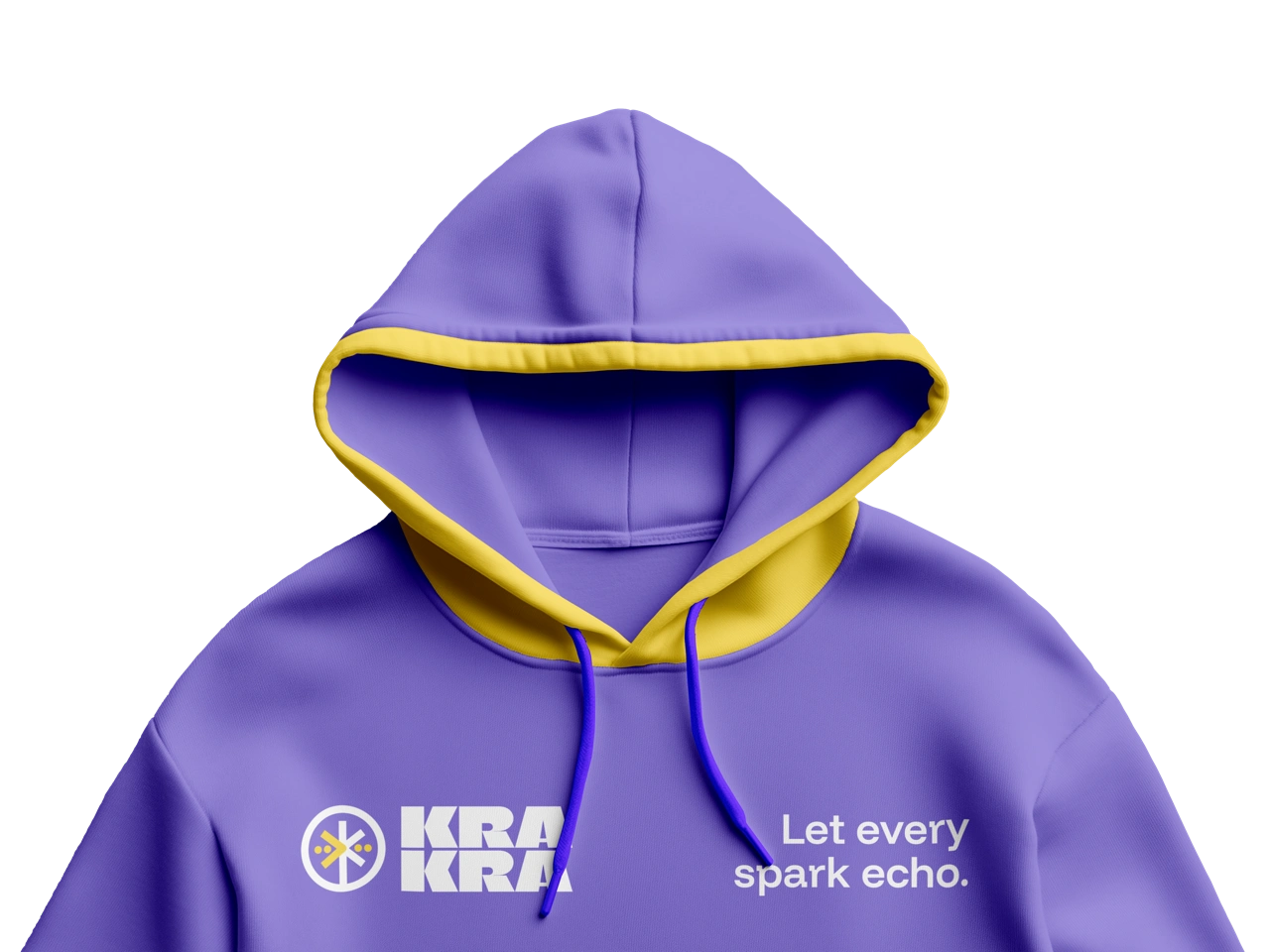
Application of branding on hoodie, still using second brand color (yellow)
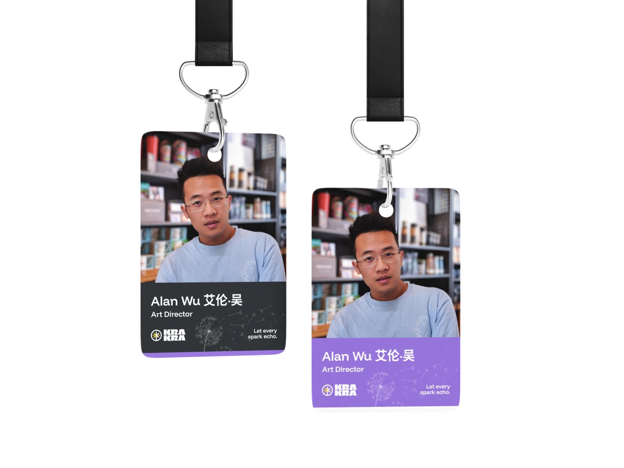
Employee ID design could've up to 3 variants
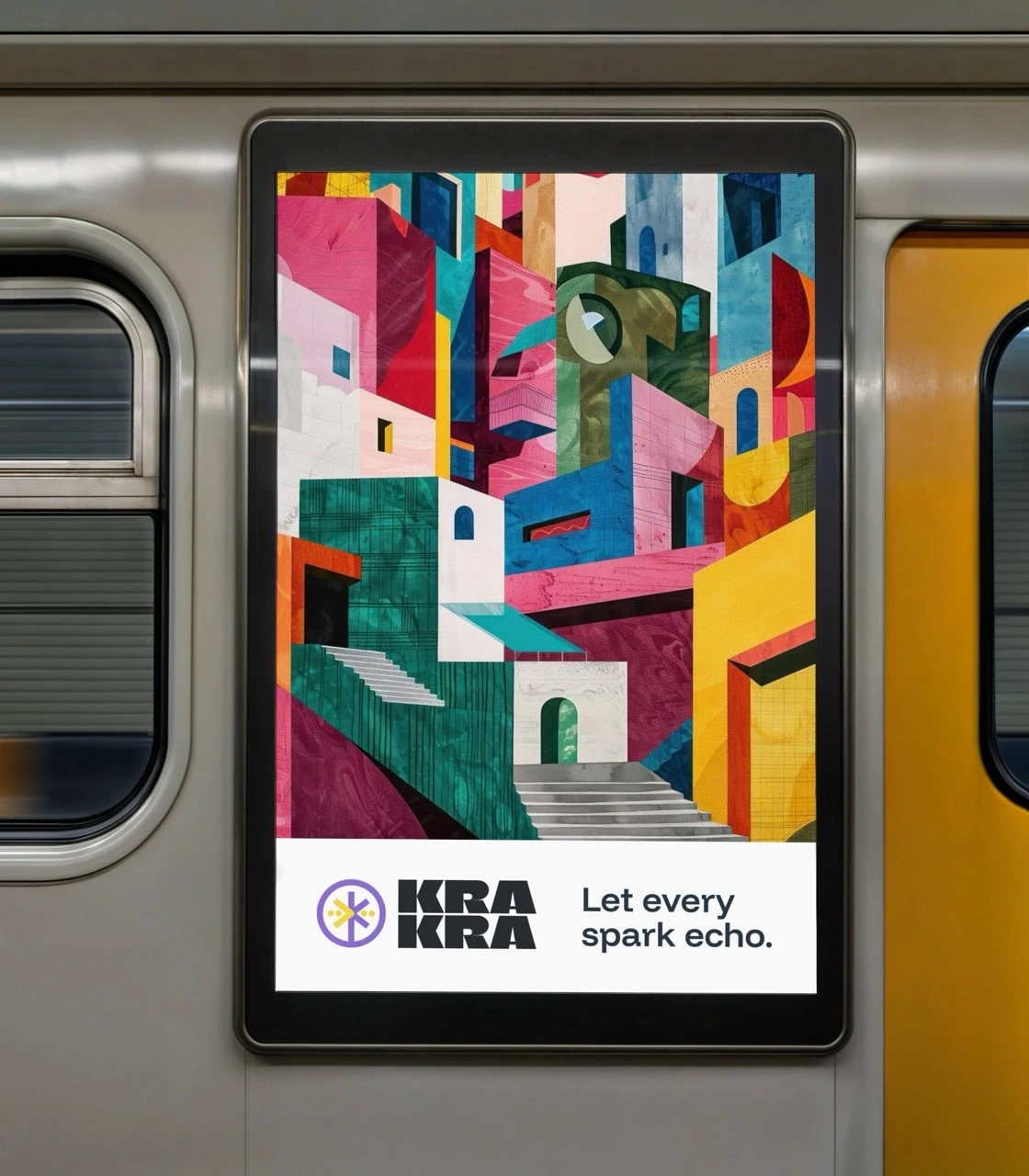
Branding application on poster inside passenger train
Eventhough just having 3 variants, these logo are widely applicable
This logo design applicable on anything
Like this project
Posted Sep 1, 2025
Redesigned a meaningful logo for KraKra.fan to boost brand recognition.
Likes
2
Views
34
Timeline
Jul 23, 2025 - Aug 27, 2025
Clients
Krakra