Rhinobis Logo Design Project

Supreet S



The Mission
Rhinobis is a revolutionary brand redefining the edible experience. Their core mission is to provide high performance cannabis gummies designed specifically to deliver an intense, natural boost of vitality. They are shifting the paradigm of cannabis from a relaxant to a powerful catalyst for active, energetic lifestyles, promising consumers the raw energy of a rhino.
Logo Design
The Challenge
The cannabis industry is saturated with predictable, tired visuals and cliché botanical symbols. The client required a revolutionary identity that aggressively broke away from traditional dispensary aesthetics. The challenge was to craft a logo that instantly communicated raw power, human vitality, and unstoppable movement while remaining modern, masculine, and highly minimal. The final mark needed to be completely self explanatory, telling the complex brand story at a single glance.
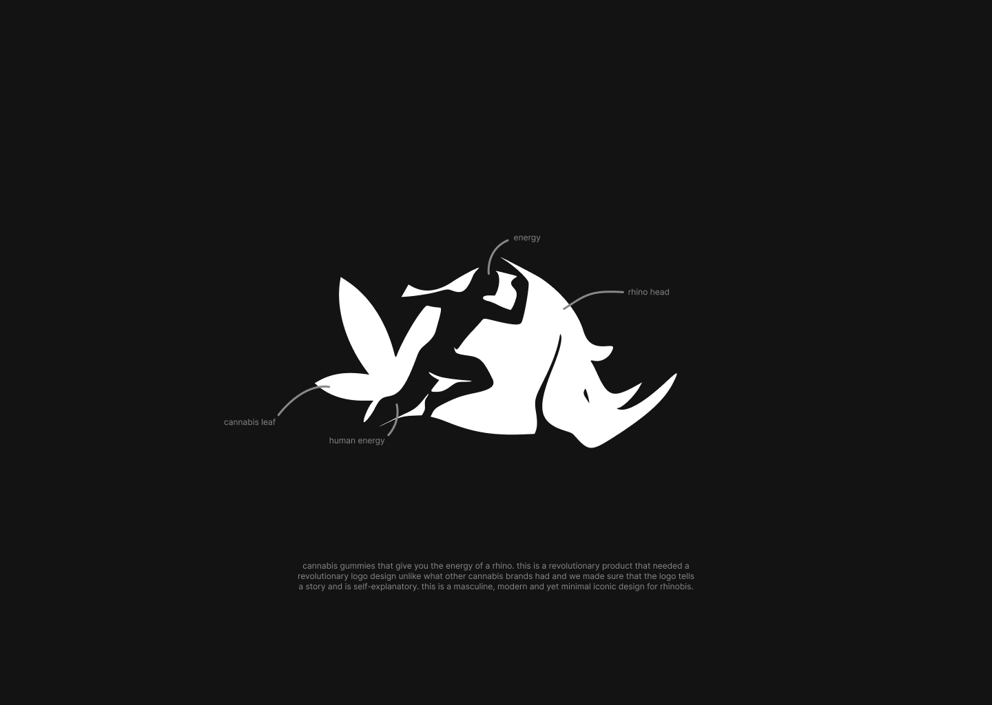
Logo Explanation
The Concept
To visually articulate the promise of rhino-like energy, I utilized clever negative space to create a dynamic, multi layered visual narrative. By merging the unstoppable force of a rhinoceros with kinetic human momentum and the botanical root of the product, I crafted a bold icon that is both aggressive and elegantly simple.
Design Breakdown
The Rhino Head: Anchoring the right side of the mark is a stylized, solid white rhino profile. This bold positive space immediately conveys durability, strength, and raw masculine power.
Human Energy: Carved directly into the center of the design using negative space is the silhouette of a sprinting human figure. This element represents the active consumer, surging with kinetic energy and forward momentum.
The Cannabis Leaf: Seamlessly integrated into the left side of the composition, the trailing shapes that follow the runner form the recognizable points of a cannabis leaf. This subtly nods to the product's core ingredient without relying on overused green tropes.
Rhinobis Logo
The Outcome
The Rhinobis identity is a striking, masculine, and highly iconic design. It successfully differentiates the product in a crowded market by delivering a clear, self evident story of power and vitality, proving that minimal design can carry immense narrative weight.
Let’s Create Together
Do you have a vision that needs bringing to life? I am currently open for new collaborations and would love to hear about your upcoming design challenges. You can view more of my work and connect with me directly on my Contra profile at https://contra.com/supreethere. Let us discuss how we can elevate your next project.
Like this project
Posted Jul 9, 2026
Explore my professional logo design for Rhinobis. A masculine, modern brand identity for energy boosting cannabis gummies featuring clever negative space.