High Converting Framer Landing Page for Proper (CRM Software)
Joe Yong
High Converting Framer Website for Proper (CRM/Productivity Software)
This is a self initiated project showcasing how I would build a high converting SAAS landing page.
Check out the full landing page here.
Project Overview
The client needed a modern and professional landing page to showcase their new productivity software, Proper.
The Challenge
The goal of the landing page is to motivate visitors to sign up for a free trial of the product.
In order to accomplish this, the landing page should clearly communicate the value of the software and have smooth user experience that creates a strong impression on visitors and motivates them to sign up for the free trial.
Check out the full landing page here.
Solution
Leveraging Framer's powerful design features, I was able to design and develop the landing page in roughly 48 hours.
The landing page has the following features.

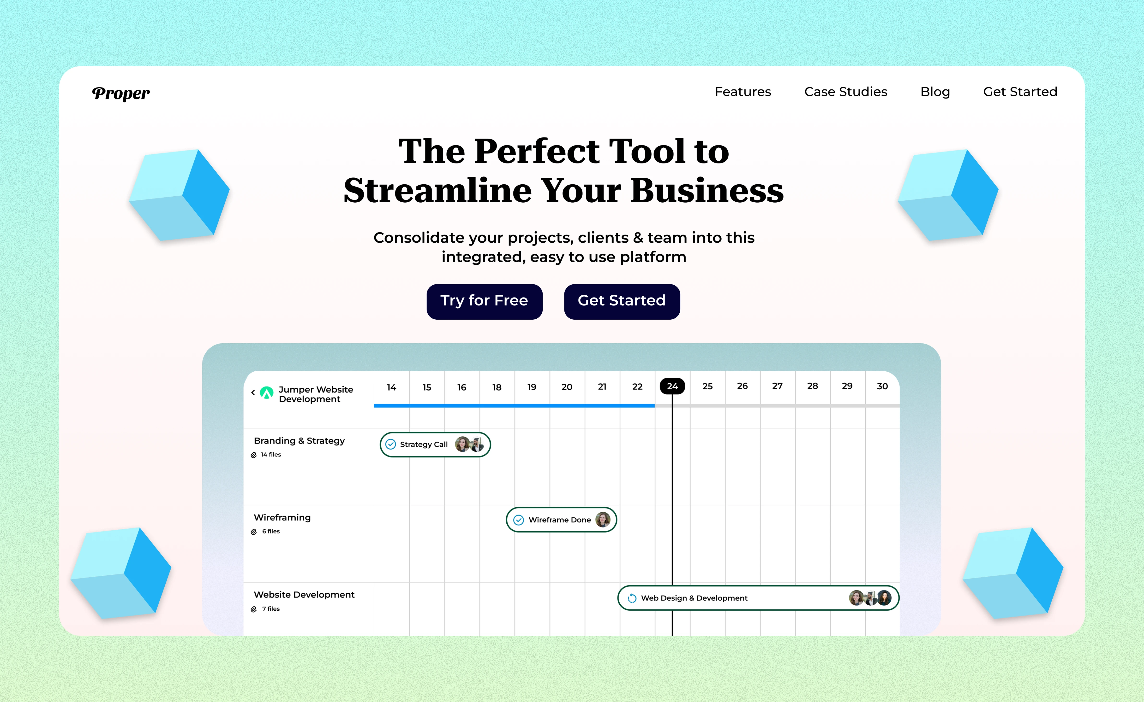
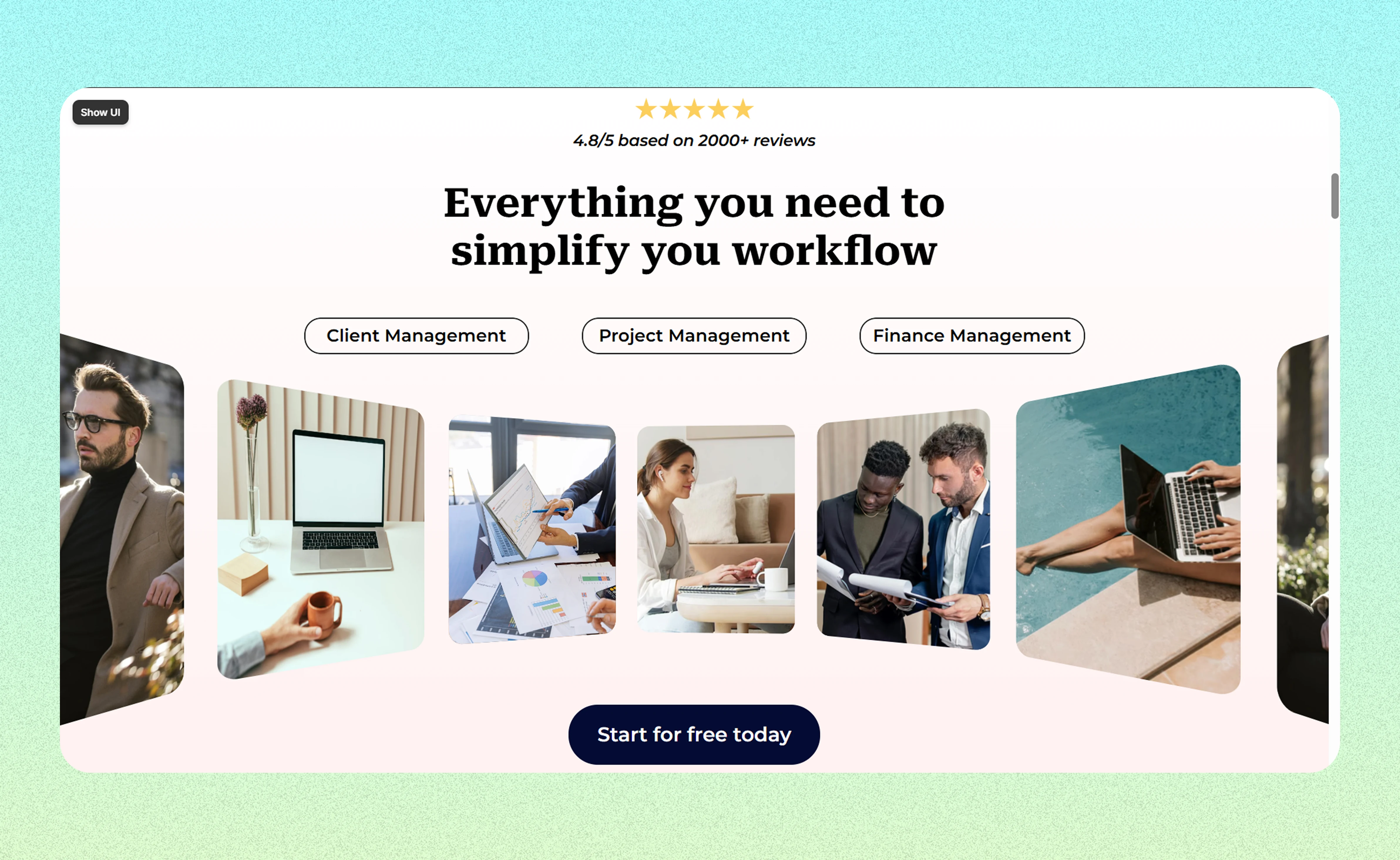
Powerful Hero Section of Proper
1) Custom & Compelling Hero Section: A big headline showcasing the unique value proposition of the software, with a 'risk free' call to action that would motivate visitors to take action.
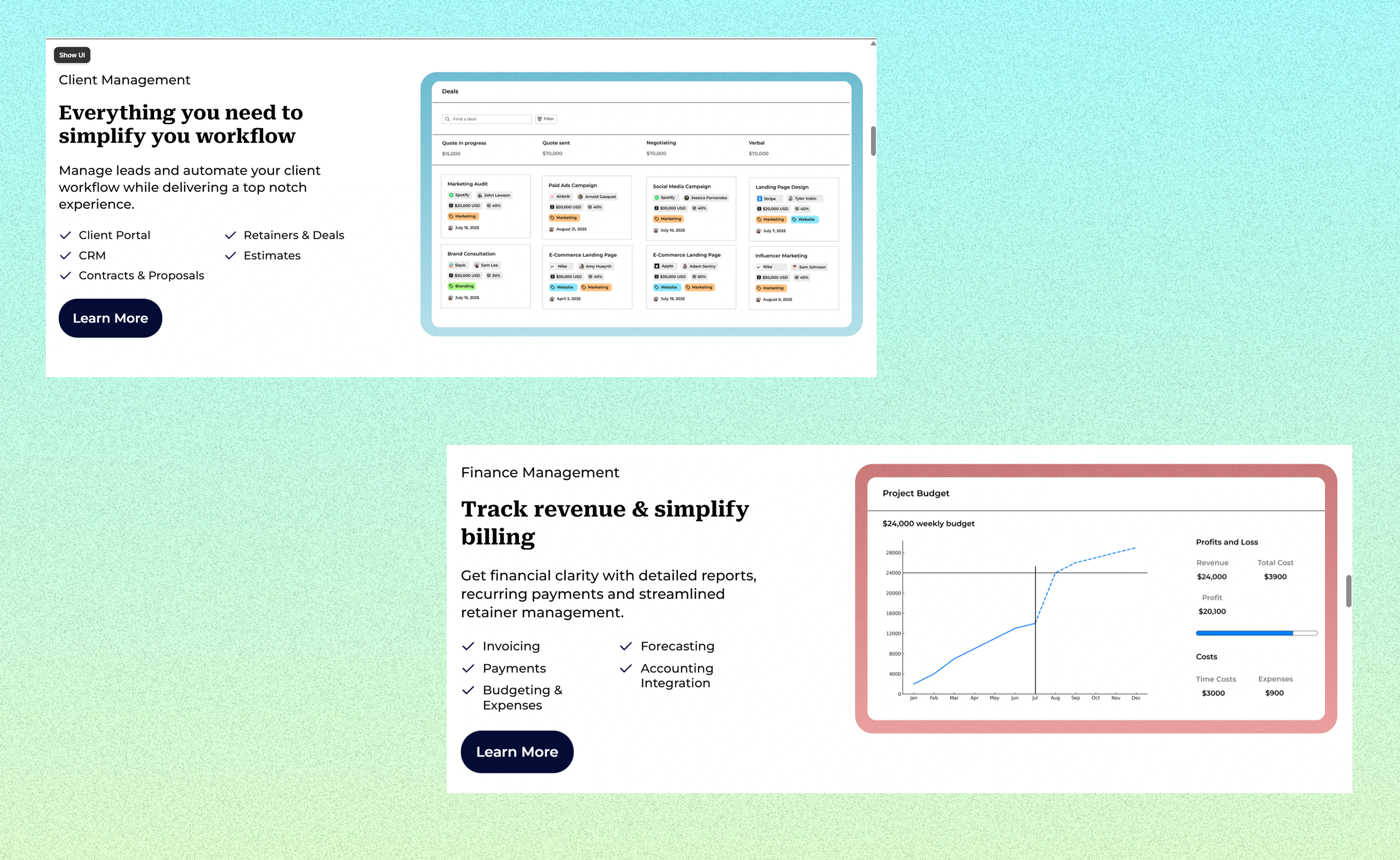
2) Feature Highlights: Mini sections that introduce the features and benefits of the software. This provides helpful information for visitors on whether the product is meant for them, and will encourage them to stay on the website to learn more about the software (image below).
3) Smooth Animations that increase the perceived value of the brand: For this project, I've incorporated some 'appear animations' and a stylish 3D carousel to give a premium + storytelling feel to the landing page - both of which will increase the perceived value of the brand and its products.
These animations were fairly simple to create and they do not negatively affect the performance of the landing page.
3D carousel animation
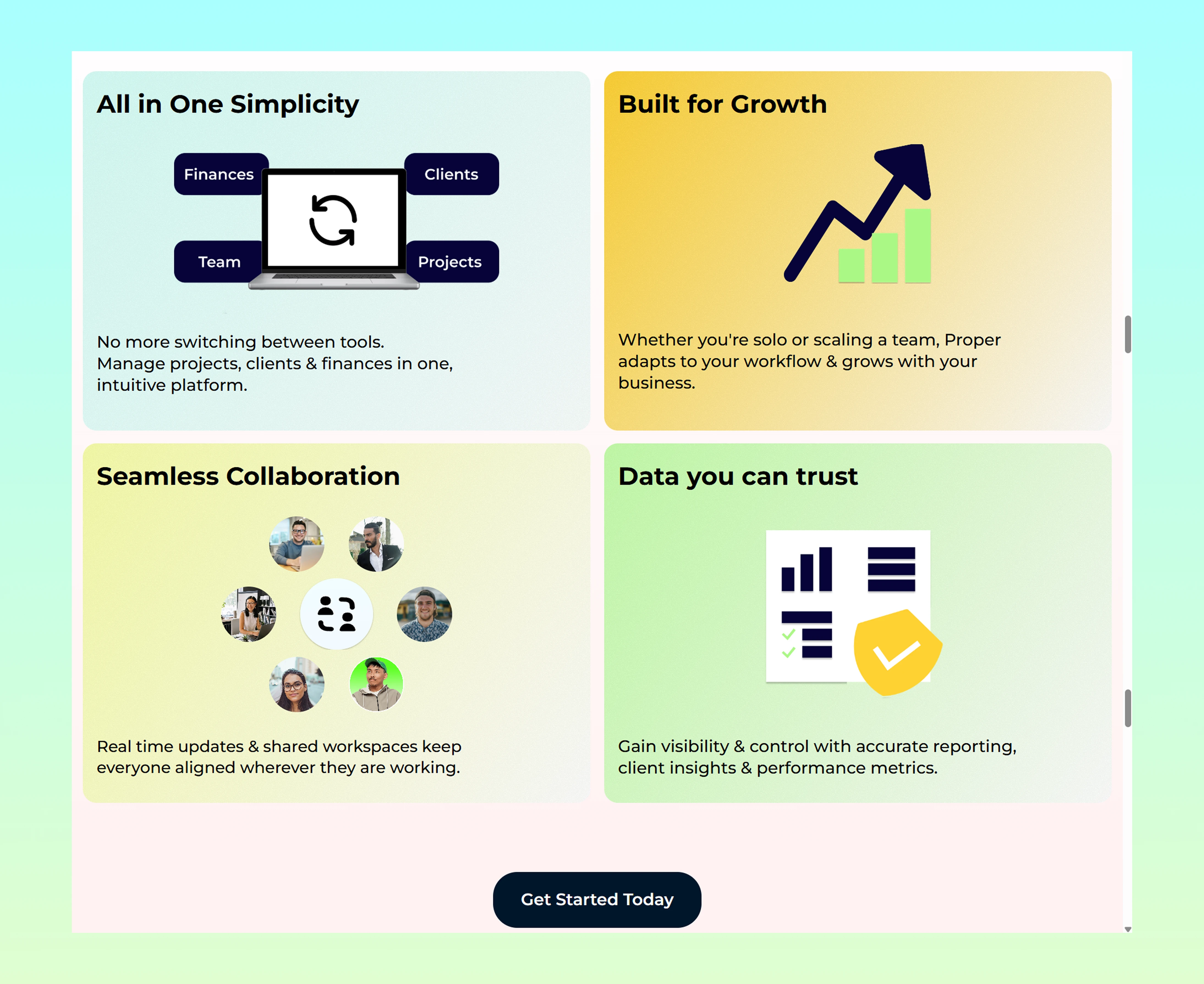
4) Branding & Strategy: For this project, I've kept the landing page simple, bold and clear.
White background that helps visual elements of the landing page stand out and creates an overall professional feel.
Buttons and certain boxes were coloured dark blue, because dark coloured elements stand out from the white background, making it easy for people to notice them.
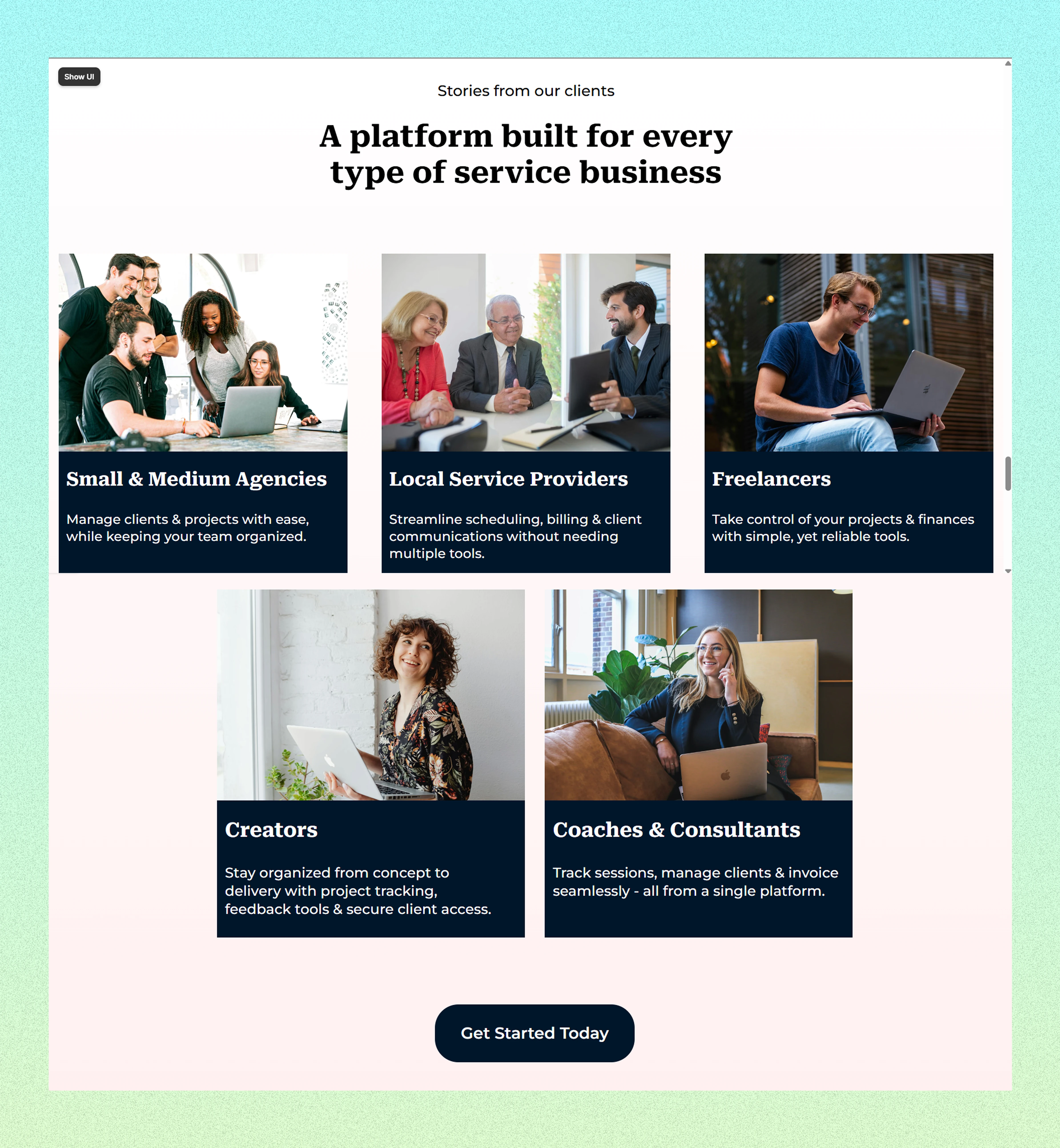
The landing page is structured in a way that has important product information, statistics that indicate the company's track record and testimonials - all featured very early on the landing page, to maintain the visitor's attention and communicate the value of the software to them.
Conclusion
This landing page is simple, informative and visually compelling - everything that a tech startup would need to convert visitors into customers.
If this was a real client project, I would expand this website to include specific pages for each feature, a blog, case study pages and much more.
The website will be optimized for conversions, SEO success, high performance and also include integrations of the client's choice.
Check out the full landing page here.
Ready to get started ?
I offer affordable Framer Web Design and Development services that fulfil your business needs and elevate your digital presence to the next level.
You can book a free consultation with me here.
Looking forward to meet you and help you with your next project :)
Like this project
Posted Nov 6, 2025
Designed a professional and visually compelling Framer landing page for Proper.
Likes
0
Views
1
Timeline
Oct 22, 2025 - Oct 24, 2025