
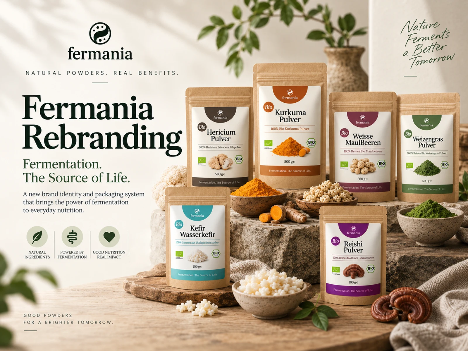
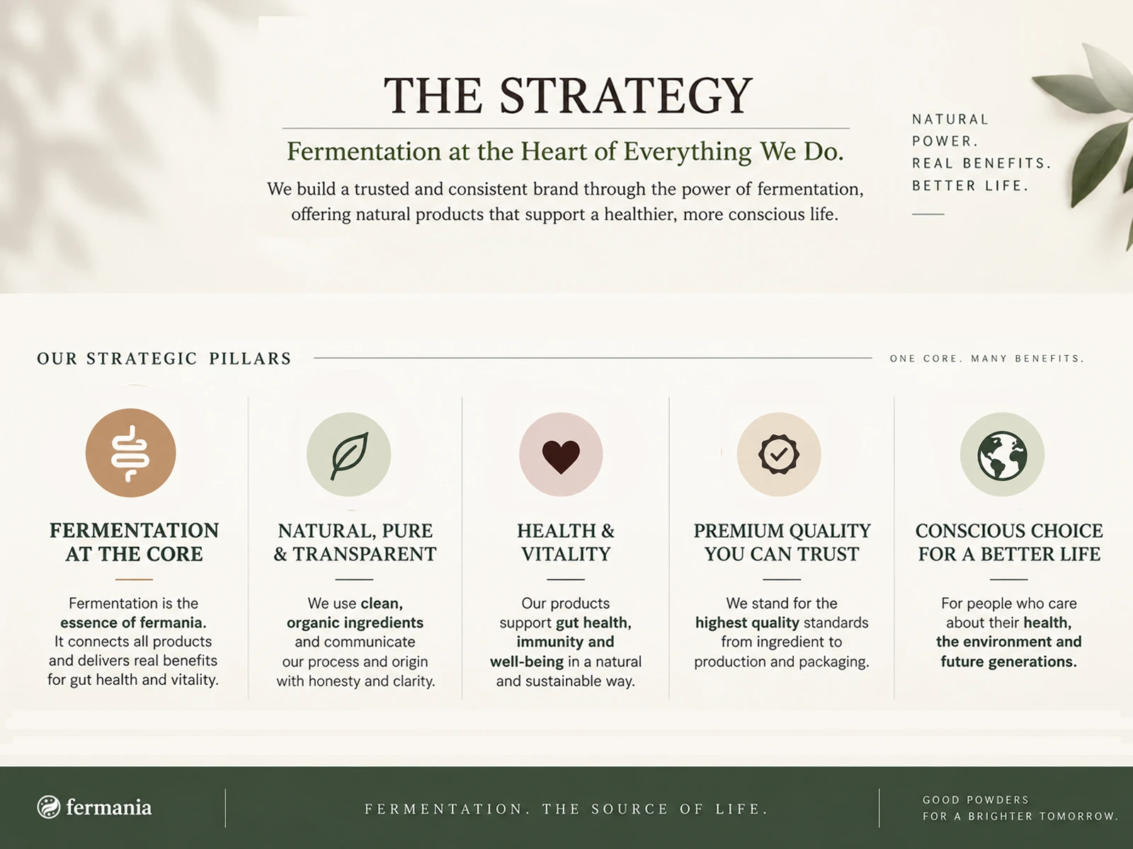
PUTTING FERMENTATION AT THE HEART OF FERMANIA.
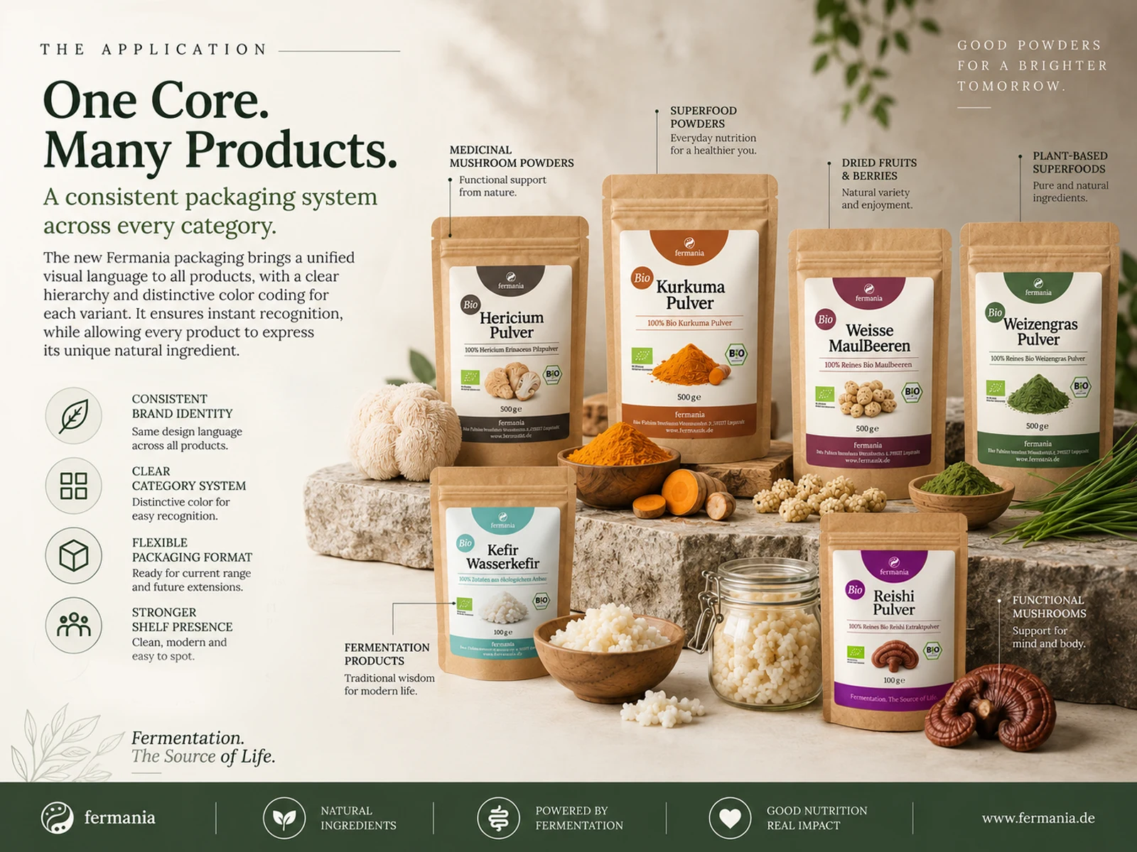
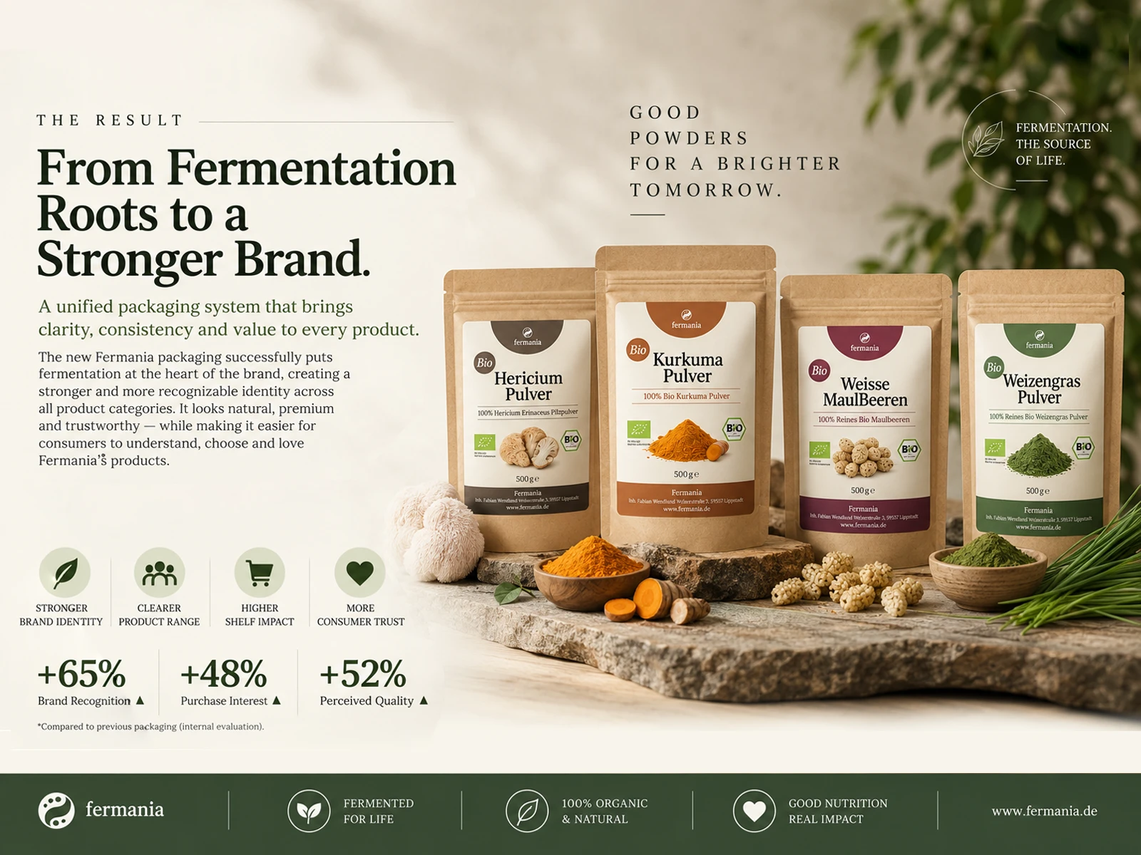
Fermania’s previous packaging lacked a clear connection between its products and its fermentation heritage. We created a new identity and packaging system that turns fermentation into the brand’s central story.
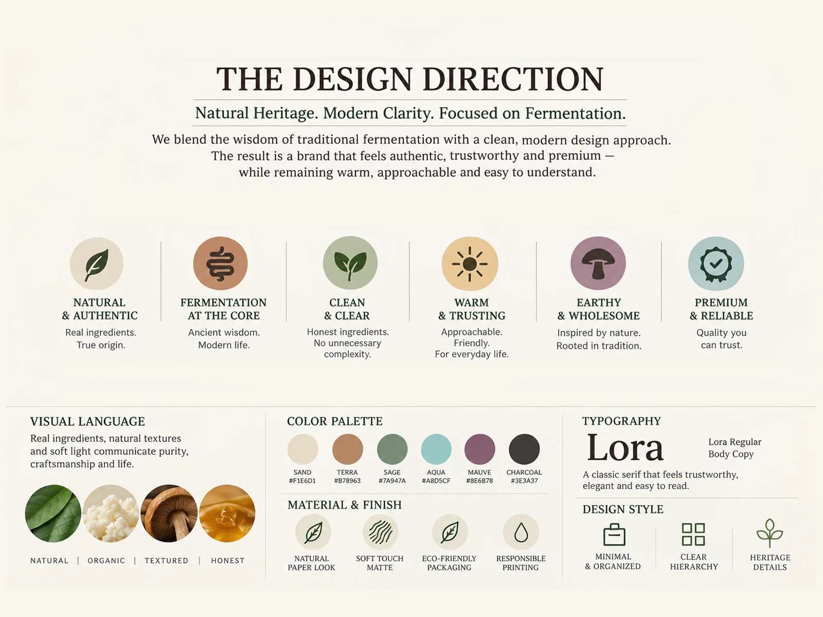
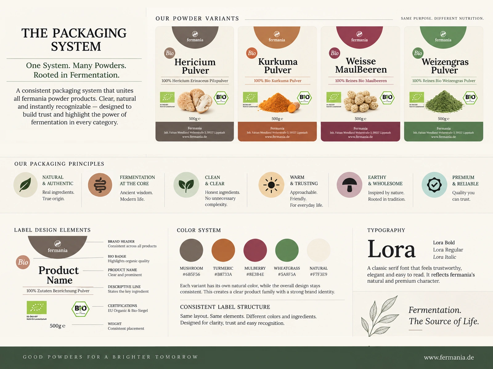
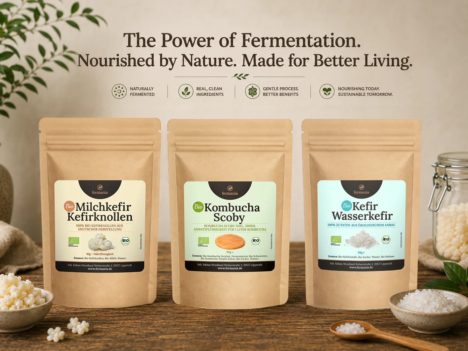
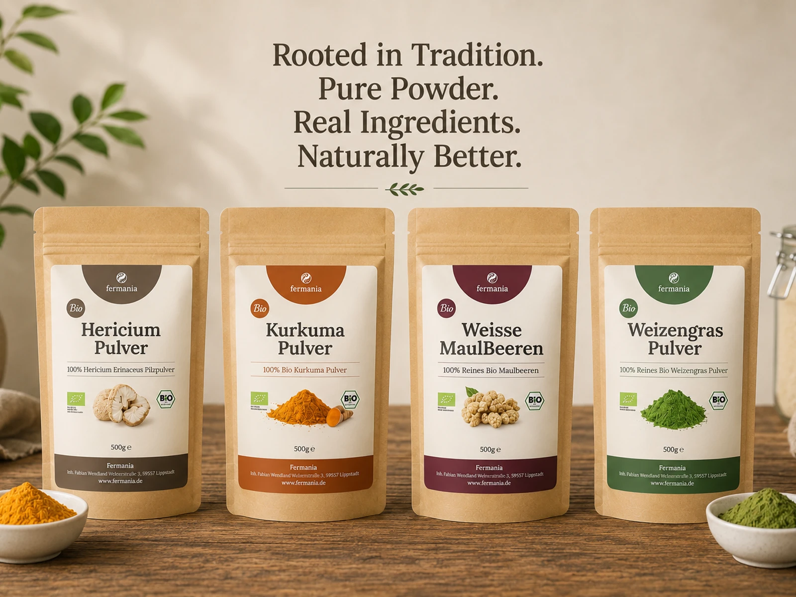
A flexible structure, distinctive category colors, clear hierarchy and natural visual language now work together across the range — making Fermania more recognizable, cohesive and relevant for today’s health-conscious consumer.
The redesign combines natural heritage, modern clarity and a consistent visual system to create a packaging family that feels authentic, premium and trustworthy. Each category has its own character, yet remains clearly connected to the Fermania brand.
1 like · 8 views · Sep 5, 2026
Redesigned Fermania's Packaging to Spotlight Fermentation Heritage.

