Trades Trek Limited | Fintech Brand Identity
Abdulsamad Umar
Trades Trek Limited is a financial agency who are into investment management, financial training and business advisory. With a client base mostly consisting of stock traders and those interested in financial investment, they are poised to take their clients on a discovery journey into financial investments and financial instrument trading.
Trades Trek Limited wanted a new identity that would create an image that sticks in the mind of the target audience. With a vision to stand out amongst its competitors in the financial ecosystem and become the major financial market player in Africa.
Our approach was to create a modern and dynamic identity system.
A logomark that is simple, flexible and future-focused, with an objective to make Trades Trek Limited stand out amongst its competitors and elevate the brand personality.


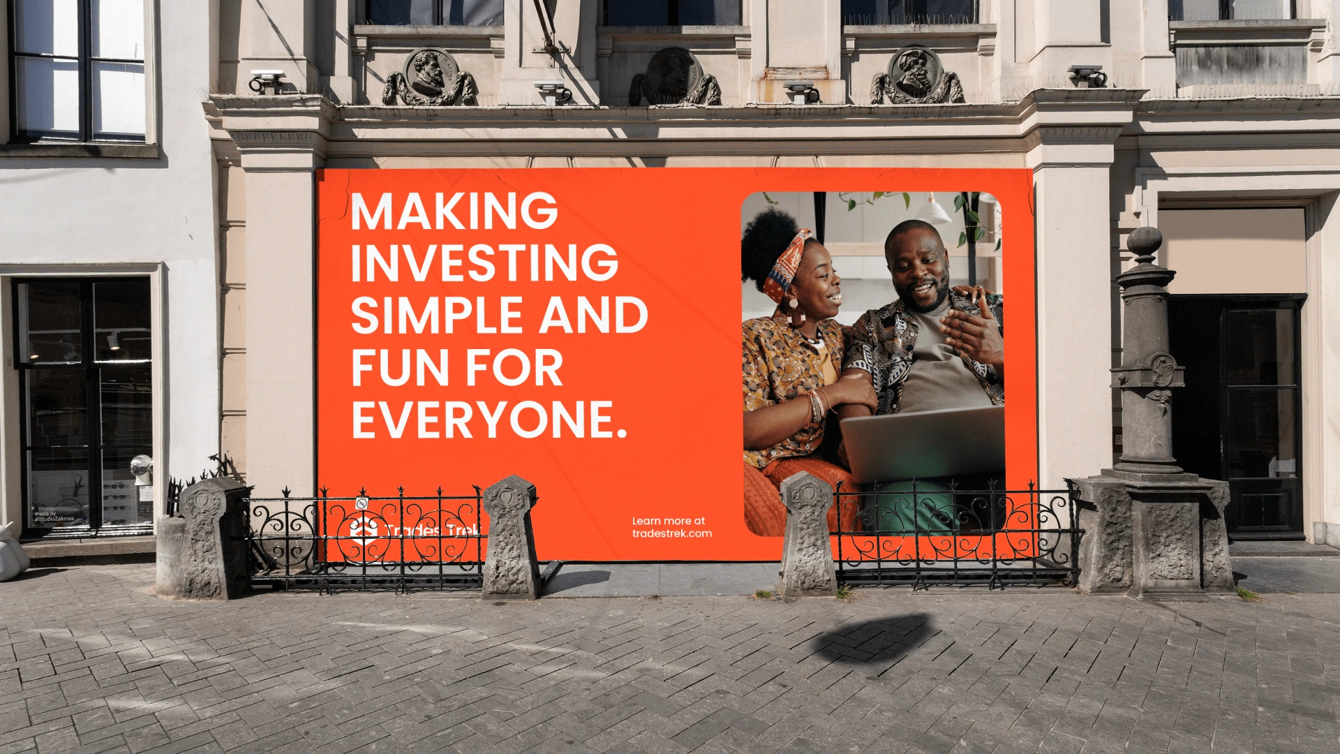
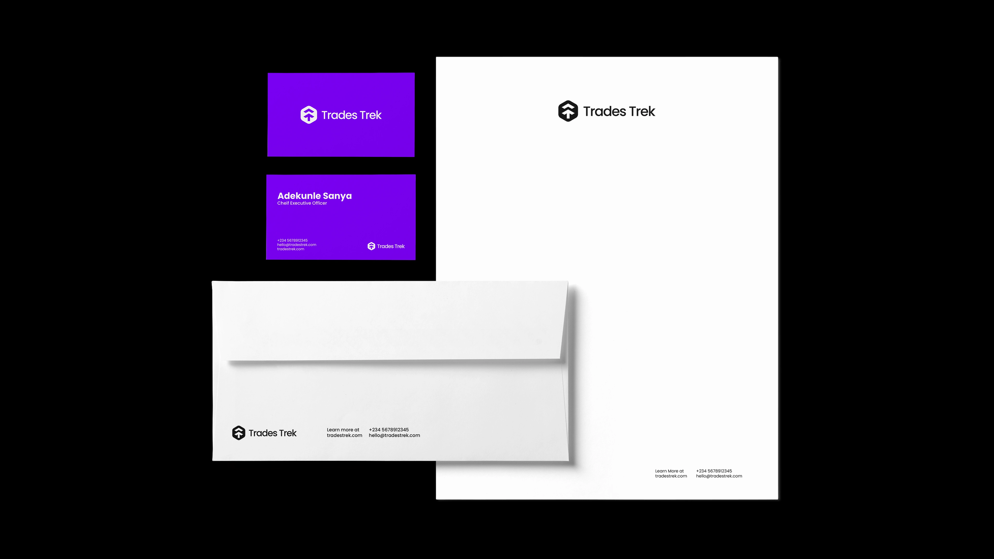
The logo features abstract shapes that are based on the letter "T" and "T" which stands as the abbreviation for Trades Trek. The abstract mark also references an "Upward Arrow" which represents progress and the forward-thinking values of Trades Trek Limited.
The primary colour palette consists of black, white, violet and lavender blue. The secondary palette features several complementary colours such as blue, orange, chartreuse yellow and spring green. These can be used for secondary brand identity, illustrations and marketing materials. This simple colour system perfectly matches the brand's approach to financial technology and business advisory, helping customers feel confident in its comprehensive business offer.


Like this project
Posted Dec 4, 2024
Trades Trek Limited is a financial agency who are into investment management, financial training and business advisory.