Case Study: Redesign a Website for the SEO Agency for SaaS.
Sandi Dez
✦ Linkflow Website Re-Design Project.
Client
Linkflow started as a link-building-only agency. They're beginning to niche into full-service SEO for SaaS and Tech. The company has 6 years of experience as an SEO agency and helps clients with roadmaps for that build-out strategy. Linkflow has systems in place for securing high-quality links which are very difficult to build. They are more transparent than the competitors in terms of work and reporting.
Project
Linkflow approached me to re-design their existing website since the current one does not appeal to the customers and also does not represent the company itself. They want to shift the company message and design more towards targeting SaaS and tech, and when leads from those niches come to the website - it should feel like Linkflow is the obvious choice.
So, I started to send over the questionnaire for the client to pull more data and do some research on their existing website so we could outline the real problems and how to improve it in terms of user experience and visual appeal.
Problem
Based on the client's data and problem researched. We found some issues on the existing website that have to be improved:
The current design is a bit cartoony and doesn't look super professional.
It has tons of colors and distracting elements.
No clear CTAs and the typeface doesn't represent the company message.
Some elements look blurry since they used the low-resolution image format instead of SVG.
Here's their previous website:
Solution & Creative Process
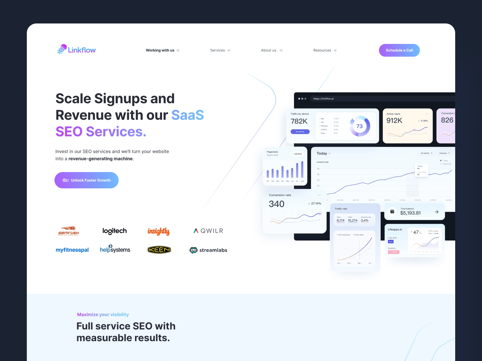
The agency should have something more simple and tech-focused website so that when their clients come to the website, they know Linkflow is the right place to work with and collaborate.
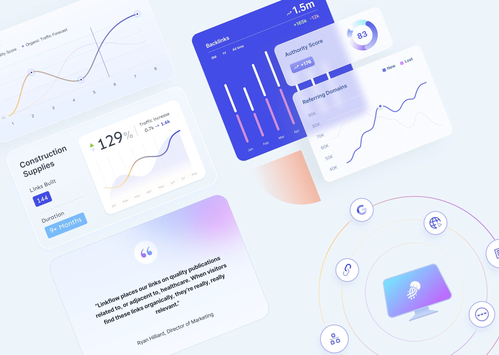
The message should also have more attention by creating a well-sized heading, the right CTA button, showing the social proof above the fold, and presenting some graphics based on real data to improve trust and navigate the potential customer into the leads.
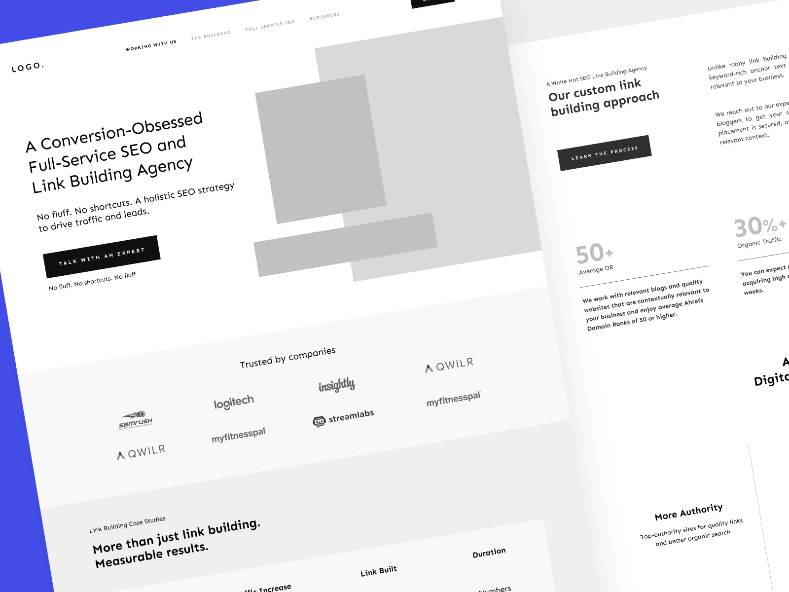
We started by creating wireframes to find the best solution for the layout that converts through great navigation for potential customers.
The color scheme and the rest of the content should be easy and clear for the eyes and not distract from the main message, so I decided to use a simplicity concept and light background. Also, pulling the gradient color from their logo and making it the secondary color to use as the important message and some element's accents.
We're doing in-depth iterations of design and layouts back and forth, once we find the best one, we improve it and focus on the details.
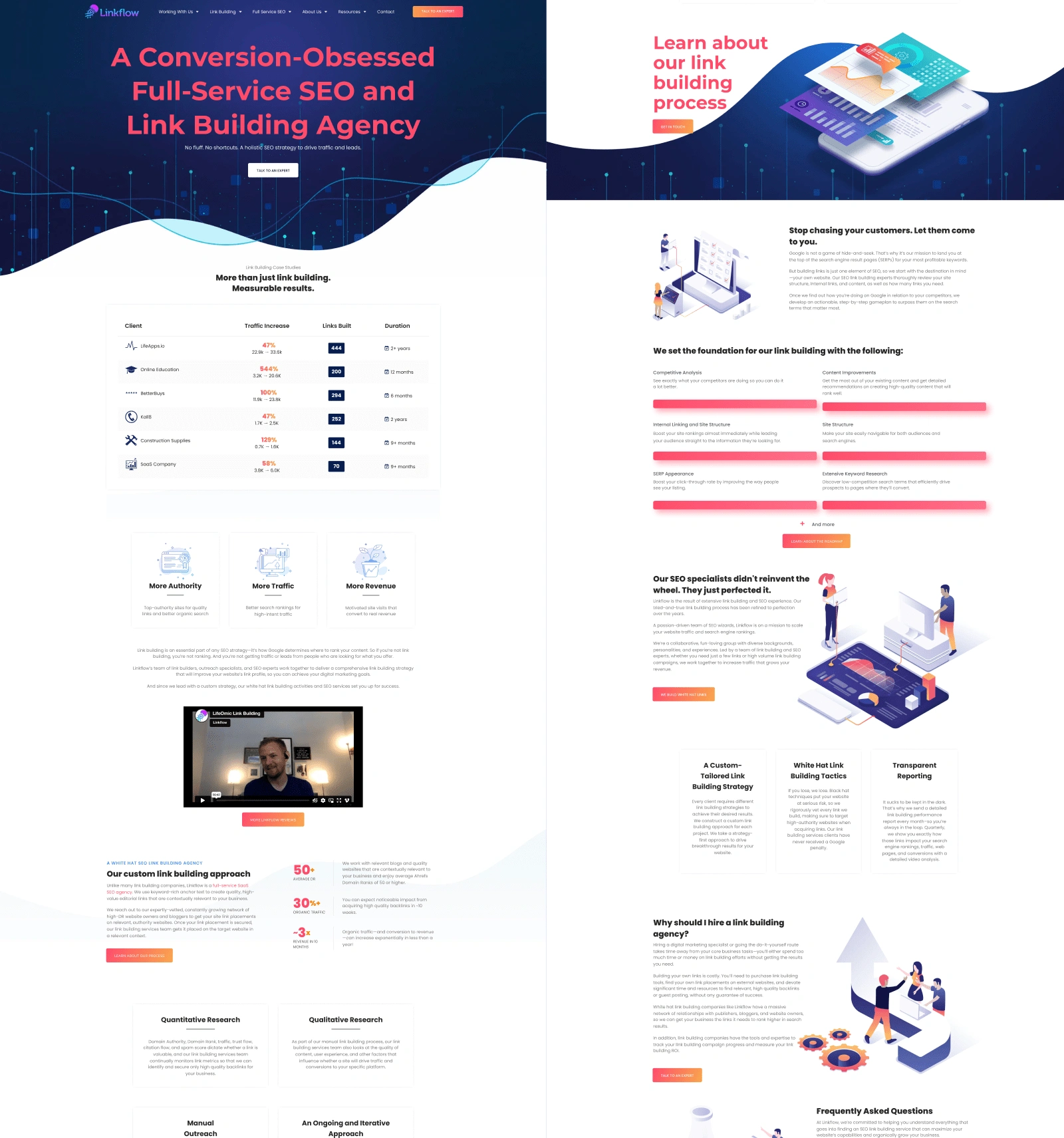
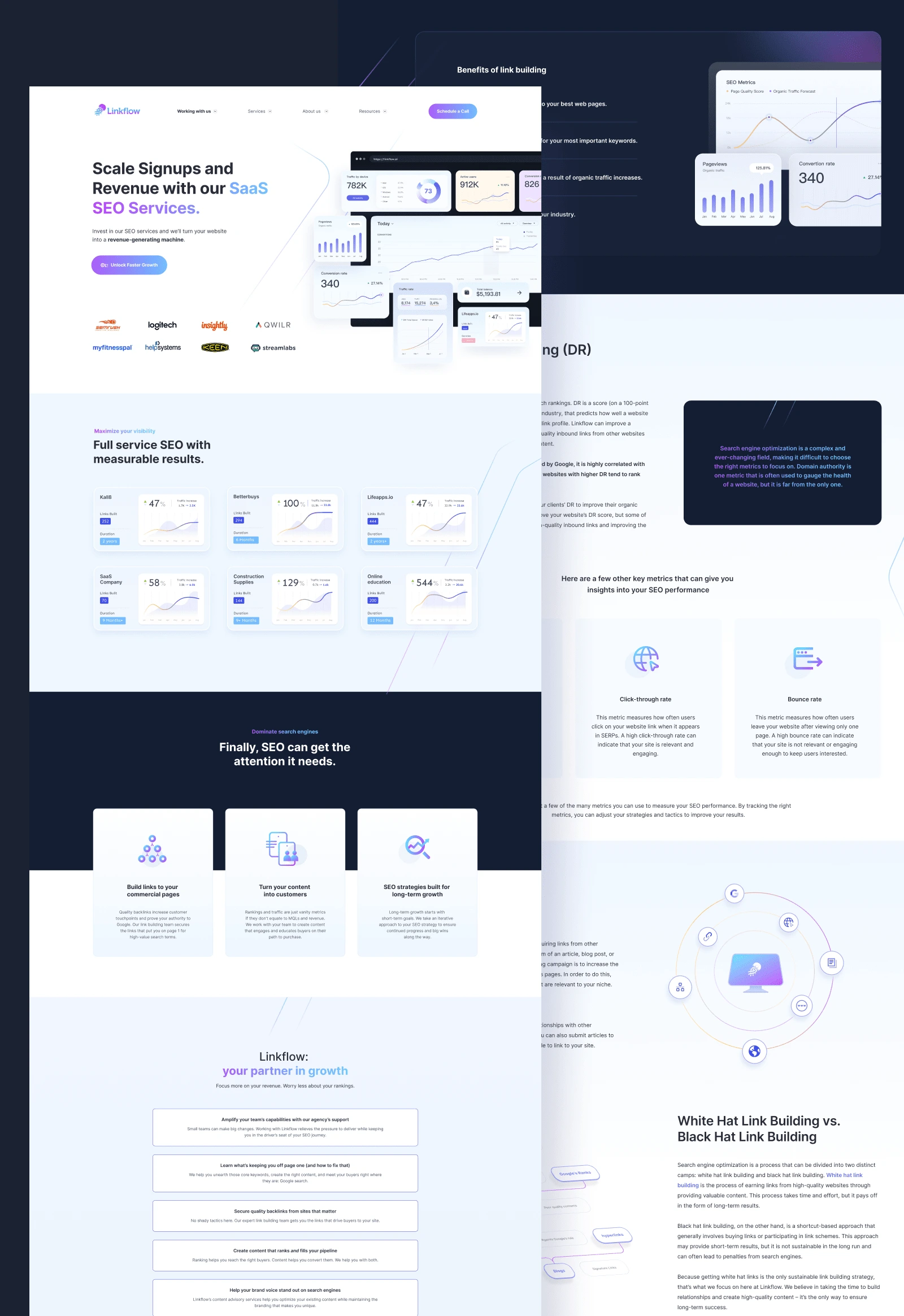
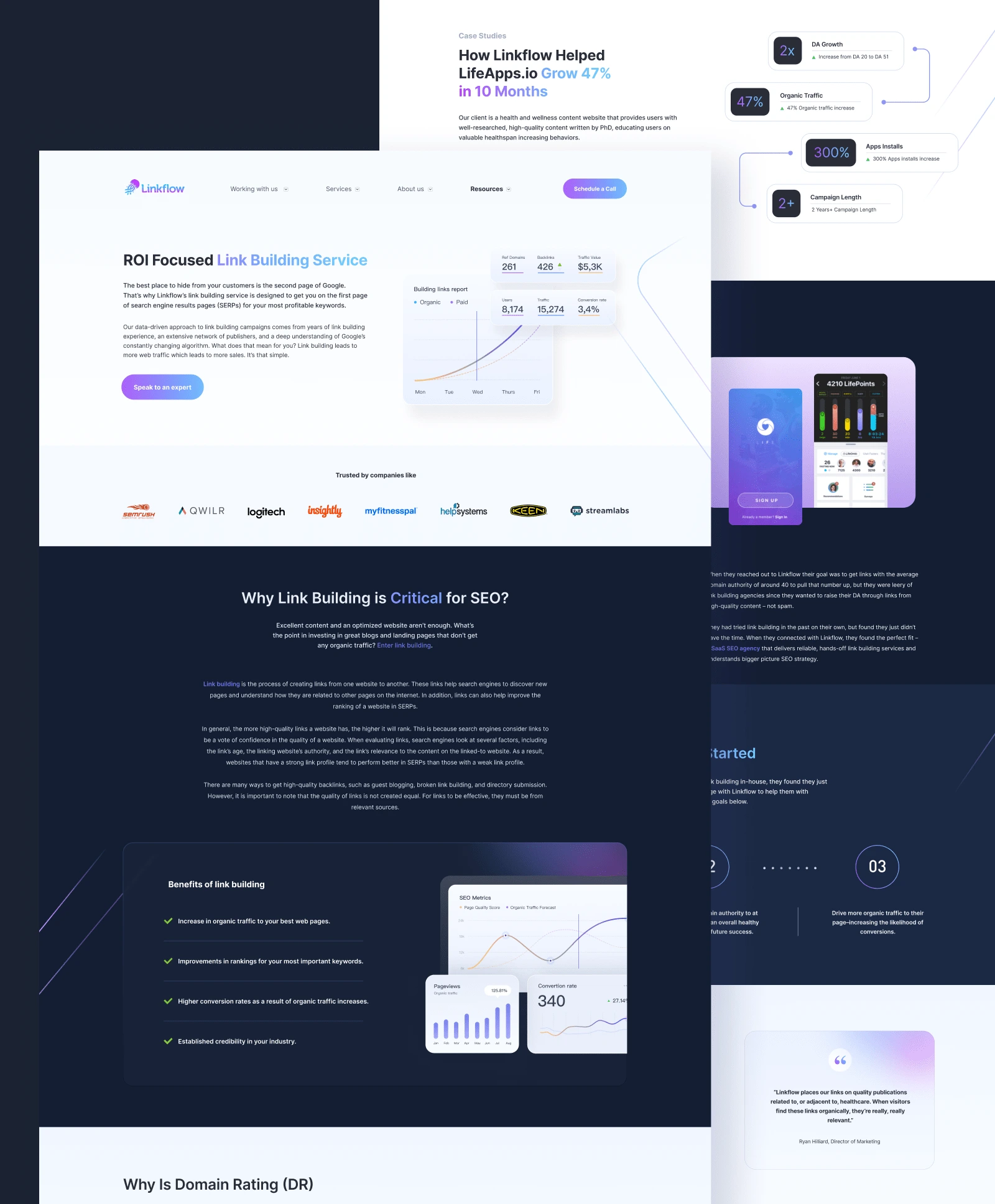
Final Result:
Conclusion
Re-designing the existing website has its own challenges, especially when the website doesn’t have a good user experience that slows down the business. But with the right solution, data research, and communication, the new website will have a good impact on the business and also has a great potential to establish a welcoming mood and emotional appeal. Finally, the potential customers will have a big chance to choose Linkflow as the only partner to grow their business.
--
Need a unique, clean, and nice performing UI/UX design that helps you stand out from the crowd?
📩 Send your message or get in touch at hello@creativezeune.com
Like this project
Posted Sep 22, 2023
Created a sleek and user-friendly UI re-design for a SaaS website, improving the overall user experience and increasing customer satisfaction.