“Lavra a Rir” | Identity & Ad
Nuno Santos
Overview:
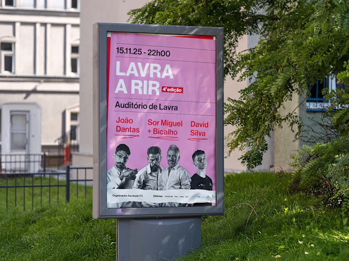
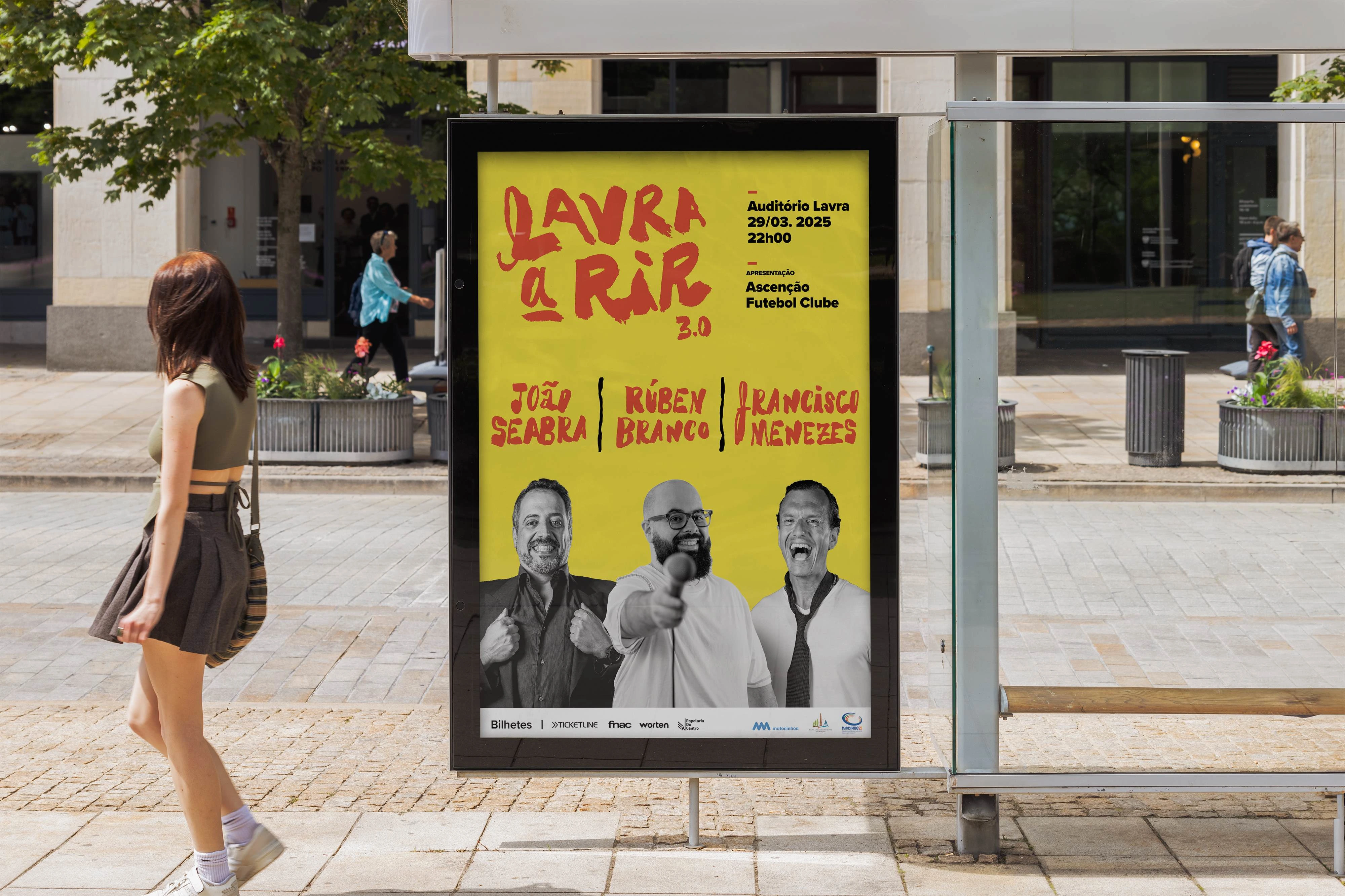
"Lavra a Rir" is an annual stand-up comedy show based in the city of Lavra, Portugal. For the 2024 edition, I was invited to develop the show's complete visual identity. The goal was to reflect the humor of live comedy while building a recognizable and flexible visual system that could adapt across print and digital formats.
Creative Approach:
The identity is driven by expressive, dynamic hand-drawn lettering that conveys the humor, energy, and human spirit of the show. I combined analog techniques—such as brush pen sketching—with digital tools to refine the final logotype and graphic elements. Bold, vibrant colors were used to amplify the comedic tone and create visual consistency across materials. Photography was also integrated to showcase the performers and human connection of the event.
Deliverables:
Custom hand-lettered logotype
Poster´s and billboard design for print and web
Stage and signage mockups
Social media graphics and stories
Visual style guide with typography, colors, and image treatments
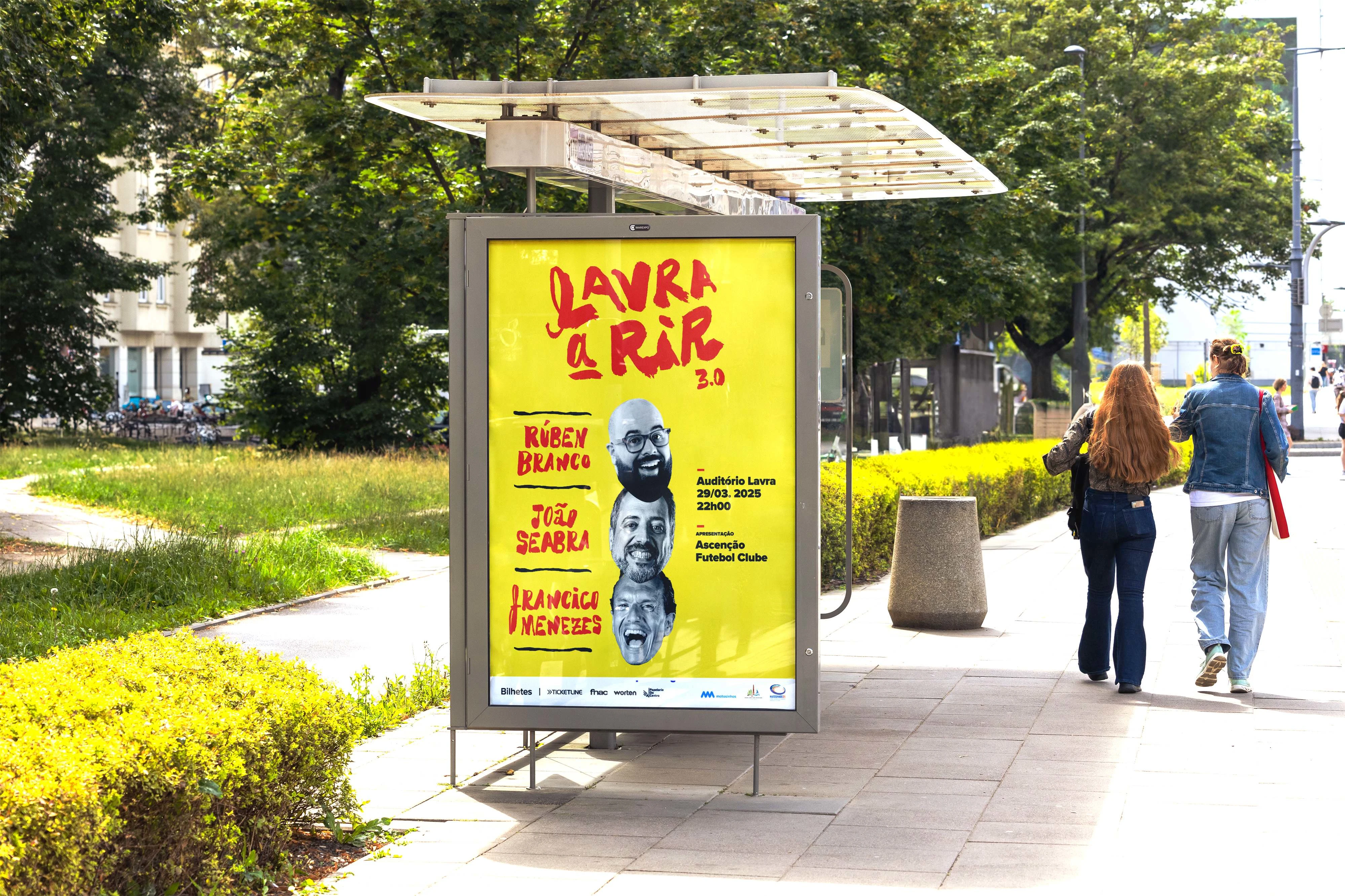
Main Poster of the event
Main Poster - Motion
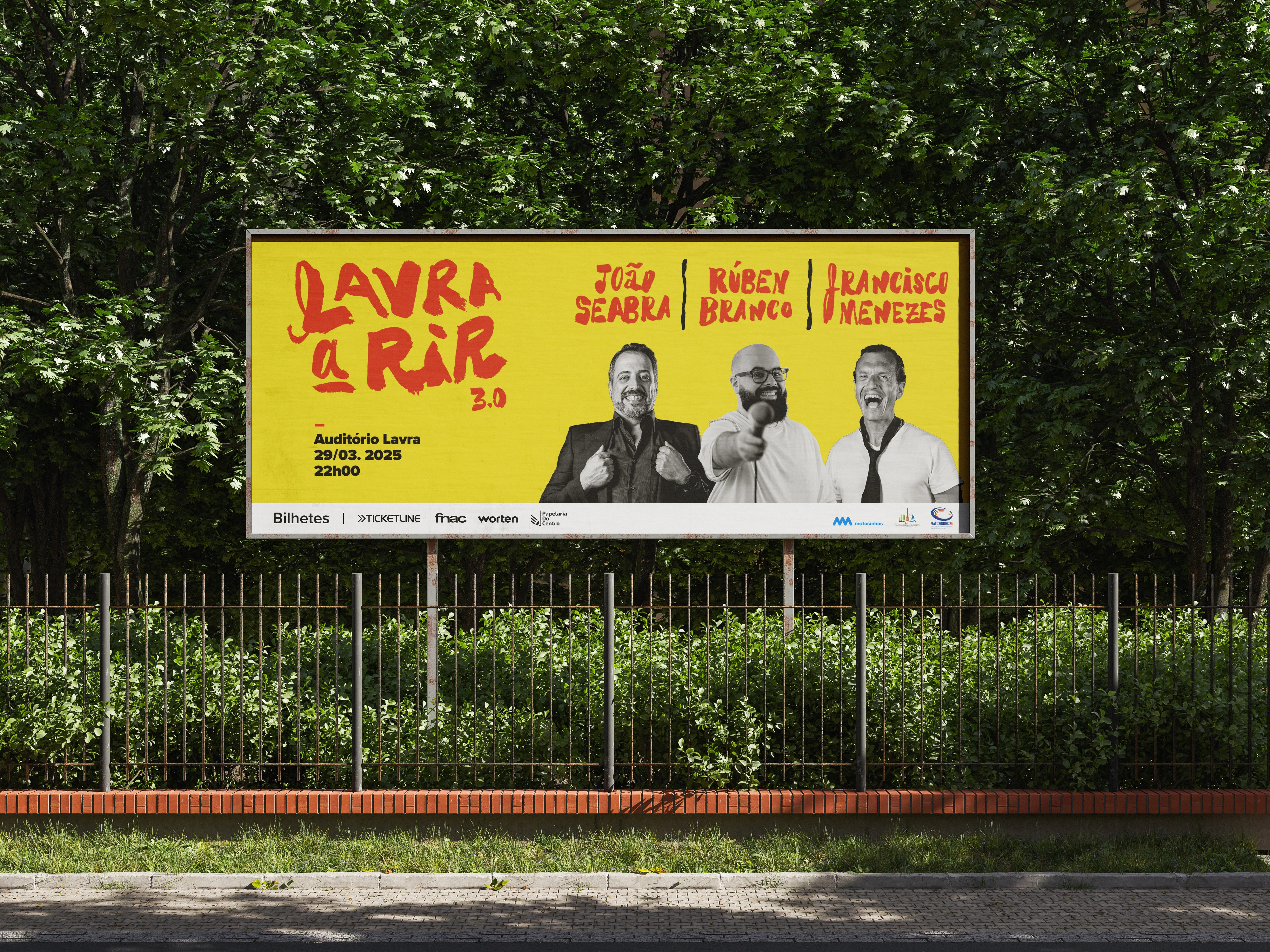
Billboard
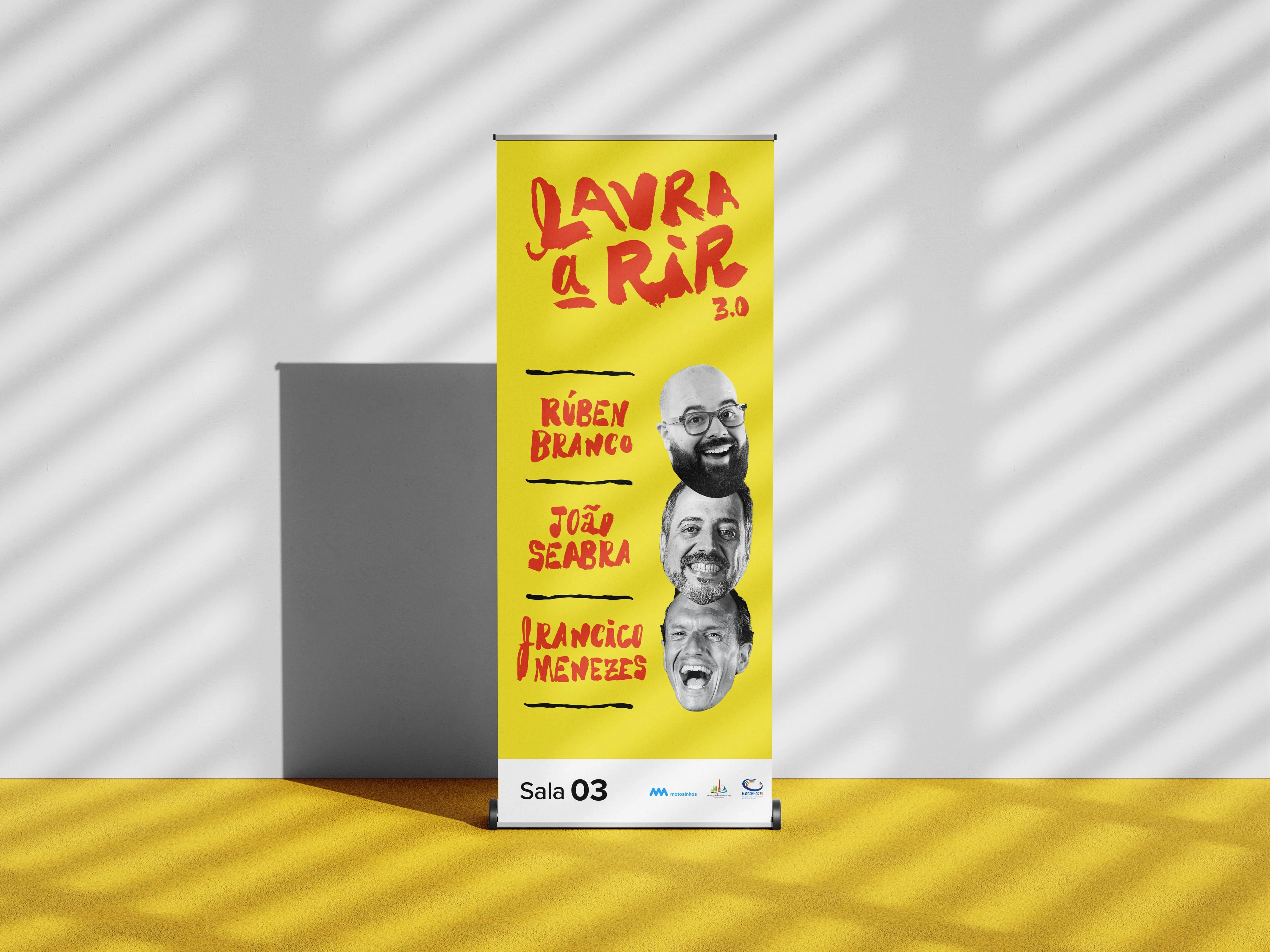
X-banner - Lobby
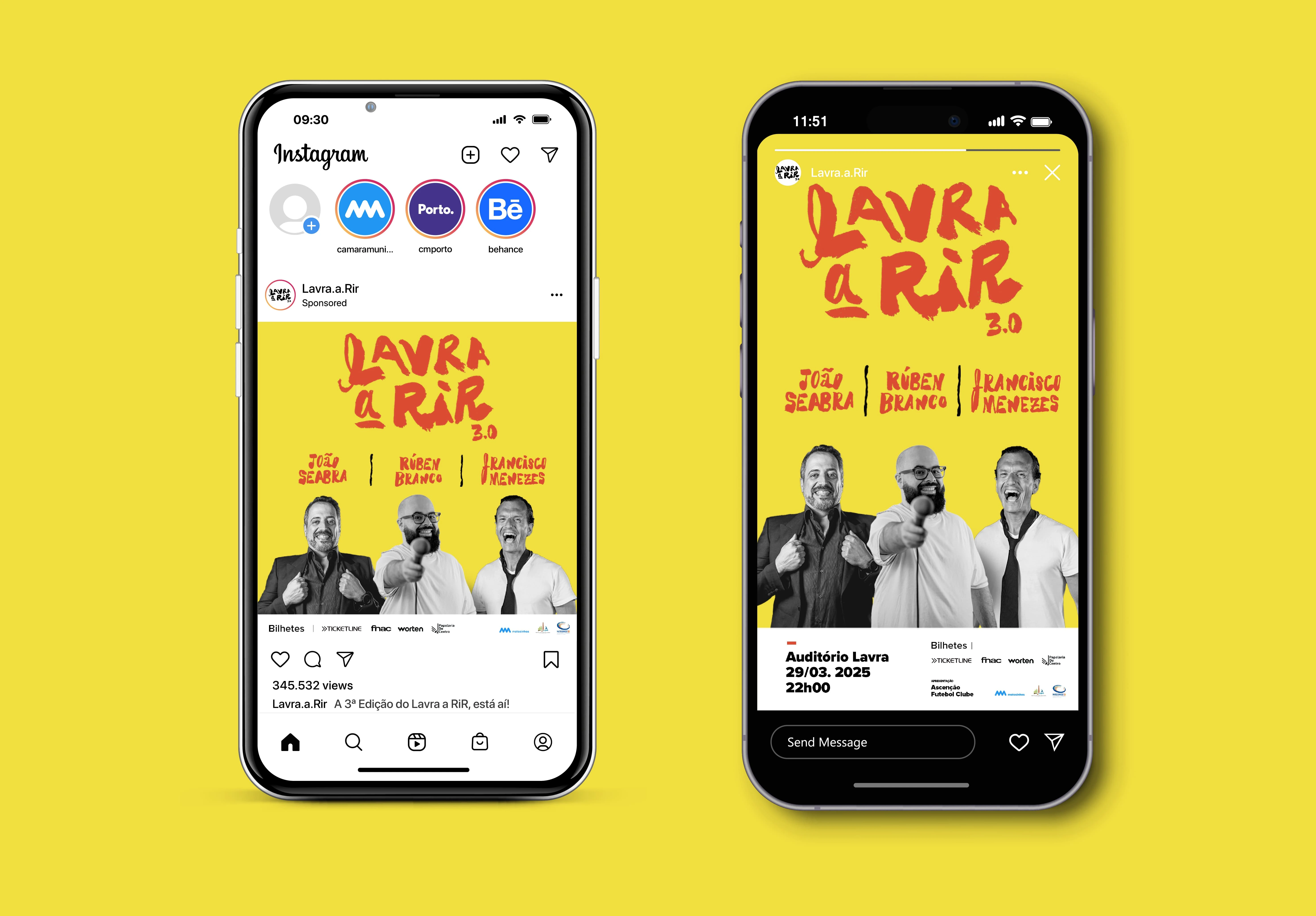
Instagram - Post and Story
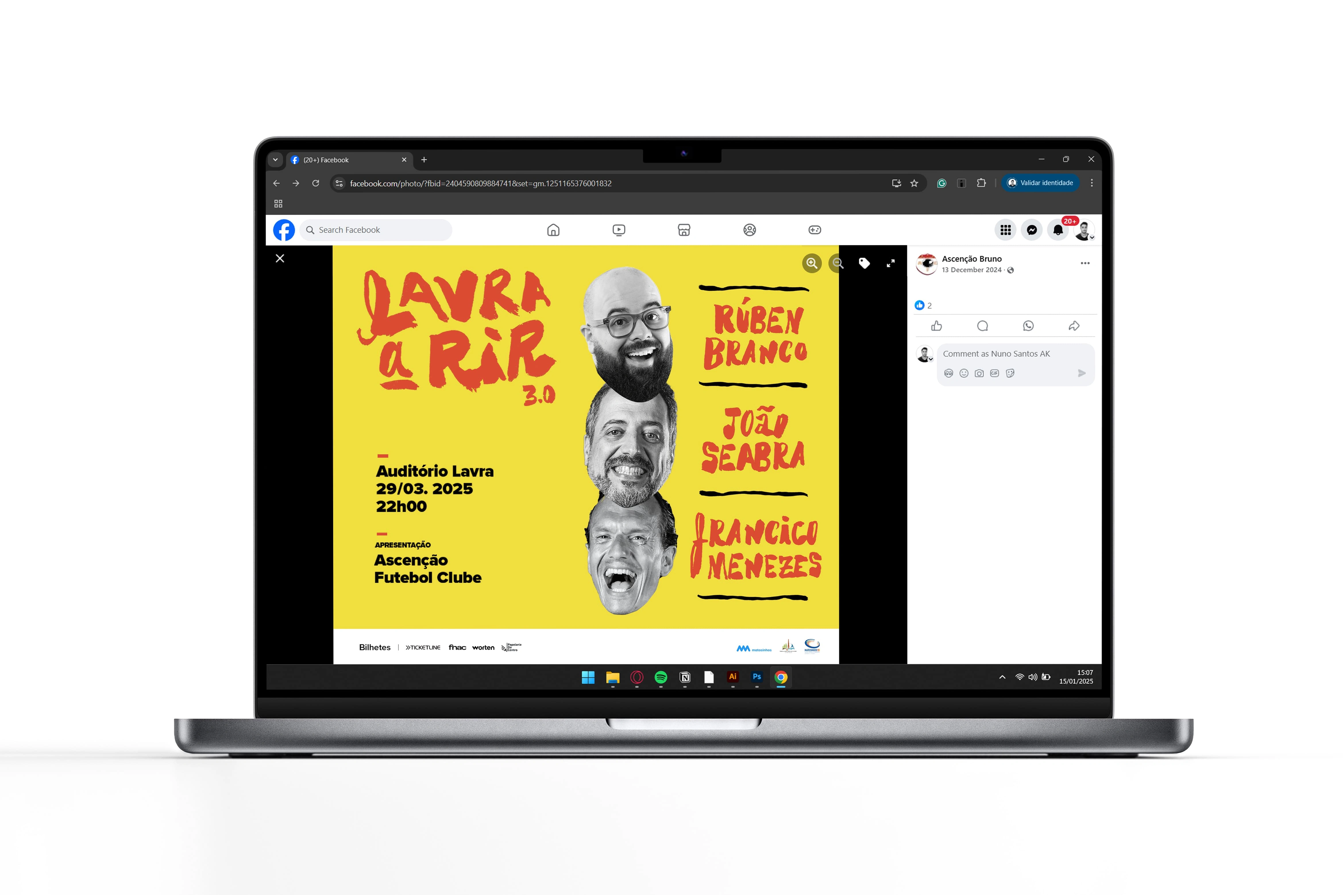
Facebook - Post
Like this project
Posted May 21, 2025
Visual identity for "Lavra a Rir" 2024 comedy show. Bold colors, dynamic hand lettering, and photos express the show’s energy and humor across all formats.