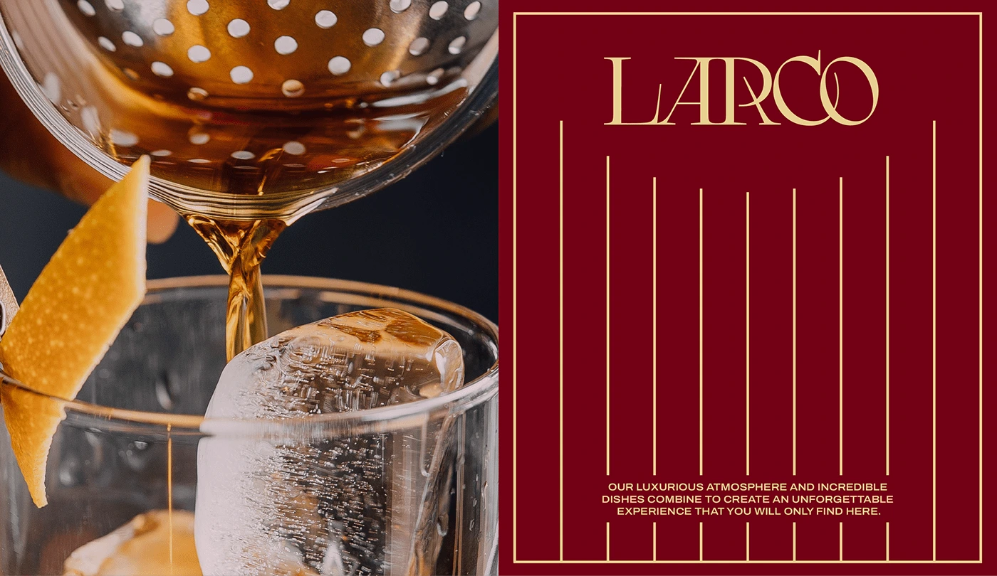
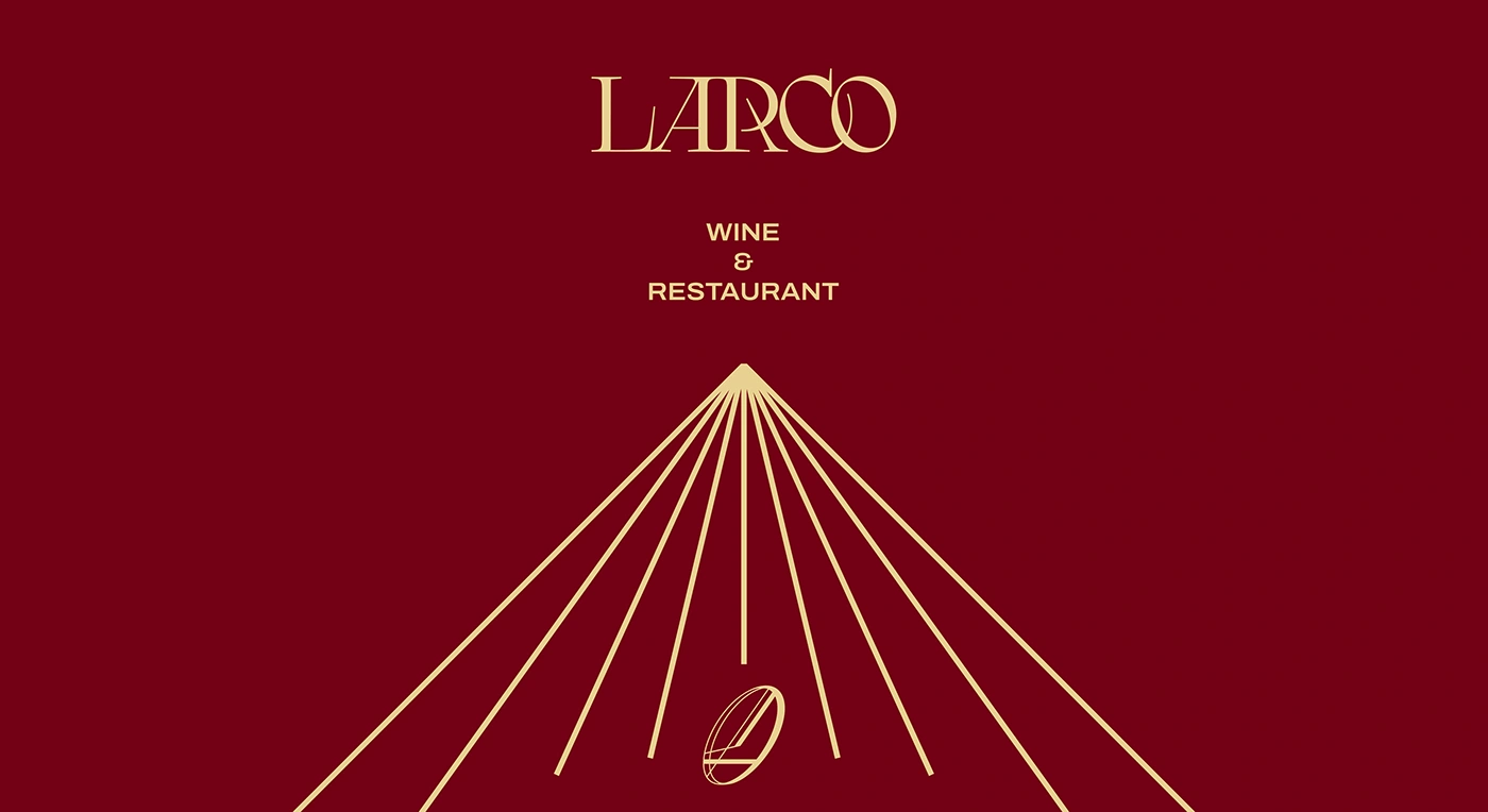
Larco
Zantana
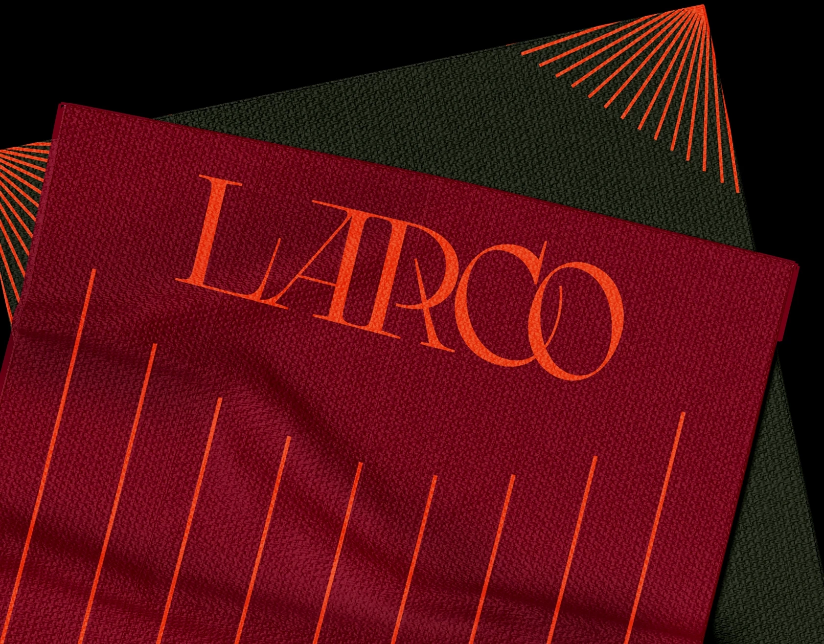
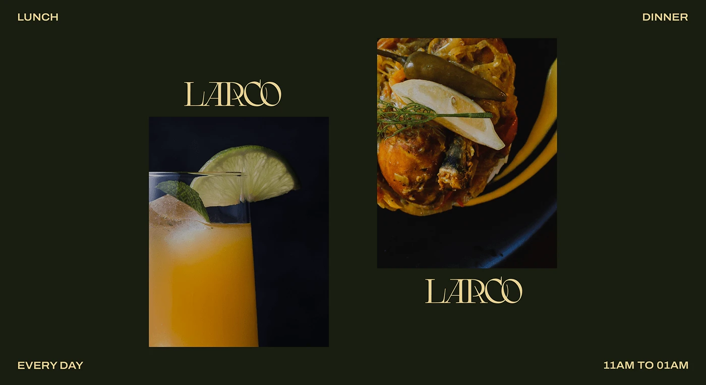
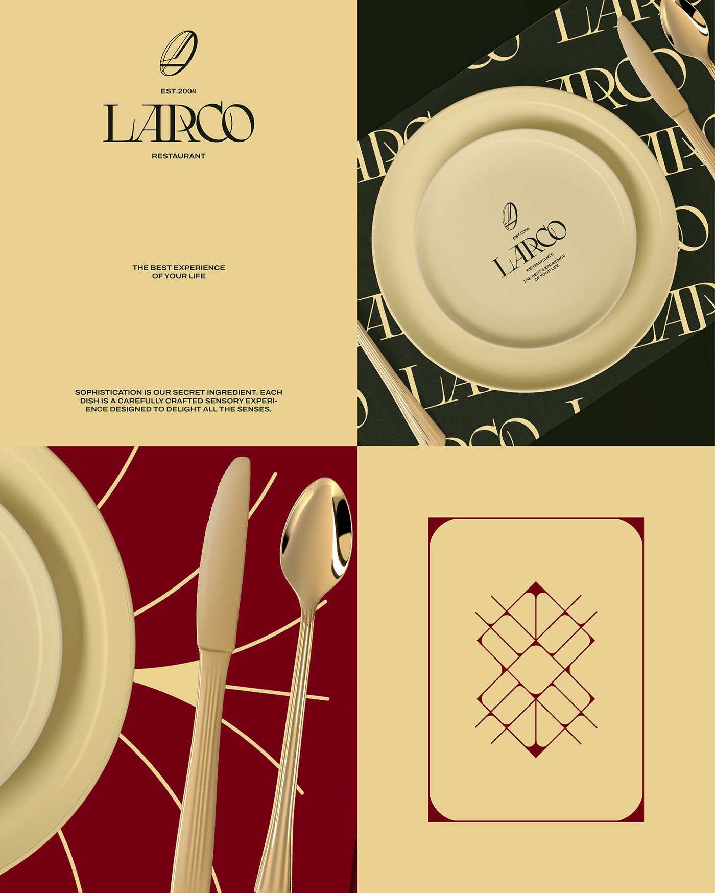
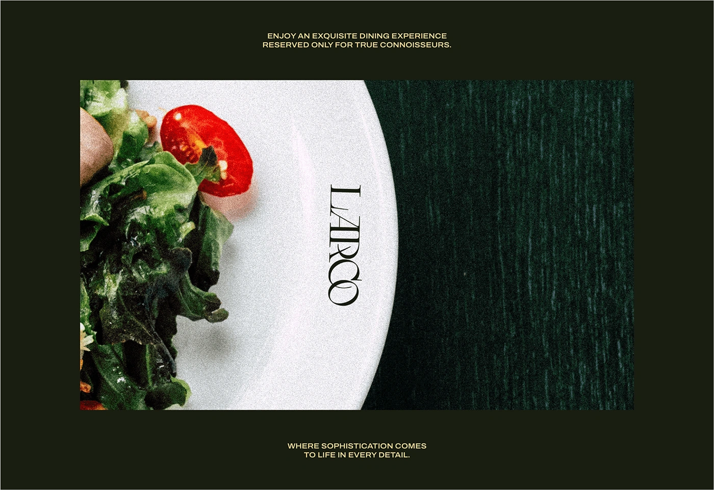
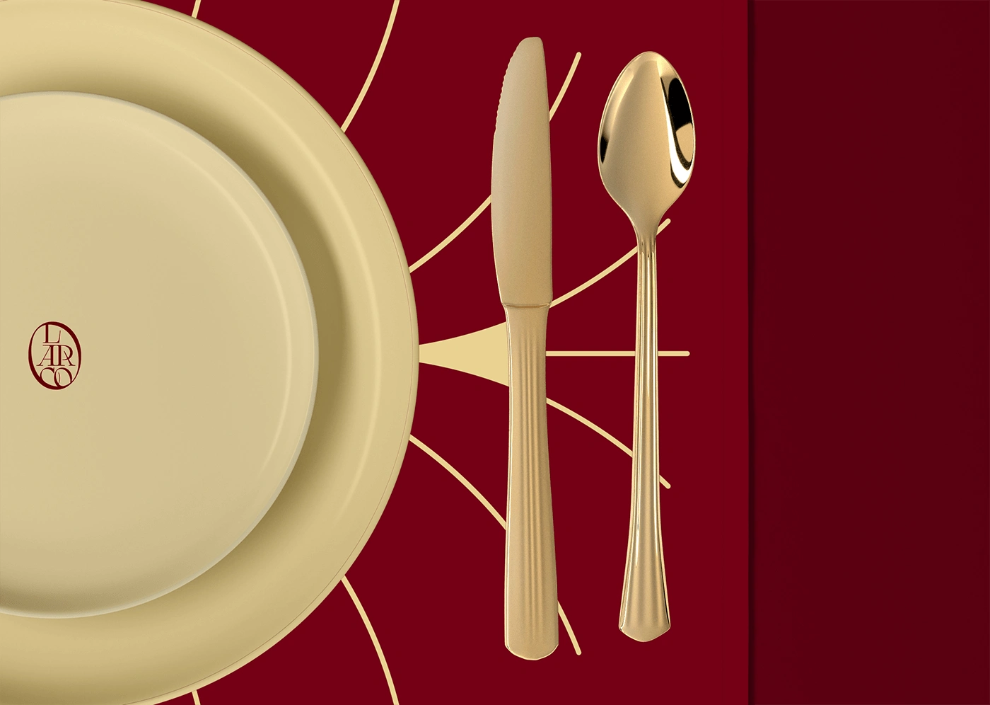
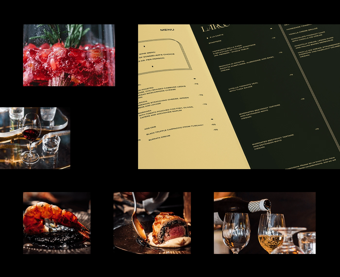
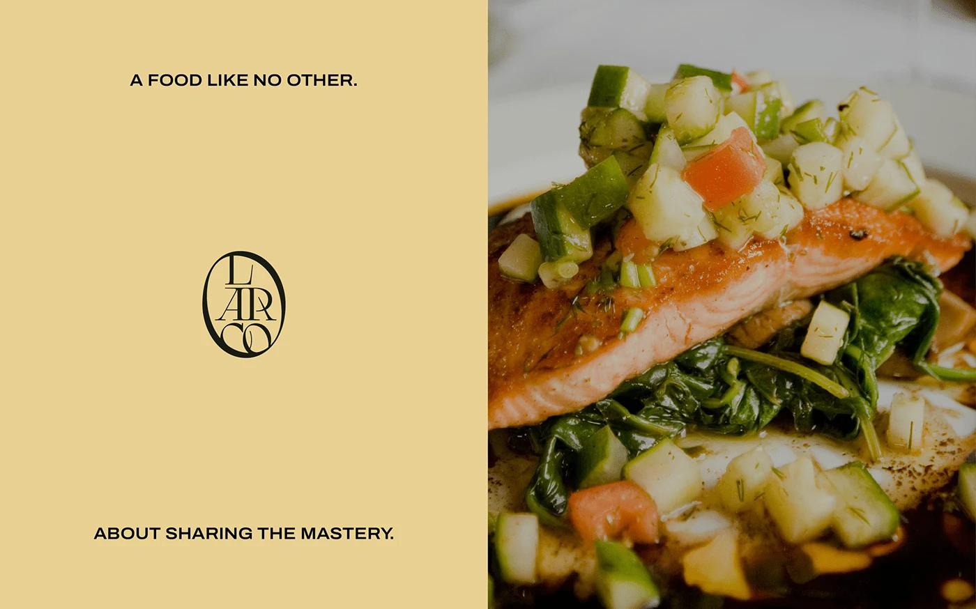
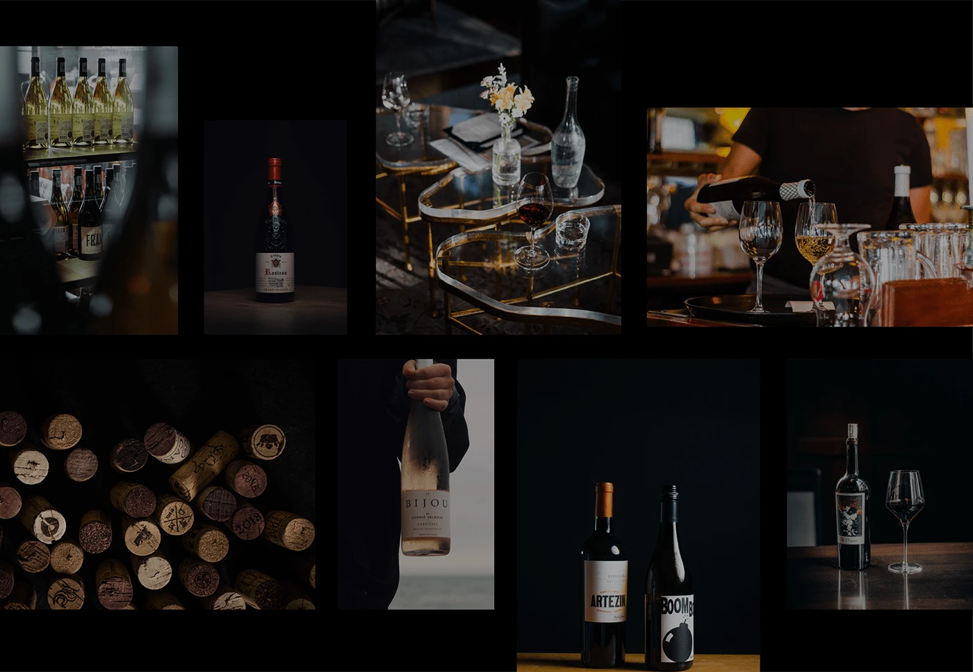
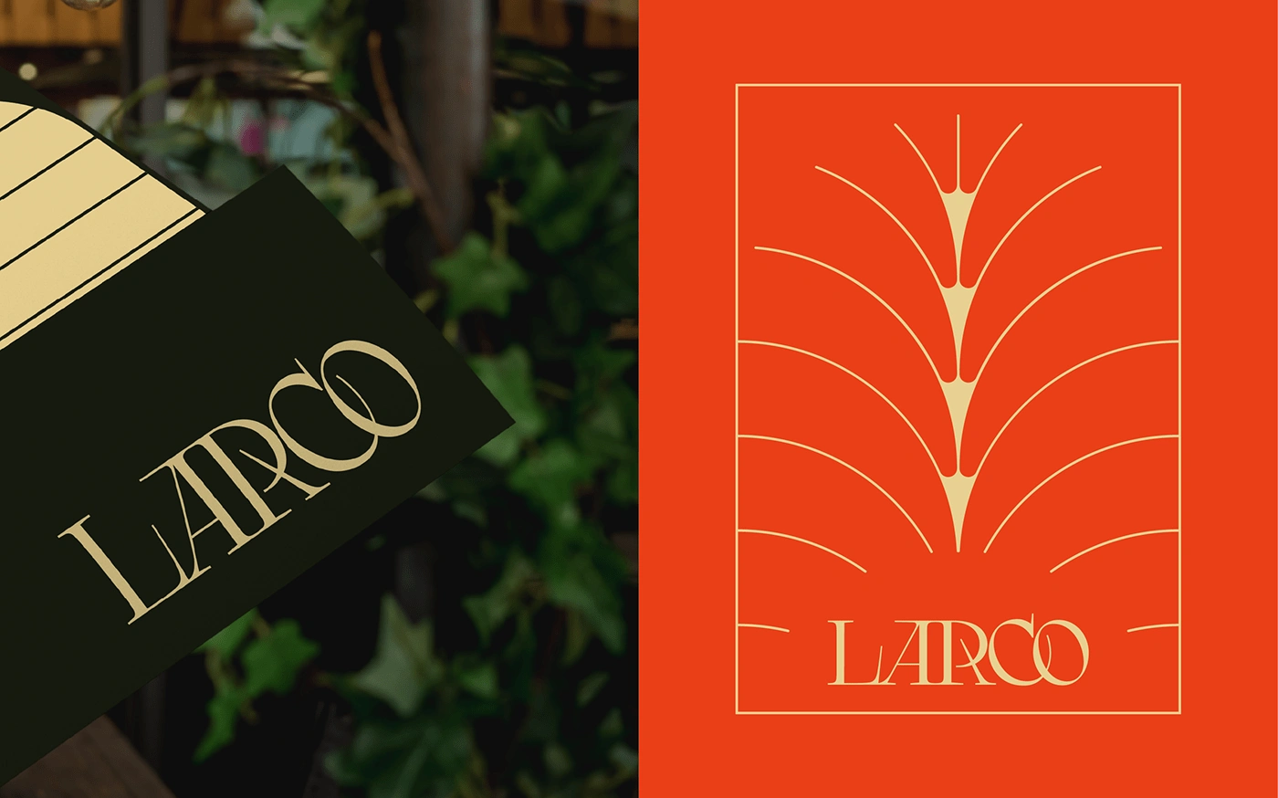
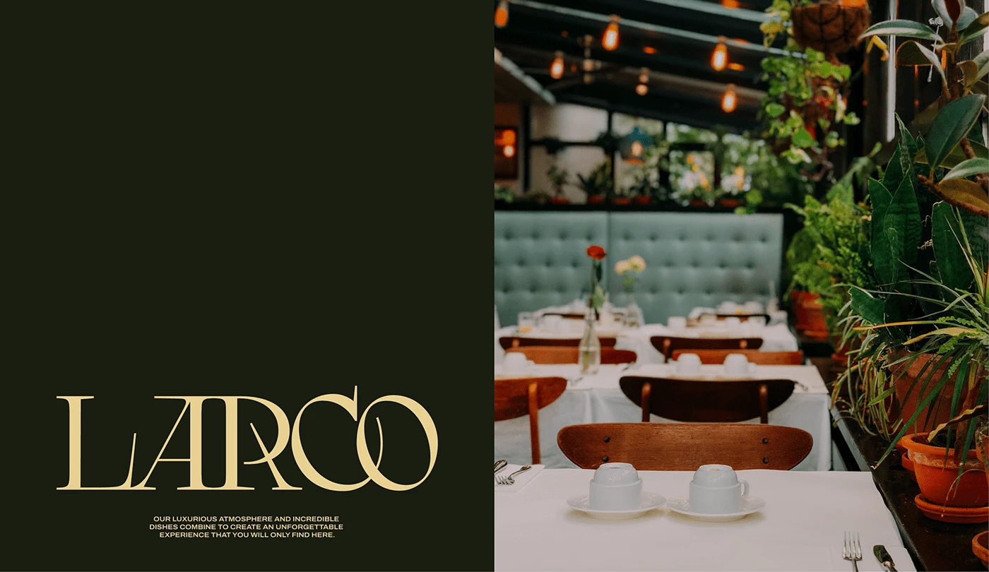
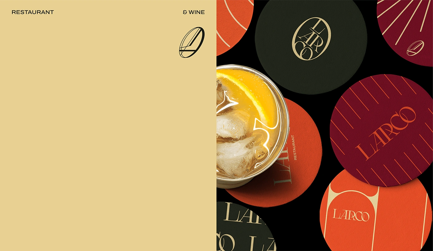
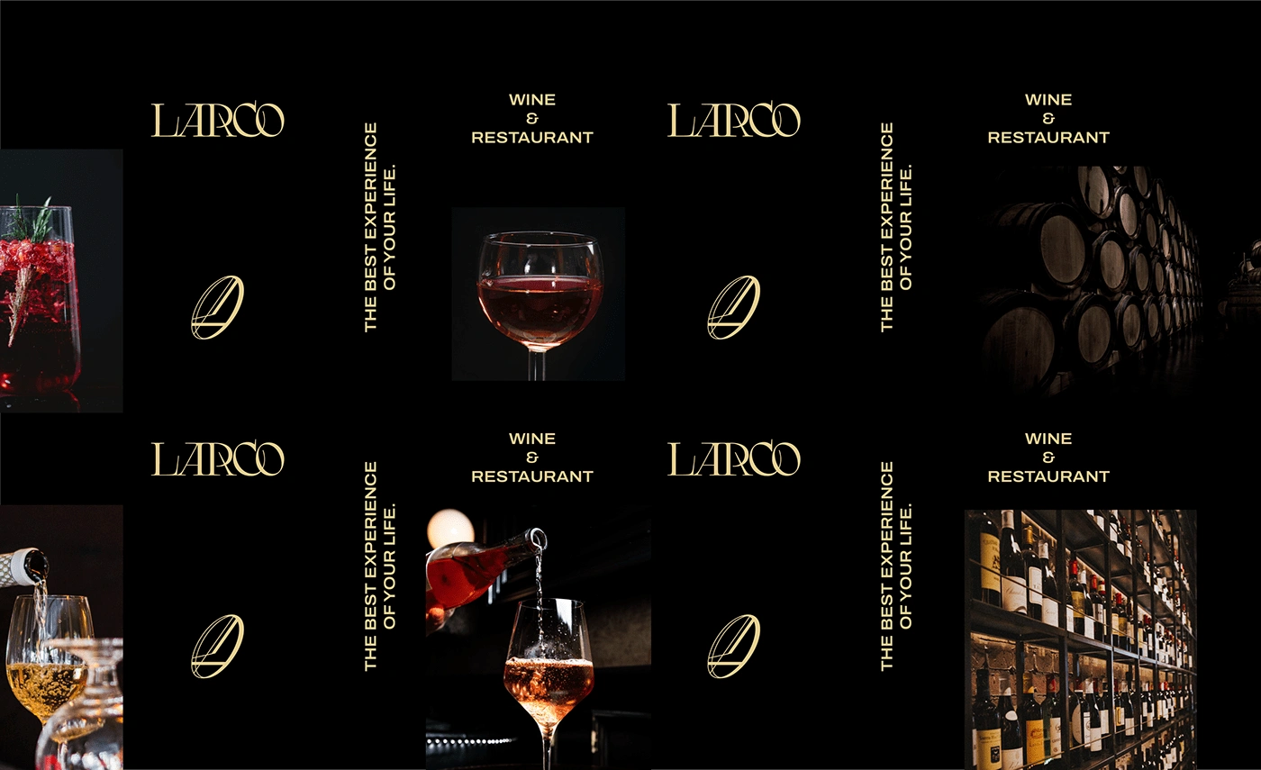
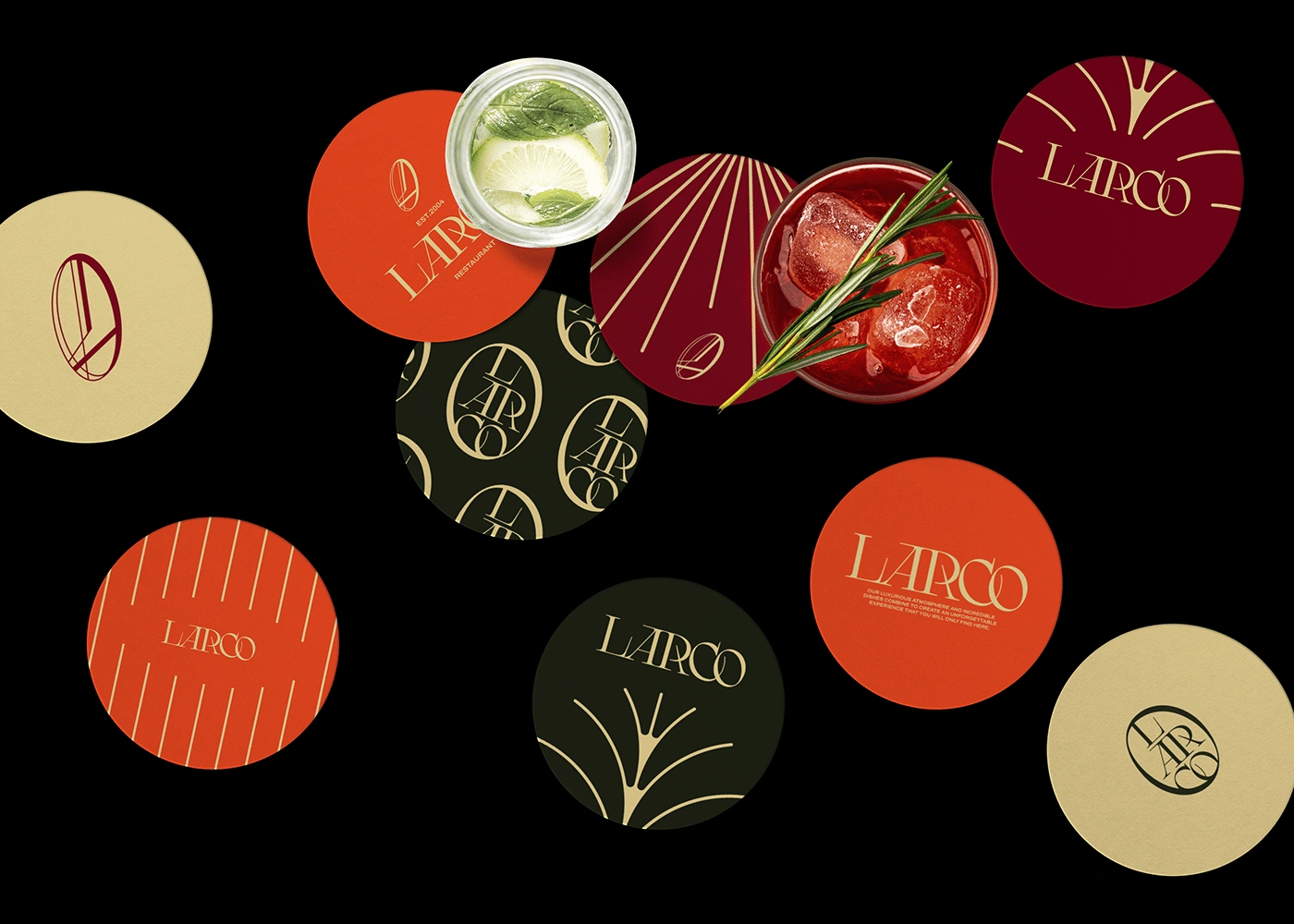
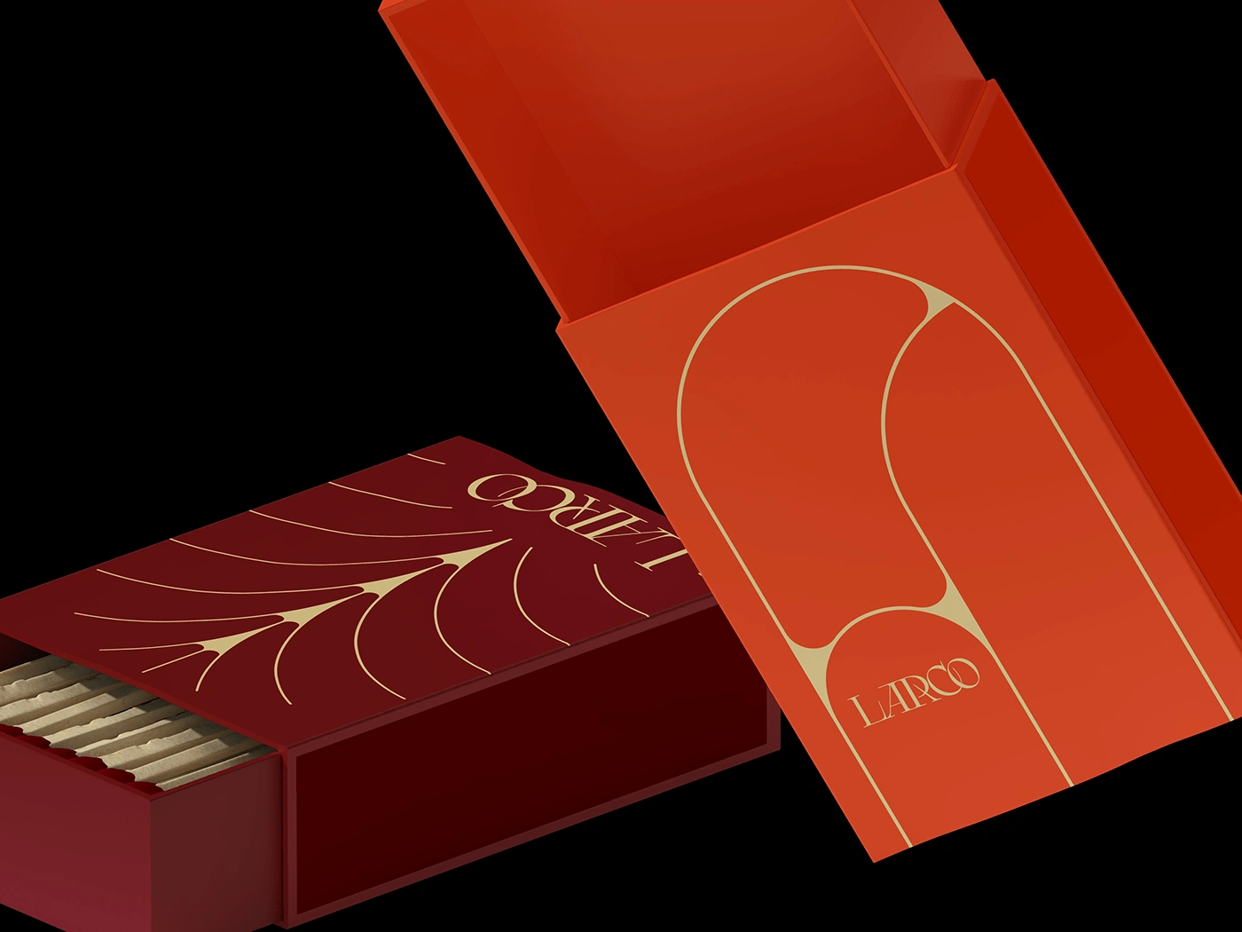
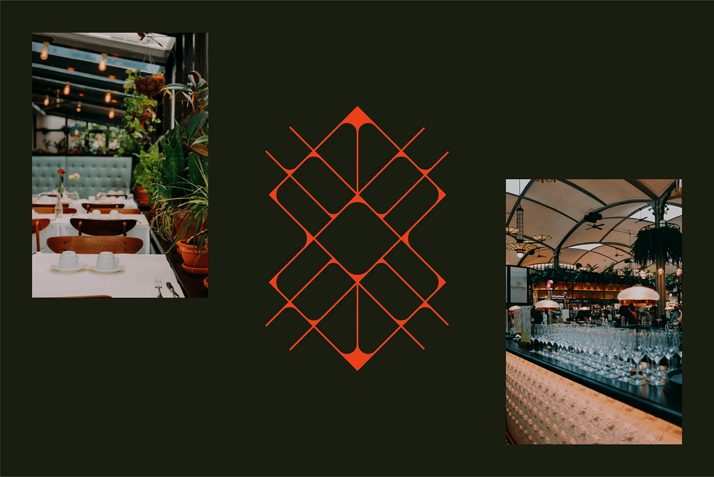
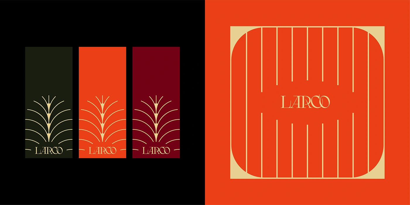
A restaurant that is the embodiment of refinement and sophistication. When carrying out this work, I immersed myself in a world of colors, typography and visual elements to create an identity that captures the essence of Larco: elegant, welcoming and a destination of gastronomic excellence. One of Larco's main attractions is its exceptional wine selection. The experience of tasting a good wine is a fundamental part of visiting the restaurant. It is a sanctuary for lovers of haute cuisine and fine wines.
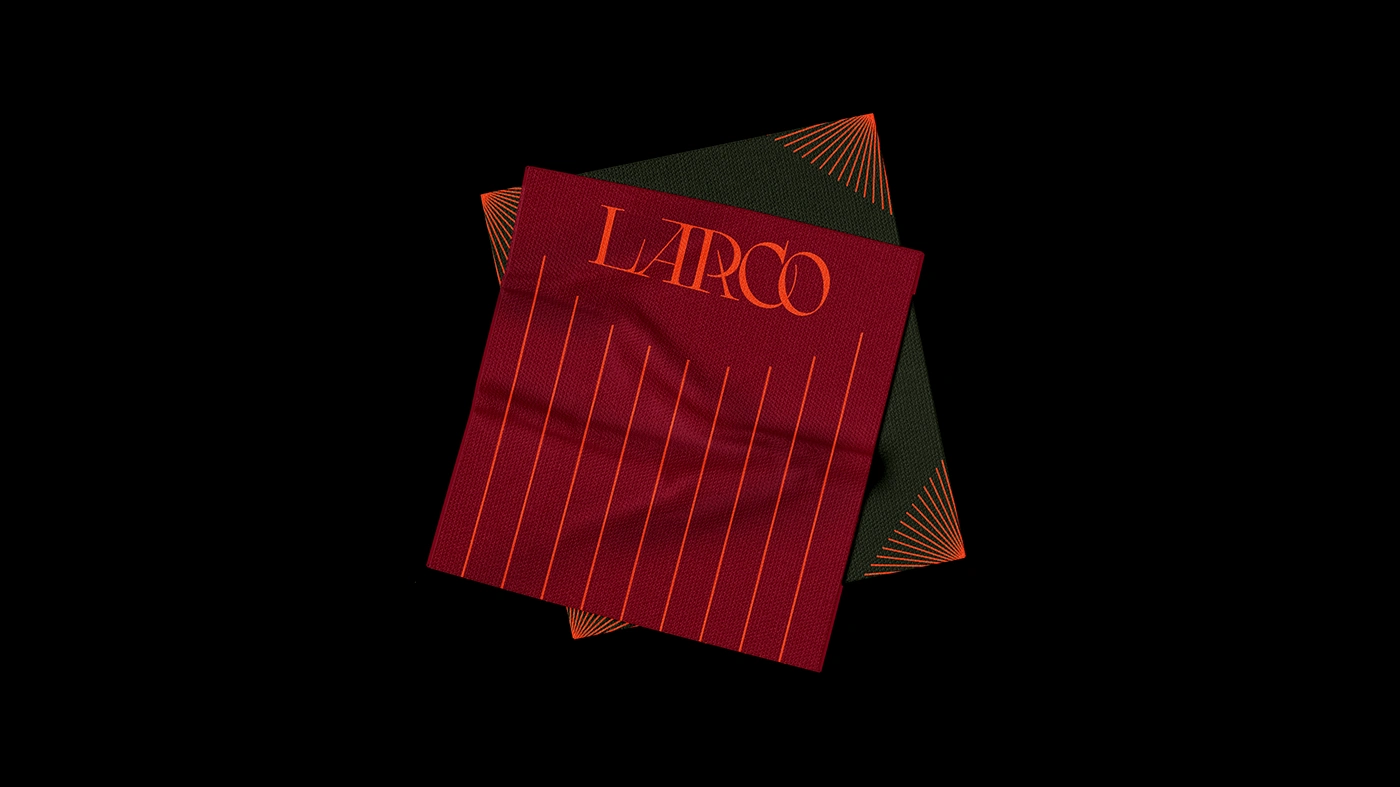
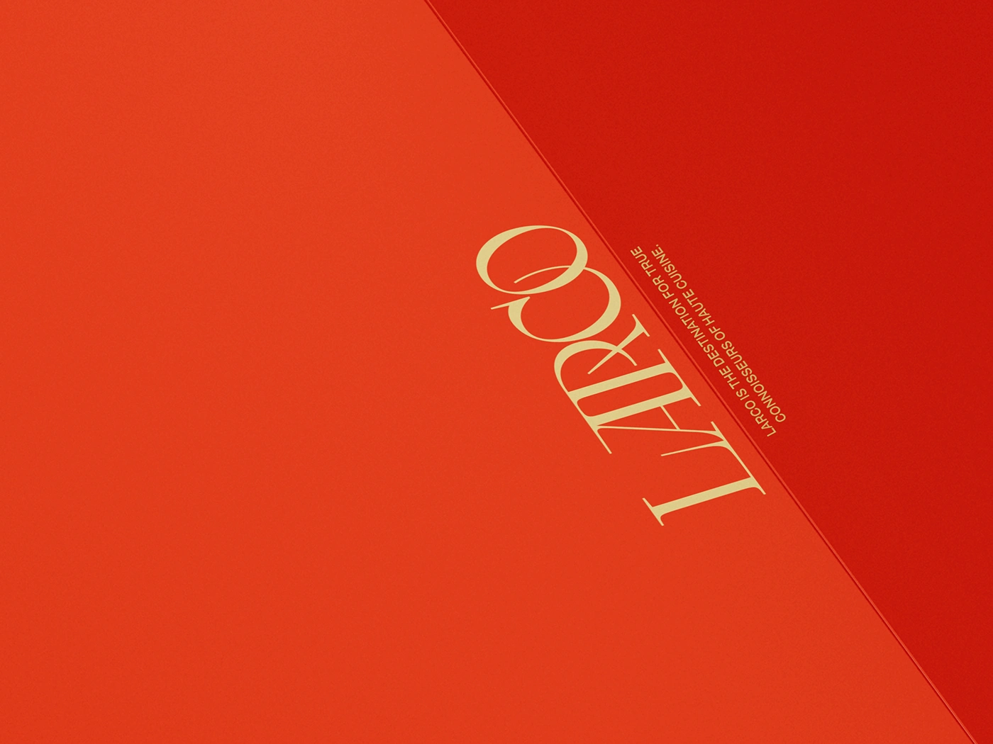
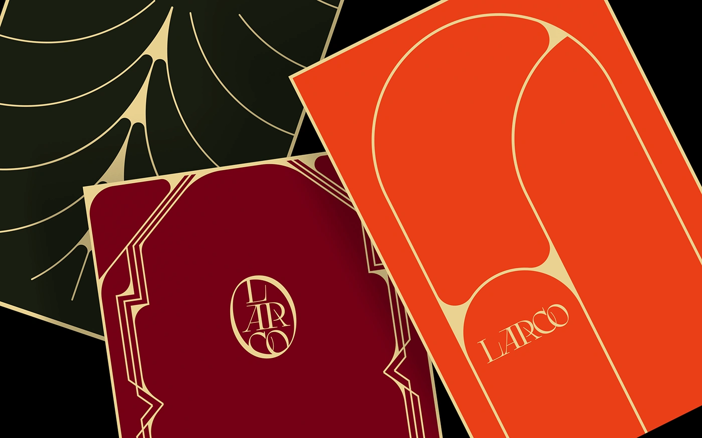
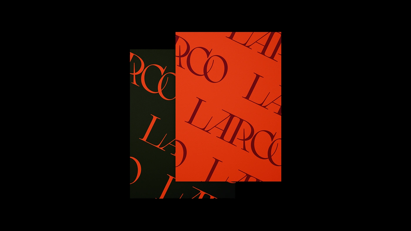
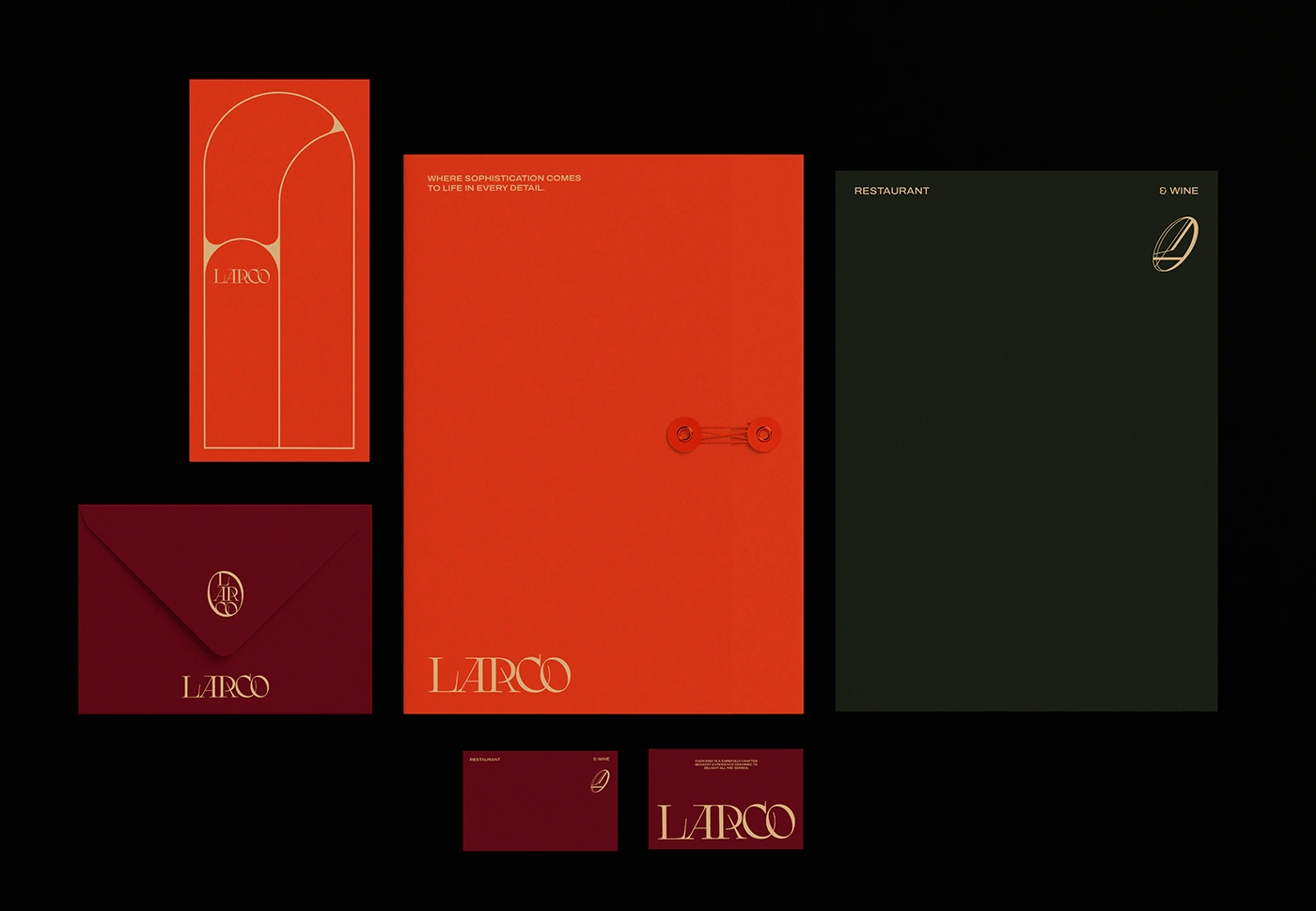
Every choice made in the process was carefully considered to convey the message of refinement and quality. The use of color plays a key role in this new identity, with tones such as dark green, vibrant orange and deep red. These colors were selected to evoke feelings of sophistication, poise and passion. Selected typography is a crucial element in conveying the atmosphere of the restaurant. I opted for a sophisticated type, with elegant lines and strokes. This choice reflects the attention to detail that is present both in the renowned chef's kitchen and in the impeccable service offered to customers. With colors that evoke elegance, sophisticated typography and subtle inspiration from Art Deco, Larco is an invitation for food lovers to enjoy a truly memorable experience.
Like this project
Posted Apr 21, 2025
A restaurant that is the embodiment of refinement and sophistication.
Likes
0
Views
10