Built with Framer
Late - Identity | Web Design | Framer Development
Zantana
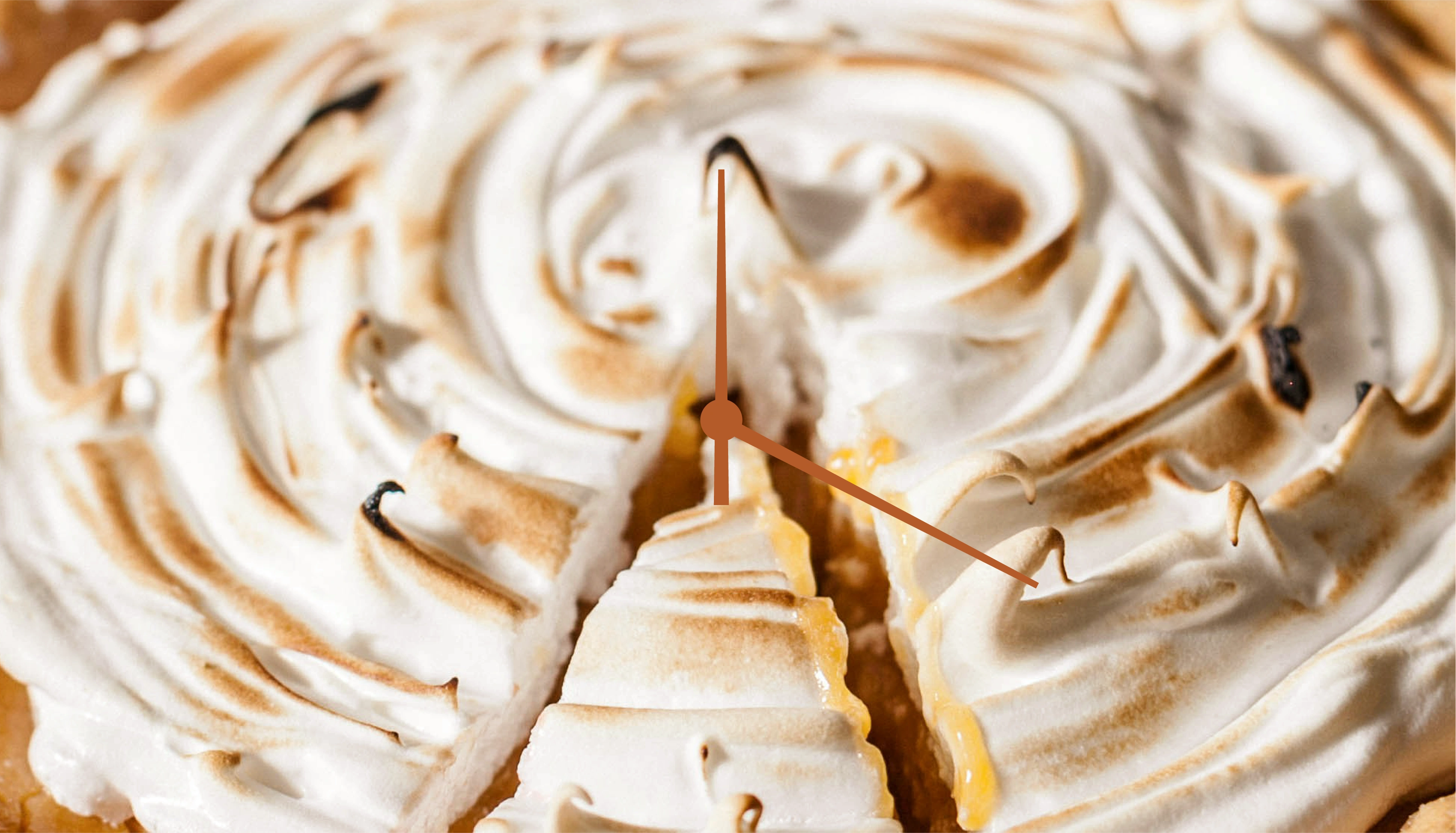
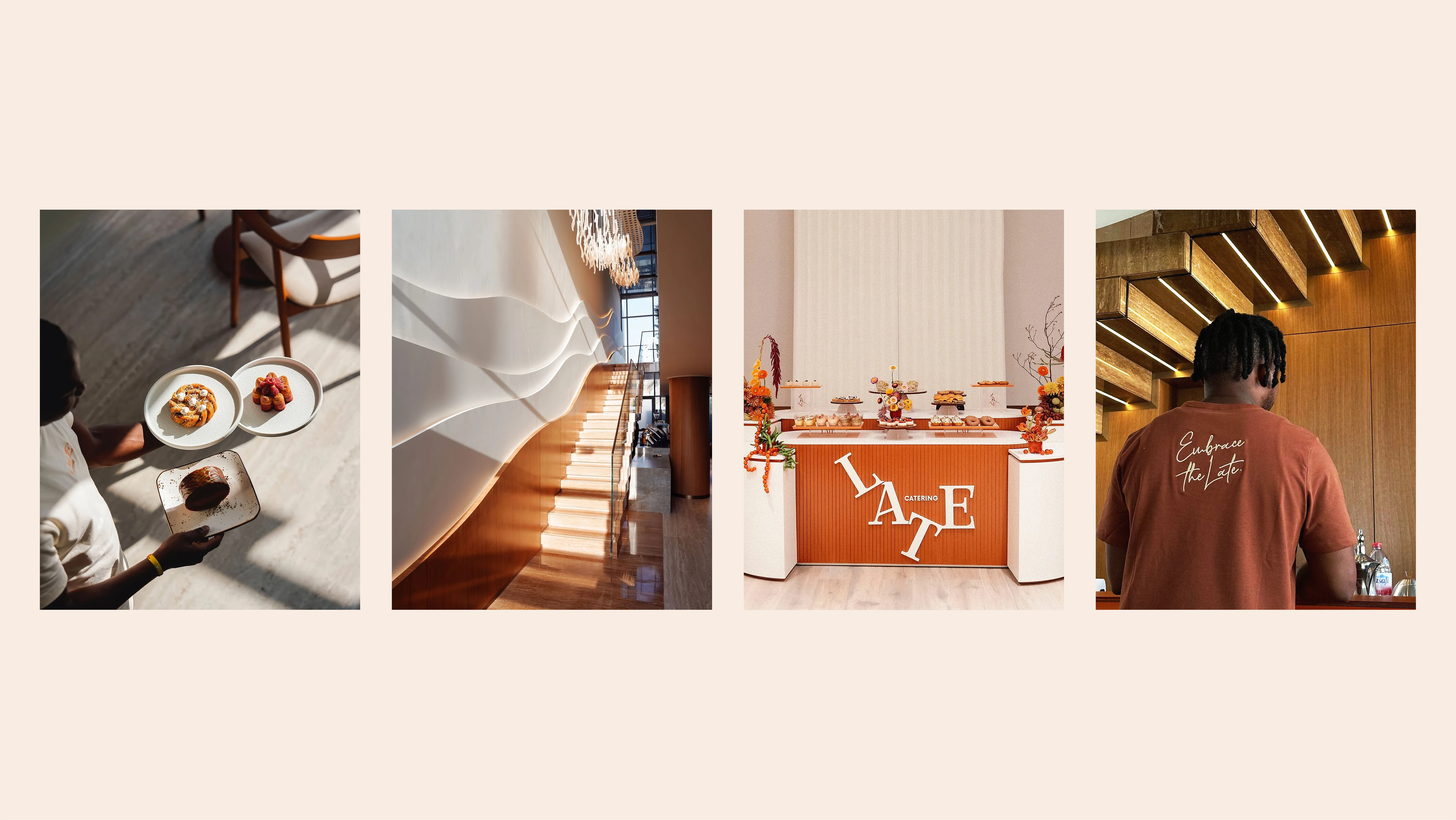
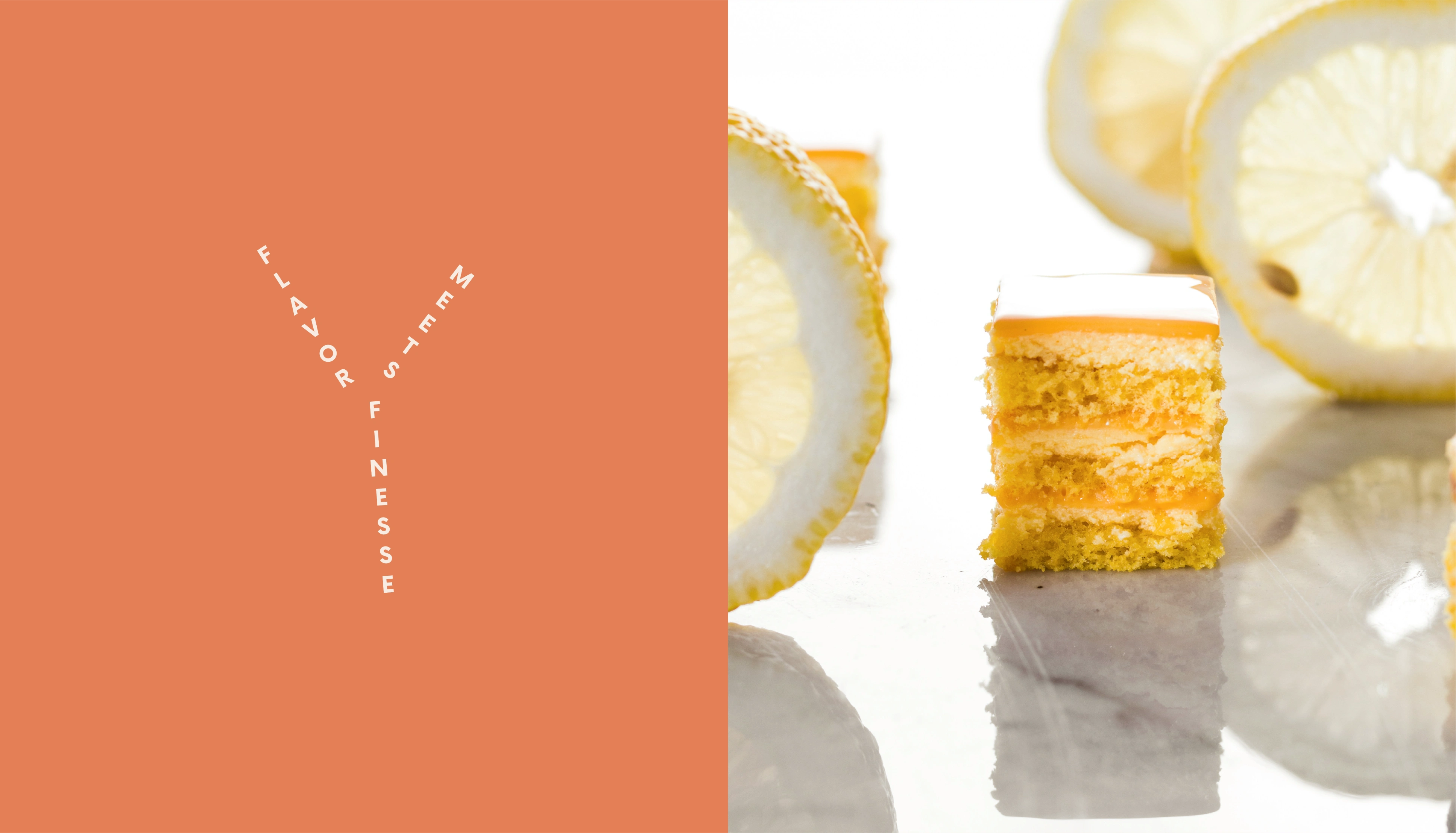
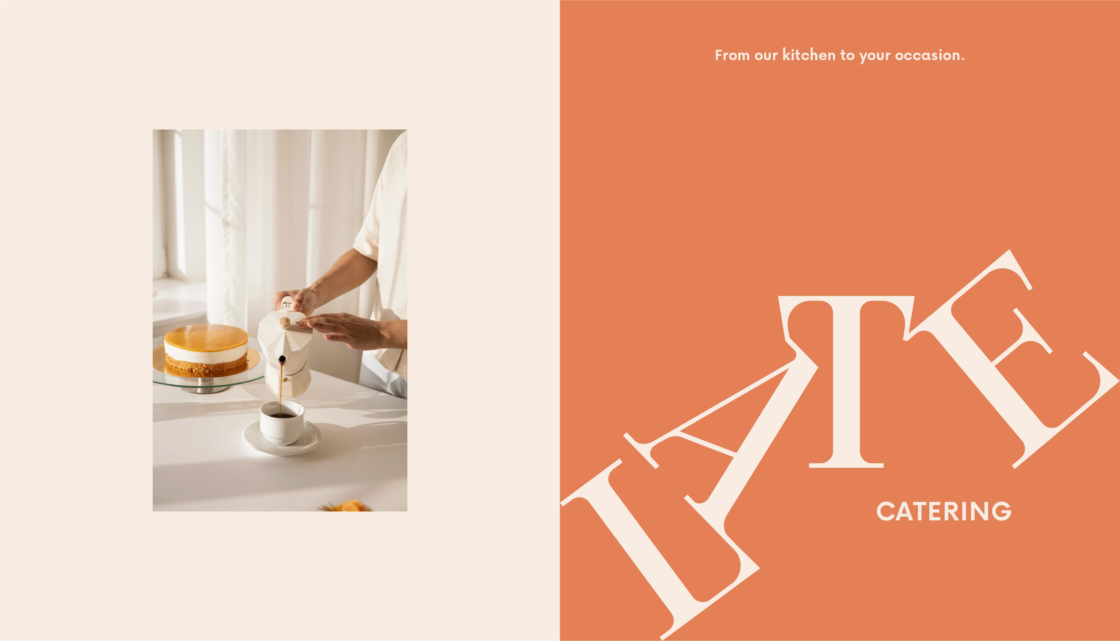
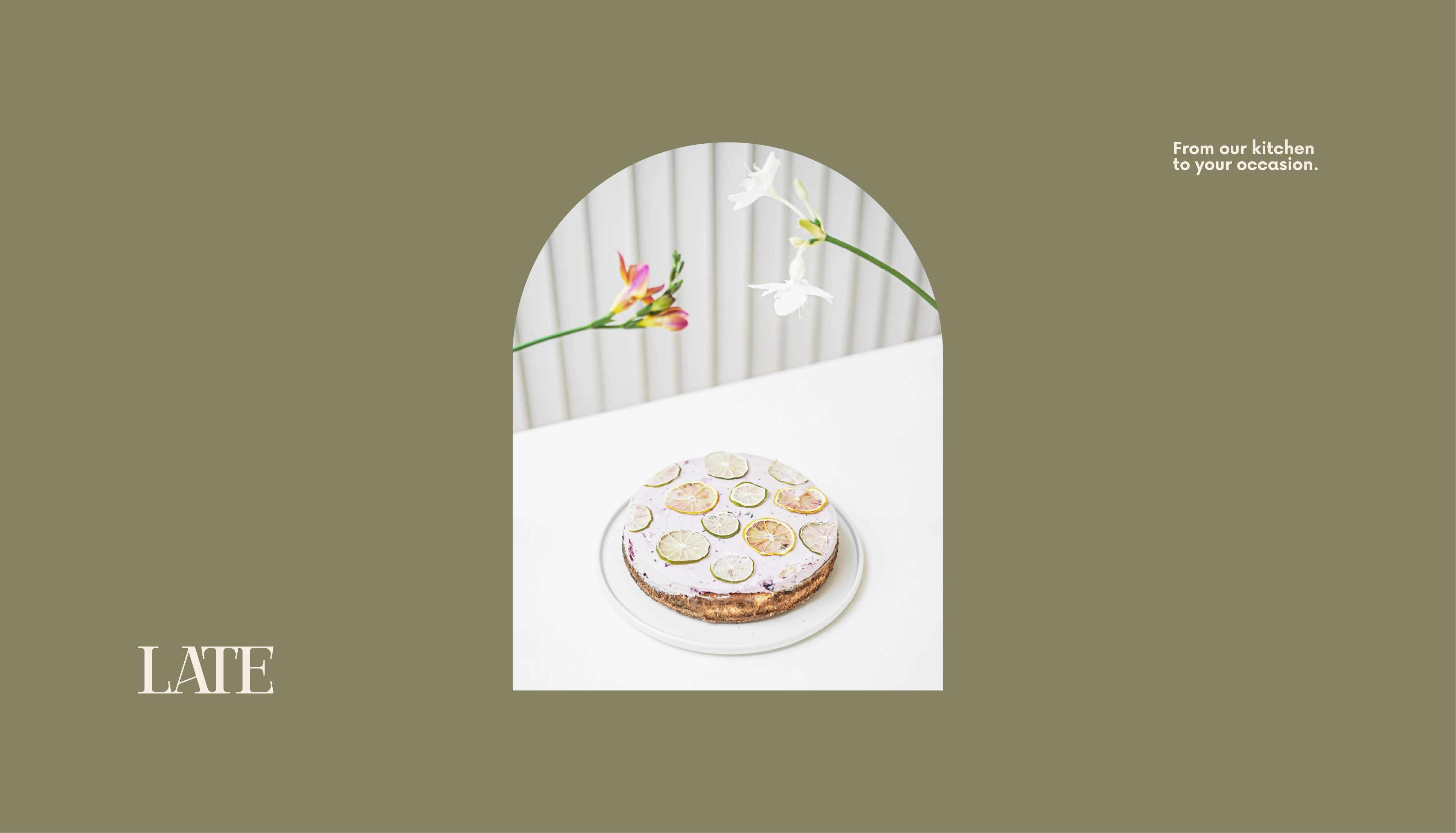
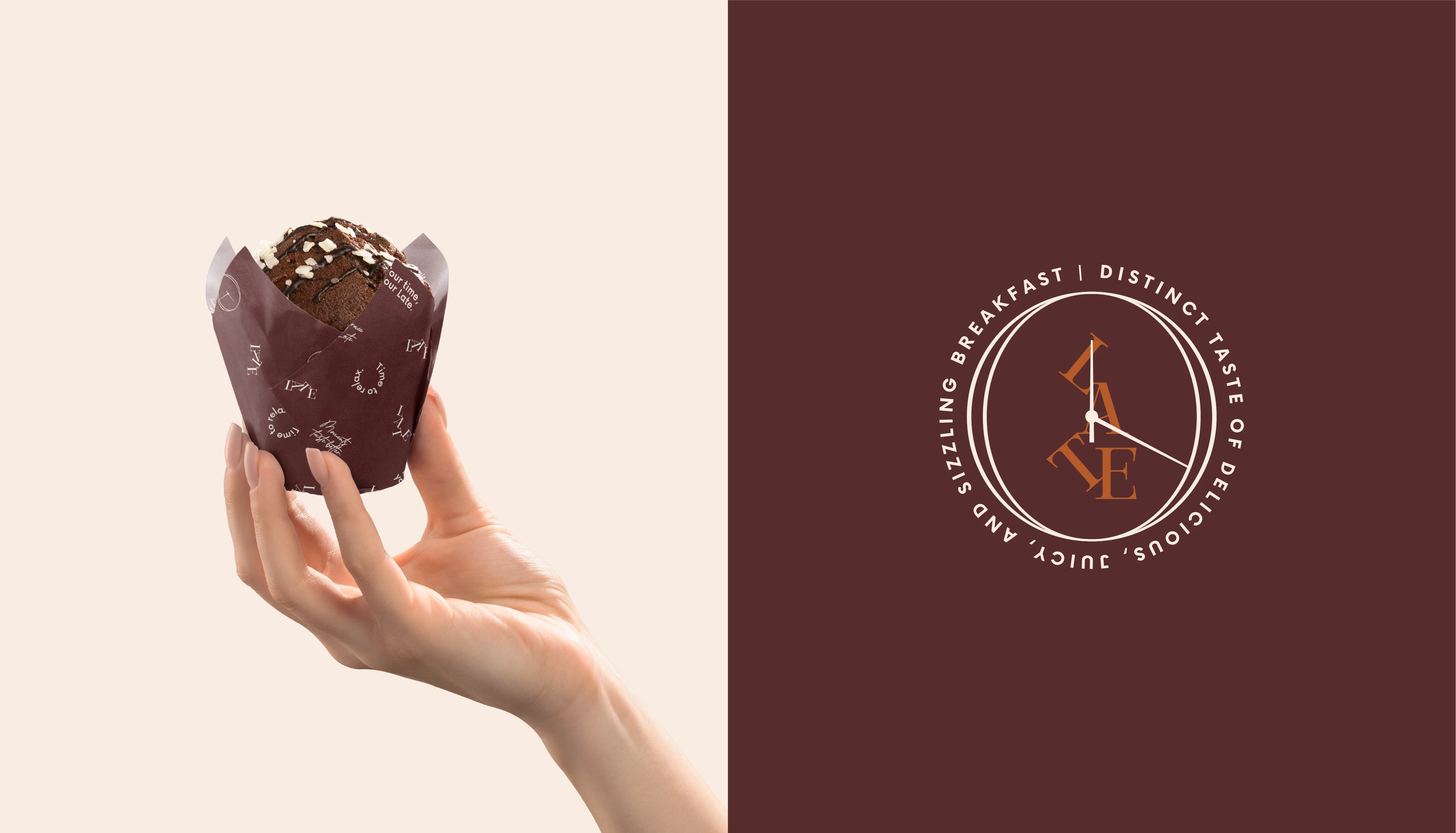
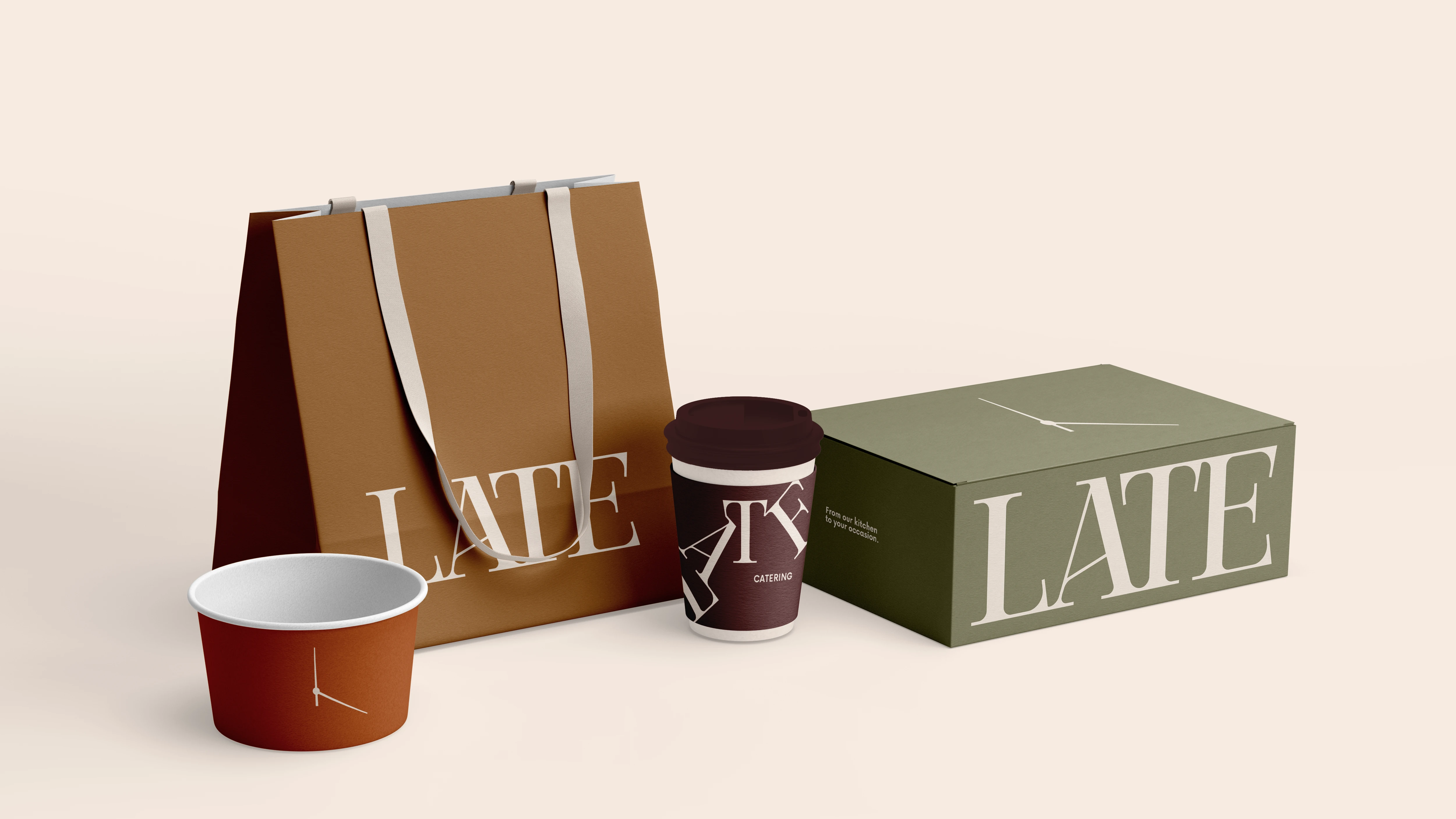
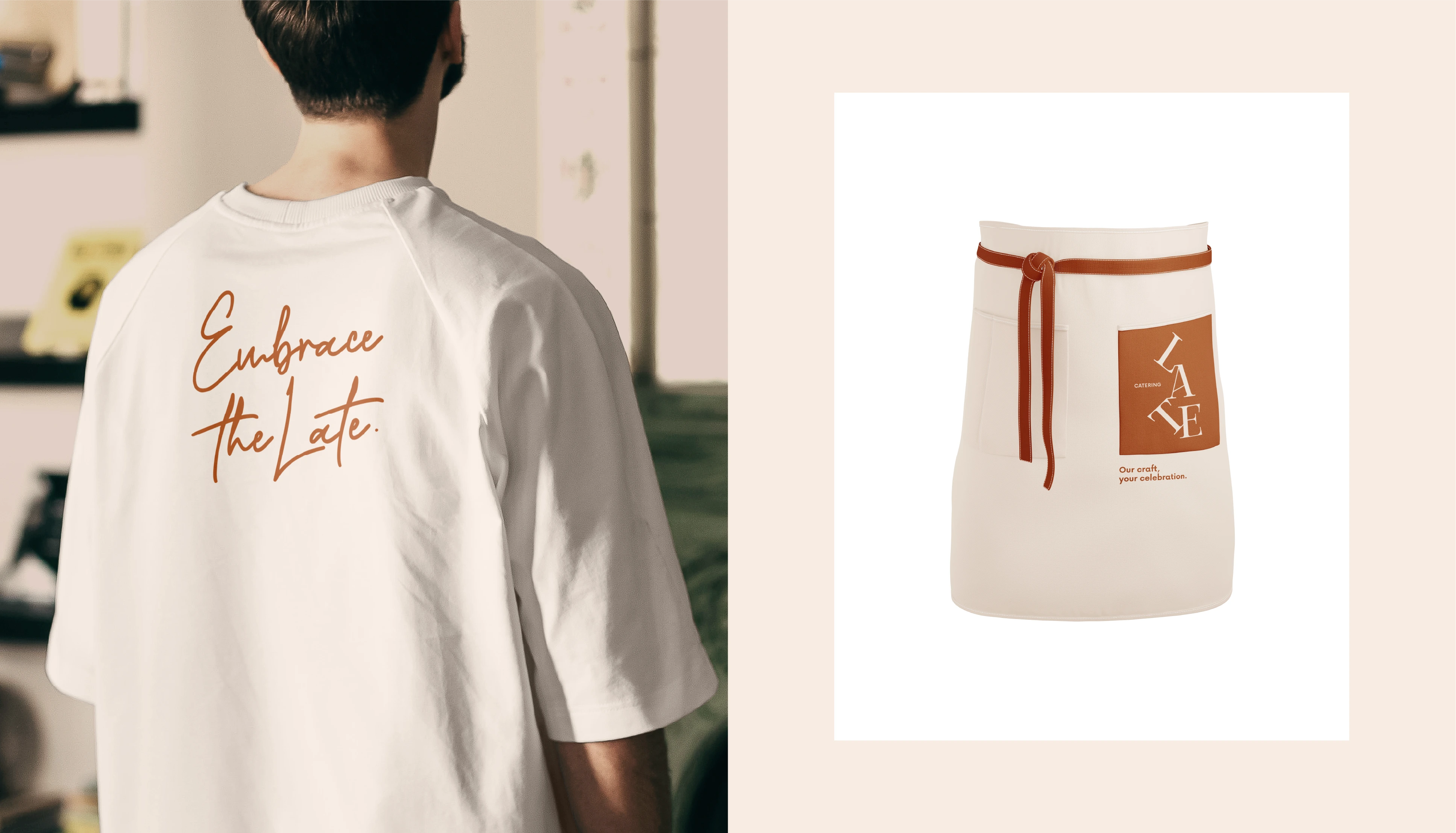
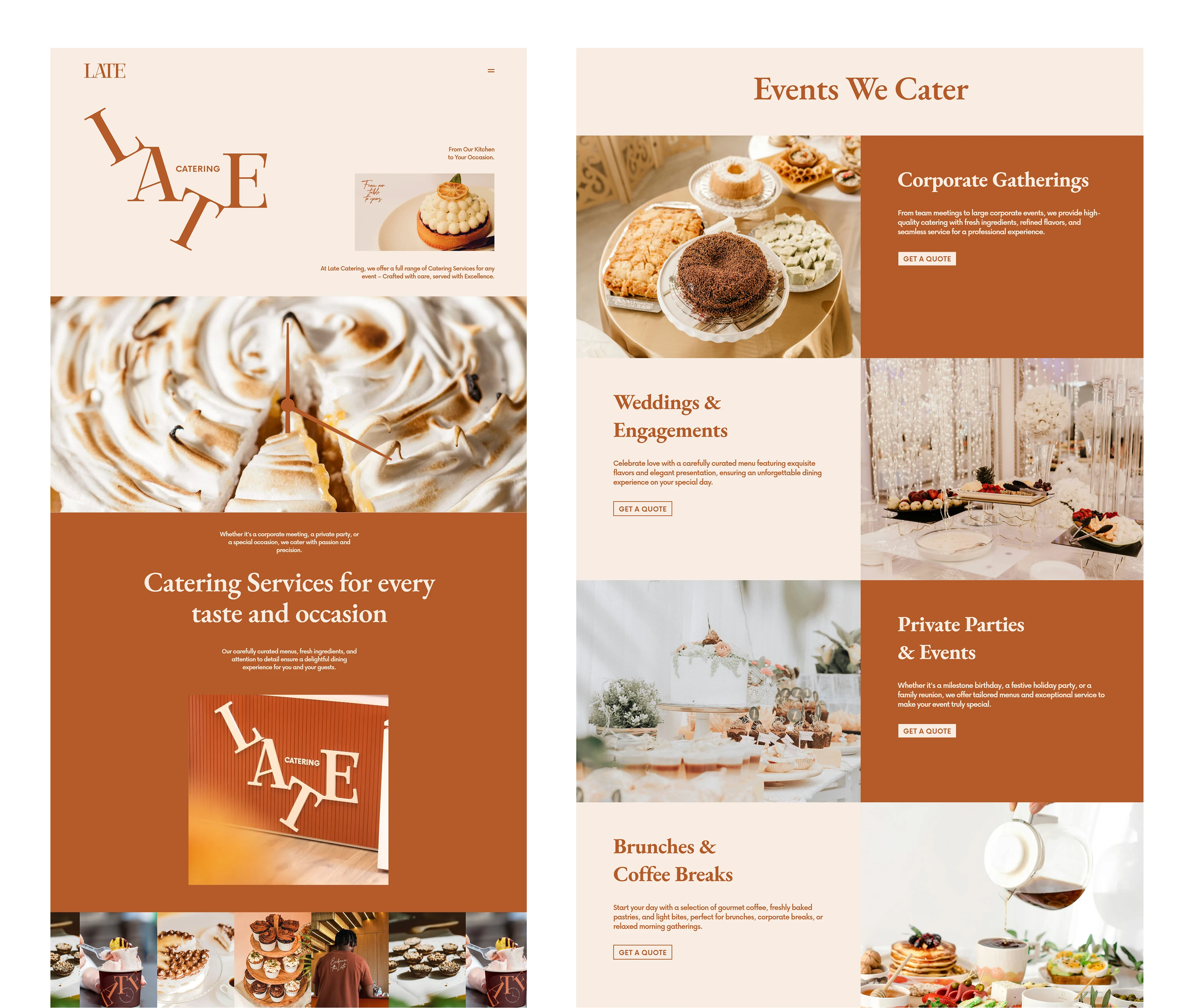
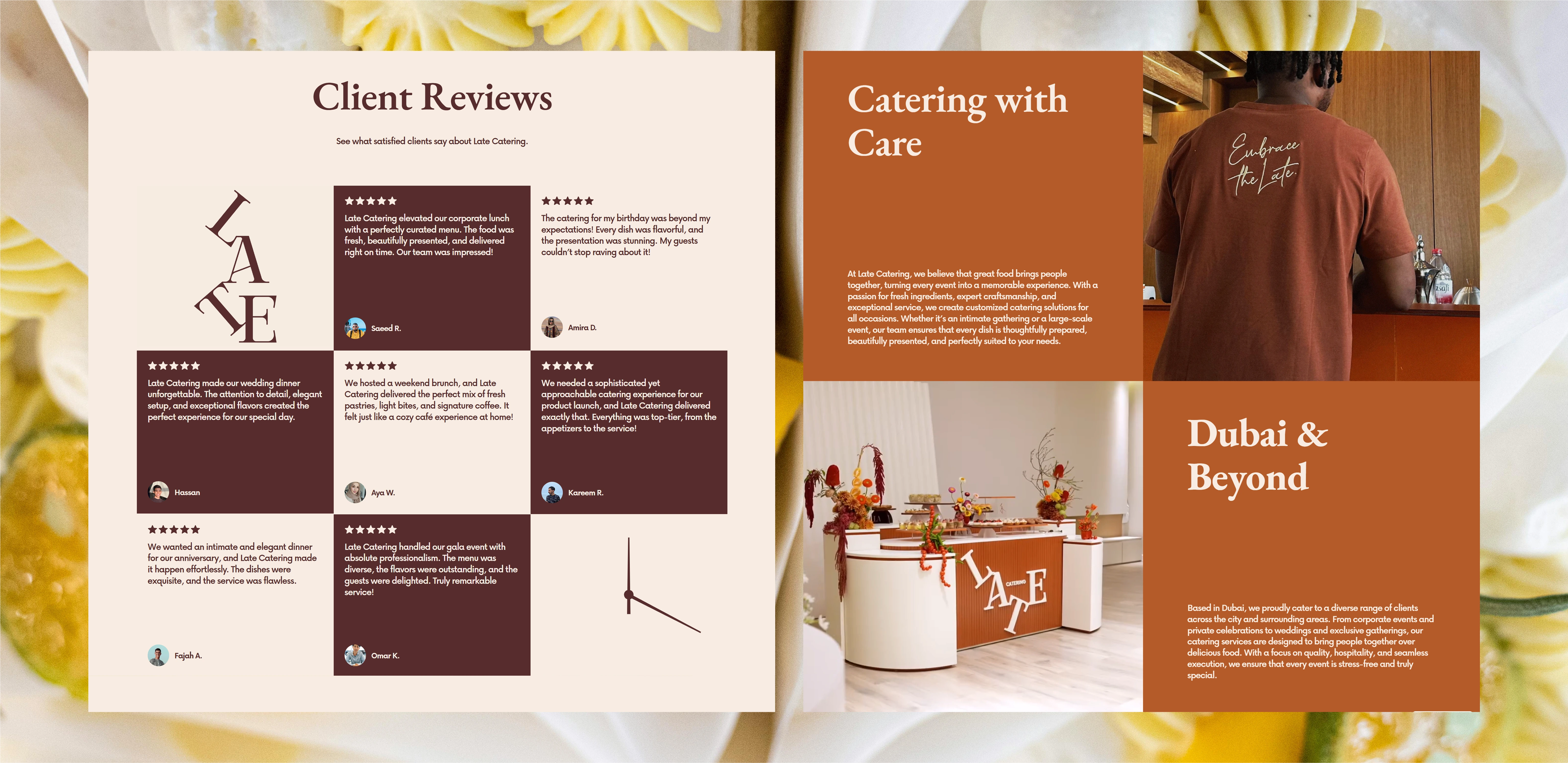
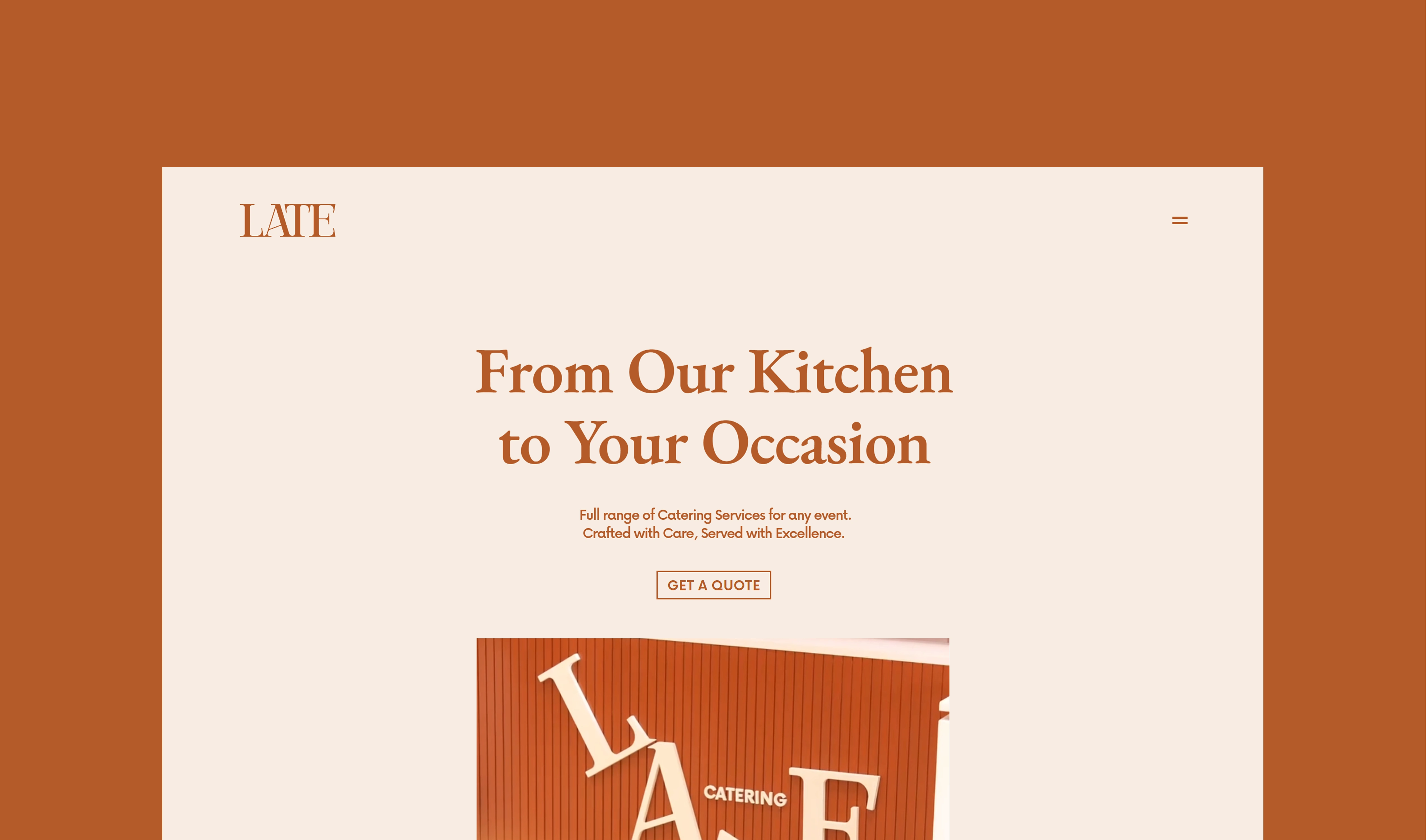
Late Catering is an extension of the calm and elegant atmosphere of Late Lounge Cafe — now translated into a catering experience. The goal of this identity was to keep the same refined, unhurried feeling, while adapting it to a more mobile and service-focused context. The concept is built around time, care, and simplicity. Every detail of the visual identity, from typography to layout, reflects the brand’s commitment to quality and thoughtful presentation.
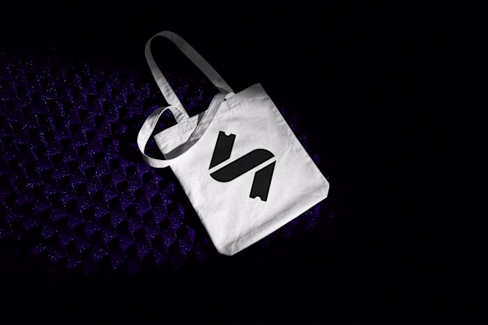
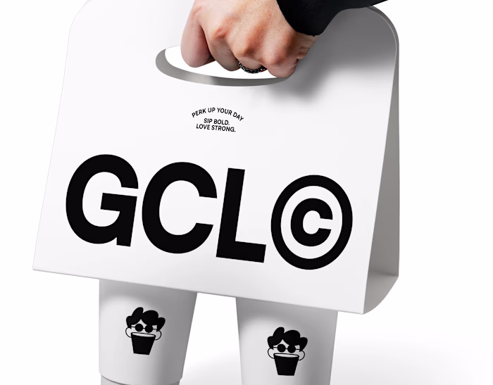
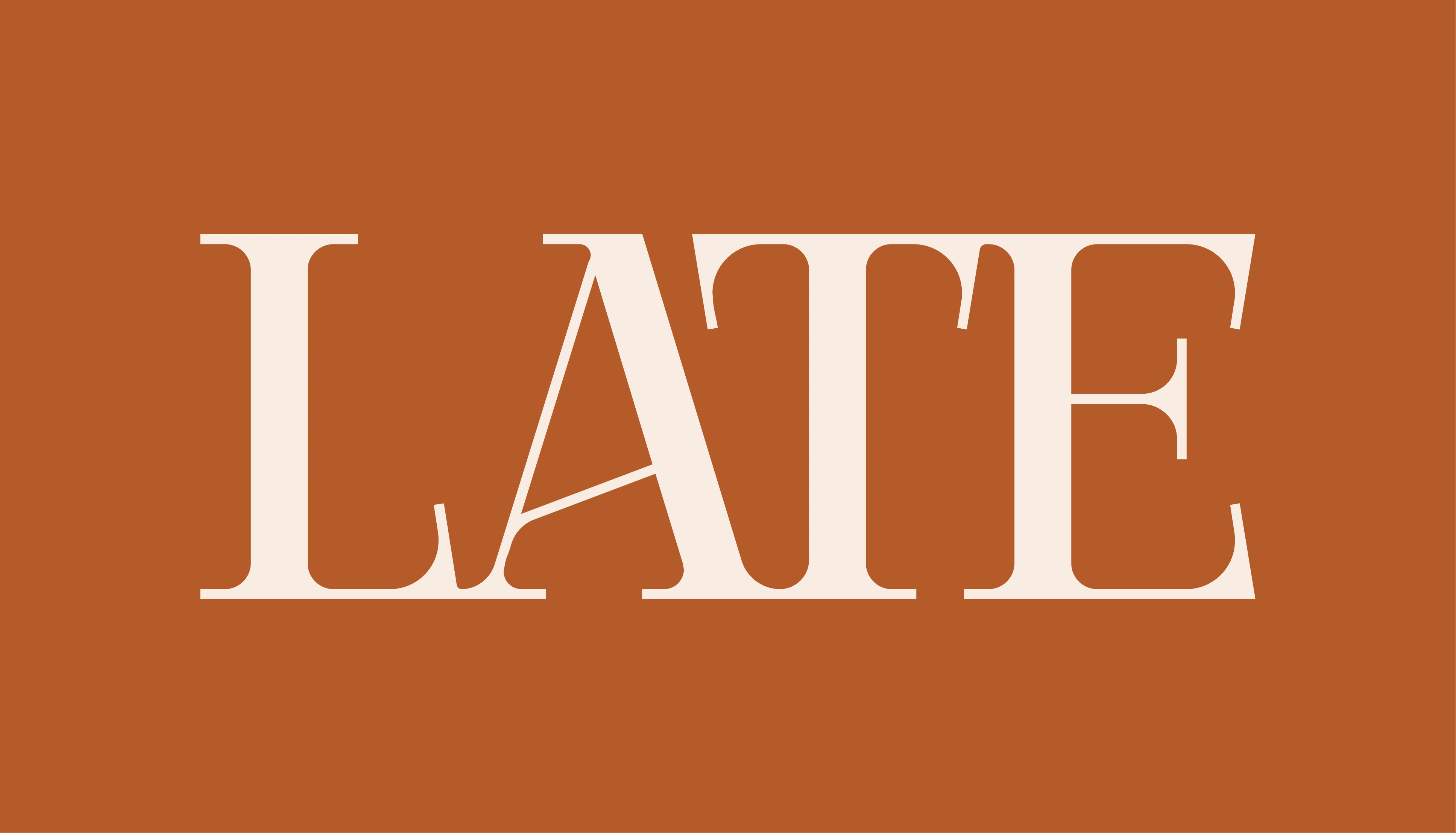
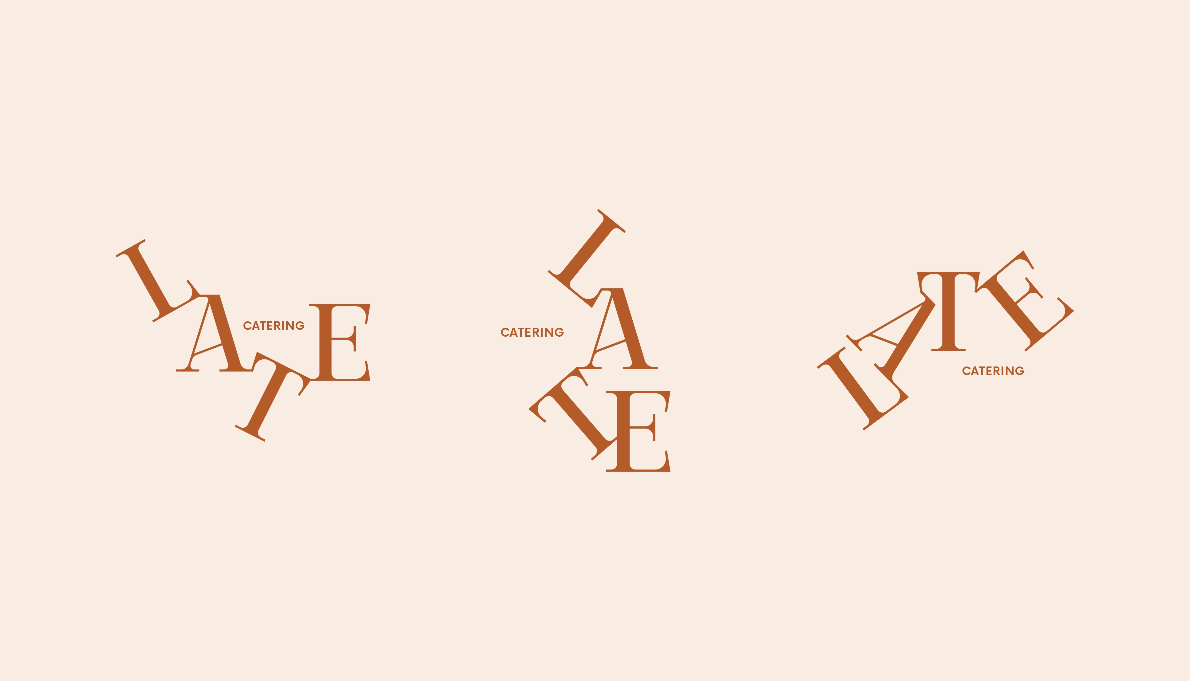
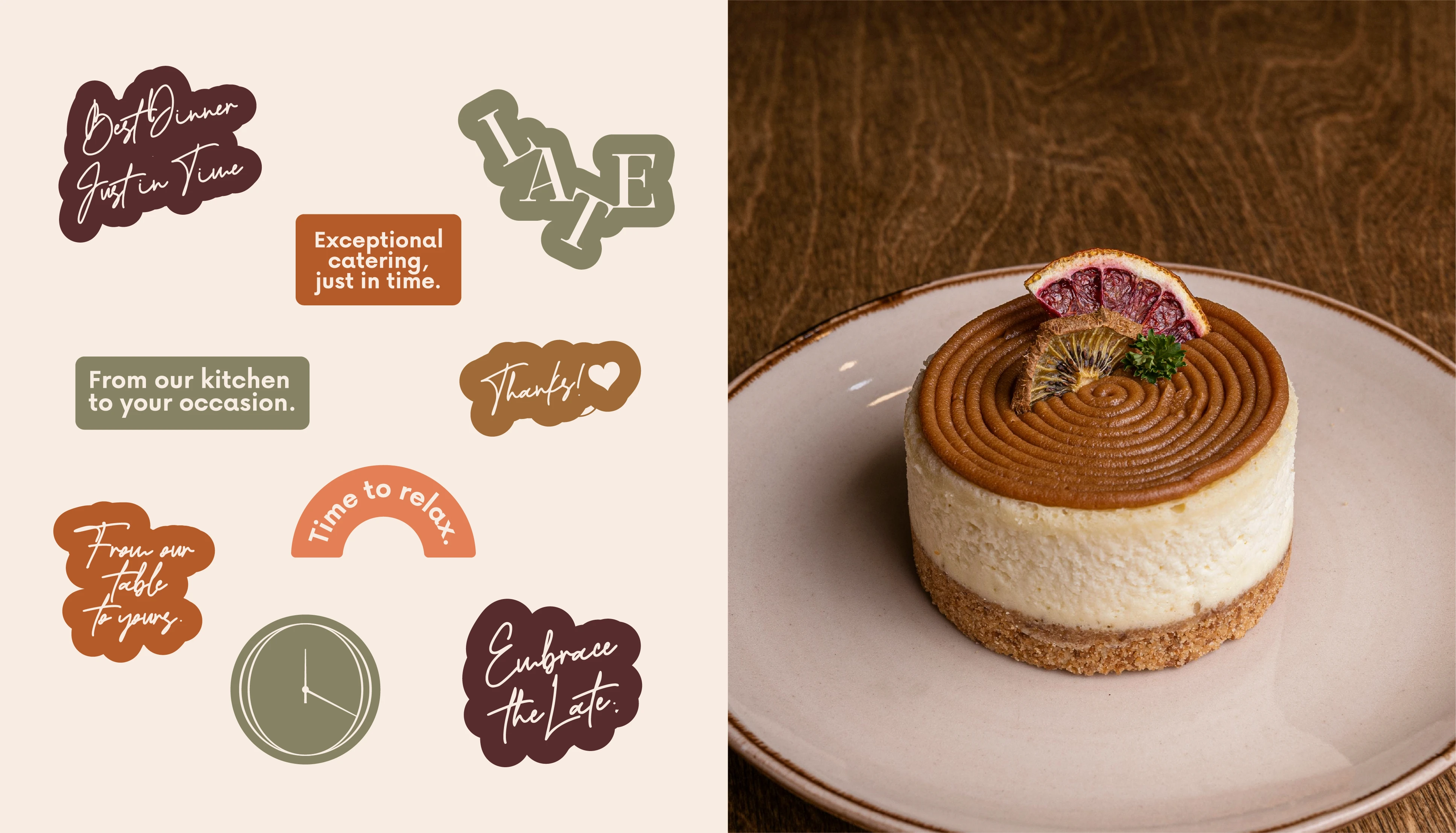
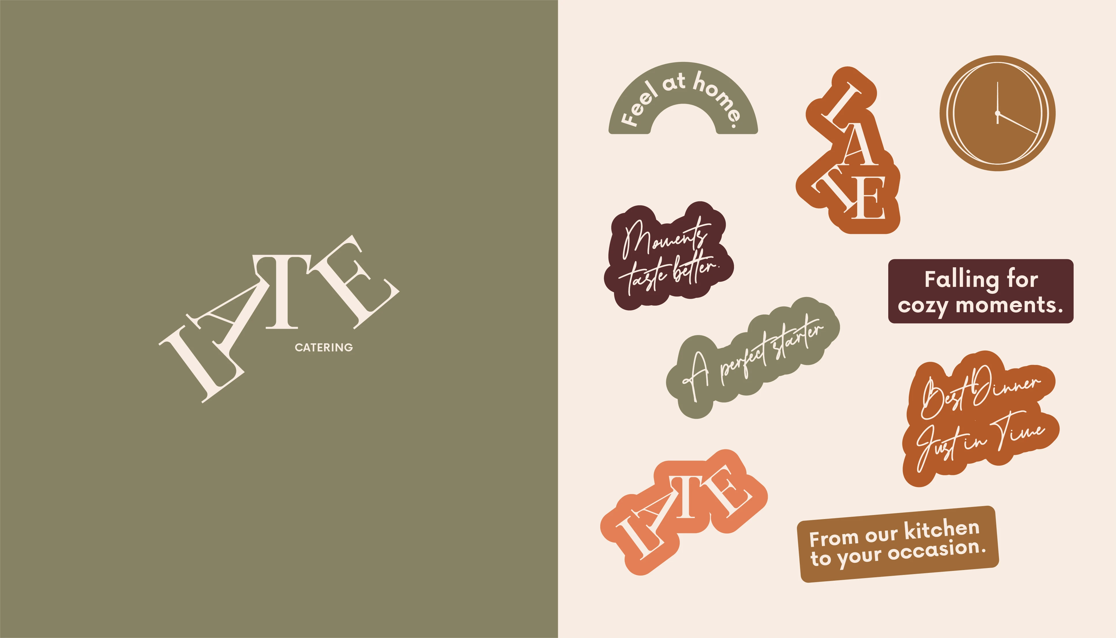
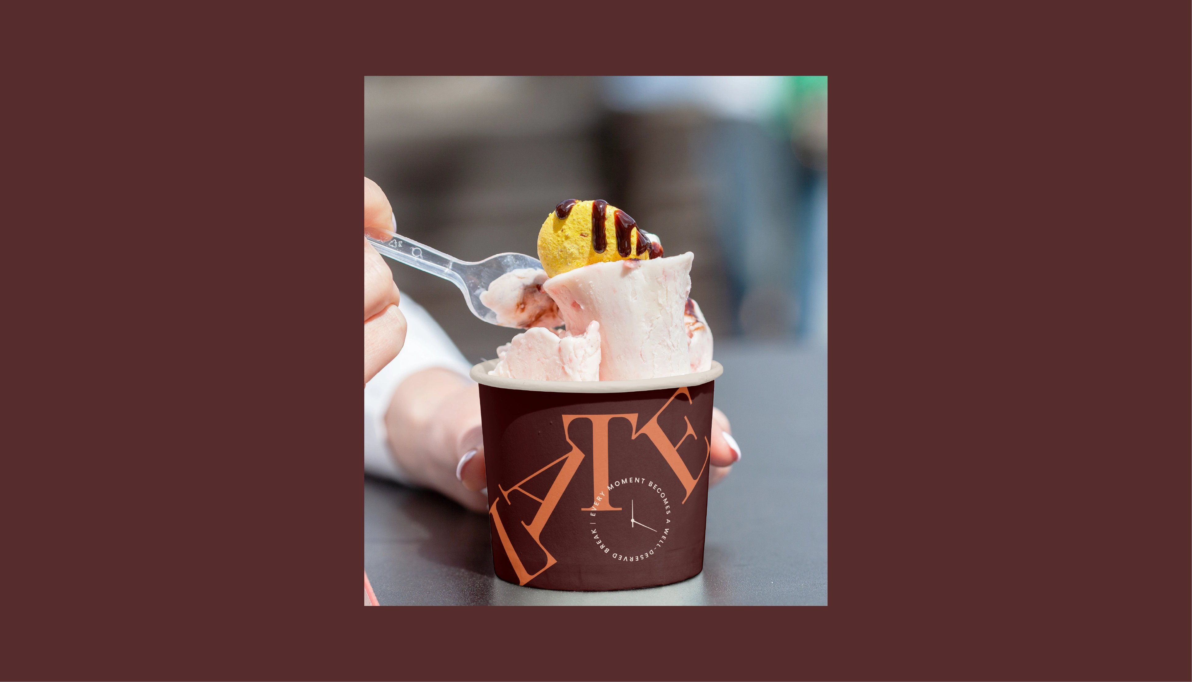
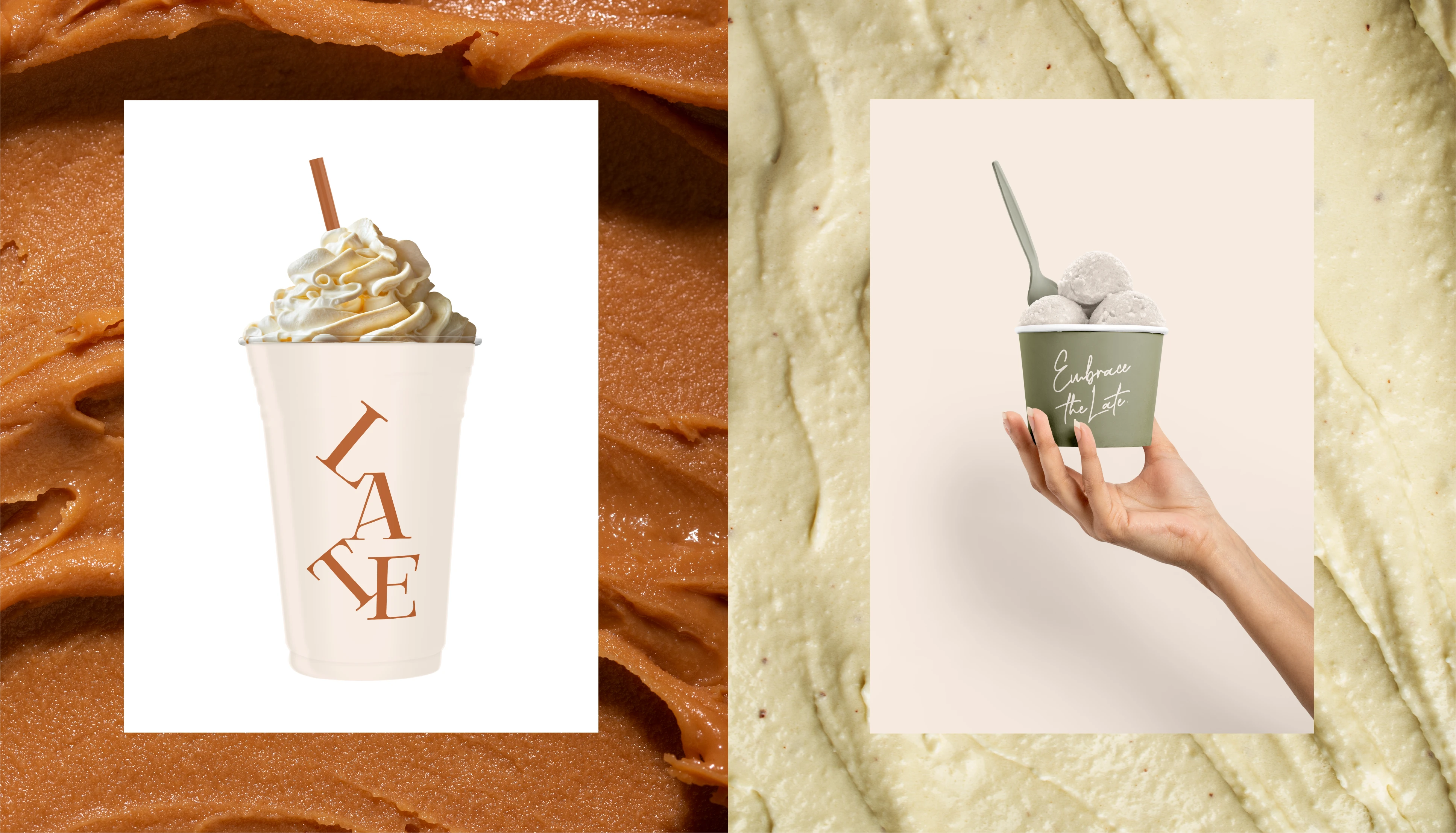
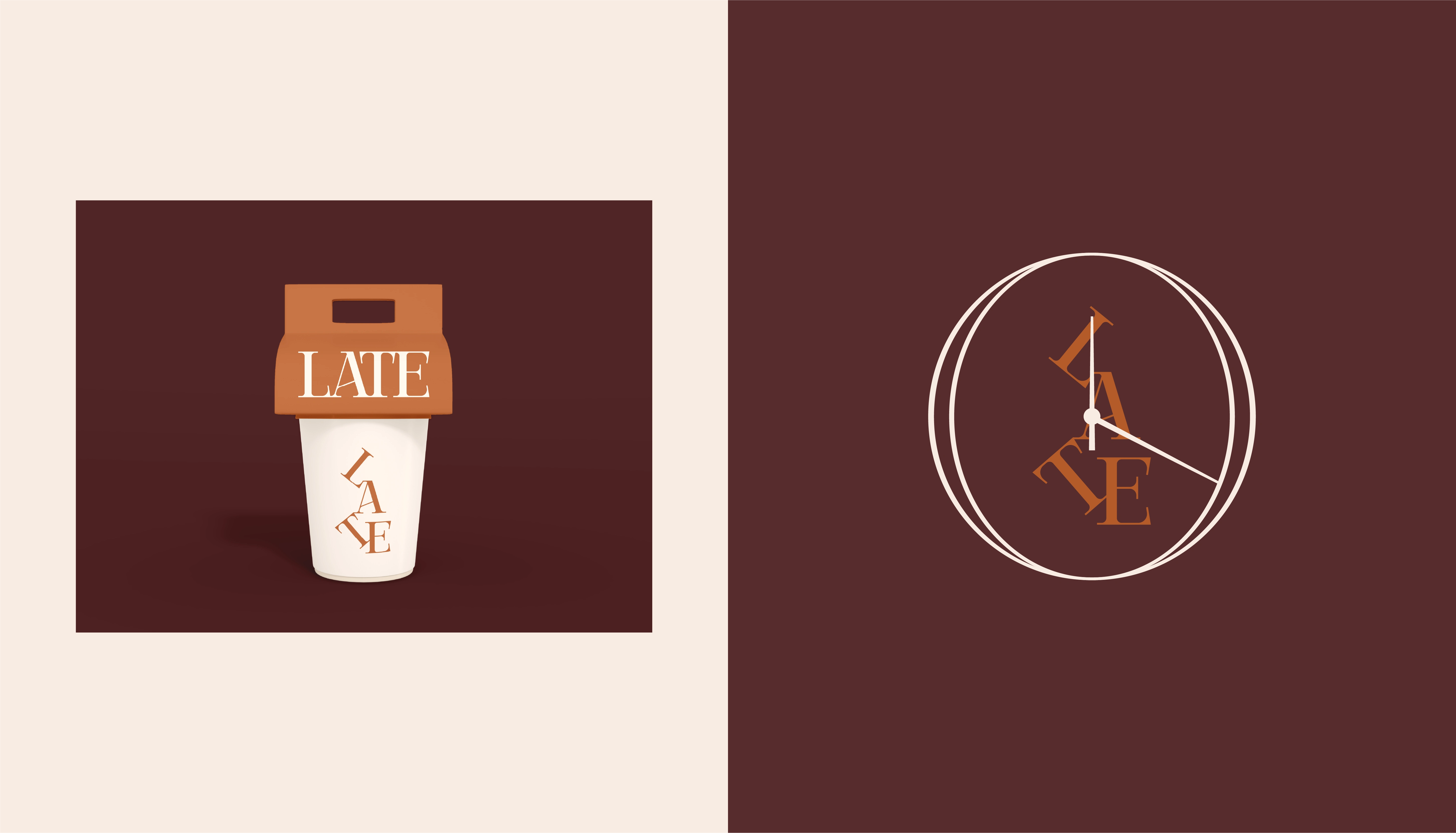
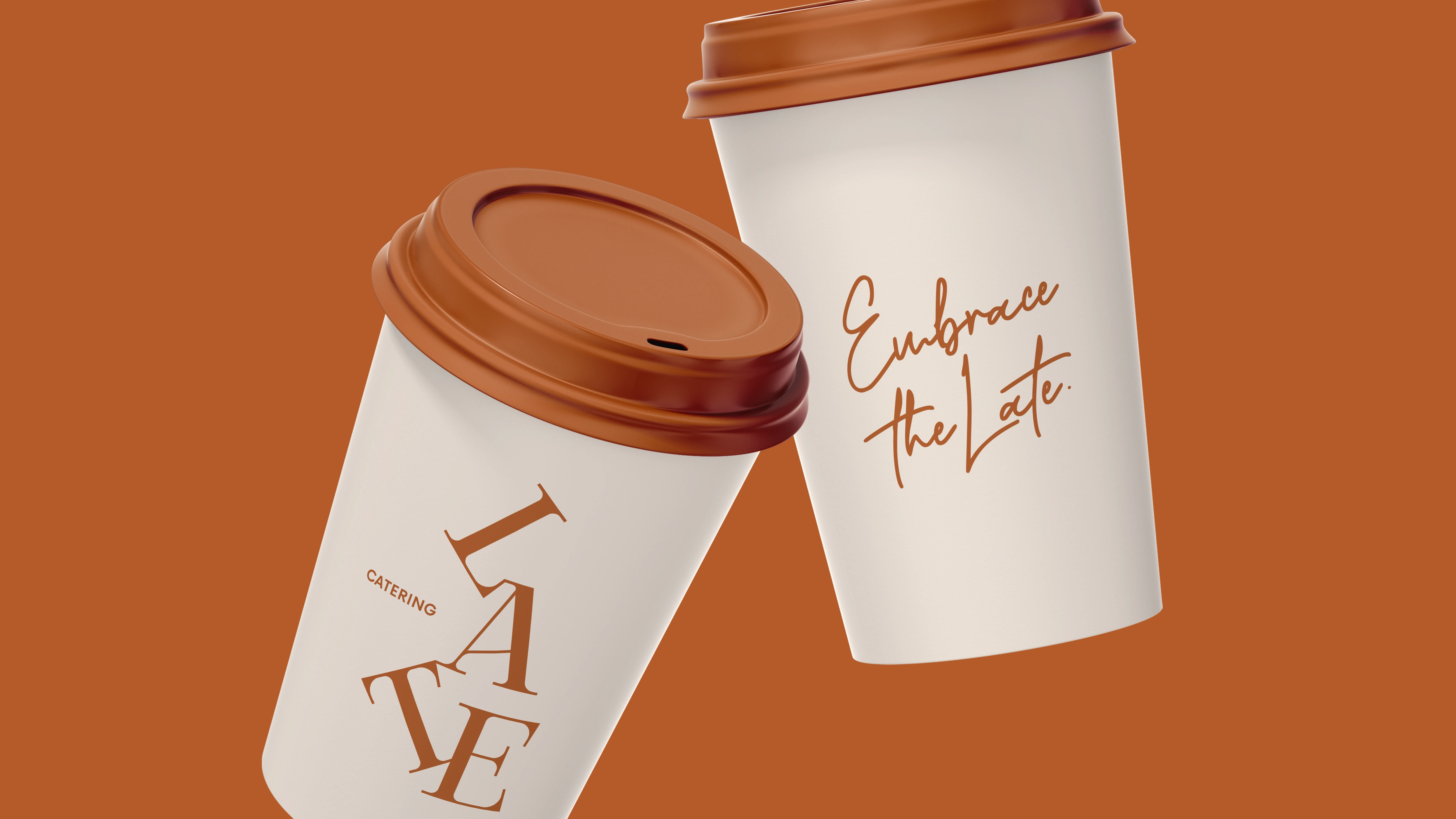
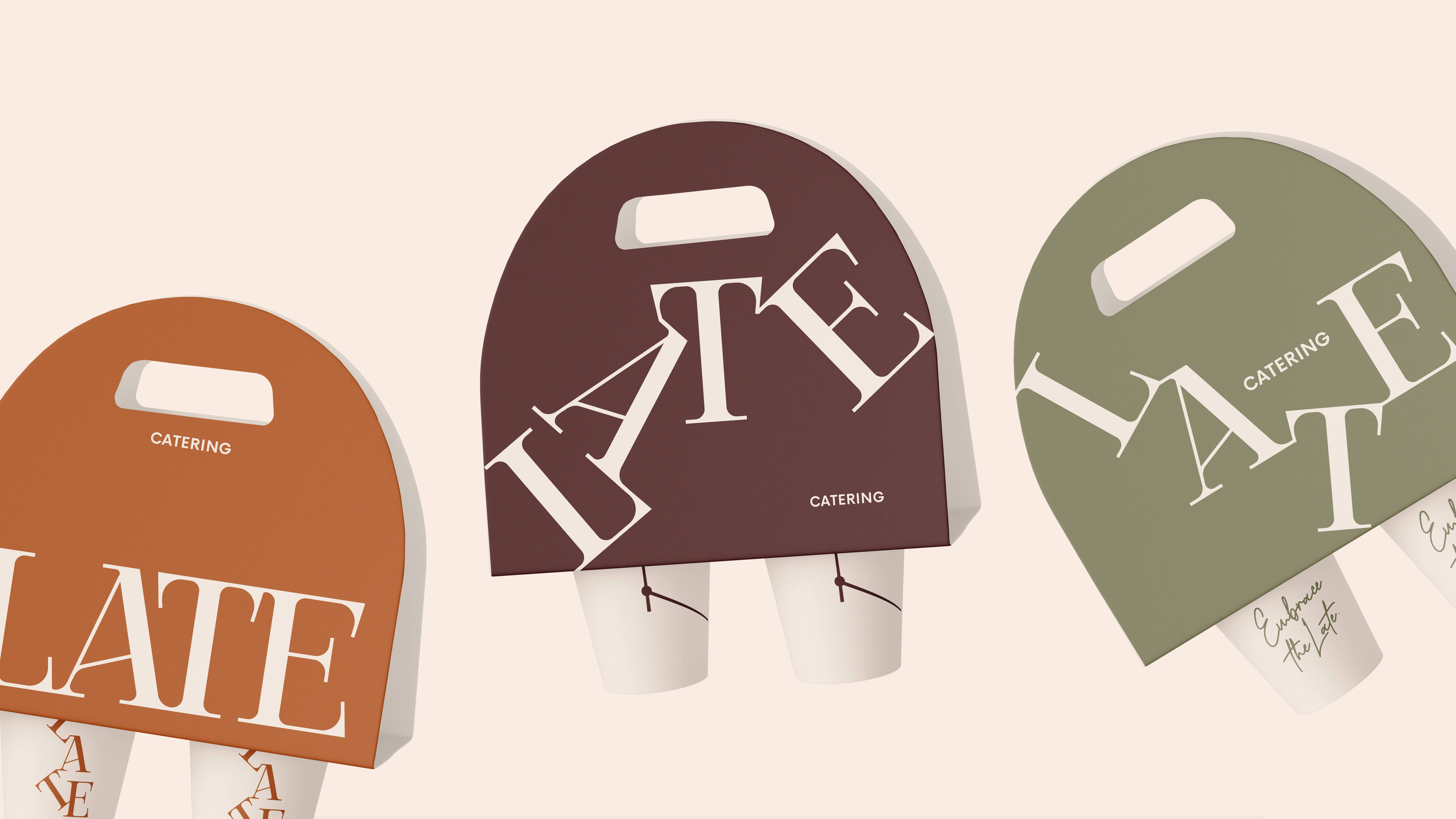
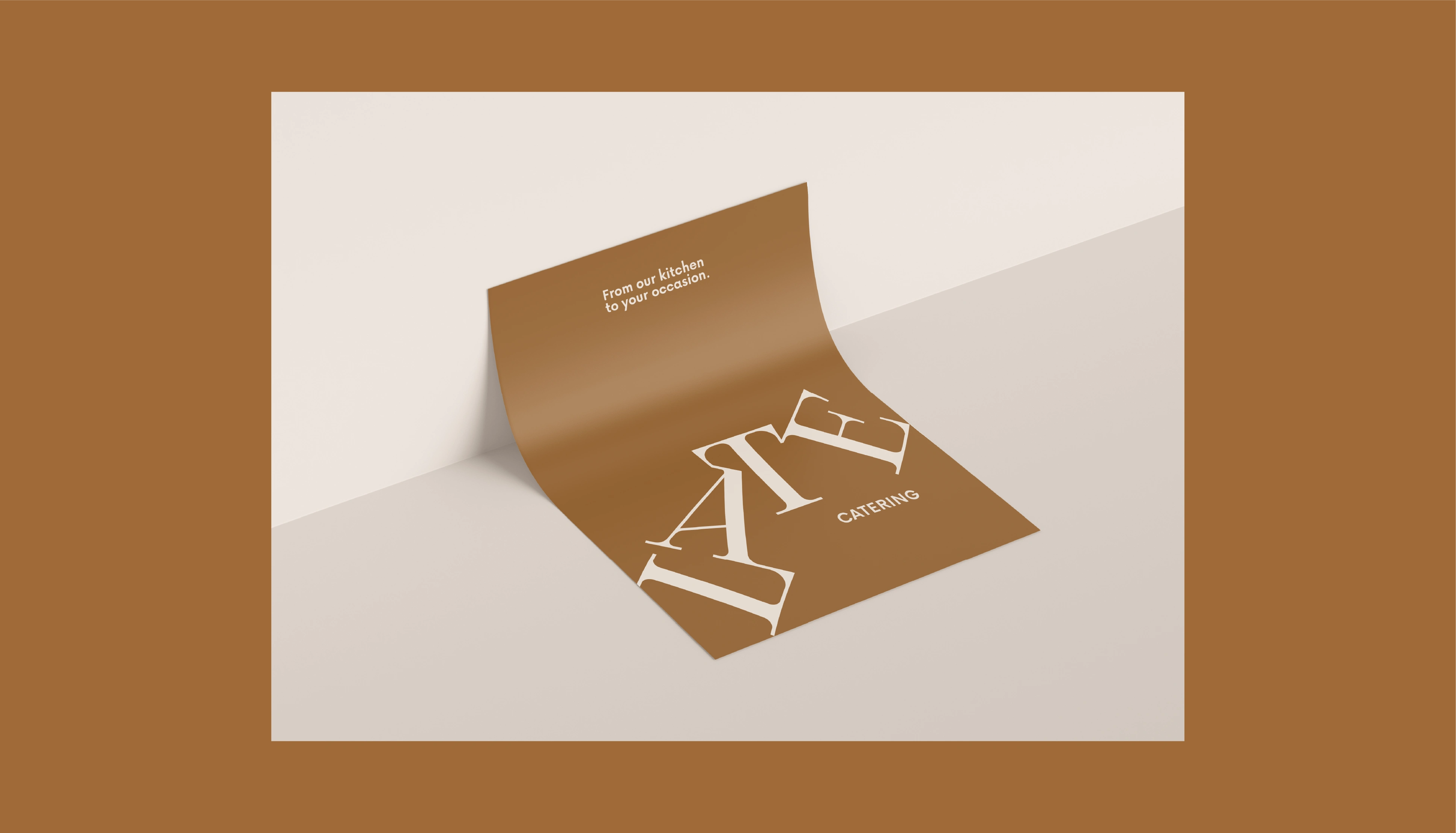
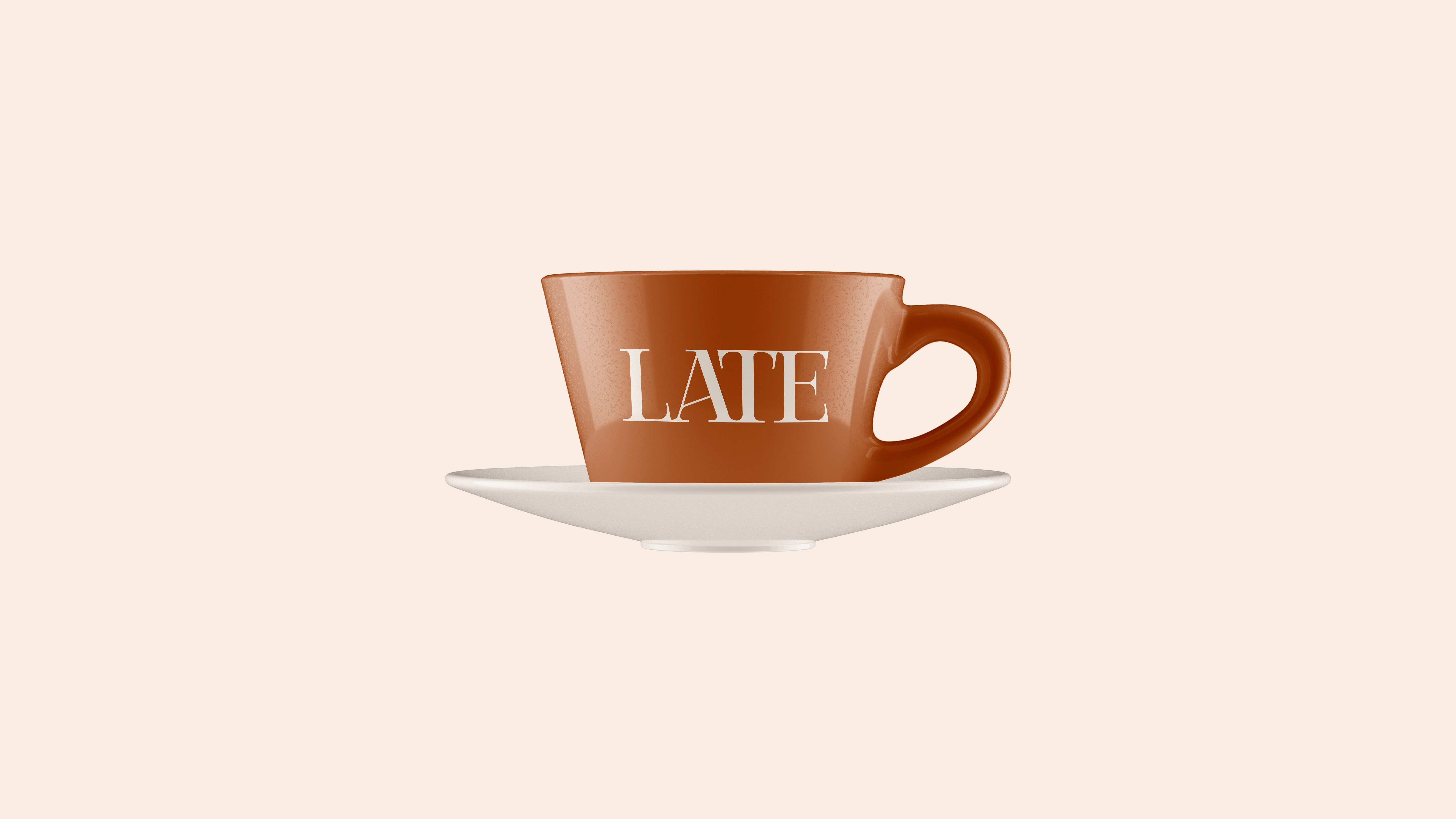
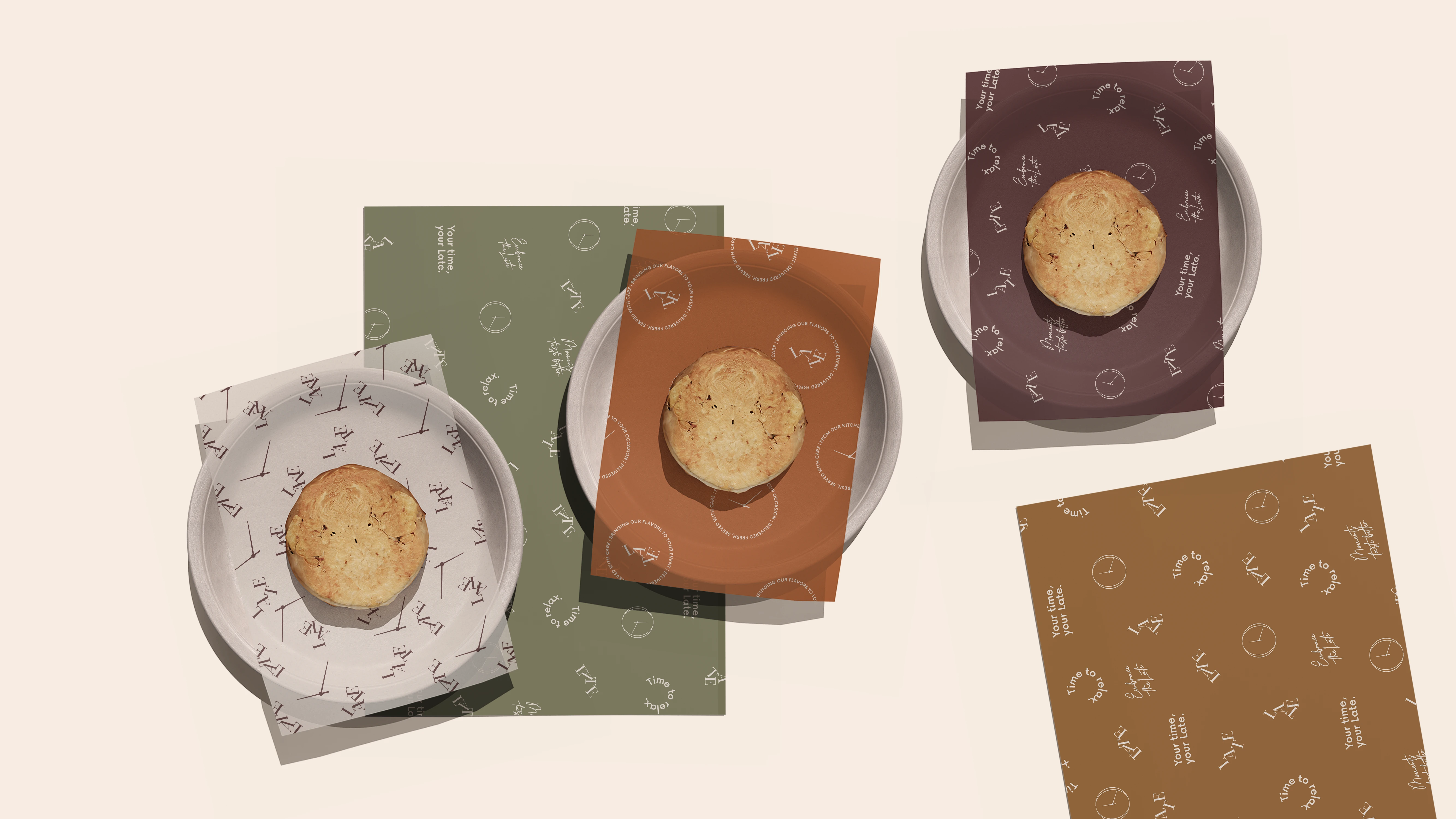
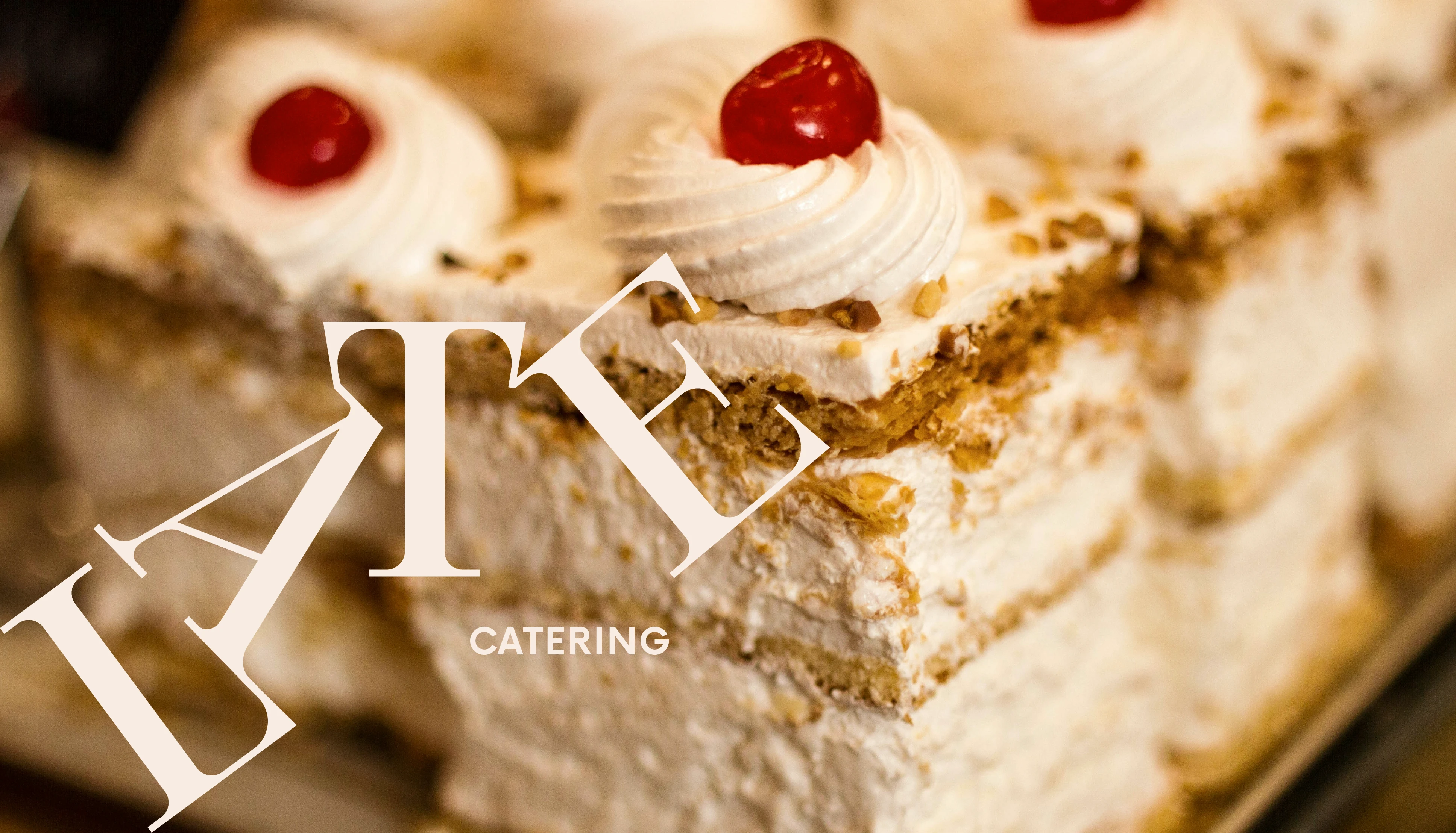
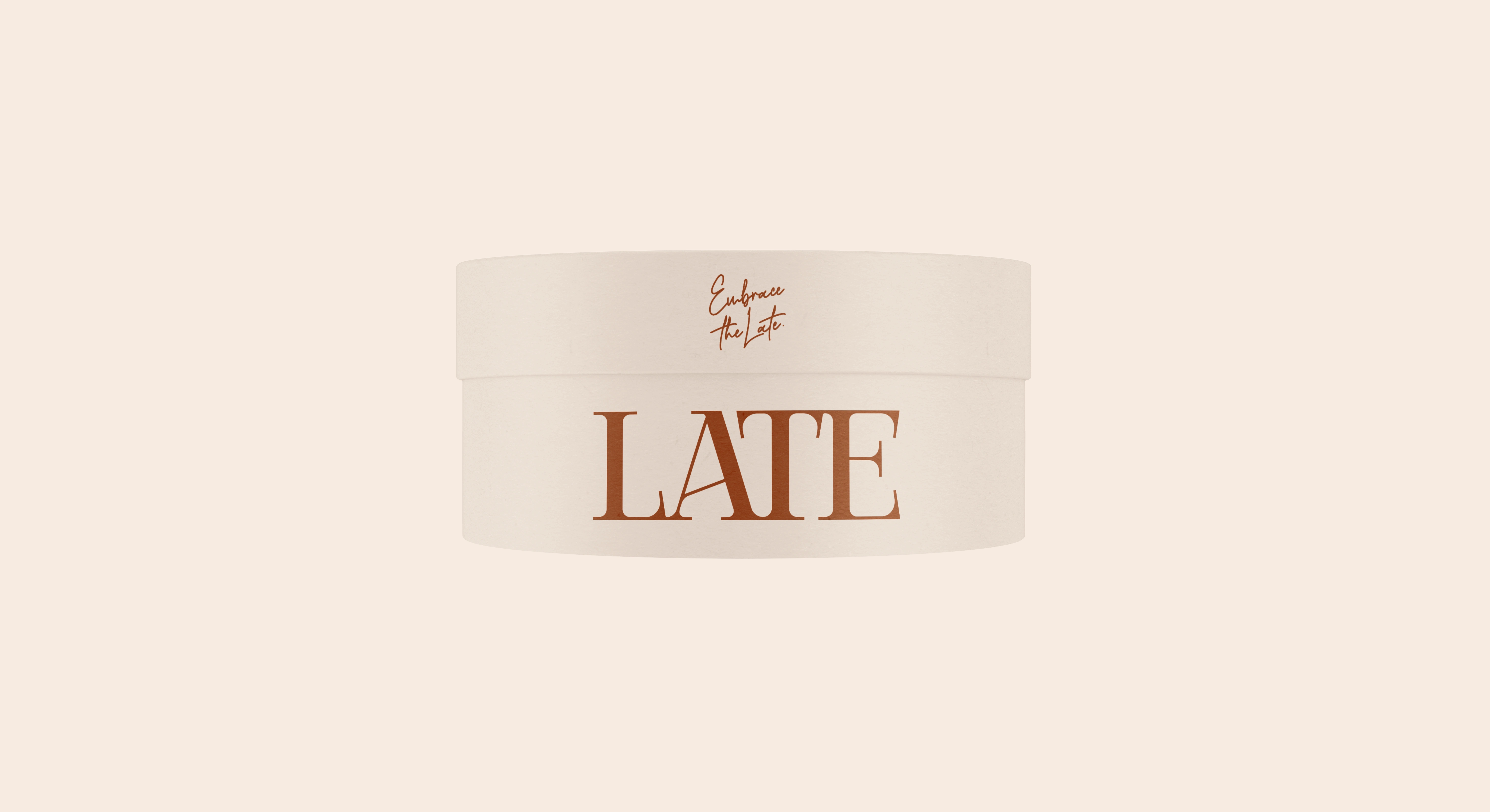
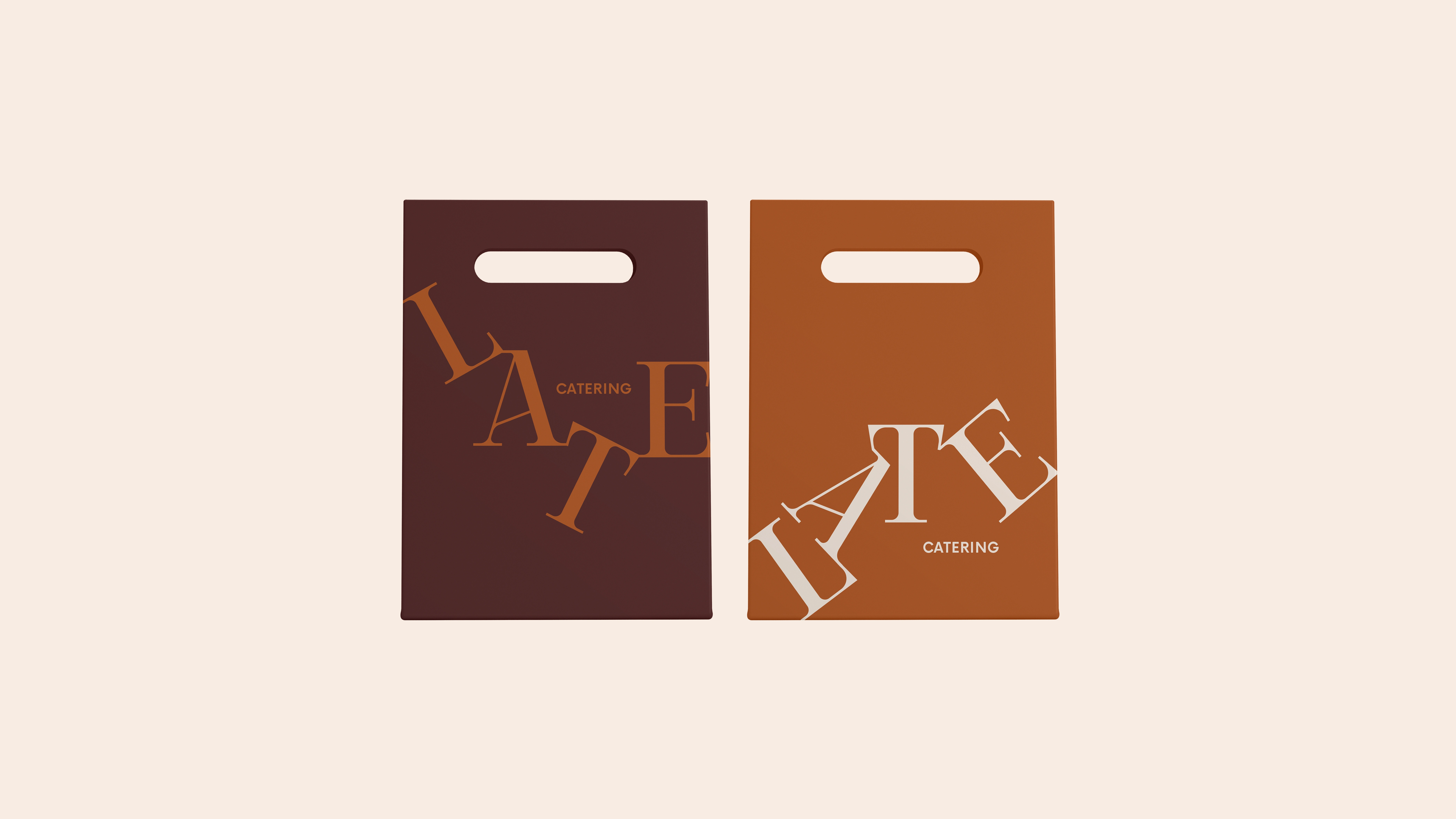
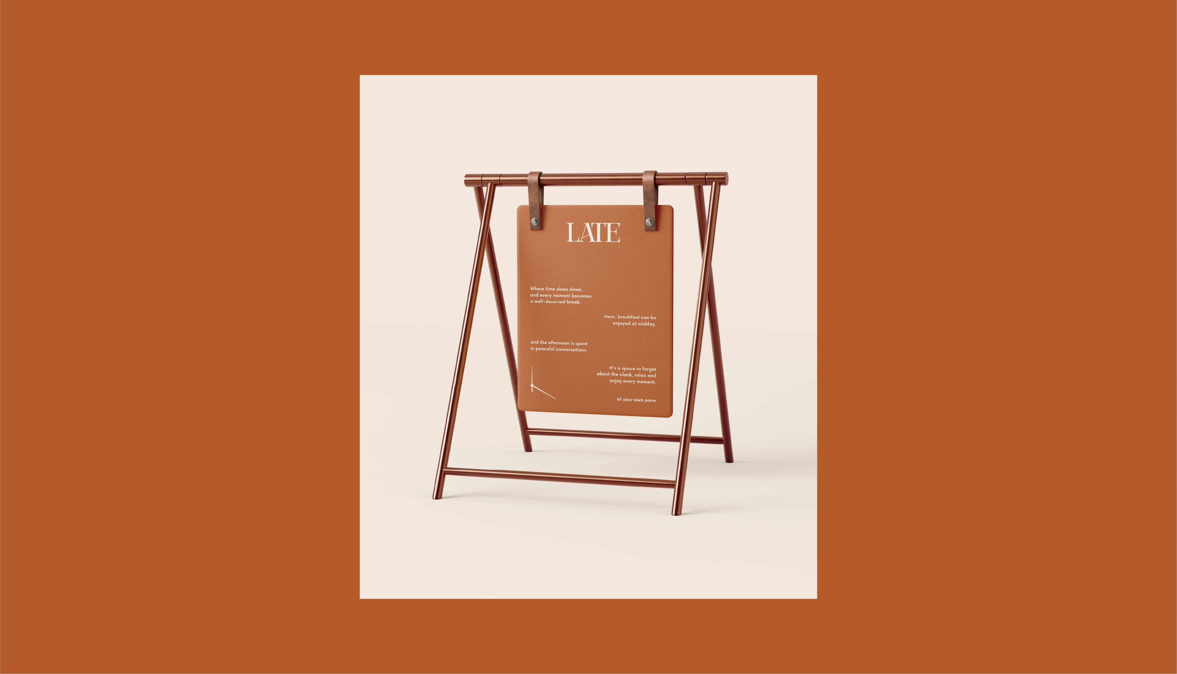
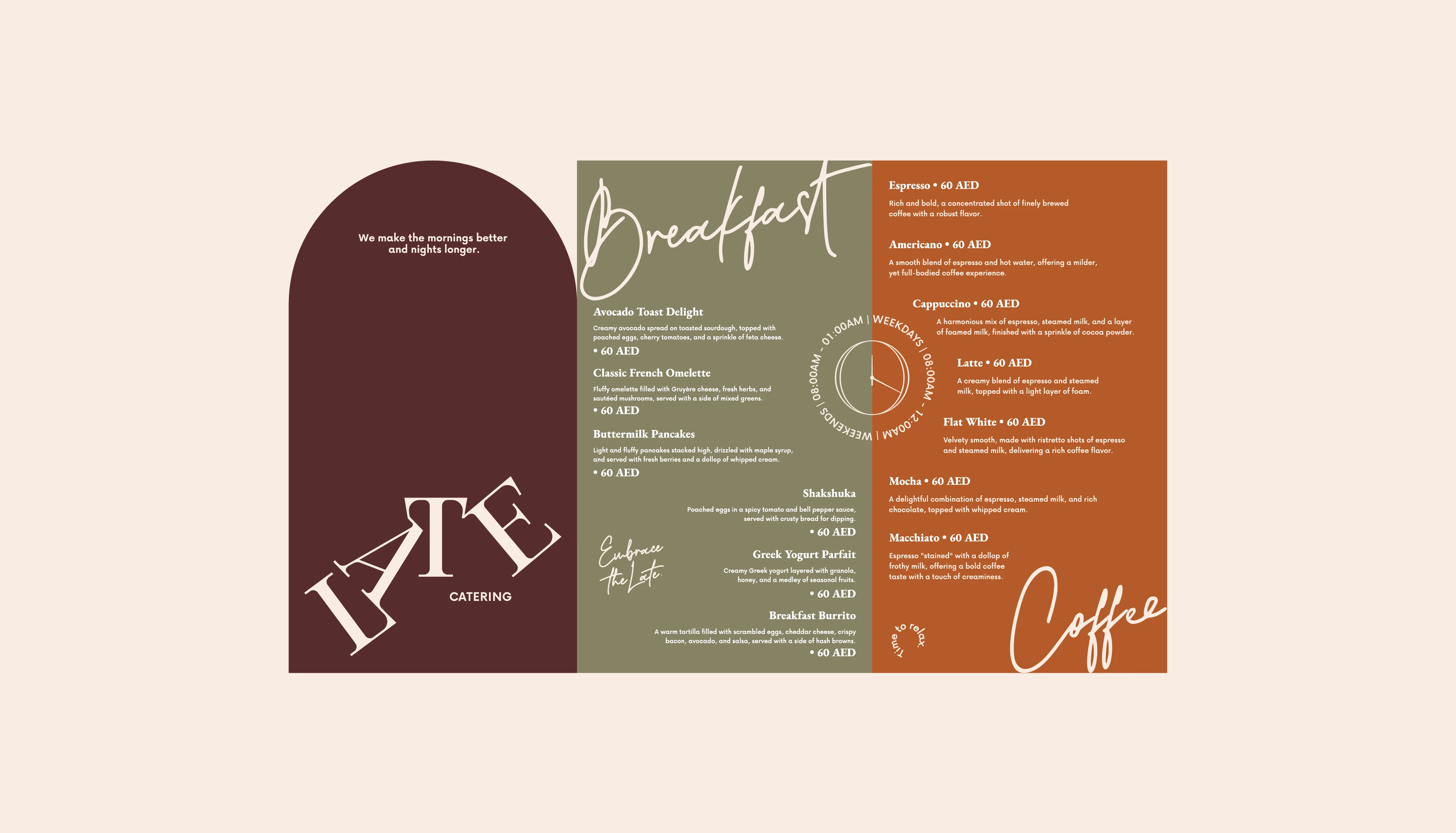
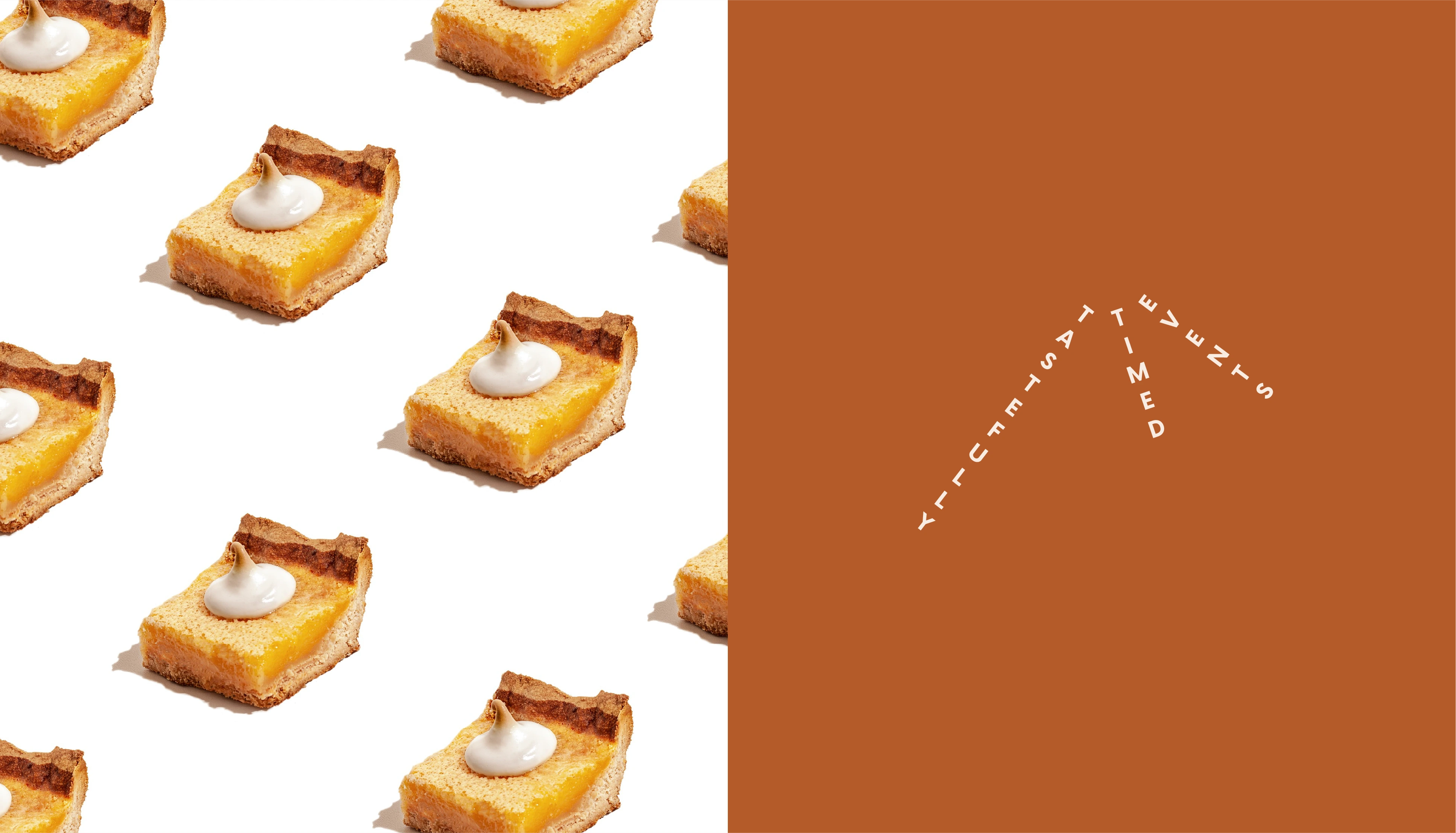
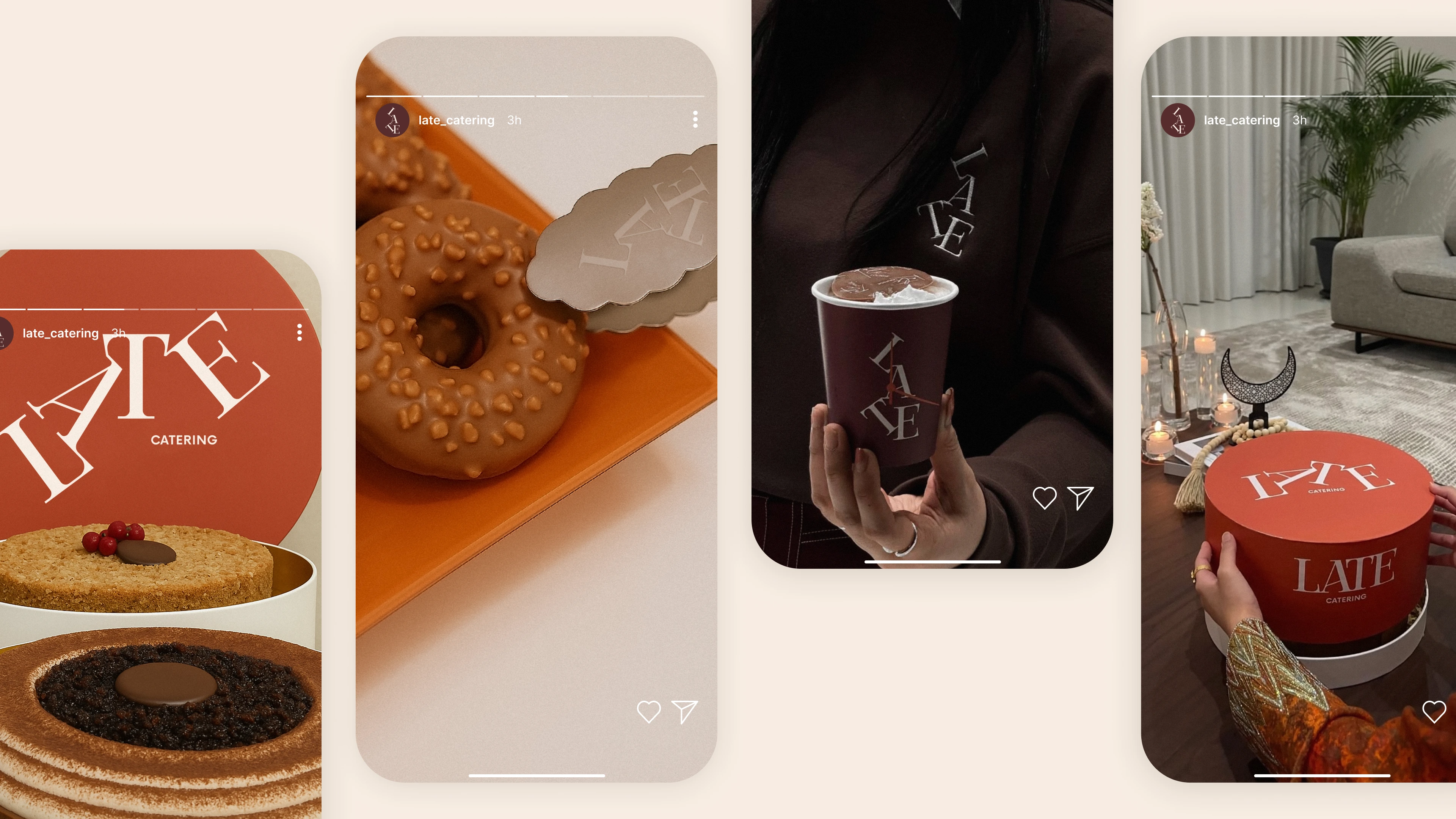
The Late Catering logo was designed to be flexible and dynamic, reflecting the brand’s relaxed and versatile approach to catering. The letters in the word "Late" are arranged in different playful compositions, creating a sense of movement and personality while still maintaining sophistication. Each variation of the logo represents a different rhythm or moment, just like the occasions the brand caters to. Whether tilted, stacked, or aligned, the logo adapts to the context while staying recognizable and elegant. The choice of a classic serif typeface adds a timeless and refined feel to the brand, balancing the casual tone with a sense of quality and care.
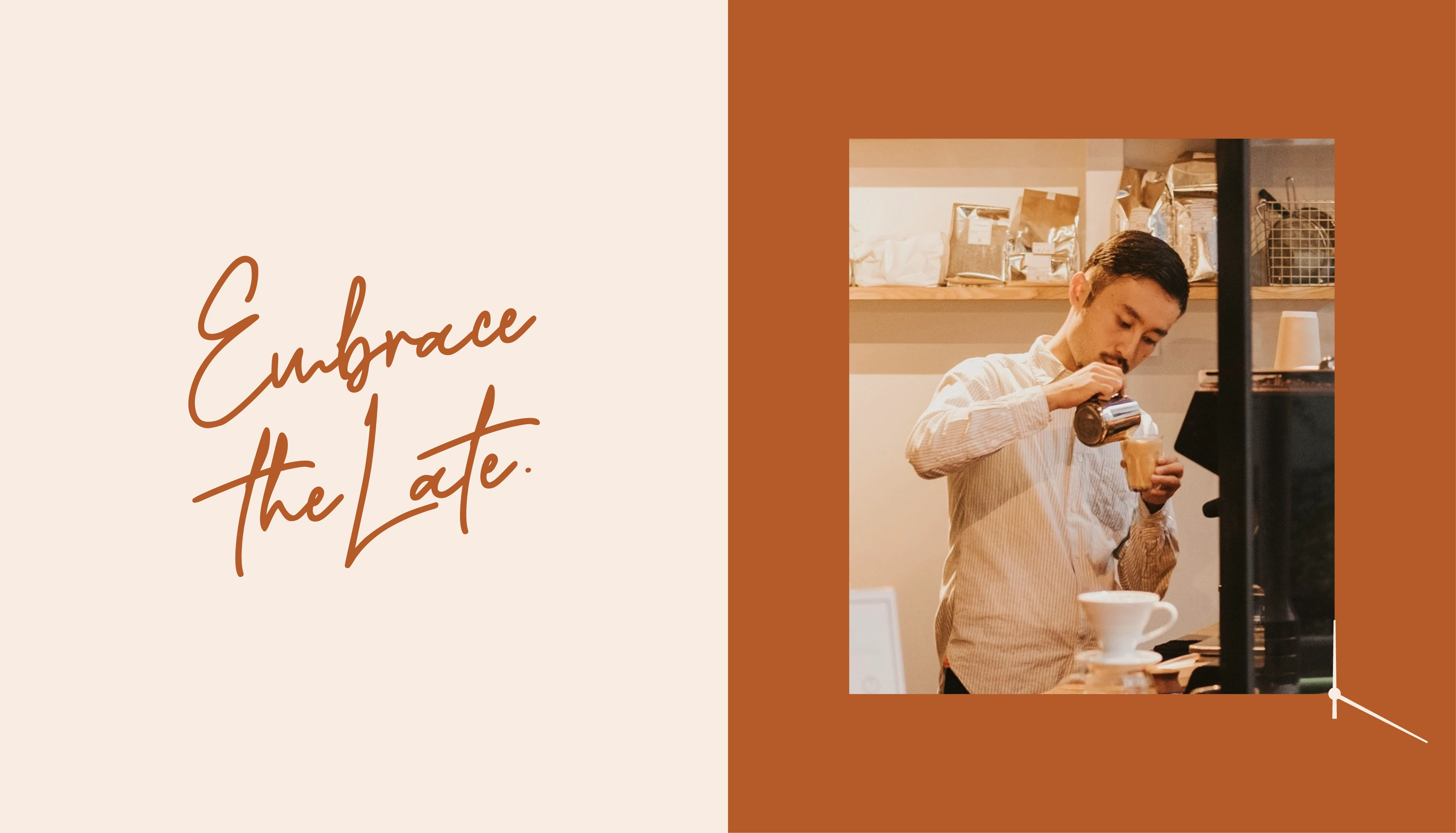
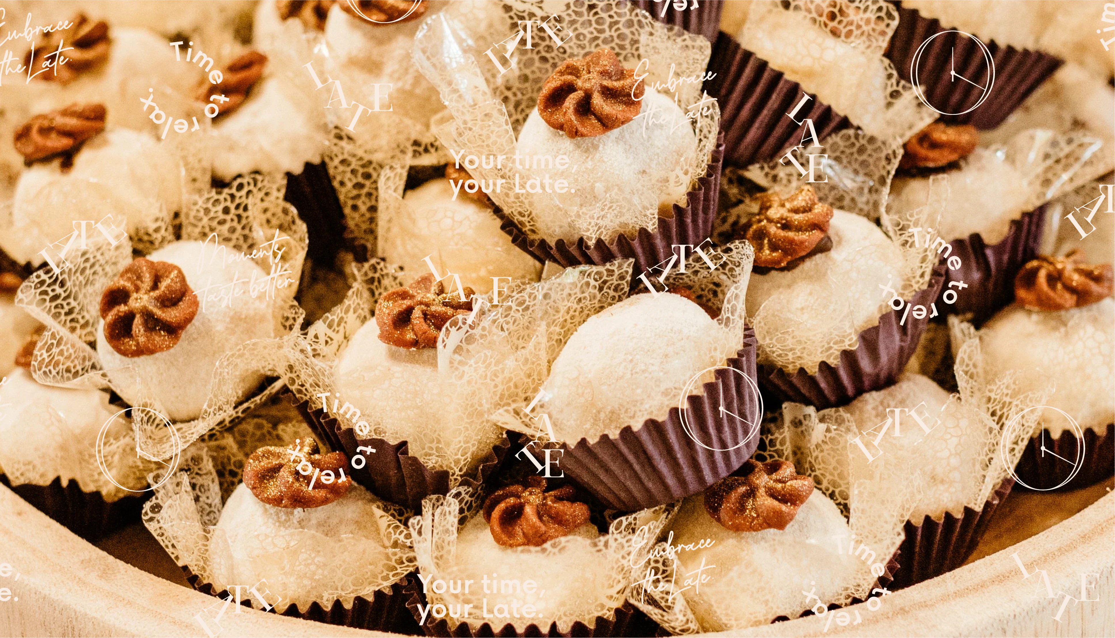
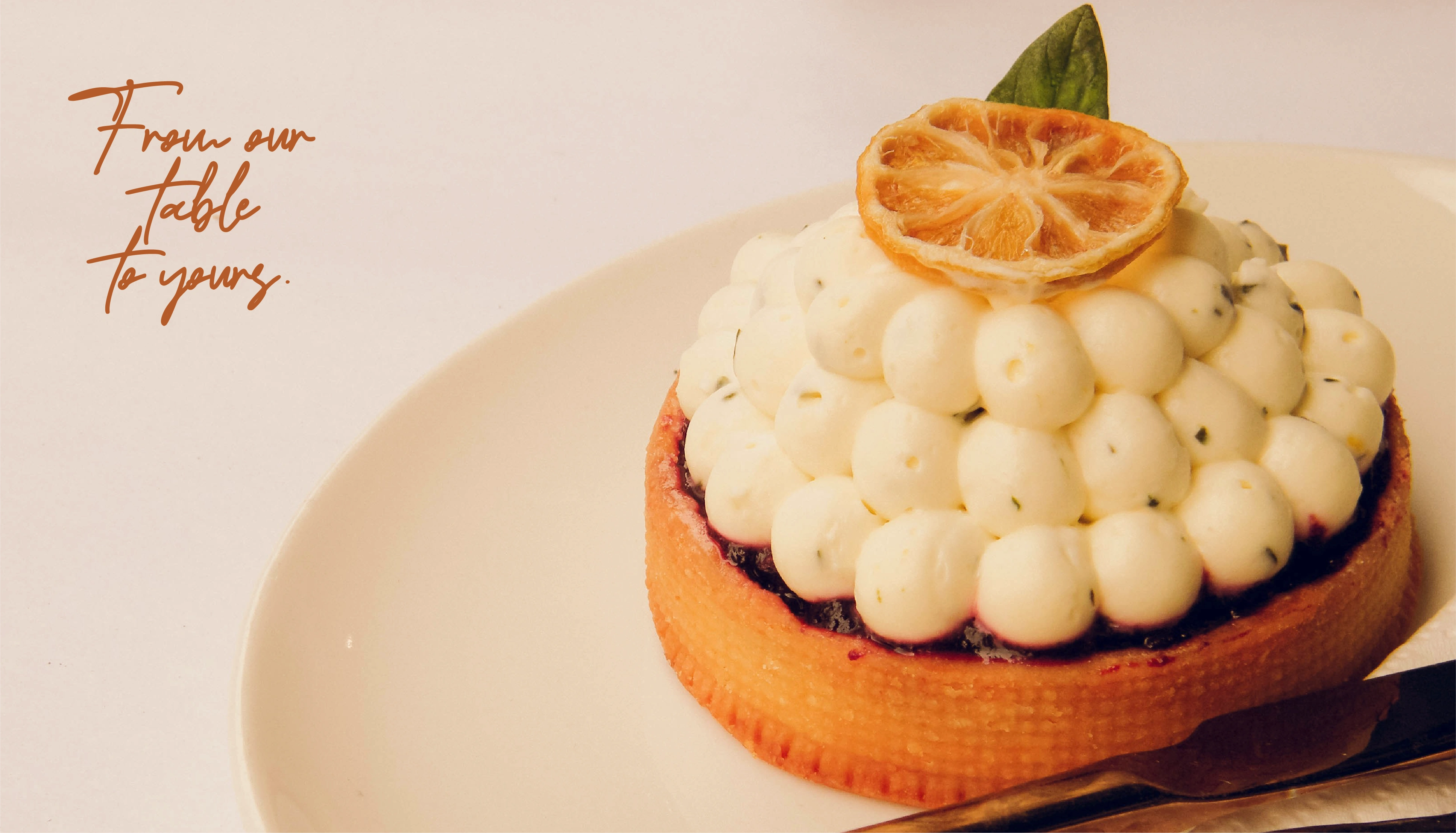
It’s a visual identity that feels both cozy and stylish, just like Late Catering’s service that doesn’t just deliver food, it delivers presence, emotion, and beauty — in every plate, and now, in every piece of its identity and website.
The website for Late Catering was designed to reflect the same calm, elegant tone established in the visual identity. The layout is minimal and inviting, using soft colors, generous spacing, and subtle animations to guide the user gently through the experience. The structure is simple and intuitive, focusing on what matters most.
Each section was crafted to feel like a slow scroll — just like the brand, it's not in a rush. Overall, the site is a digital extension of the brand’s philosophy: comforting, refined, and thoughtfully made.
Like this project
Posted Apr 21, 2025
Late Catering is an extension of the calm and elegant atmosphere of Late Lounge Cafe — now translated into a catering experience.
Likes
0
Views
20
Timeline
Nov 14, 2024 - Dec 30, 2024