MAE® - Brand Identity Development

Danar Bagus


MAE, Brand Identity & Digital Direction
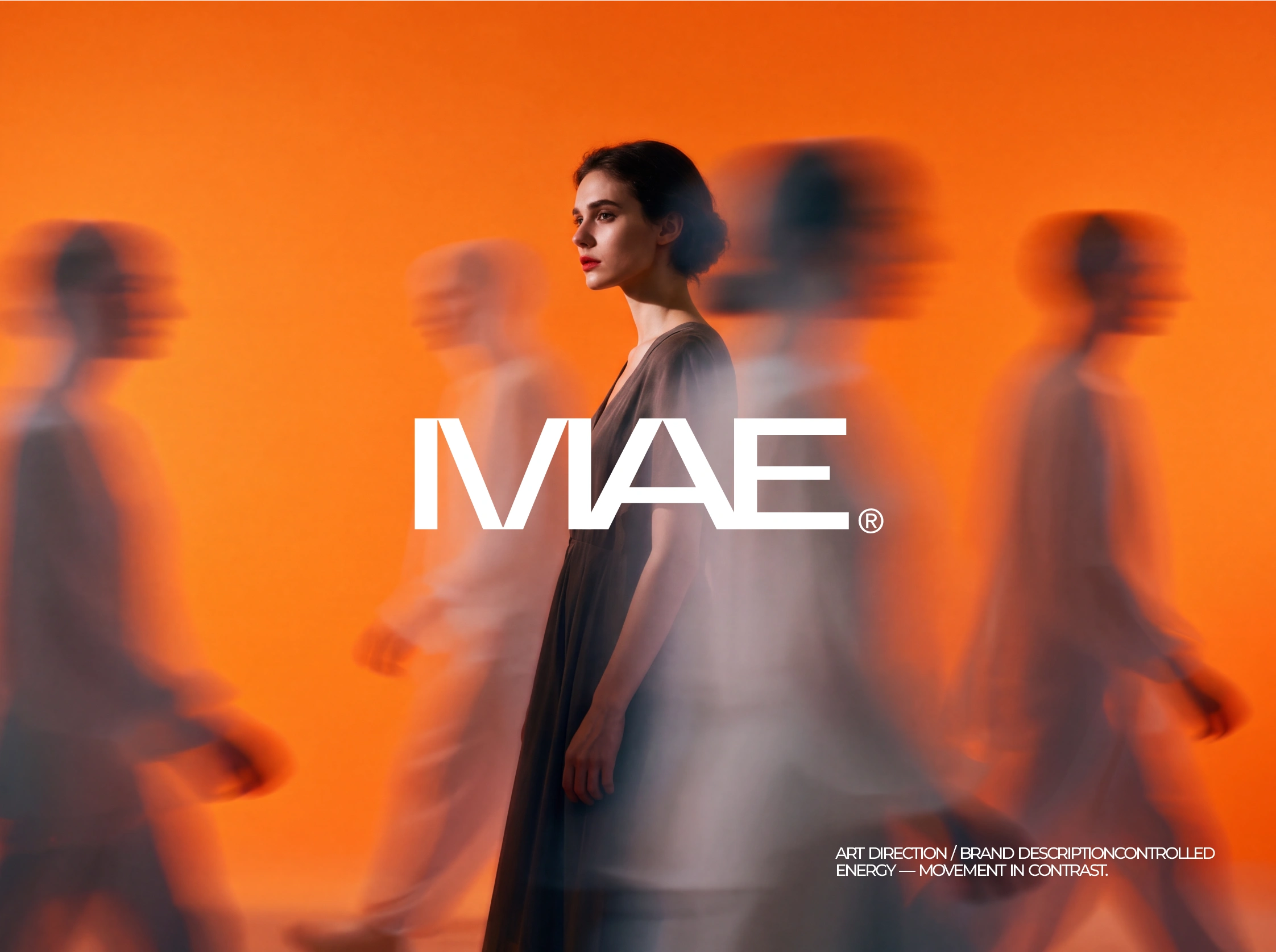
MAE is a concept brand direction built to feel recognizable from the first interaction.
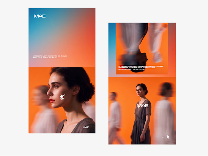
The project explores how an emerging brand can create stronger familiarity through clarity, consistency, and a distinctive visual rhythm. Rather than leaning on decorative elements, the identity uses confident typography, intentional spacing, and restrained composition to give MAE a presence that feels personal, direct, and easy to remember.
Typography became the central device. It carries the brand’s voice, creates hierarchy, and gives each message weight across digital and future campaign applications. The resulting system balances expression with structure: it can make a statement when needed, while staying clear and practical for everyday communication.
The website direction extends that same thinking. The homepage is designed to introduce MAE with focus, move visitors through the brand story, and create a natural path toward action. Strong type, considered pacing, and simple layouts keep the experience clear without losing character.
This exploration establishes an early foundation for MAE’s future brand presence, including a wordmark direction, visual identity system, art direction, and homepage concept. It creates a clear creative signal for how MAE can grow while staying cohesive wherever people encounter it.
Roles: Brand Designer, Visual Designer, Web Designer Tools: Figma, Adobe Illustrator, Adobe Photoshop
Scope of exploration
Brand strategy and visual direction
Logo and typography exploration
Core visual identity system
Art direction and layout principles
Product presentation and brand applications
This brand exploration establishes MAE’s visual character and creates a considered creative foundation for its future development, building an identity designed to feel timeless, distinctive, and recognizable.
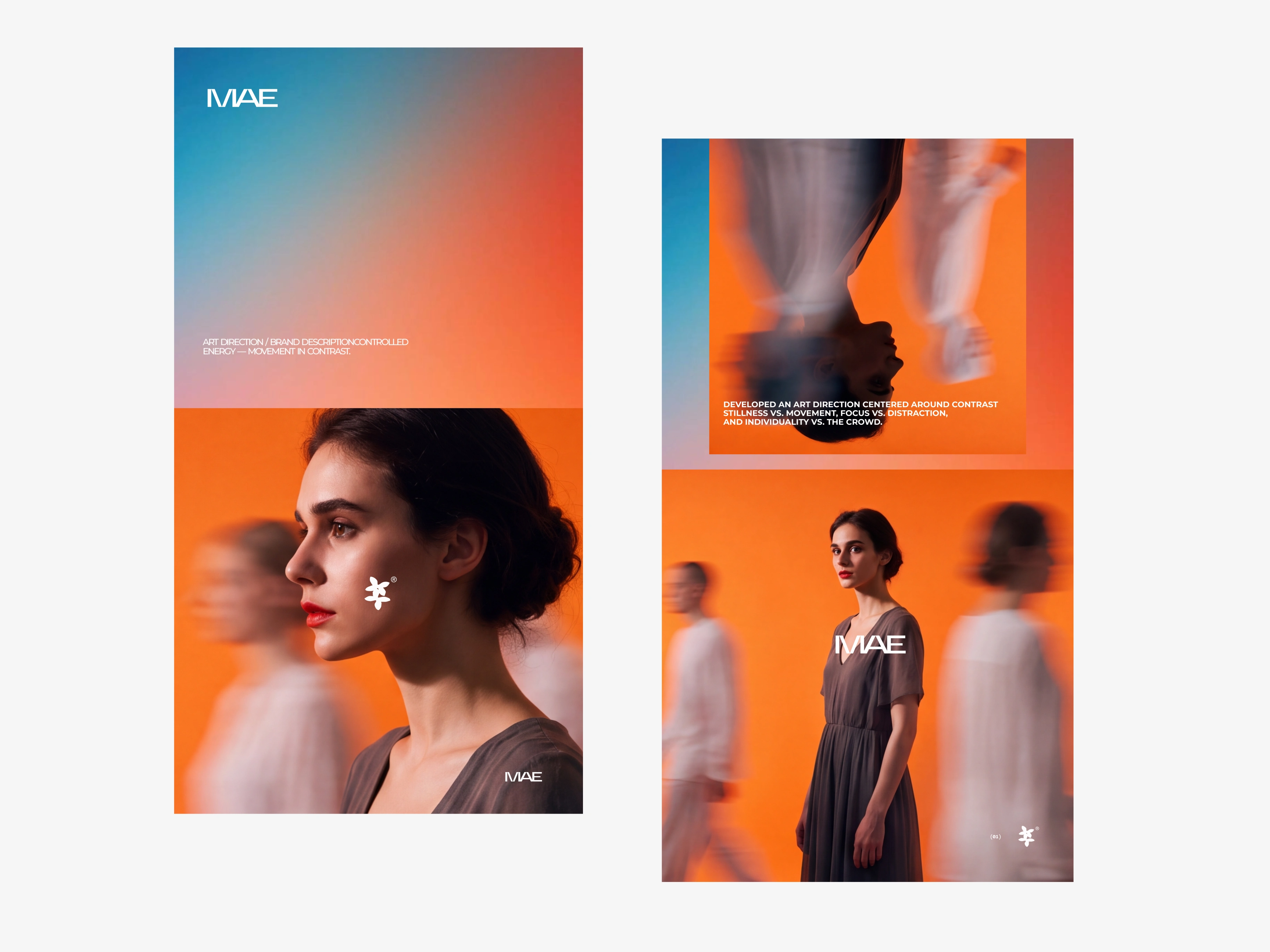
MAE is a brand identity exploration shaped around recognition, clarity, and a visual presence that stays memorable.
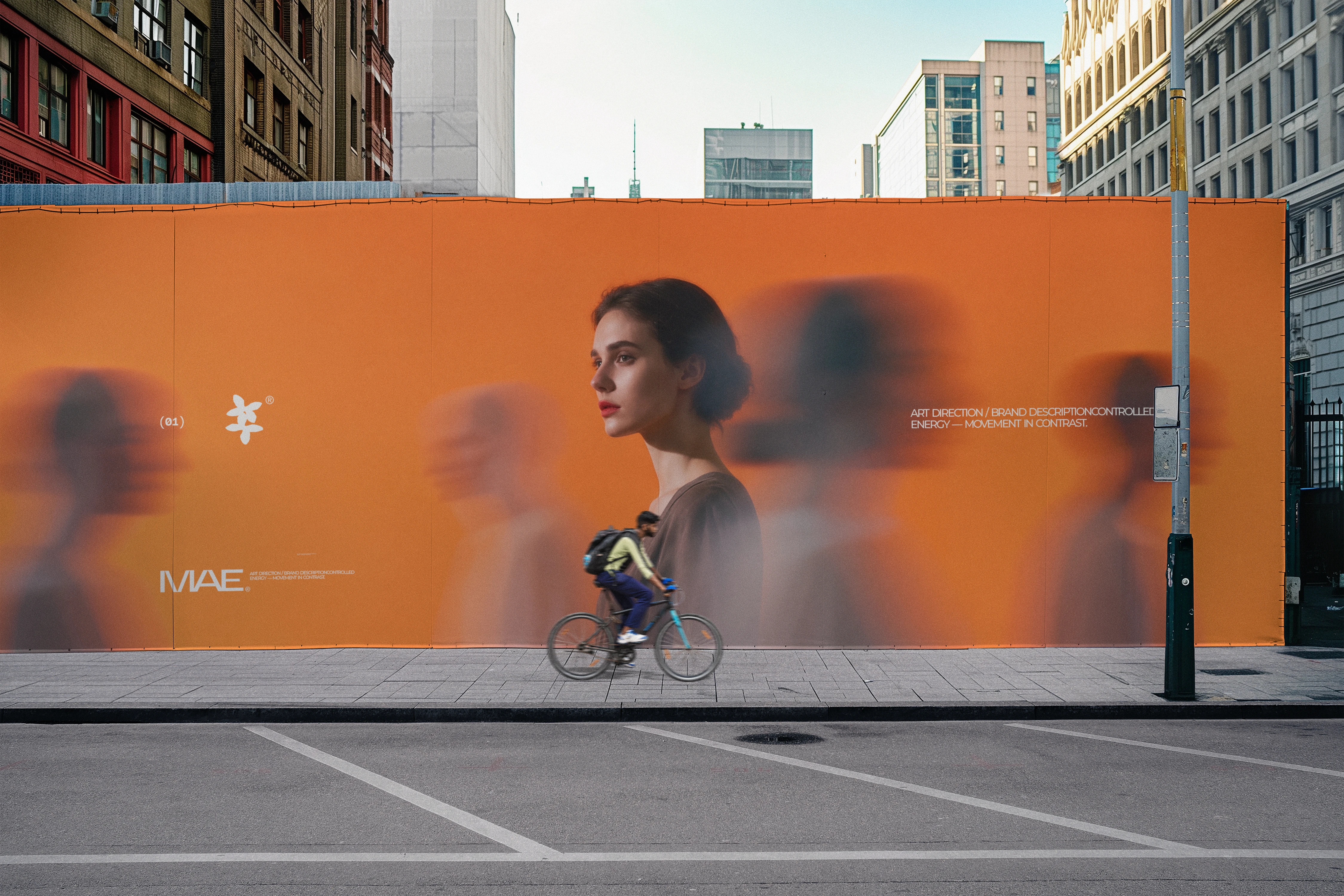
The direction uses expressive typography, considered composition, and a cohesive visual rhythm to create an identity that feels personal while remaining confident and adaptable. Rather than relying on decorative elements alone, each design choice works together to build familiarity across every touchpoint.
The outcome is an early brand foundation that gives MAE a distinct tone, a more consistent visual language, and room to grow with purpose.
MAE, Brand Identity & Digital Direction
MAE is a concept brand direction built to feel recognizable from the first interaction.
The project explores how an emerging brand can create stronger familiarity through clarity, consistency, and a distinctive visual rhythm. Rather than leaning on decorative elements, the identity uses confident typography, intentional spacing, and restrained composition to give MAE a presence that feels personal, direct, and easy to remember.
Typography became the central device. It carries the brand’s voice, creates hierarchy, and gives each message weight across digital and future campaign applications. The resulting system balances expression with structure: it can make a statement when needed, while staying clear and practical for everyday communication.
The website direction extends that same thinking. The homepage is designed to introduce MAE with focus, move visitors through the brand story, and create a natural path toward action. Strong type, considered pacing, and simple layouts keep the experience clear without losing character.
This exploration establishes an early foundation for MAE’s future brand presence, including a wordmark direction, visual identity system, art direction, and homepage concept. It creates a clear creative signal for how MAE can grow while staying cohesive wherever people encounter it.
Roles: Brand Designer, Visual Designer, Web Designer
Tools: Figma, Adobe Illustrator, Adobe Photoshop
The Challenge
For an emerging brand like MAE, recognition depends on consistency. A strong idea can lose its impact when the messaging, visual identity, and digital experience don’t move together.
This brand direction exploration focused on creating a visual foundation that could:
Make the MAE name feel more recognizable and ownable
Build an emotional connection while keeping the brand commercially clear
Create a flexible system for future brand and digital applications
Keep every interaction simple, focused, and memorable
The Creative Direction
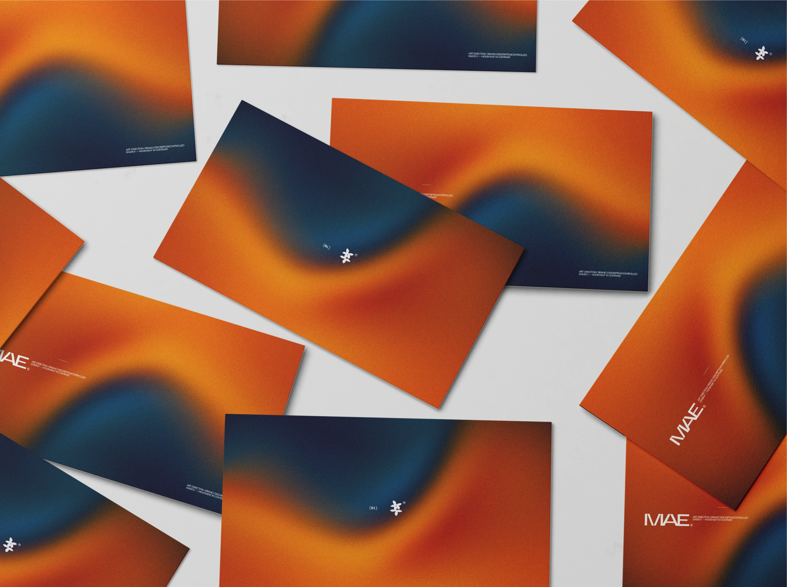
The visual direction for MAE is built around recognition and presence. It uses confident typography, considered spacing, and restrained visual elements to create an identity that feels direct, personal, and distinct.
Typography became the central device, carrying MAE’s voice, creating hierarchy, and giving each message a clear sense of weight. The system is expressive when the moment calls for it, while staying practical enough for everyday communication.
The identity balances 2 qualities:
Personal: Language and visual choices that feel familiar, human, and memorable
Structured: A clear system that can be applied consistently as MAE grows
Design Approach
The process began by defining the role of the MAE name within the identity. From there, the direction explored how typography, layout, and visual rhythm could create a stronger and more recognizable brand signal.
Key design considerations included:
Creating a wordmark and typographic direction with distinctive character
Establishing a visual hierarchy that keeps communication clear
Exploring layouts that feel confident, spacious, and intentional
Building a flexible system for digital, social, and future campaign assets
Translating the identity into a digital experience designed to hold attention and support action
Digital Experience
The website direction for MAE was developed as an extension of the identity, carrying the same visual language into the digital experience.
The homepage concept introduces MAE with clarity, guides visitors through the brand story, and creates a natural path toward action. Strong typography, intentional pacing, and simple composition keep each section focused while giving the brand room to make an impression.
The goal was a digital space that feels consistent with the identity: easy to navigate, clear in its communication, and distinctive enough to stay memorable.
Deliverables
This concept exploration includes:
Brand positioning direction
Visual identity exploration
Typography and art direction
Logo and wordmark direction
Core visual system
Homepage concept and UI direction
Digital design principles for future touchpoints
Outcome
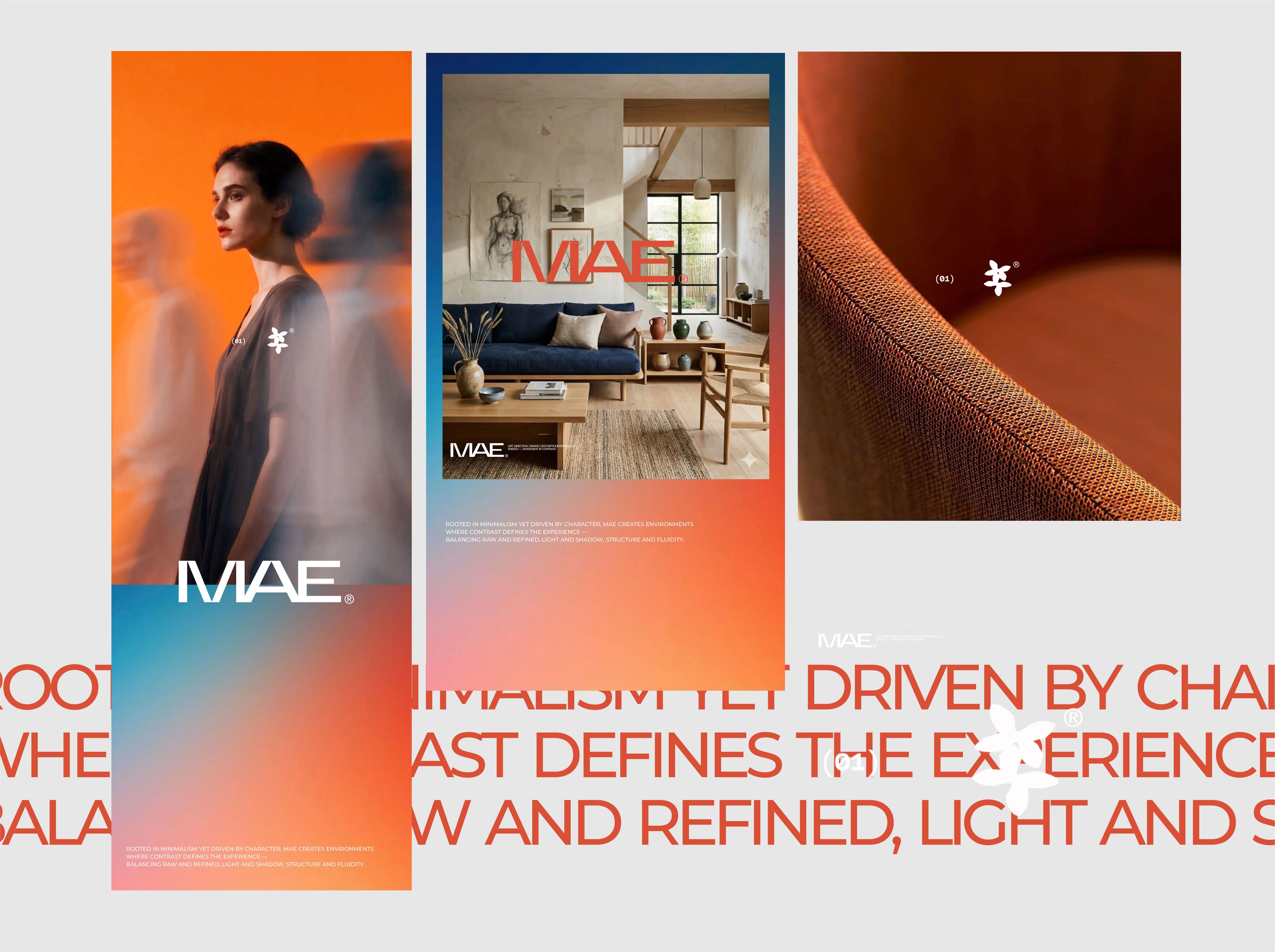
This exploration establishes an early foundation for MAE’s future brand presence. It gives the name a stronger visual role, creates a clearer system for communication, and sets a direction that can grow into a complete identity and digital experience.
The work is intended as a starting point: a clear creative signal to guide future decisions and keep MAE recognizable wherever people encounter it.
Project roles: Brand Designer, Visual Designer, Web Designer Tools: Figma, Adobe Illustrator, Adobe Photoshop
Like this project
Posted Oct 29, 2026
MAE is a concept brand identity I built a flexible visual system gives the brand a confident presence across its identity, campaigns, and future web experience.
Likes
0
Views
1
Clients
MAE