Redesigning OpenRefine's Reconciliation Dialog

OpenRefine logo...
OpenRefine, formerly known as Google Refine, is a free and open-source tool designed for cleaning, transforming, and reconciling messy and inconsistent datasets.
The process of reconciliation involves aligning and matching data entities to achieve accurate and standardized results. In this case study, we delve into the redesign of OpenRefine's reconciliation dialog, aiming to enhance user experience, streamline workflows, and elevate the efficiency of data reconciliation—a crucial step in ensuring data quality and coherence.
Project Overview:
In the quest to elevate user experience of the OpenRefine Reconciliation Dialog , I was contracted immediately aftwr my Outreachy internship to redesign the interface and experience of the reconciliation process .
This venture unfolded in 5 key phases: refining column mappings, simplifying service selection, Placement of reconciliation previews, enhancing language changeability, and Placement of reconciliation previews
Phase 1: Simplifying the Service Selection Dialog
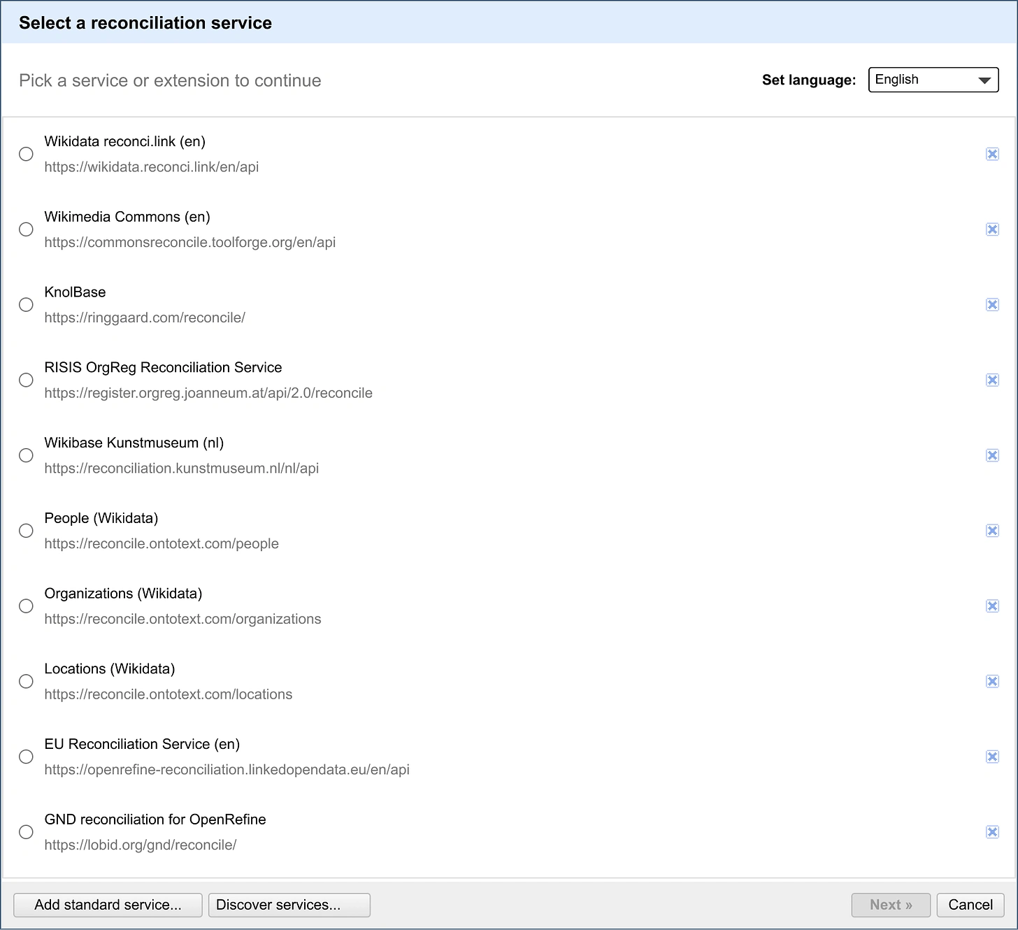
The existing service selection dialog posed challenges with its confusing slider icon and an inefficient layout.
Solution:
Removing Redundant Elements:
In my redesign, I streamlined the reconciliation dialog by eliminating the sidebar and the seemingly out-of-place price icon. This change enhances user focus and declutters the interface. I replaced the sidebar with a full view of services and their corresponding URLs, providing users with a more comprehensive and intuitive selection experience. The traditional "Start reconciling..." button was replaced with the familiar "Next >>" button, guiding users through a more controlled workflow. I incorporated Chrome's primary variable for a consistent selector effect. A hover prompt on the "Next >>" button prevents users from proceeding without selecting a service.
Improved Navigation and Communication:
Service URLs are now highlighted as hyperlinks on hover, offering users clearer visual cues about their interactive nature. The message "Pick a service or extension to continue" is presented in a more user-friendly and visually appealing manner, enhancing its noticeability. A prompt prevents accidental service deletions, adding a safeguard against unintended data loss. Overall, the redesigned interface prioritizes simplicity and guides users through an intuitive workflow, contributing to a cleaner, user-friendly experience.

Phase 2: Column Mappings Redesign
Problem Statement:
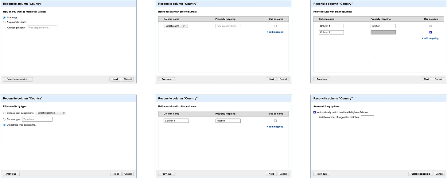
User feedback uncovered challenges related to visual hierarchy, defaults for results, and language clarity in the column mappings section. Overall, it seemed pretty hard for new users to understand reconciliation terminologies or successfully reconcile data due to no clarity of language as regards property mappings and entity identifiers.
Solution:
I collaborated with Lozaba Rosenova to enhance the OpenRefine reconciliation dialog's column mappings section. We refined the design, establishing a visual hierarchy for an intuitive reconciliation journey. Global settings were placed above the line, impacting the entire process, while result constraints were logically sequenced below.
Default Settings for Seamless Results
To ensure a user-friendly experience, I configured default settings for satisfactory results, minimizing the need for extensive user intervention. The design allowed flexibility, letting users choose between column text values or property mapping, with clear indications of their choices through selectable options.
Streamlining the User Interface
To streamline the interface, a dropdown for entity type suggestions was introduced, reducing visual clutter. The property mapping table was simplified for easy constraint selection, emphasizing a cleaner and more focused user experience.
Clarity Through Language Simplification
Language simplification was a priority, with terminology updated for clarity and to avoid unnecessary jargon. In collaboration with Lozaba Rosenova, I improved mockups to align seamlessly with OpenRefine's established design system, contributing to a cohesive and user-friendly interface.
Phase 3: Improving display of reconciliation results.
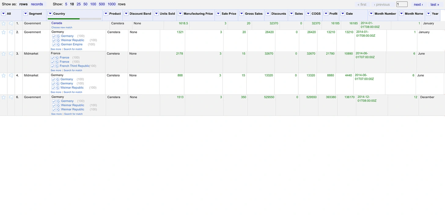
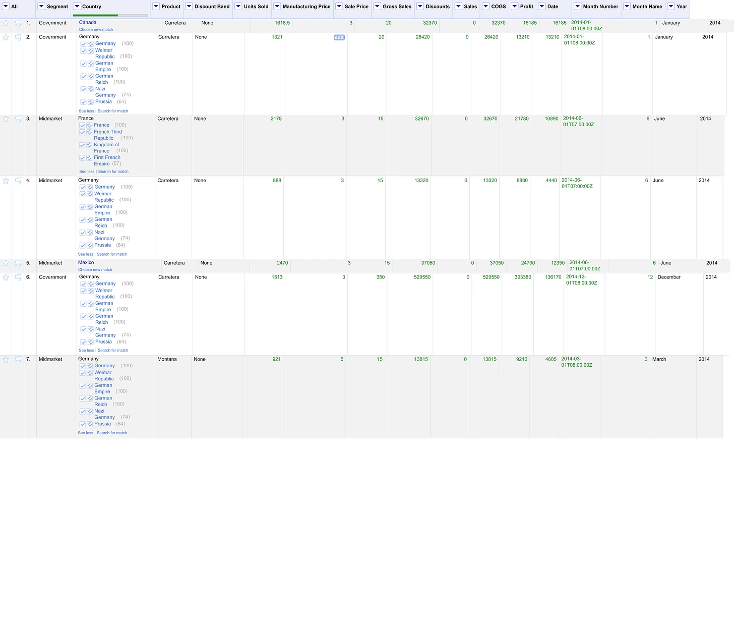
In user interviews conducted during the September redesign of OpenRefine's reconciliation dialog feature, a recurring challenge emerged—users faced difficulty managing a large number of displayed results after selecting a reconciliation service. Issues ranged from accuracy concerns to the overwhelming nature of the presented results. Users expressed a need for enhanced visibility and control, as the existing system led to sorting through numerous irrelevant results and introduced undesirable UI elements, such as expanded cells causing excessive whitespace.
Proposed Solution:
To address these challenges, I proposed a user-friendly enhancement to the reconciliation feature in OpenRefine.
Which by default, only a limited number of results (3) are displayed to users, reducing information overload. Users have the option to reveal additional candidates beyond the default limit using the "See More" button, providing flexibility based on their specific needs. Additionally, a "See Less" button (link) serves as a reverse action option, allowing users to return to the default display of 2 results for efficient navigation.
Phase 4: Language Changeability in Reconciliation
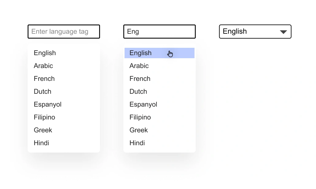
Users needed more flexibility in handling languages, particularly for languages not supported by default settings.
Solution:
Seamless Language Customization:
Added a dedicated "Set Language" option within the reconciliation dialog for easy access.
Leveraged OpenRefine's existing language settings for a consistent user experience.
User-Defined Language Tags:
Empowered users to input preferred language tags, accommodating non-default languages.

Phase 5: Placement of reconciliation previews
During the reconciliation process, previews of reconciliation candidates sometimes appear in locations that obstruct parts of the candidate itself or its matching buttons. This occurs especially when users reconcile cells and then reduce the size of the window.
Solution:
To address this issue, I proposed and implemented a solution through a mockup. The key adjustments made in the mockup include:
Keeping the preview at least 8px away from the candidate when displayed on the right.
Maintaining a minimum distance of at least 4px if displayed below the candidate's row.


Impact
By prioritizing simplicity, introducing intuitive workflows, and enhancing visual clarity, the redesign empowers users to navigate the data reconciliation process with unprecedented ease. This not only reduces the learning curve for new users but also significantly improves the efficiency and accuracy of experienced users. The user-centric approach adopted in the redesign contributes to OpenRefine's commitment to being a user-friendly and efficient tool for data cleaning and reconciliation, solidifying its position as a leading solution in the field
Like this project
Posted Apr 28, 2024
Find out how I improved OpenRefine's reconciliation process and data cleaning for users.
Likes
0
Views
0

