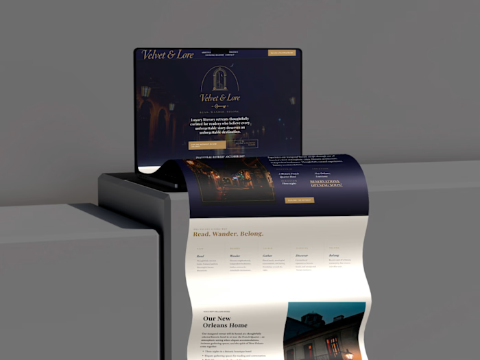
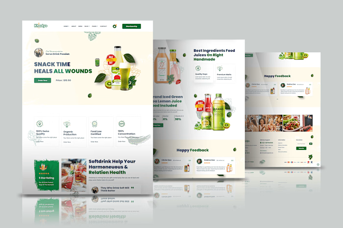
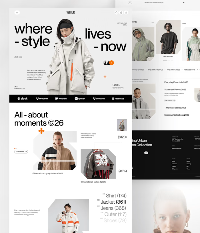
Squarespace Calmora Website Redesign for Mental Wellness

Joshua Damilola


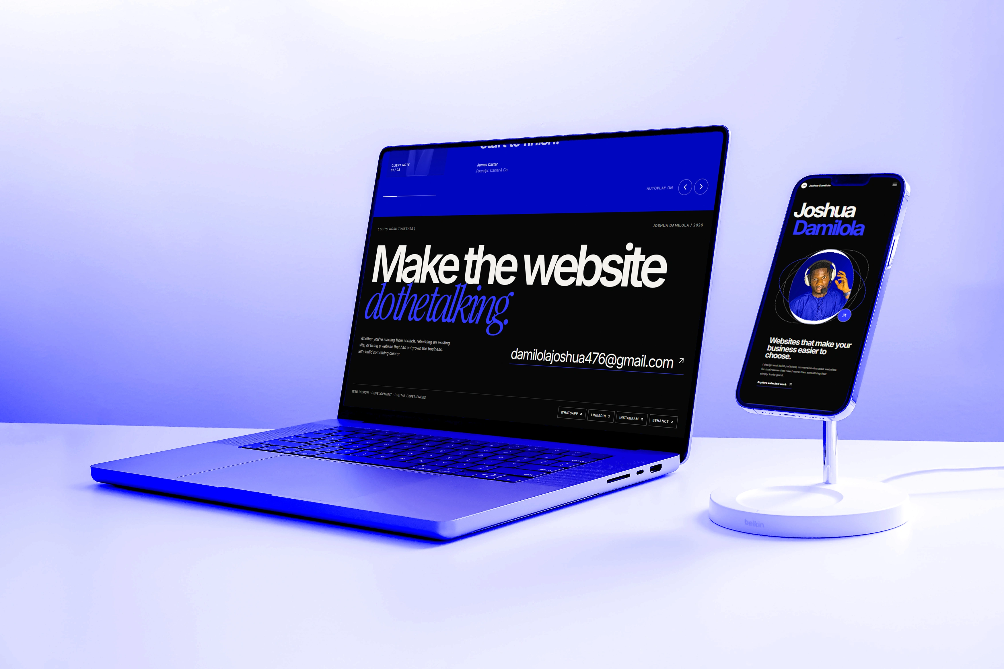

Visitors to a mental wellness site are often tired, anxious, or unsure whether to reach out at all. Instead of bright pastels and stock smiles, Calmora uses a dark, low-noise interface that feels like a dimmed room. The hero features a black-and-white portrait of someone lost in thought, which reflects the visitor’s own state instead of pushing cheerfulness. The headline is short and gentle: it names the need first and offers help second. Only two actions appear in the hero, a filled button and an outlined one, so the first step feels small. Generous spacing and a single typeface keep everything quiet.
Like this project
Posted Nov 6, 2026
Squarespace case study: a calm, dark-toned website for a mental wellness brand, designed to feel private, gentle, and easy to reach out from.