SuperBelly eCommerce Landing Page Design & CRO

Samson Bojesomo


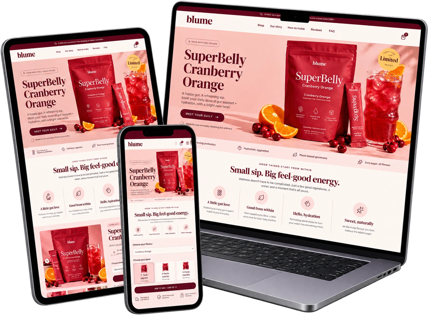
Blume — SuperBelly eCommerce Landing Page Design & CRO
My Role: eCommerce UI/UX Designer · Landing Page Designer · CRO Specialist
Project Overview
The goal was to create a visually engaging product experience that communicates SuperBelly's value while making the shopping journey simple and enjoyable.
I focused on combining brand storytelling, eCommerce UI/UX, and conversion rate optimization to guide customers from product discovery to purchase.
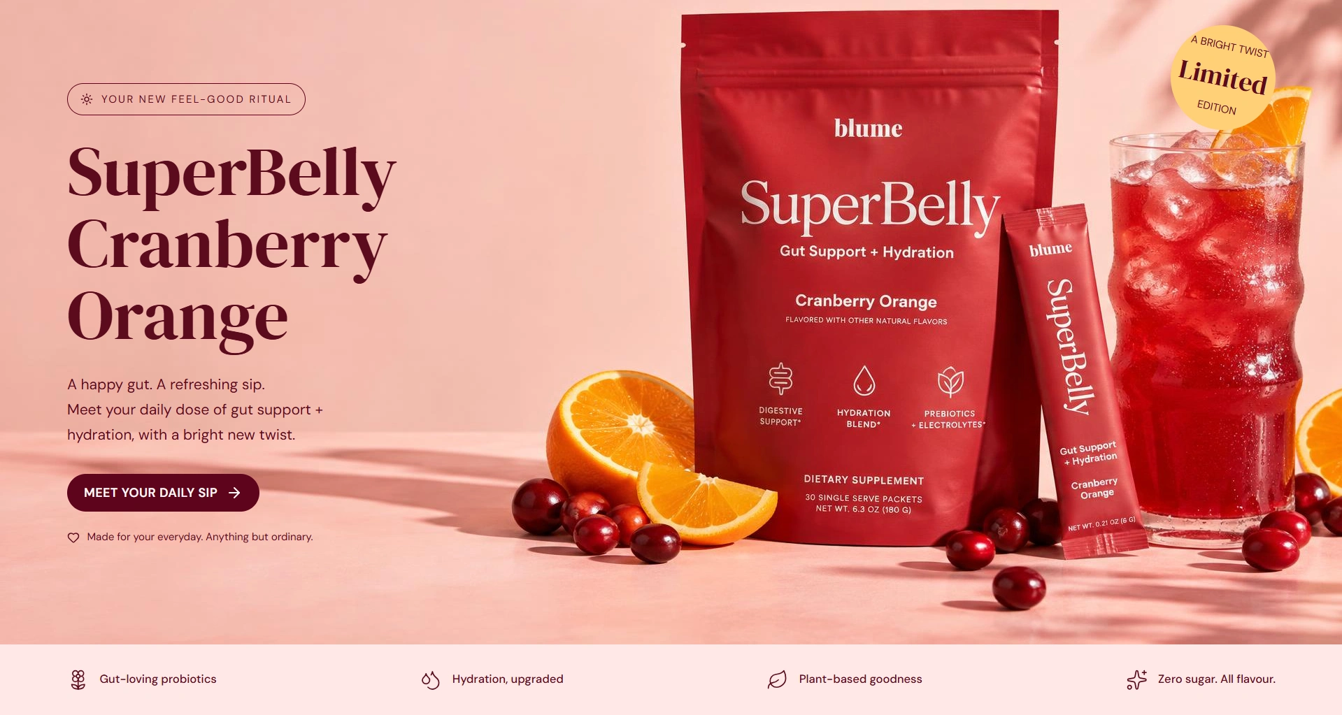
01 — Hero Section: Creating a Strong First Impression
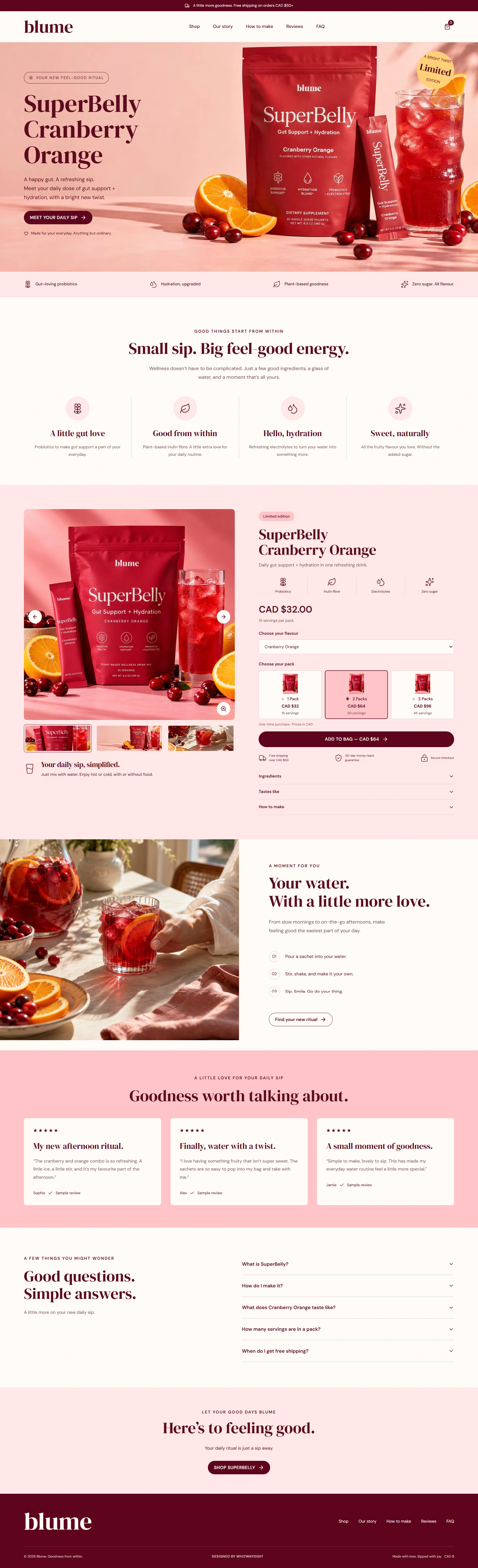
The hero introduces SuperBelly with bold product photography, a clear headline, and a prominent CTA.
I used the warm cranberry-inspired palette and lifestyle imagery to create an immediate connection between the product, its flavor, and the brand's feel-good positioning.
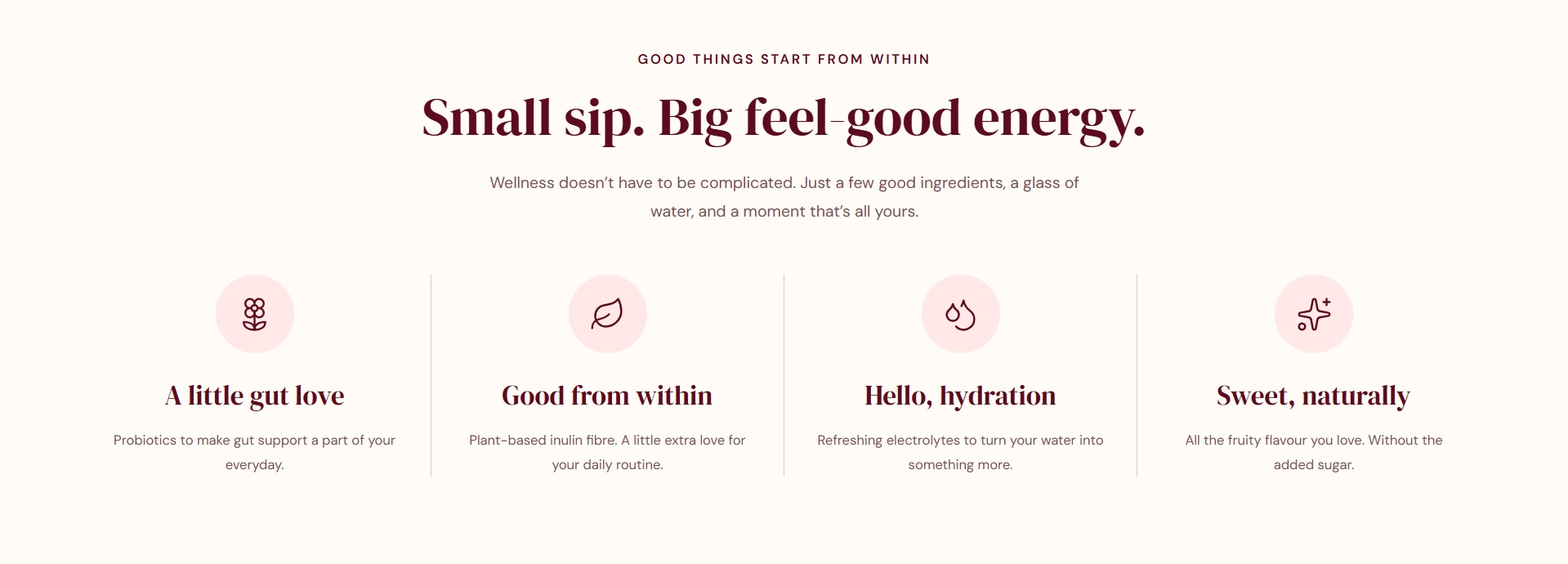
02 — Product Benefits: Making Value Easy to Understand
Rather than overwhelming visitors with information, I presented the key benefits through simple icons and short descriptions.
This helps shoppers quickly understand the product's positioning around gut wellness, hydration, and everyday routines.
03 — Product Purchase Section: Designed for Conversion
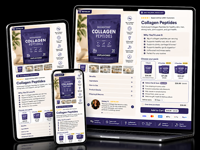
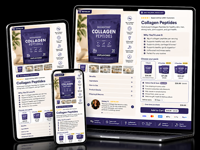
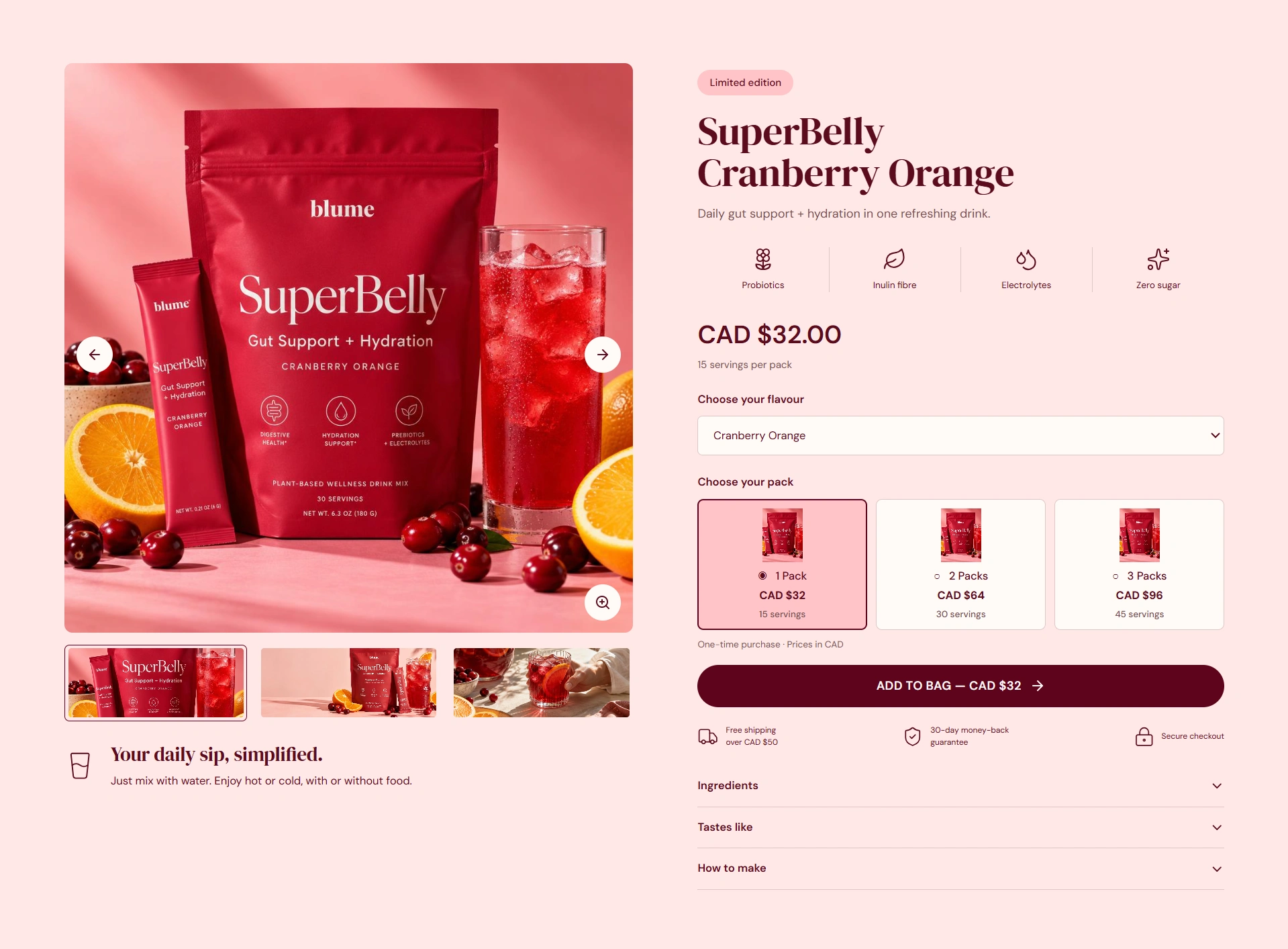
The product section brings the important buying decisions together: product imagery, flavor selection, pack options, pricing, and Add to Bag.
I included a 1-pack, 2-pack, and 3-pack selector to make purchasing options easier to compare and encourage higher average order value.
04 — Lifestyle Storytelling: Connecting Product to Routine
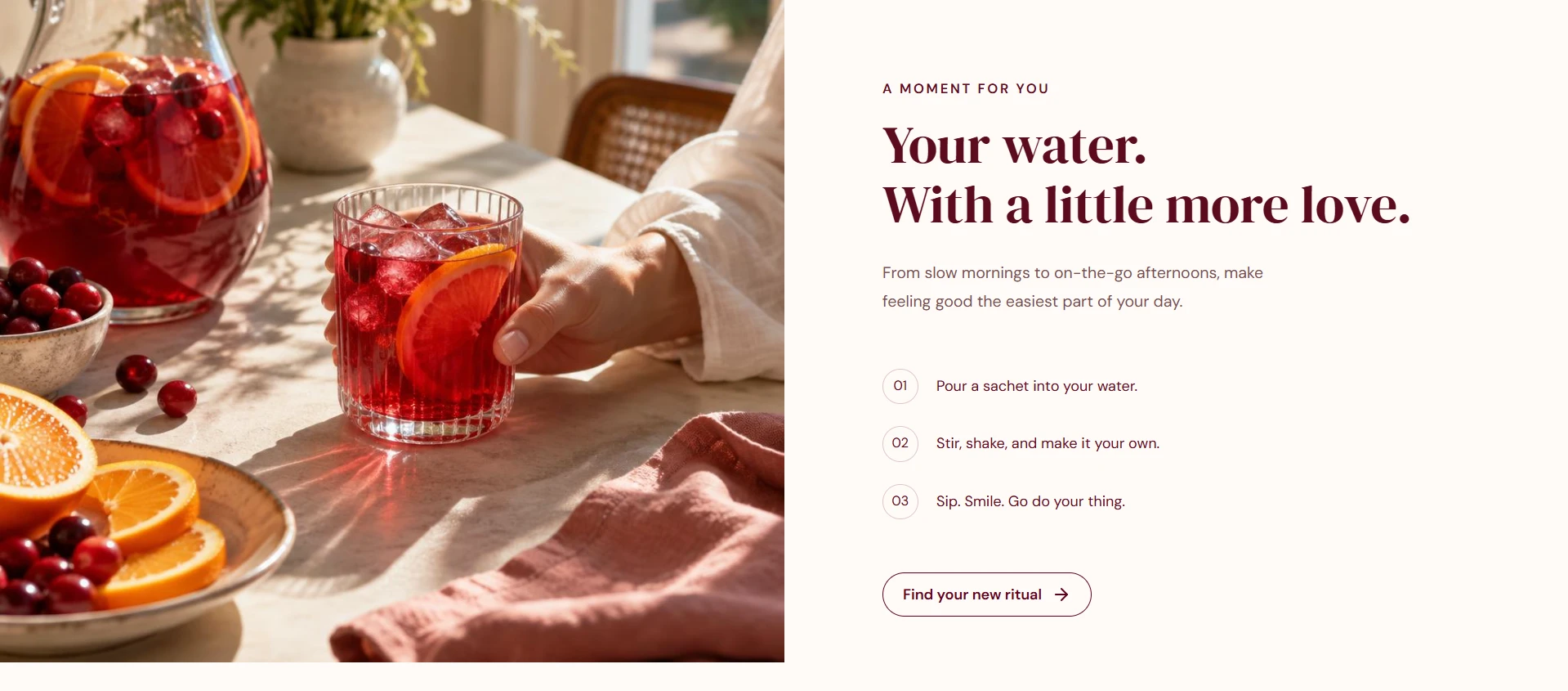
The lifestyle section shows how SuperBelly fits into everyday moments.
Instead of relying only on product specifications, I used photography and simple messaging to communicate the experience of enjoying the product.
05 — Customer Reviews: Building Purchase Confidence
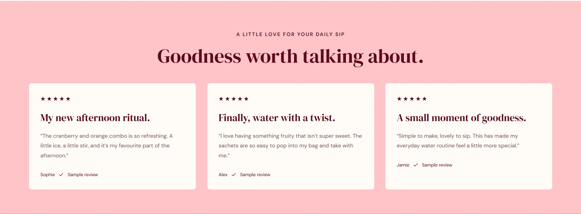
The testimonial section places customer feedback in a clean, easy-to-scan layout.
The goal is to strengthen trust, address hesitation, and help visitors feel more confident about the product.
06 — FAQ: Removing Last-Minute Objections
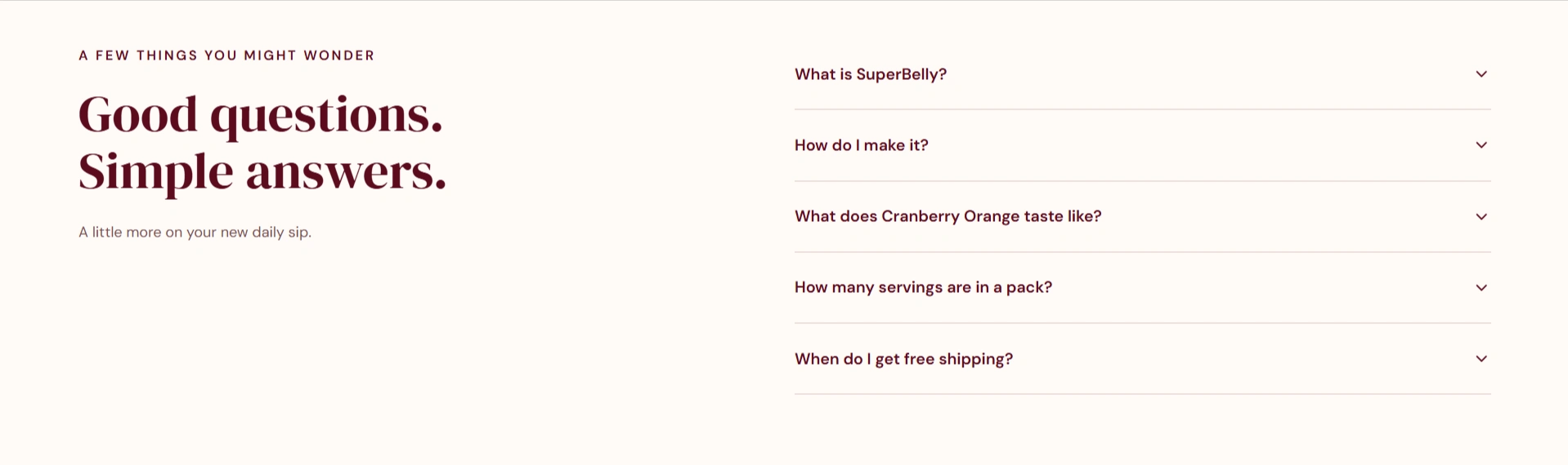
I organized common questions into expandable accordions covering the product, preparation, flavor, serving sizes, and shipping.
This keeps the page uncluttered while making important answers accessible before purchase.
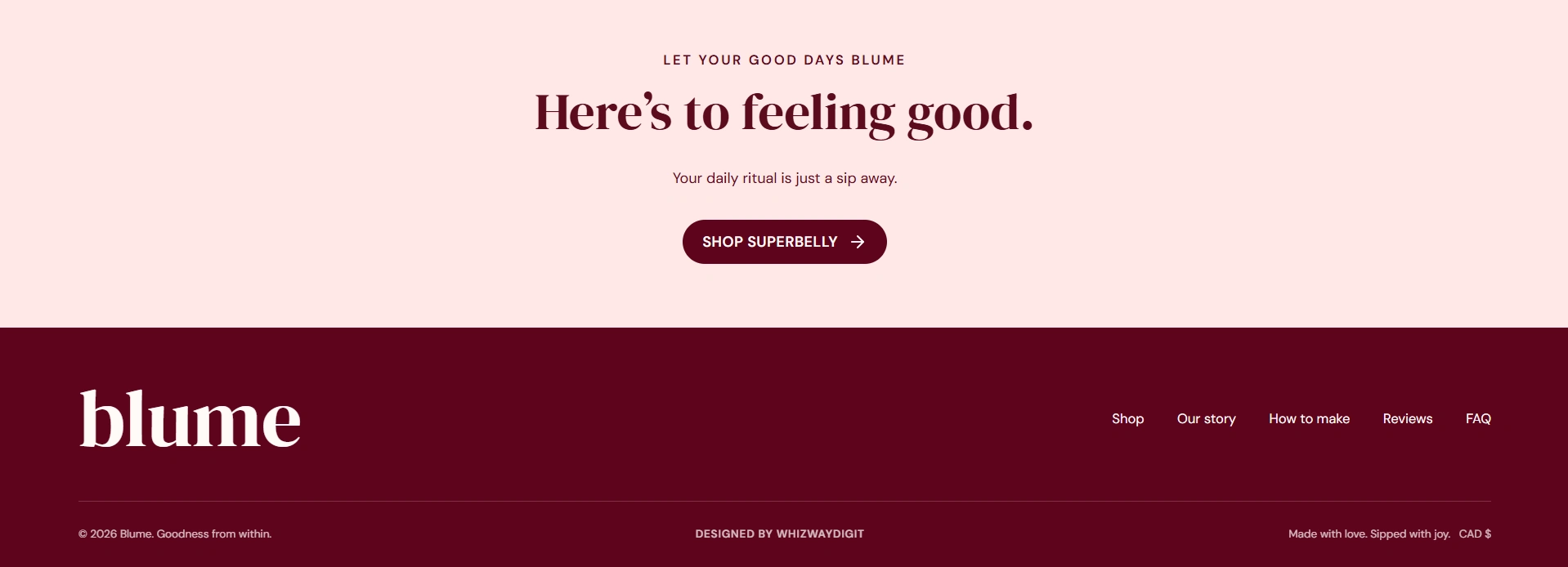
07 — Final CTA: Turning Interest Into Action
The final section gives visitors another opportunity to shop after they've explored the product benefits, lifestyle imagery, and social proof.
The design closes with a clear message and a direct shopping CTA.
The Outcome
The finished design brings together visual storytelling, product education, bundle merchandising, social proof, and conversion-focused UX in one cohesive eCommerce experience.
Each section has a clear purpose: attract attention, communicate value, build confidence, or guide customers toward purchase.
This case study describes the supplied design. No measured conversion or revenue improvement is claimed.
Contra skills: eCommerce Design · UI Design · UX Design · Replo Developer · Conversion Rate Optimization · Responsive Design
Like this project
Posted Oct 8, 2026
Designed an engaging, conversion-focused landing page for SuperBelly.