Can a logo feel balanced,

Husnain Ali


Can a logo feel balanced, precise, and memorable at the same time?
That was the idea behind this concept.
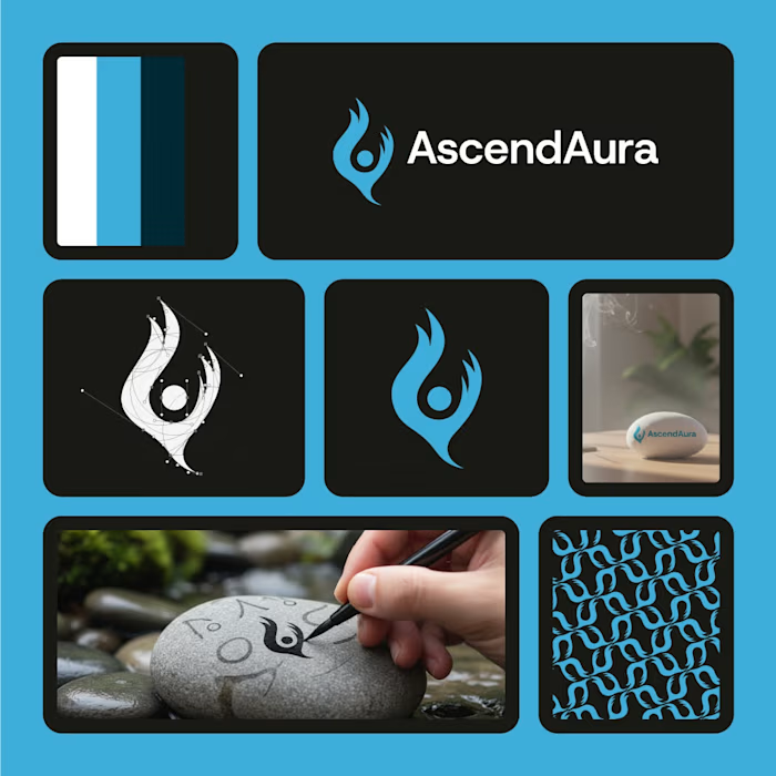
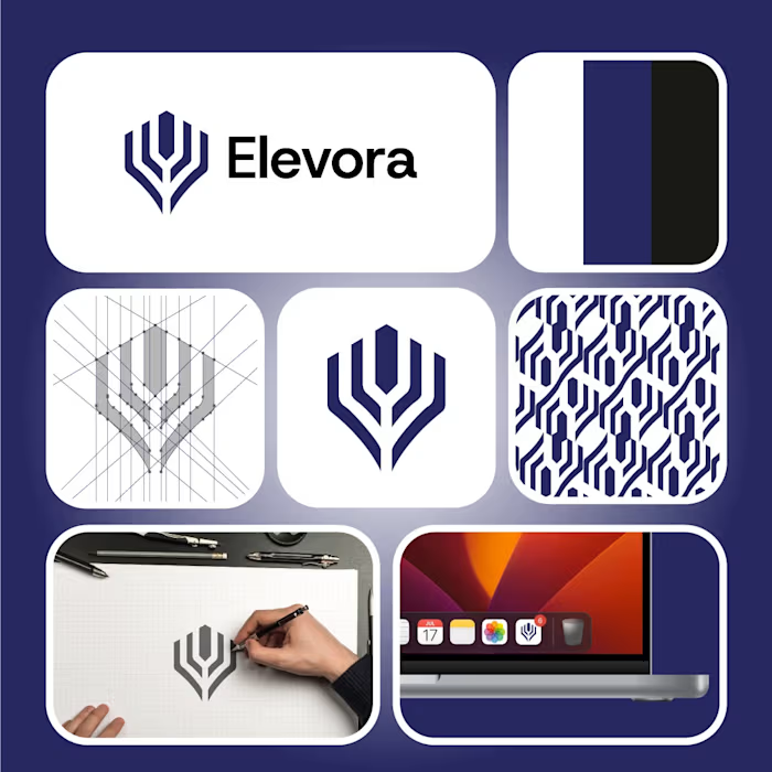
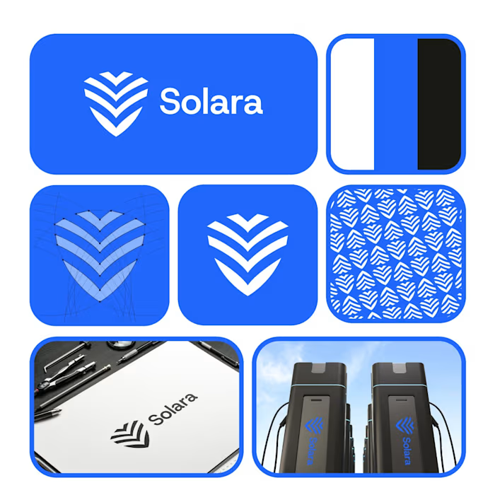
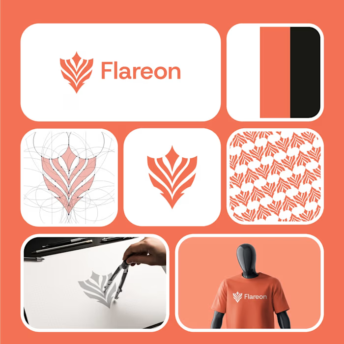
Using clean circular geometry and perfectly aligned negative space, I designed a mark that represents connection, focus, and continuous growth—without relying on unnecessary details.
The strongest identities aren't always the loudest...
They're the ones you remember.
Now it's your turn. 👇
What does this symbol remind you of first?
🎯 Target
🌐 Network
🛡 Security
♾️ Unity
💬 Or something completely different?
Let's see the most creative answer in the comments!
#LogoDesign #BrandIdentity #Branding #GraphicDesign #LogoDesigner #CreativeDesign #VisualIdentity #DesignProcess #DesignInspiration #DailyDesign #Portfolio #DesignChallenge #DesignsBurner
Like this project
Posted Sep 1, 2026
Can a logo feel balanced, precise, and memorable at the same time? That was the idea behind this concept. Using clean circular geometry and perfectly aligned...