Built with Ideogram
Vandal - Disconnect From The World | Brand Concept Identity

Abdullah Eroğlu


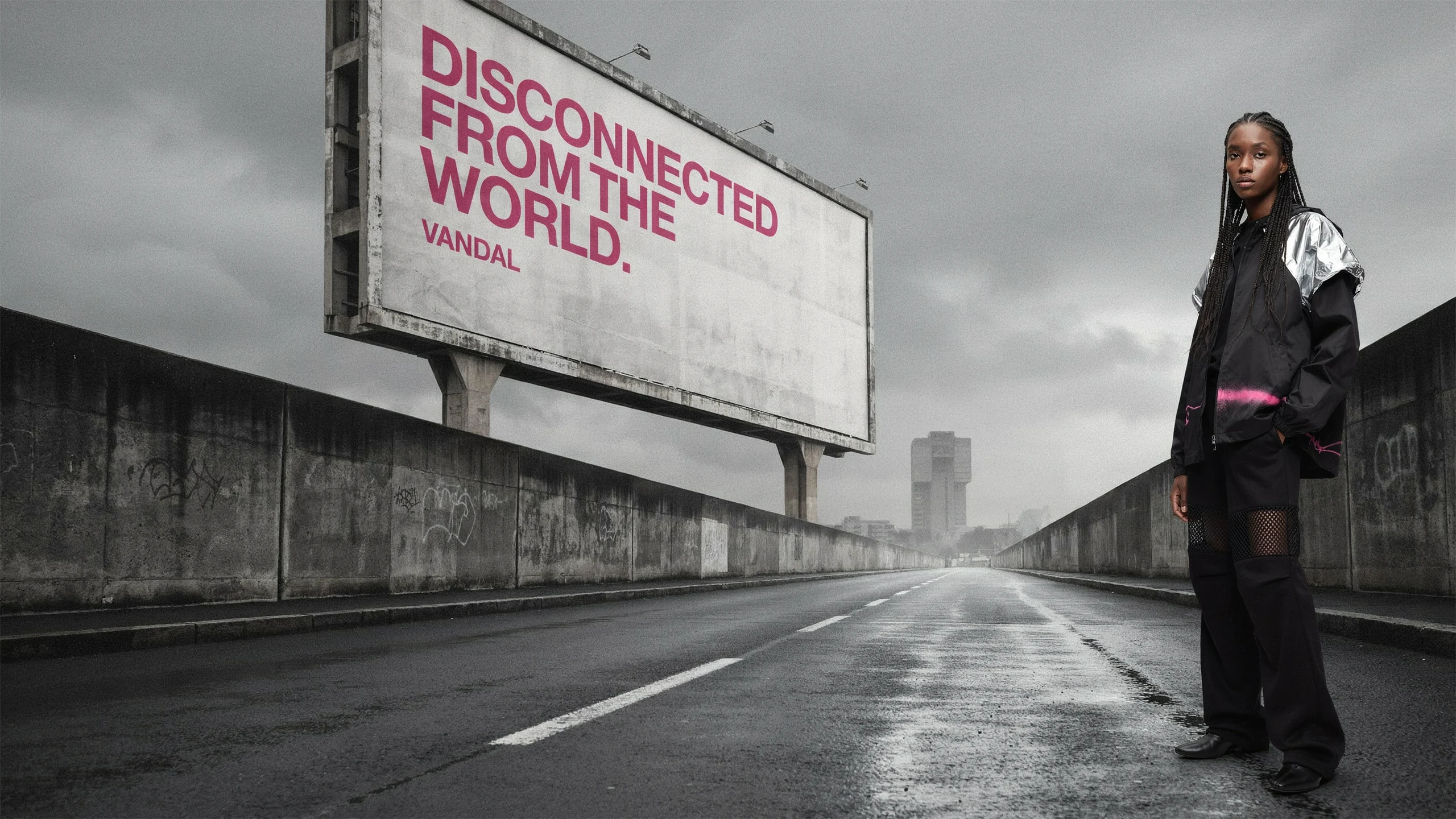
W H E R E T H E W O R L D D I S C O N N E C T S
One color breaks the monochrome.
Ten images survived dozens of rejected generations.
Eighteen website iterations turned a visual language into a working system.
AI expanded the possibilities. Taste decided what stayed.
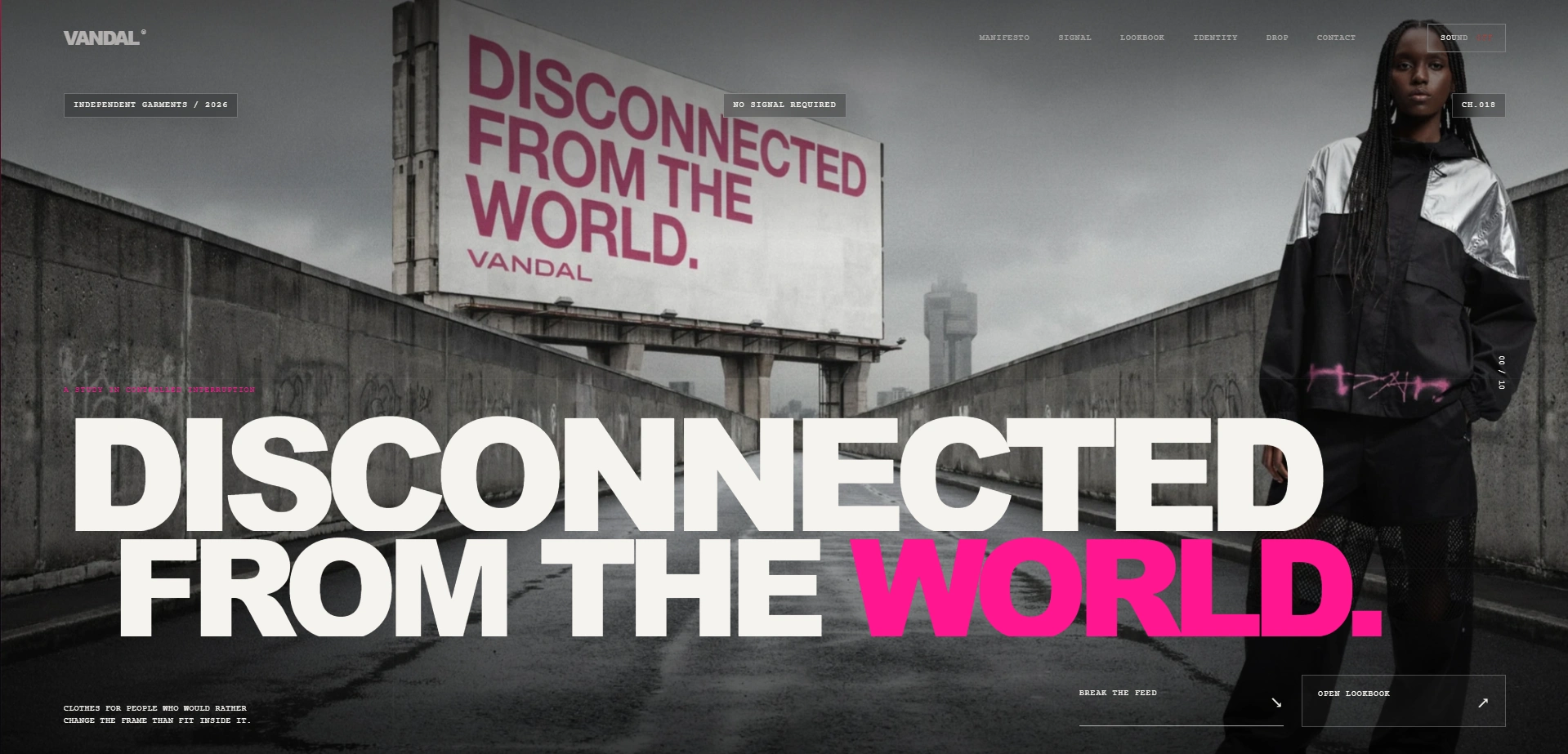
Website Hero Section
2 — What this brand says no to
The project started with one question:
What does this brand say no to?
VANDAL says no to visual obedience, disposable trend cycles, polished sameness and design that asks permission to be noticed.
That answer became the filter for every later decision: color, casting, material, image selection, motion, sound and interface behavior.
3 — Building the brand
I wanted VANDAL to feel raw but intentional, aggressive but controlled, premium without becoming polite.
The name itself became useful: a vandal alters an existing surface. VANDAL does the same with familiar fashion and web conventions it keeps them recognizable, then disturbs their expected behavior.
The core statement became:
DISCONNECTED FROM THE WORLD.
Not disappearance. Refusal.
4 — Visual constitution
The palette was deliberately restrictive:
deep black / charcoal / asphalt grey / silver / limited off-white / hot pink
Hot pink is the only vivid color. It acts as interference inside the monochrome system rather than a decorative accent.
The material system followed the same logic:
pure black fabric / mesh / crumpled aluminum / hot-pink spray paint
The silver was especially important. Early generations made it too smooth and futuristic, so I changed the prompt language from “metallic silver” to physically descriptive terms like crumpled aluminum foil, visible creases, dents, crushed reflections and irregular folds.
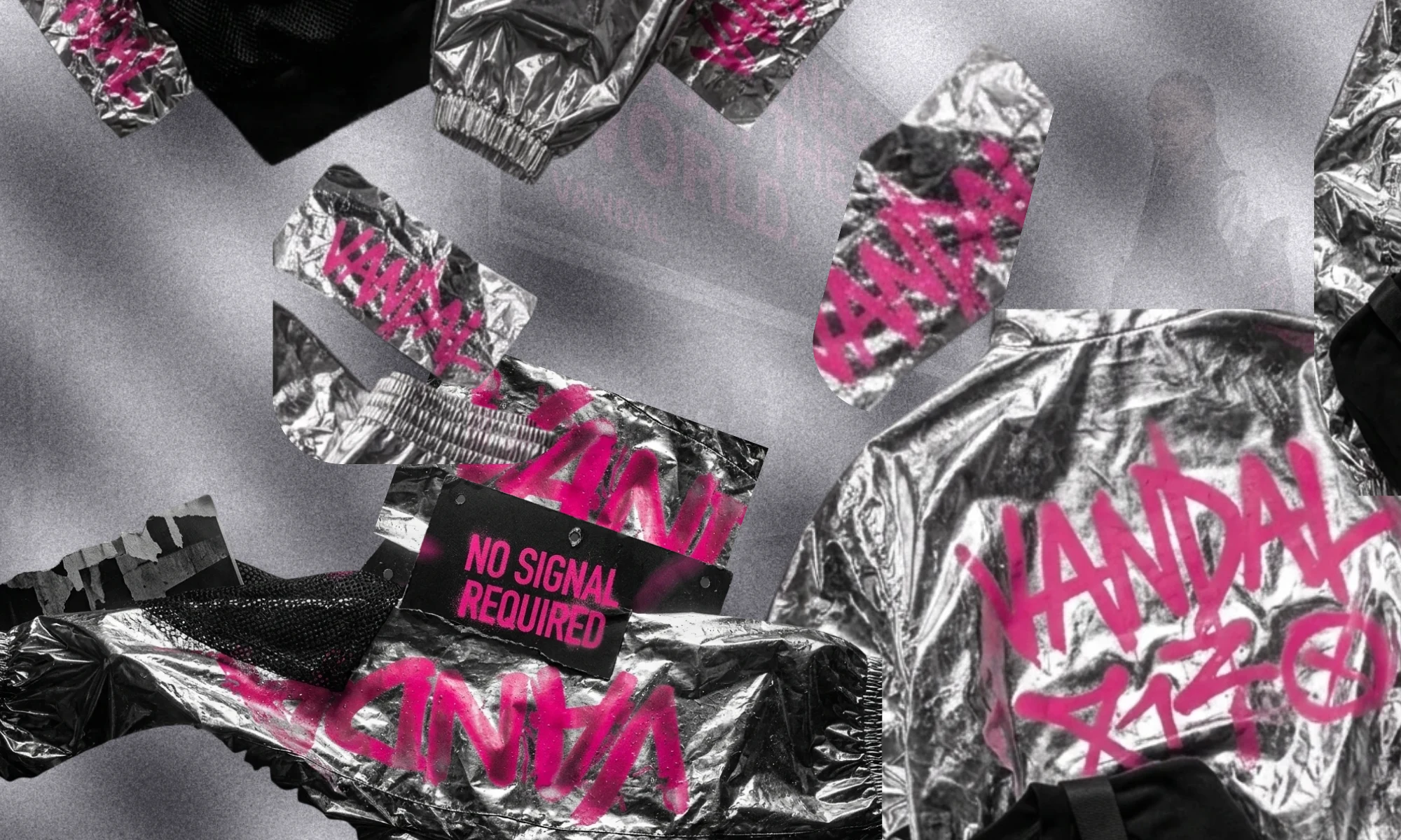
Material Mesh
5 — Casting
The campaign consistently uses Black models with braids, locs, cornrows or twists.
I wanted the styling to feel structured, physical and distant rather than glossy or celebrity-driven. Expressions stayed restrained; the cast occupies the frame without performing for it.
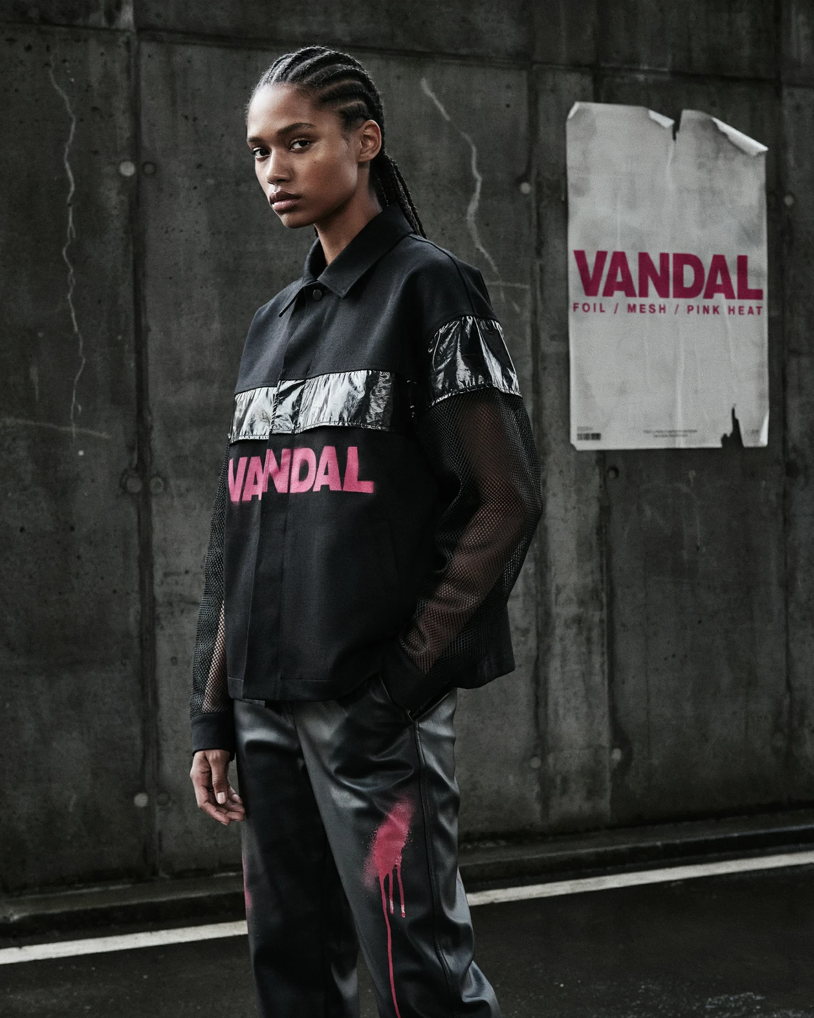
Female Look
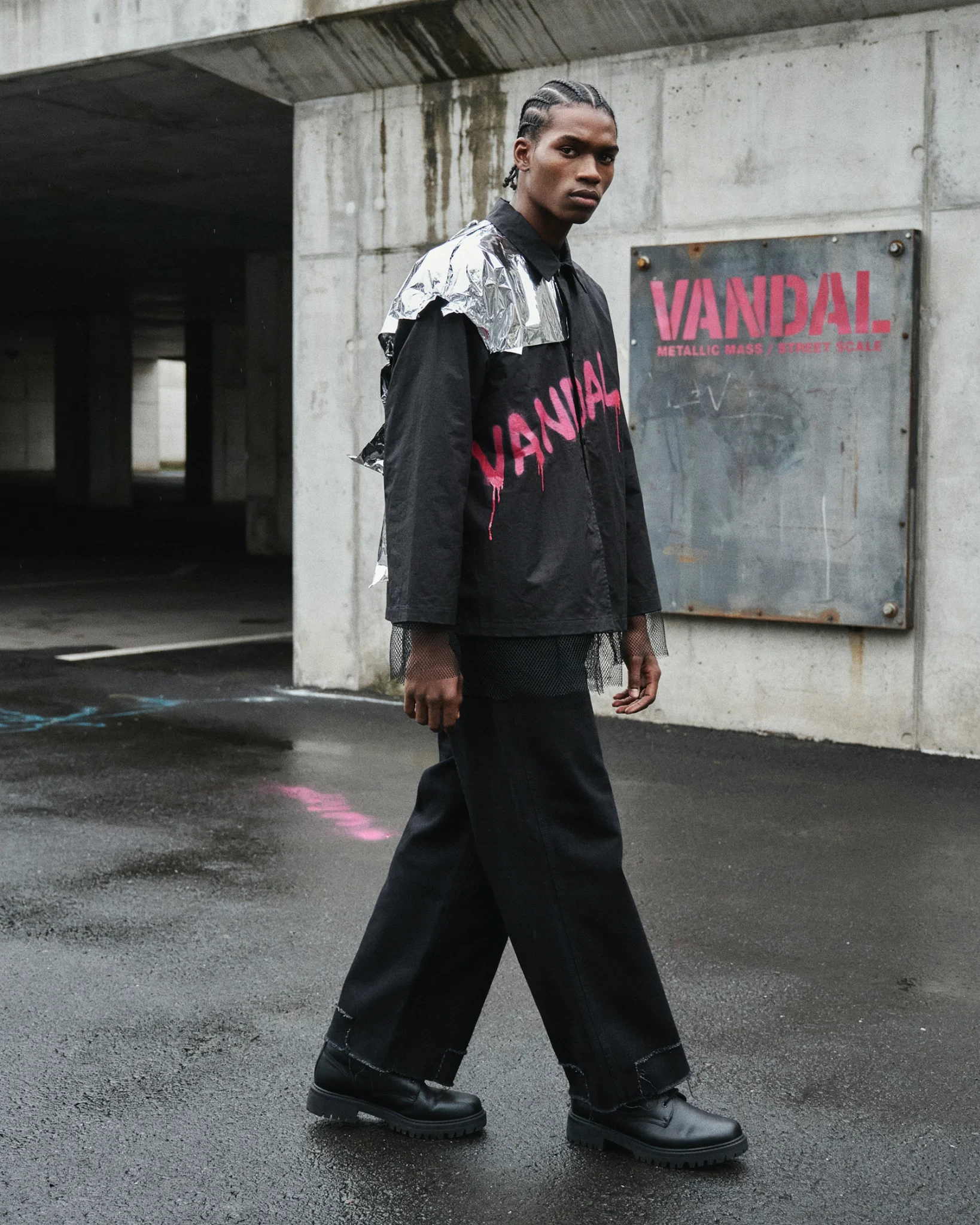
Male Look
6 — Why Ideogram
I chose Ideogram because typography needed to exist inside the image itself — on billboards, garments, posters and spray-painted surfaces.
VANDAL depends heavily on language:
DISCONNECTED FROM THE WORLD
MAKE THE FRAME UNSTABLE
NO SIGNAL REQUIRED
WEAR THE INTERRUPTION
The ability to generate photography and readable text in the same physical scene made Ideogram especially useful for this project.
7 — Prompting through failure
The first generations were often technically good but strategically wrong.
Some looked too polished.
Some became pale grey instead of dark.
Group images drifted toward K-pop-style symmetry.
Silver garments looked smooth instead of crushed and physical.
The prompt language evolved by diagnosing those failures.
Instead of saying:
“black and white fashion photography”
I moved toward:
“dark monochrome, underexposed concrete, charcoal city, wet asphalt, deep shadows.”
Instead of:
“silver clothing”
I used:
“physically crumpled aluminum-foil-like material with irregular reflections and visible dents.”
The important skill became less about generating and more about knowing why an output did not belong.
![Rejected Outputs [%38 Shown]](https://media.contra.com/image/upload/fl_progressive/q_auto:best/jvhviqtwintarhpj1lgb.webp)
Rejected Outputs [%38 Shown]
8 — The ten final images
The final ten were selected for their role inside the system, not simply because they were attractive.
The desktop hero establishes the city and billboard language. The mobile hero creates its own vertical composition rather than reusing a crop. Group images expand the brand into a collective. Female and male portraits expose the material system at closer range. SIGNAL images are intentionally less stable. The DROP isolates the garments as objects. The pink image functions as atmosphere rather than another portrait.
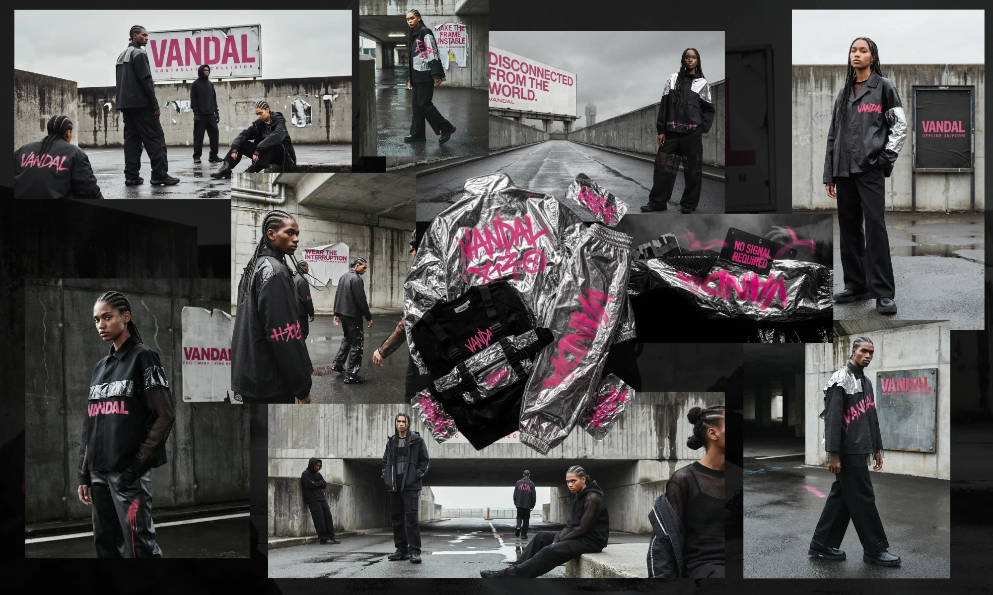
Ten Images Collaged | VANDAL |
This was the point where separate AI outputs became one campaign.
9 — Translating the brand to web
The website was designed around three behavioral principles:
Interruption. Pressure. Release.
The interface should occasionally destabilize itself, but never become random.
The hero moves from framed control into full exposure. SIGNAL turns scroll into staged image collisions. Typography crosses layers. Pink appears as interference. Dense sections are followed by quieter ones.
The goal was not “more animation.”
It was motion that belonged to the brand.
Hero into the Signal & Album Section
10 — Desktop vs mobile
I intentionally avoided forcing the desktop interaction system onto mobile.
Desktop uses Lenis smooth scrolling and more layered choreography. Mobile keeps native scrolling and rebuilds the same concepts in a vertical editorial rhythm.
This mattered most in SIGNAL and the VANDAL/VANDAL impact section. The mobile versions preserve the idea without importing desktop mechanics that would make touch feel heavy.
Hero To Signal & Album [Low End Device Responsive Performance]
11 — Motion and sound
A large part of the polish came from small physical details:
reveal timing
spring interpolation
hover-entry and release speed
parallax strength
overshoot and settling
accidental touch interaction prevention
Sound was treated similarly. Rather than background music, I used procedural Web Audio for hover, click, typing, product expansion, scroll and logo interaction.
Sound starts OFF, ambient sits behind interaction feedback, and fades after inactivity.
Card Hover Micro Cursor Glow Follow, Sound & Tilt Micro Interaction
12 — Using ChatGPT in development
ChatGPT became an implementation and debugging partner rather than a one-shot website generator.
The project went through roughly 18 iterations.
I repeatedly reviewed the result and called out specific problems: mobile hero content not fitting the first viewport, reveals firing too early, sticky touch hover states, accidental scroll sounds, abrupt hover releases, weak mobile impact behavior and DROP presentation that did not feel object-like enough.
I decided what needed to change; ChatGPT helped translate those decisions into working HTML, CSS and JavaScript.
That workflow shortened the distance between art direction and implementation.
13 — The DROP pivot
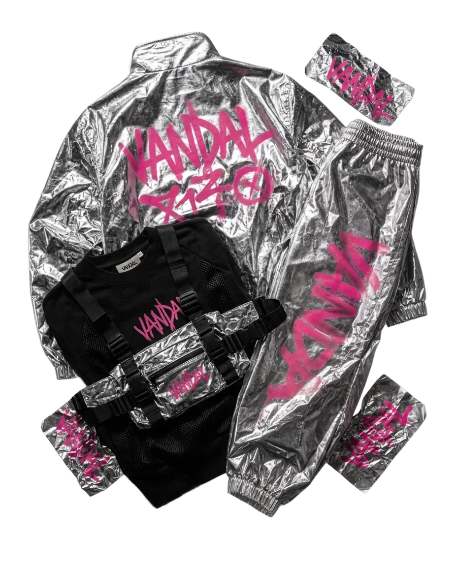
One of the strongest late-stage changes was removing the product background.
Most of VANDAL lives in a dark visual world. The DROP interrupts that with an off-white object-study space.
Silver becomes easier to read, the garments feel collectible, and the section stops behaving like another campaign photograph.
Dark campaign world → white object space.
14 — What took the most work
The hardest part was maintaining consistency between systems:
image ↔ layout
layout ↔ motion
motion ↔ sound
desktop ↔ mobile
Generating individual pieces was faster than making them all feel like the same brand.
Once the rules became clear, decisions also became faster: wrong color, reject; overly polished group, reject; smooth silver, rewrite; interaction without purpose, remove.
15 — Human direction + AI
VANDAL was not made “without AI,” and it was not simply “made by AI.”
Ideogram expanded the visual search space. ChatGPT accelerated development and iteration.
My role was to define the constraints, reject wrong directions, choose the final outputs, control the brand system and decide when the work was actually right.
The project taught me that when generation becomes easier, selection becomes more valuable.
AI multiplied the possibilities. Taste made the cuts.
Live Website Link For Vandal : https://erogludemo.com/vandal/
Like this project
Posted Aug 13, 2026
Self-initiated streetwear brand concept where AI generation, human taste, and creative development operate as one system. I directed the brand, visual language, imagery, and final web experience, using Ideogram for campaign imagery and ChatGPT across 18 web iterations.