Redesign for an all-in-one Work Management System platform

Diana Fabianczuk


Problem:
The client approached us with the issue that their customers do not fully understand that they are better than their competitors, what exactly they offer, and who they have worked with before.
💻The first screen:
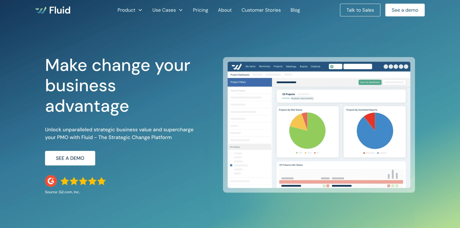
Before
After
⚡️Solution:
For the first screen, the team suggested clarifying what the company does in the title so that it is immediately clear when a user opens the site.
In terms of design, I replaced the static image, which was unclear to users, with an animated video (which I also designed). This video briefly showcases the platform's features that set it apart from competitors and provides a quick overview of the company without overwhelming the viewer. And added key functions in Fluid, particularly related to project and portfolio management.
After
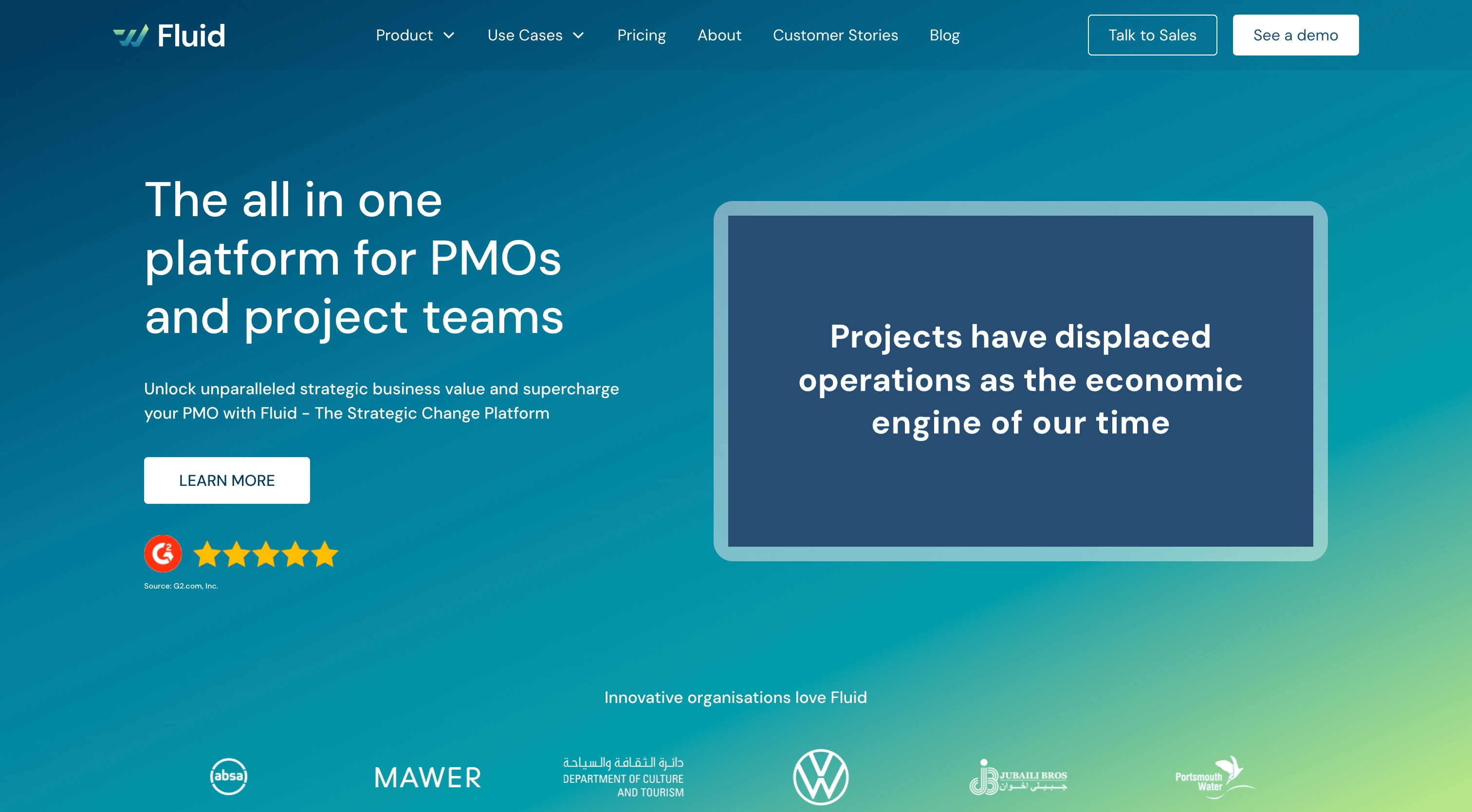
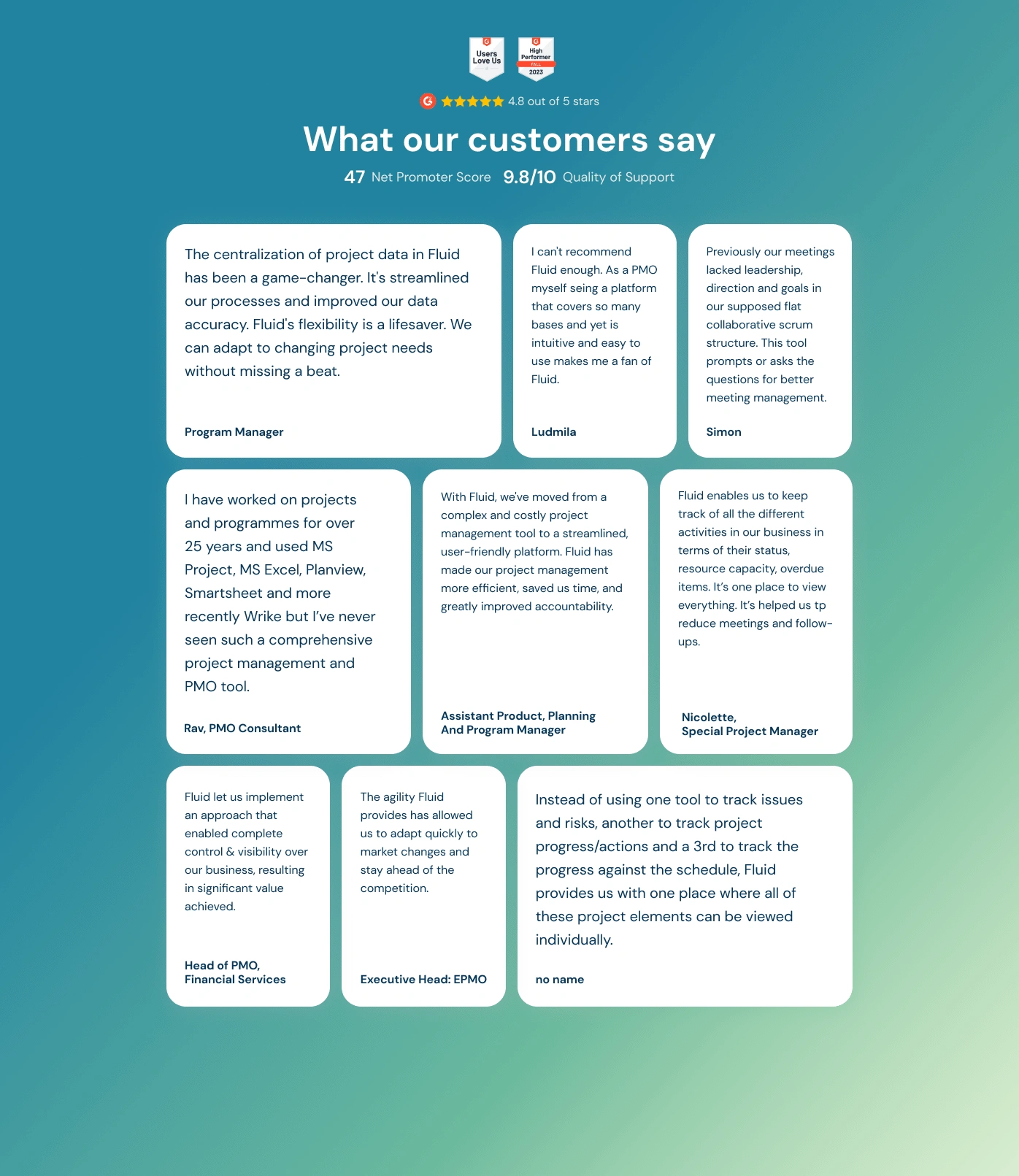
💻 Reviews section:
Before
After
⚡️Solution:
Added a header to help users identify the current section. Included social proof by linking to a platform where all reviews are located, allowing users to verify them. Highlighted key metrics that immediately catch the customer's attention, such as the overall rating and quality of support. We also selected comments that emphasize and reinforce Fluid's strengths.
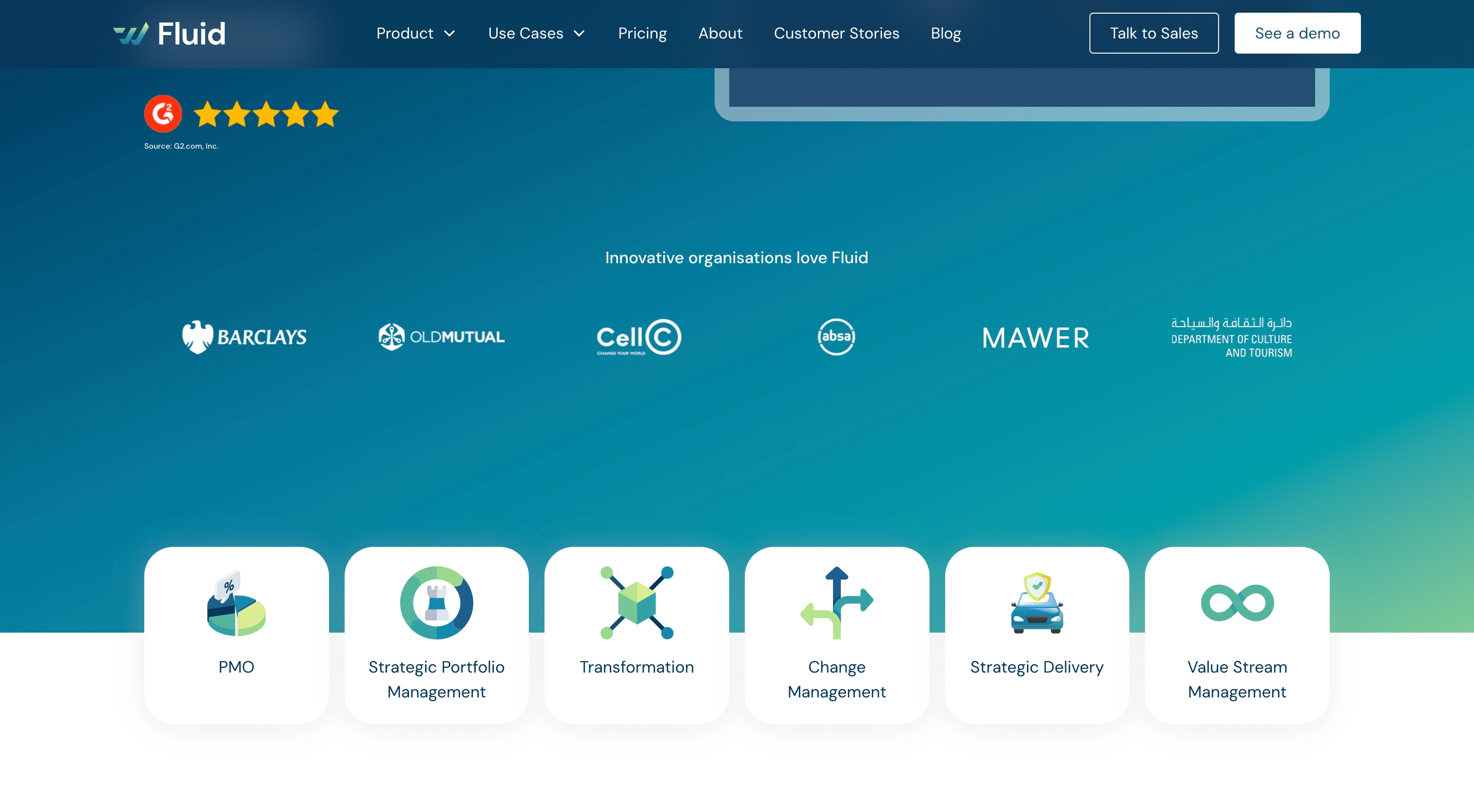
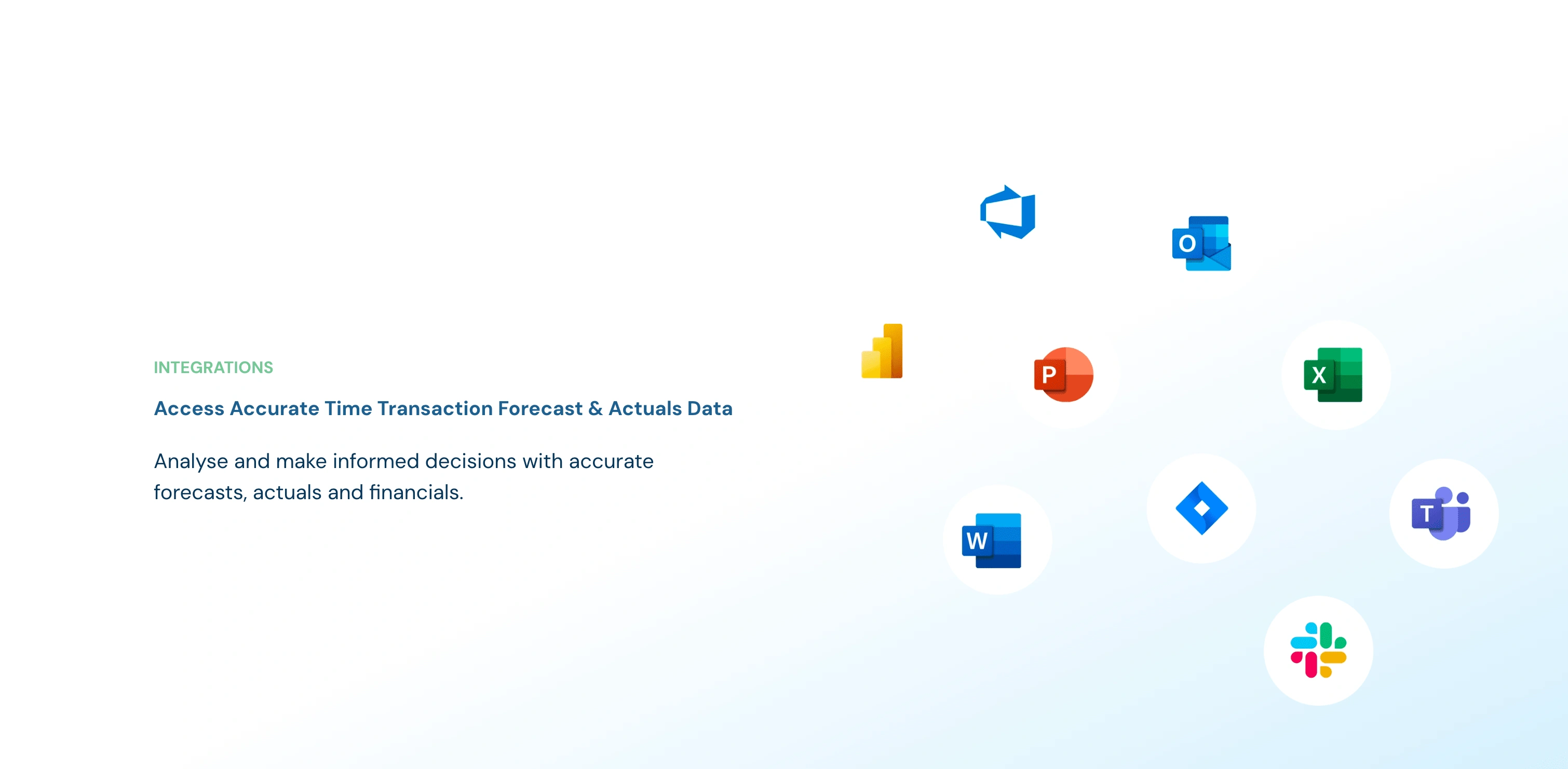
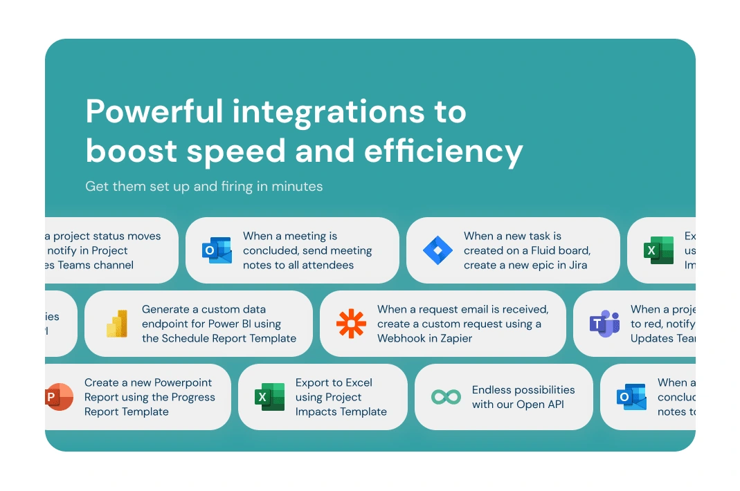
💻 Integration Section:
Before
After
⚡️Solution:
For this block, we revised the header to make it more prominent. We also rewrote the text to make it clearer and provided descriptions of each integration. This ensures that users, who may not be familiar with certain platforms, can easily understand their relevance and the value they offer.
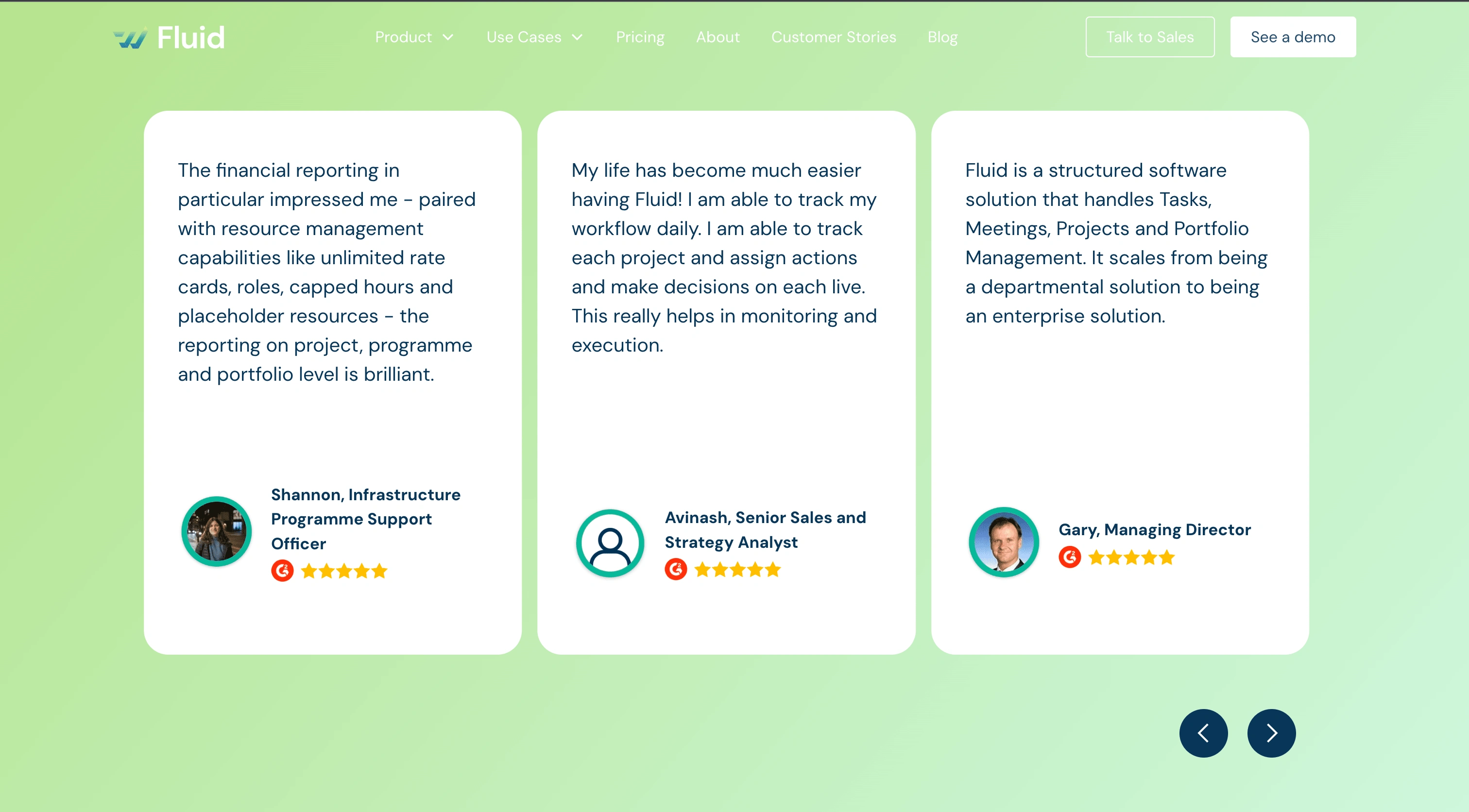
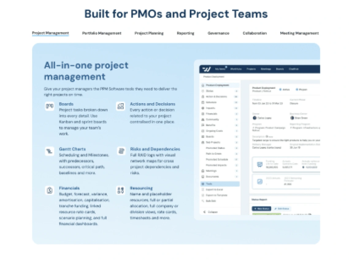
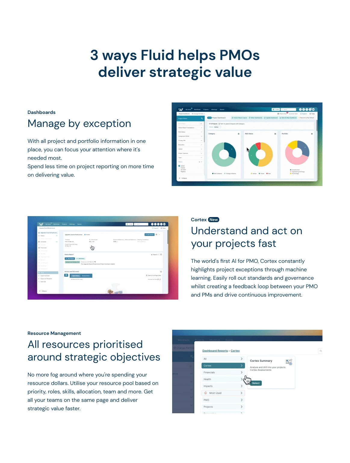
💻 Strategy block
Before
After
⚡️Solution:
In this block, we decided to remove the description of all possible functions of the platform and instead focus on how Fluid helps PMOs deliver strategic value. For each feature, we have added a separate page with a full description and demo.
Start work with me: dianafabianczuk@gmail.com or through Contra
Like this project
Posted Aug 19, 2024
The redesign was applied only to specific blocks where tests showed they were unclear or inconvenient for users.


SaaS Design & Development for LeadGen Platform
Full-stack Landing Page Design & Development for AI platfrom
Full-stack Website Design & Development for Learning Platform
Ads creative portfolio