Identity design for Birika, a restaurant in Barcelona
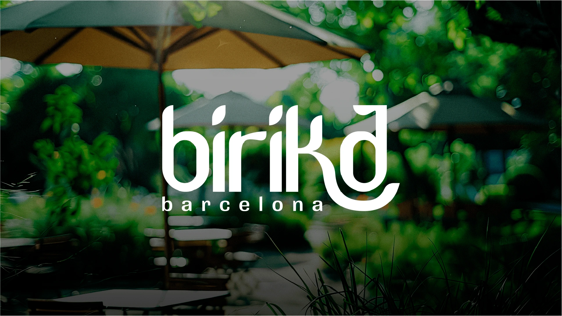
Identity design for Birika, a restaurant in Barcelona
Our goal was to reflect the essence of Birika both in the naming and its visual identity. More than just a restaurant, Birika is a space where every meal becomes an experience of connection: through flavors, atmosphere, design, and human interaction.
Challenge:
To convey the concept of Birika as an urban oasis—a place to pause, breathe, and reconnect. The identity had to evoke tranquility and warmth, while balancing a sophisticated and relaxed aesthetic. It was also essential to establish a visual connection that appealed to a modern audience while maintaining the restaurant's welcoming character.
Solution:
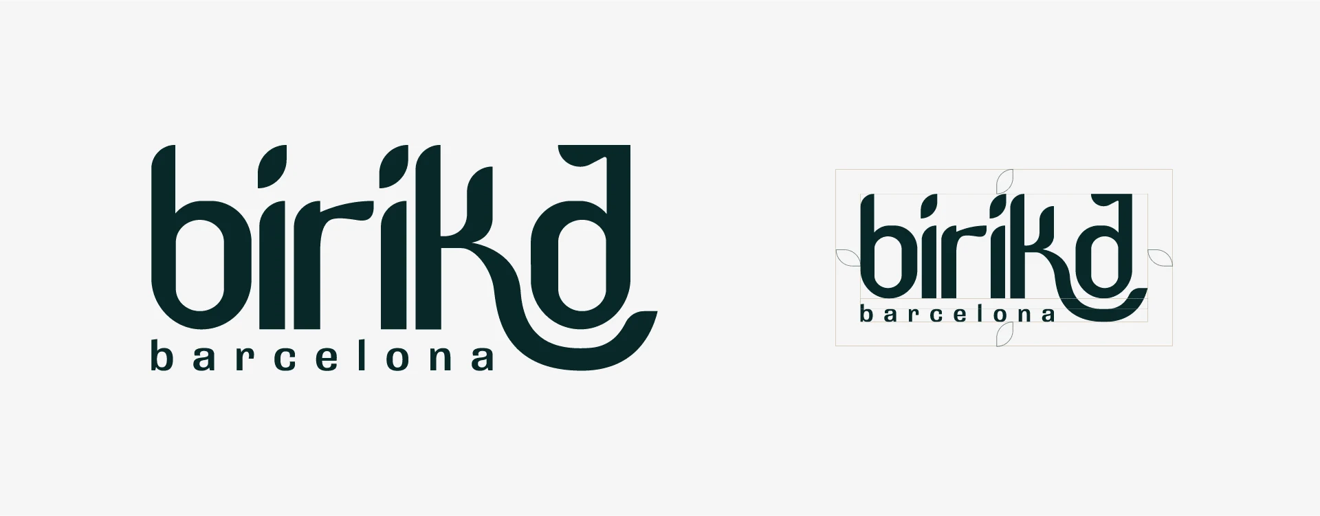
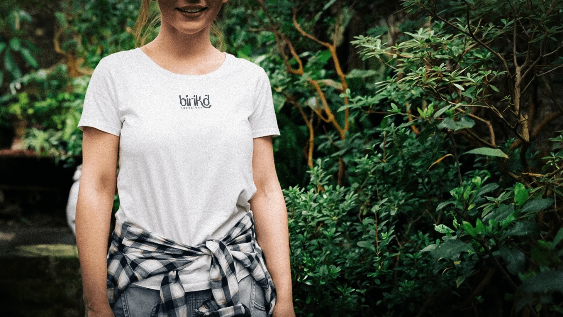
The name “Birika,” which means “lung” in Basque, embodies the idea of a refuge for breathing and reconnecting. This concept was expressed in a logo with soft lines and organic elements, like leaves on the "i"s and a “K” embracing the “a,” all in lowercase to convey calm and harmony.
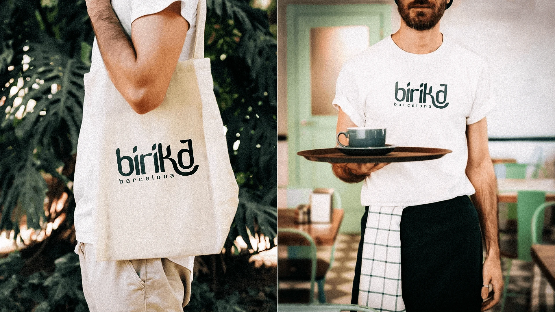
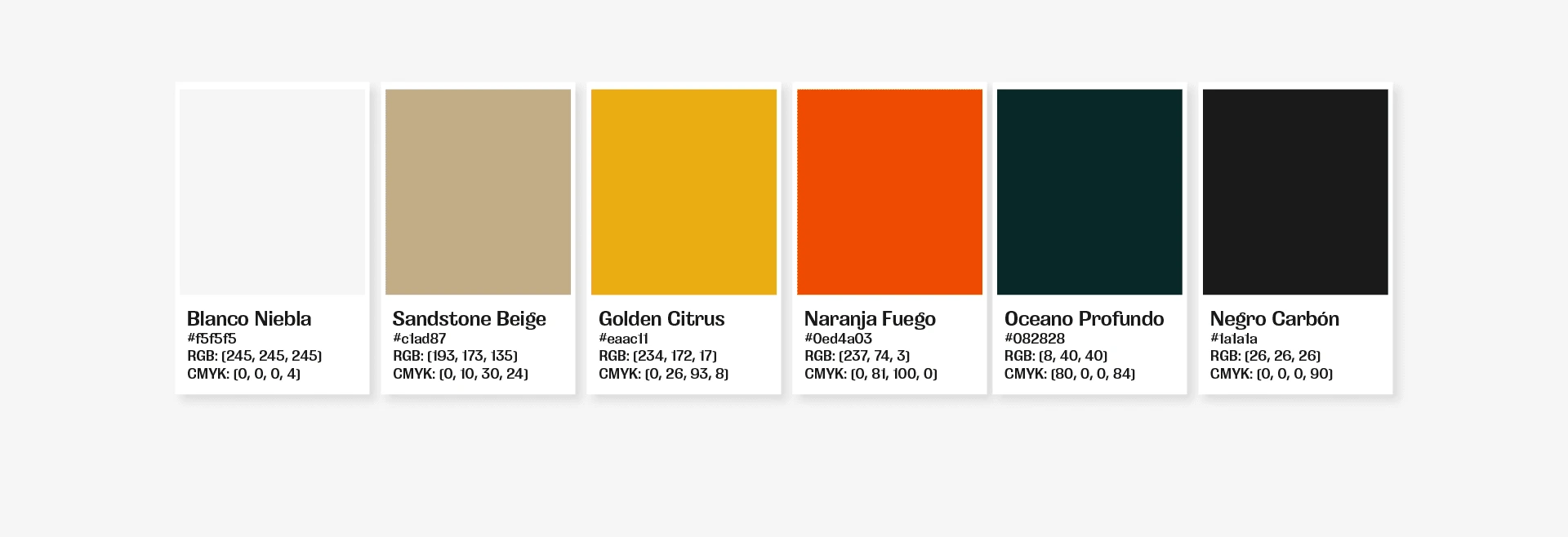
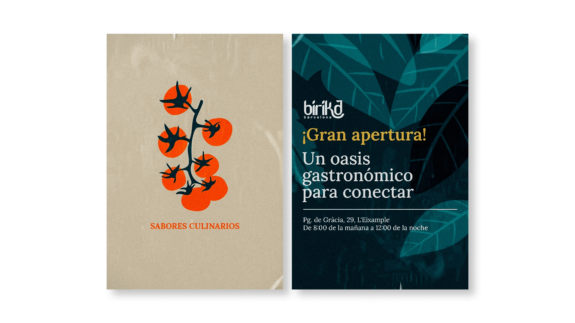
Color Palette: Natural and earthy tones that evoke warmth, freshness, and a connection to nature.

Typography:
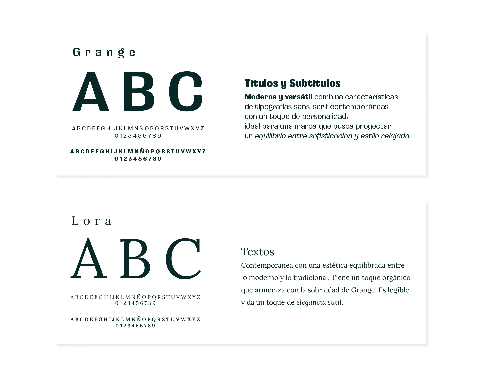
A combination of Grange for modern, relaxed titles and Lora for elegant, readable text.
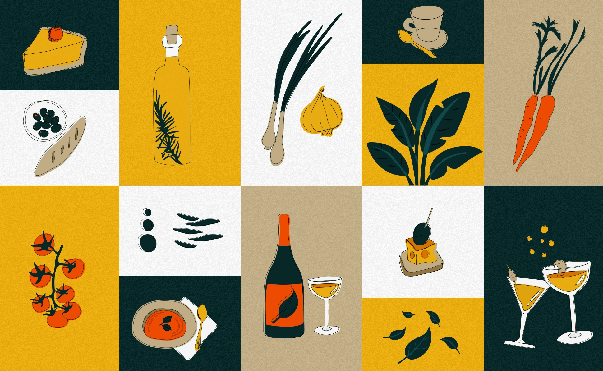
Illustrations:
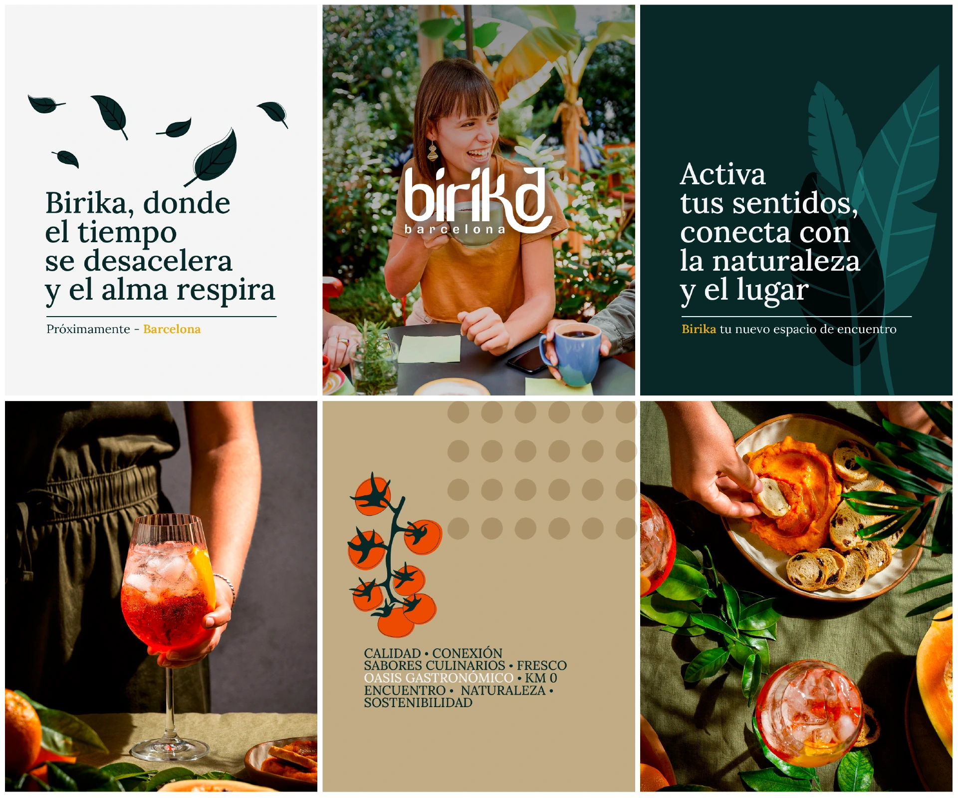
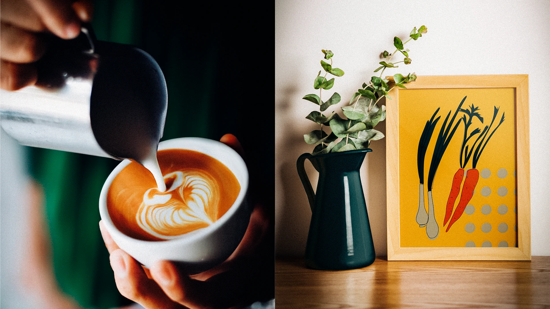
Simple, colorful vector elements that enhance the design and reinforce the restaurant’s welcoming character.
Thanks for checking out the project!
If you liked it, leave a like, share, or comment.
Your feedback is always welcome! 🙌✨
Like this project
Posted Mar 6, 2025
Identity design for Birika, a Barcelona restaurant. A calming logo, vivid colors, and modern typography reflect its urban oasis concept.
Likes
0
Views
0
Timeline
Jan 6, 2025 - Jan 17, 2025


