Brand Design (Inmobiliaria G&P)
MEET "INMOBILIARIA G&P"
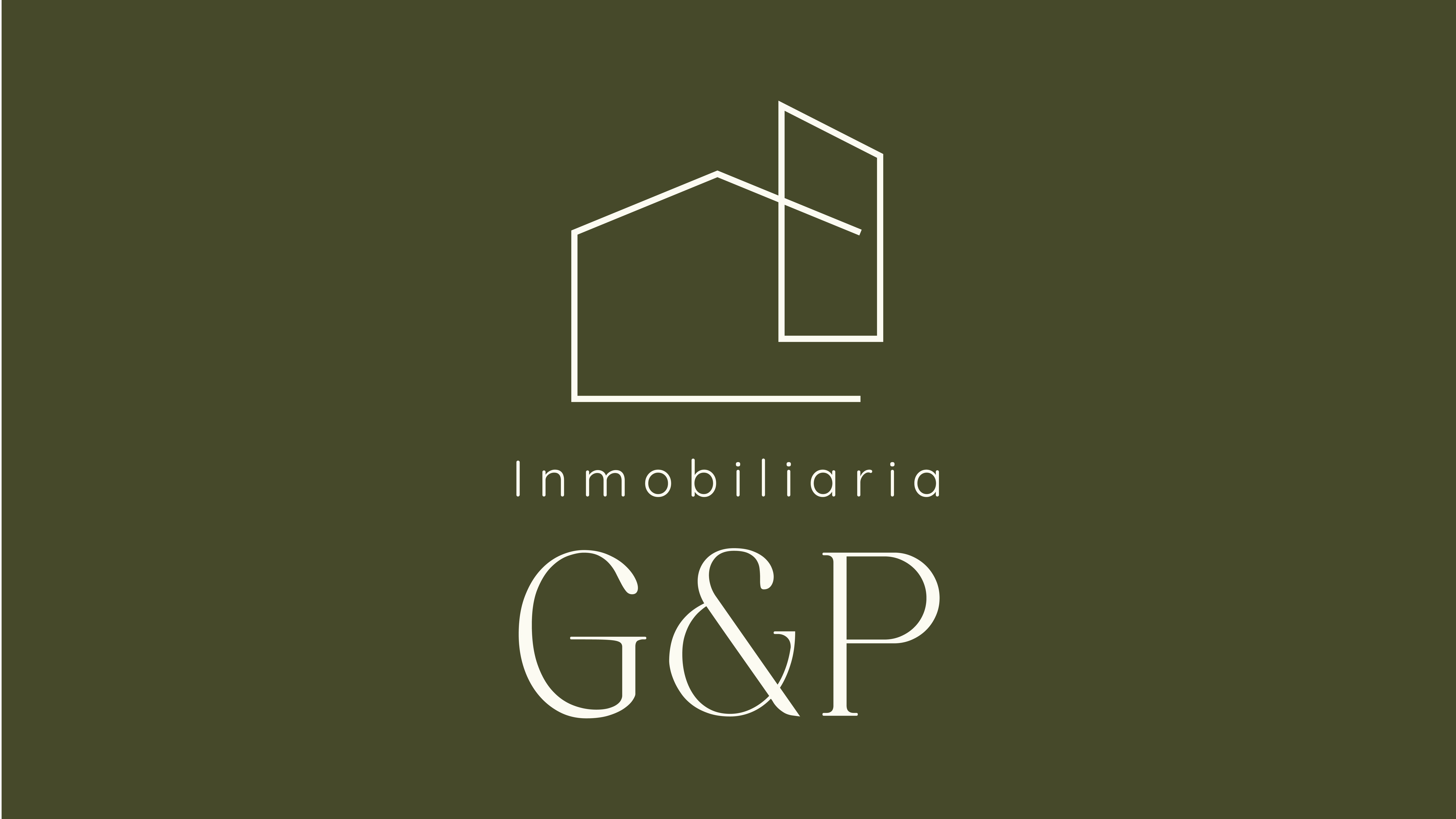
LOGO DESIGN
About the Brand
The brand originated from a discussion among entrepreneurs conducting a market analysis of a property they owned. They concluded that the demand for housing in that market segment was shifting towards spacious homes located outside the city, providing ample space and family entertainment areas. Therefore, they decided to build large houses for families.
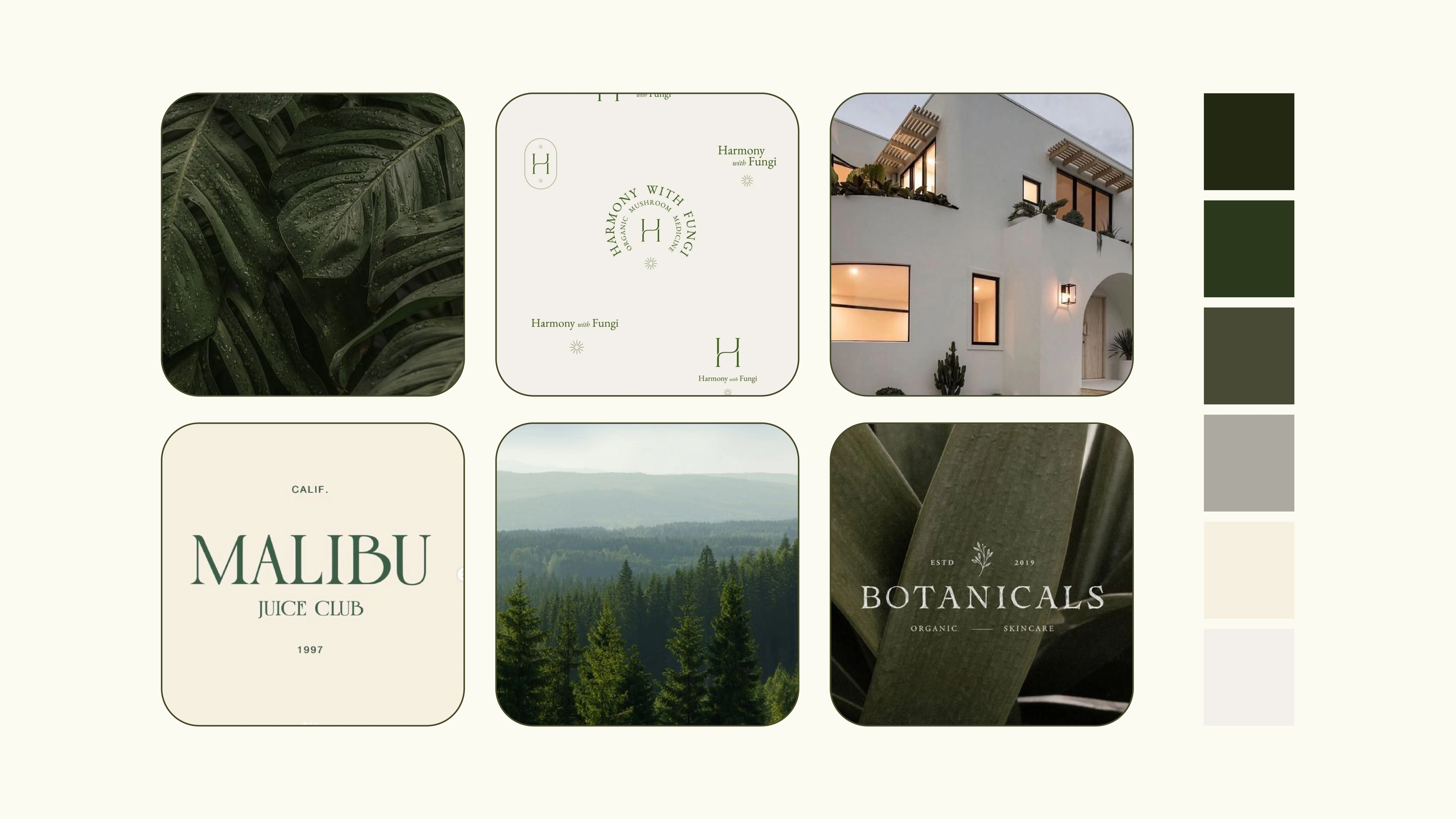
DESIGN MOODBOARD
Brand Concept
The concept was created based on the land available for building the houses, as the intention was to convey that the homes to be put up for sale are surrounded by nature yet are modern. Therefore, inspiration was drawn from the forest, nature, and the modernity of the new houses. Since it's targeted at a high-income audience, the logo had to be as refined and stylized as possible. This was to also represent the status of those to whom the houses are directed
Logo Design
In the logo, the icon of a house was used to represent what will be sold (not apartments). An abstraction of the houses to be built was created. The font is quite elegant yet modern, employing a combination of serif and sans-serif fonts.
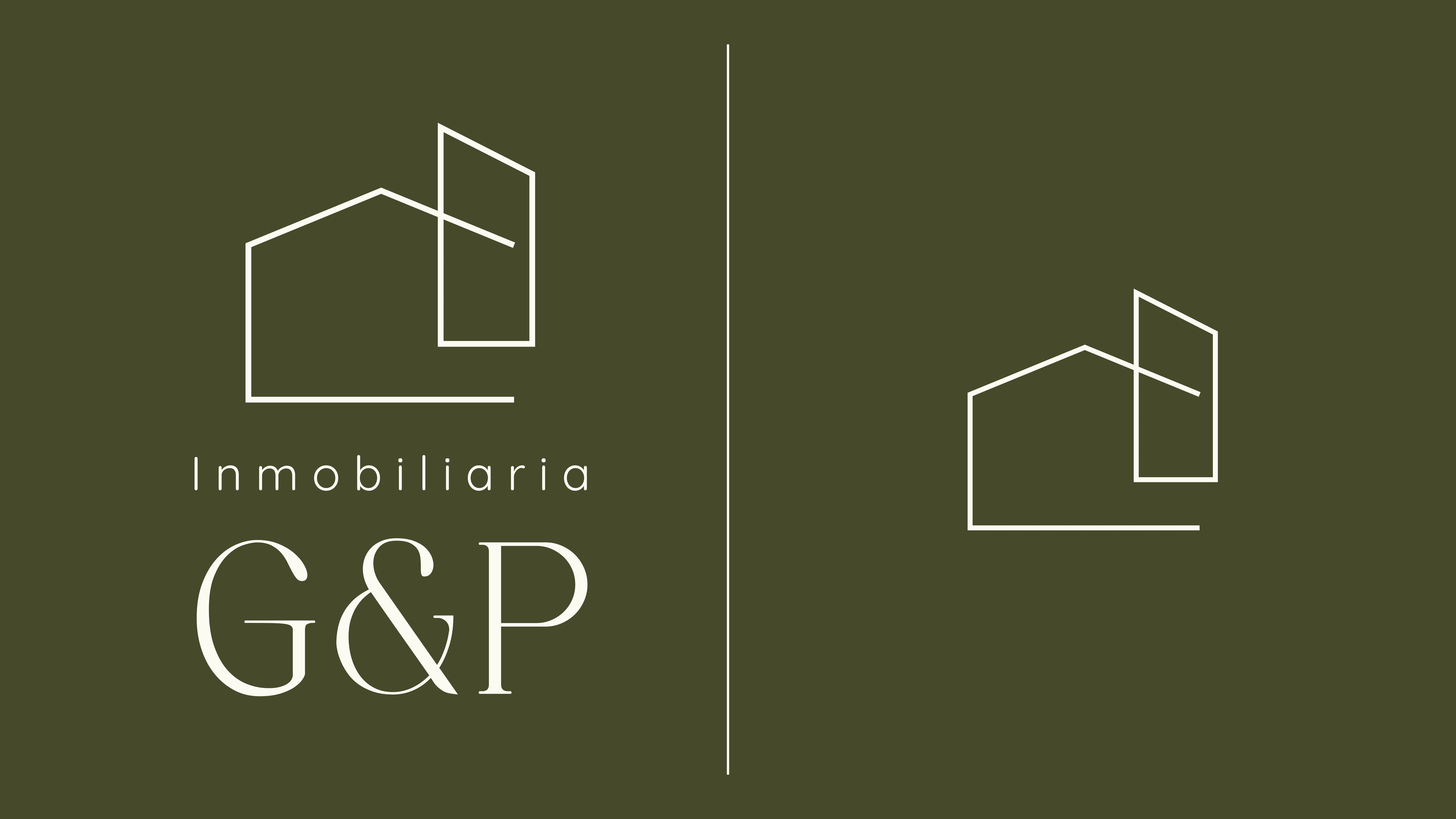
LOGOS
Color Palette & Font System
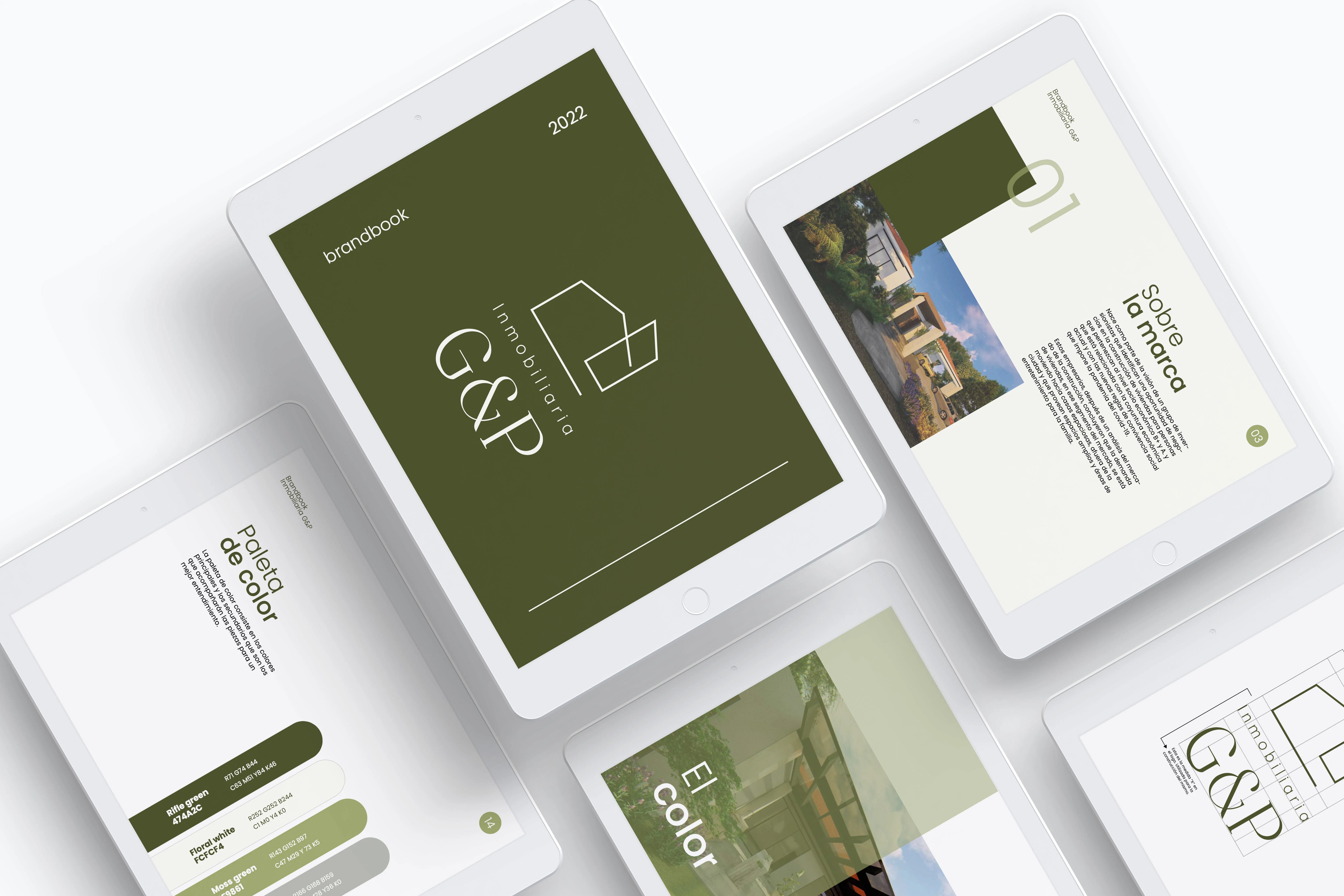
The color palette is inspired by the forest where the houses will be built, creating a combination of natural and elegant colors.
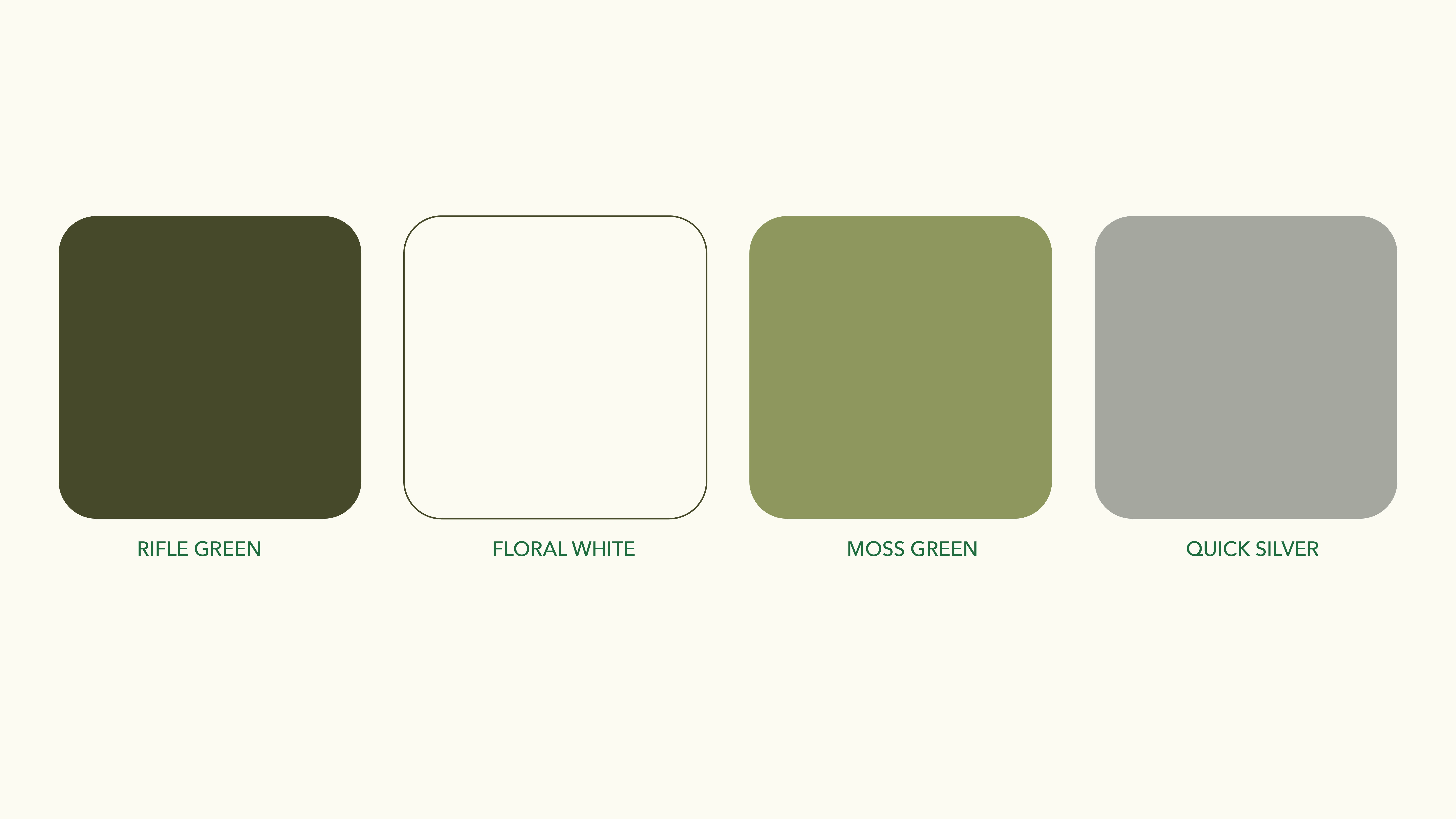
COLOR PALETTE
A minimalist and highly legible sans-serif typeface is used for all the designed pieces.
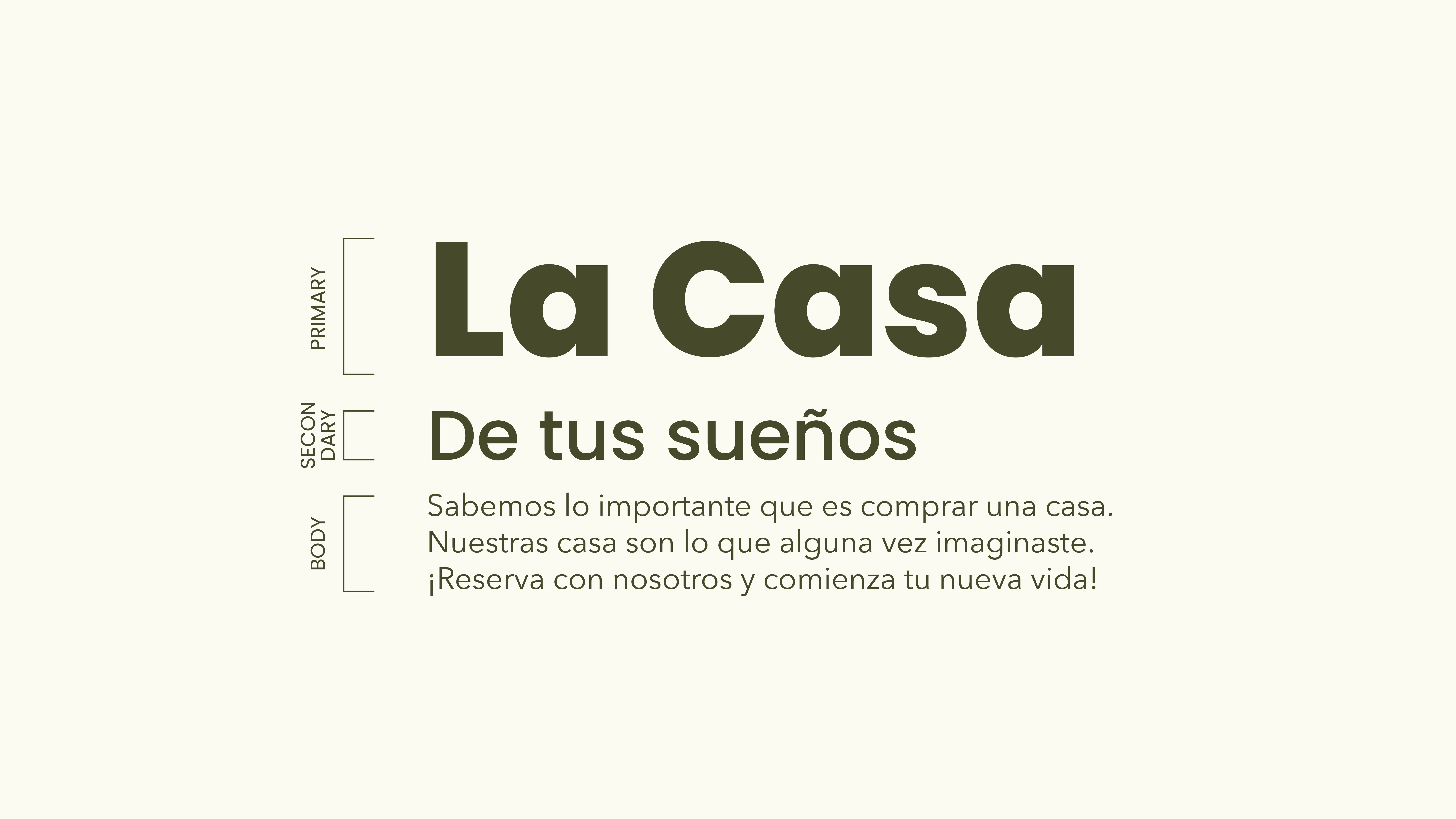
The Gran Finale
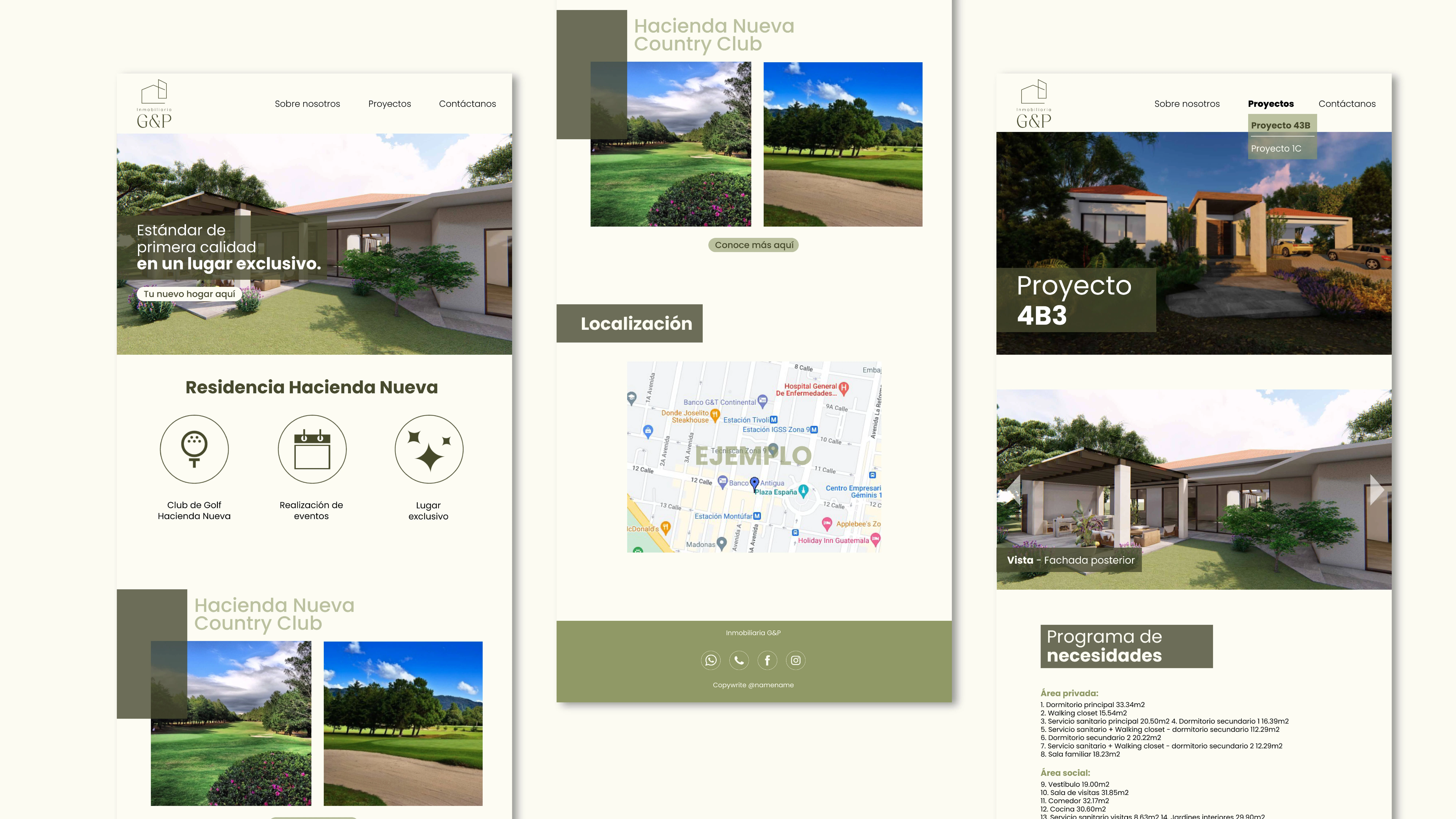
With all the elements finalized, a brand manual is created, which includes the logo, the color palette, fonts, and instructions on how to use them. Additionally, a landing page is designed with information about the real estate agency and renders of the houses for sale.ENJOY!
Like this project
Posted Oct 12, 2023
Project with Inmobiliaria G&P, where a complete brand design was delivered, including the logo, color palette, and fonts, along with a landing page.
