SIANI - Promoting inclusive food systems
THE SWEDISH INTERNATIONAL AGRICULTURAL NETWORK INITIATIVE – SIANI – IS A GLOBAL, OPEN AND INCLUSIVE NETWORK THAT SUPPORTS AND PROMOTES MULTISECTOR DIALOGUE AND ACTION AROUND OUR VISION OF SUSTAINABLE, RIGHTS-BASED AND INCLUSIVE FOOD SYSTEMS.
Project Brief
SIANI came to us looking to rebrand their current brand identity and to create a unique storytelling approach that helped them convey to their members and partners their values, mission and vision in order to be able to reach a broader audience in the pursuit of improving food systems around the globe.

Approach
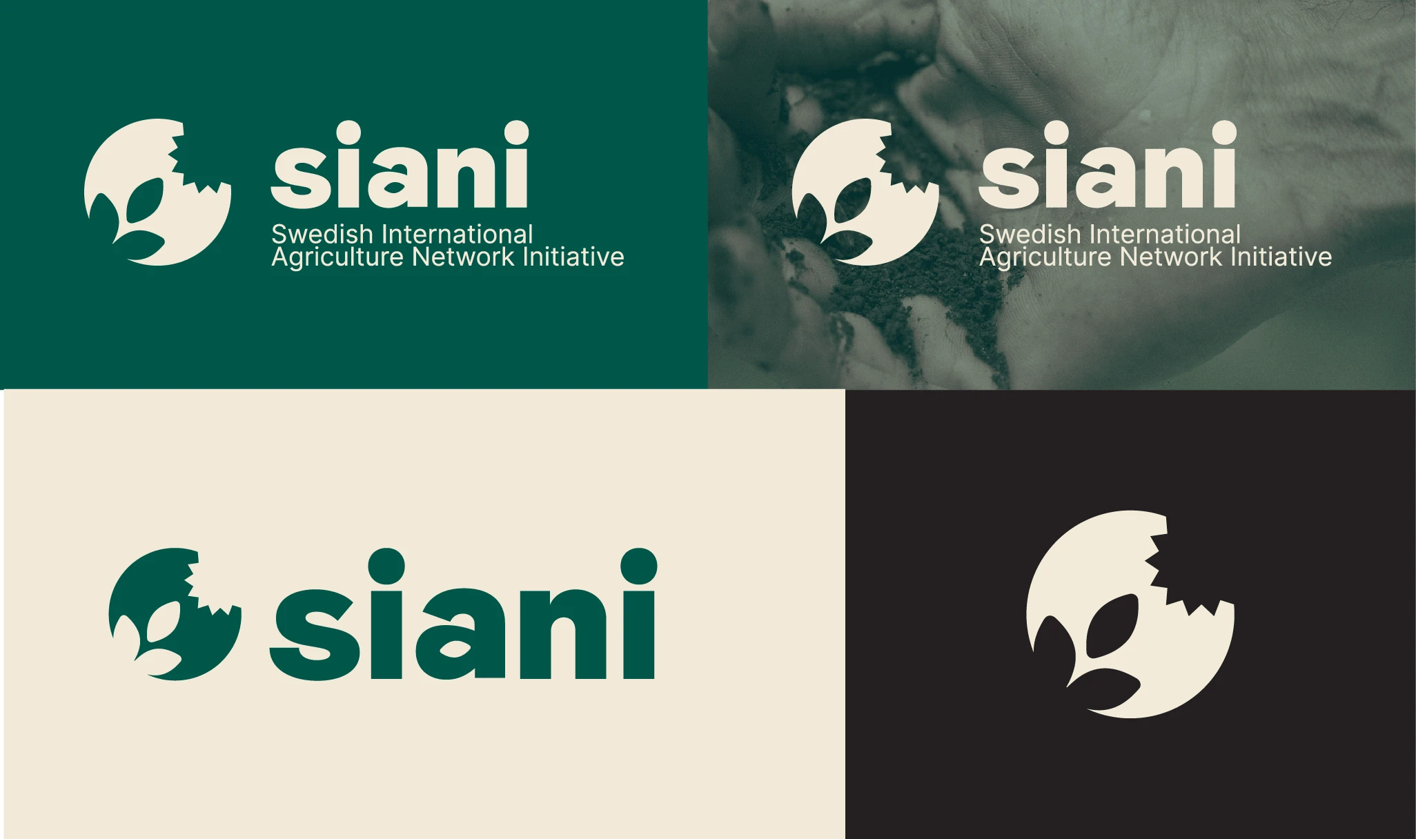
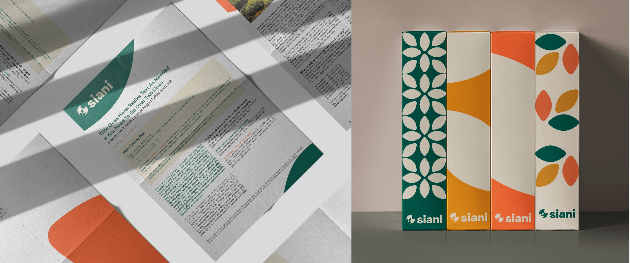
While striving for a significant modernization of their image, they remained committed to preserving the fundamental aspects of their logo and color palette. Our assignment involved staying faithful to these elements while providing them with a contemporary and streamlined appearance that could be effortlessly applied across various platforms. Additionally, it was essential for the new design to be user-friendly for their non-designer team members. We embarked on a thorough analysis of their intricate logo, meticulously dissecting its components to extract the essential elements required for incorporation into the updated version. By simplifying these elements into less intricate shapes, we ensured their durability across different sizes and integrated them into a more comprehensive and adaptable visual system.
Brand System
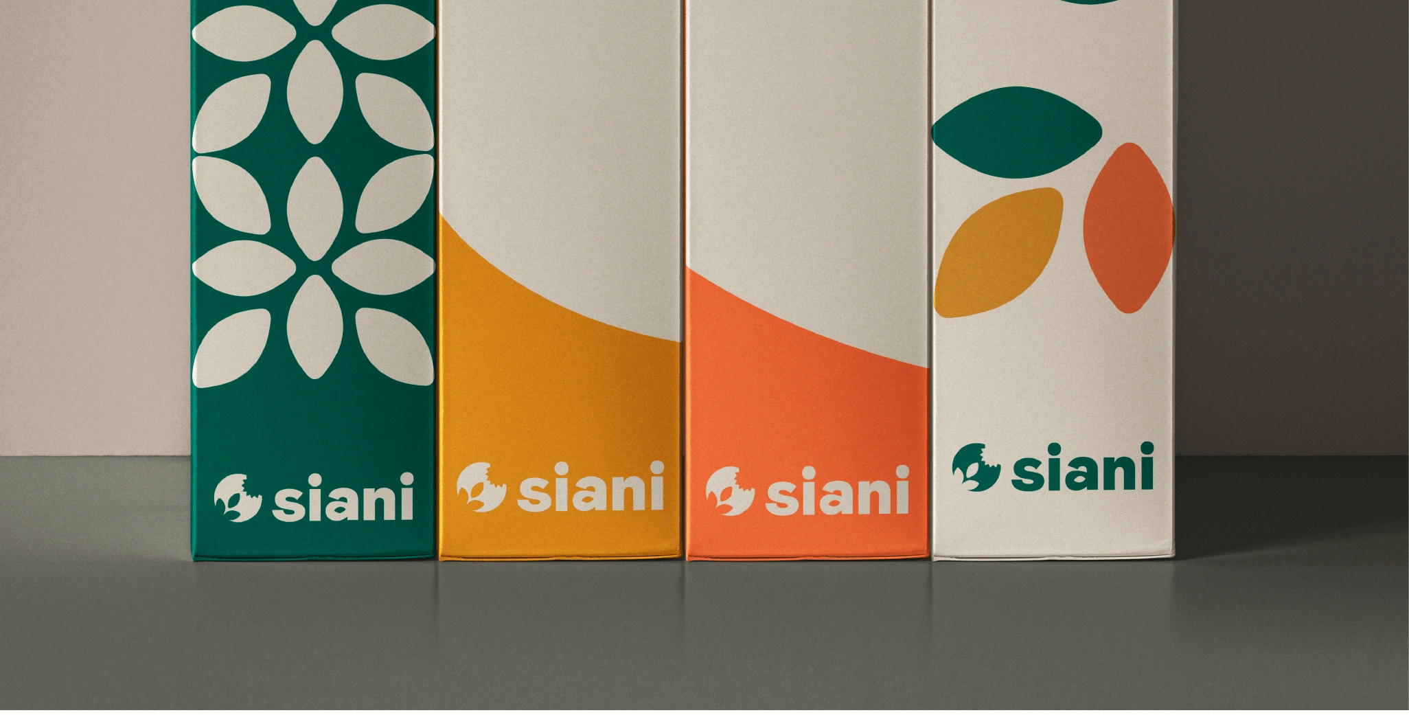
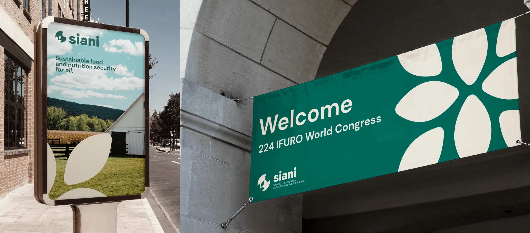
We centered our focus on the seed as the foundational element of the brand, recognizing its quintessential role within any food system. This element assumed a pivotal role within the logo and the broader visual system. Through a skillful interplay of proportions, layouts, and colors, we successfully crafted a system that struck a harmonious balance between simplicity and diversity, resulting in an engaging and captivating design. This, in turn, facilitated the establishment of distinct information hierarchies and the creation of visuals that breathed new life into the organization's appearance, all while maintaining a tangible connection to their institutional origins.




Like this project
Posted Nov 3, 2023
Strategy and rebranding for Swedish organization SIANI, modernizing their visual identity to empower their mission and strengthen their network impact.
Likes
3
Views
239


