Sour Bloom on the Can / Packaging Design
Keke Shen
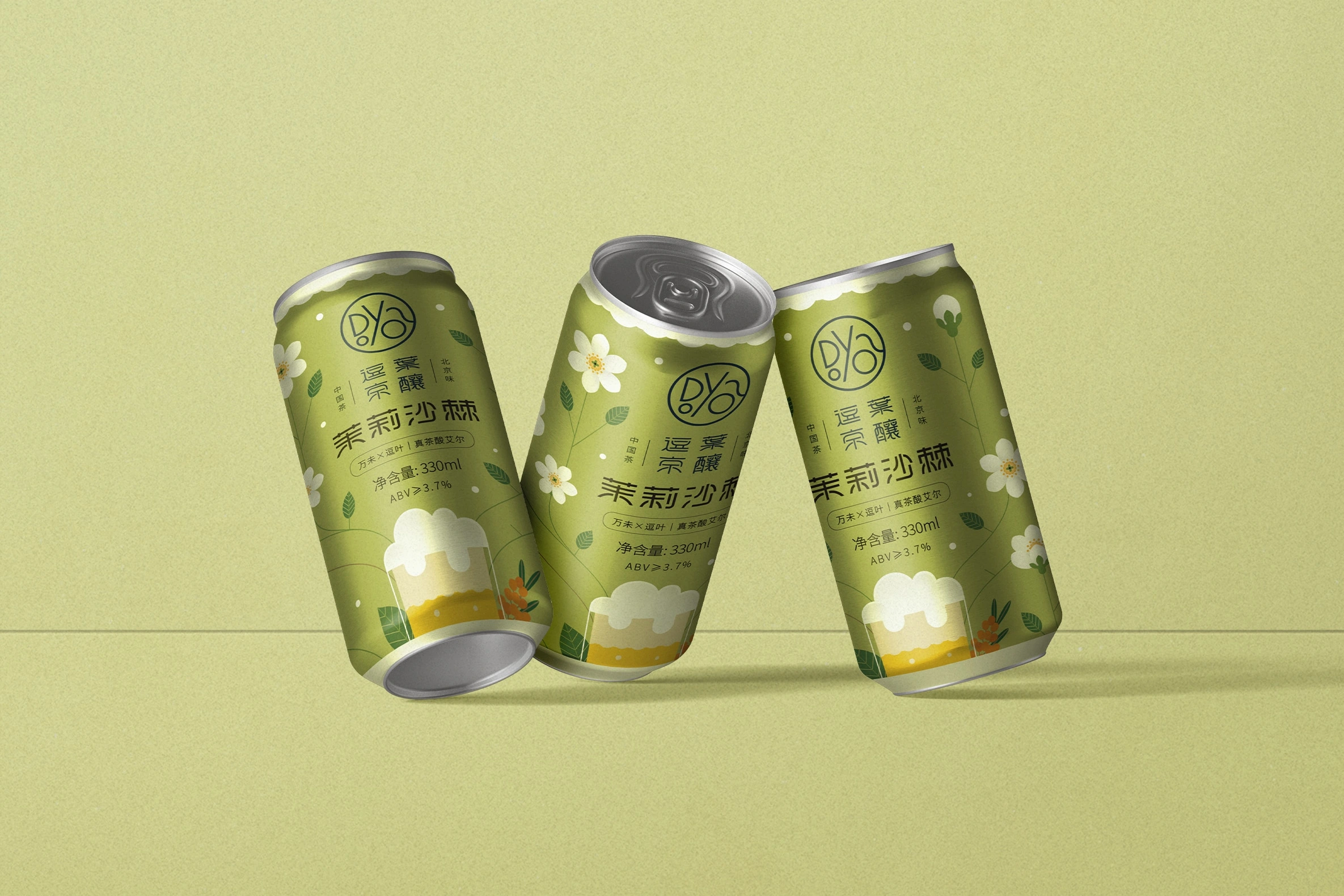
This is a packaging design project created for a limited-edition craft beer jointly launched by Doya and Wanwei. Doya is a boutique tea brand based in Beijing, known for its modern take on traditional Chinese tea culture, while Wanwei specializes in small-batch, flavorful sour ales. The beer itself features a unique fusion of jasmine tea and seaberry, brewed into a refreshing sour ale and exclusively sold at Doya’s tea shop.
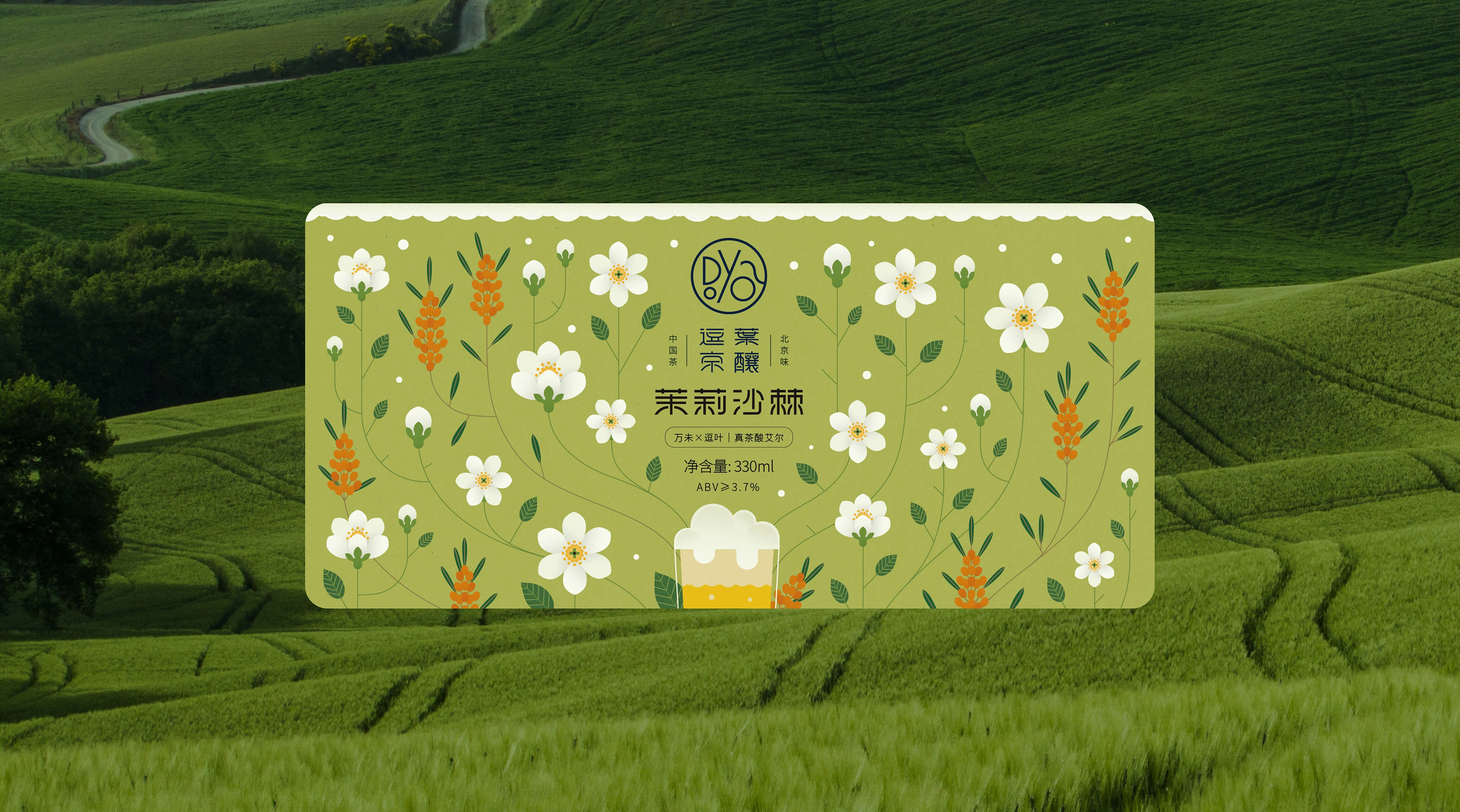
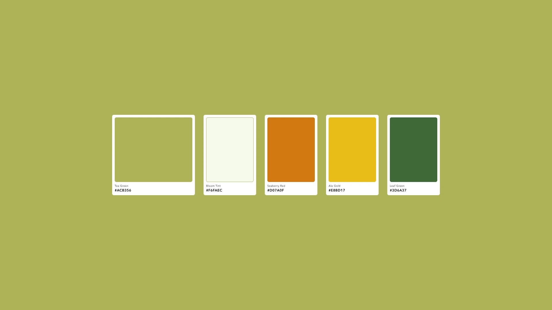
The color palette is inspired by the main ingredients of the beer: green tea, jasmine flowers, and seaberry — along with the golden hue of the ale itself. Together, these tones create a soft, refreshing look that feels natural and well-balanced. Each color echoes a part of the drink’s identity: floral, tart, and lightly brewed.
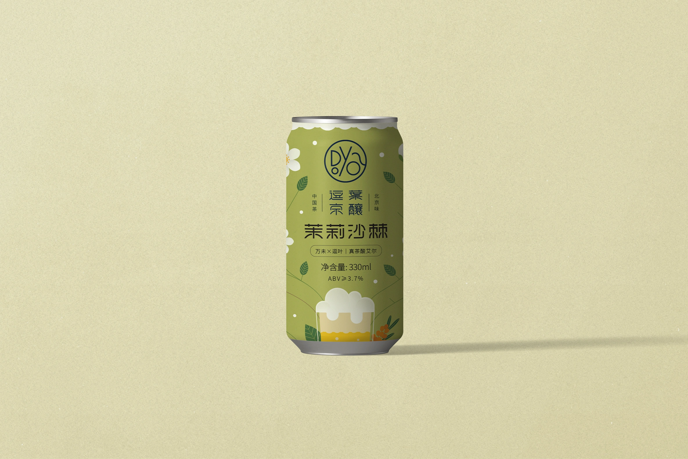
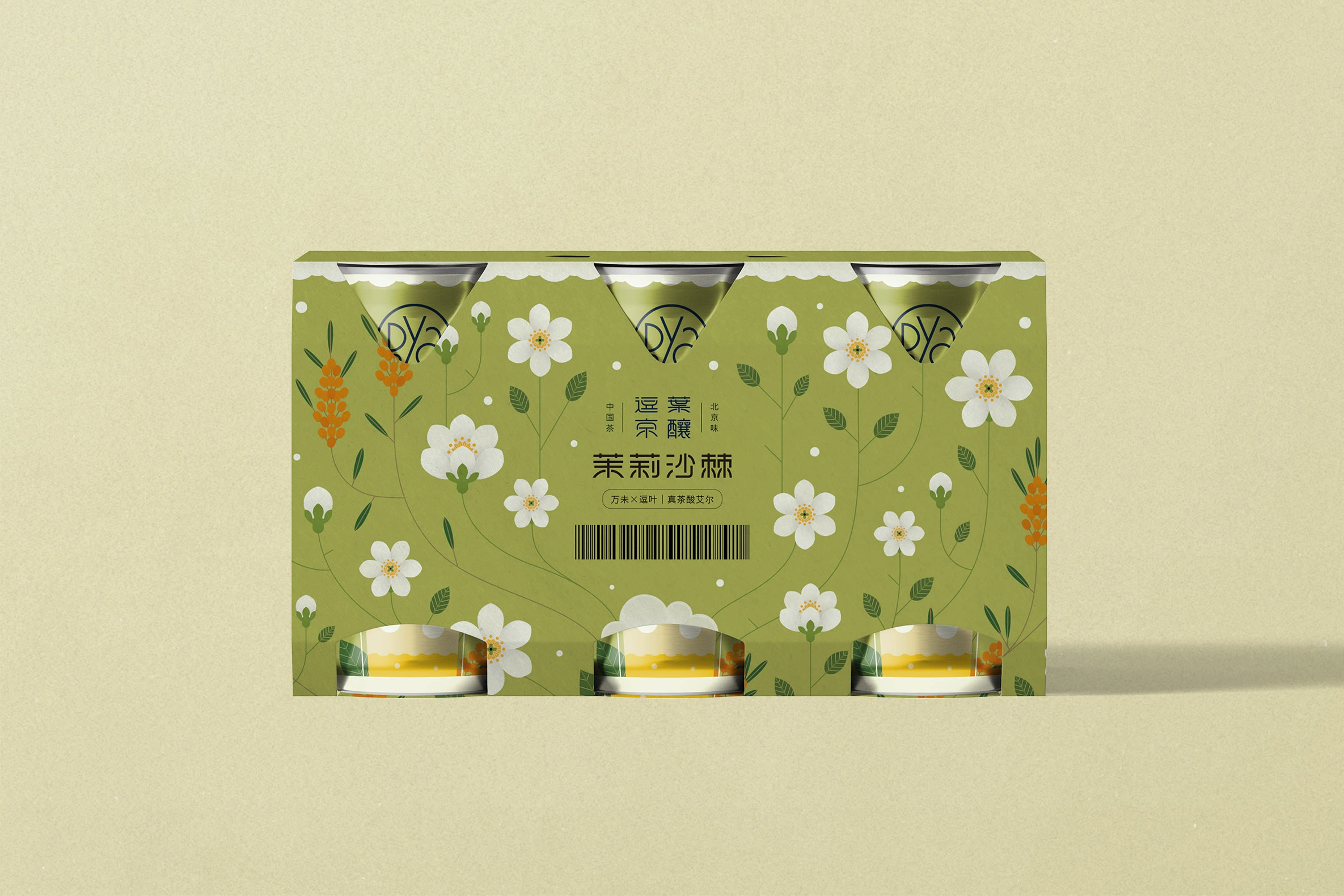
The illustration uses clean vector lines and a modern layout, with jasmine and seaberry arranged in a light, symmetrical composition. The overall aesthetic is influenced by Chinese visual culture — not just in the pattern, but also in the color harmony and spatial rhythm. The result feels both gentle and expressive, echoing the beer’s character.
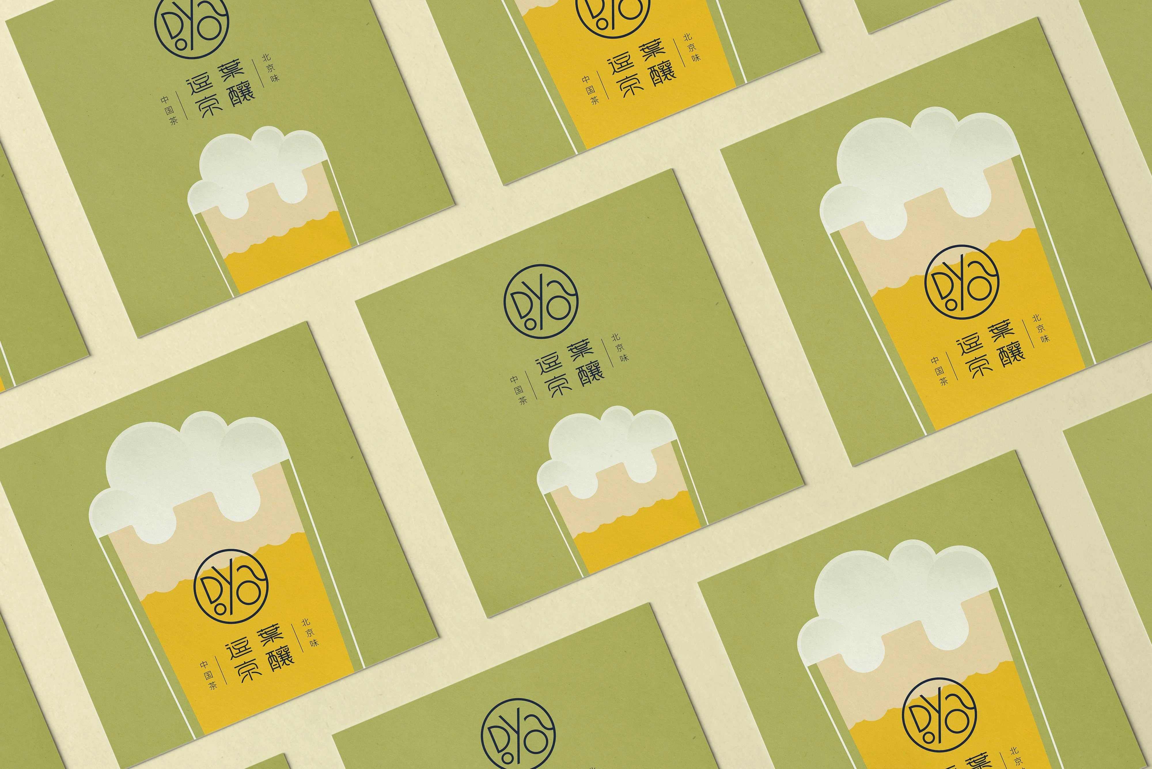
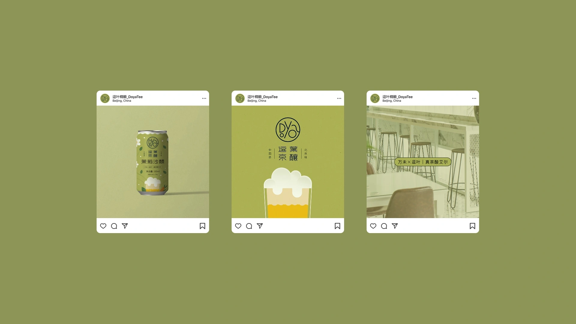
I also created a set of social visuals built around the tea green color tone, all sharing a soft, natural look. Compared to the packaging, these graphics are simpler and more direct, designed to highlight the product in a calm and memorable way.

Like this project
Posted Oct 18, 2025
Designed packaging for Doyatee's jasmine and seaberry sour ale, blending botanical art with craft beer shelf appeal in a clean yet expressive style.