XIBEI OATS / Branding
Keke Shen
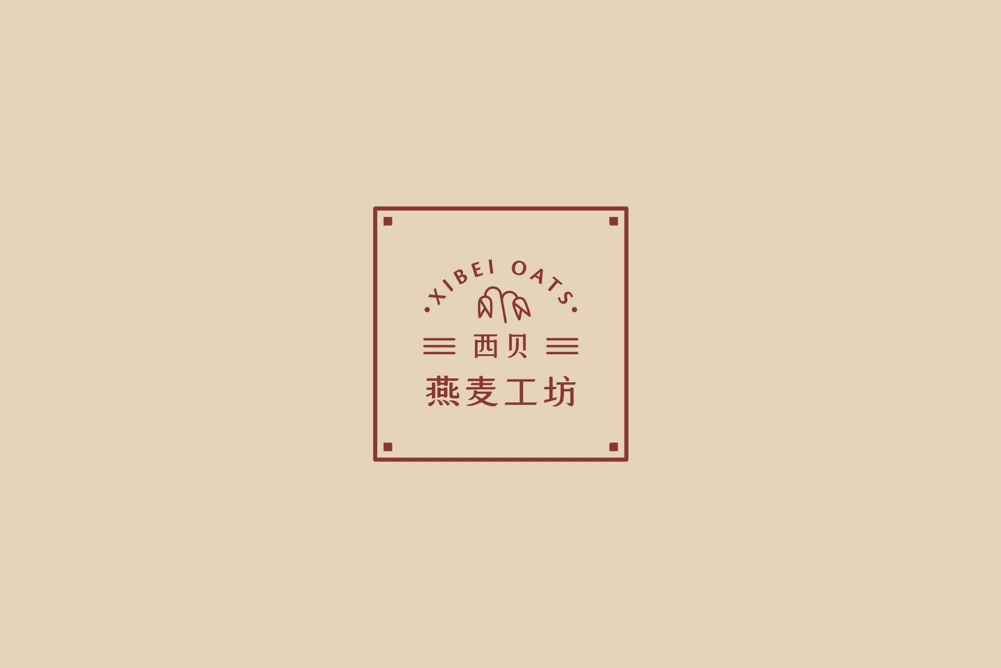
This is a project created for Xibei, a brand known for its authentic Northwestern Chinese cuisine, particularly oats noodles.
As Xibei planned to open a new restaurant, Xibei Oats, which blends Chinese and Western culinary elements, I reflected this fusion in my design by combining modern design style with traditional Chinese aesthetics and crafted a clean and classic brand identity that captures the essence of both cultures.
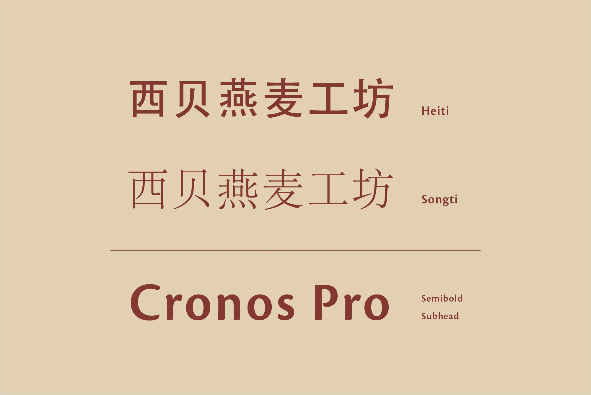
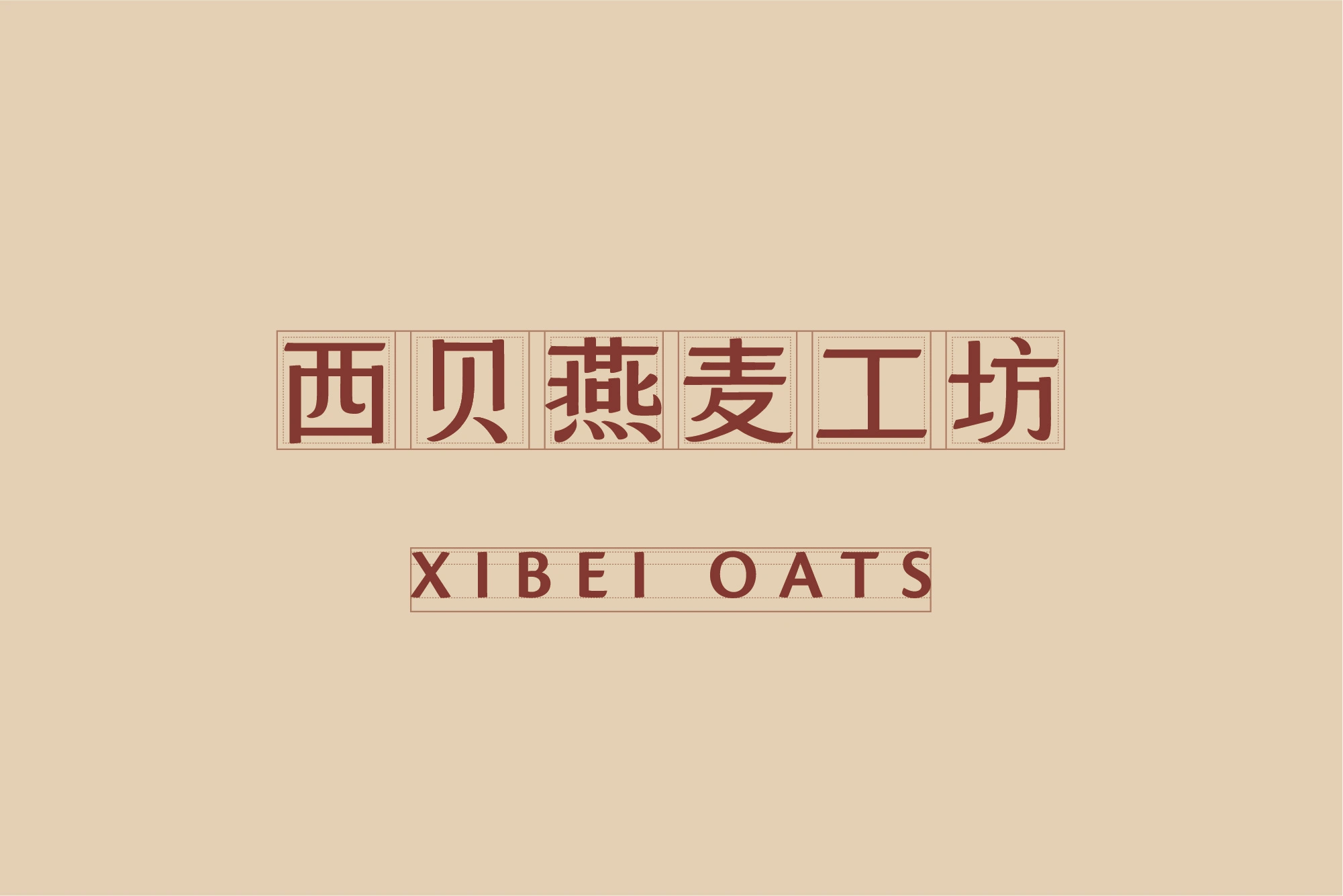
Unlike the Latin alphabet, the Chinese writing system, "Hanzi", consists of tens of thousands of characters. This complexity makes type design more challenging, resulting in fewer Chinese typeface options compared to Latin ones.
Therefore, I designed the Chinese text in the logo myself. Heiti and Songti are two major categories of Chinese typefaces, and I combined the features of both to create the characters for the logo.
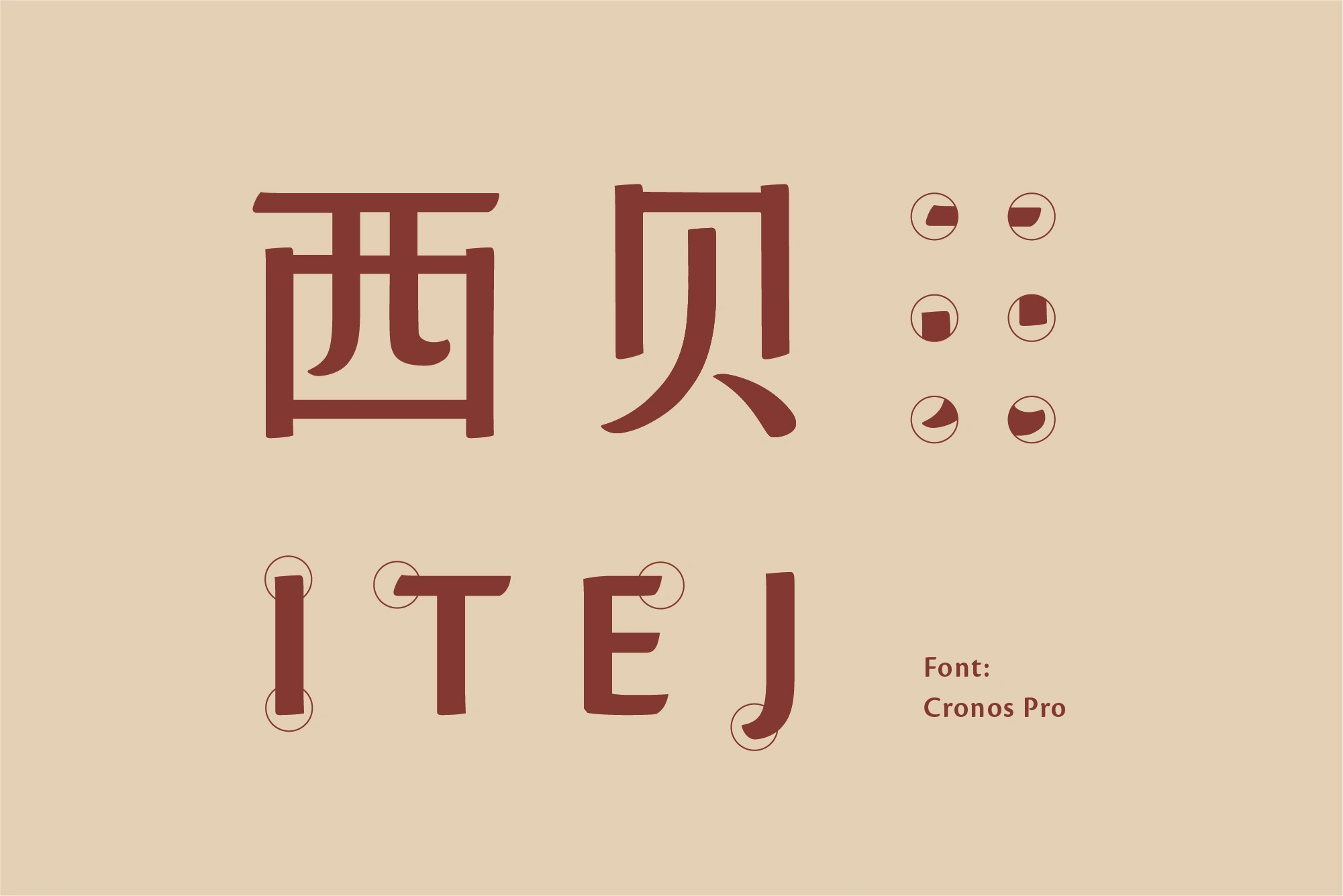
Additionally, I took reference from the Latin typeface Cronos Pro, which is used as the English font in the branding. By adjusting the stroke endings and balancing the stroke thickness, I ensured that the Chinese and English texts harmonize and complement each other seamlessly.
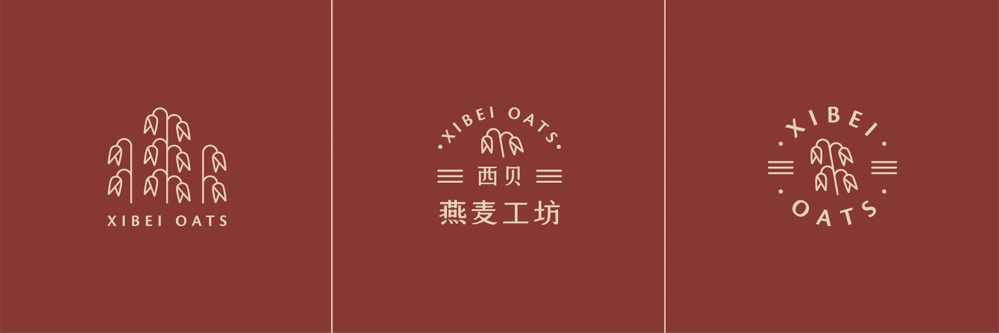
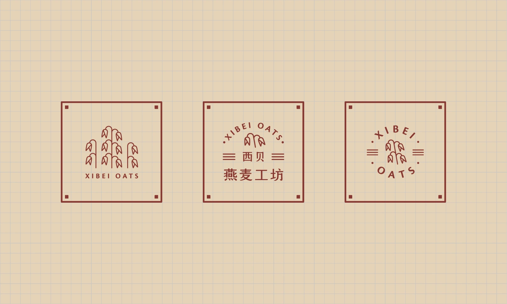
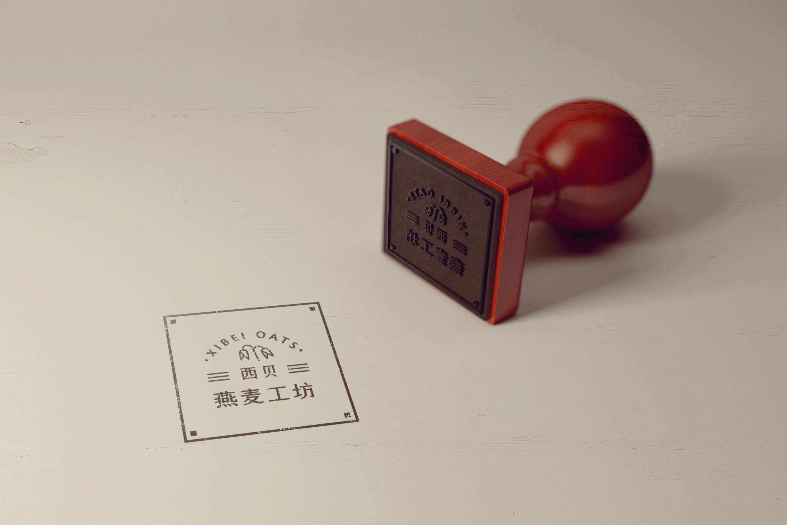
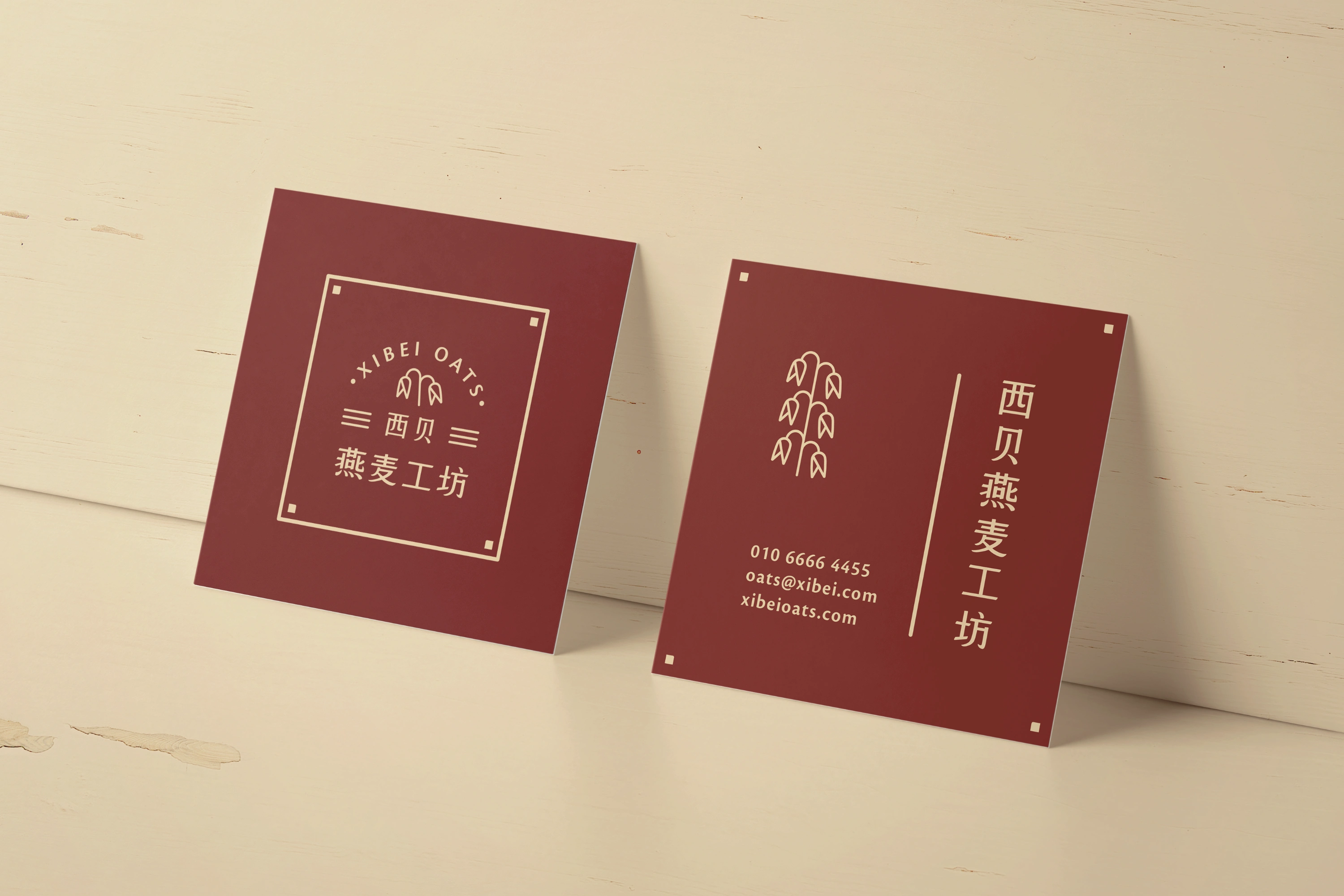
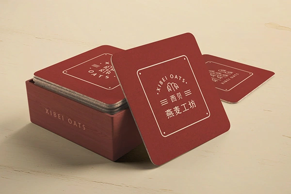
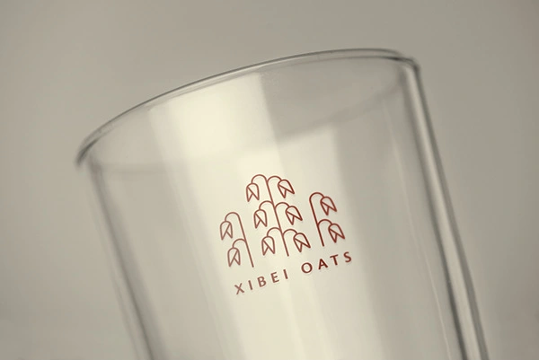
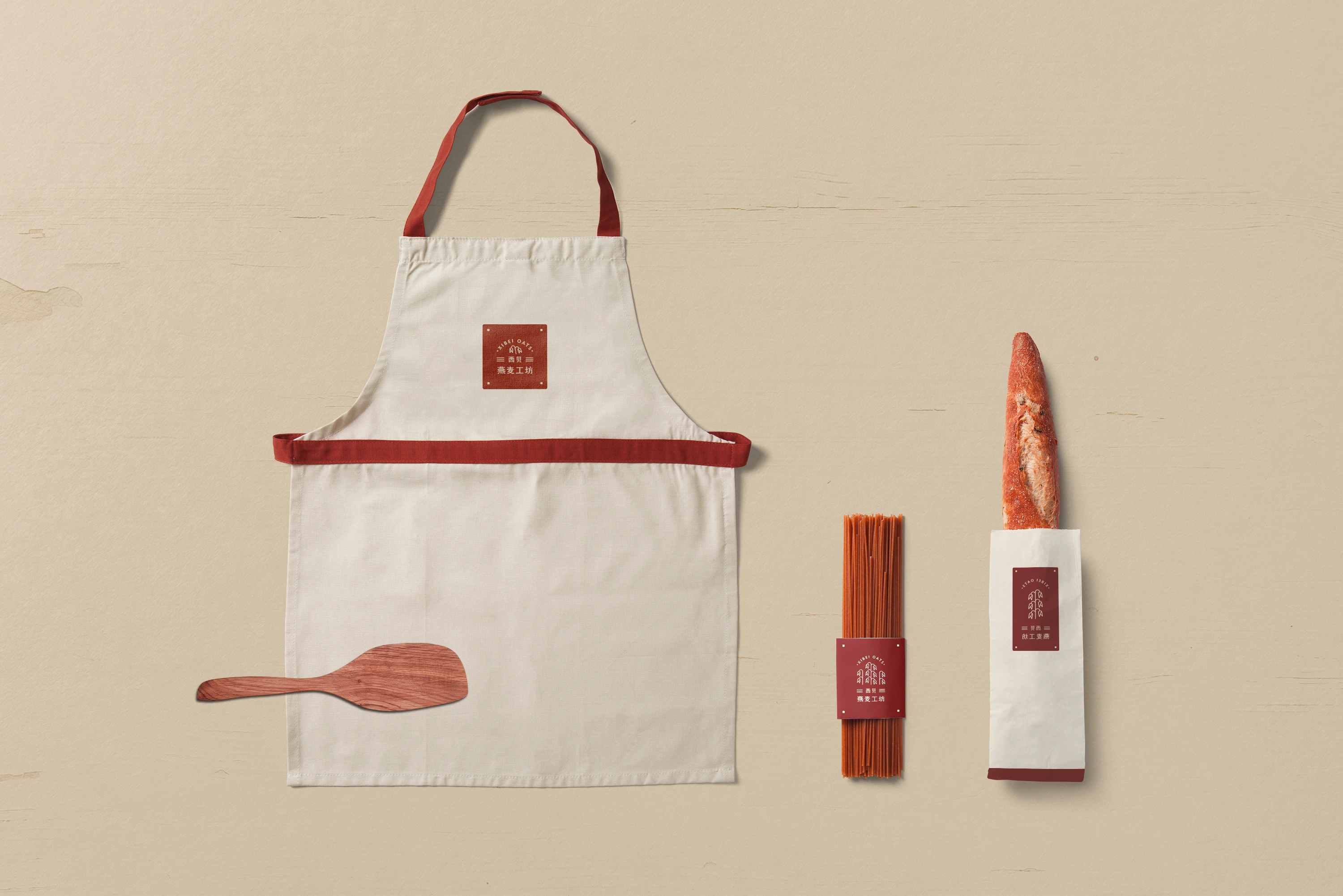
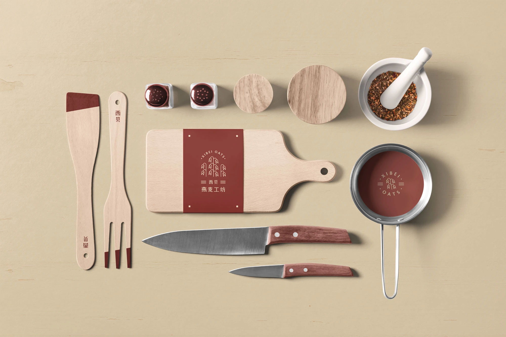
Instead of using a fixed logo, I explored various arrangements of the compositional elements. For example, the oat symbol, a key element of the logo, is available in several versions. The number of oats varies depending on the logo’s size and format. Additionally, there are versions featuring only the symbol and the English name, designed for specific use cases.
Thank you.
Like this project
Posted Apr 28, 2025
A brand identity for Xibei Oats blending modern design with traditional Chinese aesthetics — clean, fresh, and rooted in their story.