Passion Projects | Quick Redesign Series
Sara Cudemo
🚀 Welcome to the Quick Redesign Series! 🌟
In this series, I'll be exploring various apps I randomly find online, identifying design nuances, and envisioning how they could be enhanced. It's all about spotting design opportunities and sharing my take on crafting more intuitive and visually appealing user experiences, all within just a few hours.
While I won't be delving into market analysis, user studies, or exhaustive redesigns, I'll focus on crafting a fresh perspective by revamping select screens. It's all about flexing my design muscles and learning in the process. And remember, the goal is never to offend anyone, but rather to celebrate design, have fun, and keep learning along the way! 🚀📱
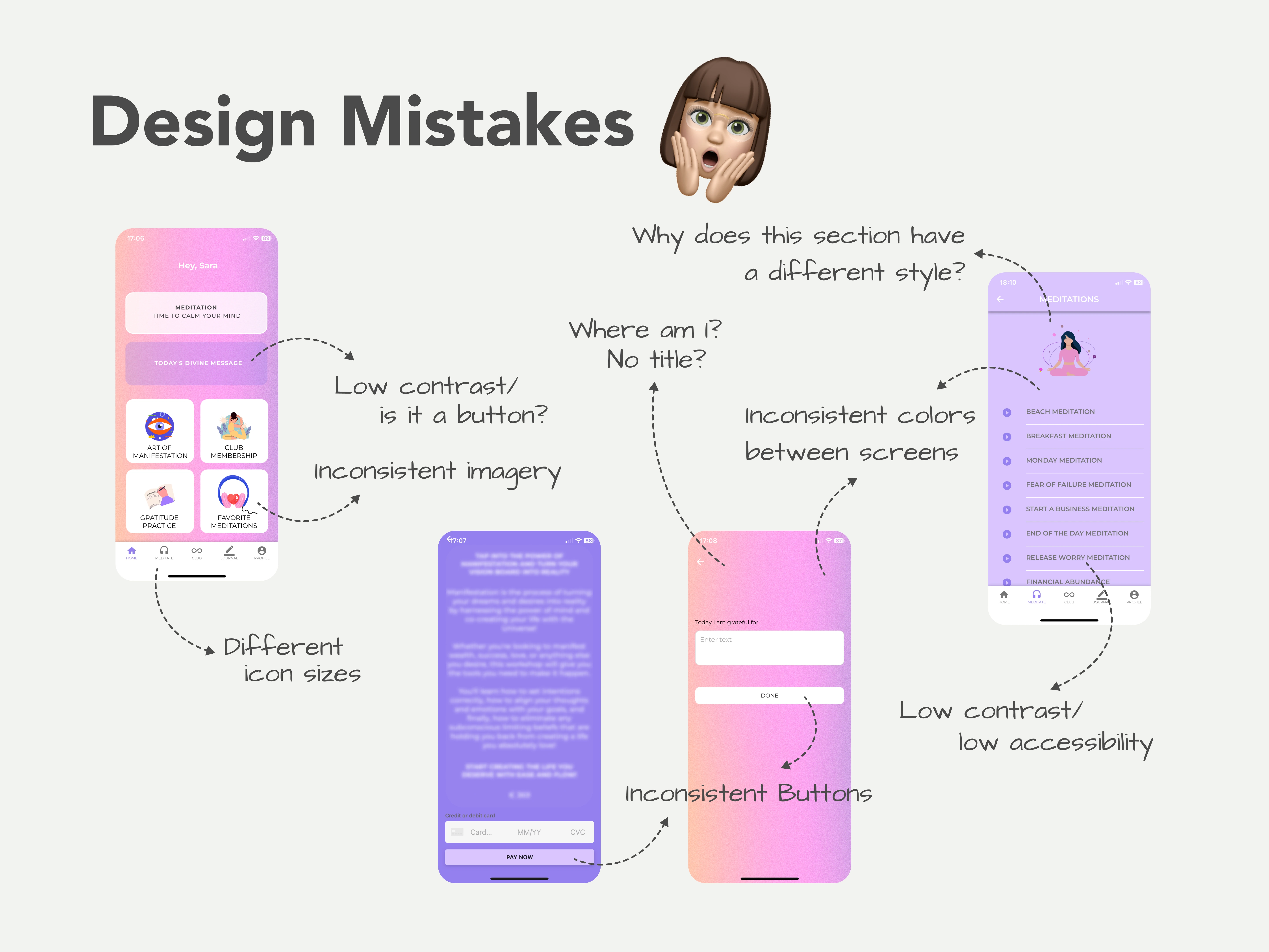
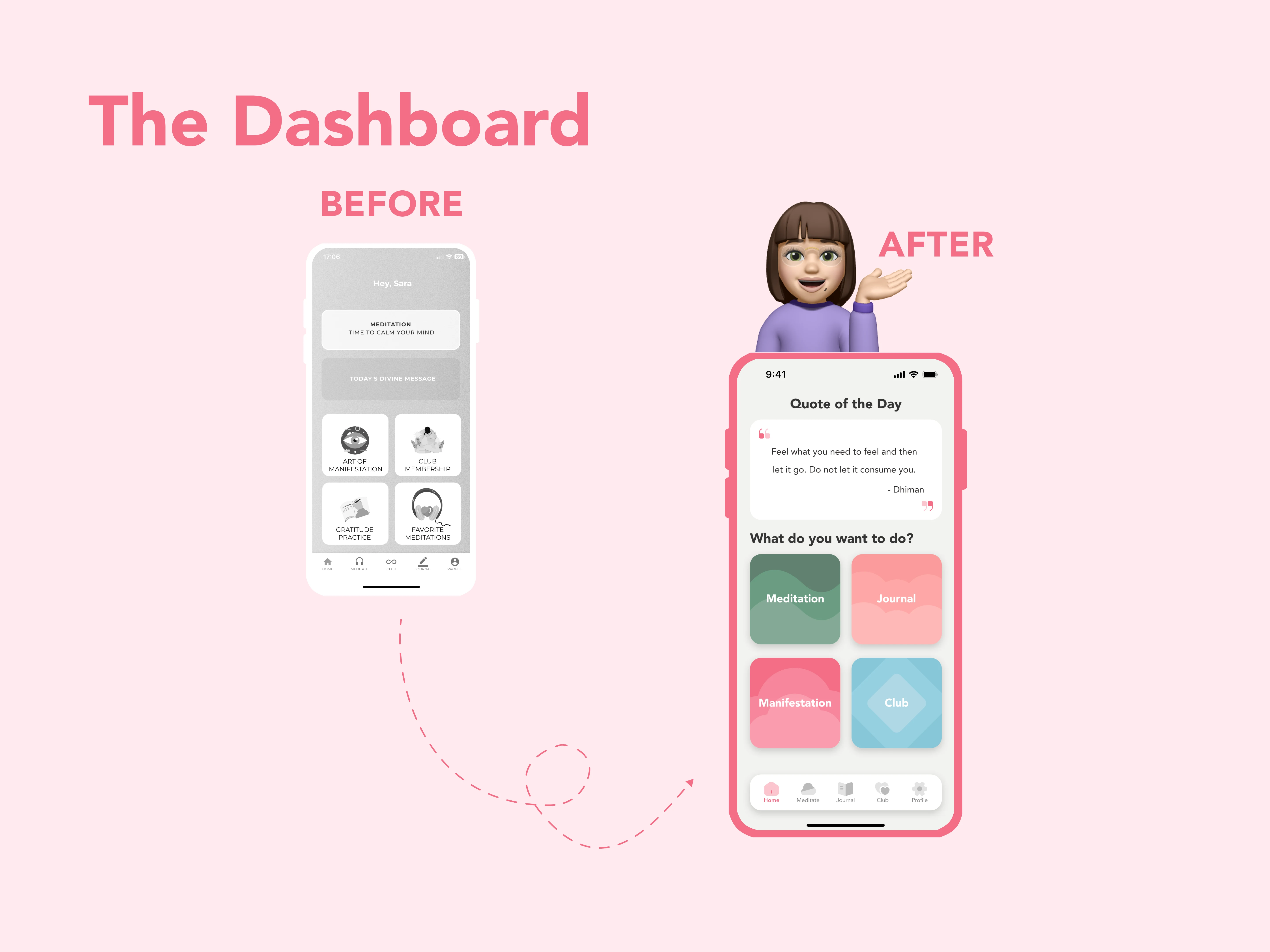
1. Mindfulness App
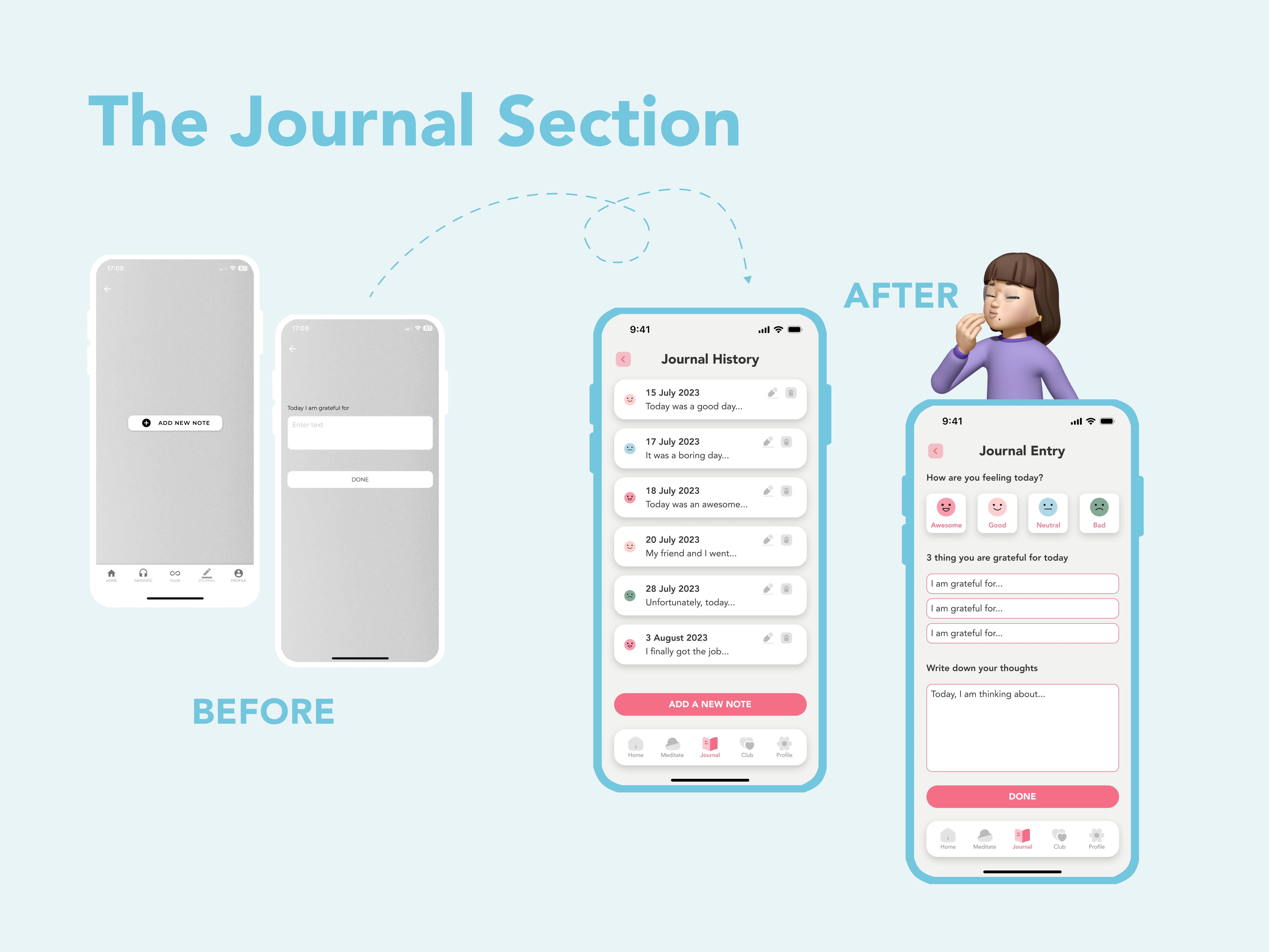
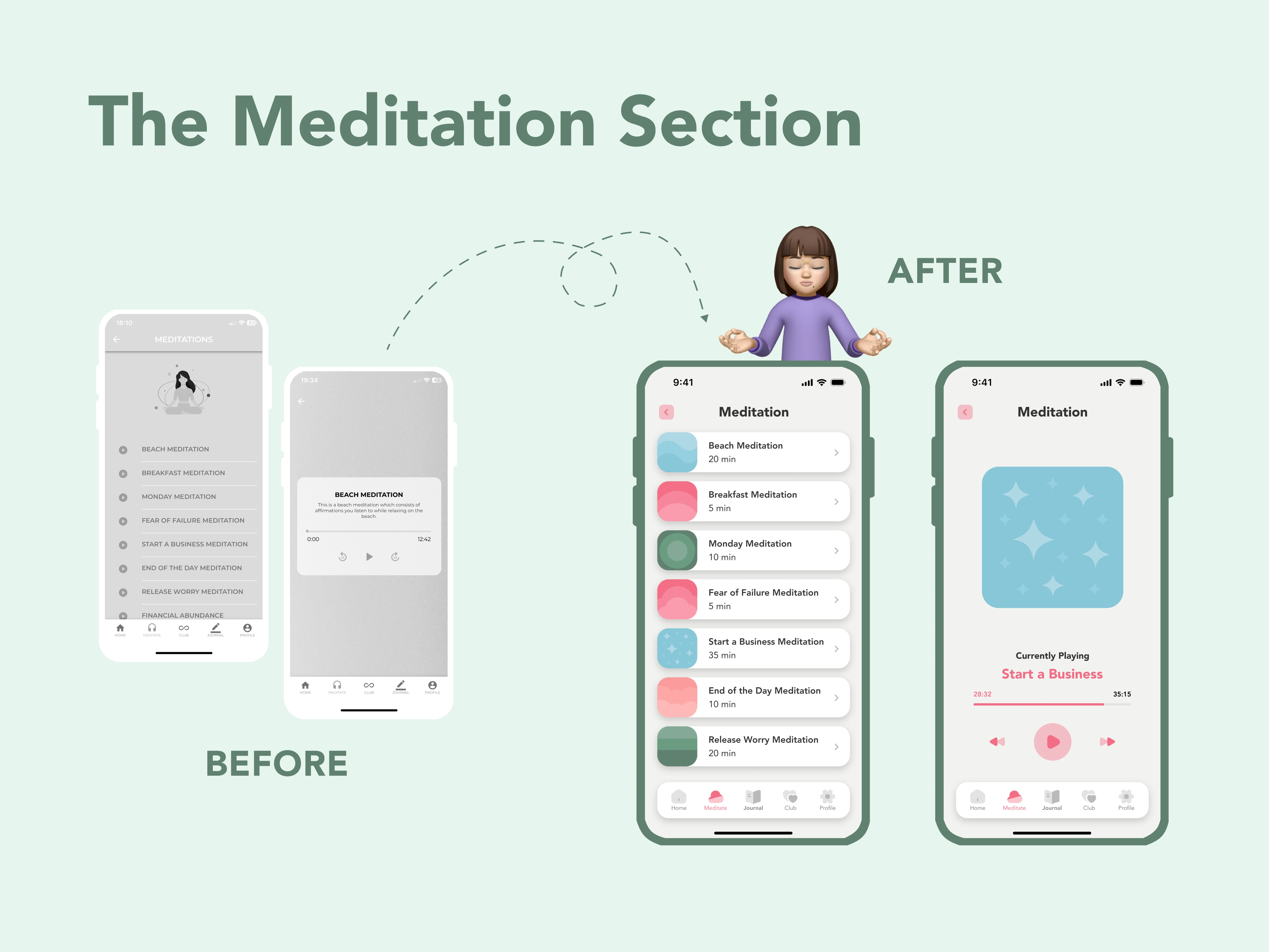
Kicking off the series, I'm excited to present a mindfulness and meditation app as our first design journey. Join me in transforming and reimagining select screens to create a more serene and user-friendly experience.
🔍 Design Mistakes
🎨 The Redesign
2. UnoBravo App
In this episode, I'm excited to present UnoBravo, an online therapy service. Join me in transforming and reimagining select screens to create a more serene and user-friendly experience.
🔍 Design Mistakes
In my analysis, I identified three primary areas in need of improvement within the app's user experience:
First and foremost, the absence of a dashboard was noted, leading to user confusion as the app directly opens into the chat with their therapist.
Secondly, the use of a hamburger menu, more commonly found in web applications, was observed to potentially hinder the app's usability as a native mobile application.
Lastly, the challenge of quickly accessing information about upcoming appointments—either through scrolling in the chat or navigating to the appointment section—was evident.
🎨 The Redesign
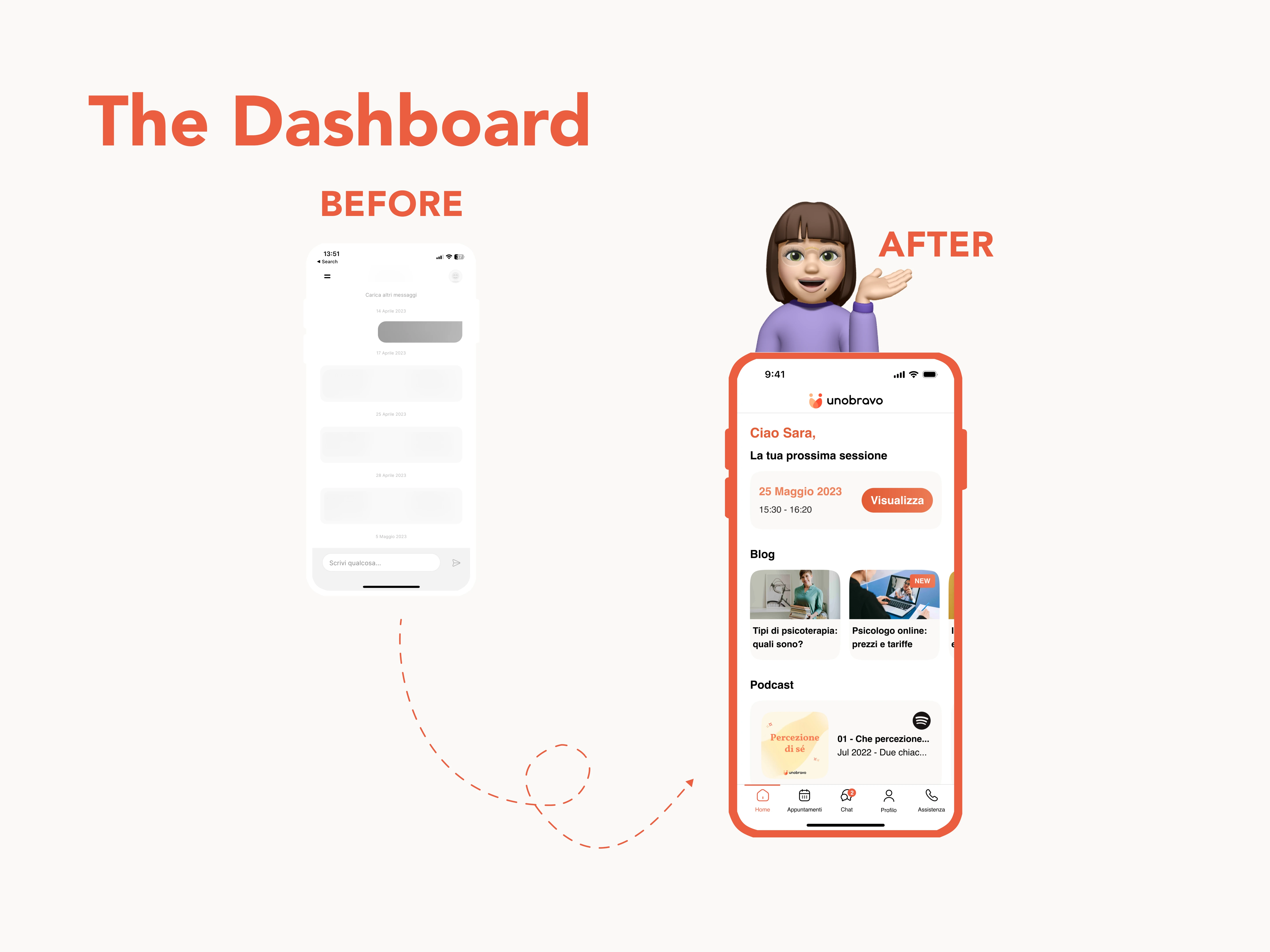
To address these issues, I proposed a partial app redesign:
The homepage was revamped to include a user-friendly tab bar at the bottom of the screen, simplifying navigation.
Additionally, I integrated blog and podcast elements, which were previously exclusive to the website, into the app to enhance user engagement.
A dedicated section on the homepage was introduced, allowing users to easily view their upcoming appointments.
To improve user communication with their therapist, a notification icon was incorporated into the chat tab.
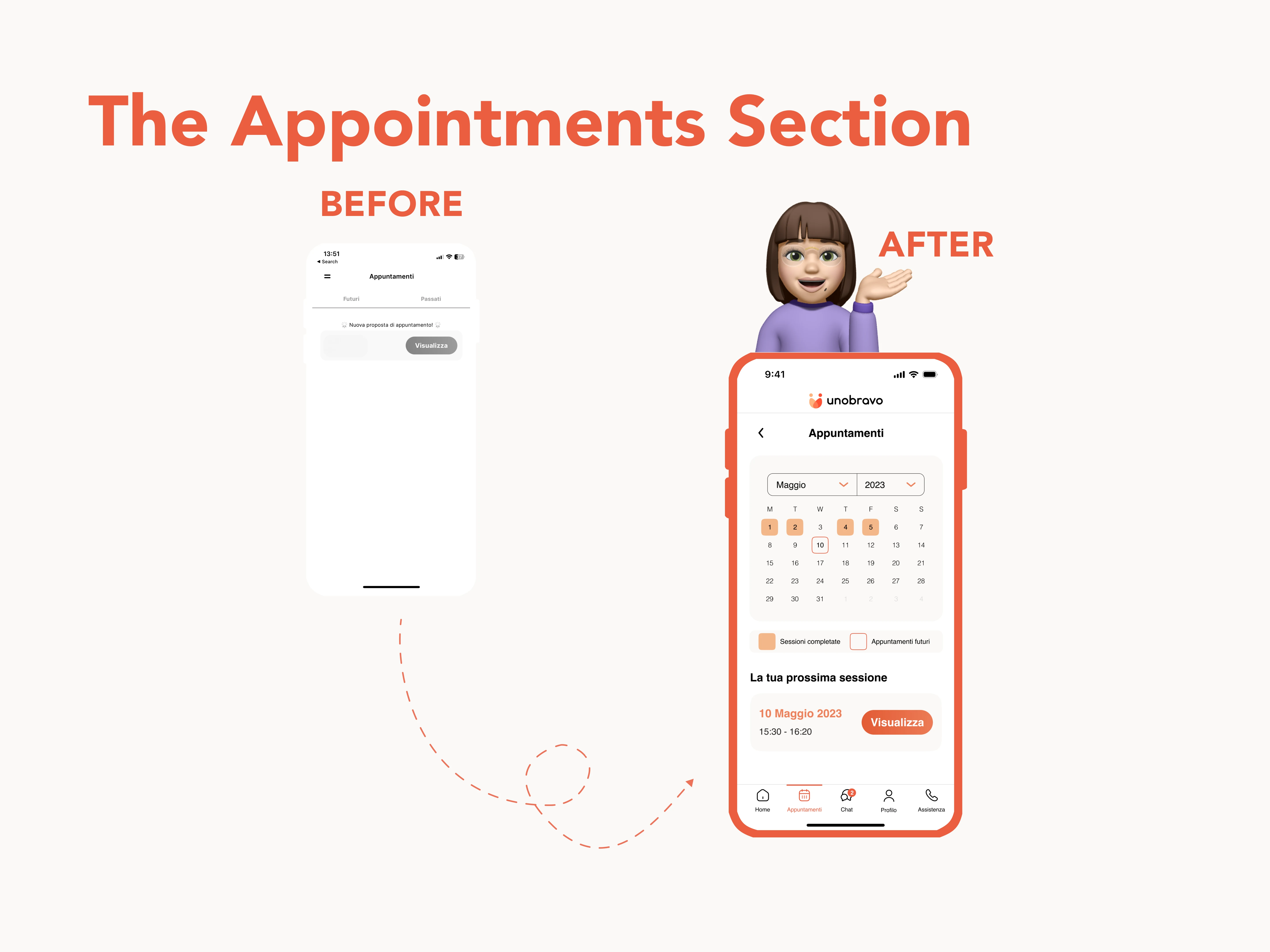
Lastly, the appointment section underwent a redesign, making it easier for users to distinguish between older and new sessions by implementing a calendar view.
These design changes collectively aim to elevate the app's user experience and functionality.
Like this project
Posted Nov 9, 2023
In this series, I'll be exploring various apps I randomly find online, identifying design nuances, and envisioning how they could be enhanced.
Likes
0
Views
2