The Sport Dog Society
Aaron Heth
The Sport Dog Society – Branding, Visual Identity, Web Design
Scaling an elite, in-person training consultancy into a democratized digital community.
The Sport Dog Society and it's founder Luke had specialized in 1-on-1 luxury training for years. They were ready to grow, and needed a transition from a boutique consultancy to a national digital community. I needed to lower the barrier to entry without diluting Luke's high-performance credibility.
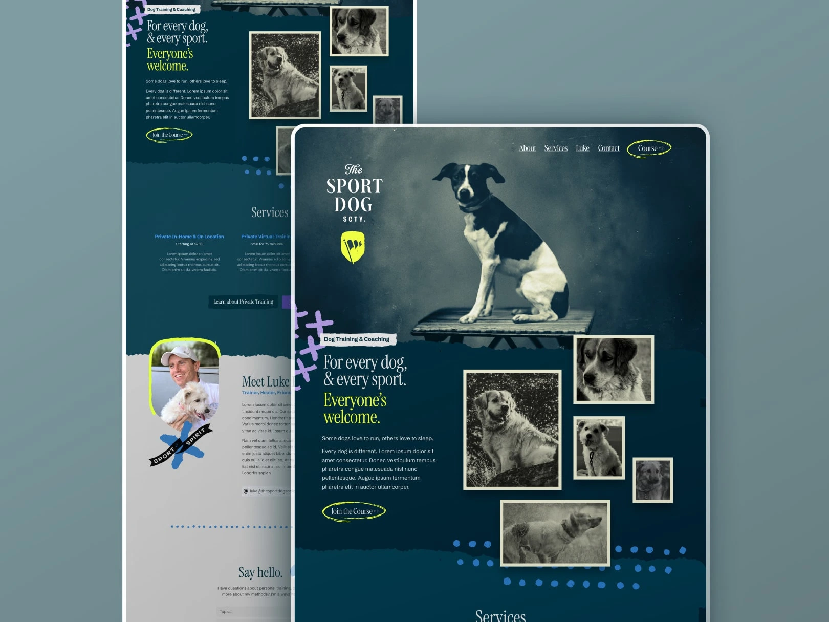
The brand was rebuilt to support a scalable, one-to-many business model, shifting the narrative from elite coaching to an inclusive, fear-free training movement that exemplified Luke's philosophy.
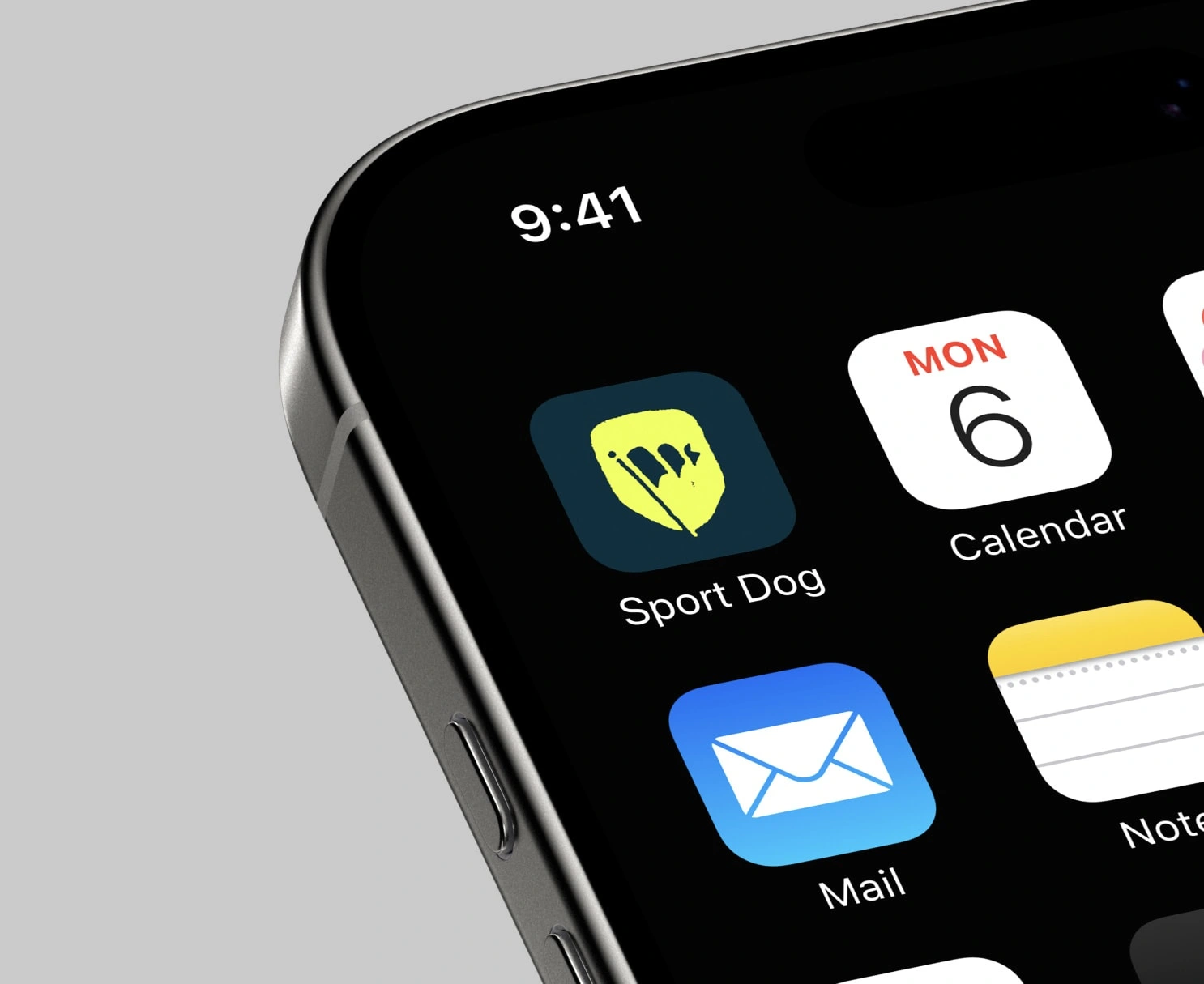
I delivered a modular motion toolkit and high-tempo intro sequence designed for rapid in-house content production. The animation style uses quick-cut transitions and the kinetic flag icon to mirror the responsiveness of reward-based training. This toolkit ensures that as the Society's online course library grows, every video maintains a consistent, high-energy professional standard.
Collegiate Grit
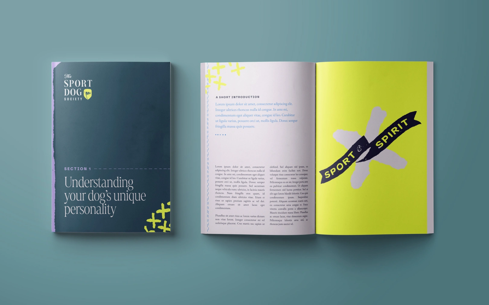
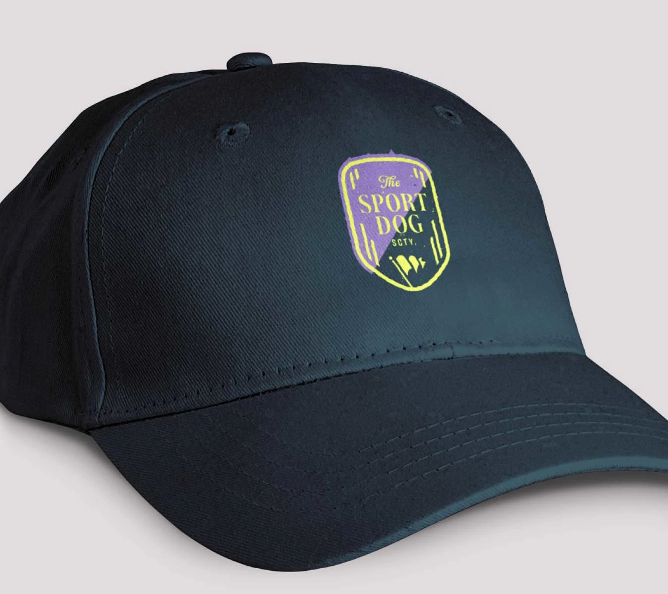
The identity is anchored in collegiate grit, a blend of traditional Ivy League teals and high-visibility tennis ball neon. I developed a modular logo suite featuring a weathered, stamp-textured crest for formal certifications and a kinetic flag icon for digital movement. This high-contrast palette signals both established authority and the urgent, "ready-to-go" energy of a dog at work.
The Sport of Training
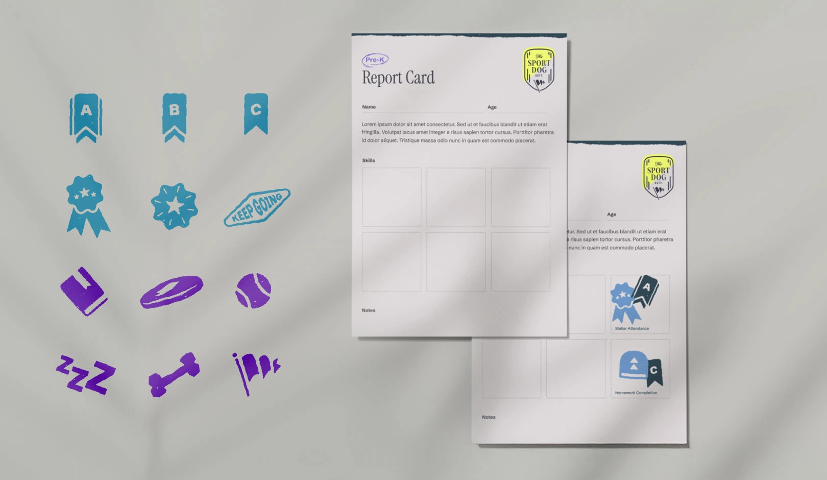
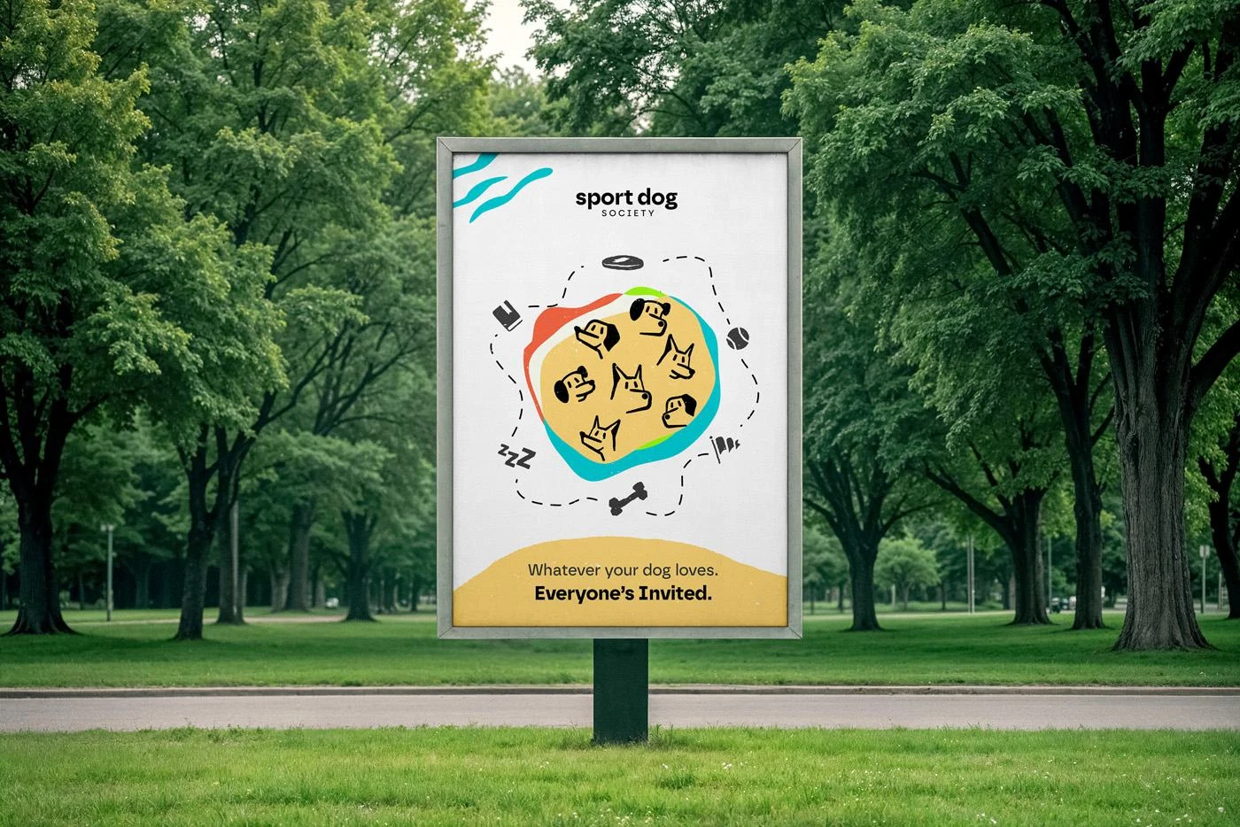
To bridge the gap between digital courses and hands-on results, I created a suite of tactile report cards and custom iconography. By categorizing everything from frisbee-catching to competitive napping as a valid sport, I gamified the curriculum. These assets act as visual rewards for owners, reinforcing the brand philosophy that every dog belongs in the Society while driving student engagement and social shareability.
The Other Direction
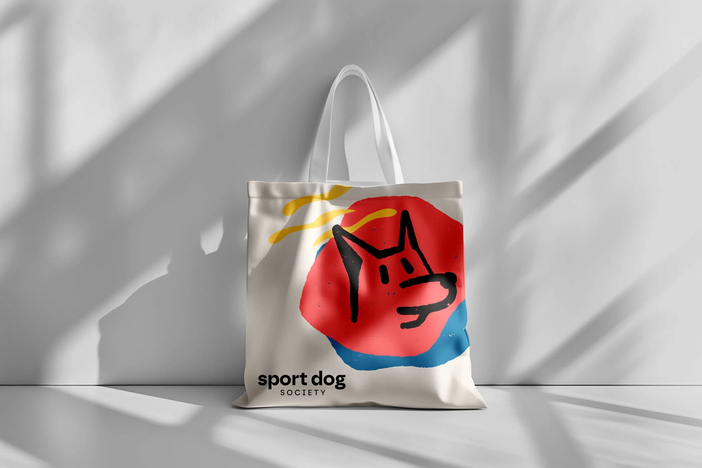
The alternative, unused direction featured a modular identity system made up of snouts, ears and eyes that could be combined randomly. Coupled with a bright colour palette, the identity was a more pure visual metaphor for welcoming all kinds of dogs and all kind of sport. Each touchpoint of the brand would be a slightly different iteration that was a part of the whole system.
Like this project
Posted Mar 17, 2026
Scaling an elite, in-person training consultancy into a democratized digital community. Visual Identity, Motion, Print and Web.