VentureCraft

Amirul Hakim


Designing Journey Animation for Venture Capital
Responsive Isometric Animation
How animation flow in responsive website
Overview
VentureCraft needed a clearer way to explain its services and how its engagement model works. The website already had strong positioning and clear copy, but the visual layer was doing the classic static-image thing: looking polished, then quietly asking visitors to connect the dots themselves.
The Challenge
Before :
Static images had to do too much work
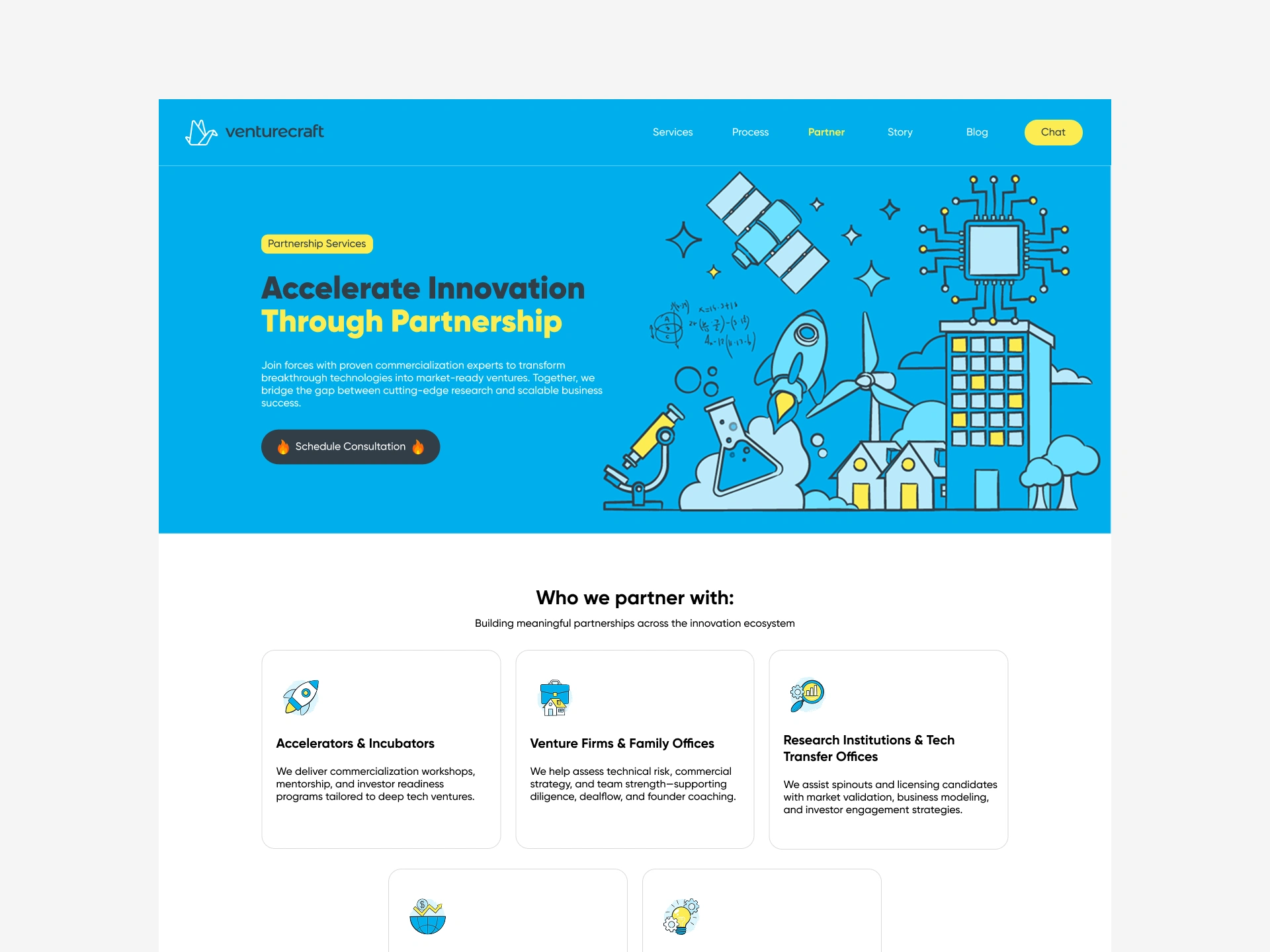
The original hero used static images to support the message. They looked fine. They did their job as visual texture. But when the task is to explain services and how the process works, a single static frame has a hard job. It can show a result, but it cannot easily show sequence. It can show labels, but it cannot show cause and effect. It can look like a system, but visitors still have to infer how the system behaves.
For a service business, that is a problem. People do not just want to know what you offer. They want to know what happens after they say hello. Static visuals often turn that into a small detective exercise: read the copy, look at the diagram, find the labels, guess the order, hope for the best. Static diagrams are excellent at hiding the plot.
The Proposed Direction
Isometric Animation
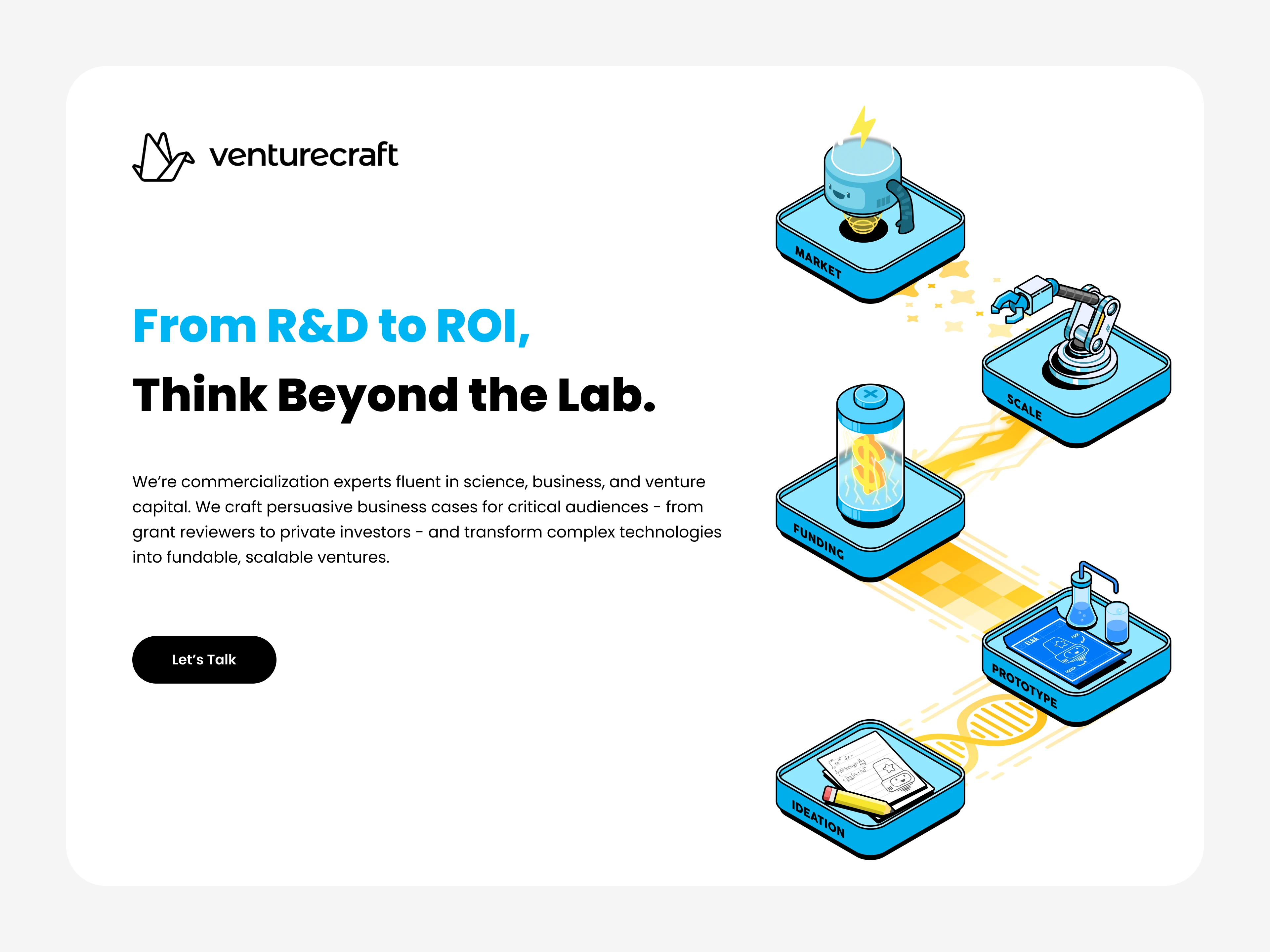
The proposed solution was an isometric animation in the hero. Isometric illustration is useful here because it can show a system without becoming a literal photograph. It can simplify the messy real world into understandable layers. Animation adds the missing ingredient: time.
Instead of one static scene, the hero could build the story in stages. A stage appears, connects to the next, and resolves into a clear flow. The visitor sees the service model as a sequence rather than a puzzle. That is a much better use of the hero than another pretty image that says “we are professional” and then leaves the explaining to the copy.
The Responsive Problem
Then the mobile viewport did what it always does: it made the desktop layout look generous and slightly overconfident.
Isometric scenes depend on spatial relationships. The labels, objects, and connections all sit in a specific composition. On a wide screen, that composition can breathe. On a phone, it gets compressed. Labels become tiny. The scene becomes cramped. The animation either shrinks into a squint fest or gets cropped in a way that breaks the logic of the diagram. Stacking the scene vertically can also damage the isometric illusion. Auto-playing a complex animation on mobile adds another risk: performance cost and motion sensitivity.
The Solution
After :
One story, two delivery modes.
The solution kept the isometric animation as the core visual language but changed how it behaves across devices.
On desktop, the hero uses a continuous isometric animation. The scene builds in sequence, with each stage of the service model appearing as the previous one settles. The camera stays stable so the visitor can follow the flow. Labels appear when they are relevant, not all at once. The animation supports the copy instead of competing with it.
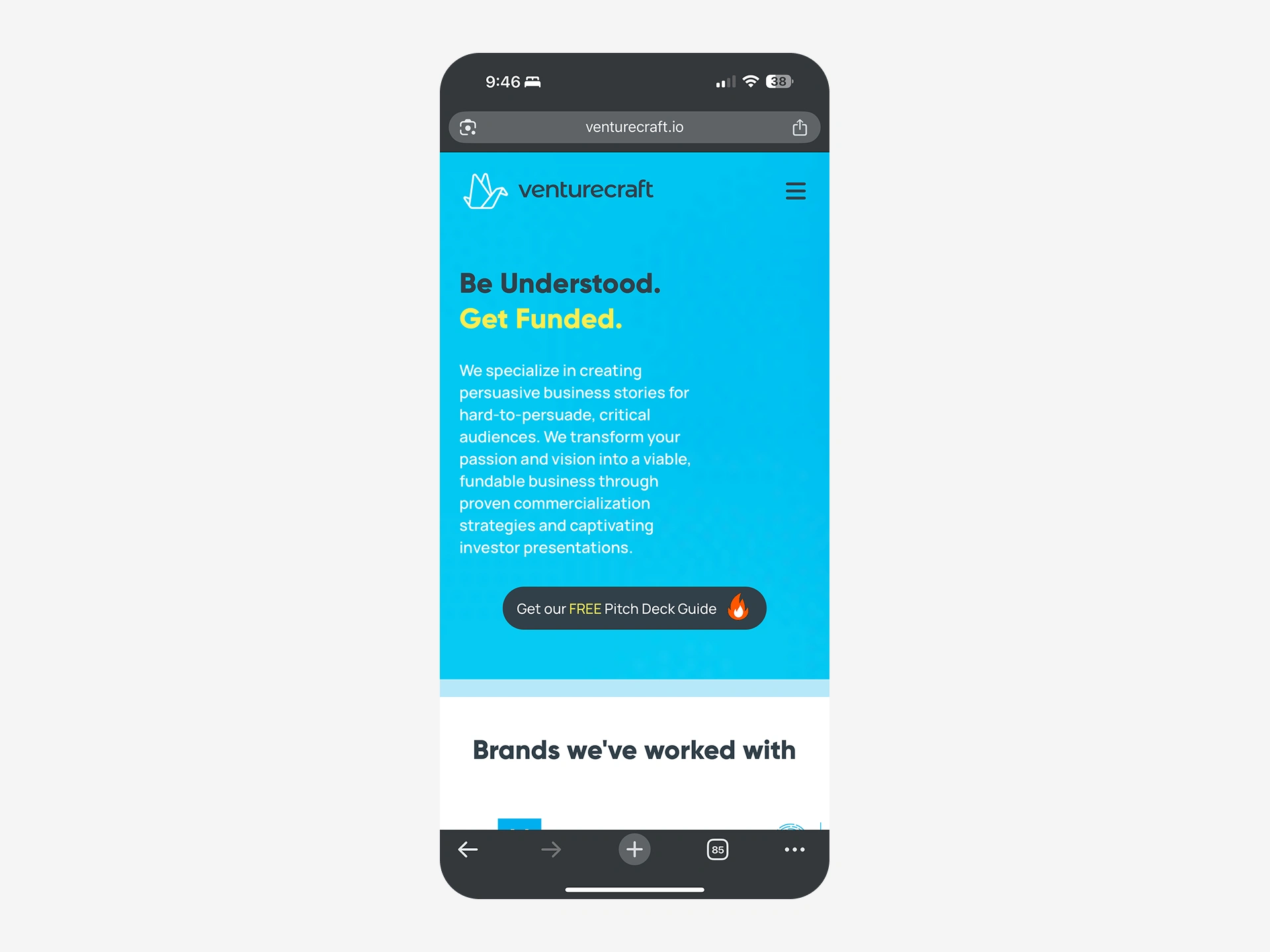
On mobile, the same story becomes a carousel animation. Instead of squeezing the full isometric scene into a phone, each carousel frame focuses on one stage of the story. Visitors swipe through the scenes. Each frame has a clear caption, a progress indicator, and enough breathing room to be understood. The isometric style remains, but the composition is adapted for a narrow screen. It is not a mini desktop. It is a mobile-native way to tell the same story.
Take a closer look.
Need animation like this?
Thank you for Watching!
Like this project
Posted Oct 27, 2026
VentureCraft is a strategic consulting firm focused on the commercialization of technology. I help them to create a stunning animation for the hero image.