Lotly : Brand Identity & Icon System

Amirul Hakim


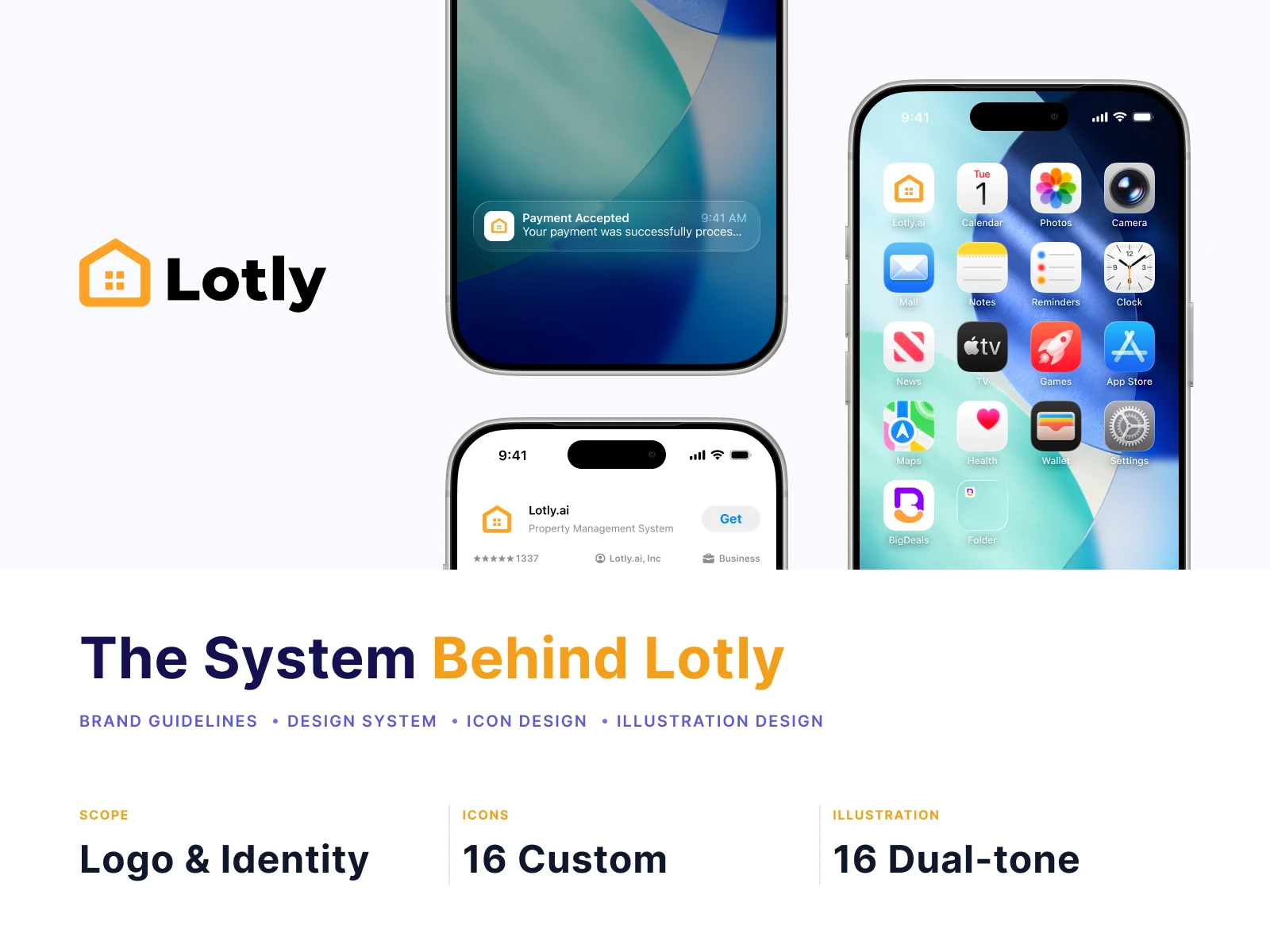
A product is only as good as its smallest parts.
Every pixel here — from the house in the logo to the key icon in the sidebar — was designed to carry the same promise: clear, trustworthy, and built for humans.
The Logo
Friendly Innovation
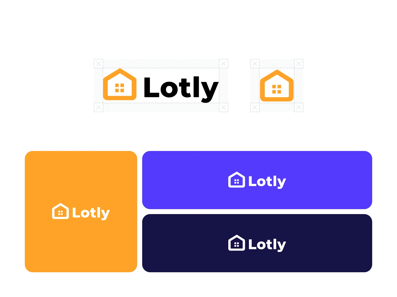
A clean, trustworthy identity that bridges complex technology (AI) and human comfort (Home).
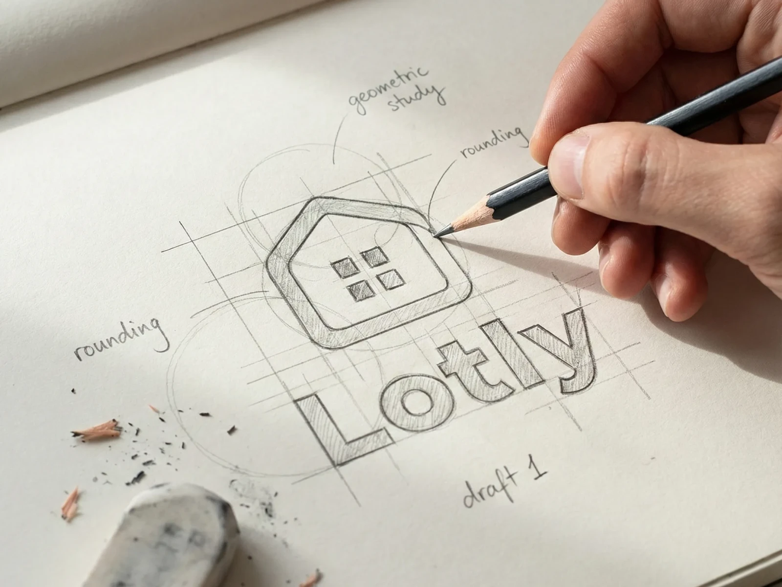
The symbol combines four pixels — representing digital intelligence — inside a house form.
Neither cold nor naïve. Exactly in between.
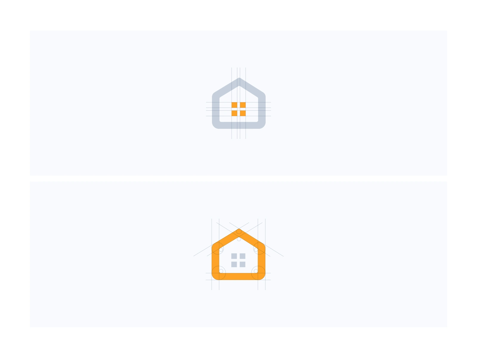
Philosophy Behind 4 Square
The symbol is a combination of four pixels and a house. The pixels represent digital, innovation, and technology, while the house represents a place to live
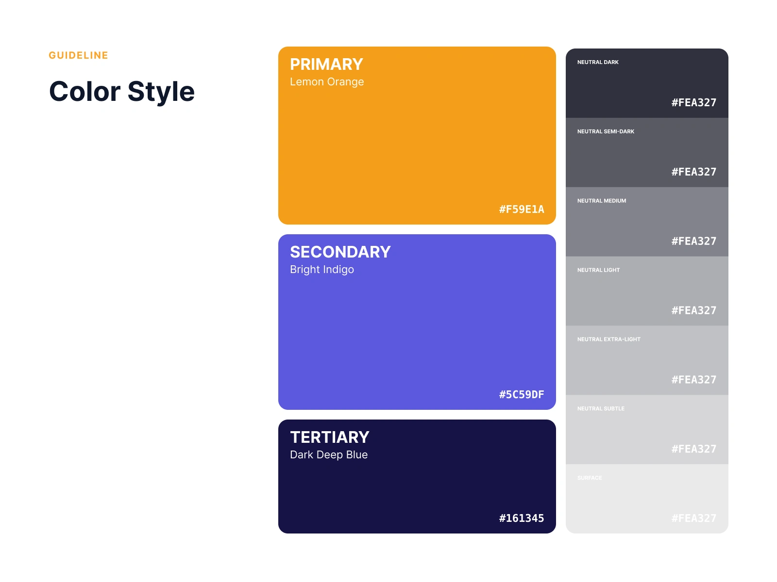
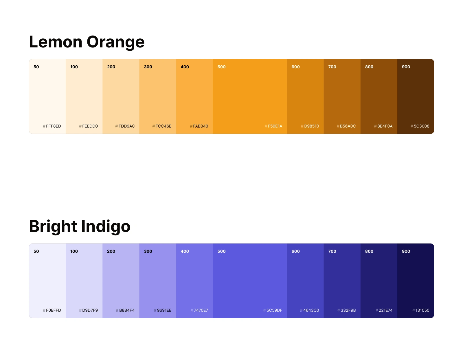
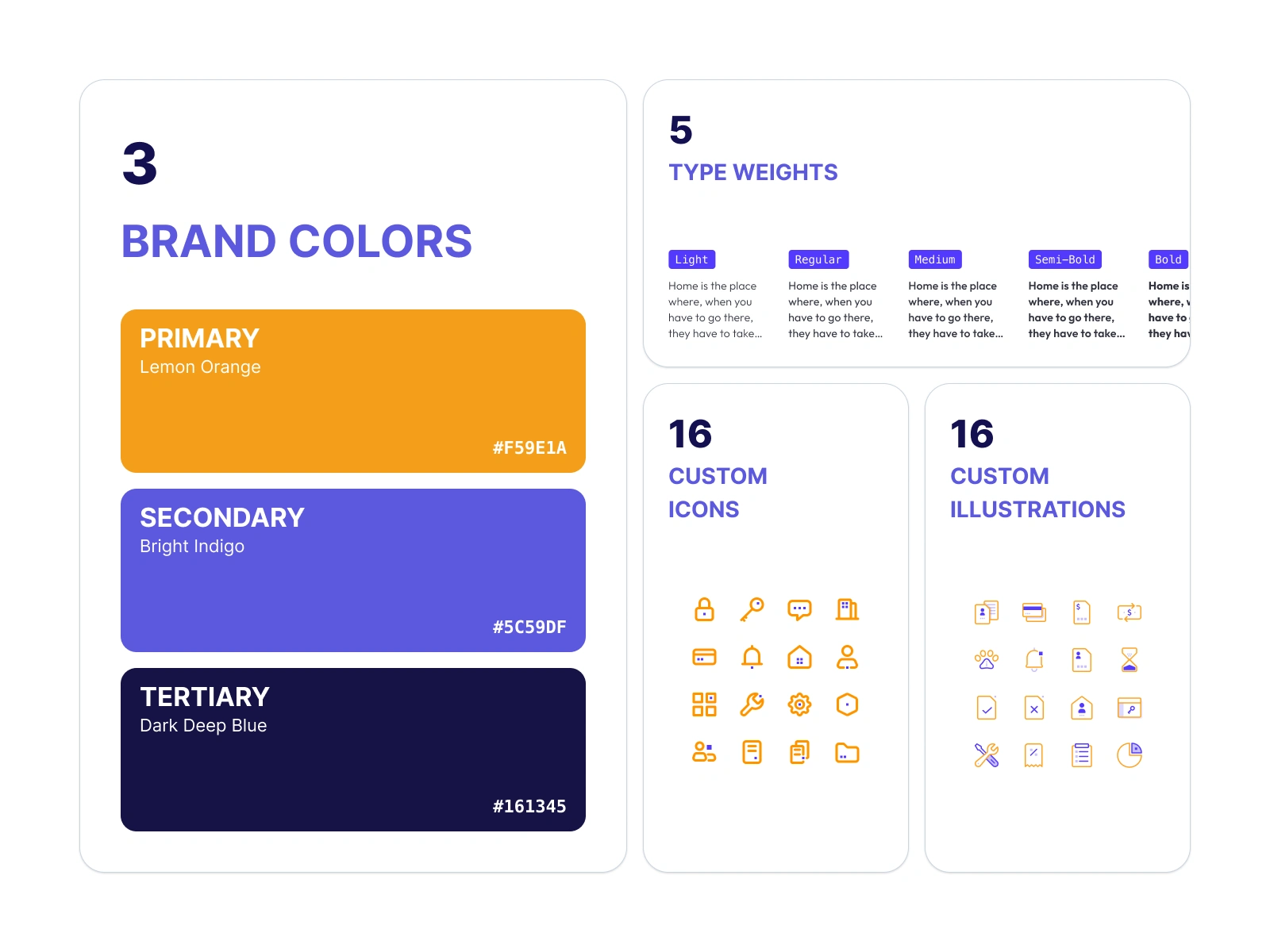
Three Colors.
One Personality.
Orange communicates warmth and approachability —
it belongs to the owner who needs a product that feels human, not corporate.
Indigo signals intelligence and trust —
it surfaces wherever AI is thinking. Navy anchors the entire system in authority and depth.
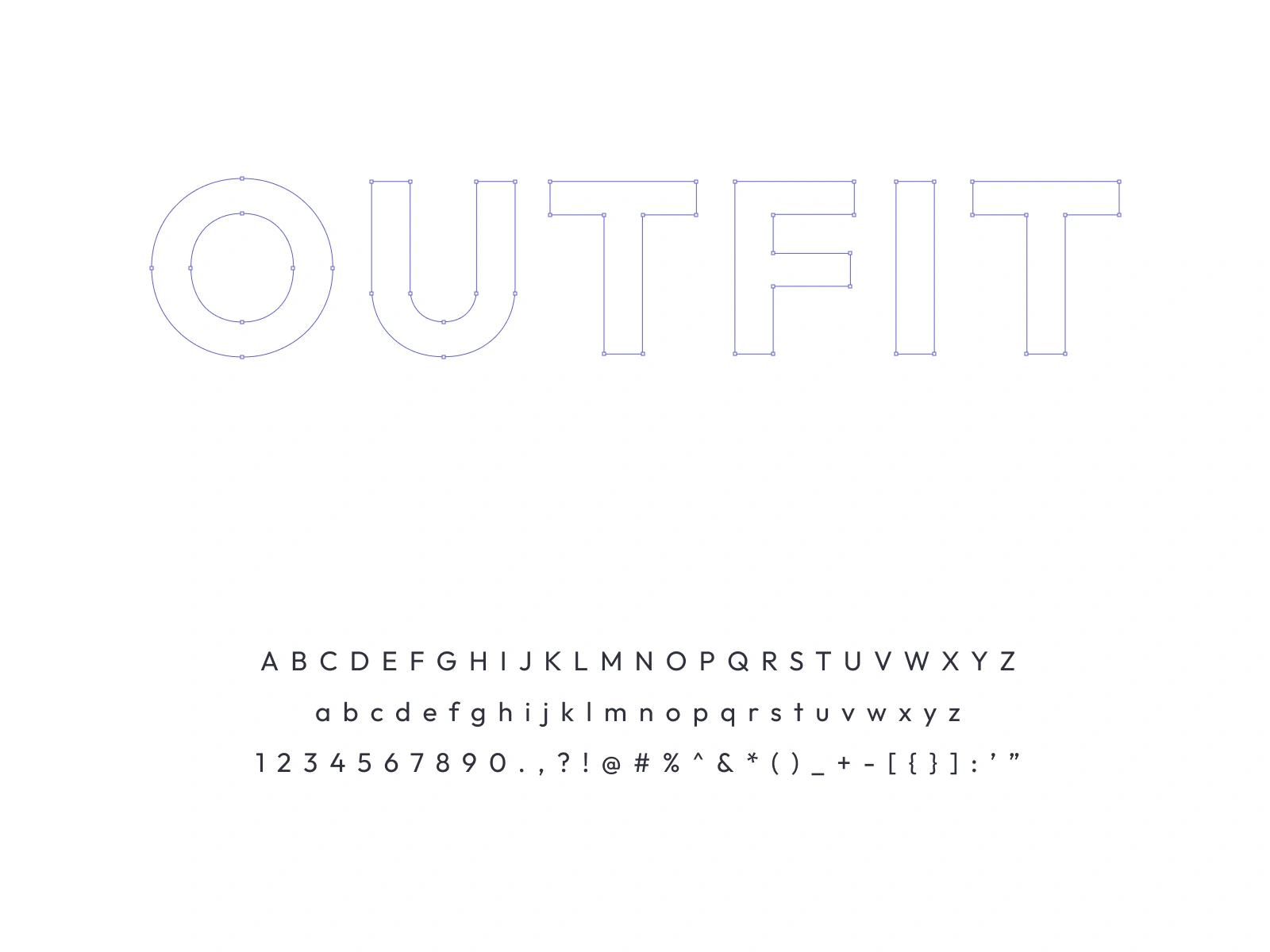
Outfit.
Five Weights.
Outfit is geometric, modern, and broadly legible —
properties that translate directly to the product's core promise. It reads clearly at 9px in a table cell and holds presence at 52px in a hero. It never shouts. It never whispers. It just communicates.
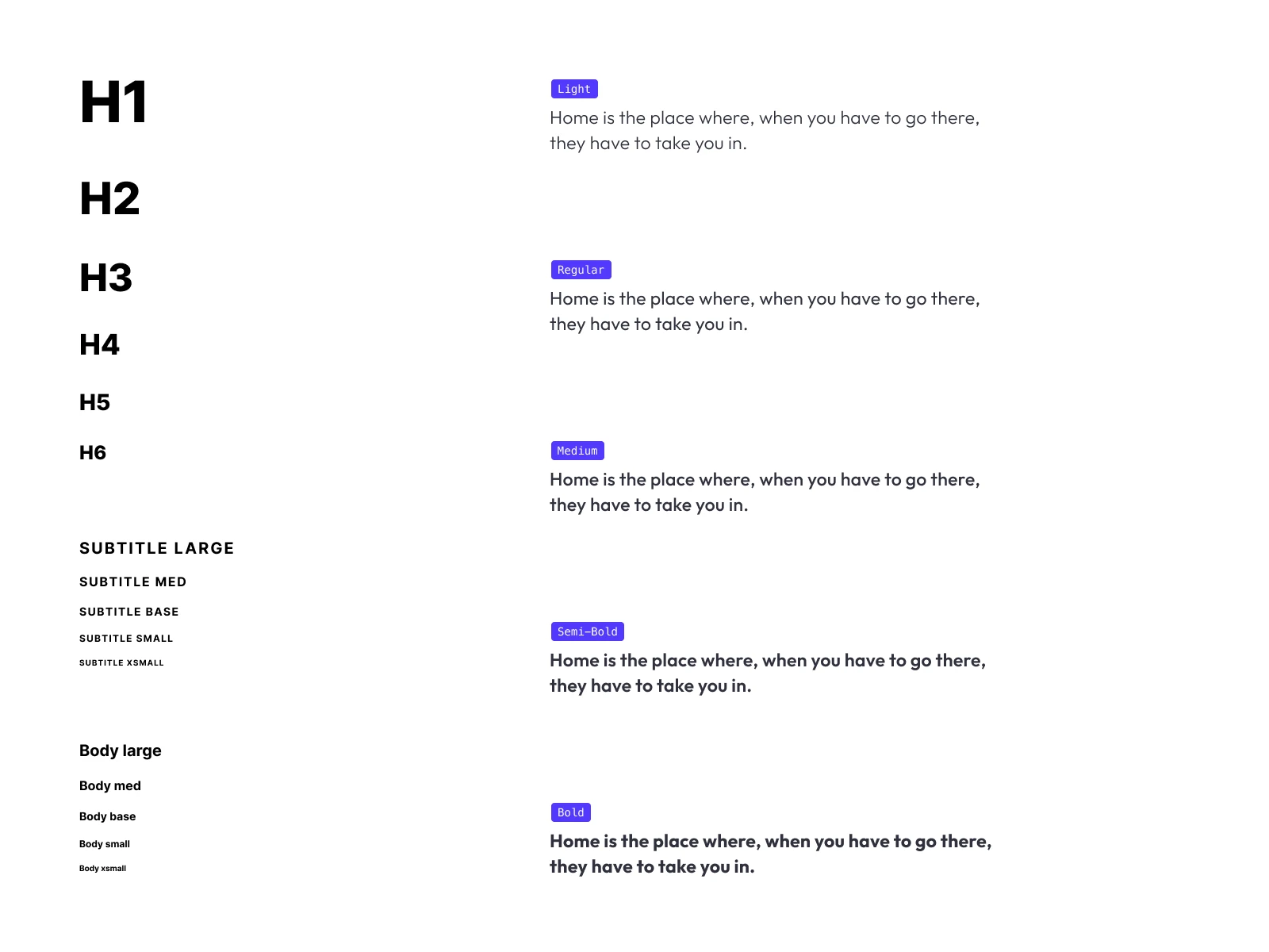
Technical Note
Here is a quick peek behind the curtain on why we chose the 'Outfit' typeface:
Crystal-clear readability
your users' eyes will thank us
Lightning-fast load times
because patience might be a virtue, but speed is definitely better
Google Fonts availability,
making it super accessible and an absolute breeze to implement
The perfect vibe—
it effortlessly delivers a modern, beautifully simple, and incredibly welcoming aesthetic for the reader
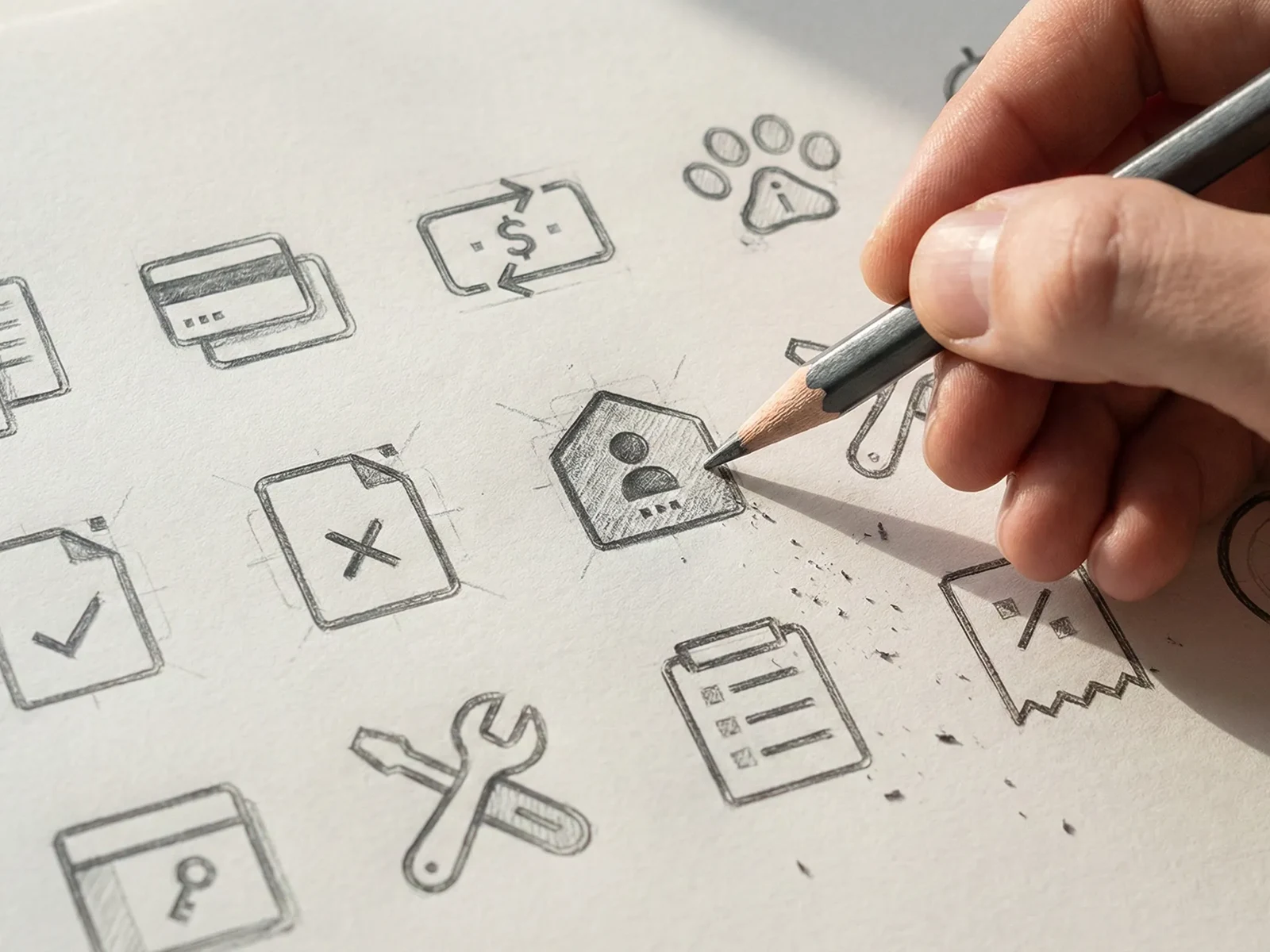
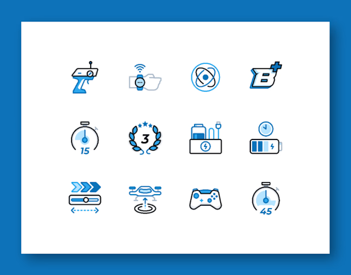
No Generic Clip-Art.
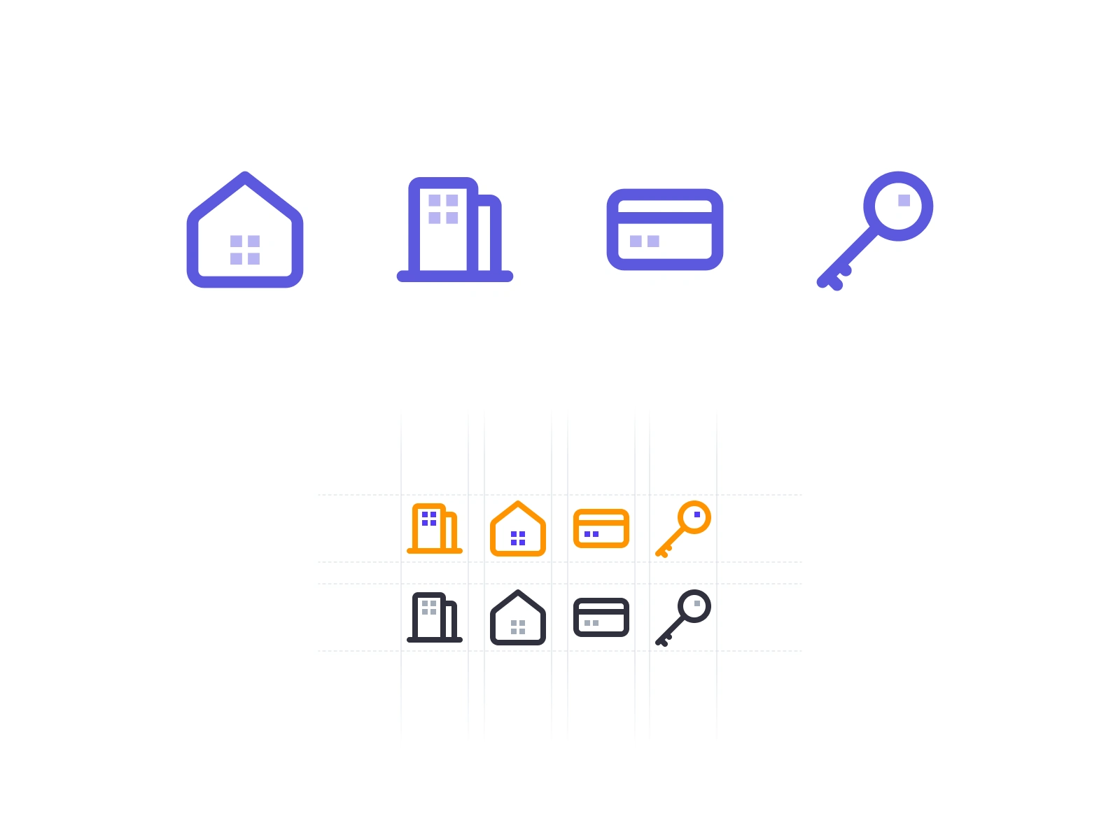
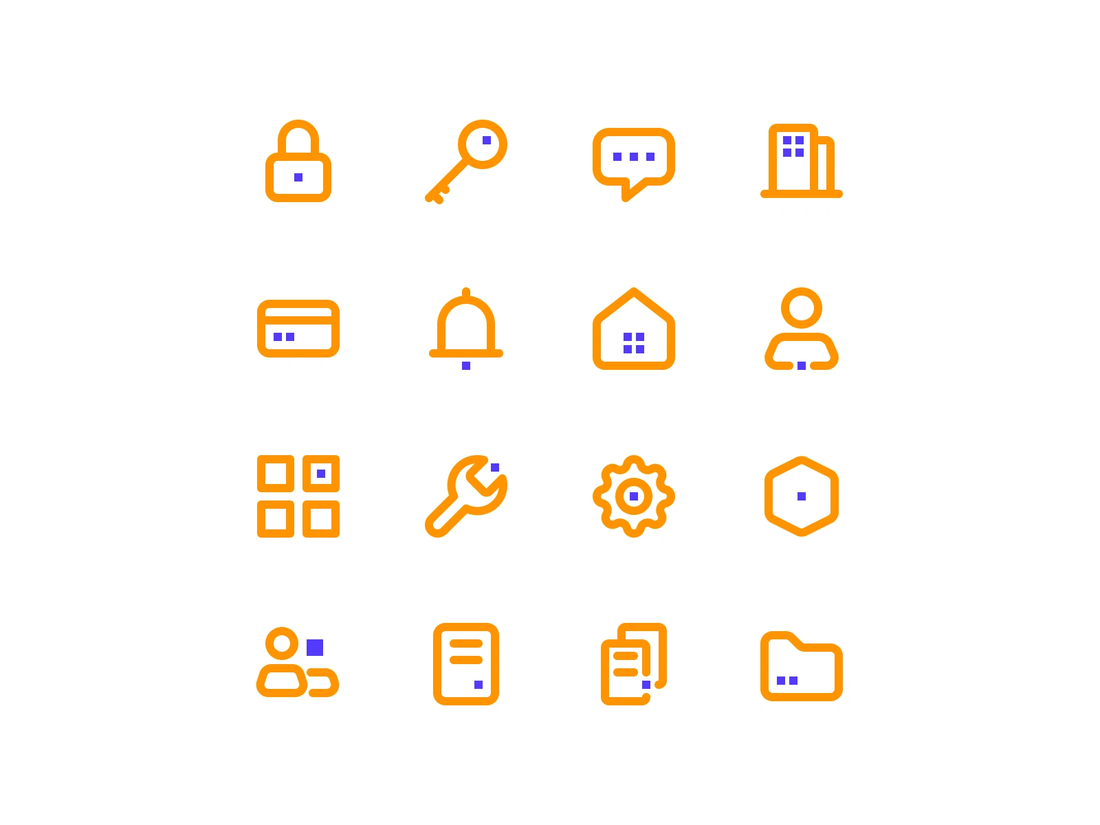
Every icon was drawn from scratch to align with the logo's personality :
soft, rounded strokes that feel approachable but structured.
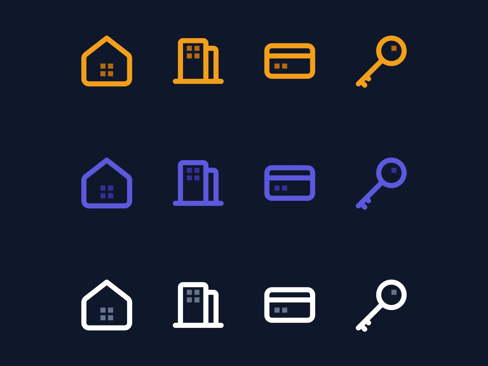
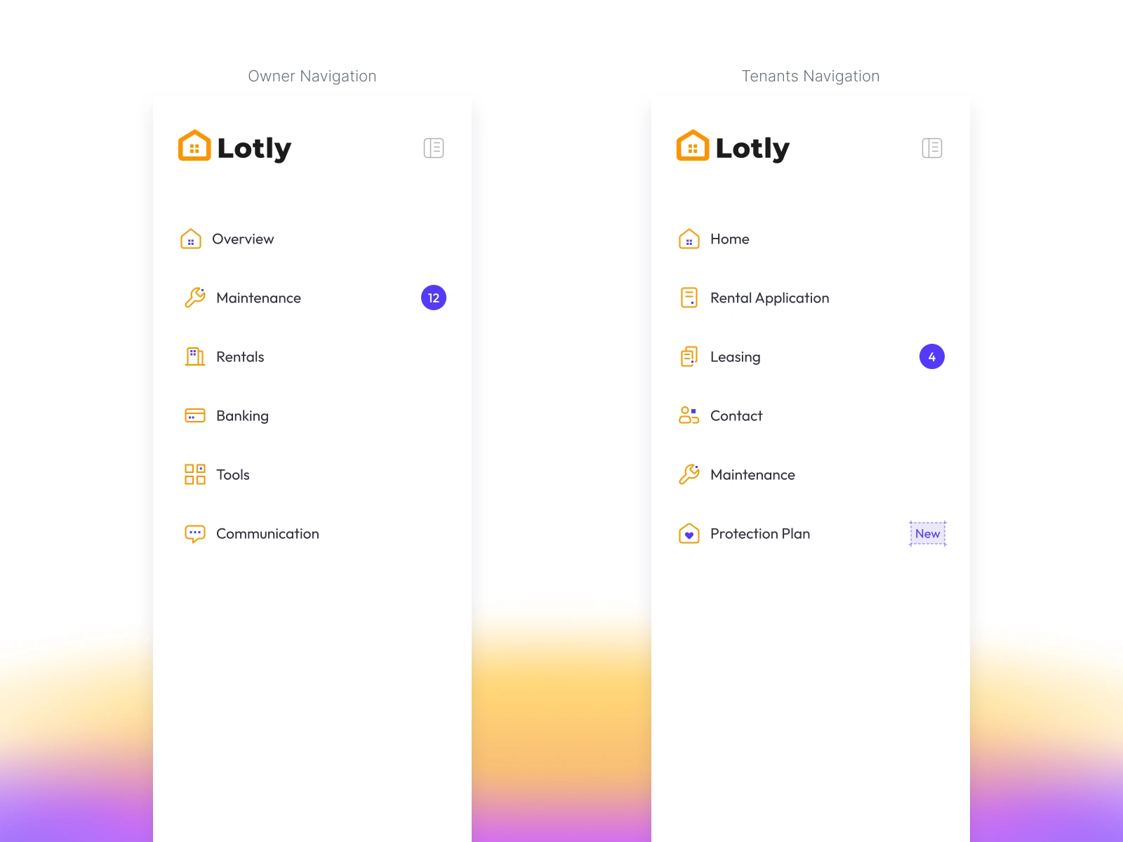
Active states use brand colors.
Inactive states pull back to dark.
The system communicates state before the user reads a label.
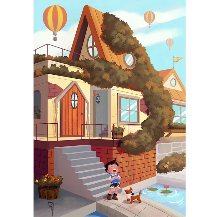
Orange Leads.
Indigo Supports.
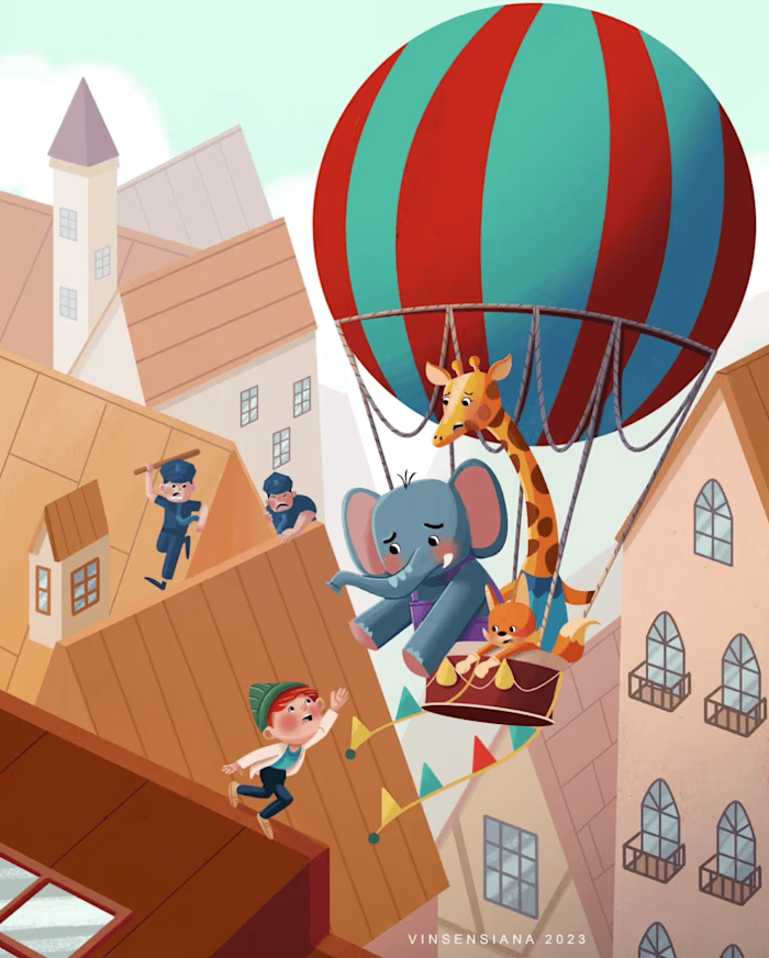
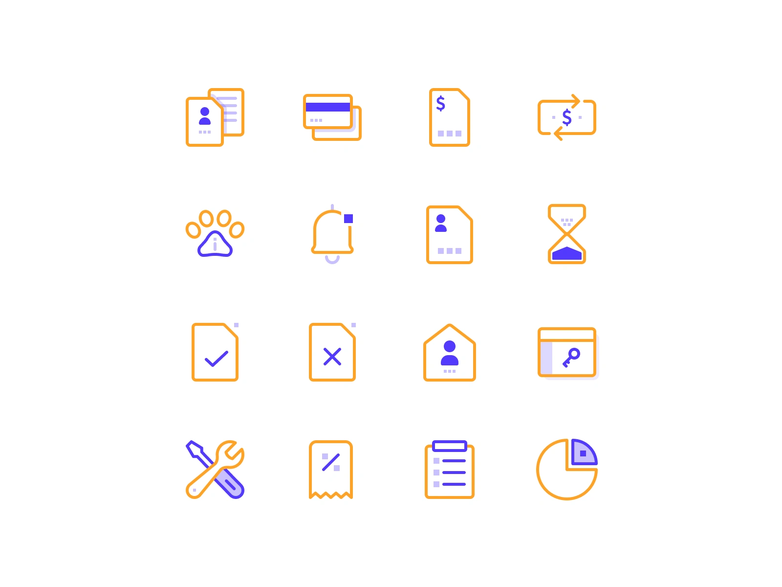
Every illustration uses exactly two colors from the brand palette —
Lemon Orange as the primary form, Bright Indigo as the accent detail.
No gradients. No photography.
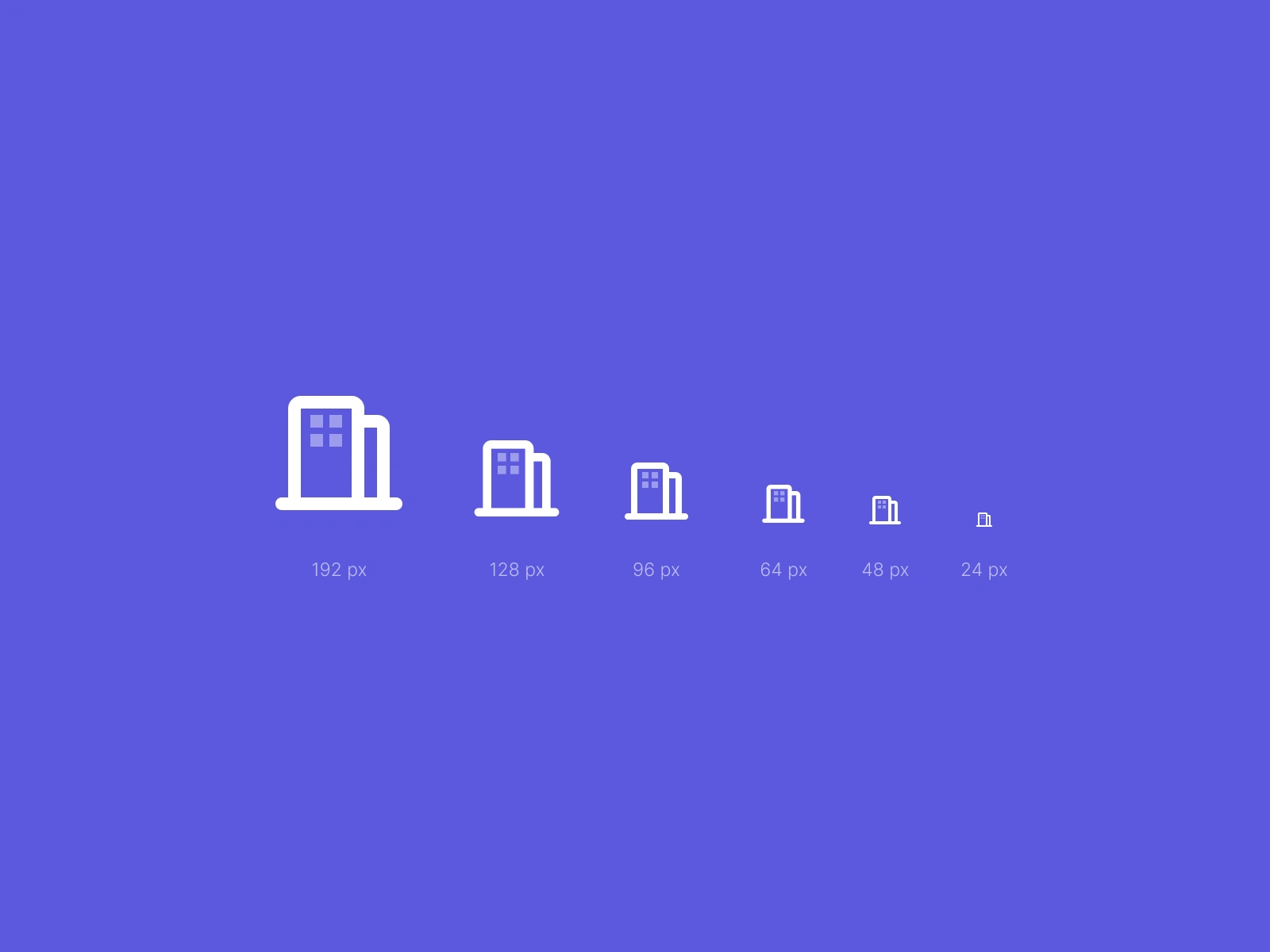
Just a consistent visual language that scales from a 40px empty state to a full onboarding screen.
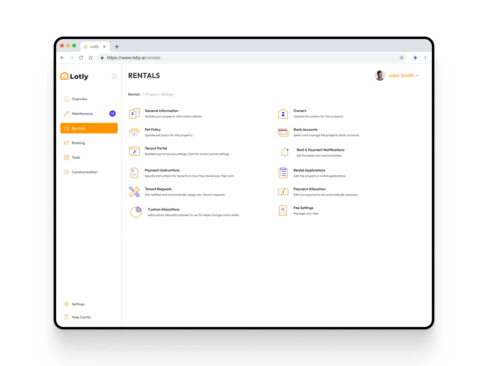
Design Principle
A product is only as good as its smallest parts.
Every illustration carries the same palette,
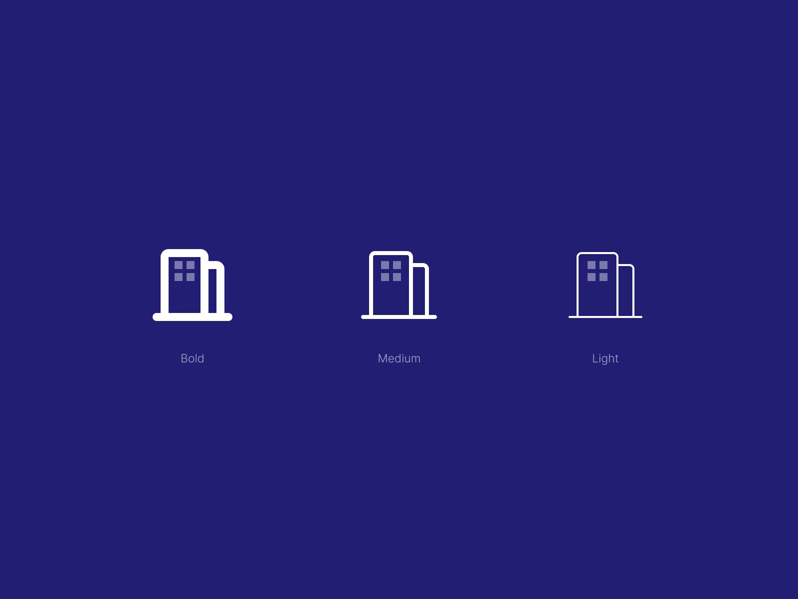
the same stroke weight, the same emotional register —
so that when a user moves from an empty state to a full dashboard,
the visual language never breaks the spell of consistency.
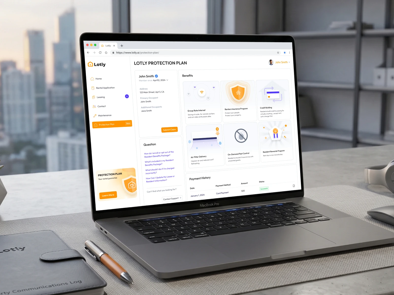
What Was Built
Brand
Logo · Color System · Typography · Icon Library · Illustration
UI/UX
Owner Dashboard · Tenant Portal · Dual Navigation · Architecture Design
Features
AI Screening · E-Sign · Fraud Prevention · Protection Plan
Design System
Component Library · Icon Set · Interaction Patterns · Token Variables
Tools
Figma · Jitter · Framer · Adobe Illustrator · Adobe Photoshop · Procreate · LottieLabs
Who Works On This Project
Principle Designer · Icon Designer · Illustration Designer
Design System · UX Designer
Like this project
Posted Oct 27, 2026
The hardest part of building a brand for a proptech product isn't choosing colors. It's deciding what the product is trying to feel like to two very different people — and then making sure both of them trust it. Lotly serves landlords who need control, and tenants who need reassurance. Those aren't the same emotional register. A brand that only speaks to one will feel off to the other — either too corporate and transactional, or too soft to carry operational weight. The system had to hold both without collapsing into a generic "friendly SaaS" aesthetic that says nothing to anyone.