Kalai Logo Design and Branding

Potara Studio


The Client
Our client have goals to help companies get their documents in order. Modern foundations, customized AI, and a focus on making work processes easier across the board.
Challenge
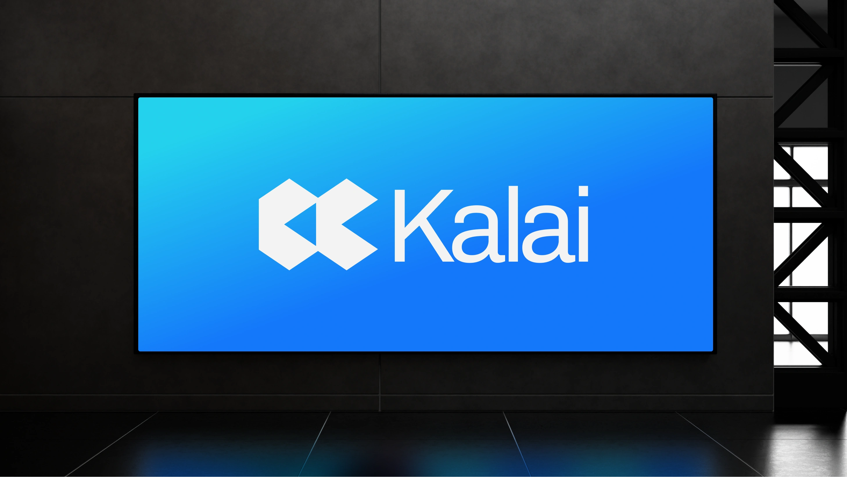
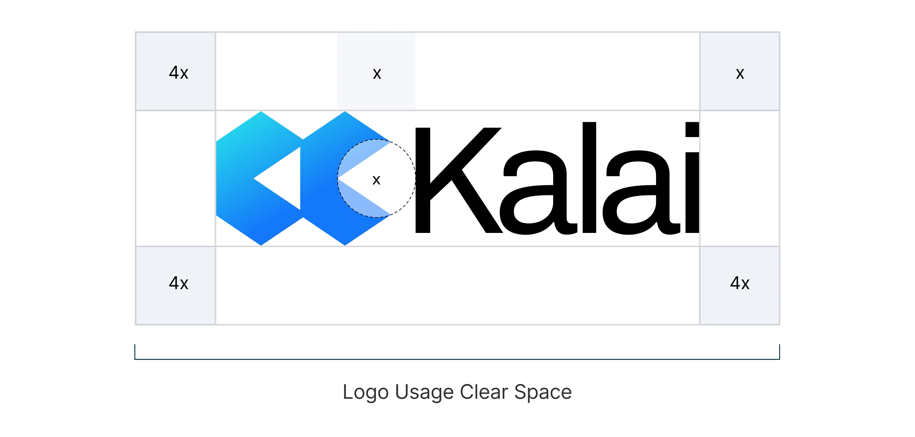
Kalai brings smart technology and complex documents together in one place, making everything easier to access. That's why the logo needed to reflect both progress and simplicity, without losing sight of what the brand actually stands for.
Our Approach
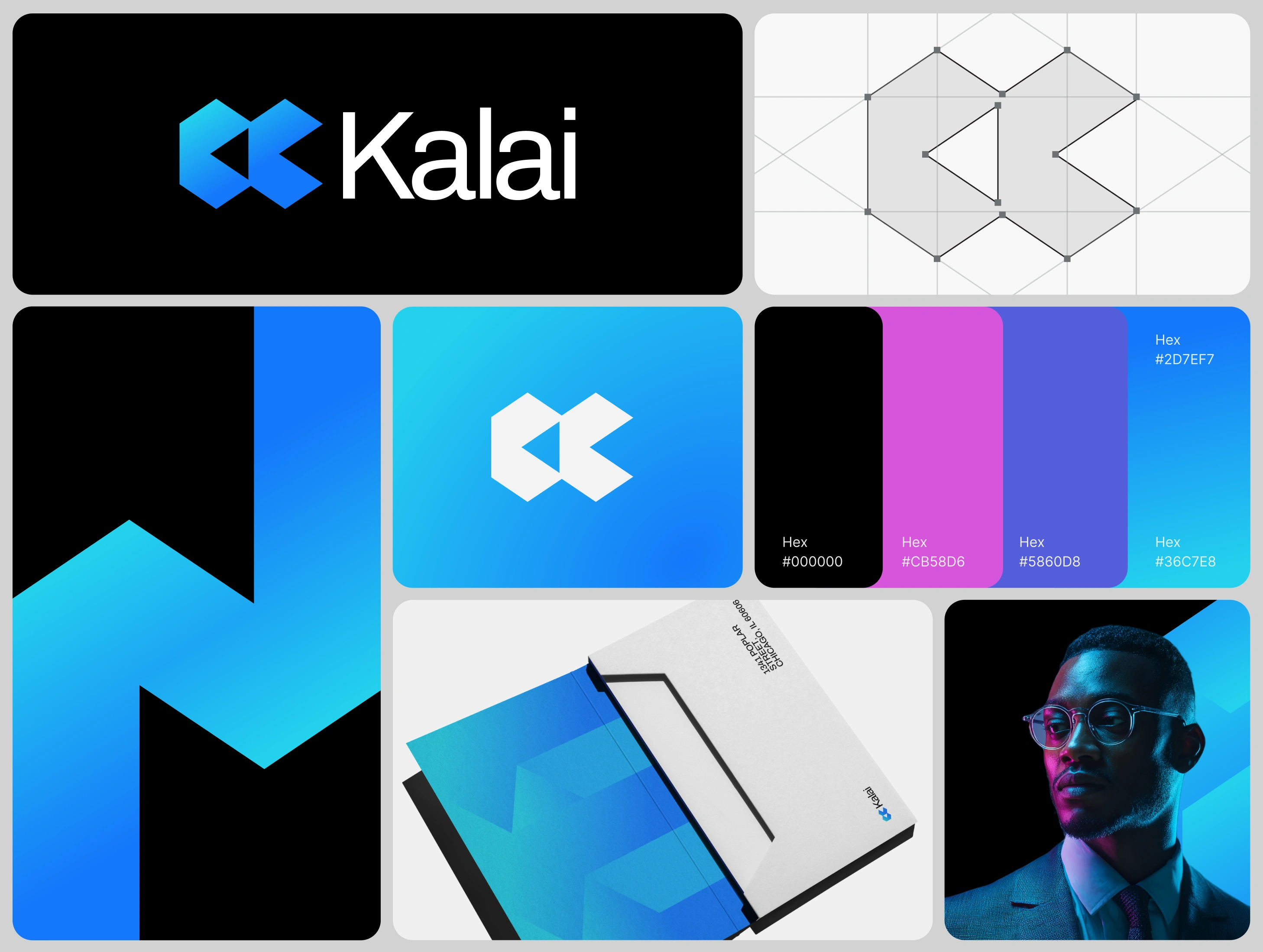
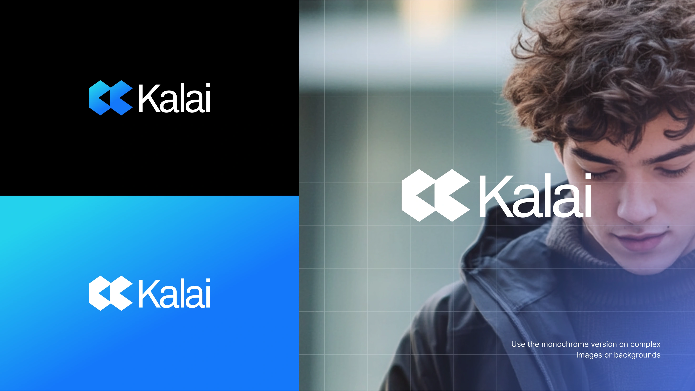
We built this logo from two interlocking geometric blocks forming a subtle K-shaped structure, symbolizing connection, precision, and forward progression. Each element locks into place, representing how Kalai integrates rules, layouts, and governance into one unified system.
Scope:
Wordmark, logomark
Brand guideline
Colours
Typography
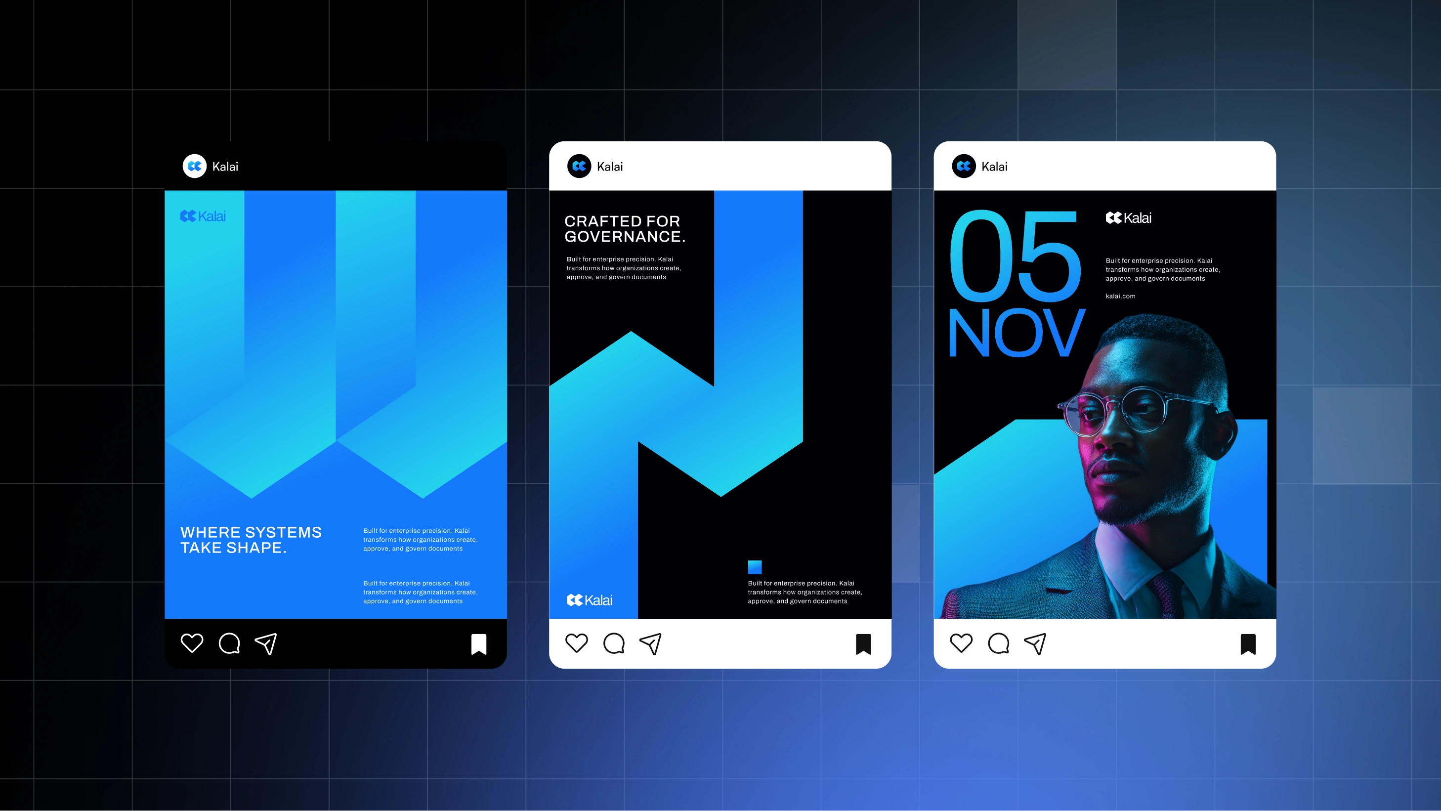
Social asset
Deck templates
Posters
Pitch Decks
Logo Design
Primary Logo: a bold fusion of logomark and logotype, commands attention for maximum recognition.
Secondary Logo: a symbol of simplicity, stands alone for clean, minimalist spaces.
The tertiary Logo: an essence in letters, offers text-centric flexibility, tailored for diverse brand applications
Construction:
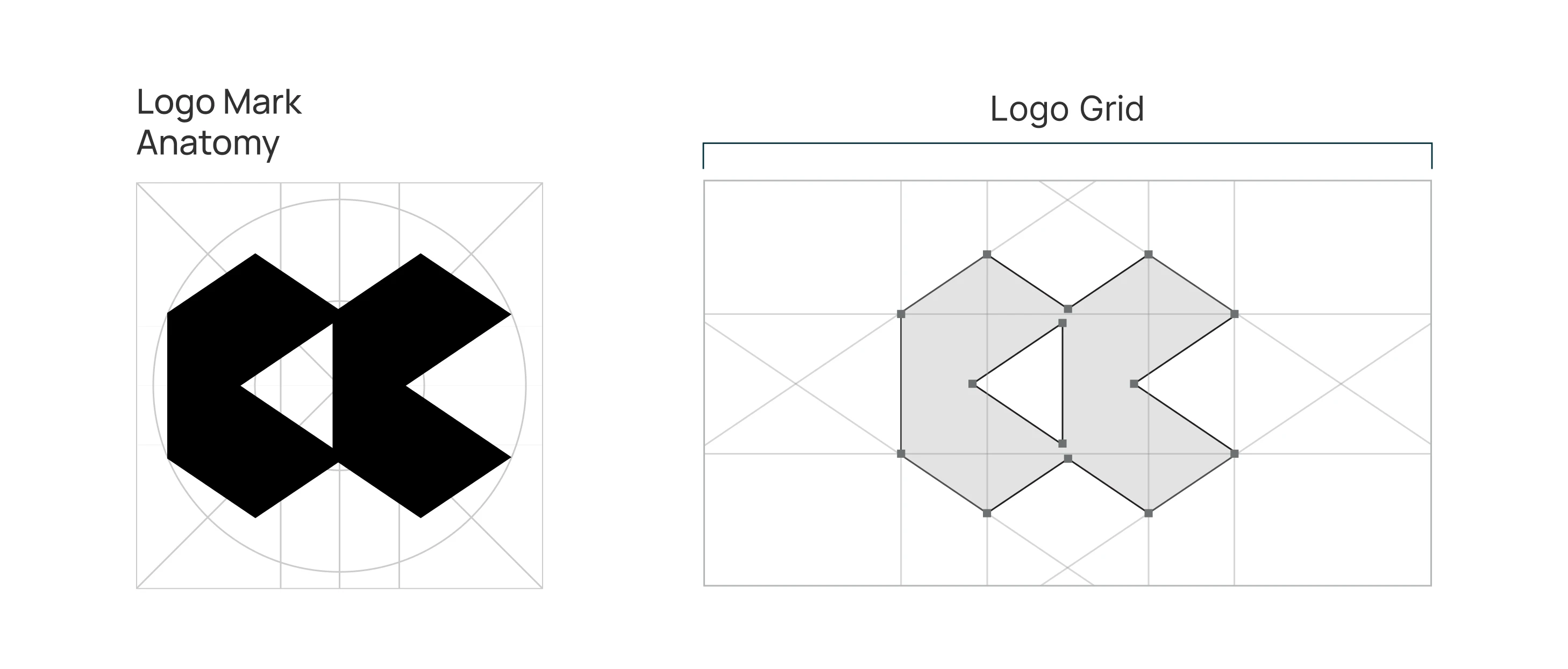
Infinity Formation - the logo's foundation is derived from the infinity loop, representing continuity, connection, and timeless relationships.
Double "O" Initial - reinforcing the name Haloop
Interlocking Geometry - two balanced loops intersect to express unity, balance, and mutual exchange
Colour Palette and Fonts
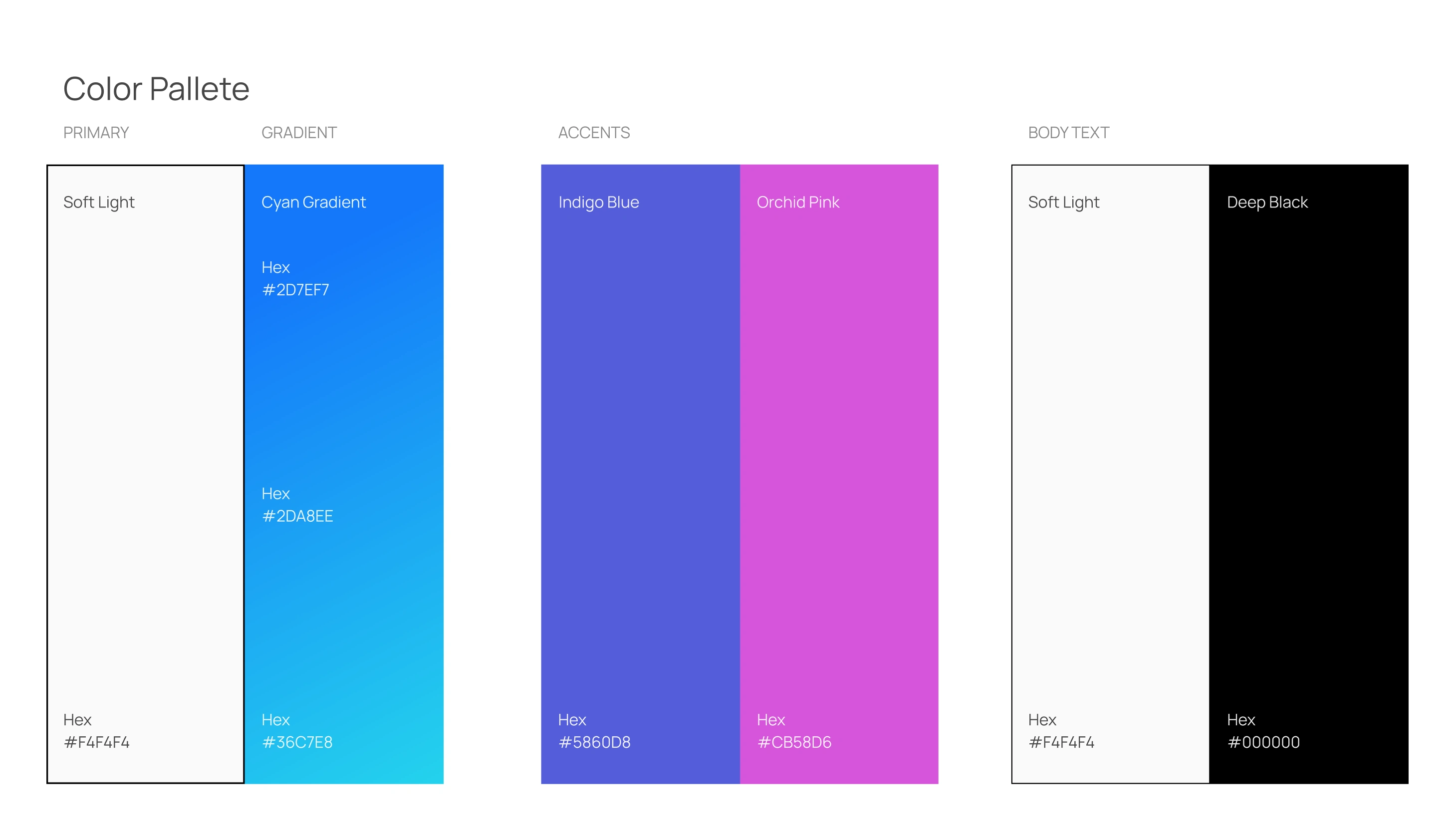
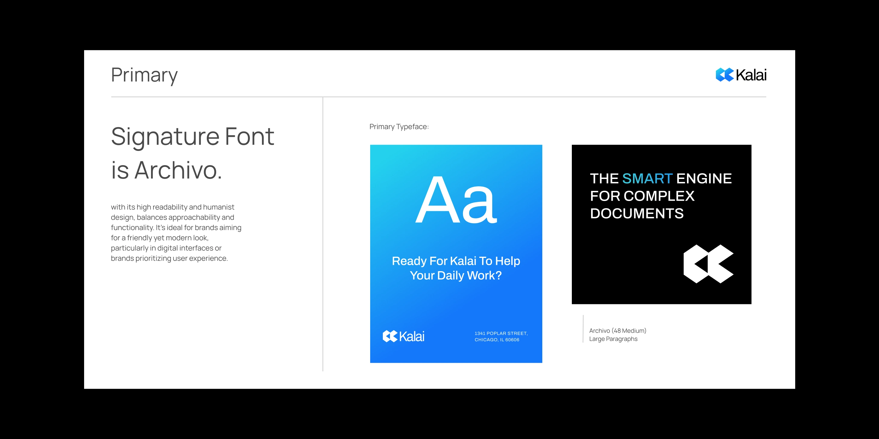
The Archivo font was chosen for its high readability and humanistic design, balancing accessibility and functionality. This font is ideal for brands seeking a friendly modern look, especially for digital interfaces or brands that prioritize user experience.
Like this project
Posted May 28, 2026
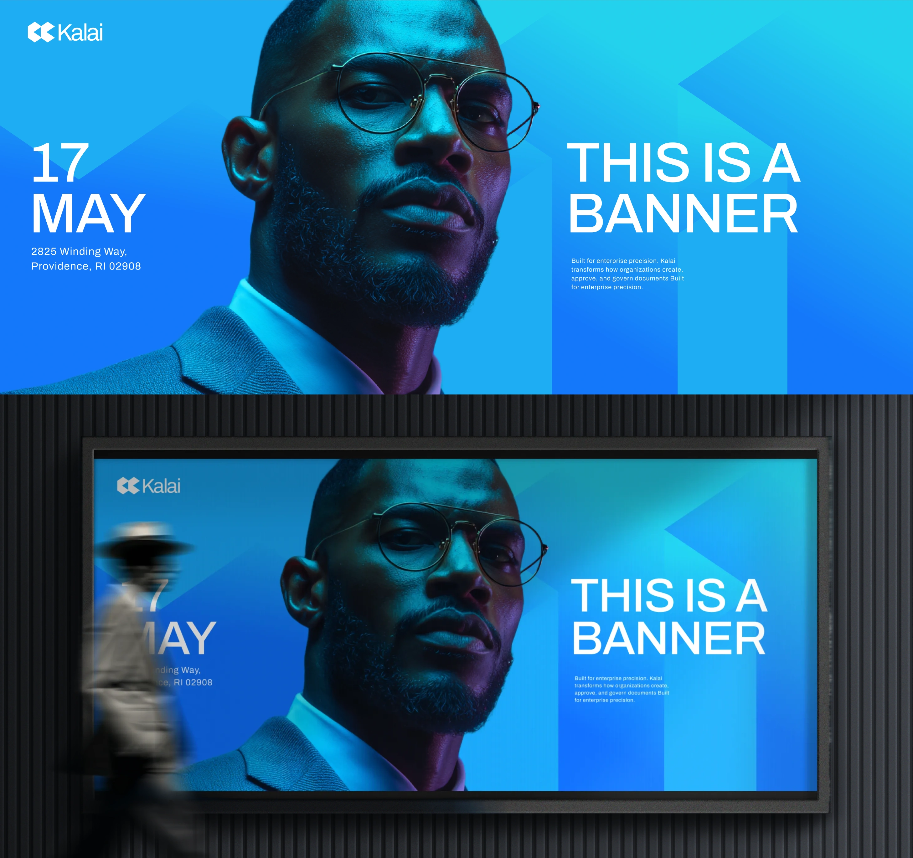
Designed a progressive and simple logo for Kalai using geometric blocks.