Opalene Skincare Brand Identity Design
Samreen Popli
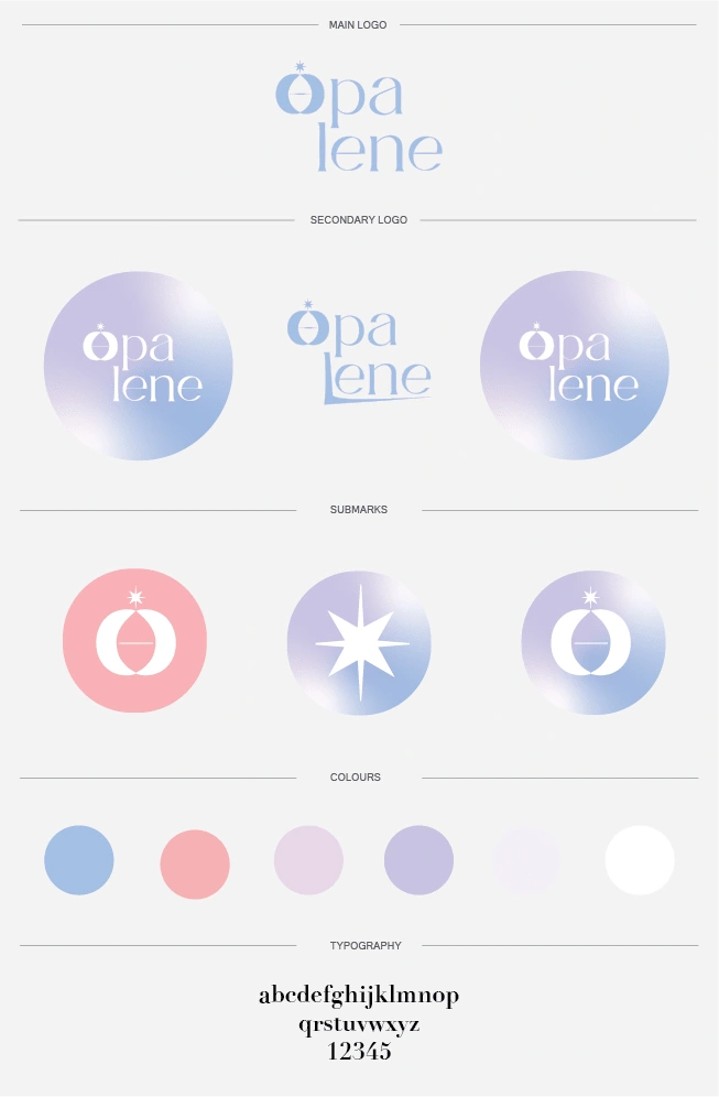
Opalene
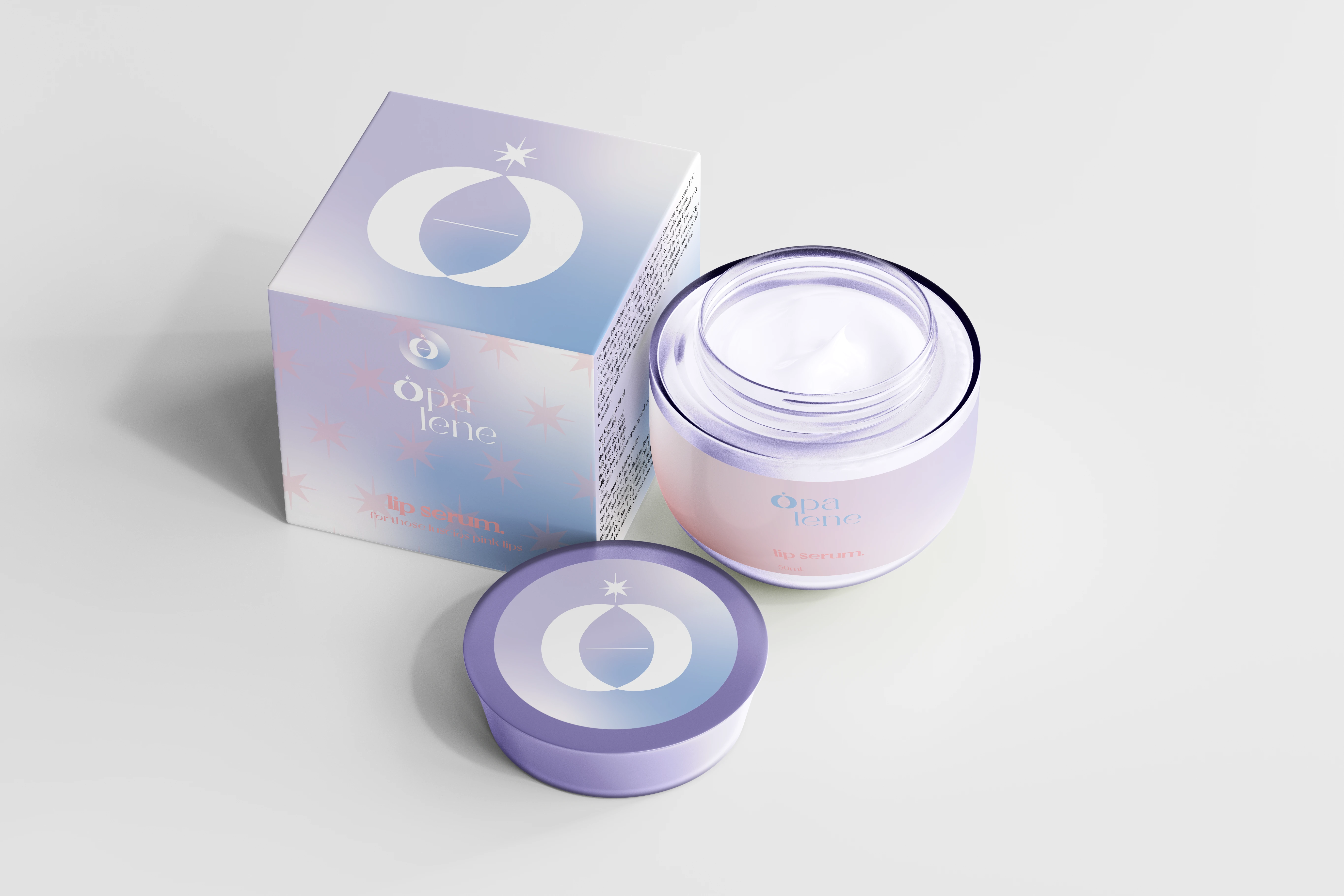
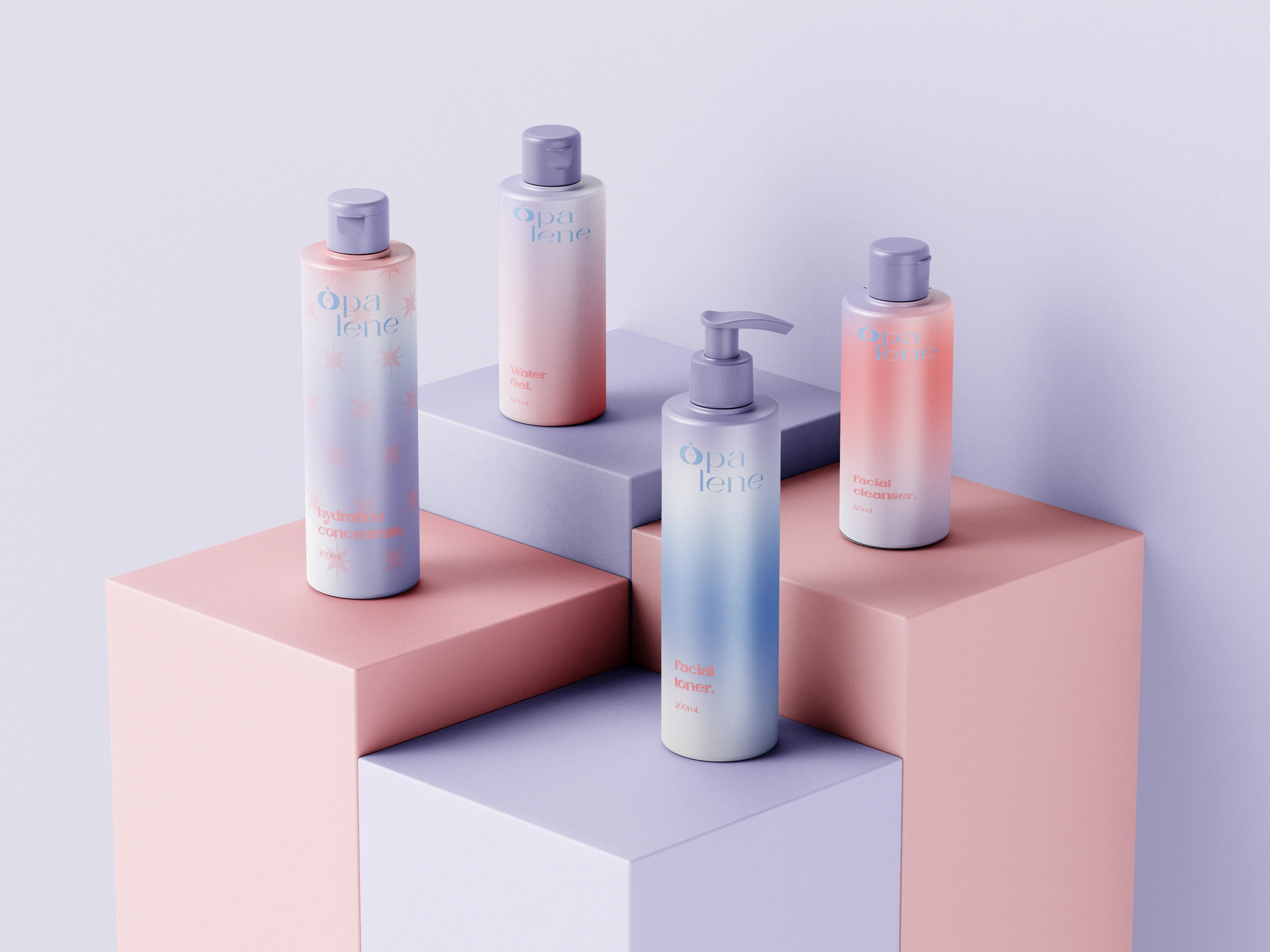
Opalene is a skincare brand that aims to represent simplicity in the delicacy that both skin and water share. The brand name "Opalene" was born after the combination of words 'Opal', a gemstone regarded a the symbol of purity and 'line' which signifies subtle healing.
About the process
The logo was created with a minimalist approach that priorities the form and purity of the product. The corporate colours are simulated as a 'shift in colours' like a rainbow which embodies the balance that the gemstone Opal signifies.
More Results
Like this project
Posted Feb 15, 2023
Opalene has been created under the brand's corporate identity and aesthetics to showcase their product in a minimalist approach following the corporate colours.