Logo & Brand Identity - SCAN

Ahmad Jan


DIRECTION — Building Confidence Into Identity
DIRECTION — Building Confidence Into Identity
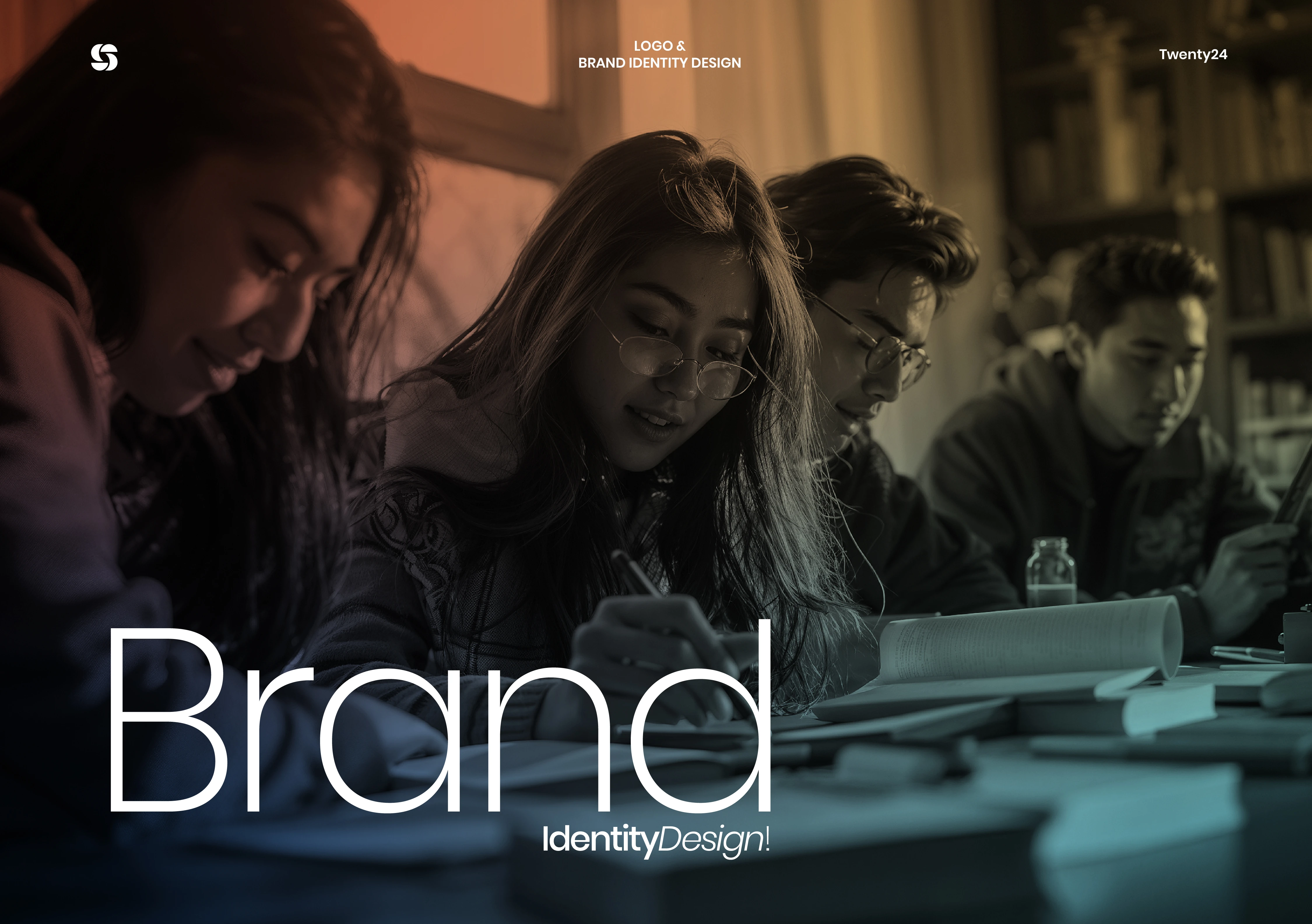
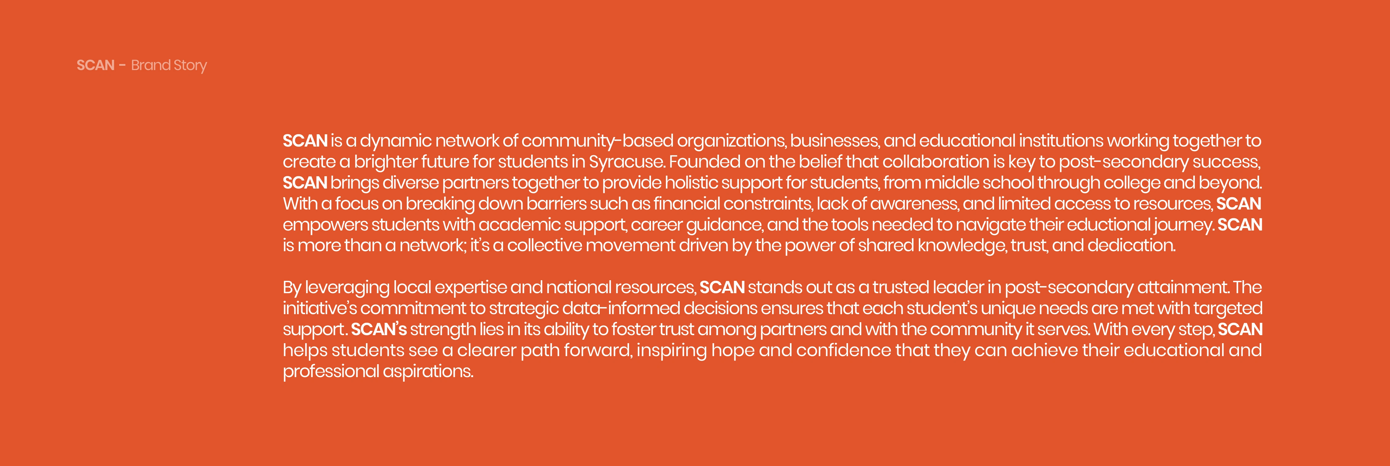
An educational institution built around one goal: helping students move forward with clarity instead of uncertainty. DIRECTION wasn’t designed to feel corporate or institutional. It was designed to feel like momentum — structured, optimistic, and visibly future-facing.
The identity had to make career guidance feel empowering instead of administrative.
The Brief
An educational institution built around one goal: helping students move forward with clarity instead of uncertainty. DIRECTION wasn’t designed to feel corporate or institutional. It was designed to feel like momentum — structured, optimistic, and visibly future-facing.
The identity had to make career guidance feel empowering instead of administrative.
The brand needed to feel trustworthy without becoming rigid. Modern without becoming trend-driven. Aspirational without sounding performative.
The tension was clear. DIRECTION wasn’t simply helping students enroll in programs. It was helping them navigate transition — from confusion into confidence, from education into opportunity, from uncertainty into direction.
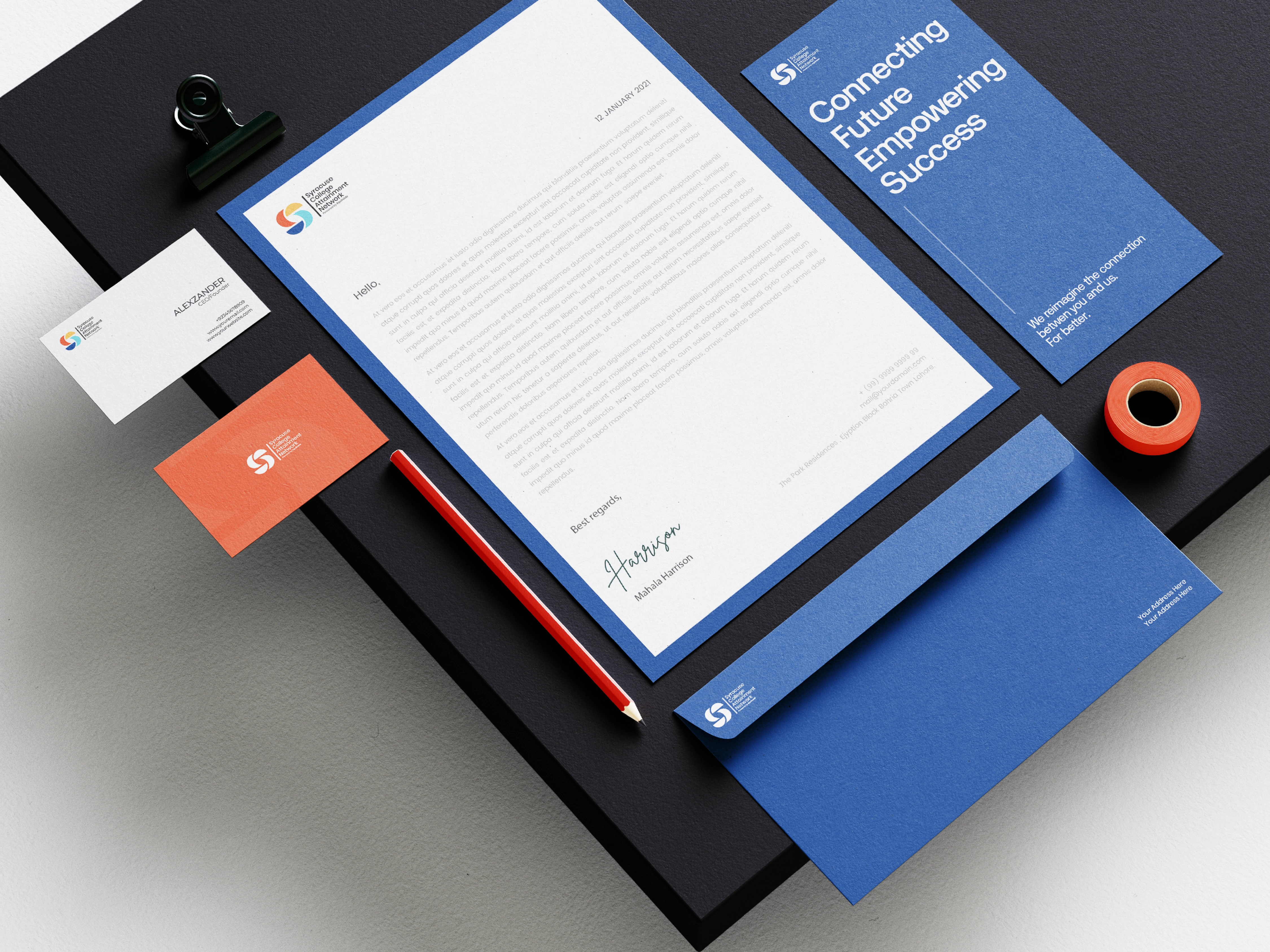
What I took on was the creation of a complete visual identity system — logo architecture, typography direction, color system, print collateral, environmental applications, and digital touchpoints — unified under one conceptual framework strong enough to scale across every interaction.
Logo System
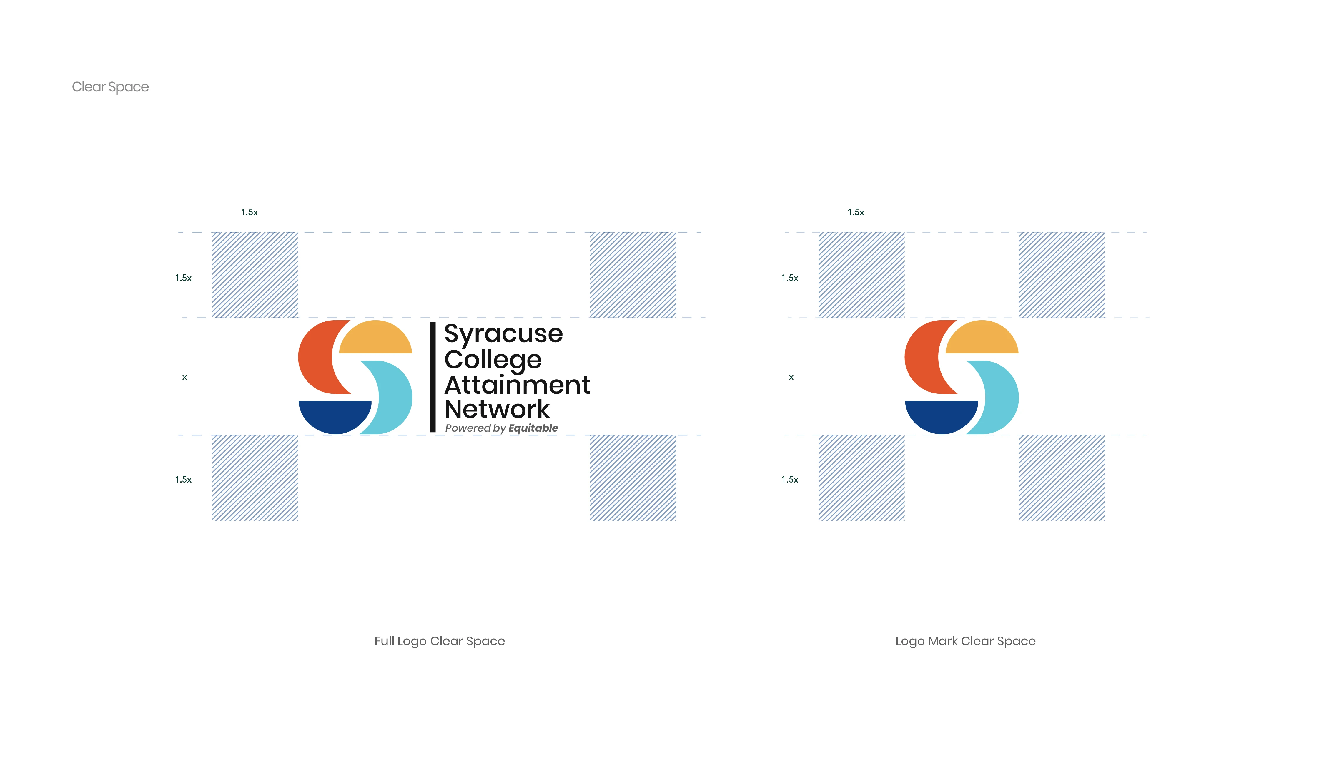
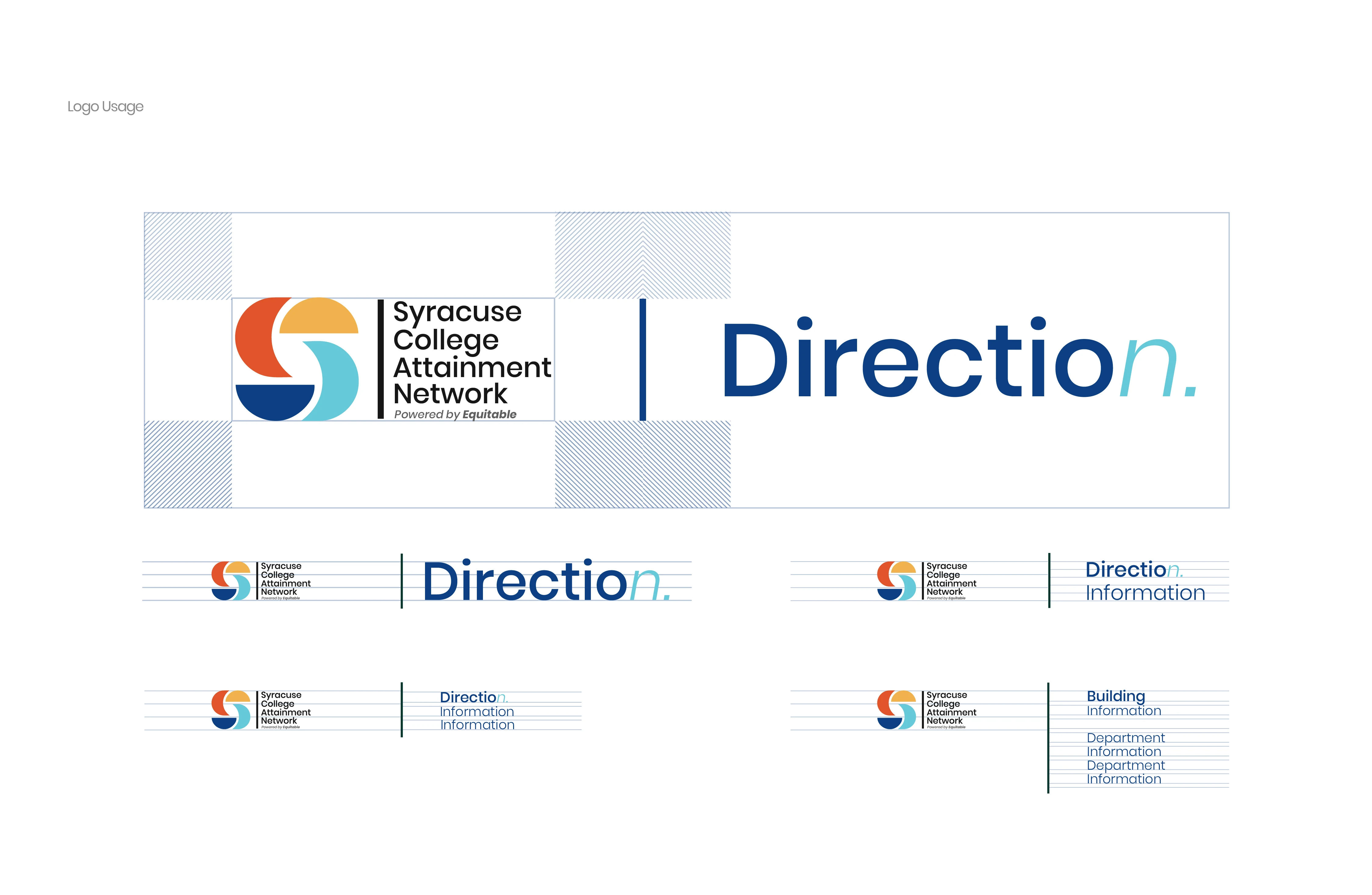
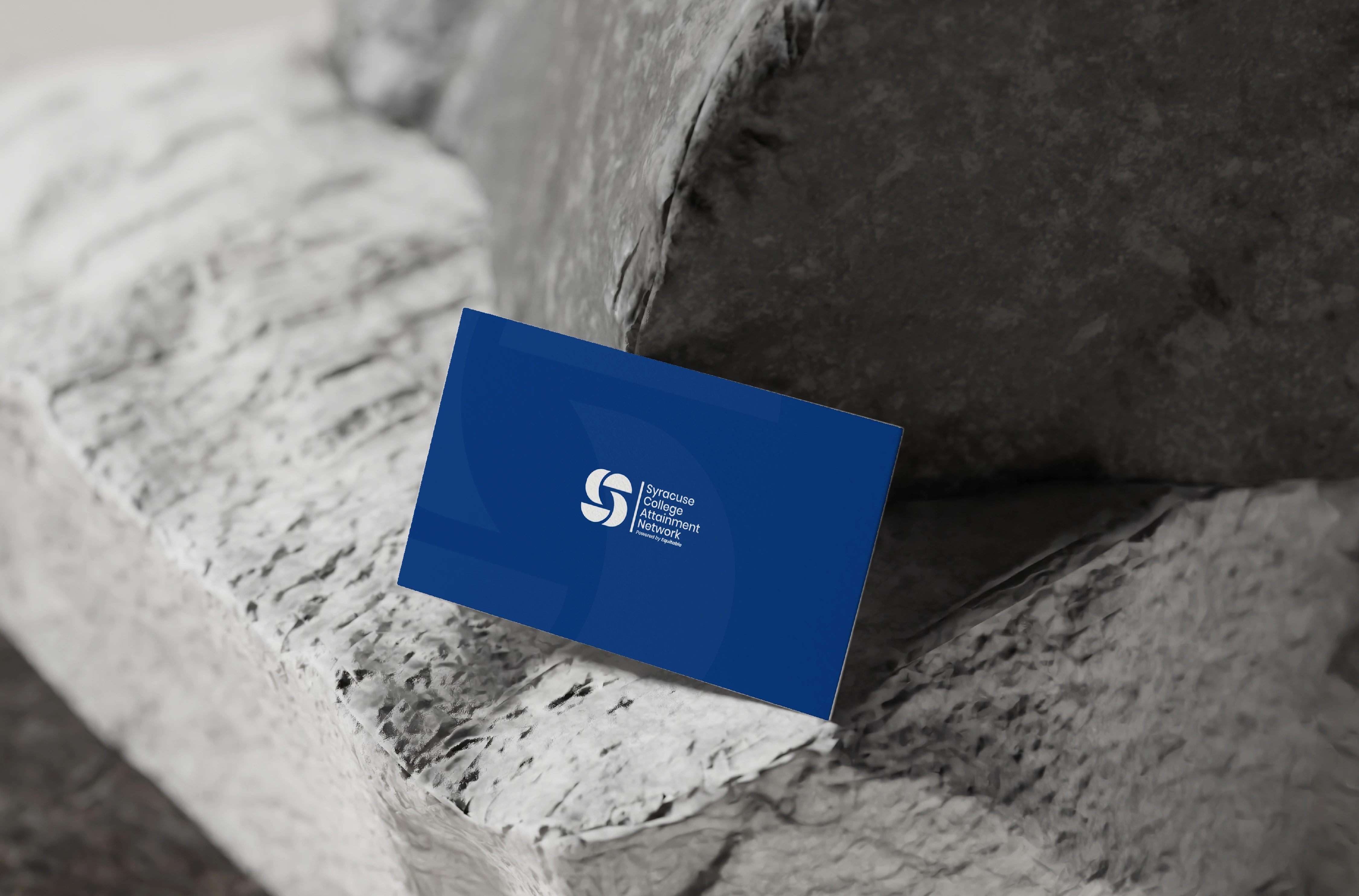
The symbol is constructed from intersecting directional curves that imply motion without becoming literal arrows. It behaves more like a navigational marker than a decorative icon. Compact, scalable, and unmistakable at small sizes, the mark holds equal weight across digital headers, stationery systems, environmental graphics, and social applications.
The typography lockup remains intentionally restrained. The identity doesn’t compete for attention — it guides it.

Brand Architecture
The visual system was built around directional movement. Layouts consistently create flow through asymmetrical balance, horizontal motion, and controlled whitespace. Thin grid lines and modular spacing structures subtly reinforce the idea of pathways and progression without overwhelming the compositions.
The system needed to feel designed, not decorated.
Typography System
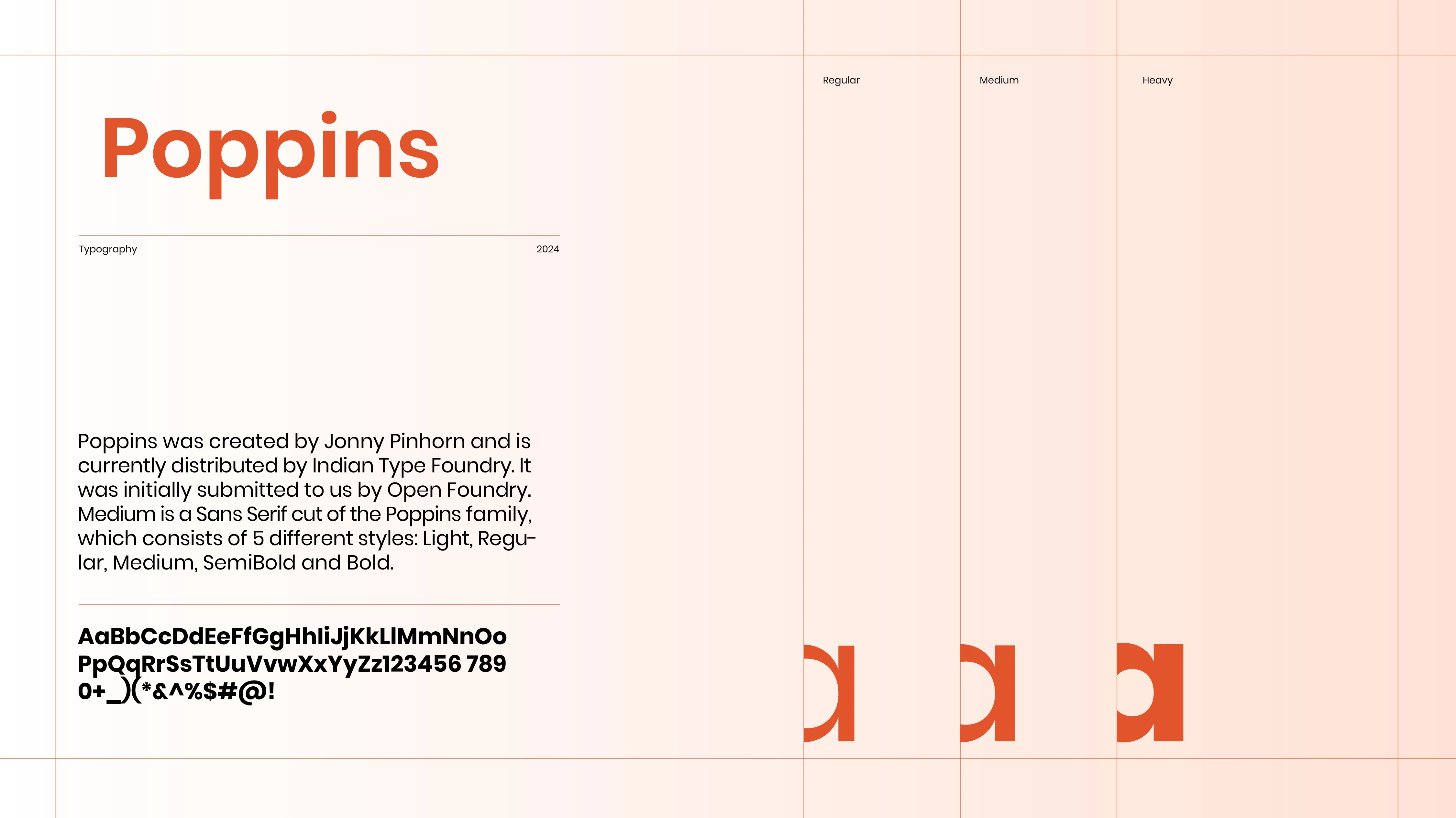
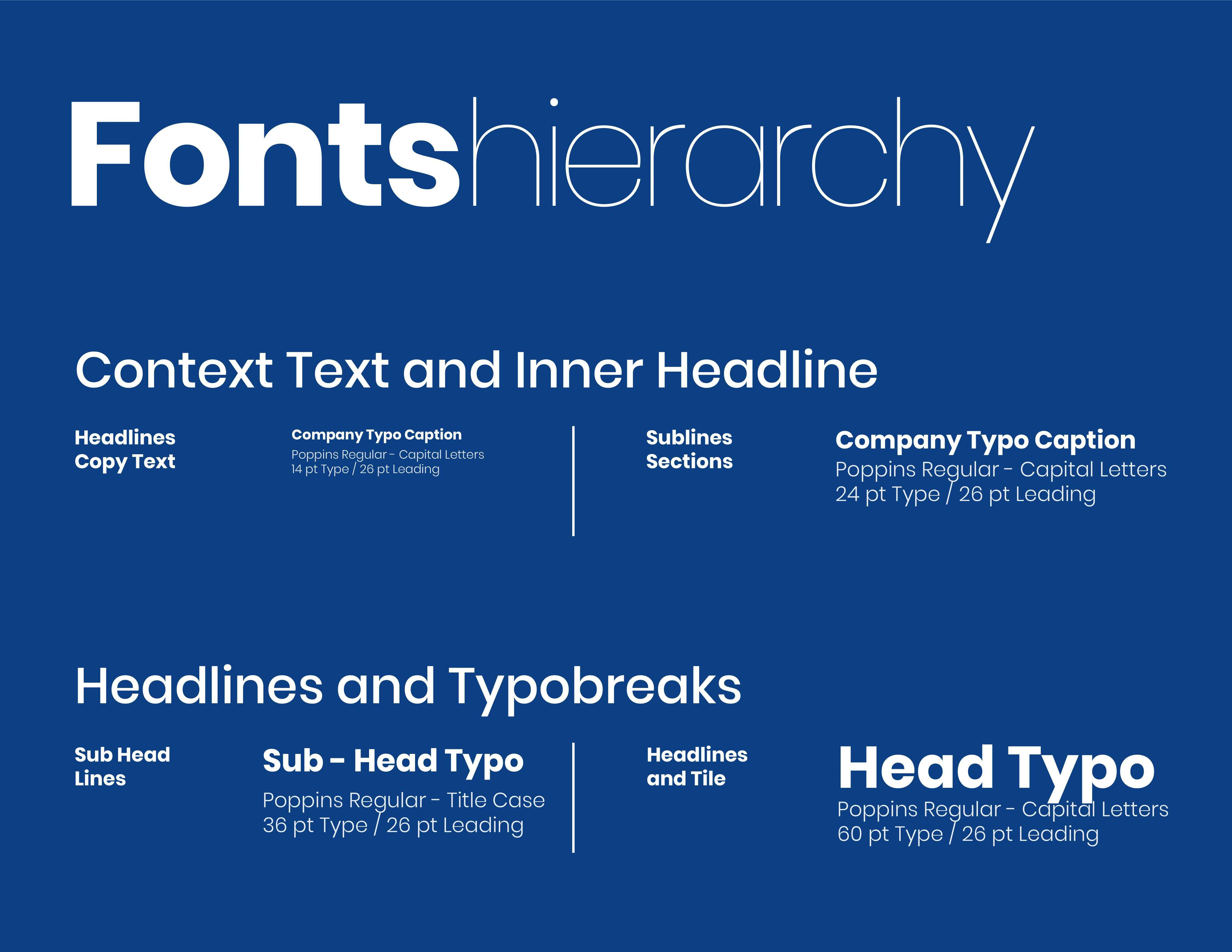
Poppins became the structural voice of the brand. Large headlines create immediate clarity while lighter-weight supporting typography introduces openness and accessibility. The hierarchy intentionally avoids overly academic density. Information remains digestible, optimistic, and easy to navigate.
The typography behaves less like institutional communication and more like orientation signage inside a contemporary learning environment.
Color System
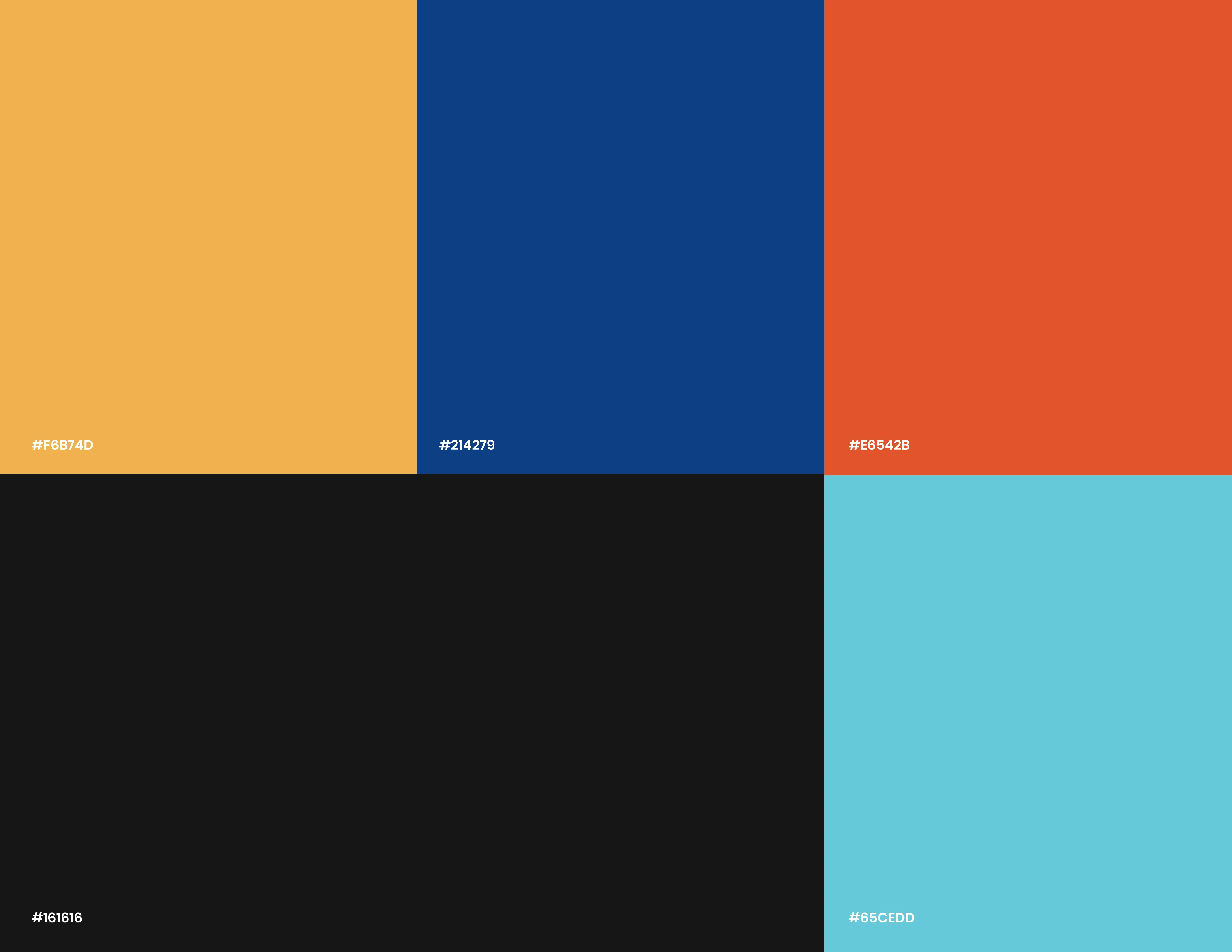
The palette balances energy and credibility.
The Direction Blue establishes trust and structure. Burnt Orange injects ambition and optimism. Warm Sand softens the system with human warmth, while Cyan introduces freshness and movement.
Used together, the colors create an identity that feels educational without becoming sterile.
The Result
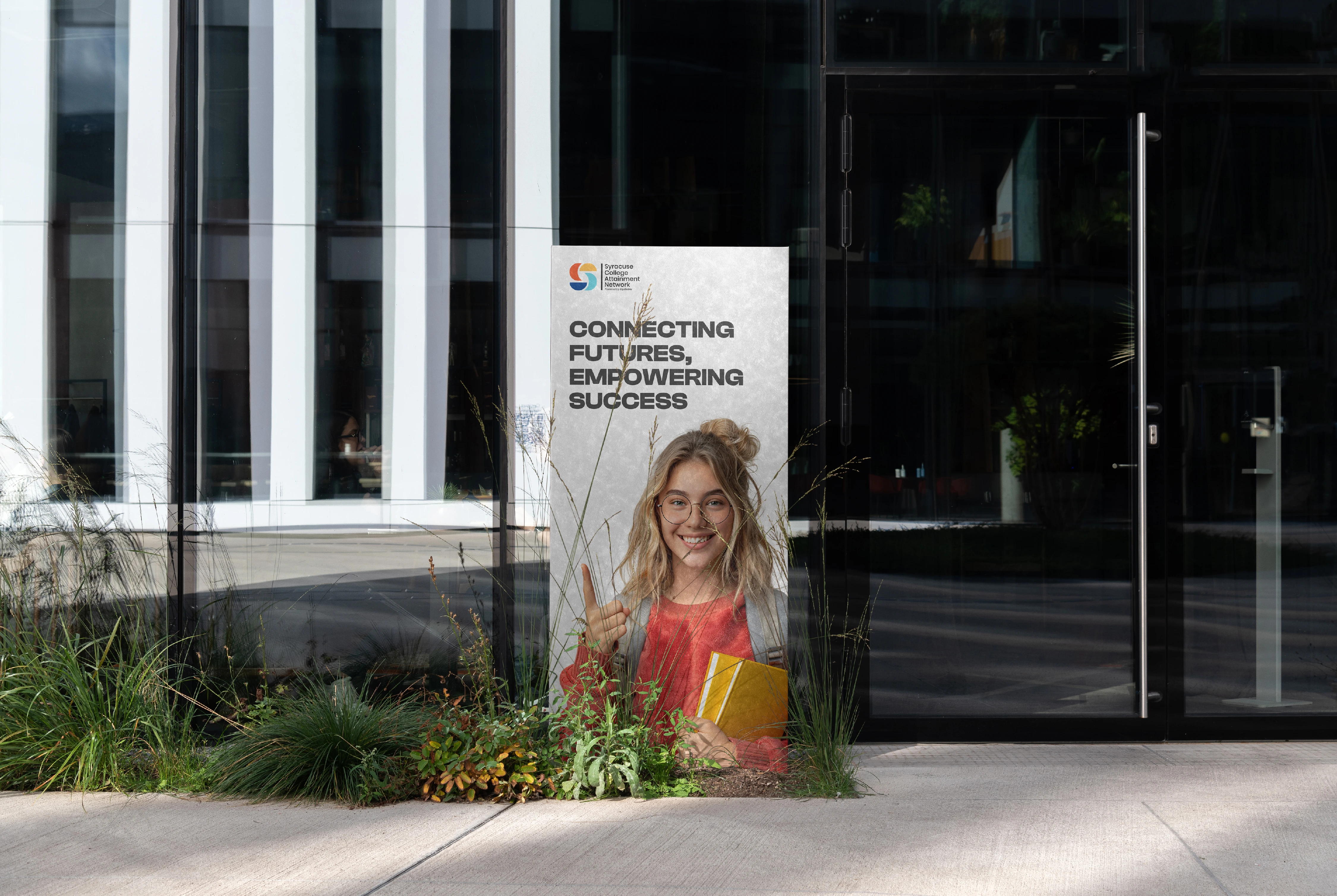
DIRECTION launched as a cohesive identity system built around clarity, movement, and progression. Every touchpoint — from posters and stationery to environmental signage and digital applications — operates inside the same conceptual framework without strain.
The strength of the system comes from restraint. Nothing feels excessive. Every element exists to reinforce navigation, momentum, and confidence.
The project demonstrates that educational branding doesn’t need to rely on outdated institutional language or exaggerated youth aesthetics to feel relevant. The answer wasn’t making education louder. It was making progress visible.
DIRECTION found its identity in movement. Everything else followed.
Studio: AJCREATIONZ
Project: DIRECTION
Year: 2026
Scope: Brand Identity, Print Design, Environmental Graphics, Typography System, Stationery, Digital Design
Industry: Education / Career Development
Like this project
Posted May 31, 2025
Minimalist brand guidelines