Casa Ferrari
Challenges
The store received a customization and auditing of its shopping experience, and it was my first research and presentation, which until today brings positive results for the store.
Objectives
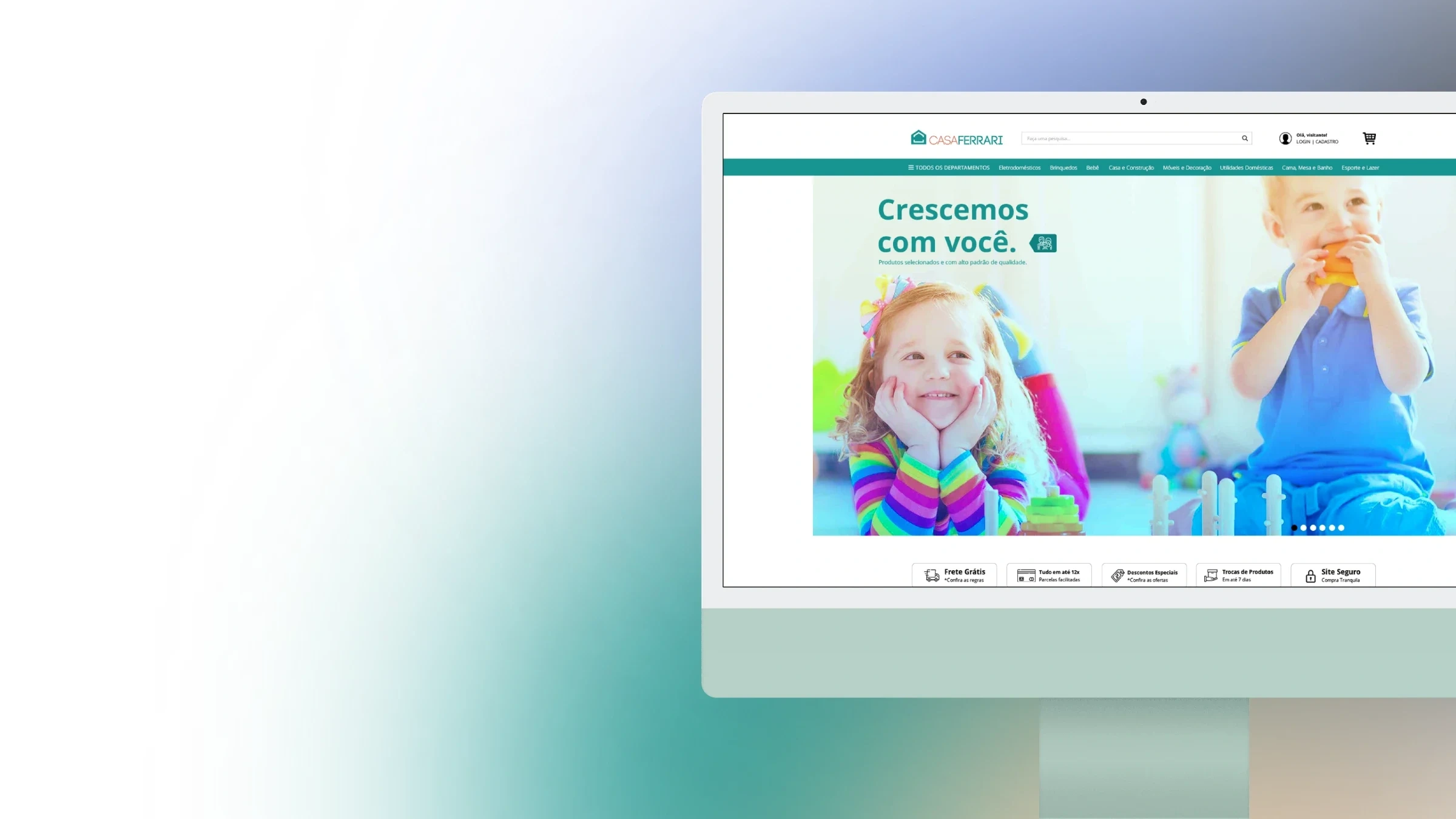
My efforts have been redirected to make the website family-focused, friendly, and welcoming, creating easy and responsive user flows.
Identifying an Identity
I selected relevant competitors and compared the main sections of each website. With the analysis of user data that frequent the store, I discovered that the majority were adults in relationships and future adults.
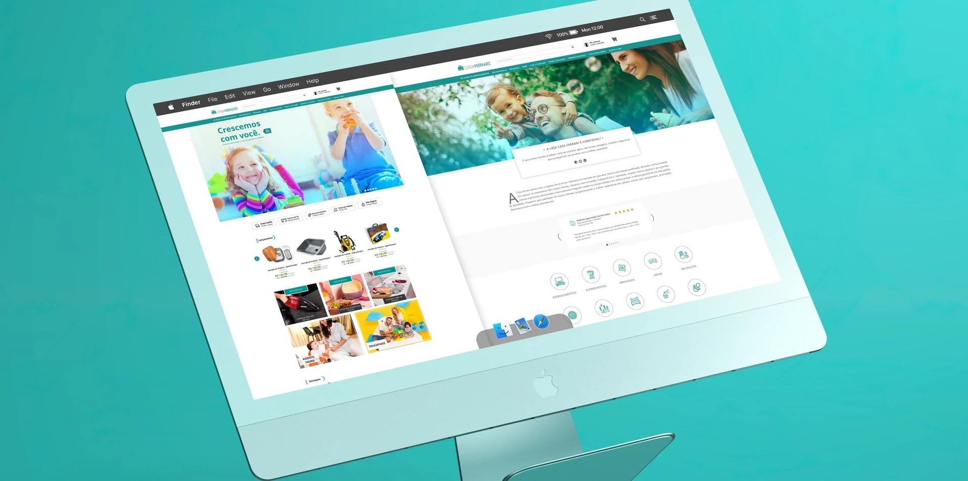
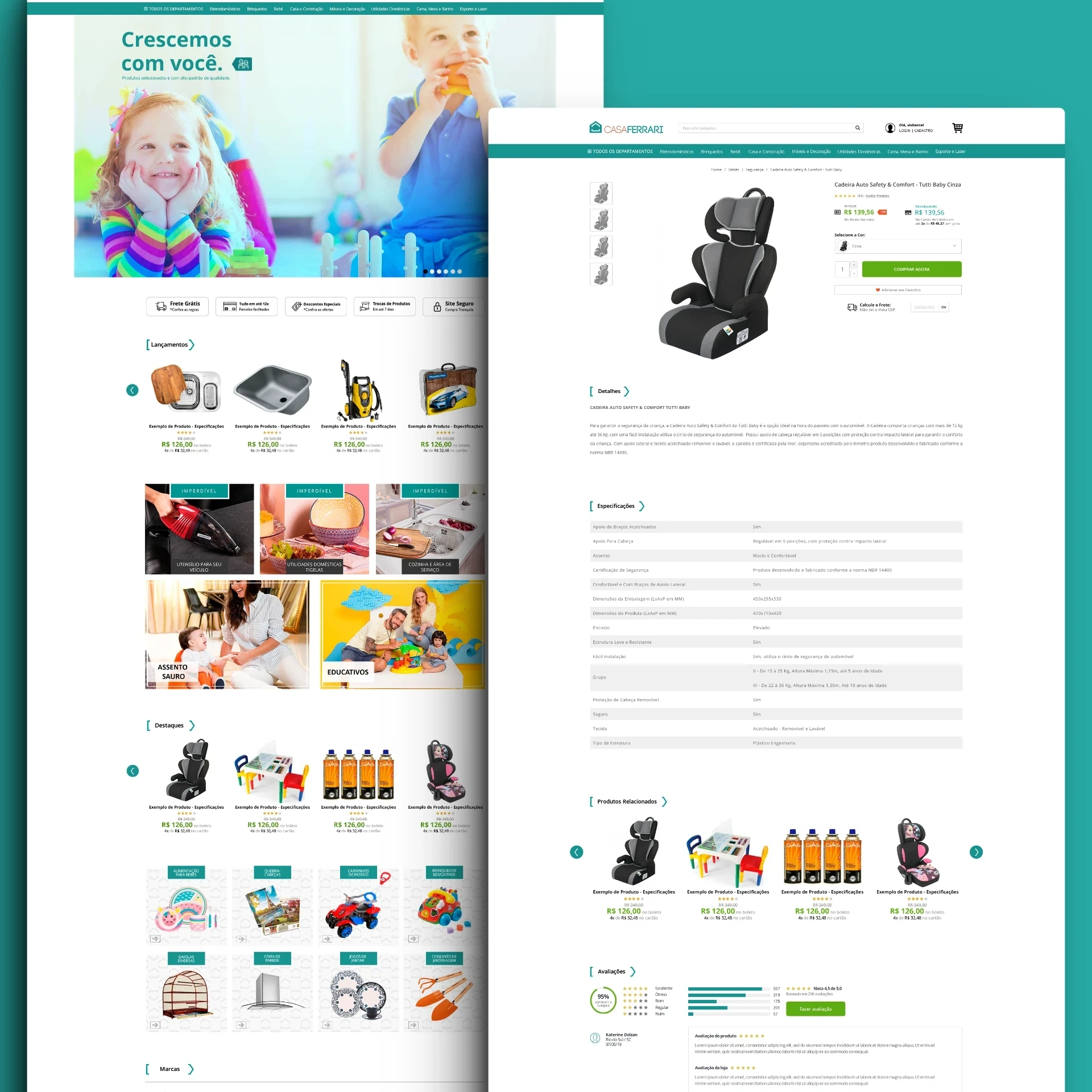
The store's homepage had a top orange banner that repeated several times and did not match the store's light tone. Therefore, its information was reorganized to present the advantages of buying at the store below the main banner.
Taking into consideration the store's target audience, which seeks products for the family, it is extremely important to hear from other buyers what they thought of the store in order to finalize the purchase. For this reason, a buyer review section was included on the main page to further retain the virtual store, providing more confidence to new visitors.
Redefining a flow
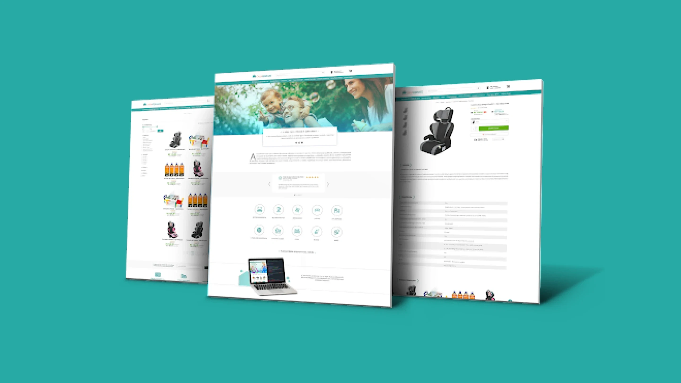
Another problem was their filtering system with many variations. The store's target audience ranges from 18 to 50 years old, and the store does not sell to other companies, it sells to families. For this reason, product filtering should be more objective and contain fewer specific or too complex descriptions.
"Buy" button for each product
Streamlining the purchase process and assisting accessibility for the elderly.
Section for "All departments" in the menu
What would be several links with huge menus, polluting the user experience, becomes a large and unique menu, encompassing all categories.
The initial image has been enlarged and institutional content has been added
Casa Ferrari sells home items, and since it has categories dedicated to human beings, it must also show its human side and approach its audience by demonstrating its dedication to customers.
New items in the store
After having seen the advantages of buying at the store, its products and customer opinions, the news are strategically positioned for the visitor to analyze everything they've seen and make their decision.
All indications were accepted by the store, which after its revamp received an even larger number of customers.
Compared to its revenue before the change, today the store is one of the main ones in its category and the biggest customer of the Magazord virtual shops platform. It still uses the same filter system today.
Studying the structure of your store thoroughly proved to be a decision that would further increase the spread of your values to customers.
Like this project
Posted Jun 14, 2024
Research on online store user contributes to its growth even today.
Likes
0
Views
0


