Built with Webflow
Assistantly: An Award Winning Unicorn Experience for Web
Qaisar A.
Assistantly - Designing a Unicorn Experience
For Assistantly, the challenge wasn’t just to design a website — it was to redefine how offshore talent is perceived and experienced. I approached this as a full-spectrum digital experience, blending strategic positioning with playful storytelling to bring their “Unicorn” philosophy to life.
From bold visual language and expressive motion to immersive interactions, every layer was crafted to communicate clarity, trust, and aspiration. The experience balances fun with function — turning complex service offerings into an intuitive journey that resonates with founders looking to scale smarter and faster.
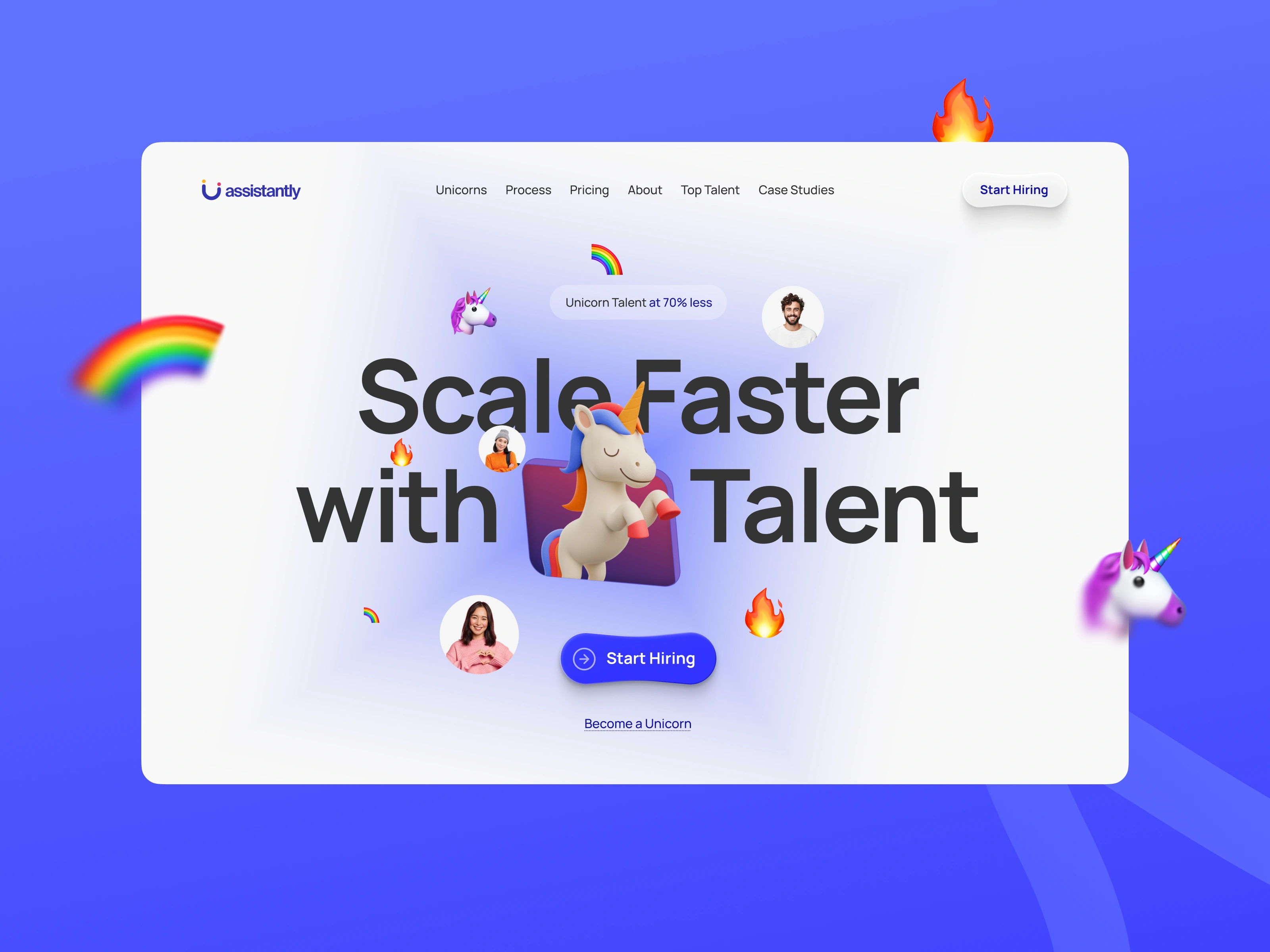
Bringing the Unicorn to Life
The hero sets the tone instantly — introducing the “Unicorn” not just as a visual, but as an idea. On hover, the unicorn rears up, creating a moment of surprise and delight that captures attention and invites interaction.
This subtle yet powerful animation reflects the core message: strength, agility, and rarity. It transforms a static symbol into a living, responsive element — reinforcing the value Assistantly brings to the table.
More than just an animation, it acts as a statement. A playful, confident gesture that signals this isn’t just another service — it’s a different kind of experience.
My Role
Creative Direction, Experience Design & Creative Development
Description
I led the project end-to-end — from defining the creative direction and sharpening the brand’s digital positioning to crafting the overall experience and overseeing implementation.
My role was to translate Assistantly’s vision into a clear, compelling narrative that could live and breathe on the web. This meant thinking beyond visuals — diving deep into how the brand should feel, how users should move through the experience, and how every interaction could reinforce trust and differentiation.
I directed the visual language, interaction patterns, and motion principles while working closely with the development process to ensure the final output stayed true to the vision. The goal was simple: create an experience that doesn’t just look good, but communicates, engages, and converts with intent.
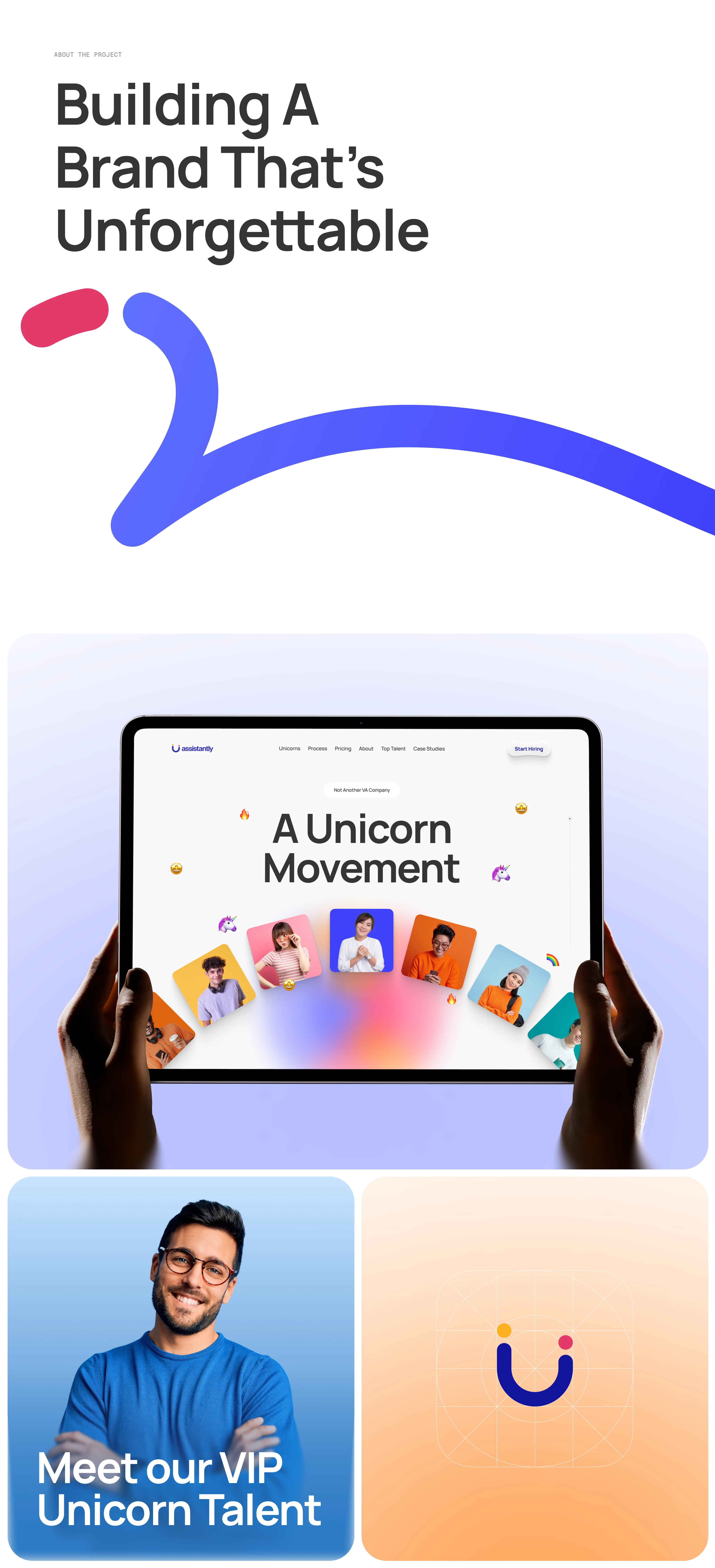
Team Integration Interaction
The interaction was designed to visually communicate what Assistantly truly offers — not just talent, but integration. As users scroll, individuals don’t just appear; they move, align, and organically become part of a unified team.
The motion reflects the actual experience: selecting the right people, bringing them into your workflow, and building a structure that feels native — not outsourced. Every transition is intentional, guiding users from scattered profiles to a cohesive unit, reinforcing trust in the process.
It’s a simple idea, brought to life through interaction — showing how a distributed team can feel central, connected, and fully yours.
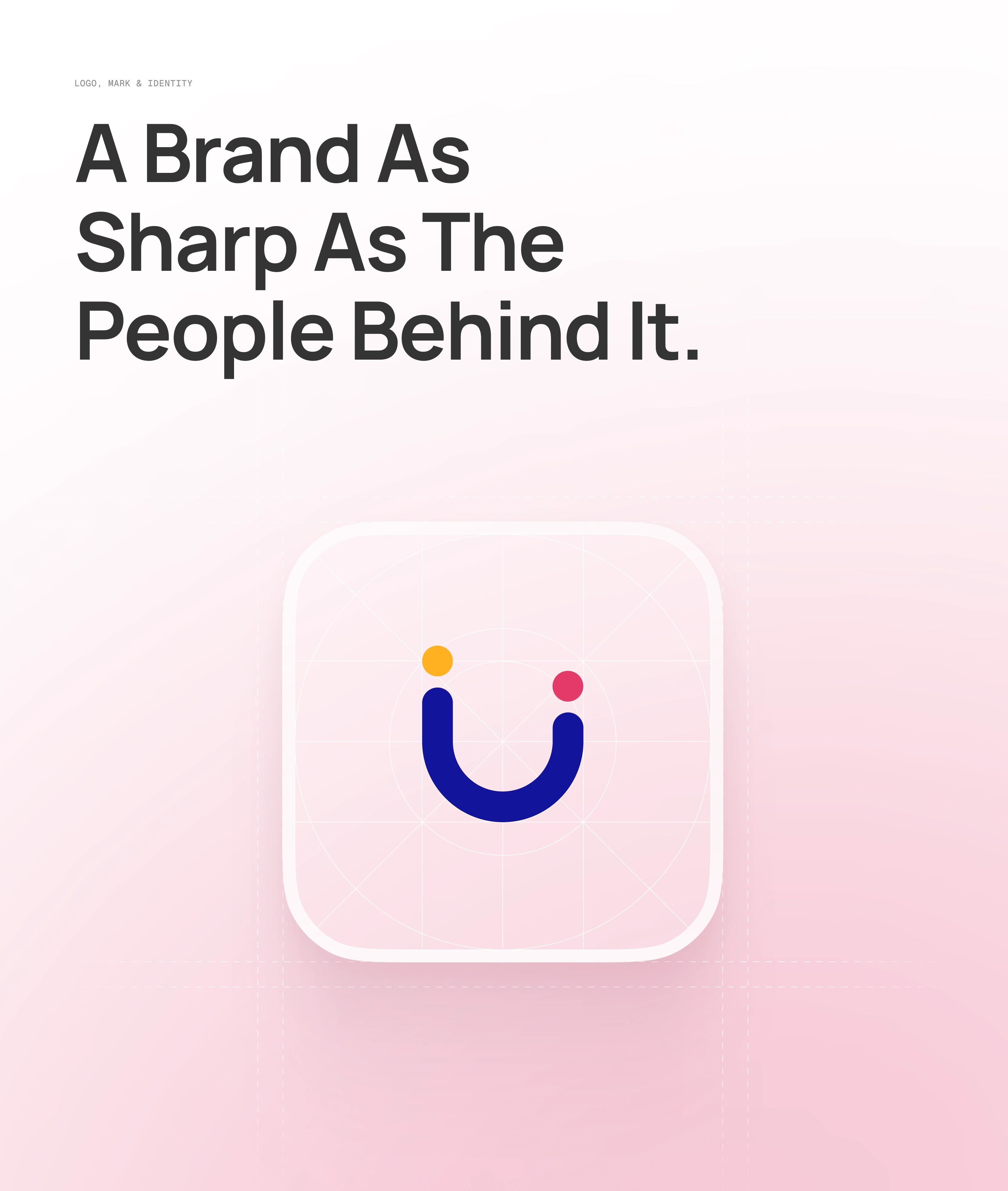
Brand
Design System
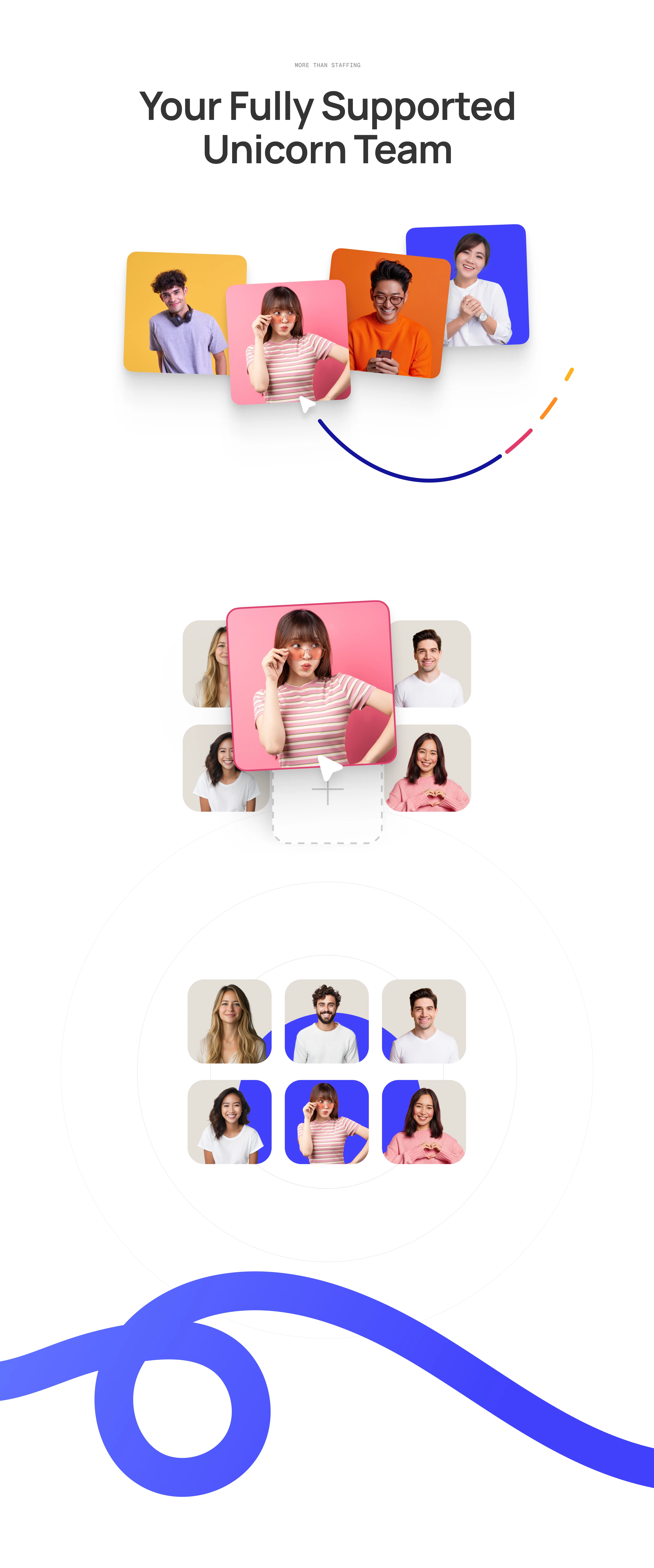
Seamlessly Becoming Your Team
This interaction is built on a modular design system where every element — from profile cards to motion paths — acts as a reusable component. I designed these building blocks to not only scale visually, but to behave consistently across the experience.
As users scroll, components don’t just animate — they respond within a defined system. Cards shift, stack, and integrate based on clear interaction rules, creating a sense of structure behind the playfulness. This balance between system and spontaneity ensures the experience feels fluid, yet intentional.
The result is more than a visual moment — it’s a cohesive interaction language that communicates how teams are assembled, integrated, and scaled within a unified workflow.
Mobile Experience
Seamless Across Every Screen
I approached mobile not as a fallback, but as an extension of the experience. The same design system and interaction components were carefully adapted to ensure the narrative remains intact — regardless of screen size.
Scroll-based interactions were rethought for touch, with simplified motion, optimised transitions, and performance-first decisions to maintain fluidity without compromising intent. Components stack, scale, and respond intelligently, preserving clarity while keeping the experience engaging and intuitive.
The goal was consistency without compromise — ensuring the story, the system, and the experience feel just as seamless in your hand as they do on a larger screen.
Content Sections
Making Information Feel Alive
I didn’t want this section to feel like a list of benefits — it had to feel like part of the experience. The flowing ribbons in the background act as a continuous visual thread, guiding attention and adding a sense of movement that keeps the interface alive.
Each info card is placed with intention, almost floating within the motion, creating a balance between structure and fluidity. As users scroll, the composition subtly shifts — making the content feel dynamic rather than static.
The goal was simple: present key information without breaking the flow. By blending motion, layout, and hierarchy, I turned what could have been a standard content block into an engaging, scroll-driven moment that keeps users curious and connected.
Page Layout
Dynamic, Interactive, and Built to Flow
The entire experience is built on a dynamic layout system where motion, interaction, and content work together seamlessly. Instead of fixed sections, the page evolves as users scroll — creating a continuous sense of movement and progression.
Interactive elements are woven throughout, allowing content to feel responsive and alive rather than static. Background ribbons act as a visual connector, guiding attention across sections while reinforcing the brand’s fluid and scalable nature.
Motion is carefully optimised across the board — from subtle transitions to larger expressive movements — ensuring consistency, performance, and clarity on every device. The result is a cohesive, scroll-driven experience that informs, engages, and flows effortlessly from start to finish.
Interaction Components
Footer
Impact Beyond the Experience
The project didn’t just elevate the digital presence — it reshaped how Assistantly is perceived in the market. The experience played a key role in positioning the brand as premium, forward-thinking, and productised rather than transactional.
The work went on to receive multiple design recognitions and awards, validating both the creative direction and the execution at an industry level.
More importantly, it created a clearer narrative for the business — helping communicate value, build trust faster, and stand out in a highly competitive space. The result is not just an award-winning website, but a strategic shift in how the brand presents itself and connects with its audience.
Like this project
Posted Apr 20, 2026
A full-spectrum digital experience - focused on Creative Direction, Story-telling, Interaction Design and Webflow (no-code) implementation.
Likes
7
Views
92
Clients
Assistantly