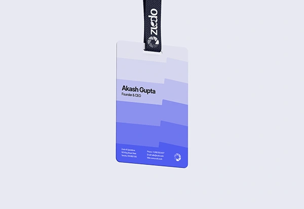
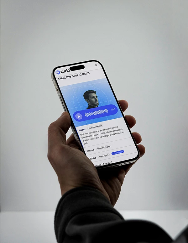
Zudo
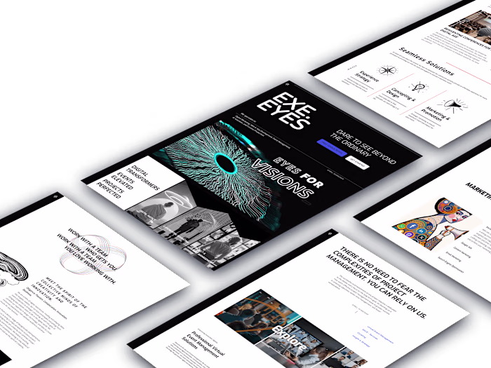
EXE. EYES
Zudo
AI Operations Platform for Warranty & Service Teams - Toronto, Canada
Logo Design & Brand Identity, Collateral Items, Website UI & Development, Motion Design Exe.Eyes ©2026.
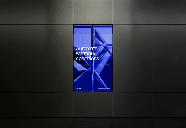
ZUDO is an AI-driven platform redefining operations in warranty and service industries. Built to reduce operational costs and increase efficiency, it automates critical processes such as customer support, coverage verification, and technician dispatch.It represents a new operational standard — where decisions are made in real time with precision and consistency.
By embedding artificial intelligence into every stage of the workflow, the platform removes friction, minimizes human error, and accelerates issue resolution. Rooted in efficiency, control, and scalability, ZUDO transforms complex operations into predictable, optimized systems — enabling companies to focus on what truly matters: growth and customer experience.
Project Manager: Yousuf Zakhel Creative Direction: Yousuf Zakhel & Matheus D. Bonilha
Brand Identity: Matheus D. Bonilha UI Design: Rayhan Juan Arifani
Motion Design: Anas Aminun Hakim 3D Design: Rayhan Juan Arifani
Development: Rayhan Juan Arifani

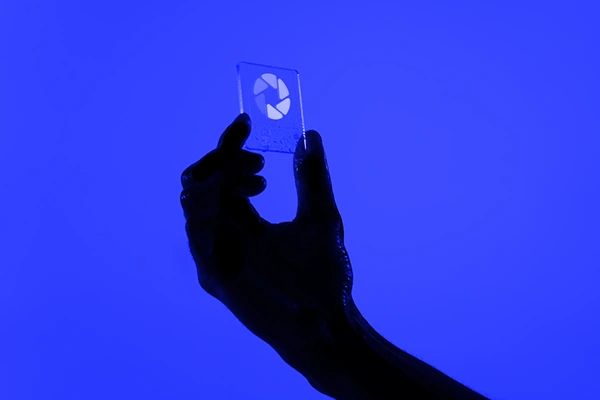
Aperture — Precision in Focus
The “Aperture” symbol represents the moment when chaos is filtered into clarity.
Inspired by the mechanics of a lens, its structure reflects the controlled opening and closing that regulates the flow of information. Each segment acts as a selective barrier, allowing only what is relevant to be captured, analyzed, and executed. Within the brand context, the Aperture embodies the system’s ability to focus with absolute precision on complex problems—such as warranty claims—and reduce them into clear, decisive outcomes without noise or ambiguity.
Visually, the circular form reinforces continuity and control, while the internal segmentation suggests multiple forces operating in coordination toward a single result: resolution. This is not a symbol of communication or interaction. It is a symbol of filtering, decision, and execution.
The Aperture does not observe.
It defines what matters—and acts on it.


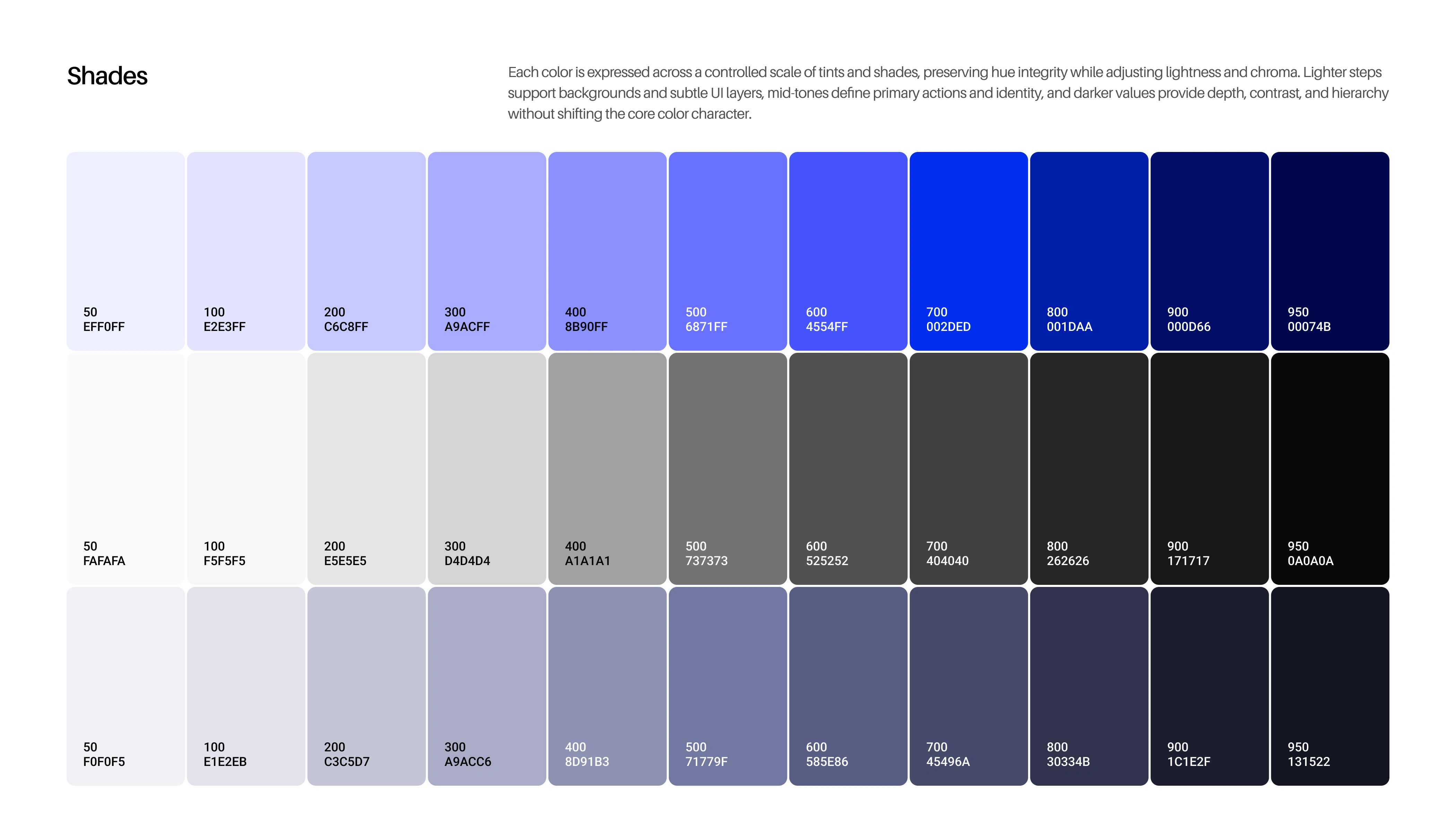
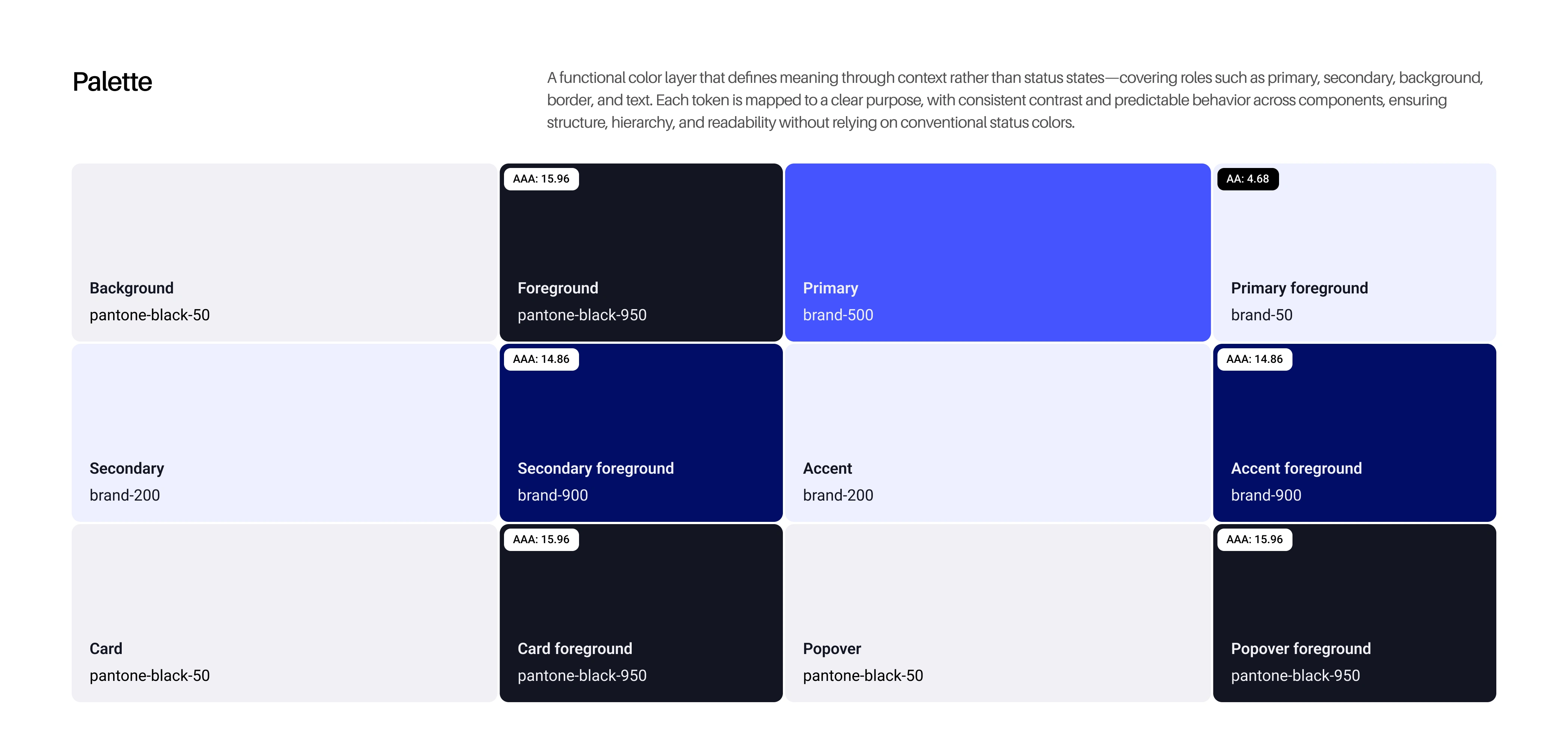
Color System — Control & Signal
Zudo’s color system is built on contrast between control and activation. At its core, the palette is dominated by deep, restrained tones—near-black and desaturated navy—establishing a foundation of stability, precision, and authority. These colors are not expressive; they are structural. They create a controlled environment where information can exist without distraction.
The blue spectrum acts as the system’s signal layer. It is used with intention to highlight data, structure interfaces, and guide attention. Rather than functioning as decoration, blue operates as a technical marker—defining hierarchy, reinforcing clarity, and indicating points of interaction.
Lighter tones are introduced sparingly to provide balance and legibility, ensuring that information remains accessible without compromising the system’s overall rigor.


Like this project
Posted Jun 1, 2026
ZUDO is an AI-driven platform redefining operations in warranty and service industries. Built to reduce operational costs and increase efficiency.