Borrow Website Redesign
→ short-term electric vehicle subscription service 🚙
→ ui/ux/interaction design, prototyping, user testing 👨🏽💻
→ may 2020 - aug 2020 🗓
→ figma file | prototype link 🔗 ← please explore!
→ joinborrow.com 🌎 ← soon to be updated to my design!
role
I was the sole UX Designer at Borrow and was tasked with redesigning Borrow's website from the ground upworking with the Creative Director and UX Researcher. My deliverable at the end of the internship was a working prototype of my redesign.
about Borrow ⚡️
Borrow is a startup based in Los Angeles focusing on providing easy and accessible short-term electric vehicle (EV) subscriptions for any type of customer. All reservations are made on their website, making it their primary connection with the consumer. While I interned at Borrow, we launched a campaign at Republic raising over $130,000.

problem
When I joined the team, Borrow's website was convoluted causing high site bounce rate. Because Borrow is a business to consumer model, having a website difficult to navigate lowered the conversion rate. My job was to convert website visitors into Borrowers.Additionally, Borrow needed to better educate potential customers on the new concept of renting an electric vehicles.
Borrow needed to direct users to their ideal electric vehicle.
Customers were able to reserve cars they weren't eligible for resulting in a high exit rate after the reservation customization process. Borrow didn't have a way for users to check their eligibility, portraying a false promise to the user.

Borrow's original reservation user flow.
solution
After conducting user surveys and a heuristic analysis on the original website, it was evident the site didn't serve as a proper onboarding for a user unfamiliar with EVs. Users could spend a few minutes on the site and still have many questions about what Borrow offered.The new website needed to be educational, but also have a clear path to reservation. Those who were knowledgable of the EV industry could learn about Borrow and those new to the EV industry could learn about electric vehicles while also learning about Borrow.
Designing for both the EV nut and the EV newbie would allow Borrow's website to convert visitors into Borrowers.
To combat the high exit rate, I created a new reservation flow for Borrow's website. This flow eliminated the issue of users being turned down after customizing their reservation and limited the rate of failed eligibility checks. This was due to the addition of the The EV Quiz which asked for the user's estimated credit score.

My revised reservation flow for Borrow.
the home page
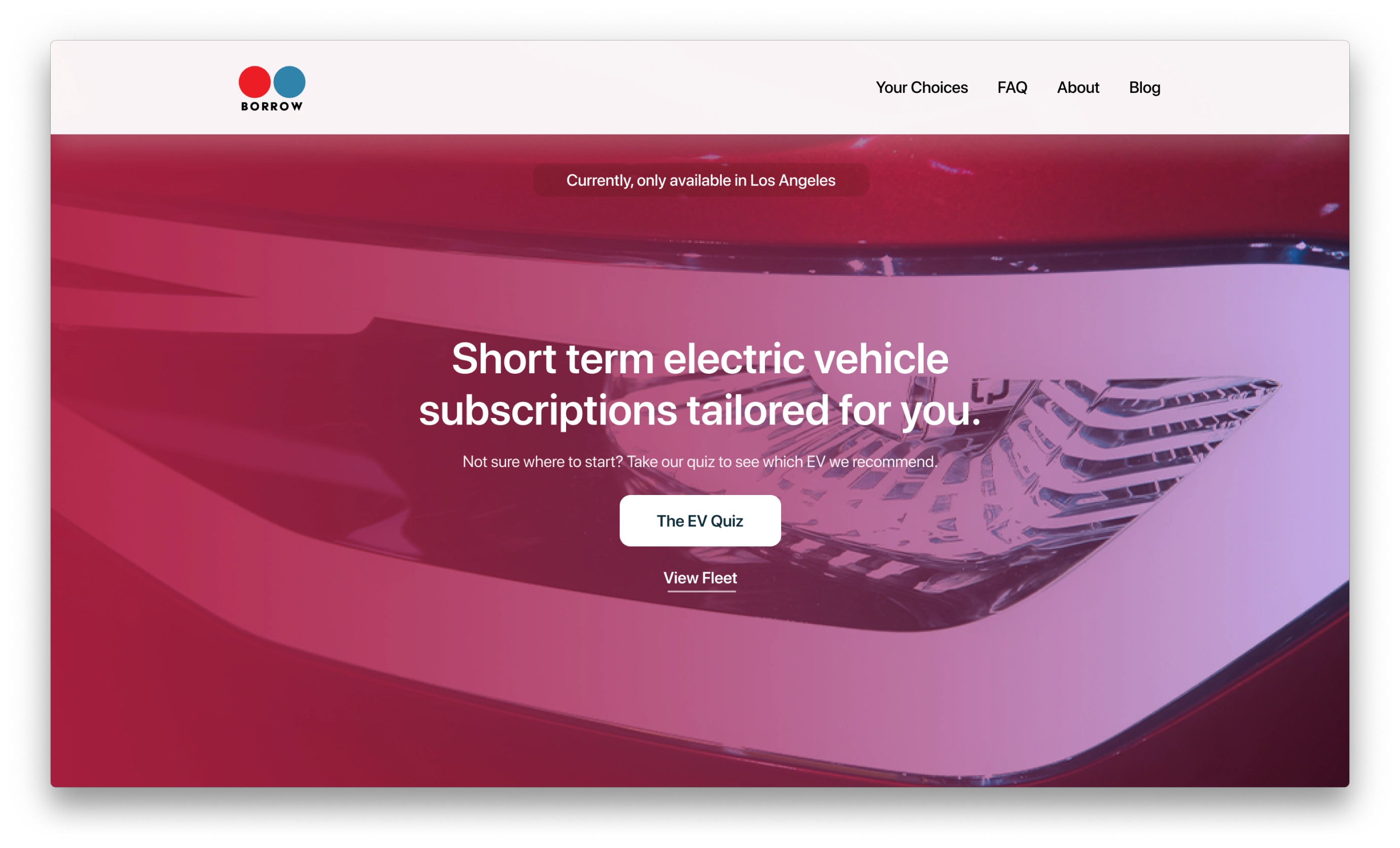
The notable features on the initial viewport of the home page are a call-to-action button for 'The EV Quiz' (a quiz to point new user to a specific EV) and a secondary call-to-action button to 'View Fleet'. This caters to the two types of customers visiting Borrow's webpage.
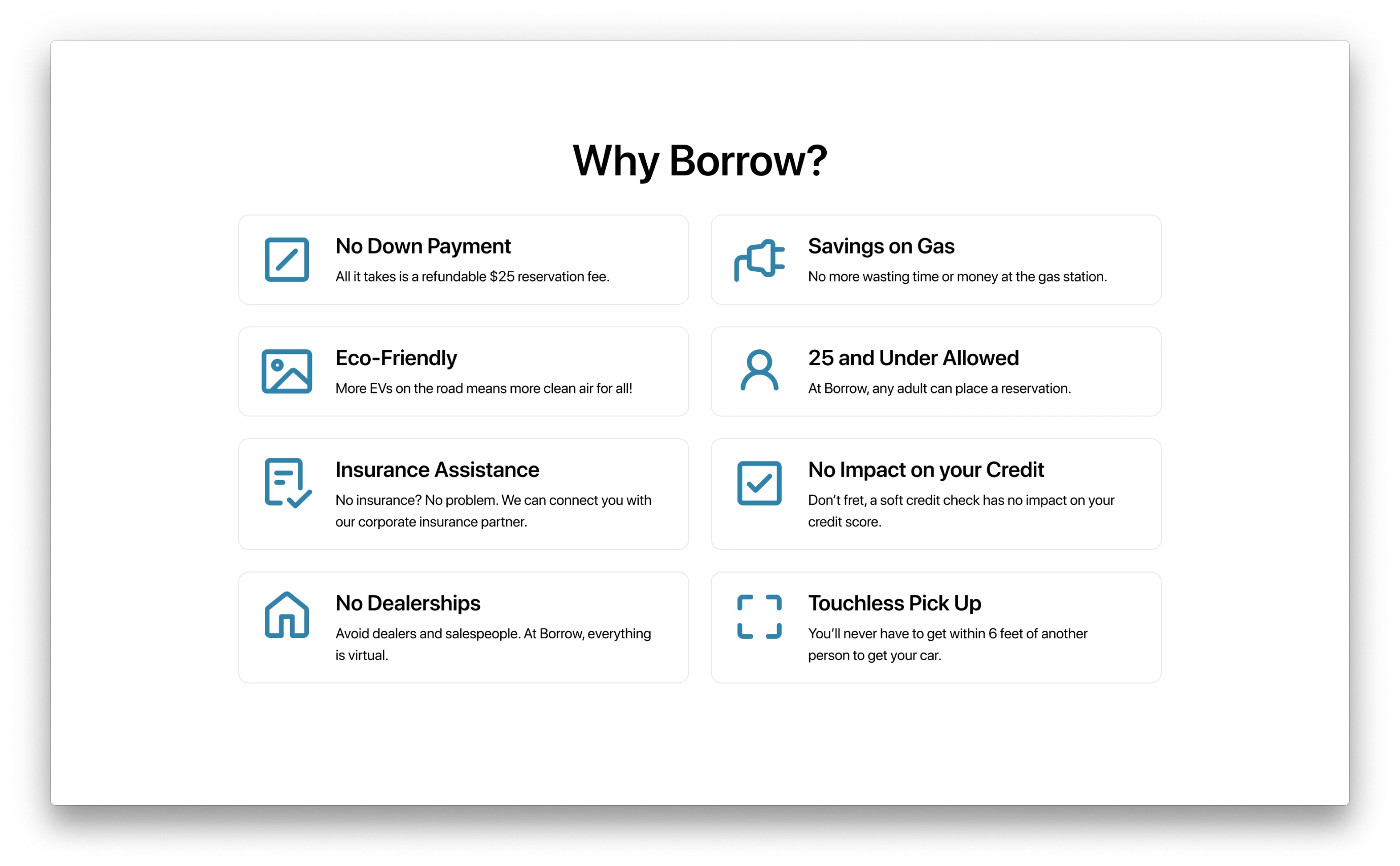
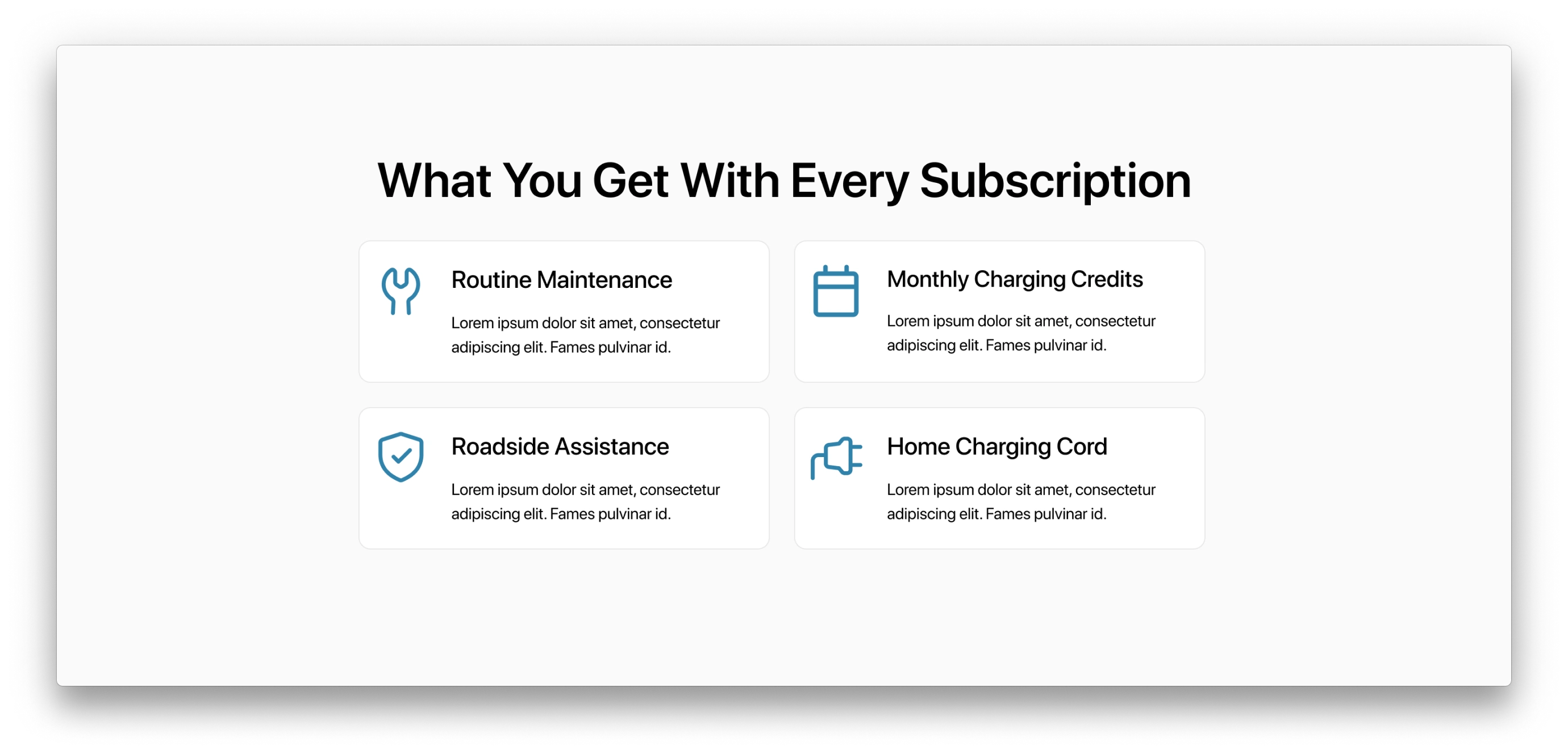
For the user who scrolls down looking for more information before committing to one of the CTAs, I decided to show them why they should choose Borrow. I thought the best way to do so was through scannable cards of information accompanied by icons as a visual cue. This clearly communicates Borrow's benefits.
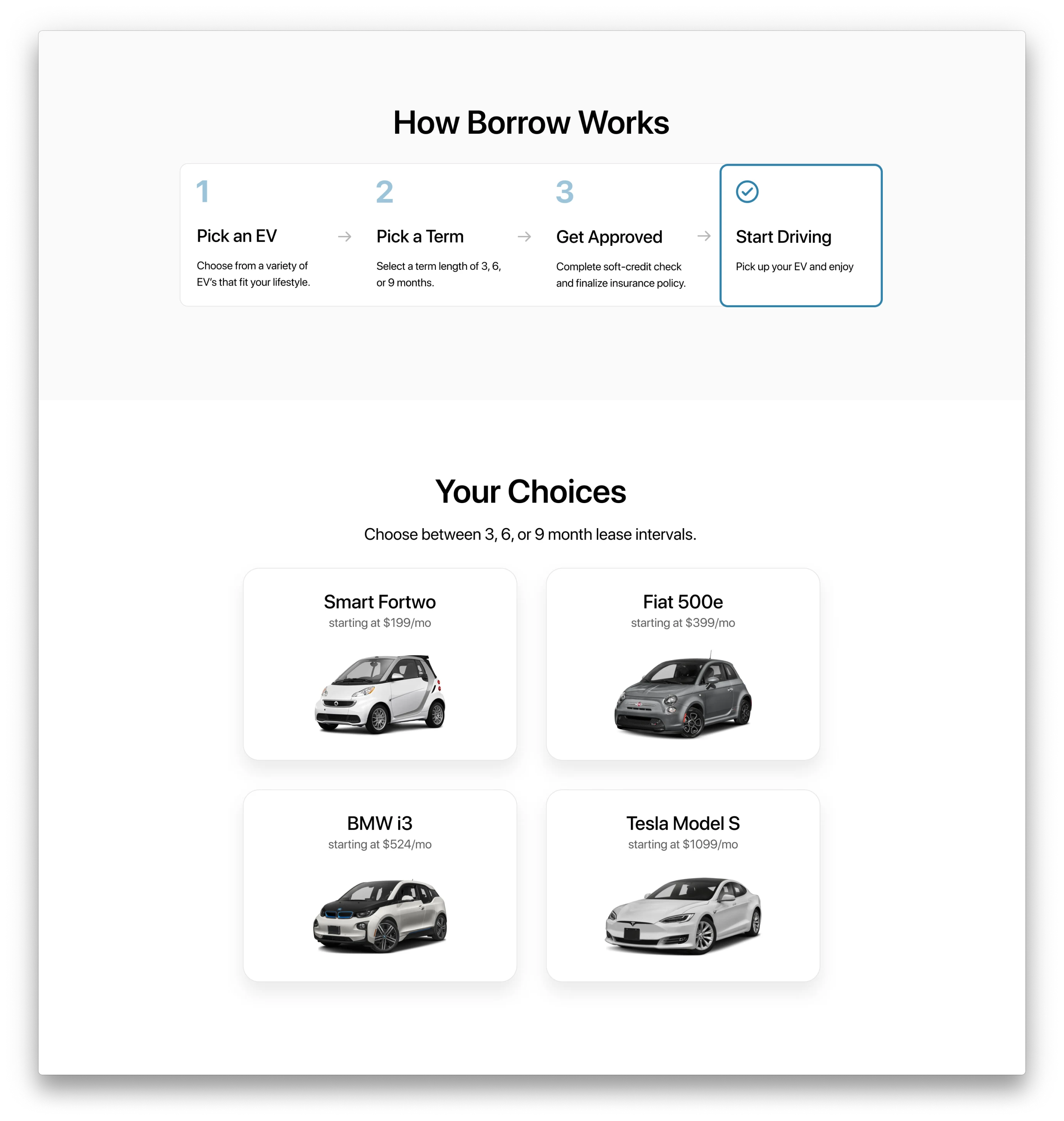
Next, I decided to show the product alongside Borrow's reservation steps. Showing the product once the user is more familiar with the company allows them to browse with intent.
The logistical aspects of the subscription are then shown to the user as they're more technical but still needed to be communicated.
the EV quiz
To aid uninformed users with their car selection, we decided to include a quiz to see which car from Borrow's fleet is best for them. After running multiple user tests using Maze, we finalized on this set of five questions for the user:
1. Which subscription length best aligns with your needs?
2. How much are you willing to spend monthly?
3. On average, how many miles do you drive a day?
4. In your estimation, where does your credit score fall?
5. How many passengers do you normally carry?
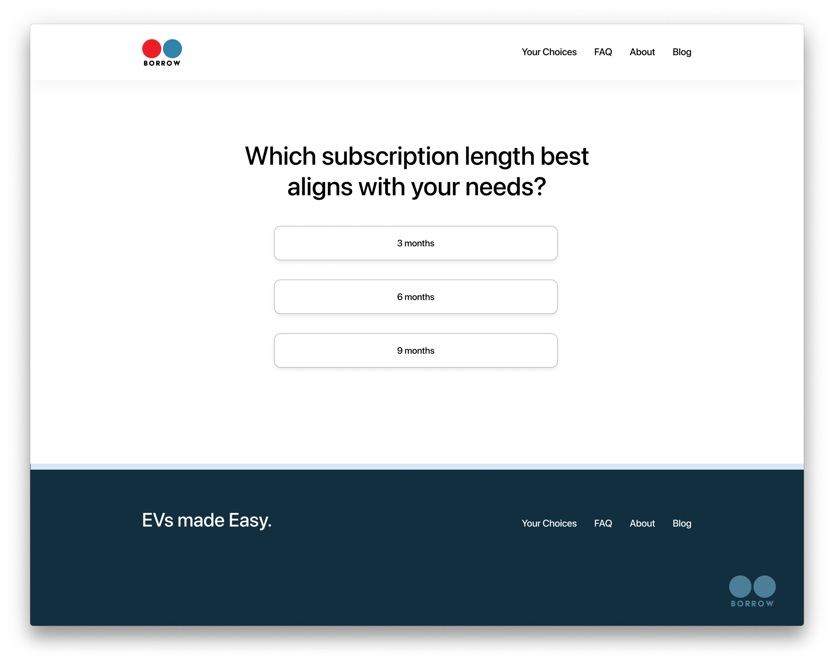
Screen grab from the EV quiz.
After completing the quiz, the user is matched with a car that best fits their needs.
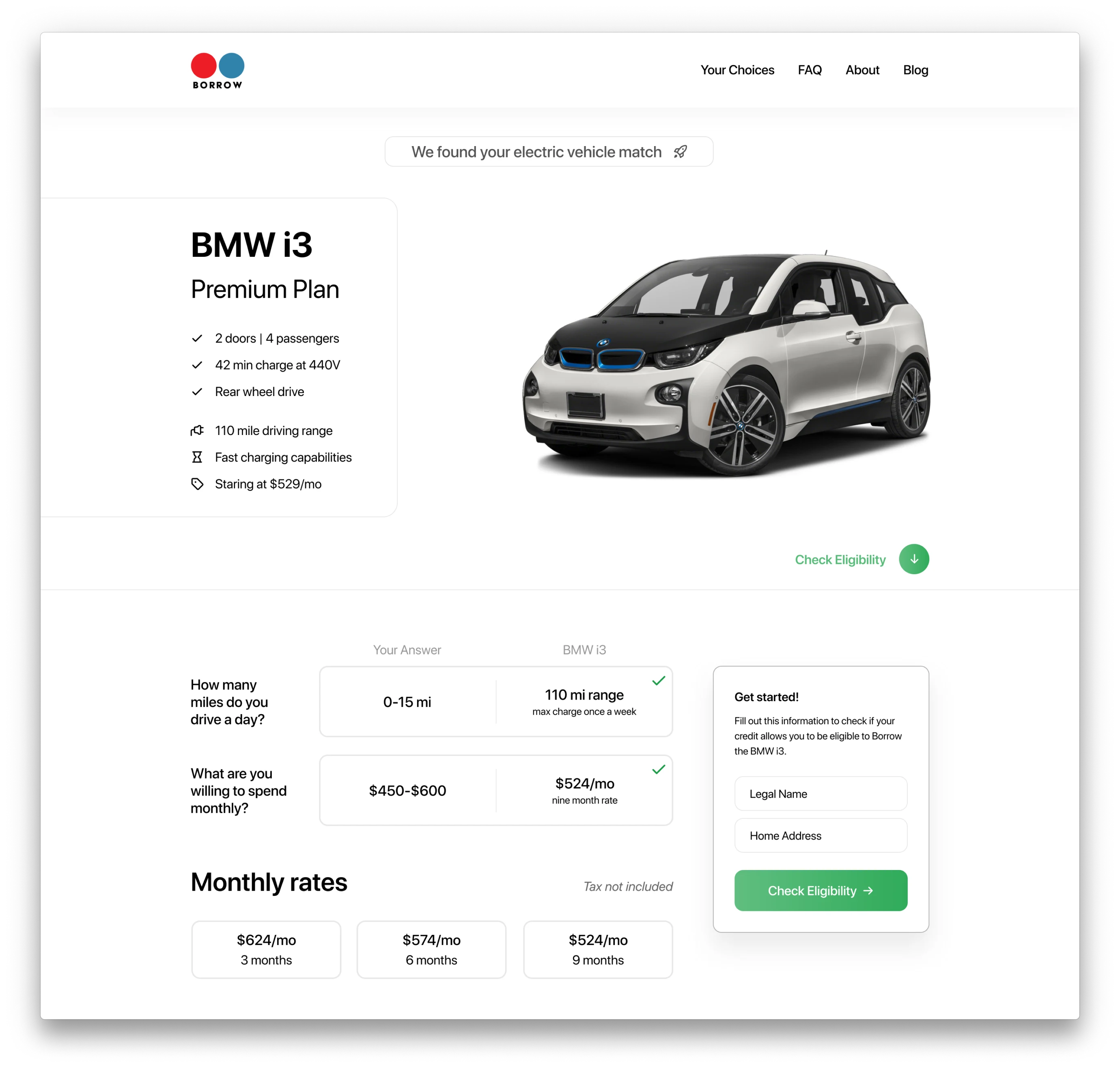
Example product page shown to user after completing the EV quiz.
breaking down the product page
There are two product page variations: one for each type of user. The product page for the EV newbie (shown above) refers to the user's quiz answers to validate why Borrow chose this car for them. This interface element shows the user's answers directly compared to the car's specifications.
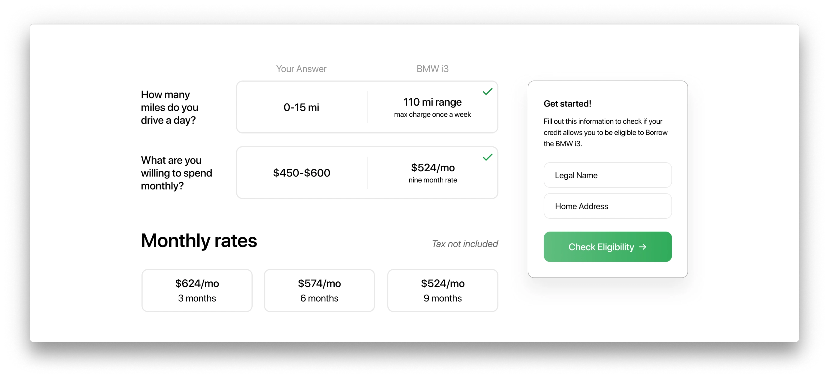
The eligibility card is pinned to the user's scroll so the user can easily start a reservation no matter where they're on the page.
Before the redesign, the user was taken to a page outside of Borrow's website to fill out the information for their reservation. Since user had to conduct the soft credit pull after placing the reservation, they could complete the reservation process and be turned away for having an ineligible credit score.To combat this, I designed a floating card that handles the soft credit pull eligibility check and collects the basic information for the user's reservation.
Now the user cannot customize their reservation until they pass the eligibility check.
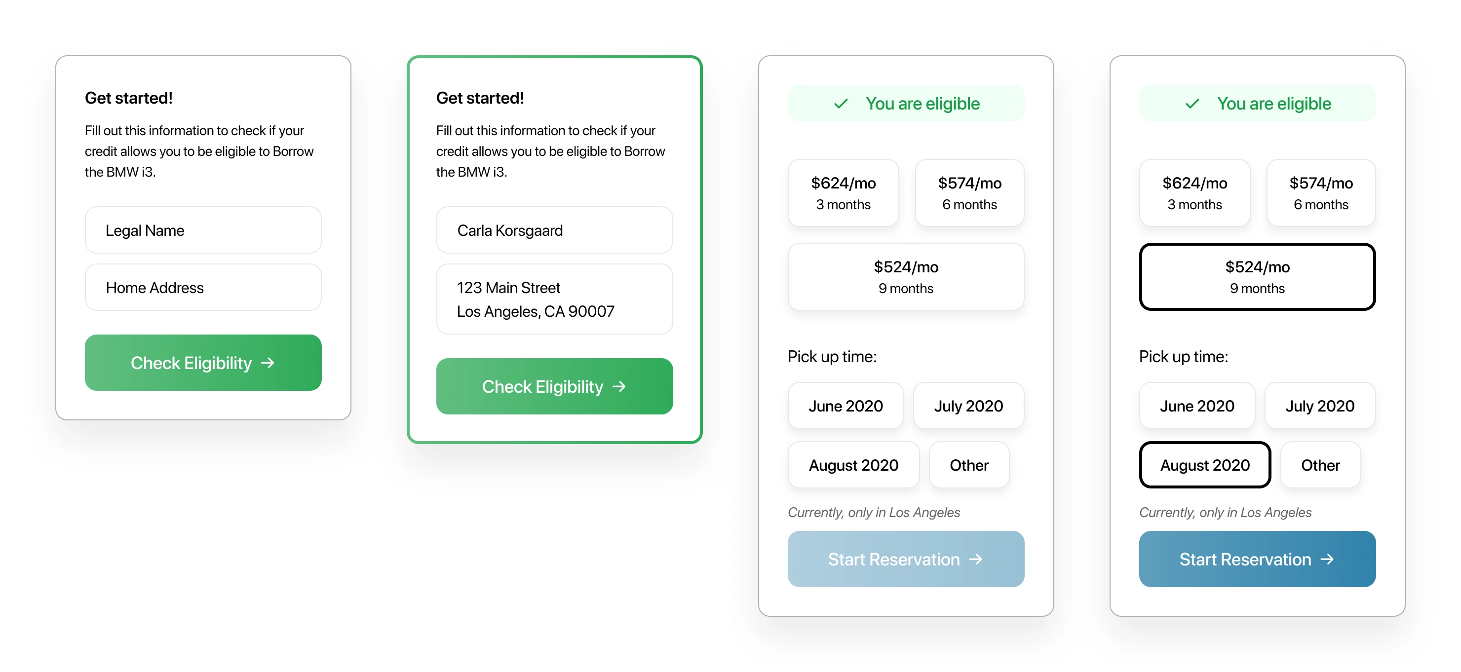
Process of filling out the floating card.
what i learned
At Borrow, I learned the importance of design iteration, but more specifically, conducting user tests between these iterations. At the end of the day, you are the designing for the user, and it's easy to get caught off track while coming up with new features and fun interactions. The prevalence of user tests throughout a project allows for productive design advancements.As the only UX Designer at Borrow, I learned the importance of leaving well-documented work for the next designer and future developers who join the team. The Figma file I handed off to the company laid out everything I had done and everything I would have continued doing if my time there wasn't coming to an end.
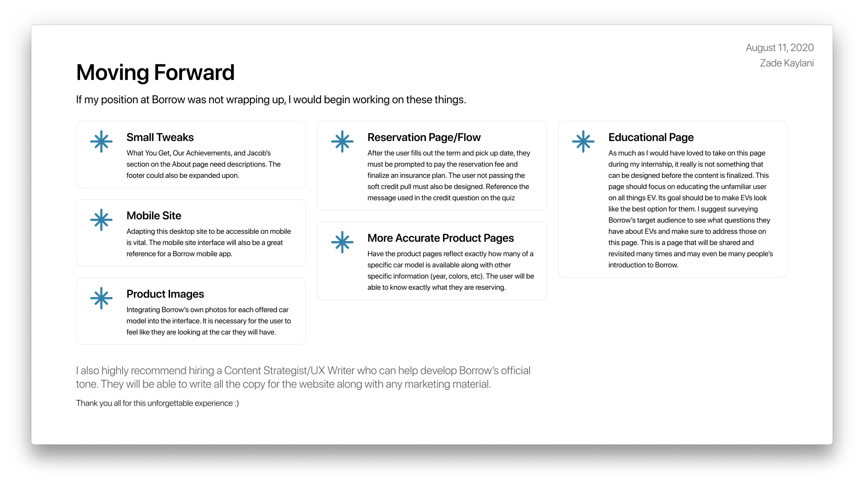
A user interface can always be expanded upon, so I wanted to make sure I mapped out the next steps for a smooth transition into the future of the company.
Check out my Figma prototype of the redesign here!
Like this project
Posted Feb 24, 2021
Likes
0
Views
4


